Techno Typeface; A Look at the Design Process and Logic
The Idea Formation:
The Techno typeface designed as part of a Type Therapy type design course.
In this course, students develop a clear and expandable idea within a limited time frame, rooted in the formal characteristics of letterforms and defined as a “gene.”
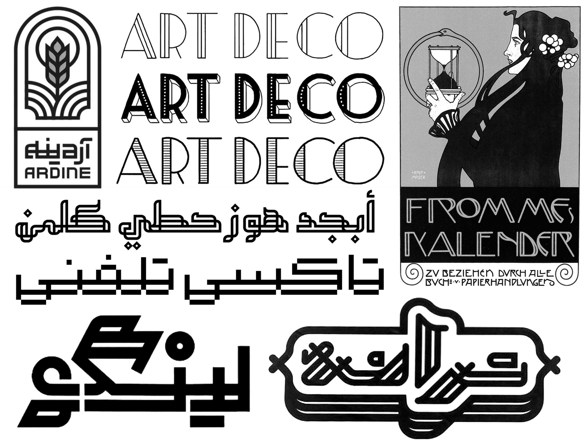
To identify this gene, the student studies a range of references, including:
-
Persian and Arabic calligraphy
-
Modern typography
-
logotypes
-
Latin fonts and typefaces
The goal of this research is to reach a structure that:
-
Can be clearly analyzed
-
Defines fifteen design variables, as outlined in the Type Therapy course
-
Makes it possible to reproduce and further develop the typeface based on those same variables
Double-Line Type
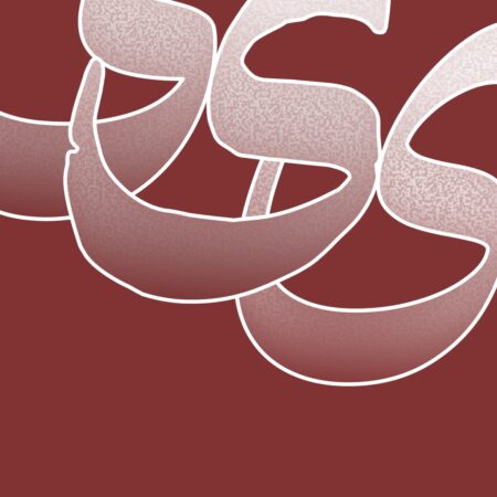
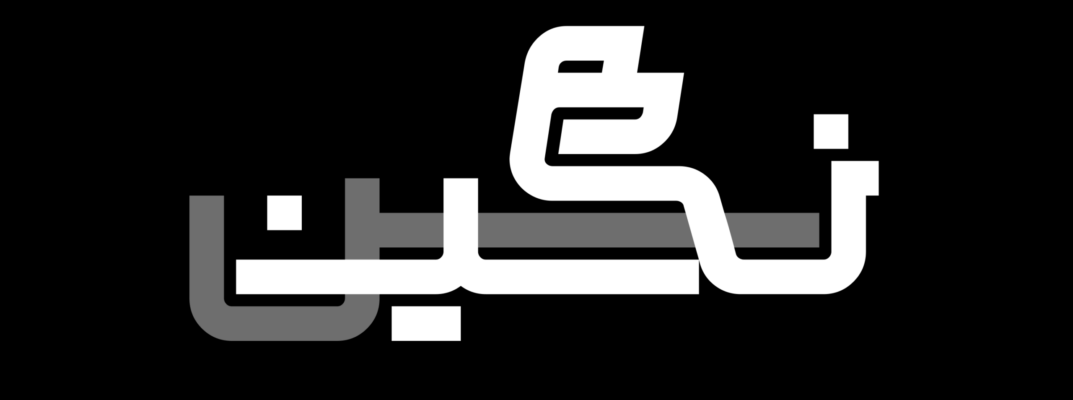
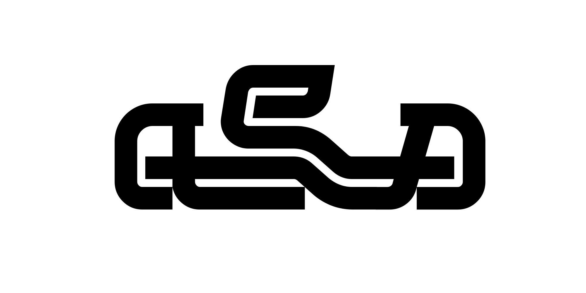
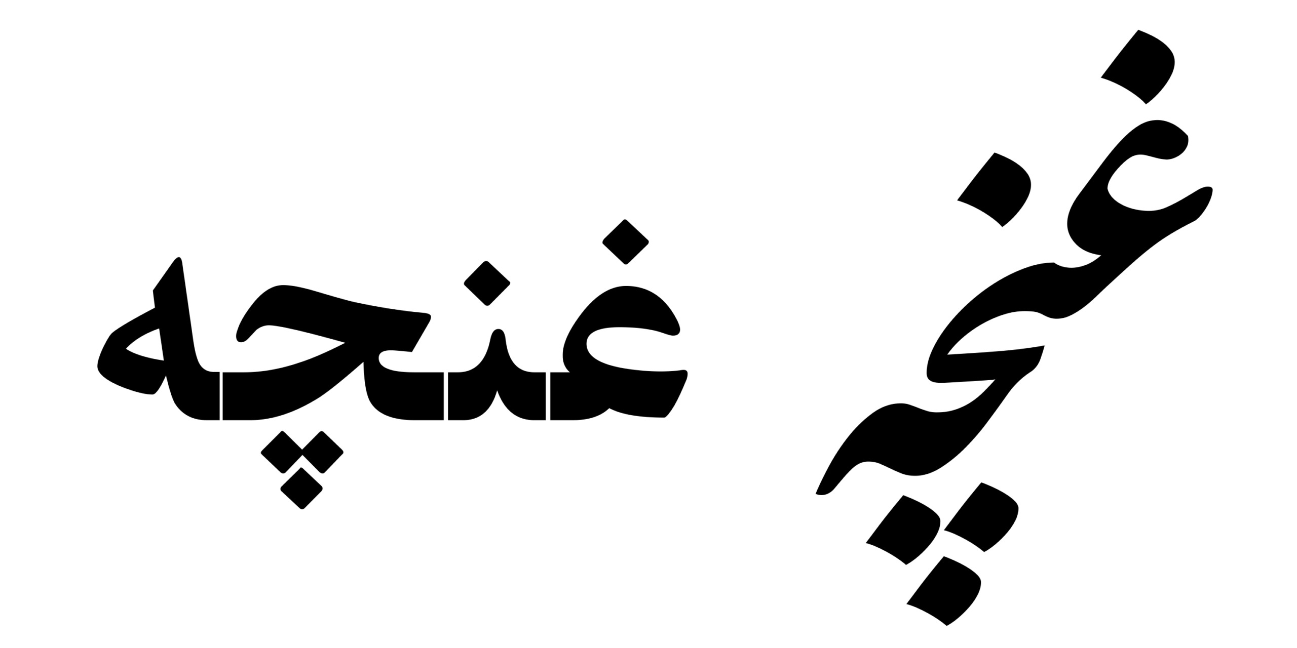
The main idea behind the Techno typeface emerged from studying typefaces and logotypes designed in the double-line style.
At the beginning, the main focus was on the relationship between the two parallel lines in the thick parts of the letters and the single-line forms in the thinner sections. Narges Homayoun, the designer of the Techno typeface, used this logic to explore new letterforms, experiments that, even in the early stages, revealed both the potential of the concept and the designer’s capabilities.
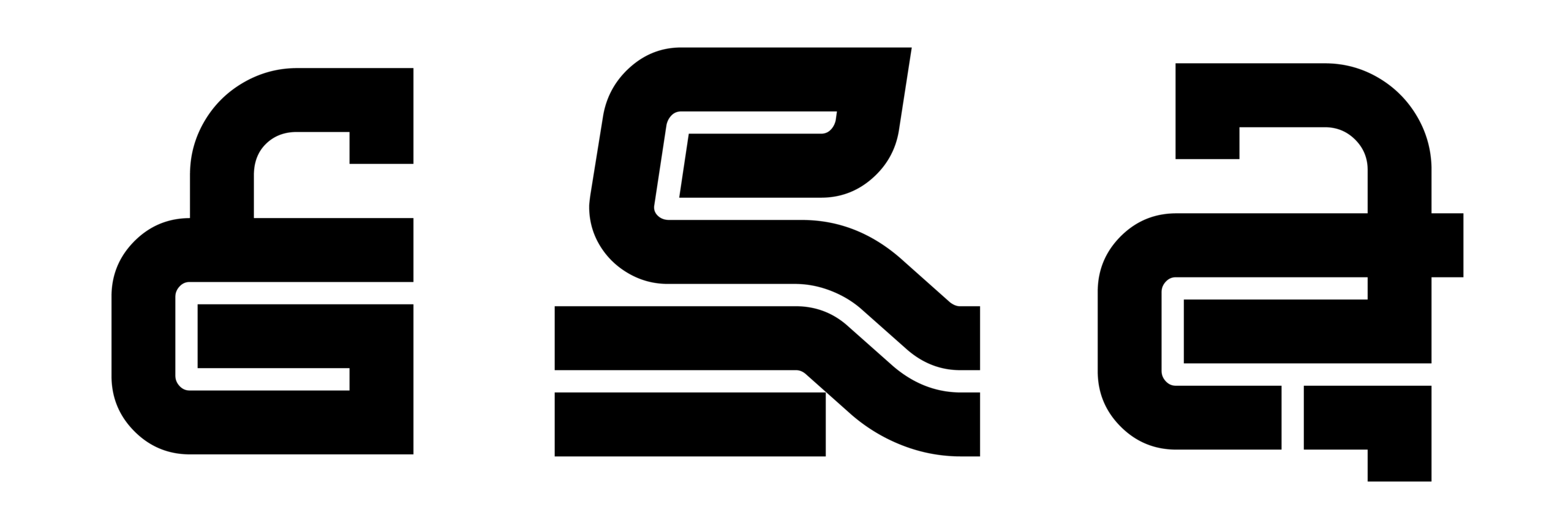
The deliberate shifting and rotation of the lines created a precise balance between positive and negative space, representing the familiar structure of the letters with minimal forms.
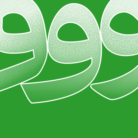
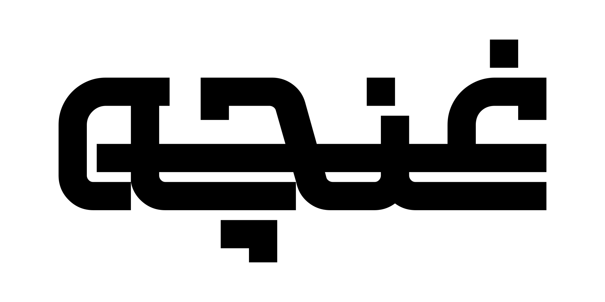
Gradually, however, it became clear that this idea was not limited to single-letter design. As the design process progressed, attention shifted from the individual shapes of the letters to how they interacted with one another.
The movement and separation of the two parallel lines caused parts of a letter to extend into the space of neighboring letters, altering the conventional boundaries between them.
In the Techno typeface, the extension and continuity of the lines align with the Gestalt principle of “continuity.” Instead of following a linear, letter-by-letter movement from right to left, the eye moves along the flowing lines, perceiving the word as an interconnected, cohesive form.
In the Techno typeface, the eye perceives the overall shape of the word before distinguishing individual letters. As a result, the reading process in this typeface differs from the patterns typical of other fonts.
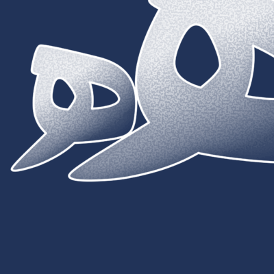
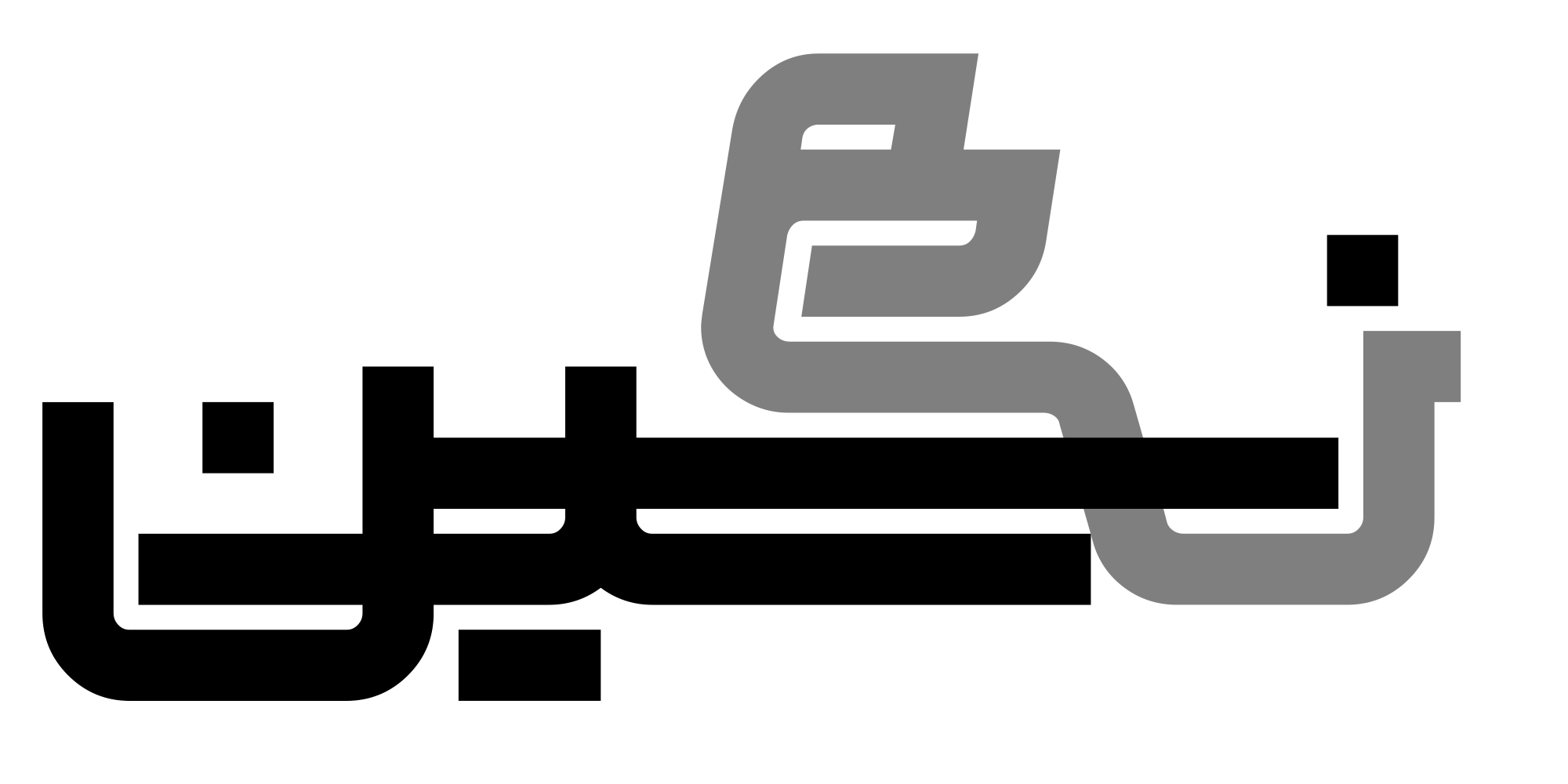
In Persian and Arabic calligraphy, the boundaries of letters are not always explicitly or separately defined. Extensions, connections, and the interaction between letters play a crucial role in forming the composition, an aspect that has become less pronounced in modern typefaces due to the limitations of typesetting systems.
The Techno typeface recreates part of this quality, not through the creation of ligatures, but through the structural logic of the letters and the way their lines extend within the word. This represents a different approach to achieving a familiar visual experience.
Techno Typeface Update
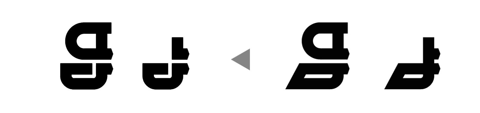
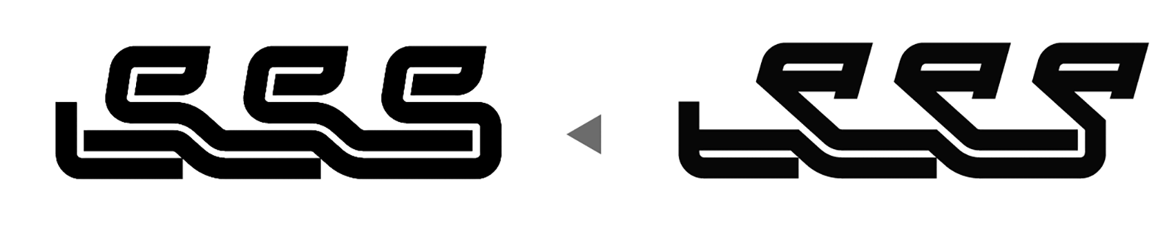
In the recent update of the Techno typeface, certain elements, such as the shape of the “ک” ascender and the”و” tail (as well as related forms in other letters), were redesigned and replaced to reduce formal similarities. In addition, adjustments to the connections and separations strengthened the intertwined structure of the letters.
The Main Goal of This Project Description
The primary aim of this text is to clarify that a typeface is built on a design concept, not an initial form. This concept must manage hundreds of characters, connections, and compositions within a complex system. Designing a typeface is not simply a mechanical expansion of a few letters into an entire alphabet; rather, it is a process in which the initial idea serves only as a starting point, and the typeface’s true character is gradually established throughout the design journey.
Contrary to common perception, designing the first letter is the simplest step.The real challenge begins when each new letter must harmonize with all previously designed letters. This requirement often forces the designer to revisit earlier stages and even redesign letters that seemed resolved, ensuring that each glyph functions correctly within the entire system.
In this sense, designing a typeface is less like a linear path and more like a gradual ascent. Many can begin the journey, but a successful design is one that can carry it all the way to the peak and reach a coherent result.
In Type Therapy projects, choosing an existing logotype or pre-designed form as a starting point reduces the time spent searching for an initial idea and allows the student to enter the design process more quickly. In this course, the main focus is not on the initial idea itself, but on learning disciplined work habits, managing the design process, and bringing a complex project to completion, skills that ultimately play a far more decisive role in the creation of a typeface.
Closing Remarks