Given the short time subtitles remain on screen, choosing the right font has a major impact on how quickly and comfortably viewers can understand the text. Subtitles should be displayed in a way that allows the audience to read them instantly without falling behind the visual flow.
Key characteristics of a standard subtitle font
1) Readability and legibility
The most important criterion in subtitle font design is maximum readability in the minimum amount of time. Characters must be recognizable at first glance and follow a consistent structure so the viewer’s eye does not jump or become fatigued while reading. NoonFont, thanks to its balanced letterforms, well-controlled negative space, and simple character design, performs well in digital and video environments.
Compare Iransans and Tahoma in the same image and with equal display space.

2) Simplicity in structure and design
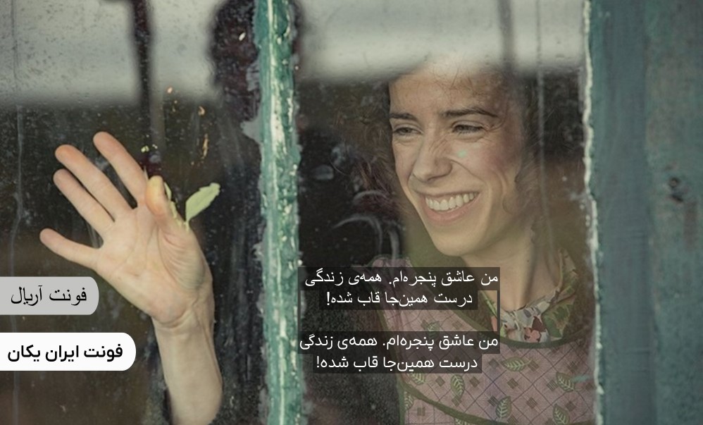
A subtitle font should have minimal structural complexity. Uniform strokes, soft corners, and appropriate letter spacing allow the viewer’s eye to follow the text smoothly without pauses. Iranyekan, while maintaining simplicity and balanced weight, is a suitable option for videos that include motion or visual effects.
3) Performance at small sizes (Small-scale readability)
Since subtitles usually occupy only a small portion of the screen, choosing a font that retains clarity at small sizes is essential.
On mobile displays, tablets, or vertical formats such as Reels, line height and font weight should be adjusted so the text neither feels cramped nor too loose. Compare Pelak and Tahoma in the same image and with equal display space

4) Adaptability to different backgrounds (Contrast adaptability)
One of the main challenges in subtitle design is maintaining readability against varied and moving backgrounds. The font must remain clear in all lighting conditions, from dark scenes to bright ones. Professional solutions include:
Using white or yellow text with a black outline or shadow
Applying semi-transparent background effects to separate text from imagery
Compare Bon and Tahoma in the same image and with equal display space.
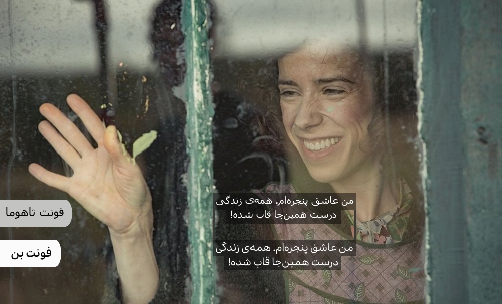
 The image shown is from the film Maudie, a biographical film about the Canadian painter Maud Lewis.
Subtitle font characteristics for Instagram Reels
On platforms like Instagram, where content is consumed rapidly and many users watch videos without sound, choosing an appropriate subtitle font becomes even more important.
Due to the vertical format and short duration of Instagram Reels, space for text is limited. It is recommended that subtitles be displayed in no more than one or two lines, using a Medium or Semi-Bold weight to ensure the text remains visible in bright lighting or dynamic scenes.