


Bon
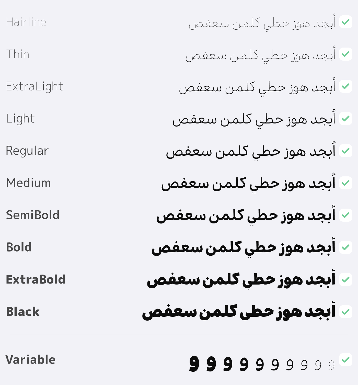
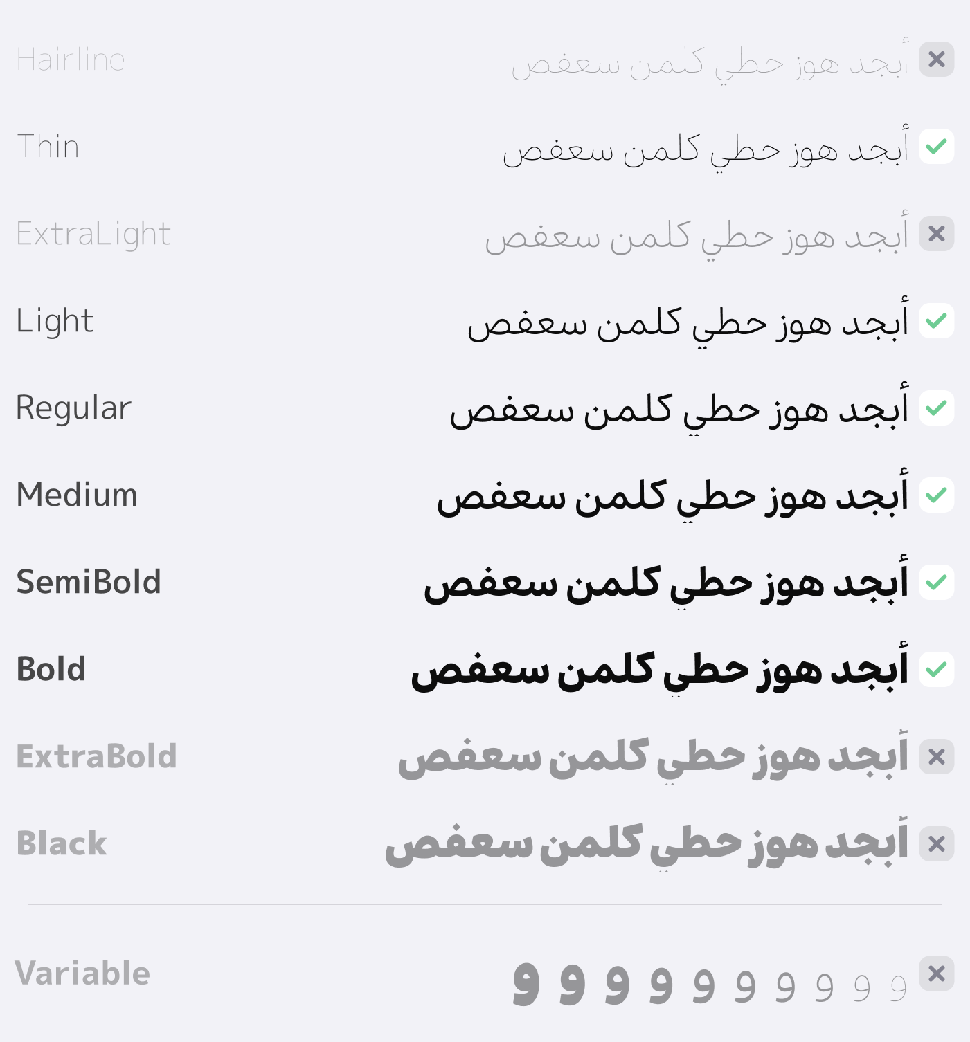
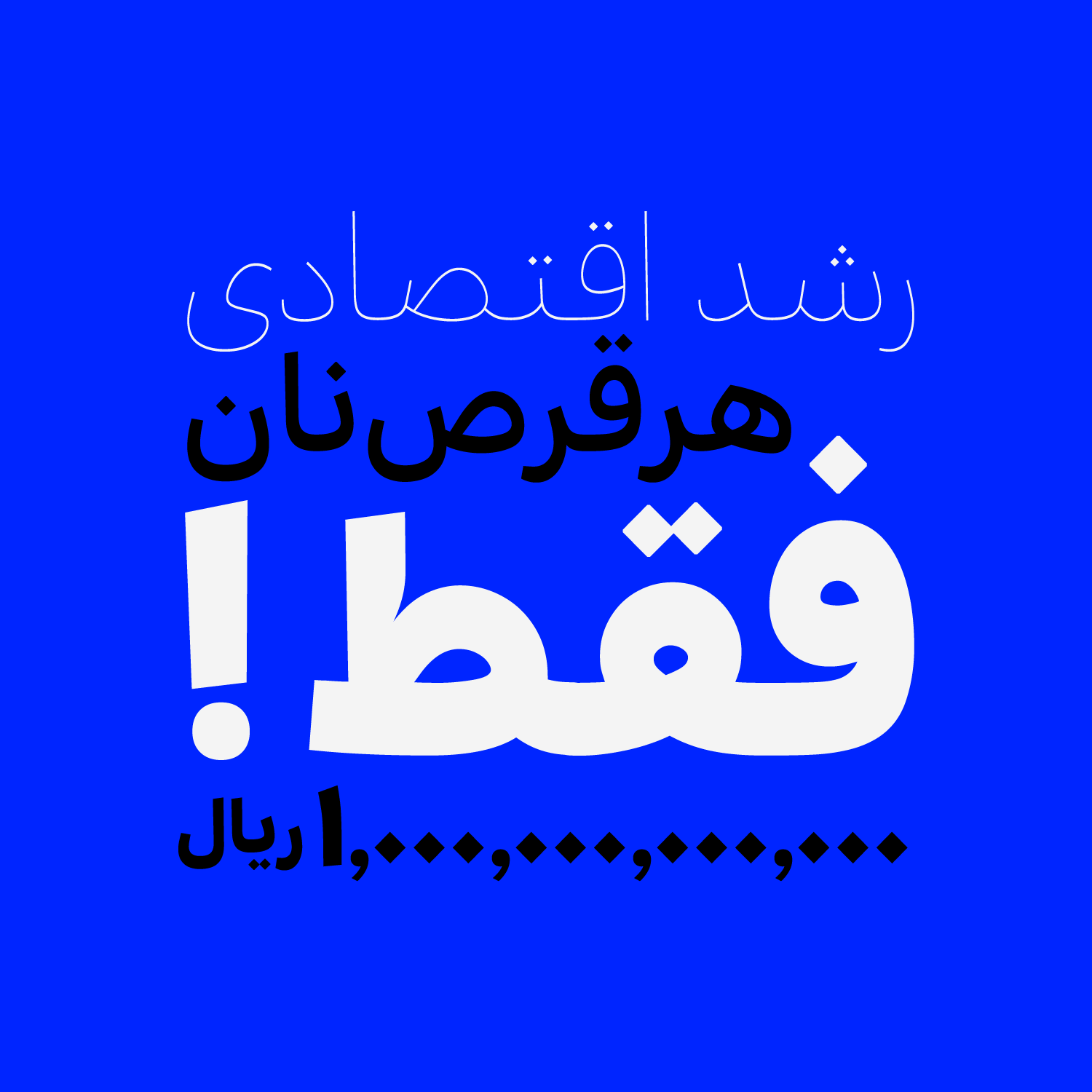
Bon is a typeface family with 10 weights, ranging from Hairline to Black, designed to meet everyday and essential needs. Its goal is to offer a readable, adaptable, and versatile font that can be easily used across various design contexts – from user interfaces to printed texts.
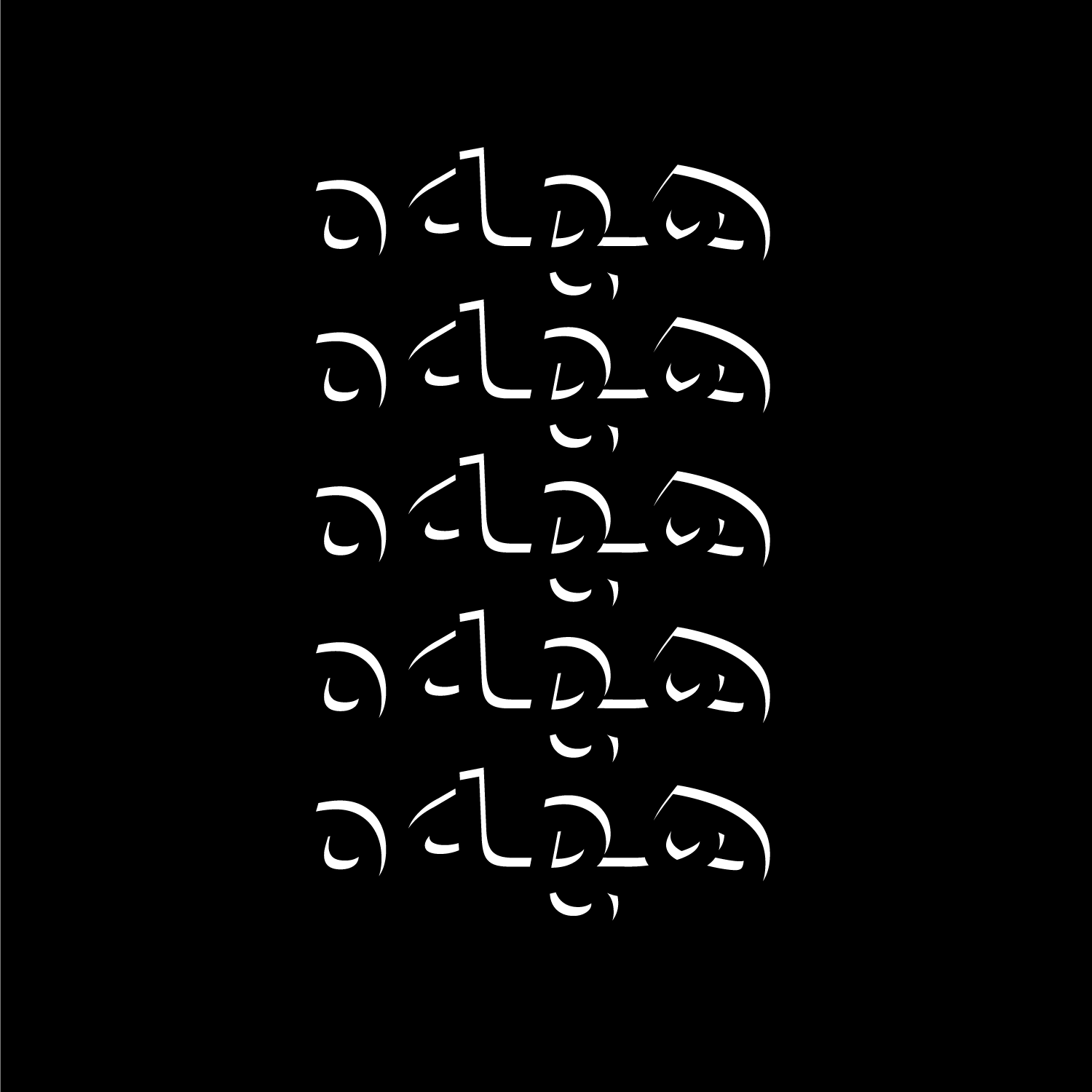
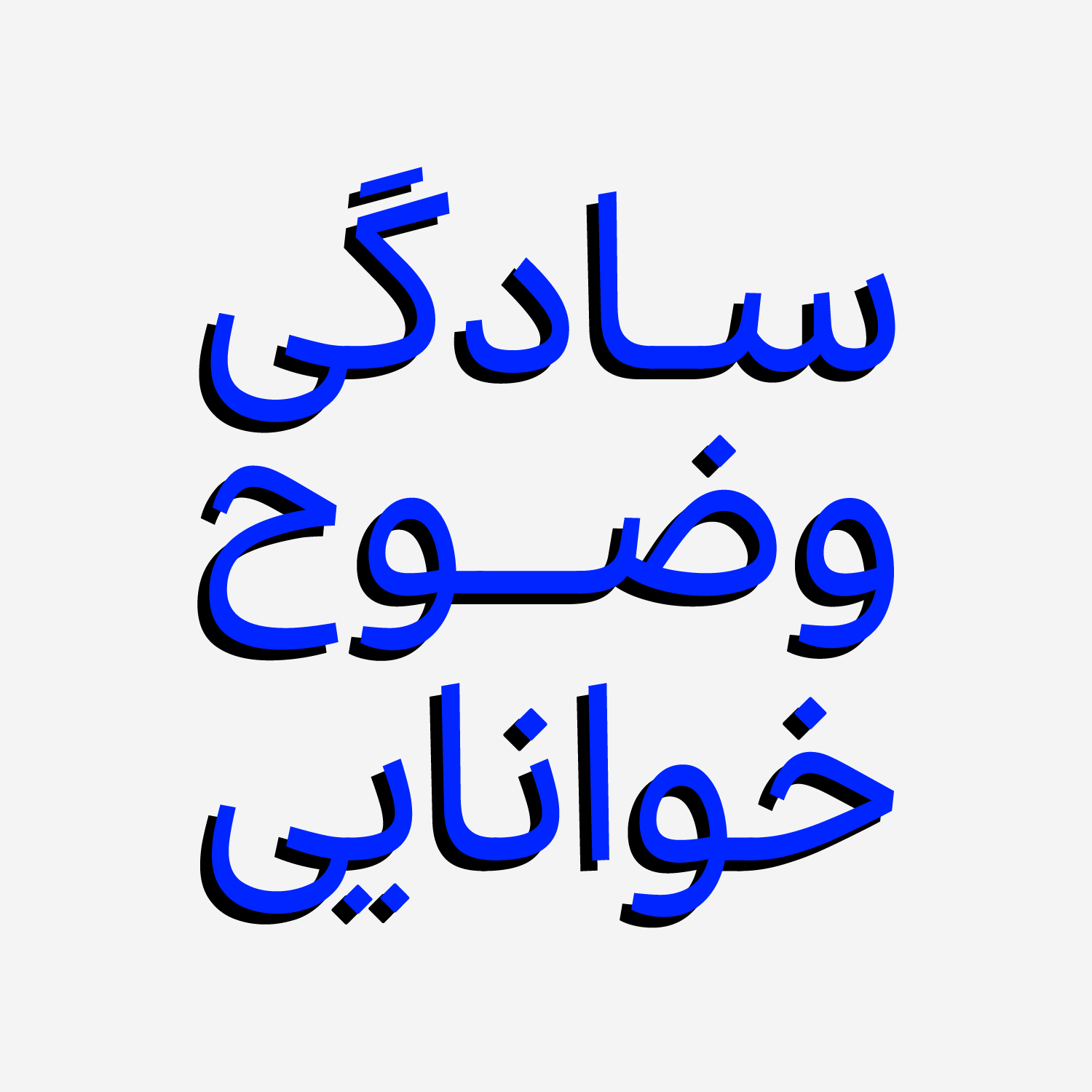
Bon prioritizes legibility and avoids ornamental details. With its simplicity and understated presence, it lets the content take center stage, making it an essential tool in every designer’s toolkit.
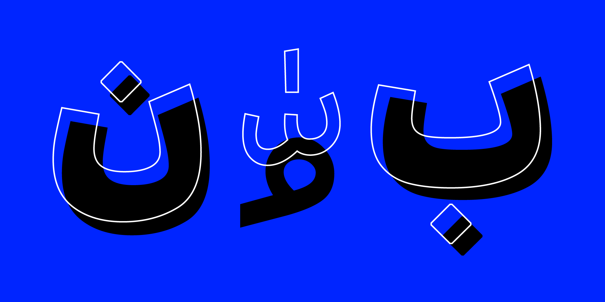
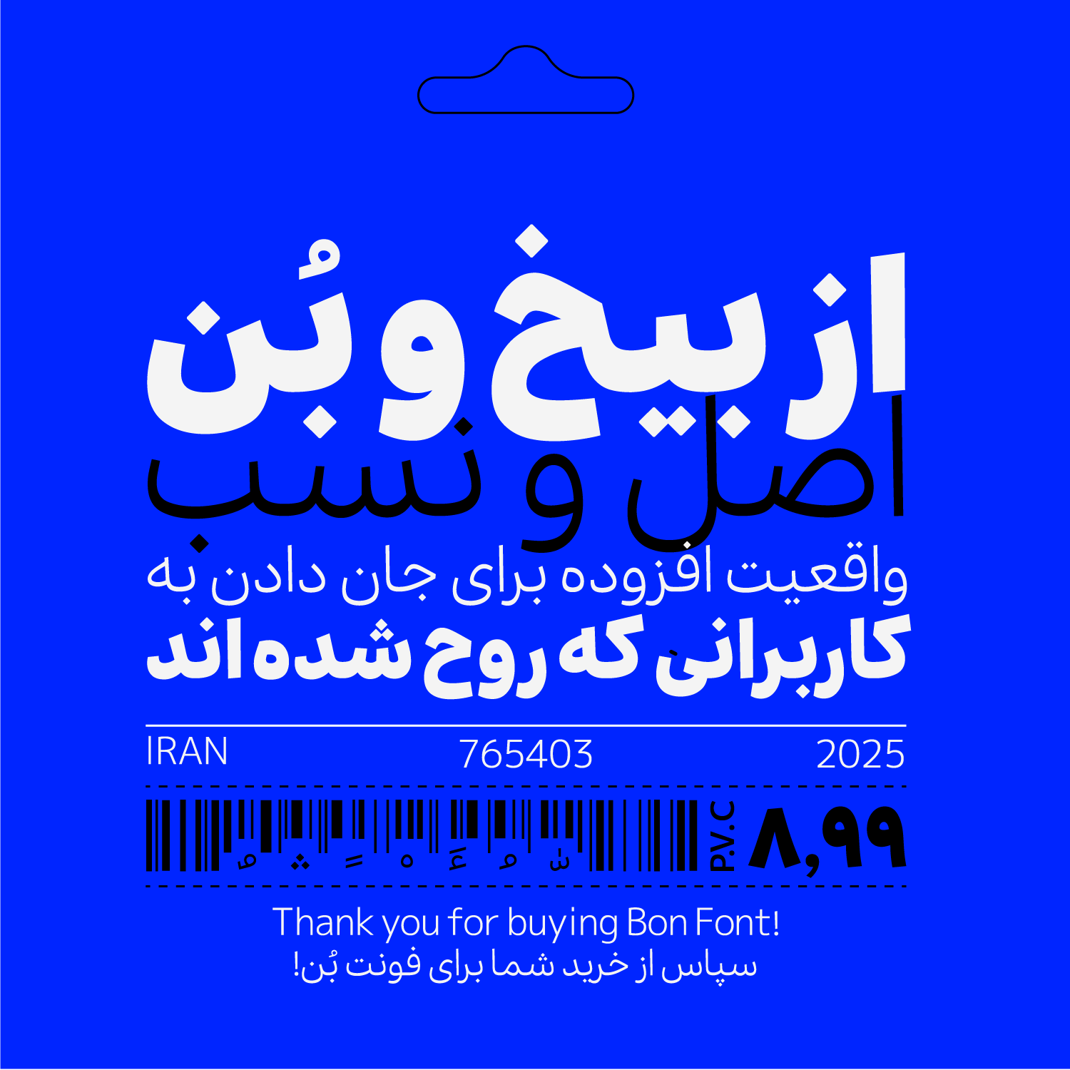
The name “Bon”, which means “root” or “foundation” in Persian, reflects the fundamental role this typeface plays in typographic systems. The design of Bon began in 2022 and was gradually refined over time.
For an additional user to use the font.To share the font with your designer or project partner. (details)
For one website or app and to share the font with 2 additional project partners. (details)
For small businesses to share the font with 5 additional employees and use it on one website.(details)
For unlimited use by companies in all their activities. A website builder, website templates and services that allow users to type with the font. (details)
Bon
Bon is inspired by a generation of practical, everyday typefaces that have shaped our visual culture, yet it redefines its role in the modern world. While remaining loyal to traditional letterform structures, Bon emphasizes legibility, balance, and fluidity.

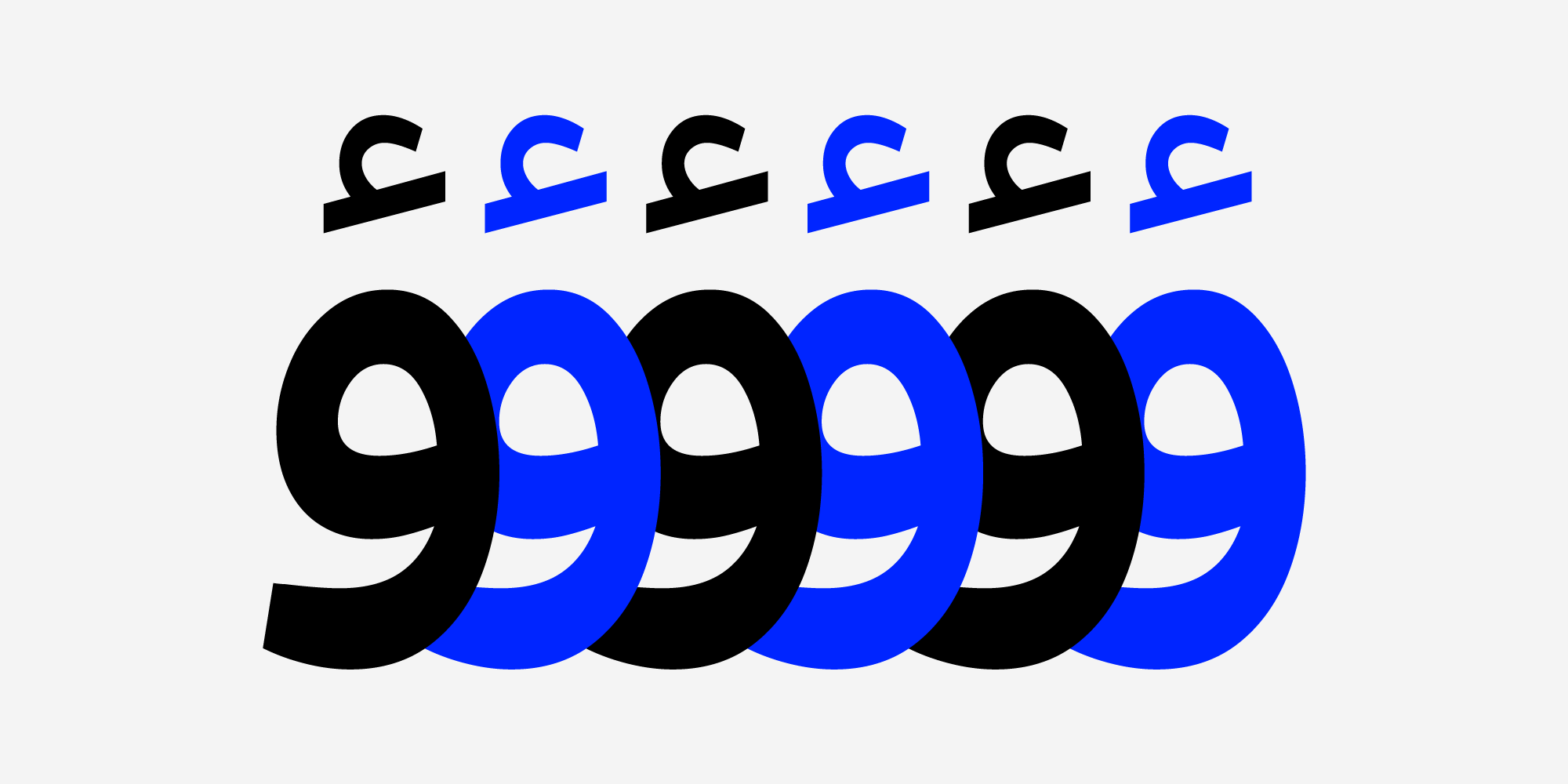
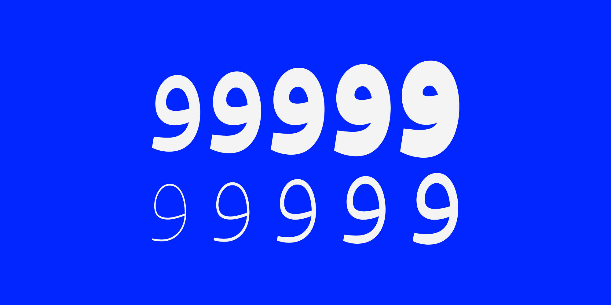
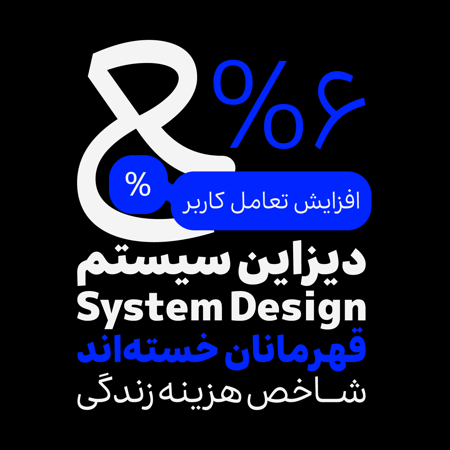
Bon’s Weight Variety
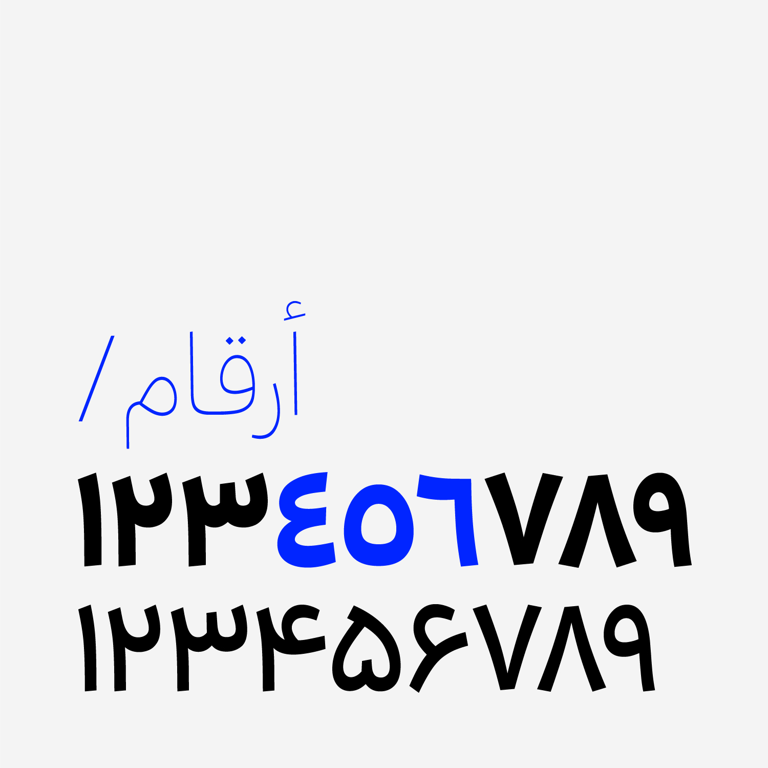
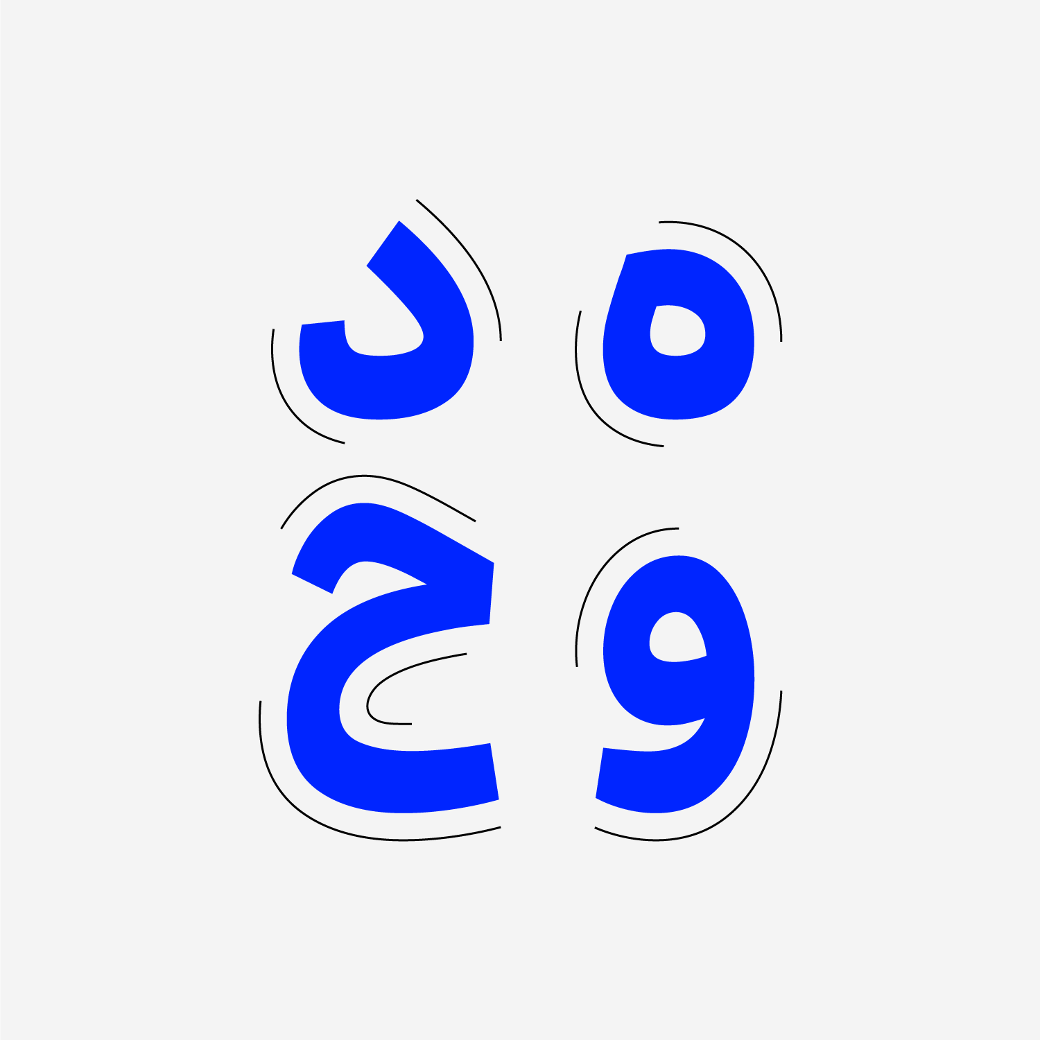
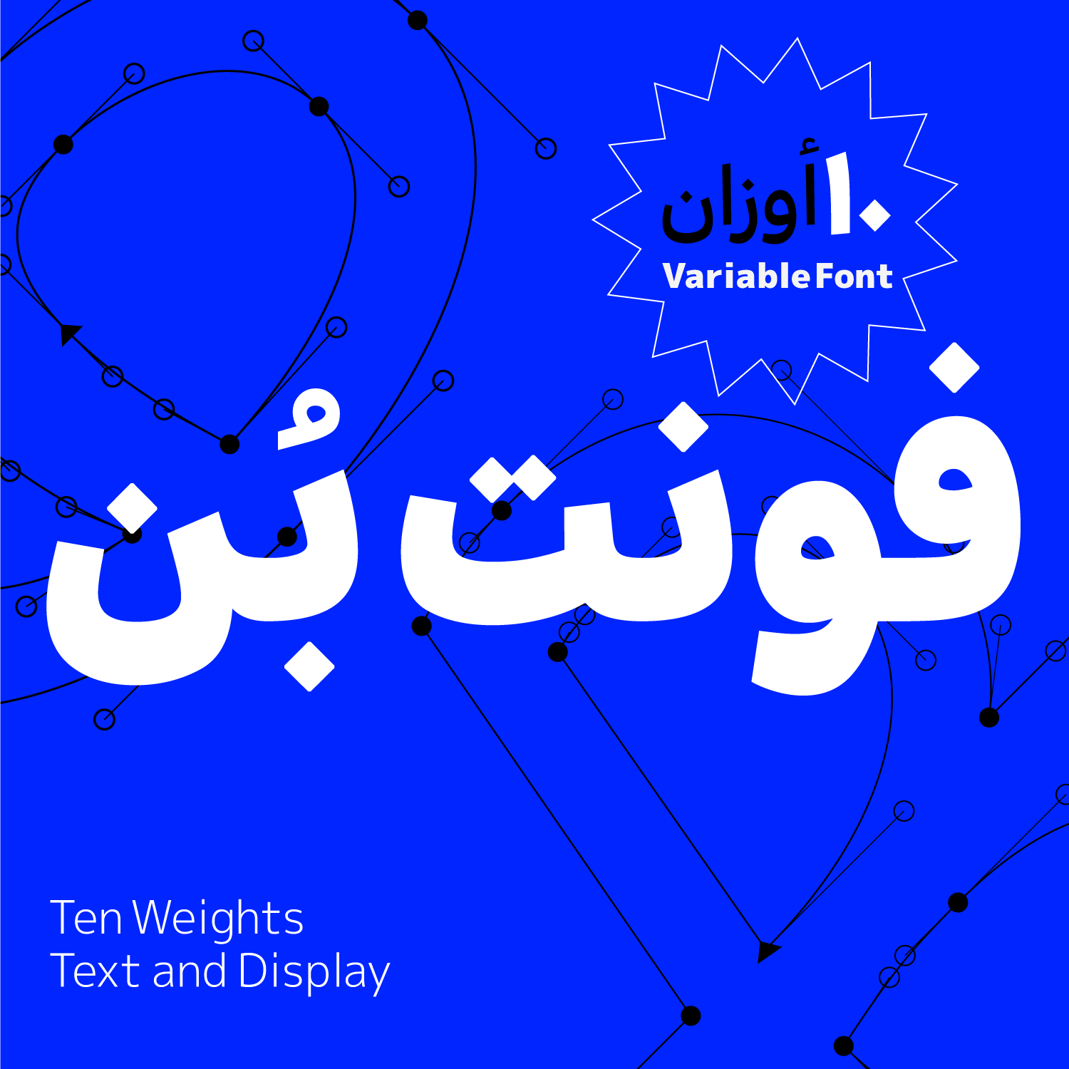
Bon is a type family with 10 weights, ranging from Hairline to Black, offering designers a wide spectrum of typographic expression—from delicate, lightweight text to bold, impactful statements.
The name Bon is derived from the Persian word “بُن,” meaning root, base, or foundation—a definition that perfectly aligns with the font’s nature. Designed to serve as a fundamental tool in typographic systems, Bon prioritizes clarity, adaptability, and seamless functionality over decorative flair. It integrates smoothly into a wide range of design environments without drawing unnecessary attention to itself.
Bon doesn’t aim to stand out—it puts content first. It is crafted to accompany rather than dominate, providing a smooth and distraction-free reading experience. Its presence in a designer’s toolkit is not only useful but essential, enabling consistent use across both print and digital applications.
- Main Fonts: available in TTF formats.
- Web Fonts: WOFF and WOFF2 + CSS code.
- Variable Font

Type and Graphic designer BA & MA in Graphic Design from Soore University Collaboration in the design, optimization, and development of the Vartan typeface, Mashq Studio.


Comments
Recommended Posts
What features does an ideal subtitle font have?
Nostalgic Arabic Fonts: Reviving the Beauty of the Past
Top Arabic Fonts for Ramadan and Eid Design
Arabic Fonts for Books & Magazines: From Print to Digital
Techno Typeface; A Look at the Design Process and Logic
Selected Fonts of 2025 in the TDC Competition
13th GRANSHAN Type Design Competition
Golpayegani Typeface creation