


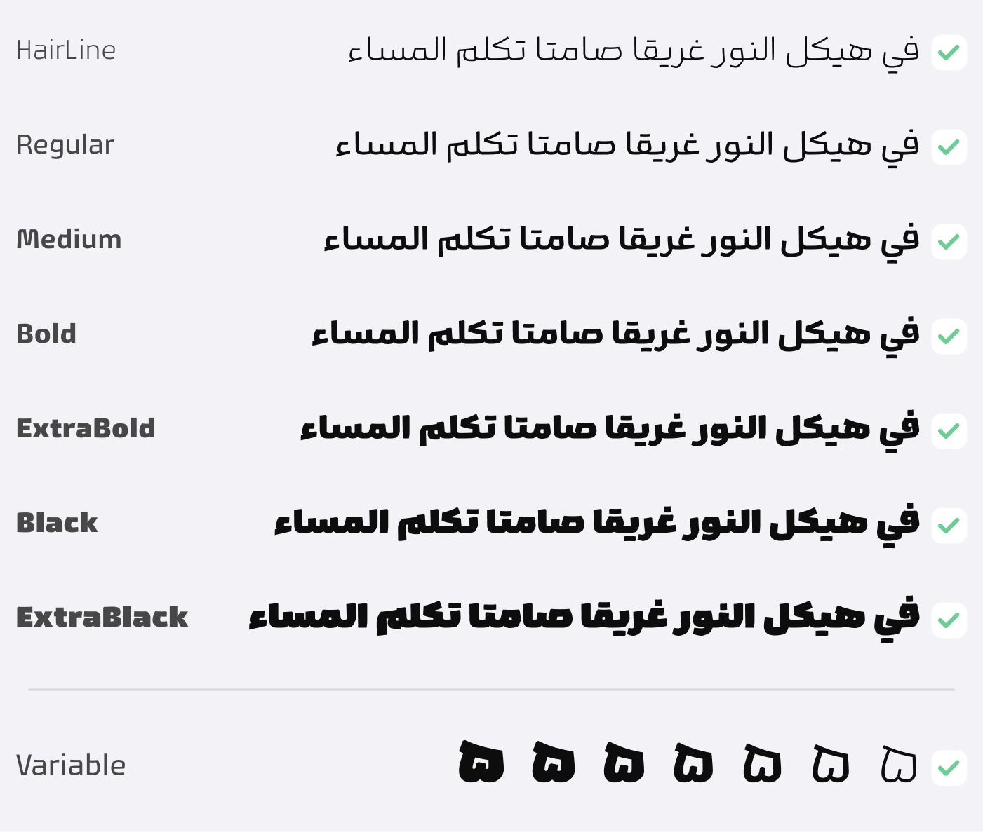
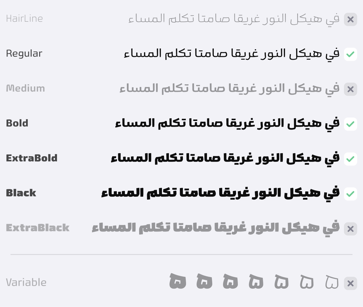
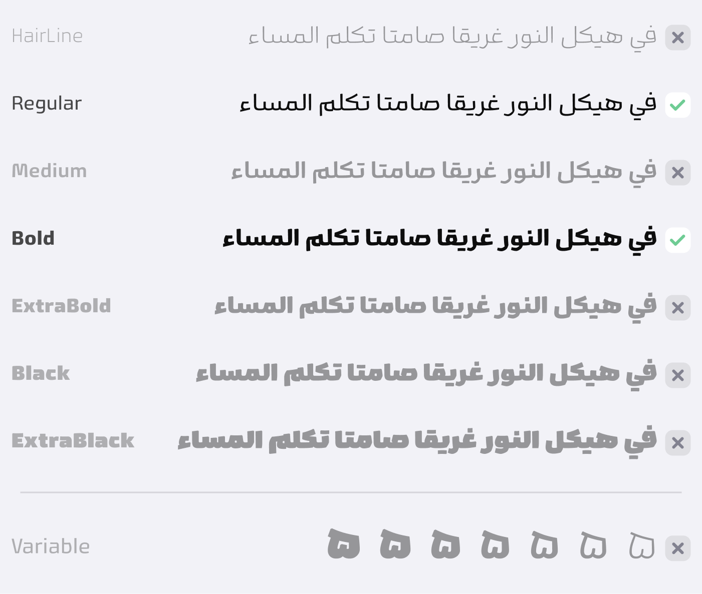
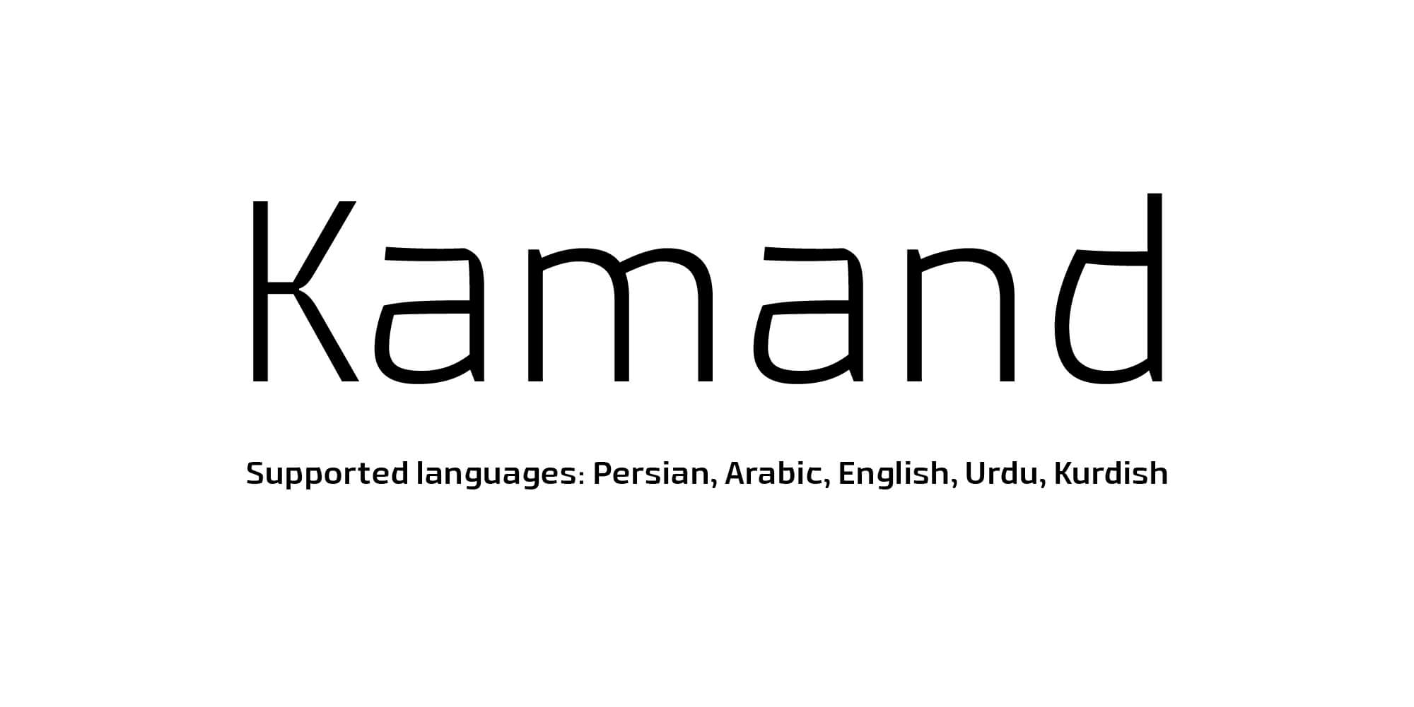
Kamand
Many fonts used on billboards don't always align with the brand's spirit. Some of them have become so generic that they no longer stand out. Kamand font adds a familiar yet distinct tone to advertising writing. We designed English letters for Kamand to ensure your peace of mind regarding bilingual texts. In terms of thickness, it has moved in the so-called Reverse Contrast direction, and 7 different weights along with ligatures and alternatives are among the other attractions of the Kamand font.
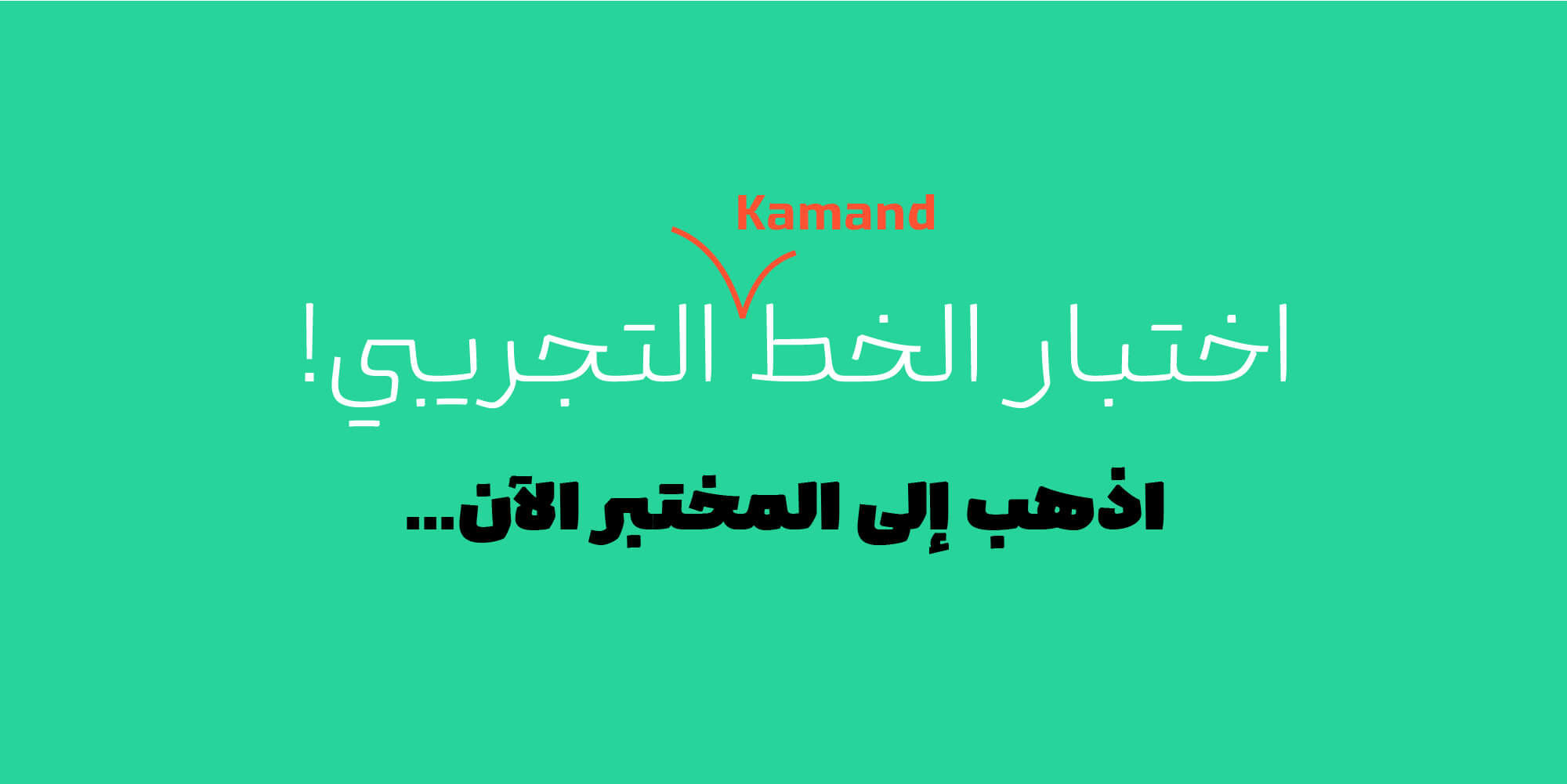
Be seen differently with the pleasant sound of Kamand…
For an additional user to use the font.To share the font with your designer or project partner. (details)
For one website or app and to share the font with 2 additional project partners. (details)
For small businesses to share the font with 5 additional employees and use it on one website.(details)
For unlimited use by companies in all their activities. A website builder, website templates and services that allow users to type with the font. (details)

Kamand
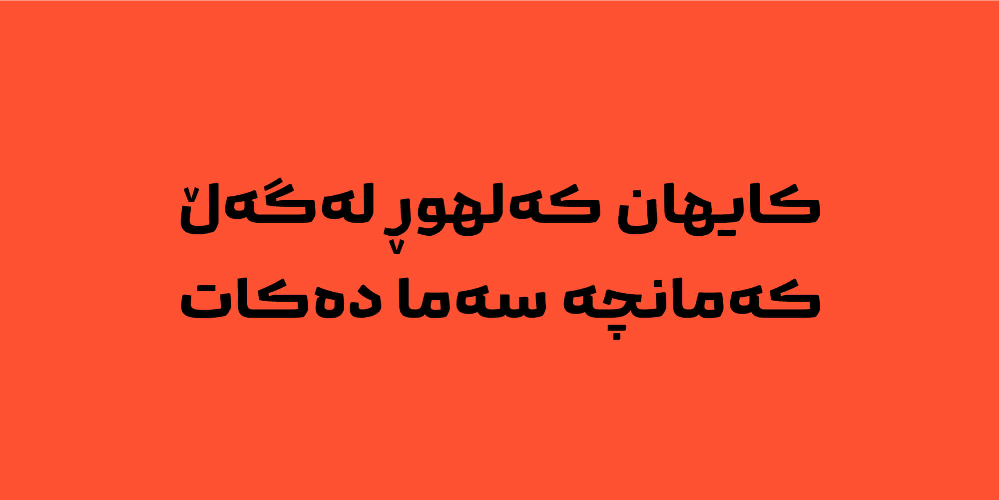


Imagine a rebellious horse, gracefully galloping across beautiful green plains, its magnificent mane flowing wildly in the wind.

Kamand is that untamed and captivating horse that cannot be tamed with any whip and surprises its rider.
Kamand has an authentic form behavior based on the Naskh script, but in the details it is unexpected and exciting; this excitement and formal appeal is a completely conscious choice and an inseparable part of today's advertising.
The formal features of Kamand include the following:
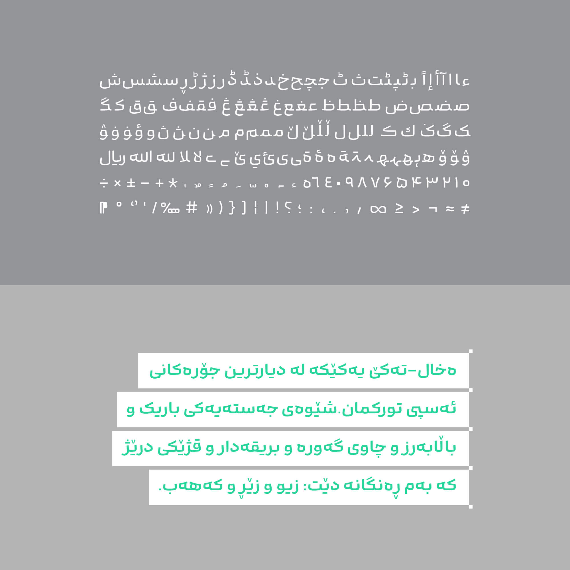
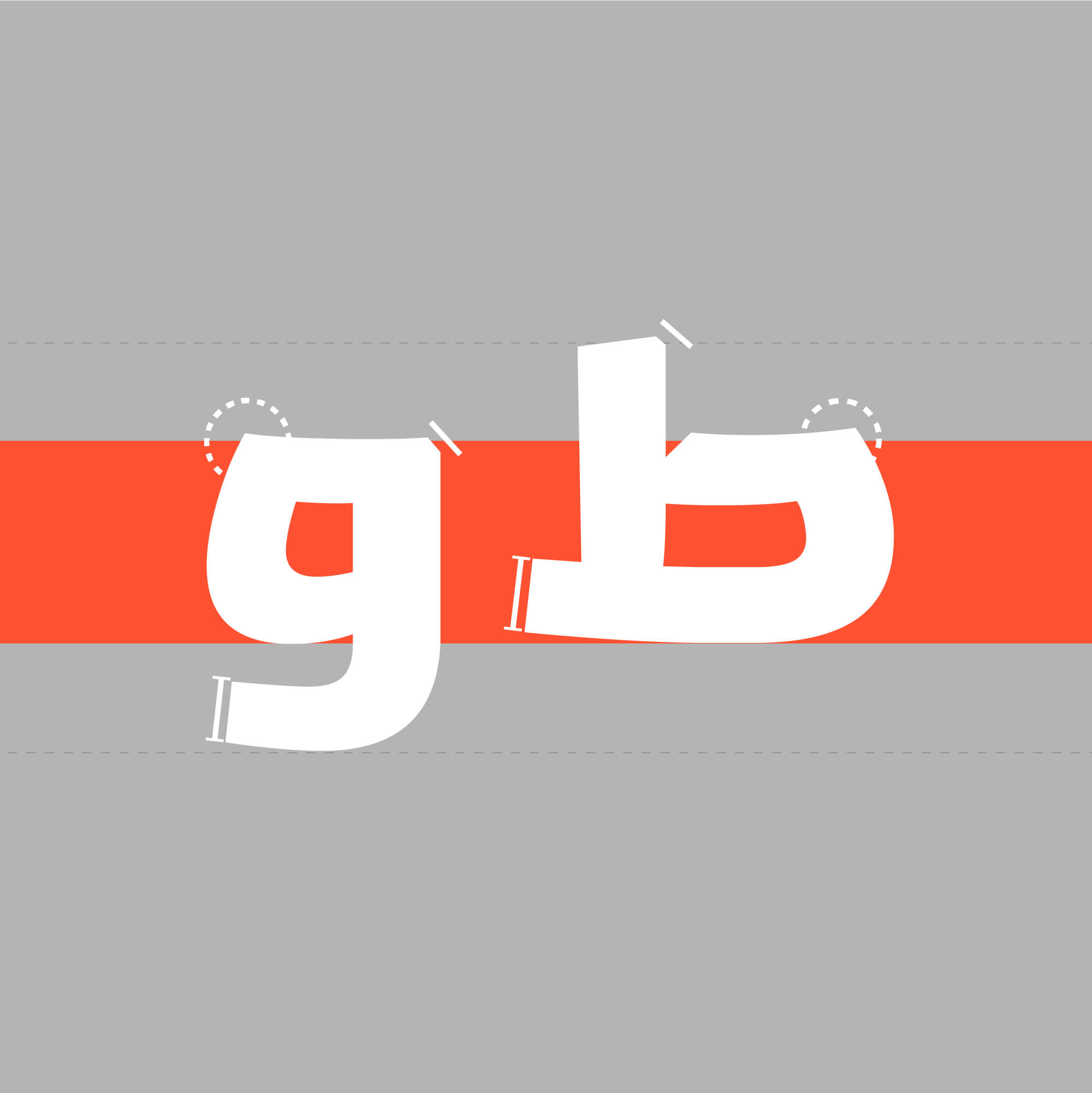
- Form:In each character and every movement, the forms either break or cut off or turn against the direction from where we expect it.
- Ascent and descent height:The height of ascenders and descenders is short and seems to be integrated into the body of the letters. This design model helps to increase the attractiveness of the typeface in environmental advertising and cyberspace.
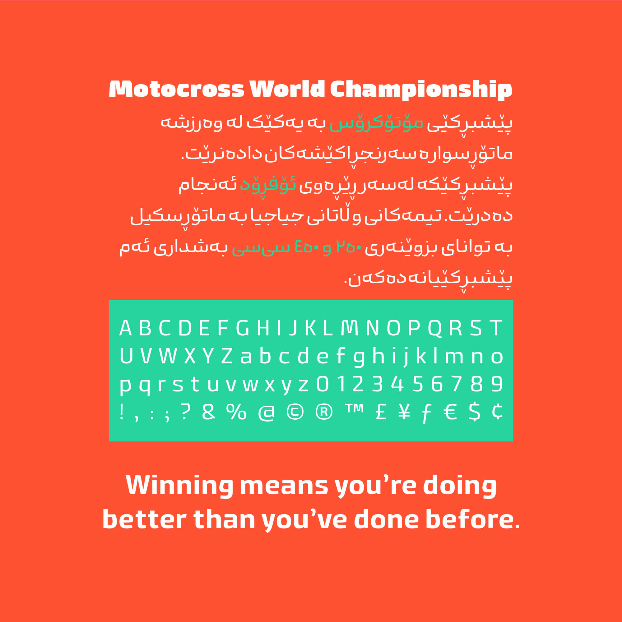
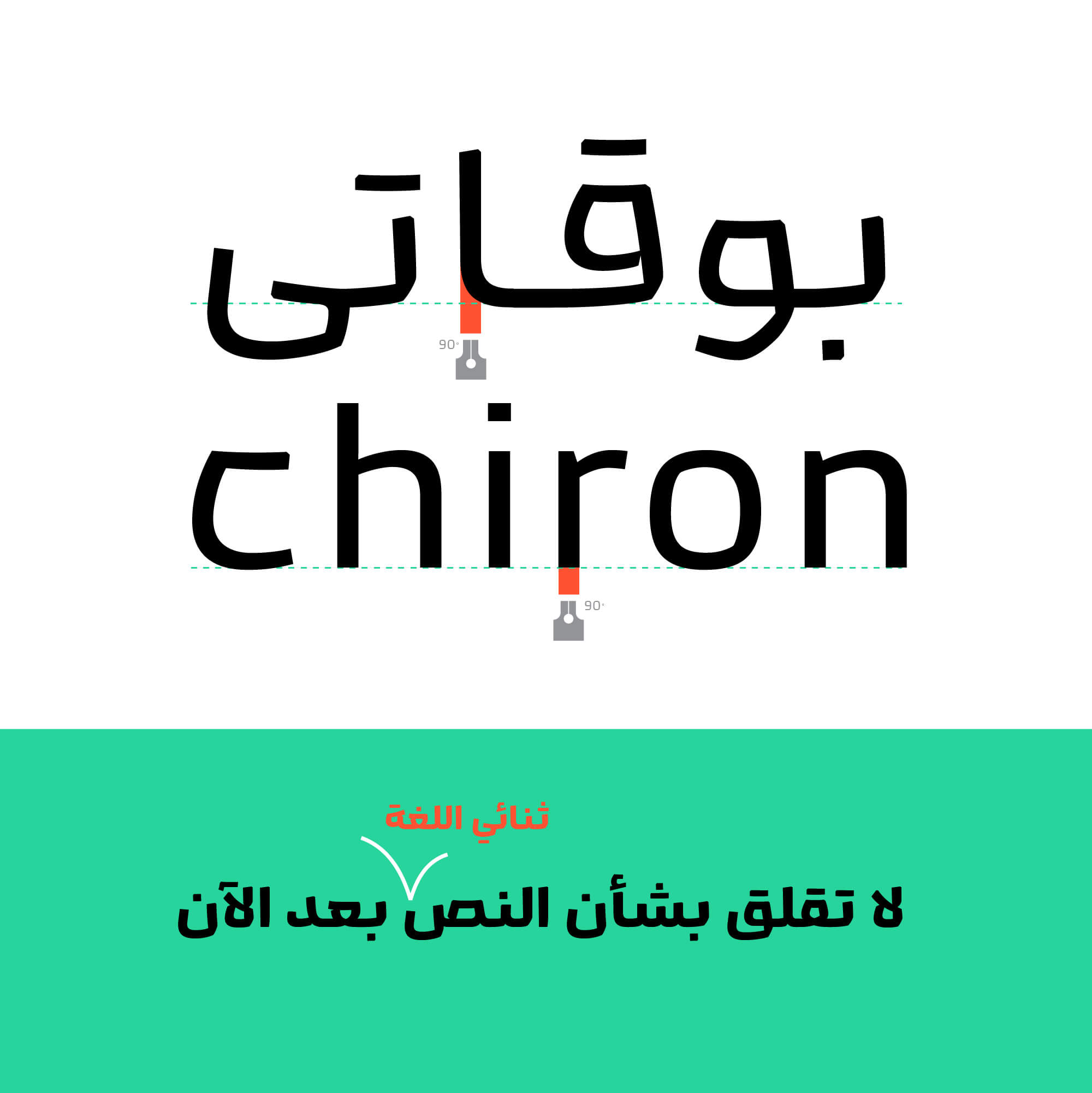
- Contrast:In terms of thickness contrast, it has changed the place of strength and weakness and moves in the so-called Reverse Contrast direction. This behavior helps us to have better formal harmony with Latin letters in bilingual texts.
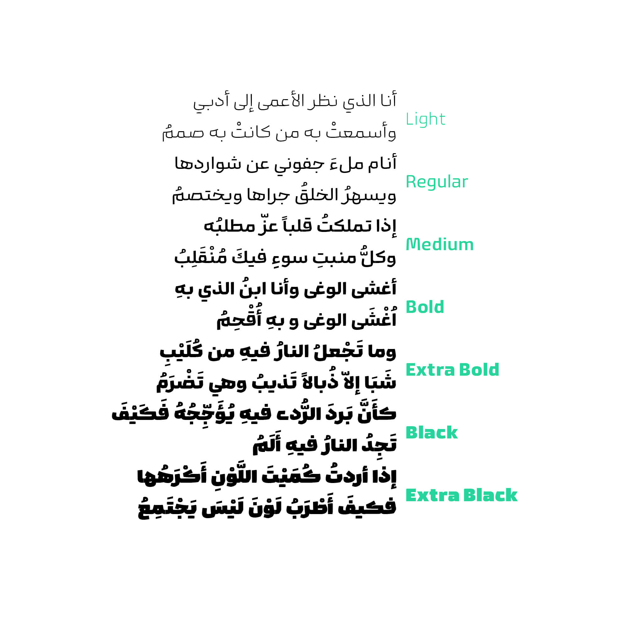
- Other features:The existence of different weights as well as features such as ligatures and alternatives are among the other attractions of Kamand.
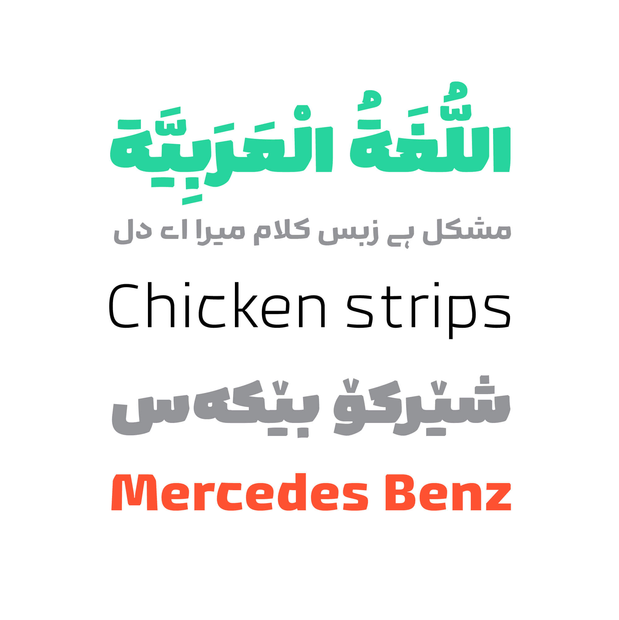
- English font:We have also designed an English font for Kamand. This makes it easier to create better and smoother harmony between the two languages in bilingual texts and the integrity of the complete text is maintained.
Our effort was to add new and innovative forms to the current of type design in Middle East and, as much as possible, for the words to sit together in the ultimate beauty and eye-catching manner and create a cohesive composition.
This typeface was designed by Omid Emamian and Mahdi Ershadi in 7 weights in the spring and summer of 2024.
It is worth mentioning that its development for other languages and styles continues.
In the Kamand (Pro) font package:
main Fonts: 7 weights available in TTF formats.
Web Fonts: WOFF and WOFF2 formats, along with CSS code.
Variable Font: 1 axes (weight)

Omid Emamian, born in 1989, is an Iranian graphic designer and type designer. He began his professional career in typeface design in 2012. Omid has designed and developed numerous fonts independently or in collaboration with various designers such as Reza Bakhtiari Fard, Mahdi Ershadi, and Kamyab Jafari. His works include fonts such as: Jam-e-Jam, Aramesh, Vazeh, Dabestan, Rey, Irancell, Aria, Mika, and Kamand. Omid has won numerous awards, including three Typography Excellence Awards from the TDC (2018, 2019, and 2021), second place and an honorary diploma from Granshan (2014 and 2017), and an honorary diploma from the Silver Cypress Festival in 2017. In addition to his professional work, he teaches type design at Sooreh University, Alzahra University, and Islamic Revolution University. He has also held numerous workshops and lectures in this field and has participated in domestic and international type design exhibitions.


I have a degree in Graphic Design and have been a member of the Iranian Graphic Designers Society (since 1987). I am involved in typeface design, font development, and logotype design. I have publicly released the Potk and Borna fonts, and I designed the Ayandeh, Ali Baba, Bonyad Koodak, Fanoos, and Inverse fonts in collaboration with Reza Bakhtiari Fard. The design and creation of the Kamand font in collaboration with Omid Emamian, as well as the development of the Valman font, are among my latest activities. I have held various workshops and courses in the field of typography, and I received the third Grand Prize at the 2021-2022 Granshan competition in Armenia for the Ali Baba font and a special award for the Potk font.


Comments
Recommended Posts
Nostalgic Arabic Fonts: Reviving the Beauty of the Past
Top Arabic Fonts for Ramadan and Eid Design
Arabic Fonts for Books & Magazines: From Print to Digital
Techno Typeface; A Look at the Design Process and Logic
What features does an ideal subtitle font have?
Selected Fonts of 2025 in the TDC Competition
13th GRANSHAN Type Design Competition
Golpayegani Typeface creation