Borna


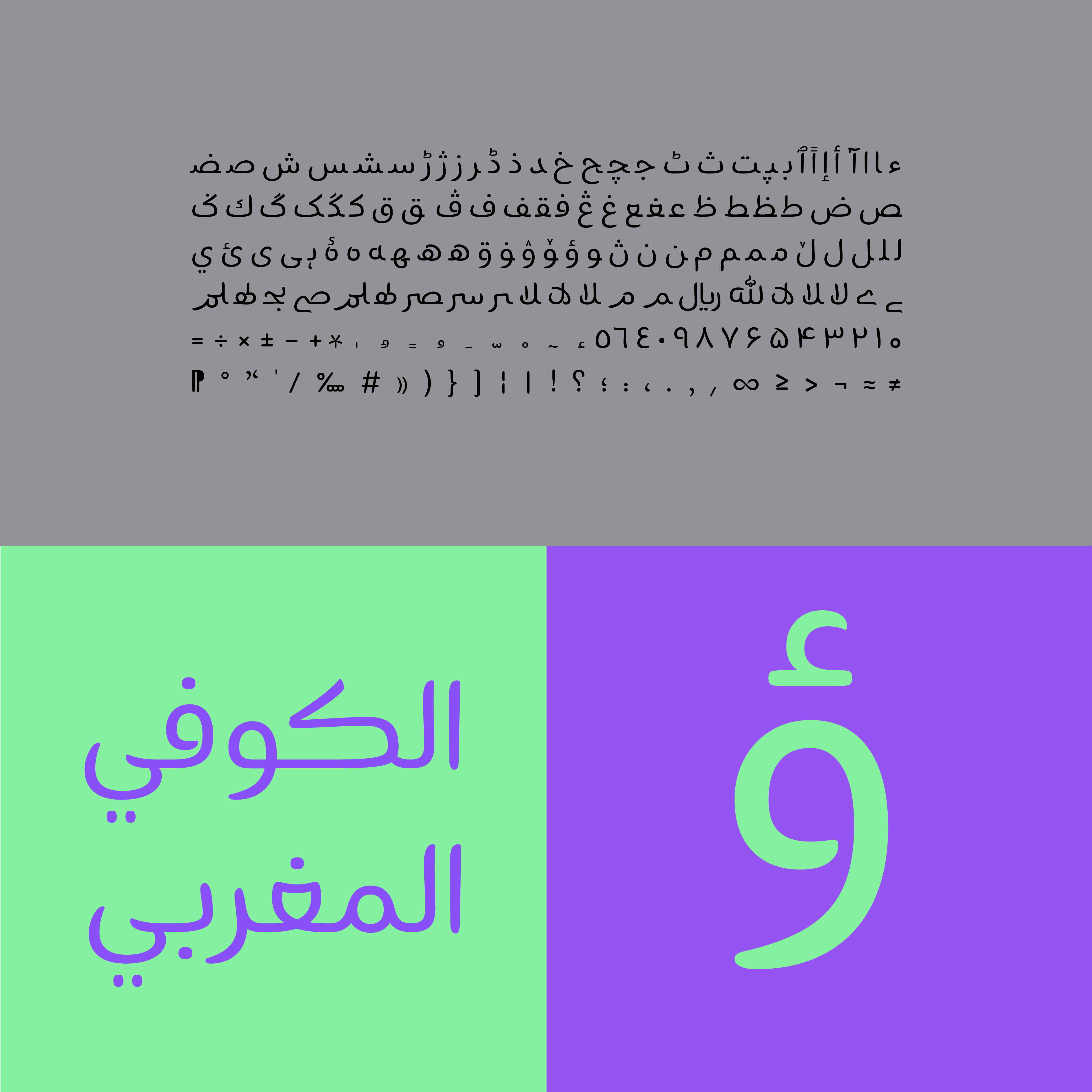
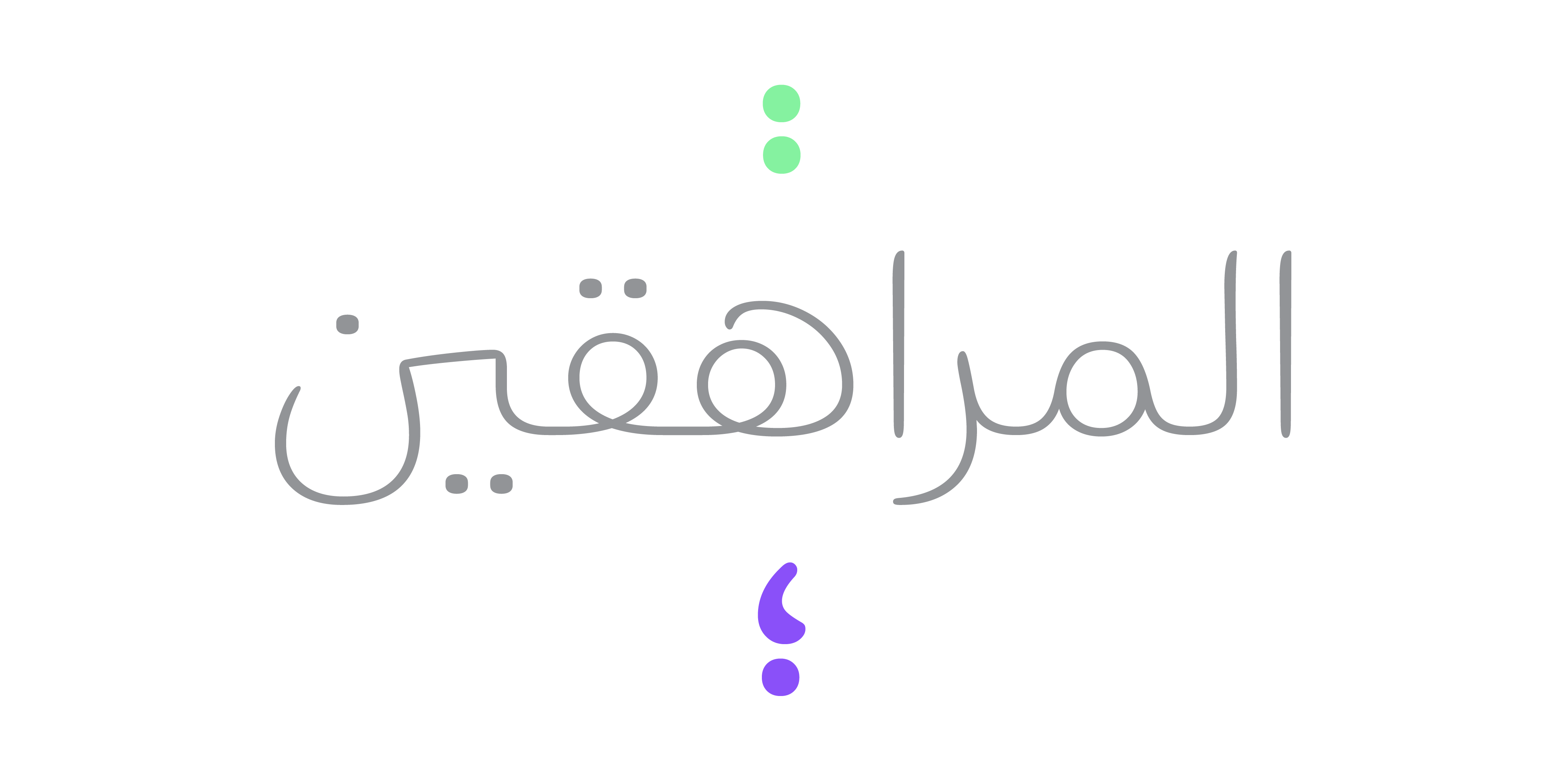
The ups and downs in teeth, the turns in bowls, the twists in forms, and the big counters, give the typeface a live and active personality.
Wide grooves, big bowls compared to the widths, and flowing forms are some of other Borna’s features.


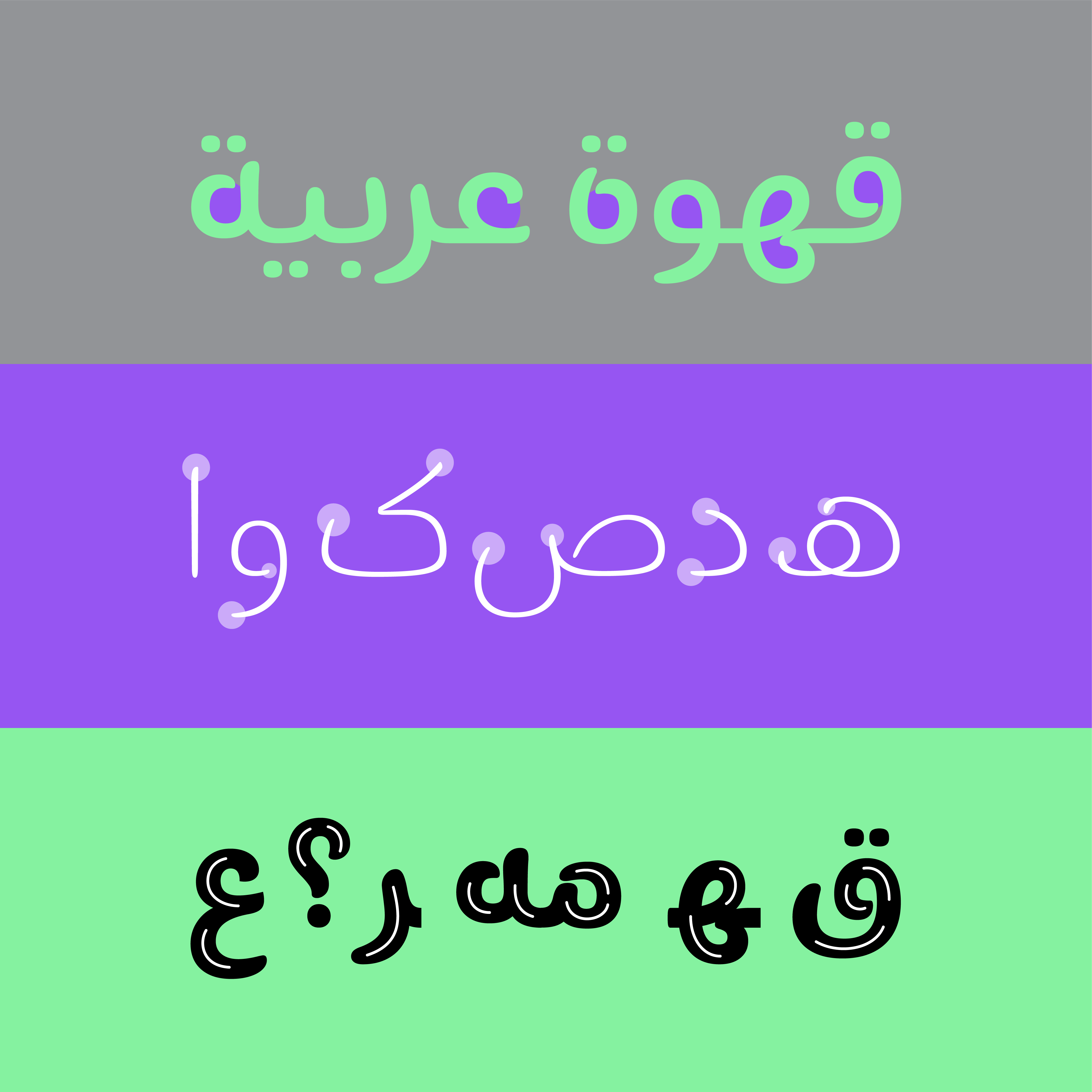
Also, swash forms in some letters and functional alternatives, gives designers various possible compositions.
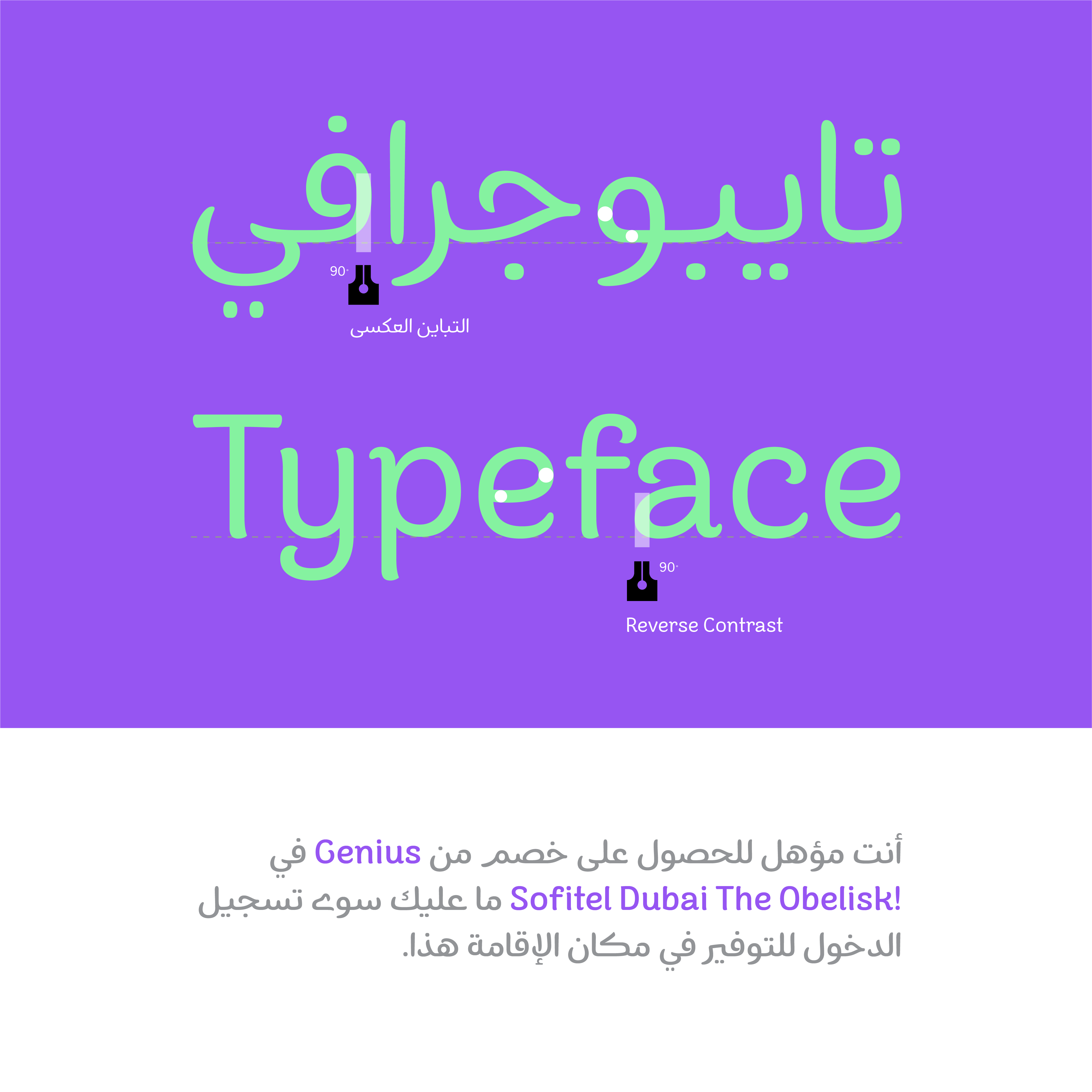
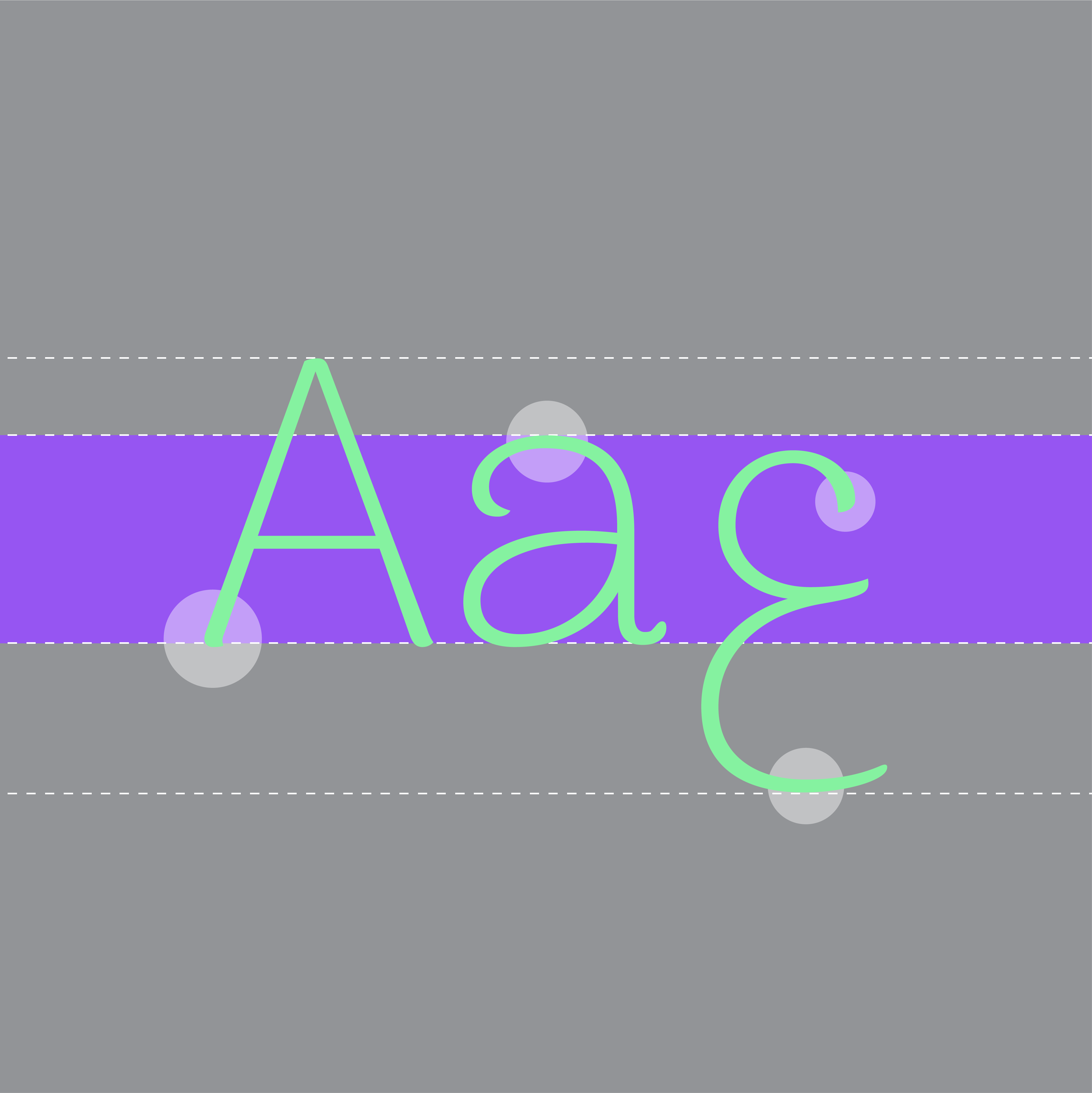
The withd’s contrasts are designed reversed so they match the Latin typeface in order to bring more harmony in bilingual body texts.

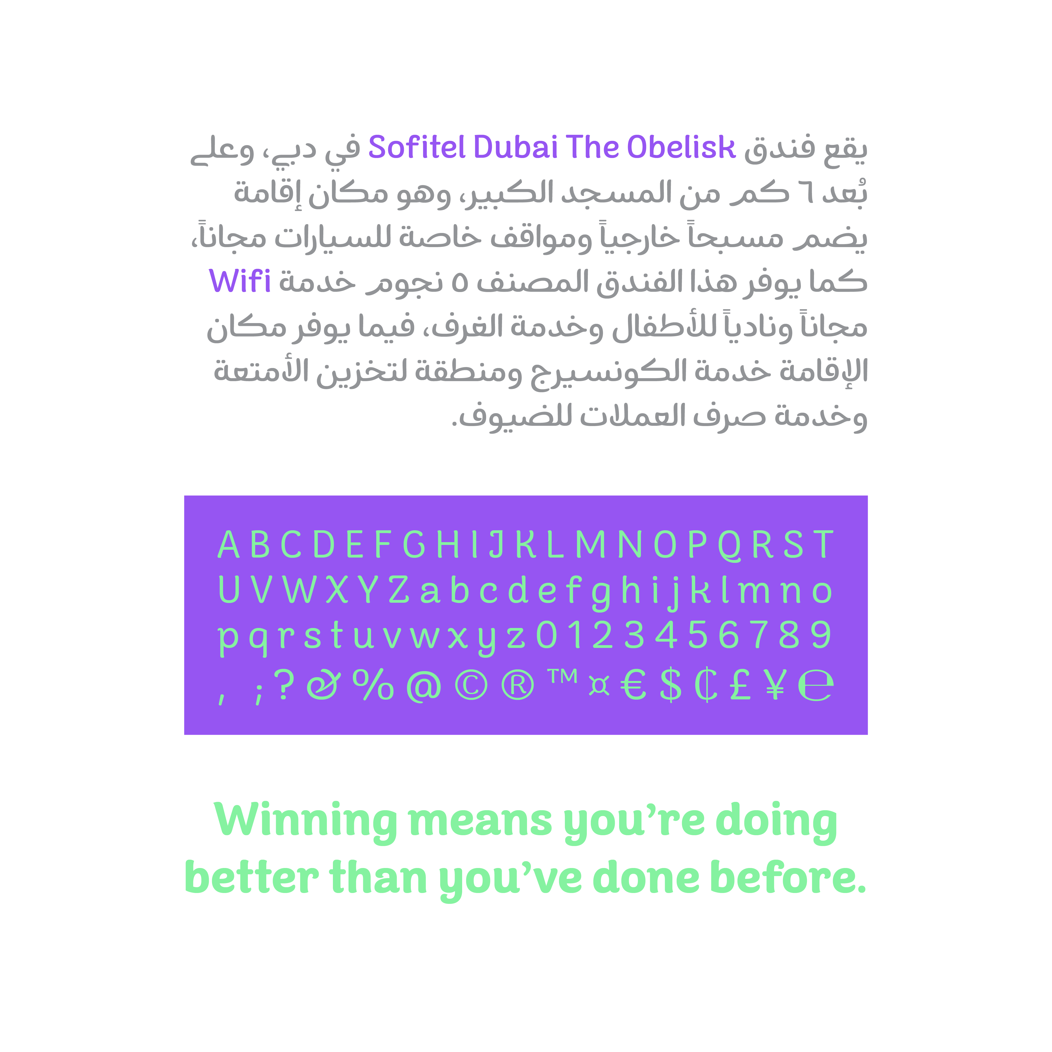
The Latin typeface Arima Madurai from Google Fonts, was chosen for the Latin version of Borna and its other weights were redesigned to go with Borna.


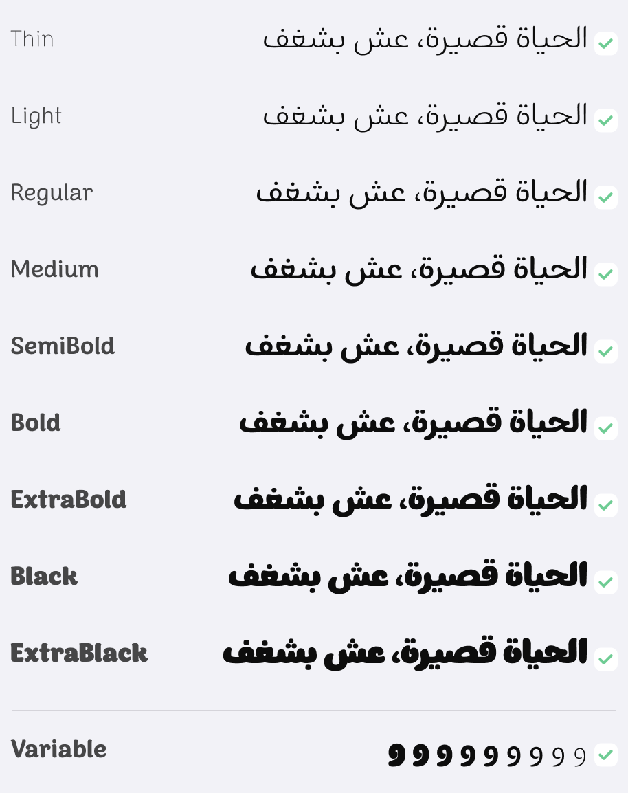
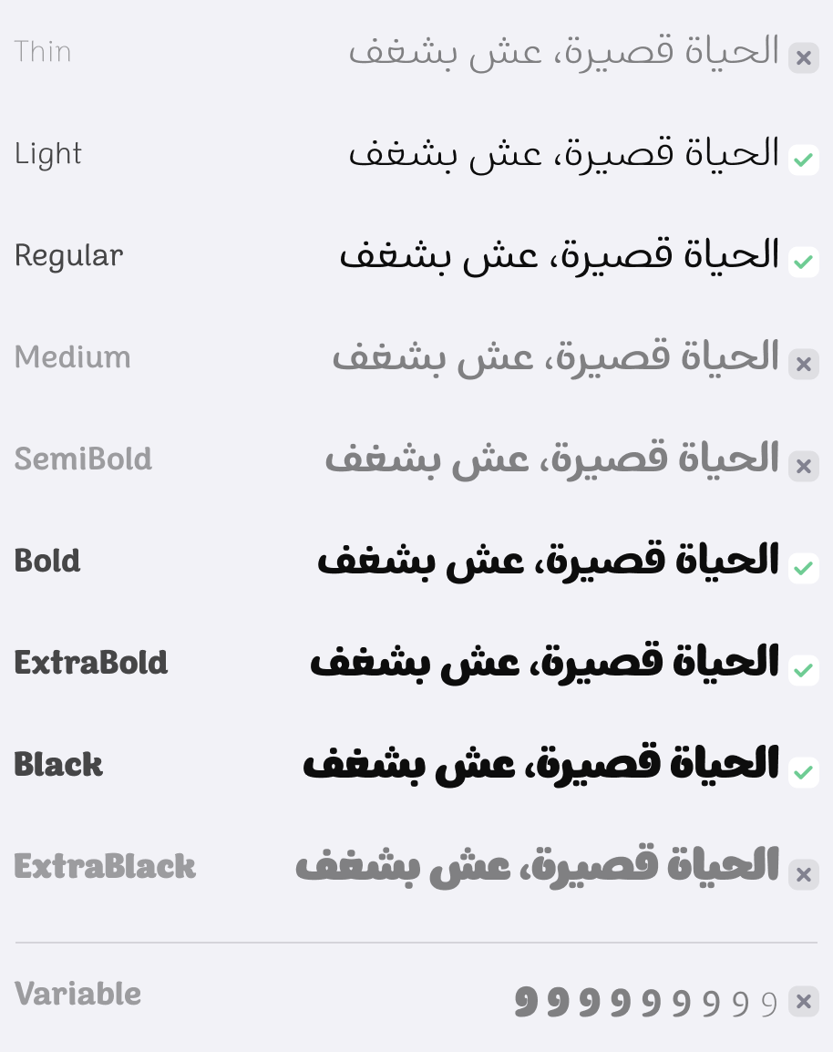
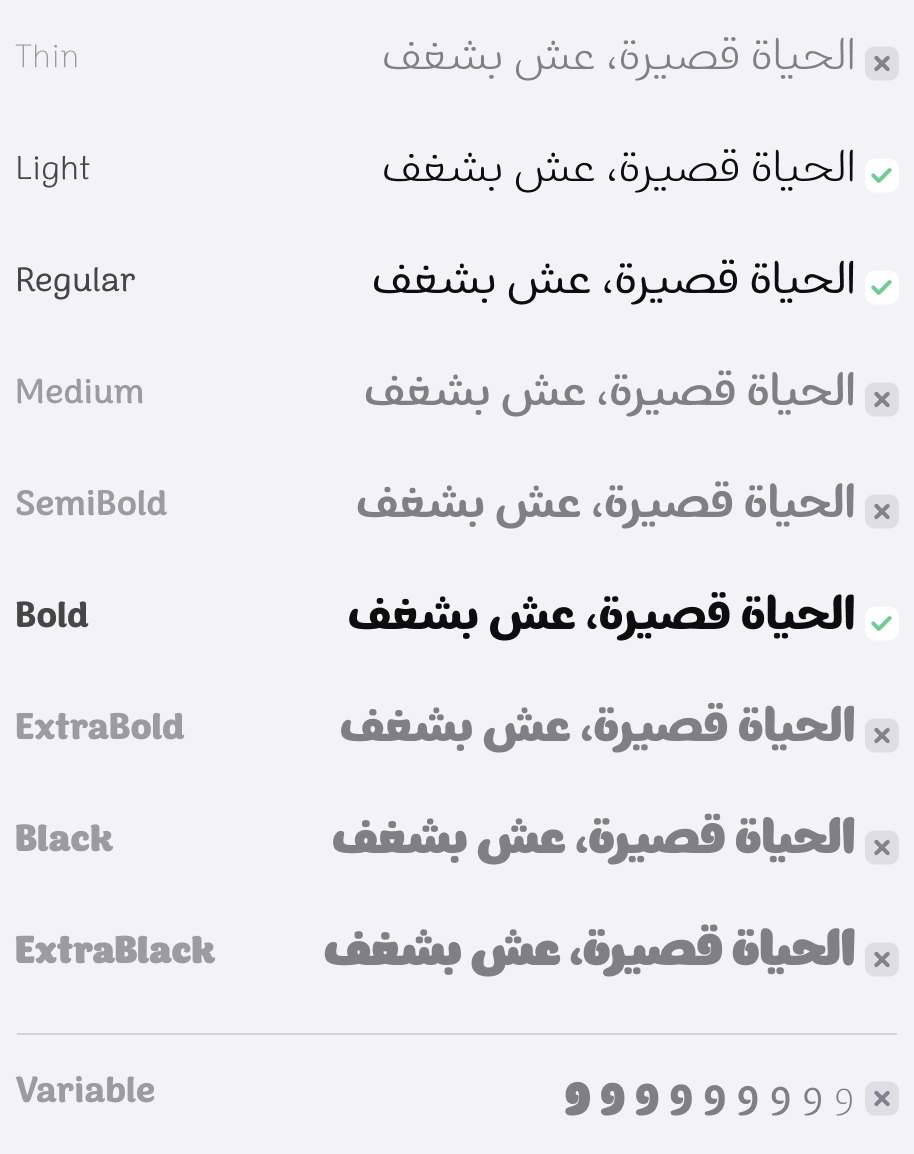
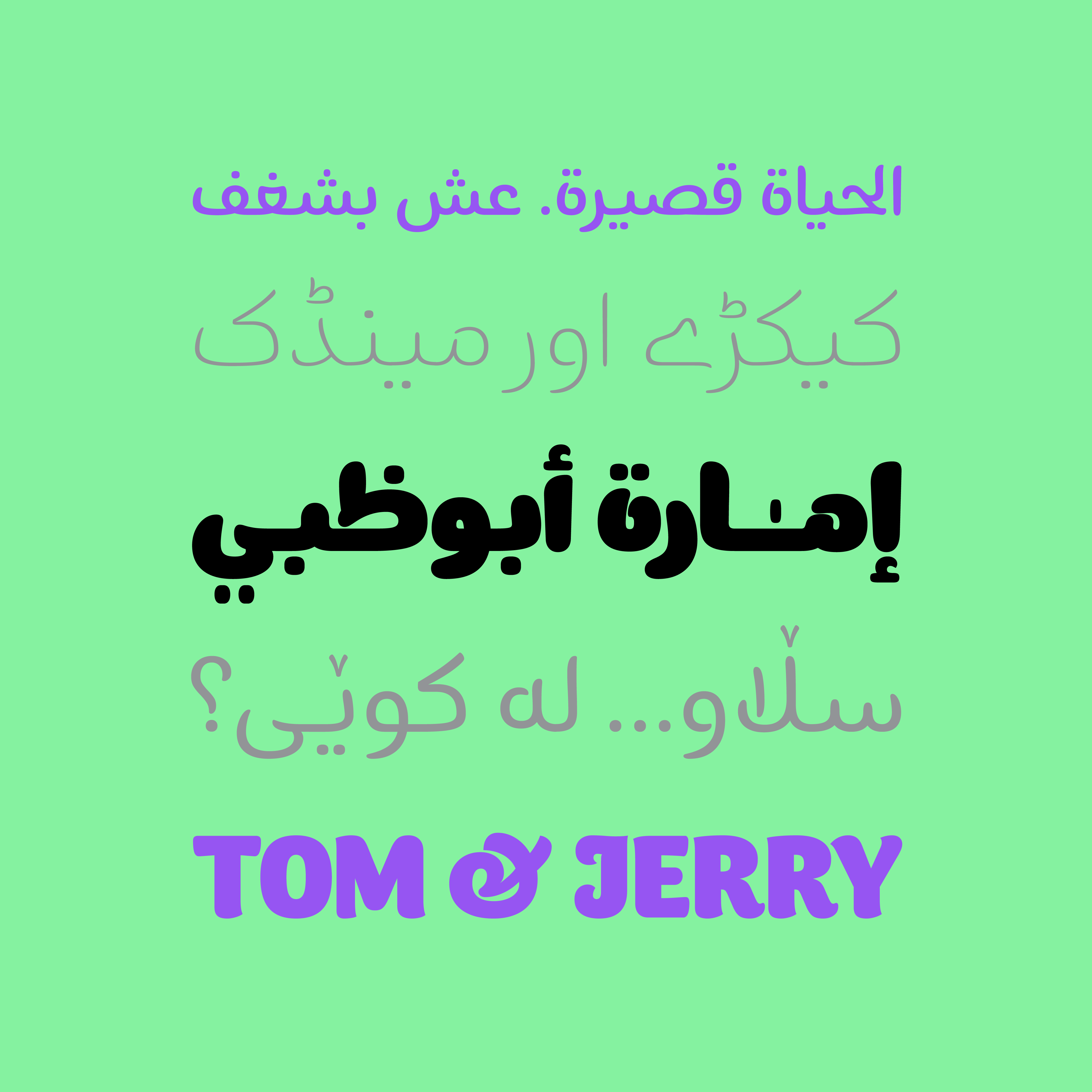
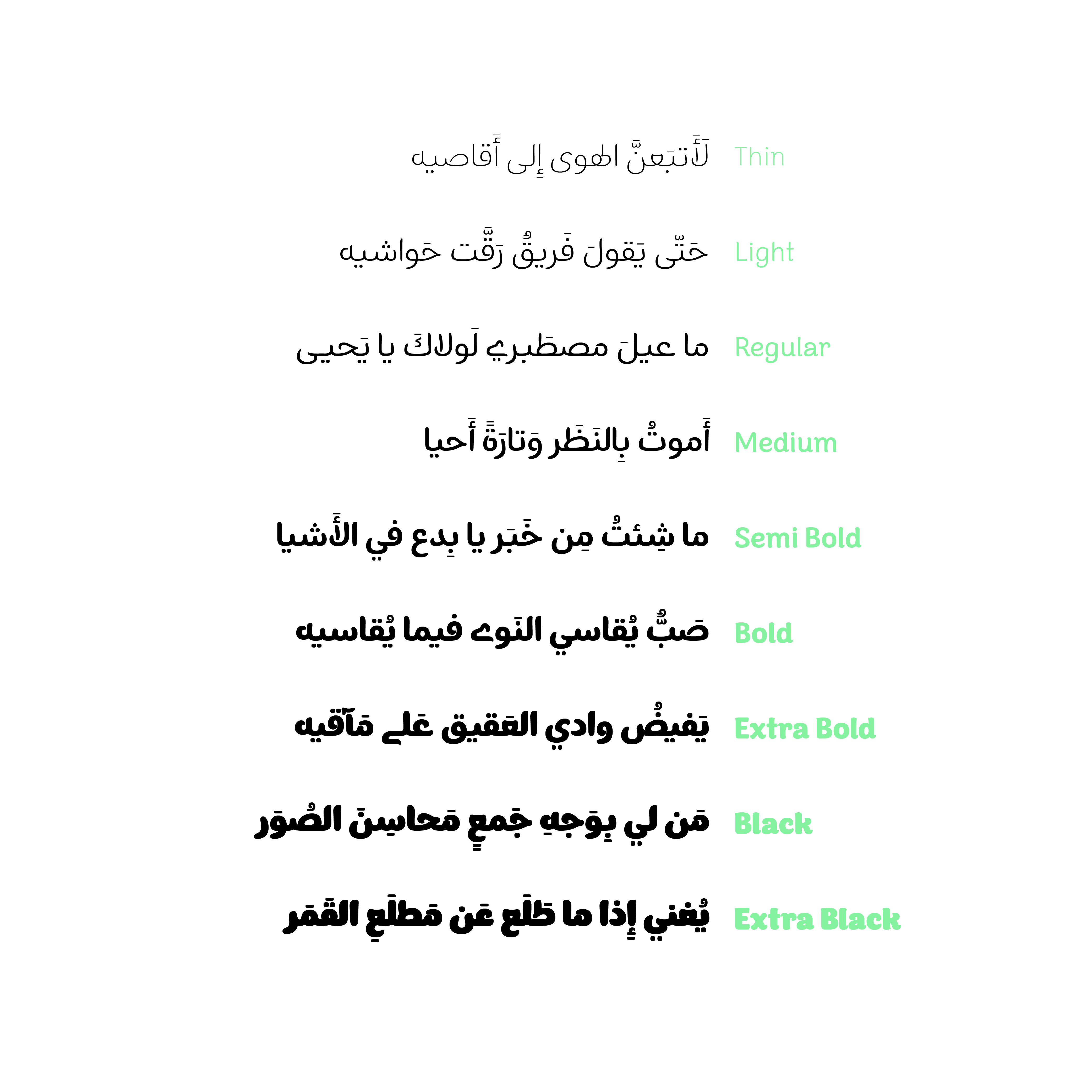
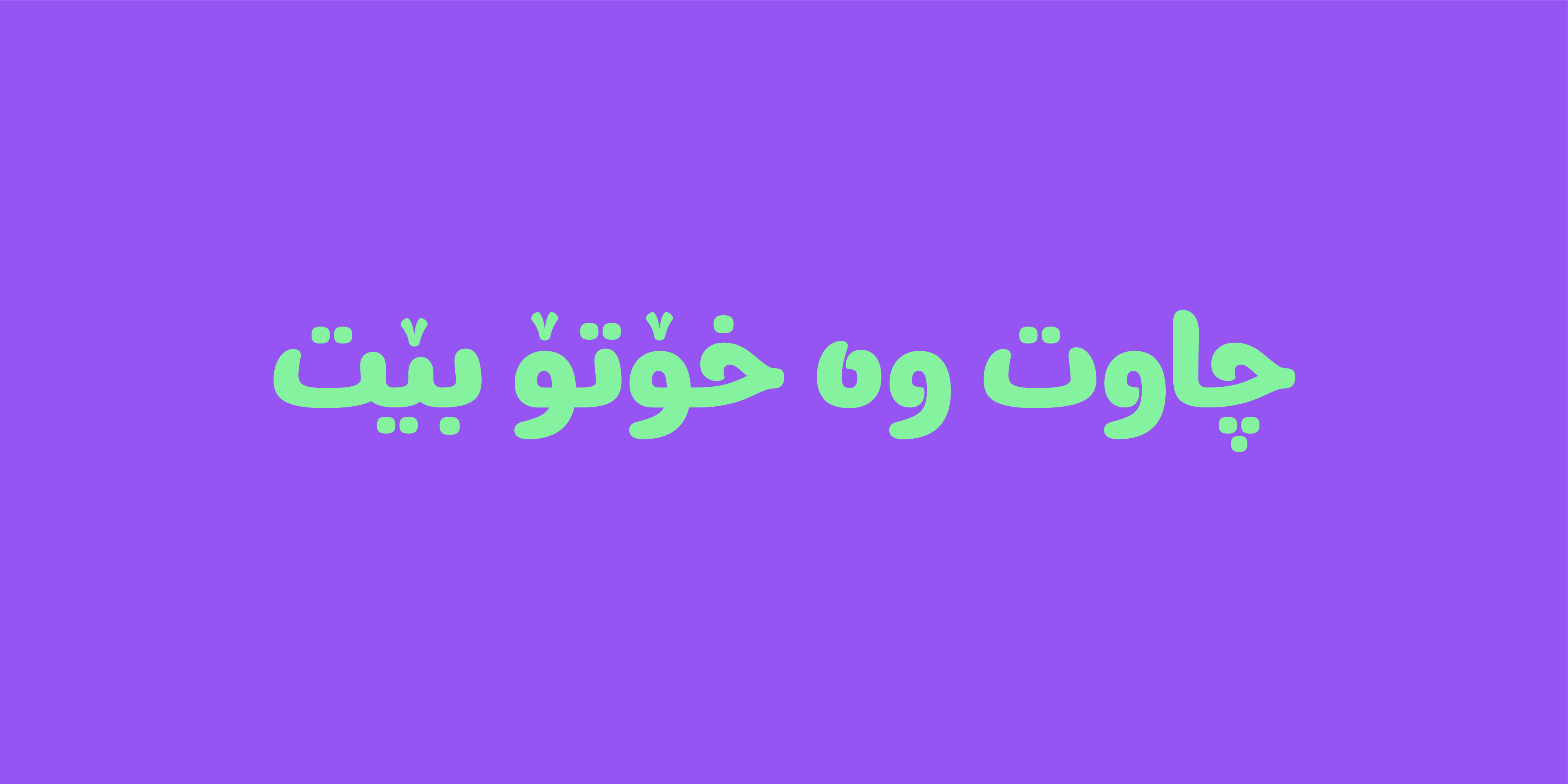
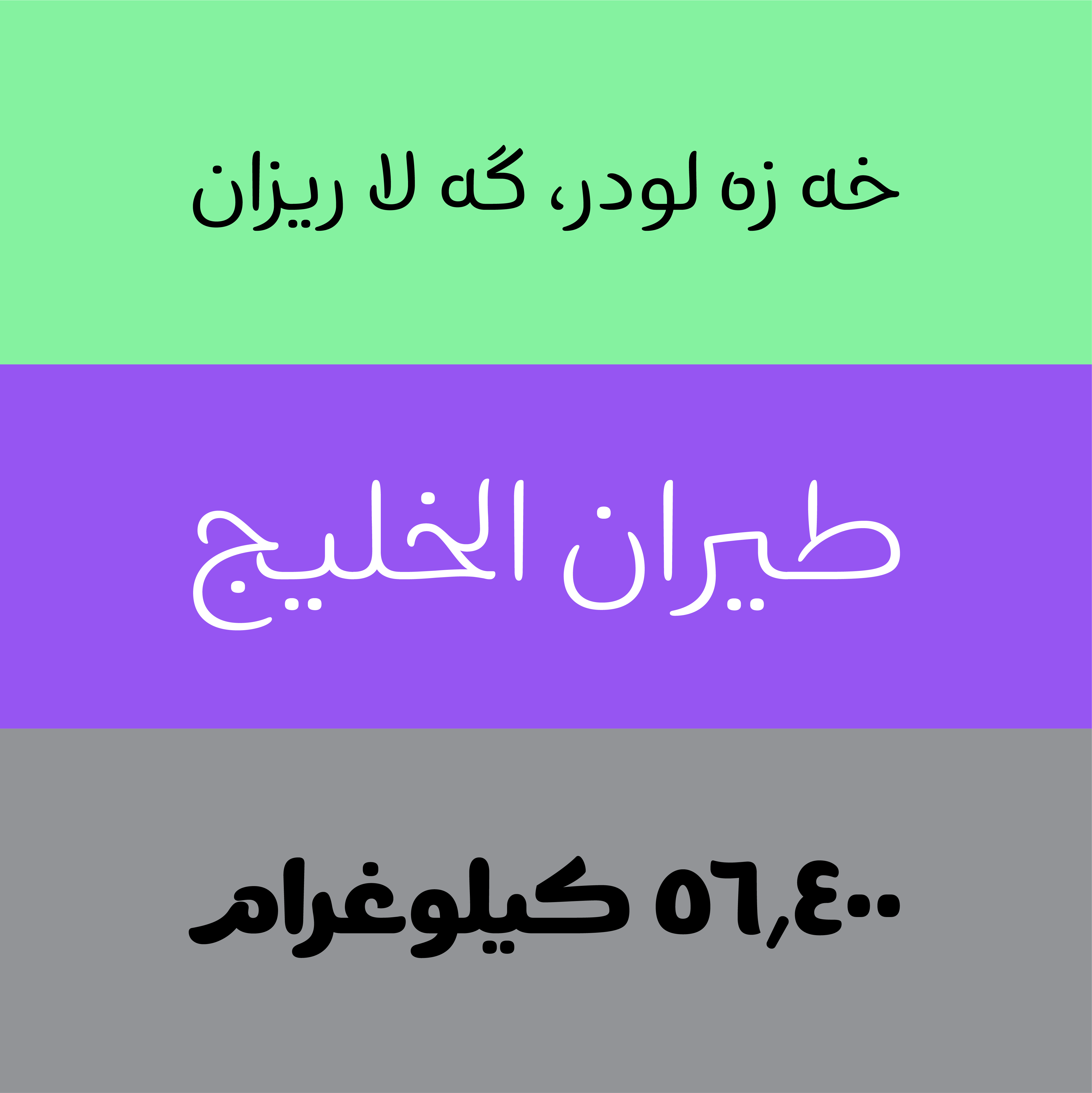
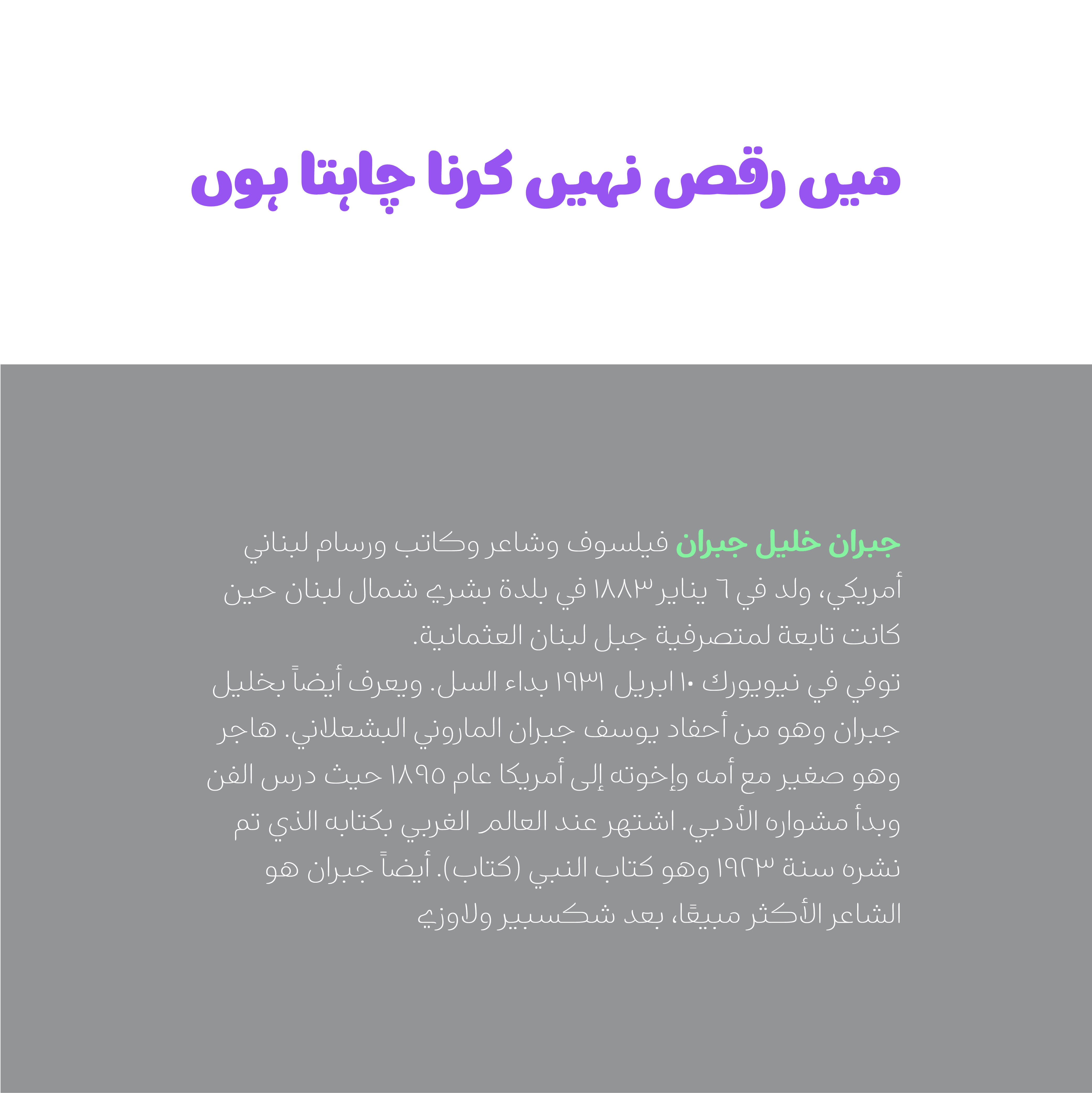
Borna Typeface with 9 weights of Thin, light, Regular, Medium, Semi Bold, Bold, Extra Bold, Black,Extra Black also covers Arabic, Kurdish, and Urdu languages.

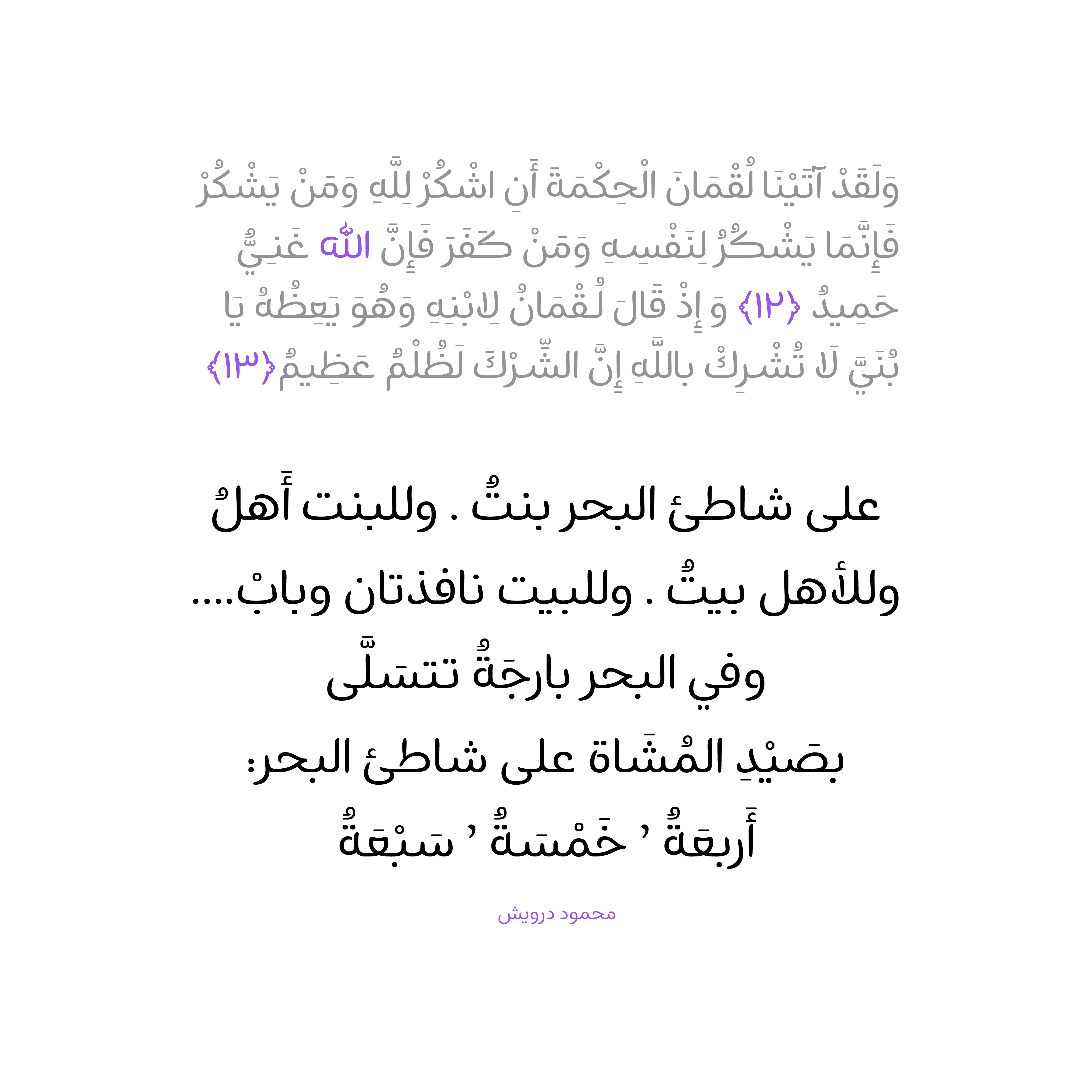
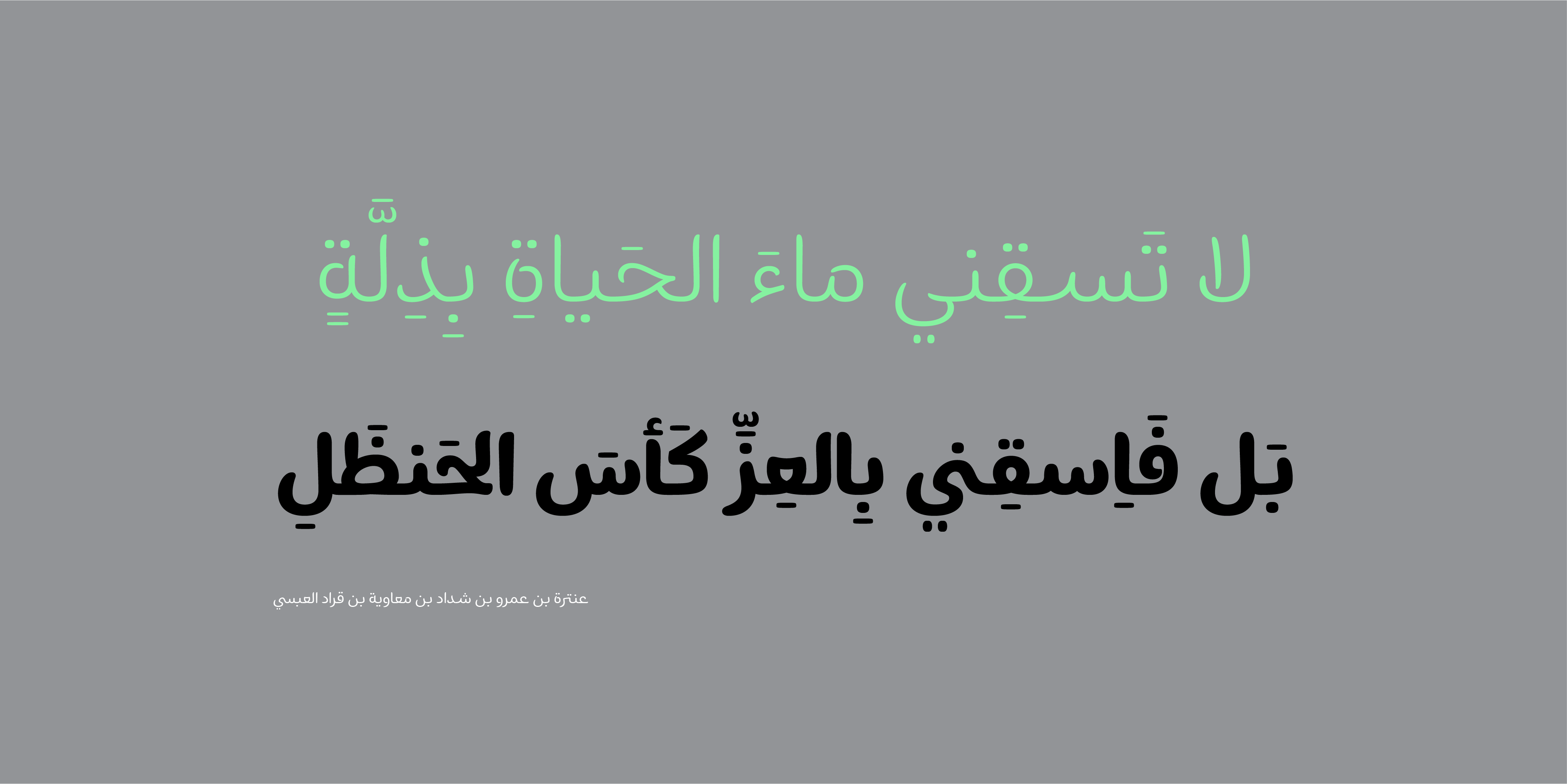
Also, the ability to change the color in diacritic on the letters helps to make phrases and sentences look more beautiful.


In the Borna (Pro) package:
Main Fonts: 9 weights Available in TTF format.
Web Fonts: WOFF and WOFF2 formats.
Variable Font: weight axes
I have a degree in Graphic Design and have been a member of the Iranian Graphic Designers Society (since 1987). I am involved in typeface design, font development, and logotype design. I have publicly released the Potk and Borna fonts, and I designed the Ayandeh, Ali Baba, Bonyad Koodak, Fanoos, and Inverse fonts in collaboration with Reza Bakhtiari Fard. The design and creation of the Kamand font in collaboration with Omid Emamian, as well as the development of the Valman font, are among my latest activities. I have held various workshops and courses in the field of typography, and I received the third Grand Prize at the 2021-2022 Granshan competition in Armenia for the Ali Baba font and a special award for the Potk font.


















Comments
Recommended Posts
Nostalgic Arabic Fonts: Reviving the Beauty of the Past
Top Arabic Fonts for Ramadan and Eid Design
Arabic Fonts for Books & Magazines: From Print to Digital
Techno Typeface; A Look at the Design Process and Logic
What features does an ideal subtitle font have?
Selected Fonts of 2025 in the TDC Competition
13th GRANSHAN Type Design Competition
Golpayegani Typeface creation