Bahar


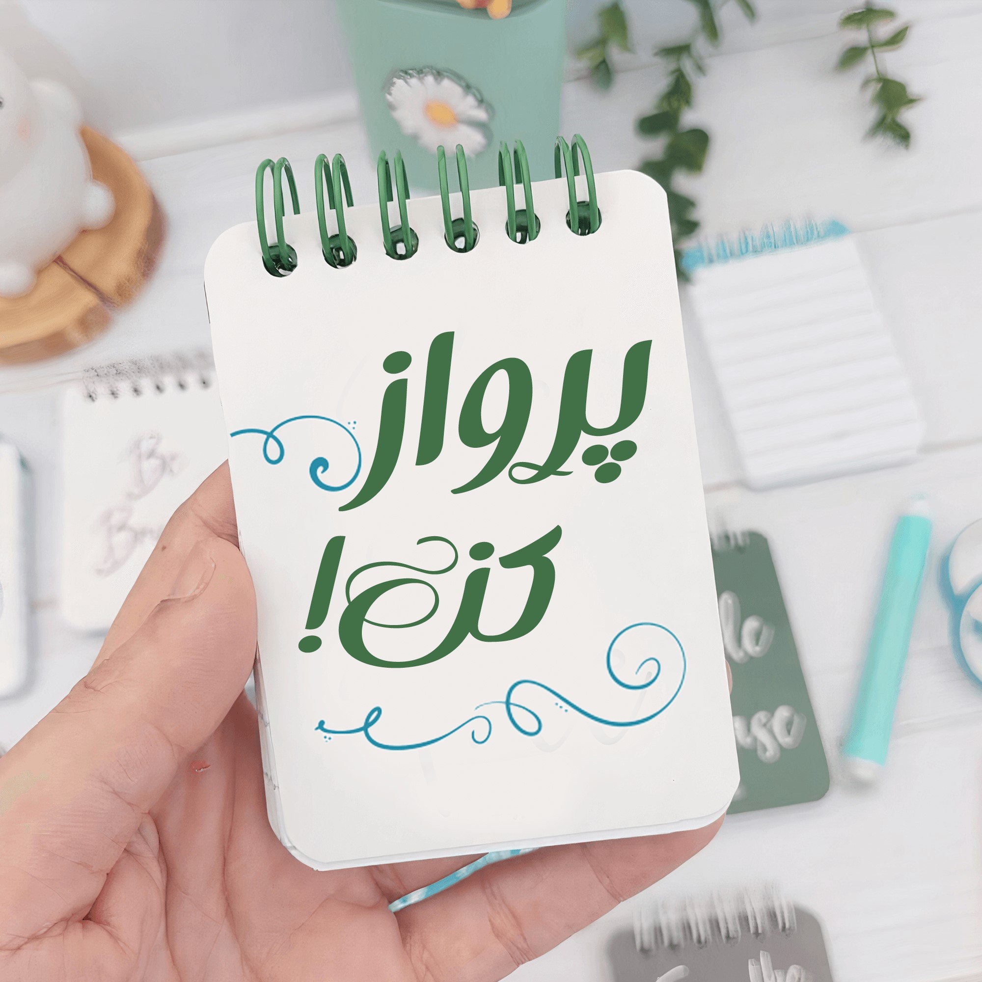
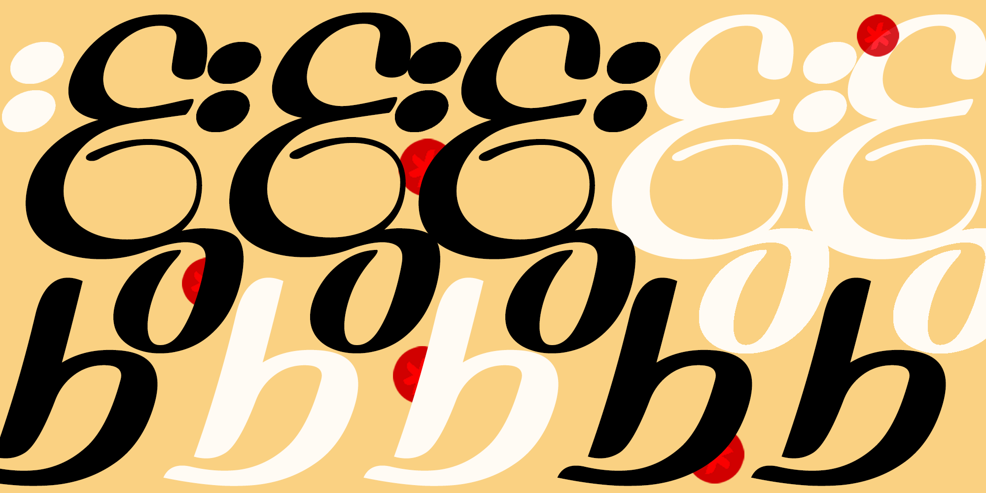
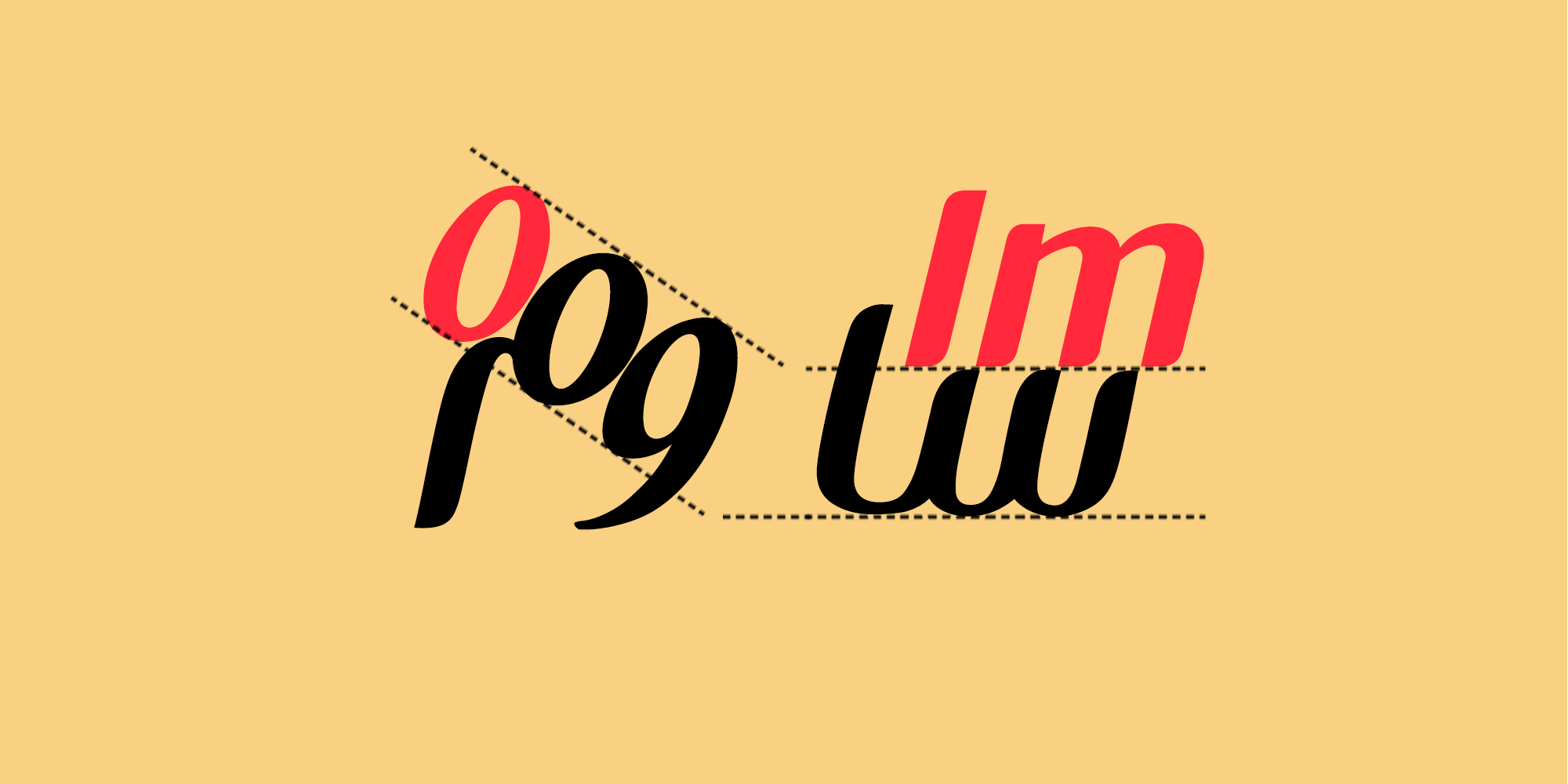
The letters become thinner at the baseline area and gradually thicken as they move away from it. This approach contrasts with the ascending and descending movements in the Naskh style, which gives the font a “Latinized” quality and aligns the letter structures with modern styles—making some characters resemble Latin letters.


The Bahar font is not only a writing tool but also a work of art in the form of modern calligraphy, recommended for both designers and artists.


The overall structure of the letters has an italic-like form. The contrasts between thick and thin strokes are striking, and the way the pen initiates each character gives the font a calligraphic quality—not through a diagonal pen angle, but rather through a horizontal one.


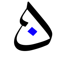
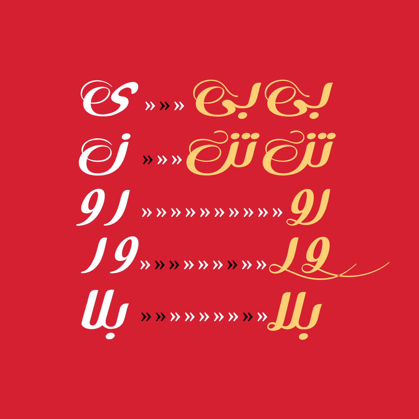
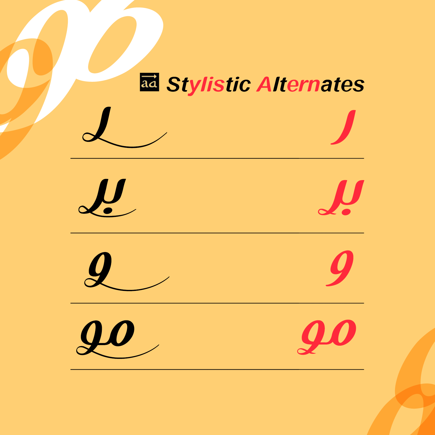
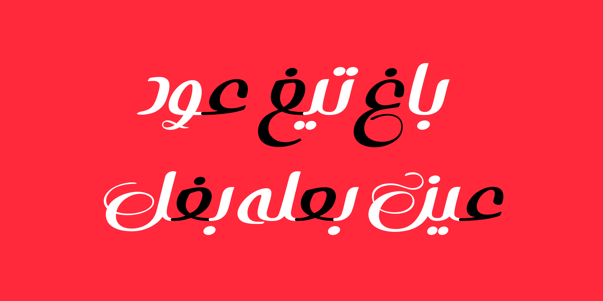
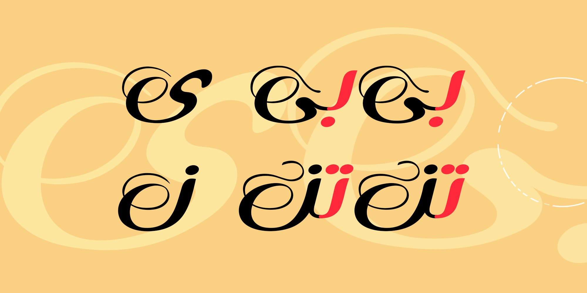
The letters “ر” and “و” can be used in both connected and isolated forms, available in two styles: simple and ornamental. Activating this feature is easy and explained in the font guide.


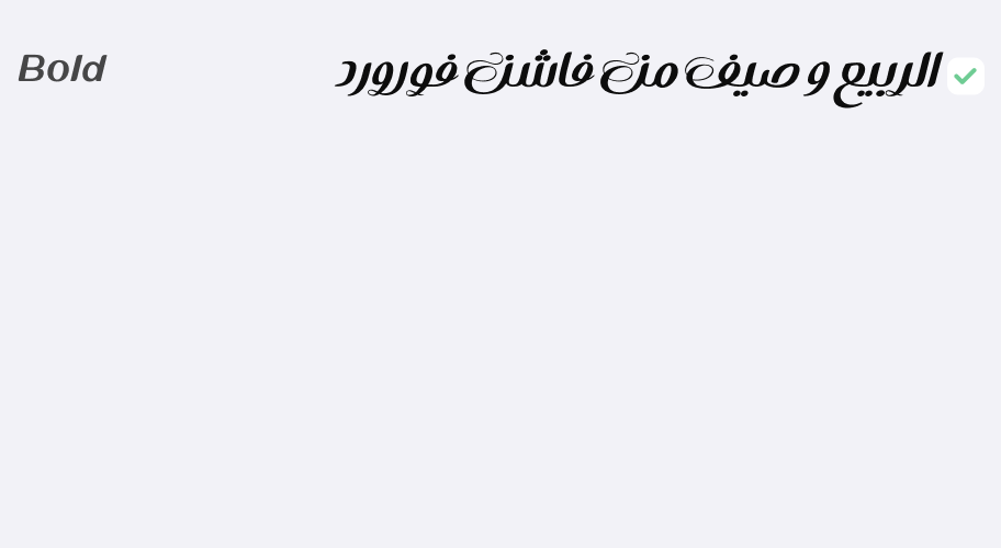
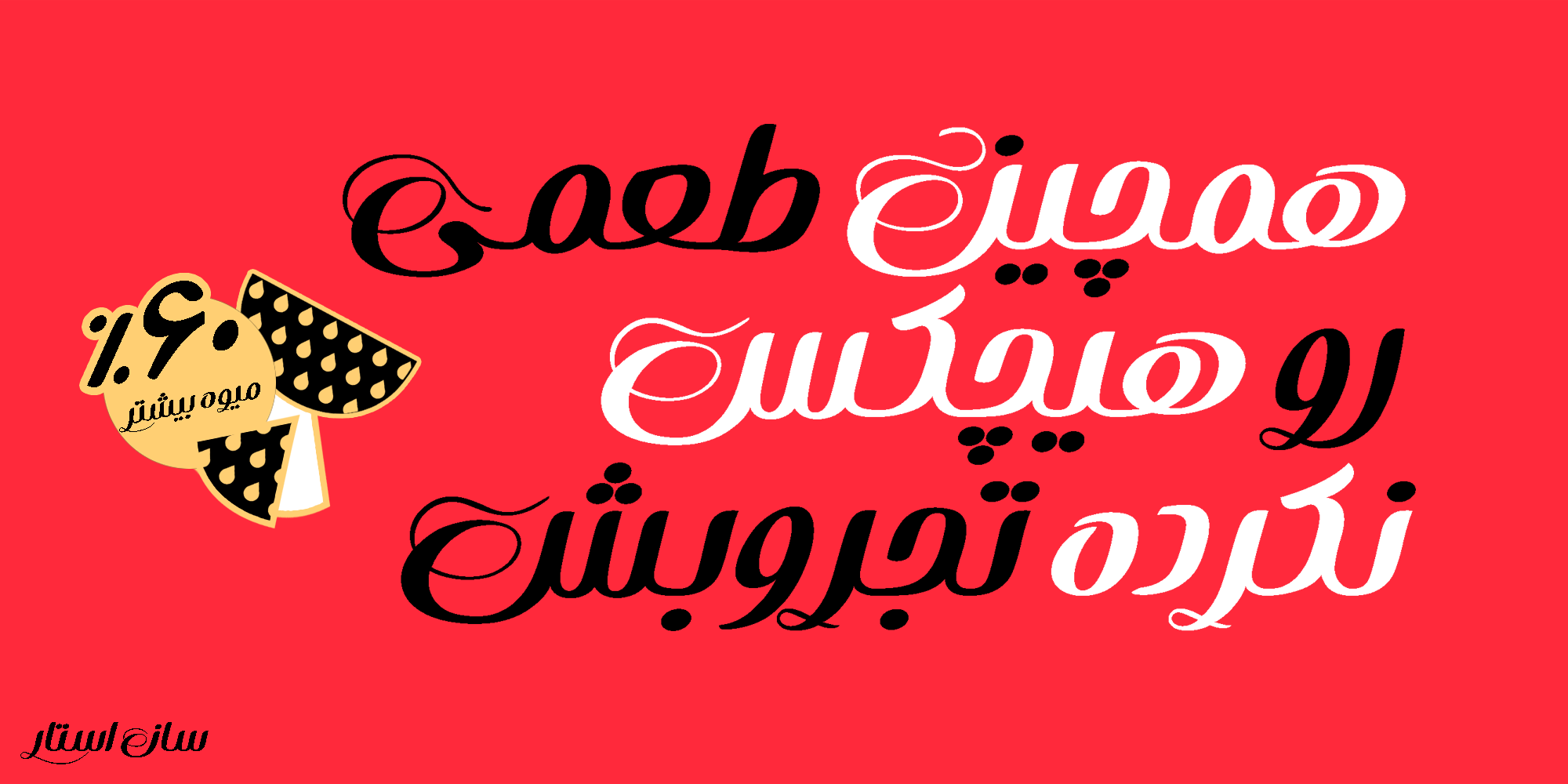
Some letters have been designed as ligature combinations to improve harmony and spacing. An example of these can be seen in the image below.

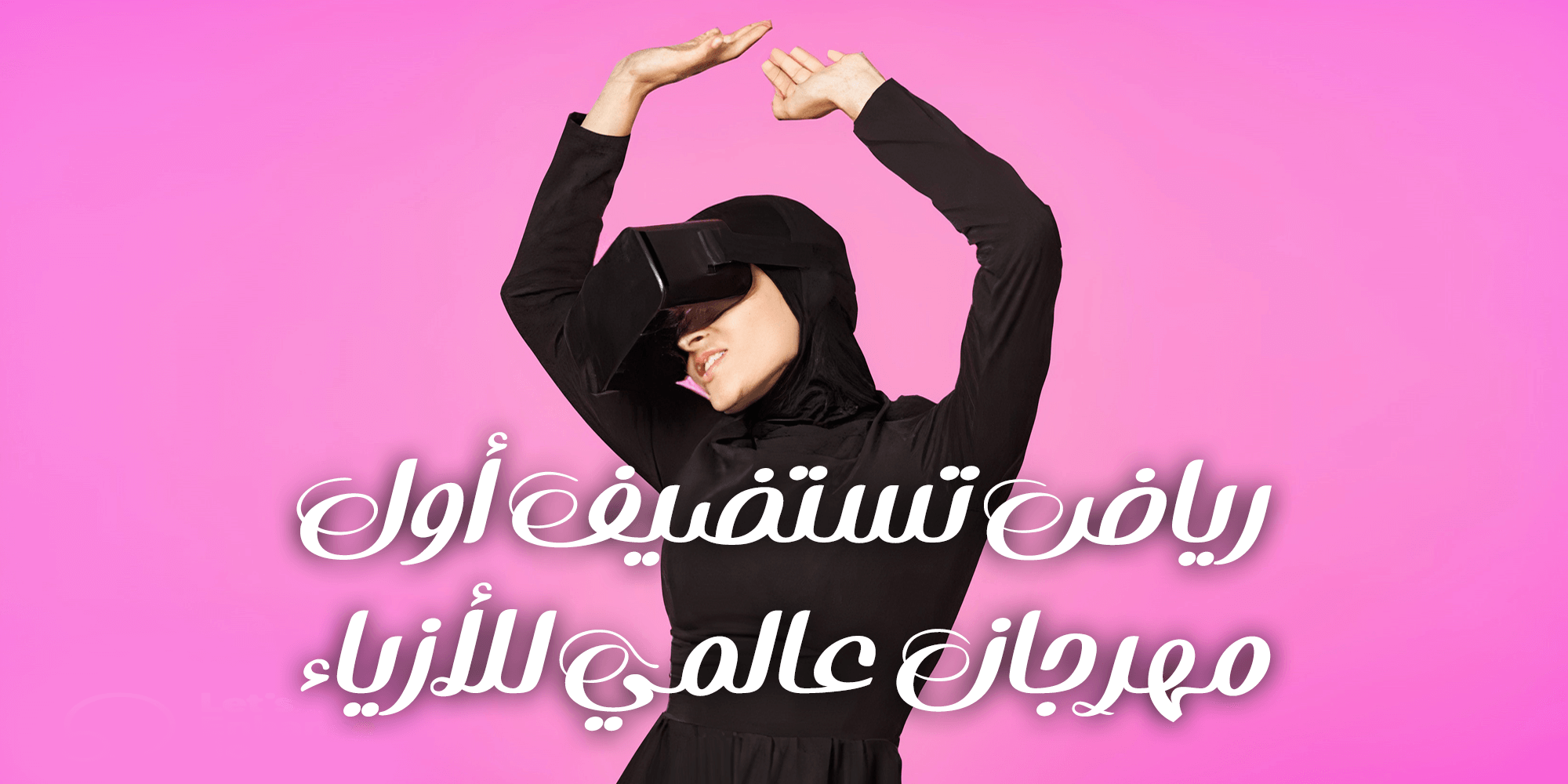
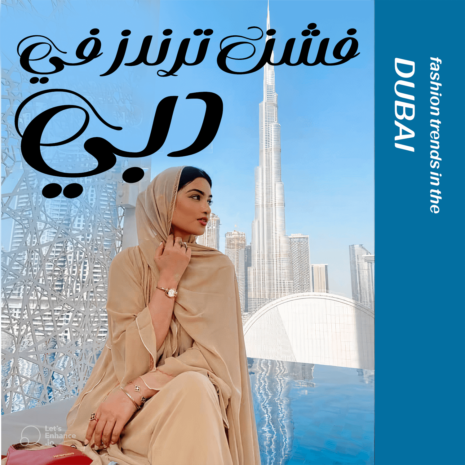
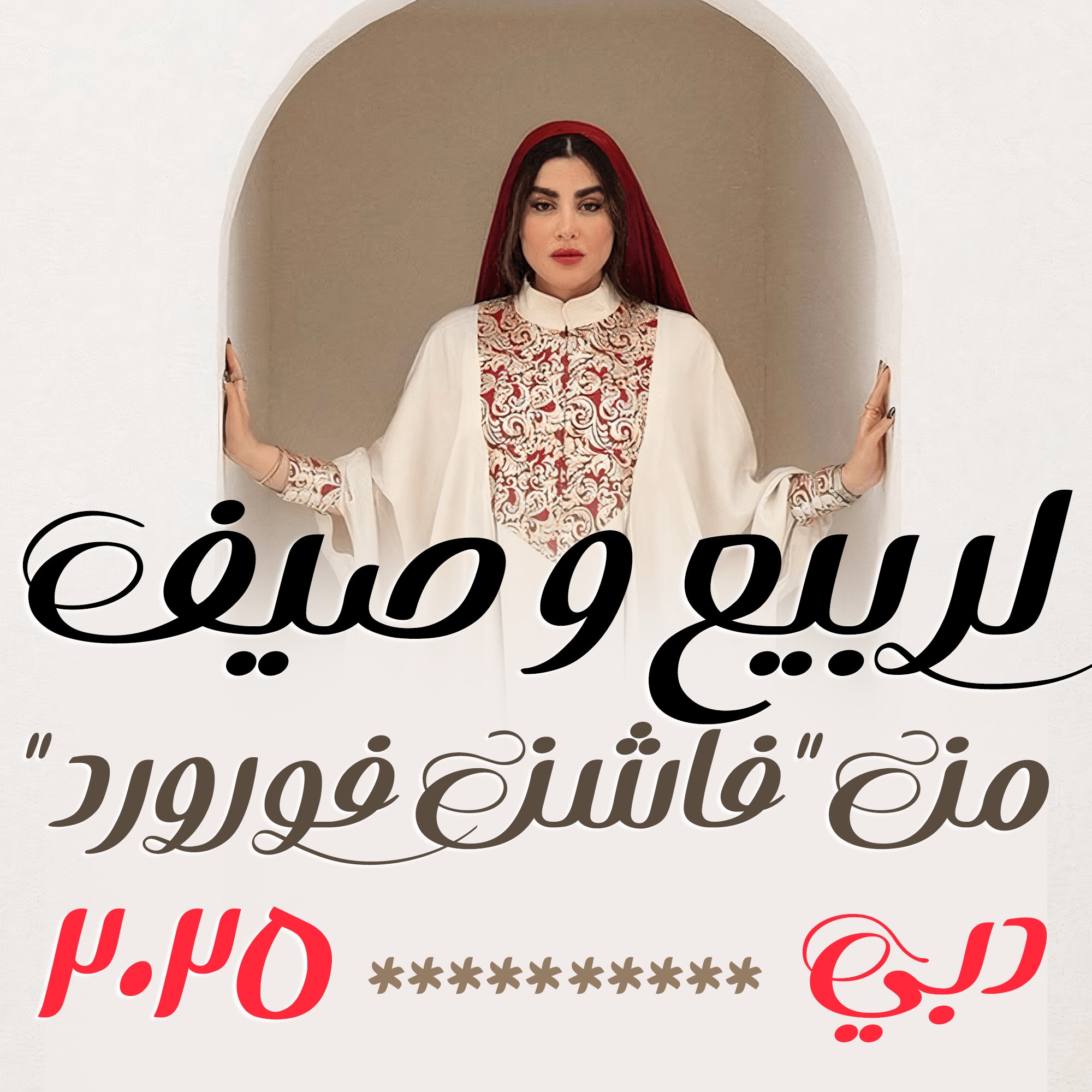
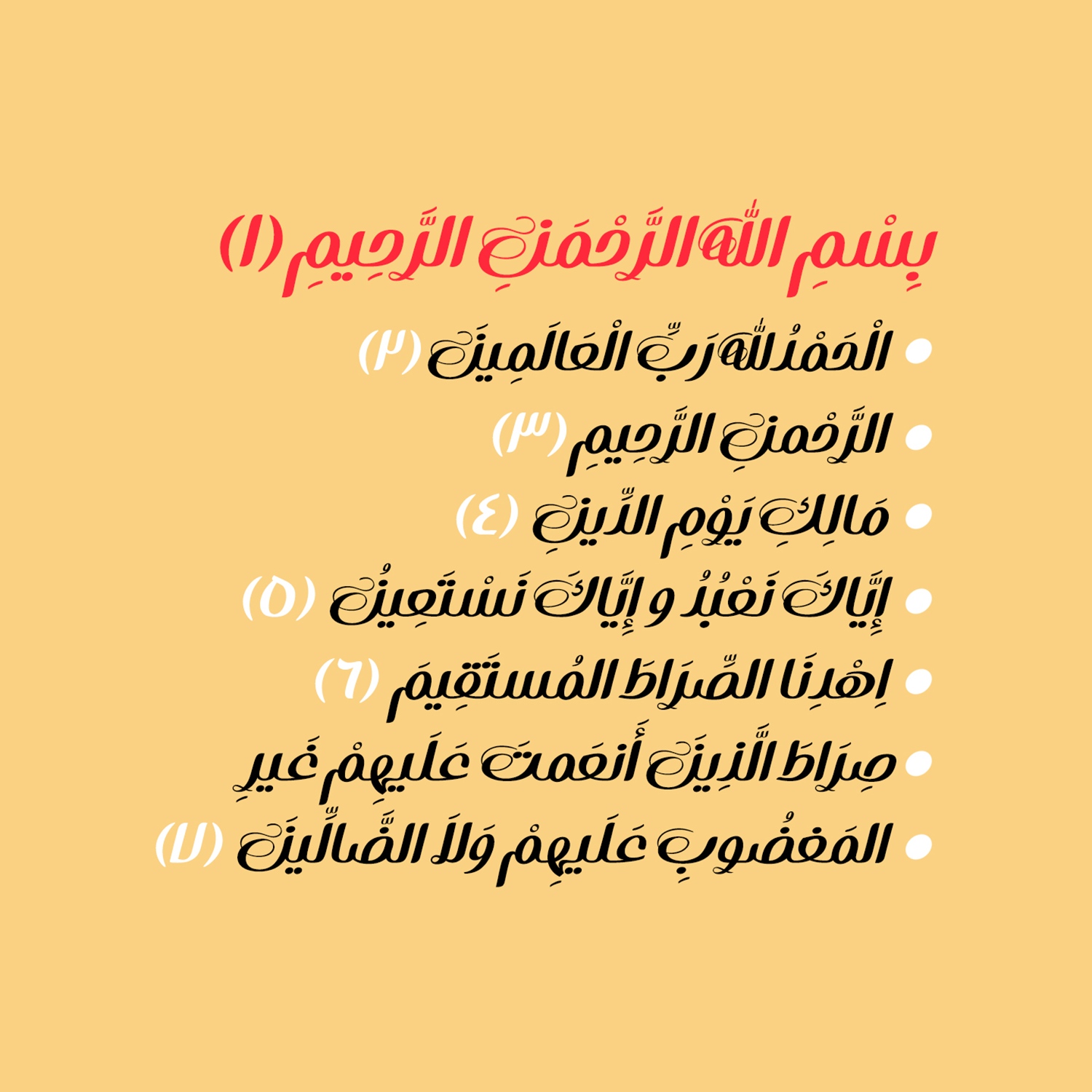
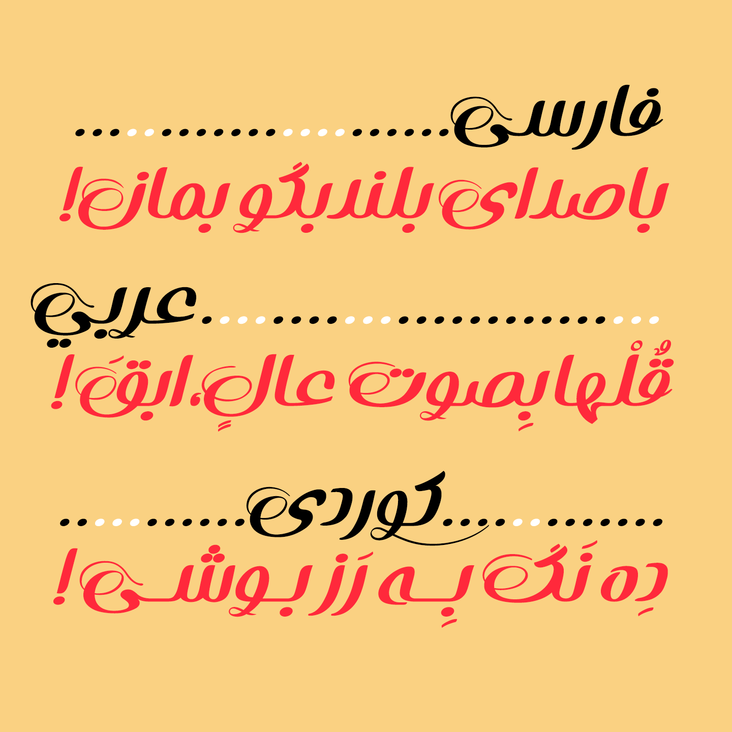
This font supports Persian, Arabic, and Kurdish letters and numerals.


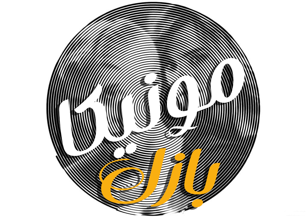
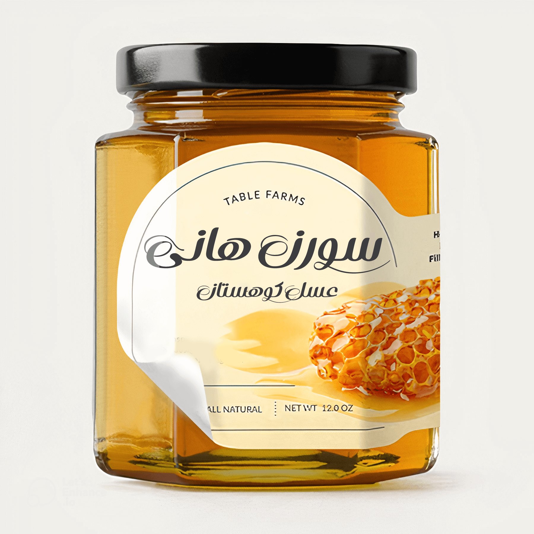
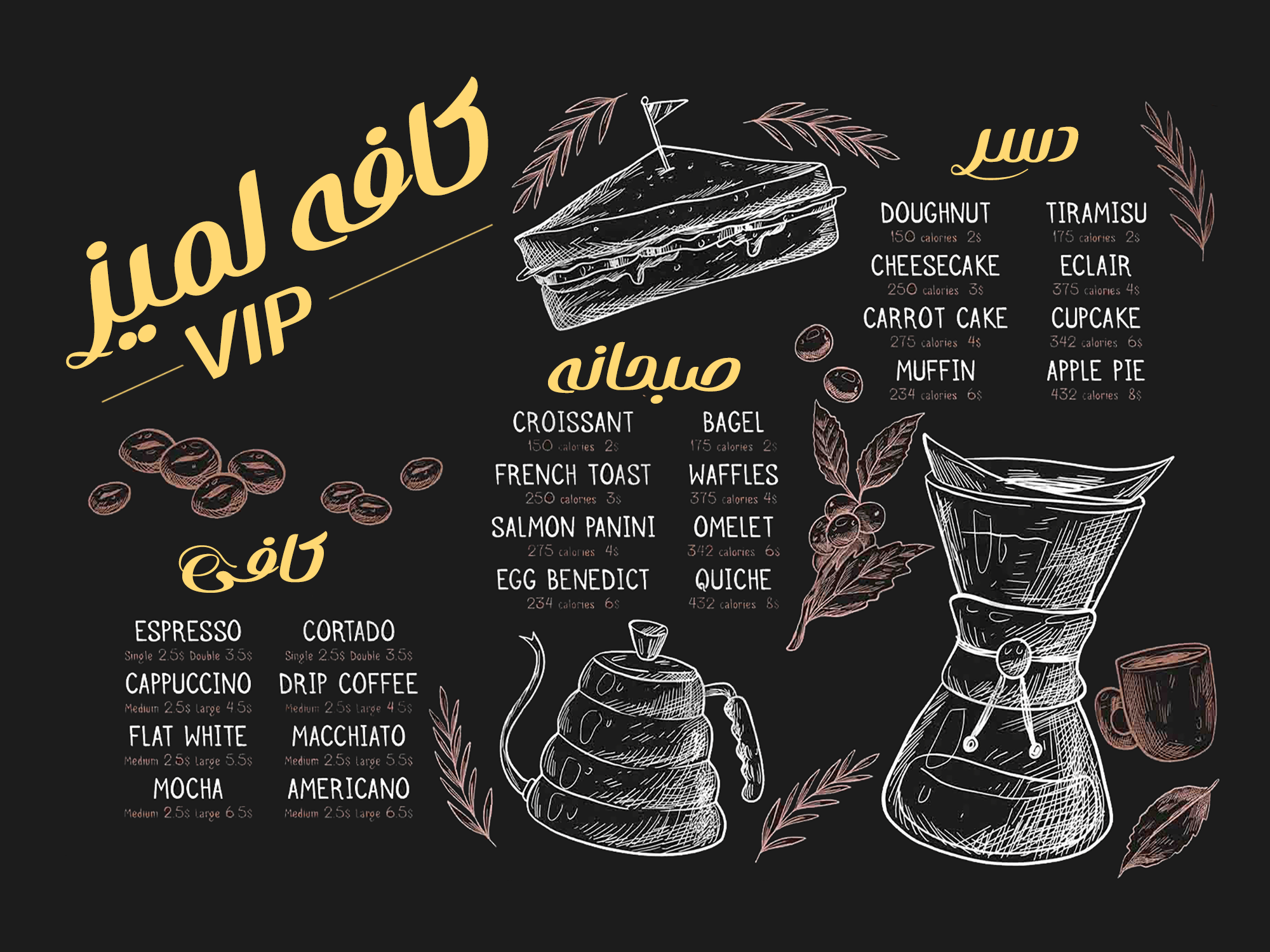
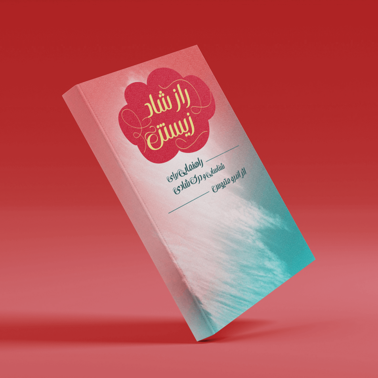
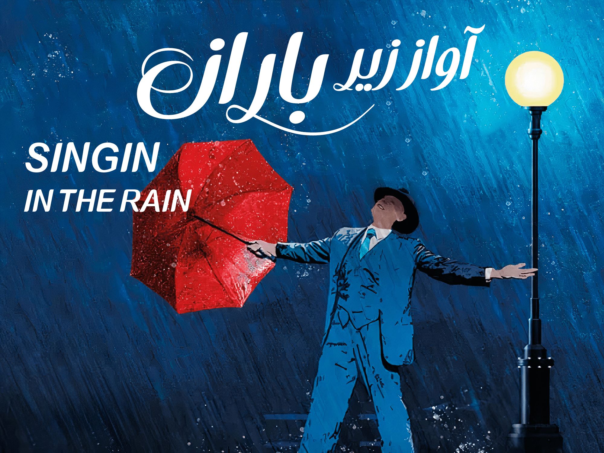
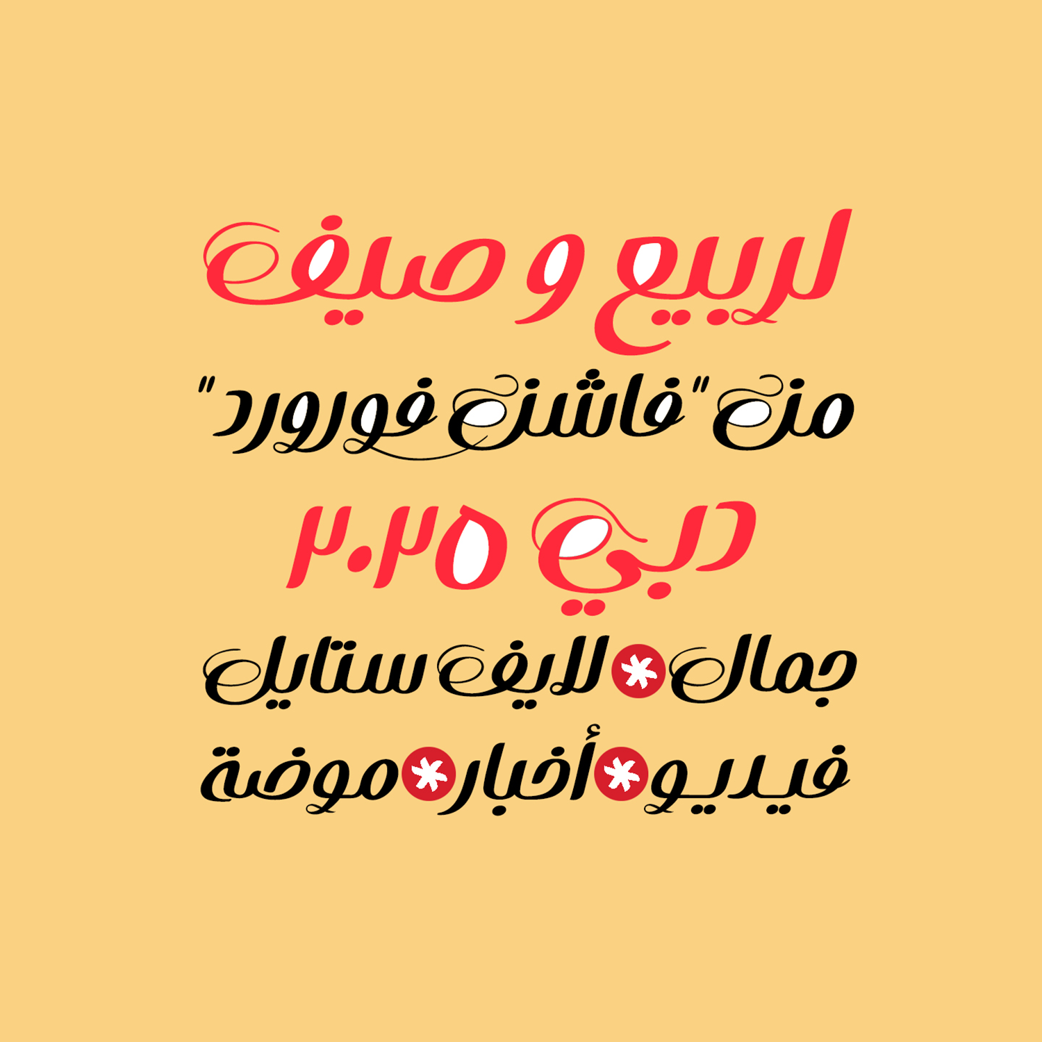
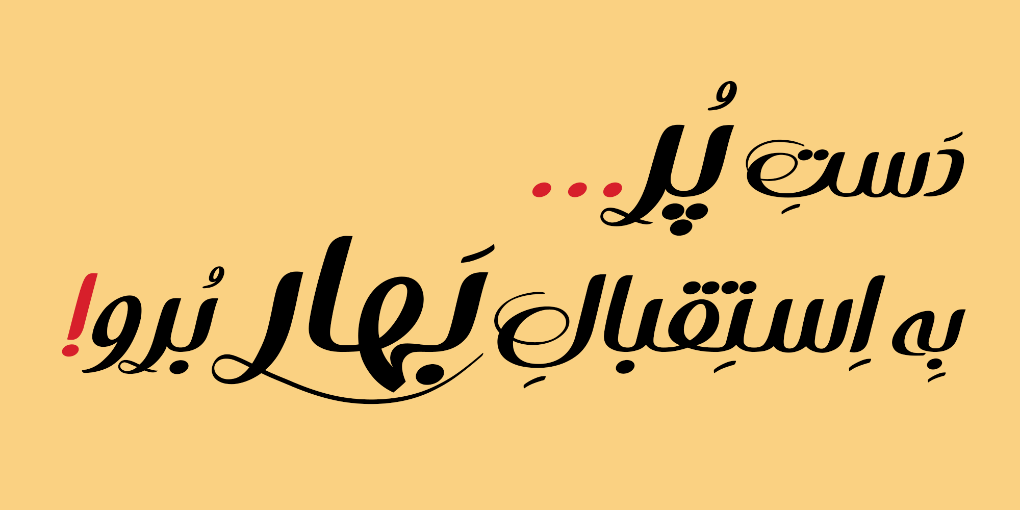
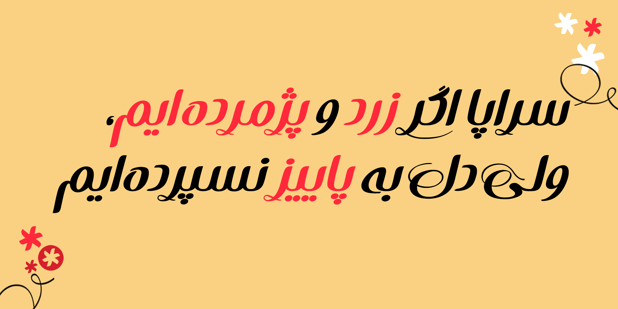
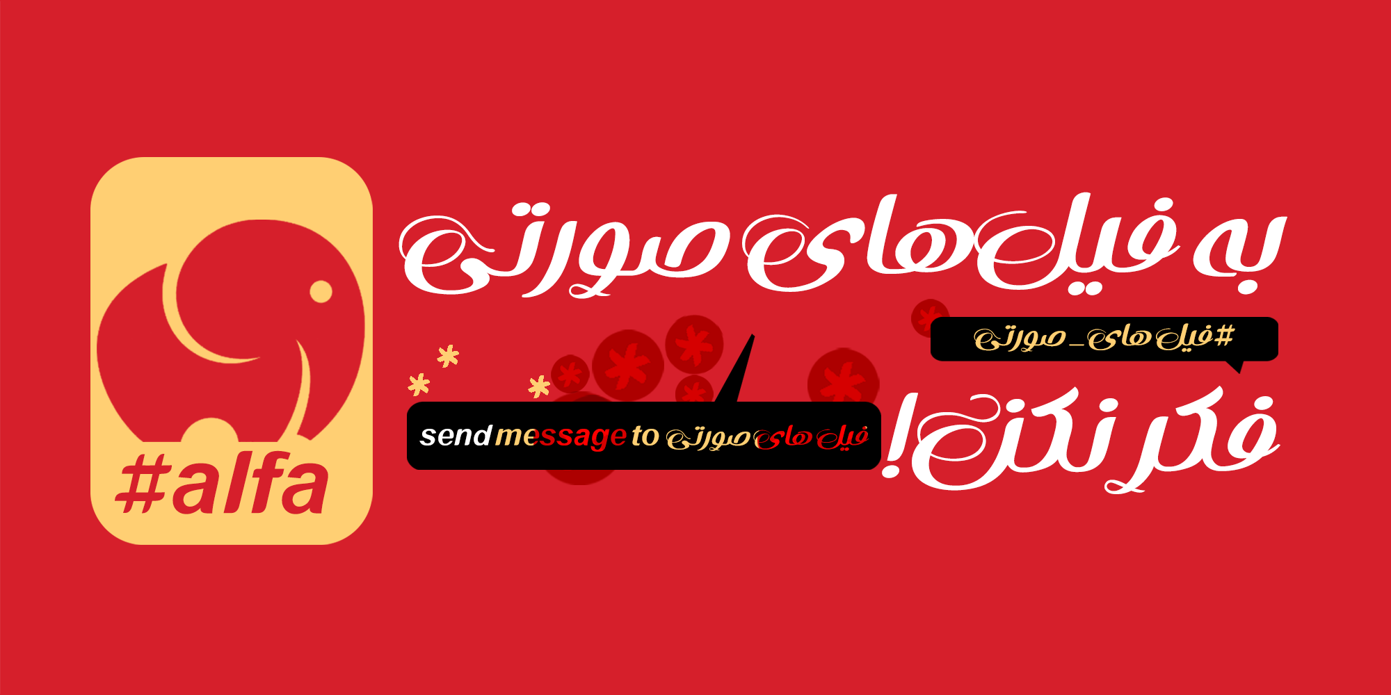
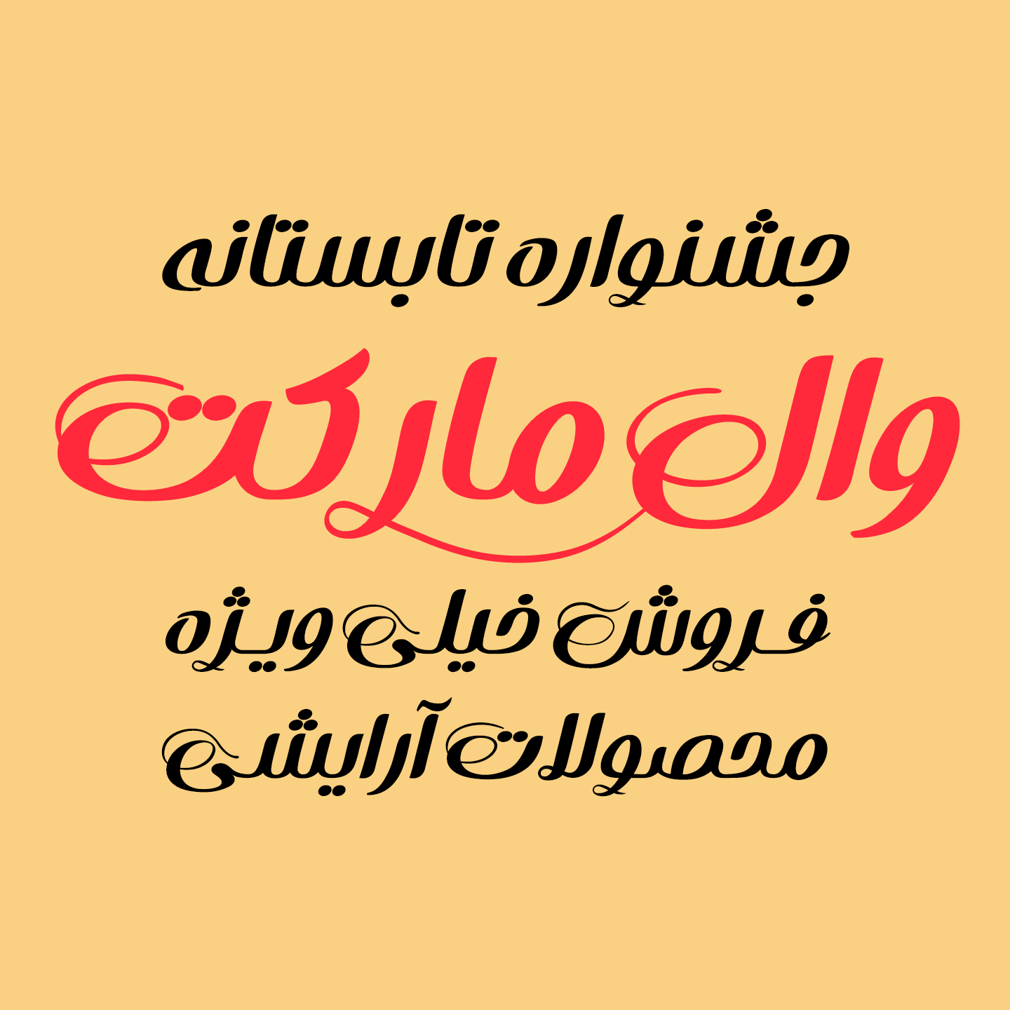
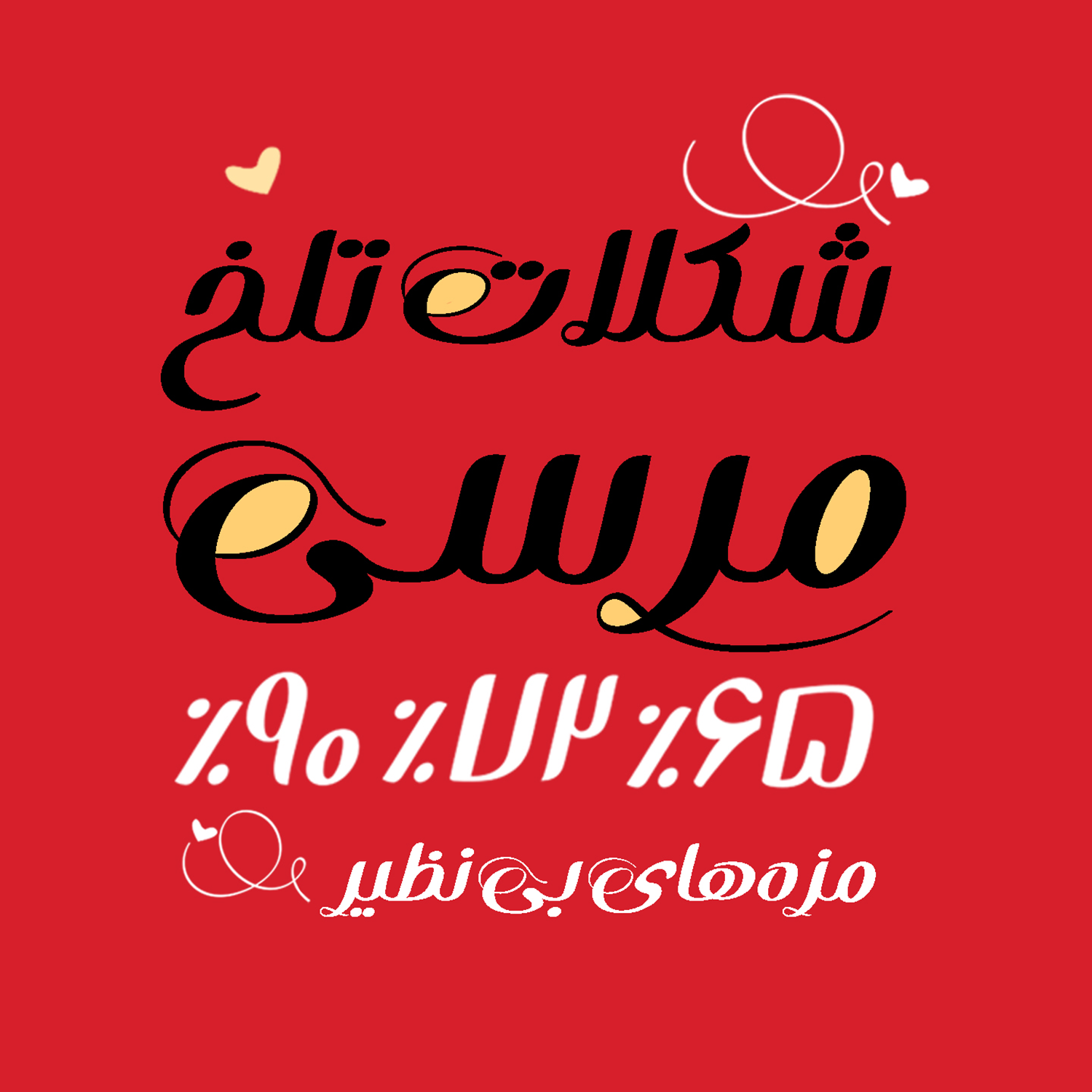
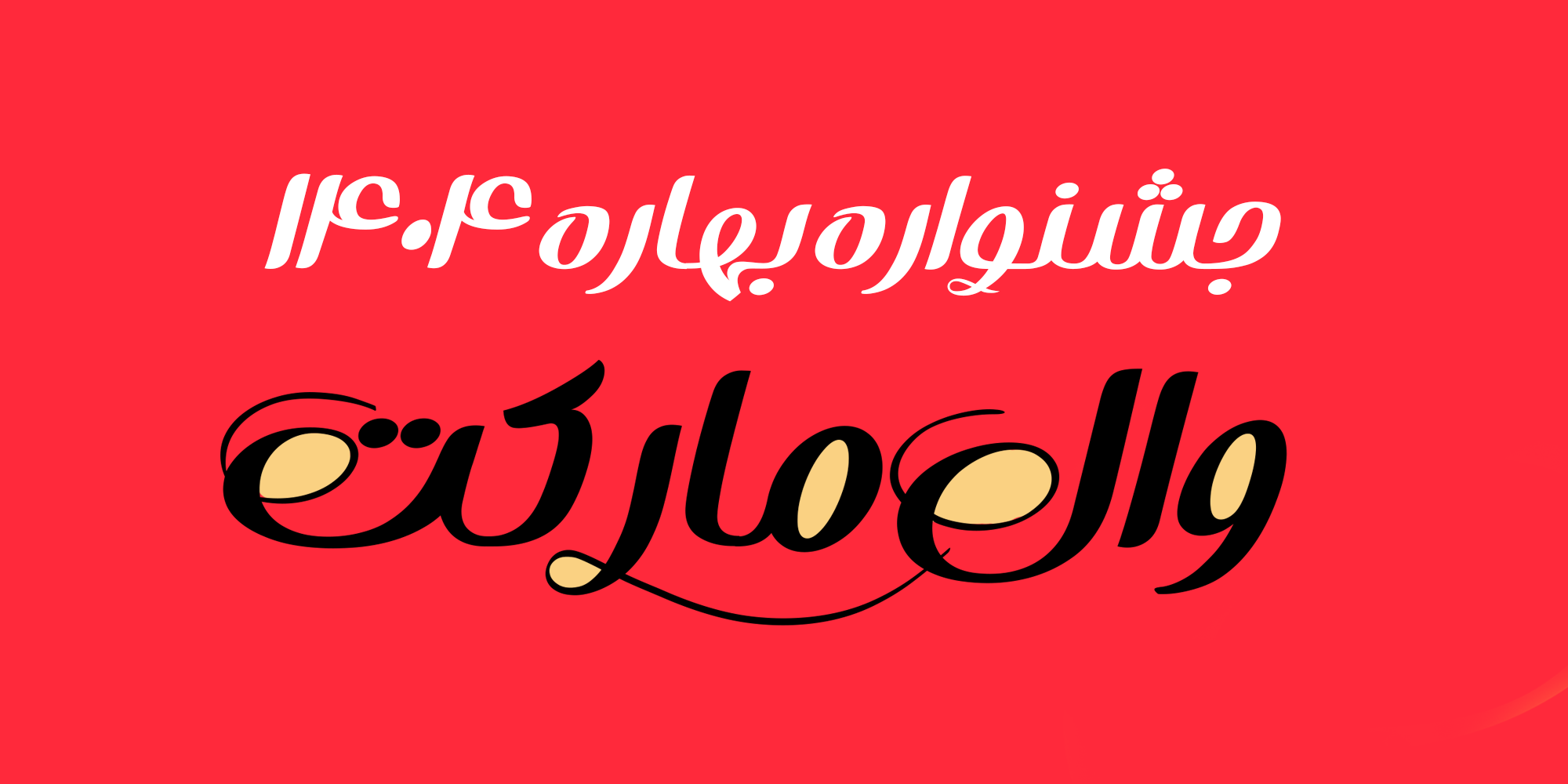
Bahar Font in Advertising


In the Bahar font package :
Main Fonts: 1 weights, Available in TTF and OTF formats.
Web Fonts: WOFF and WOFF2 formats.
Help: pdf file guide that offers instructions on how to utilize the font.
Graphic Designer and Typographer Exhibitor of numerous calligraphy and typography works in various galleries University lecturer in the field of graphic design Author of the book “Graphic Art, Graphic Design” Researcher in the field of digital calligraphy scripting

















Comments
Recommended Posts
Nostalgic Arabic Fonts: Reviving the Beauty of the Past
Top Arabic Fonts for Ramadan and Eid Design
Arabic Fonts for Books & Magazines: From Print to Digital
Techno Typeface; A Look at the Design Process and Logic
What features does an ideal subtitle font have?
Selected Fonts of 2025 in the TDC Competition
13th GRANSHAN Type Design Competition
Golpayegani Typeface creation