
























Colak Pro


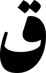
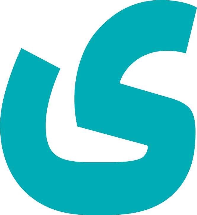
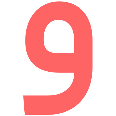
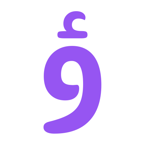
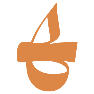
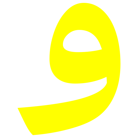
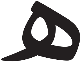
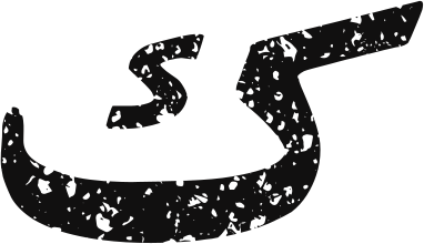
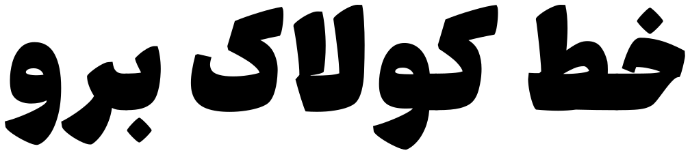
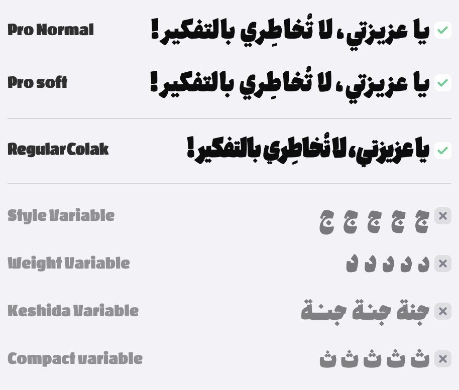
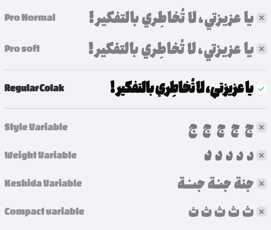
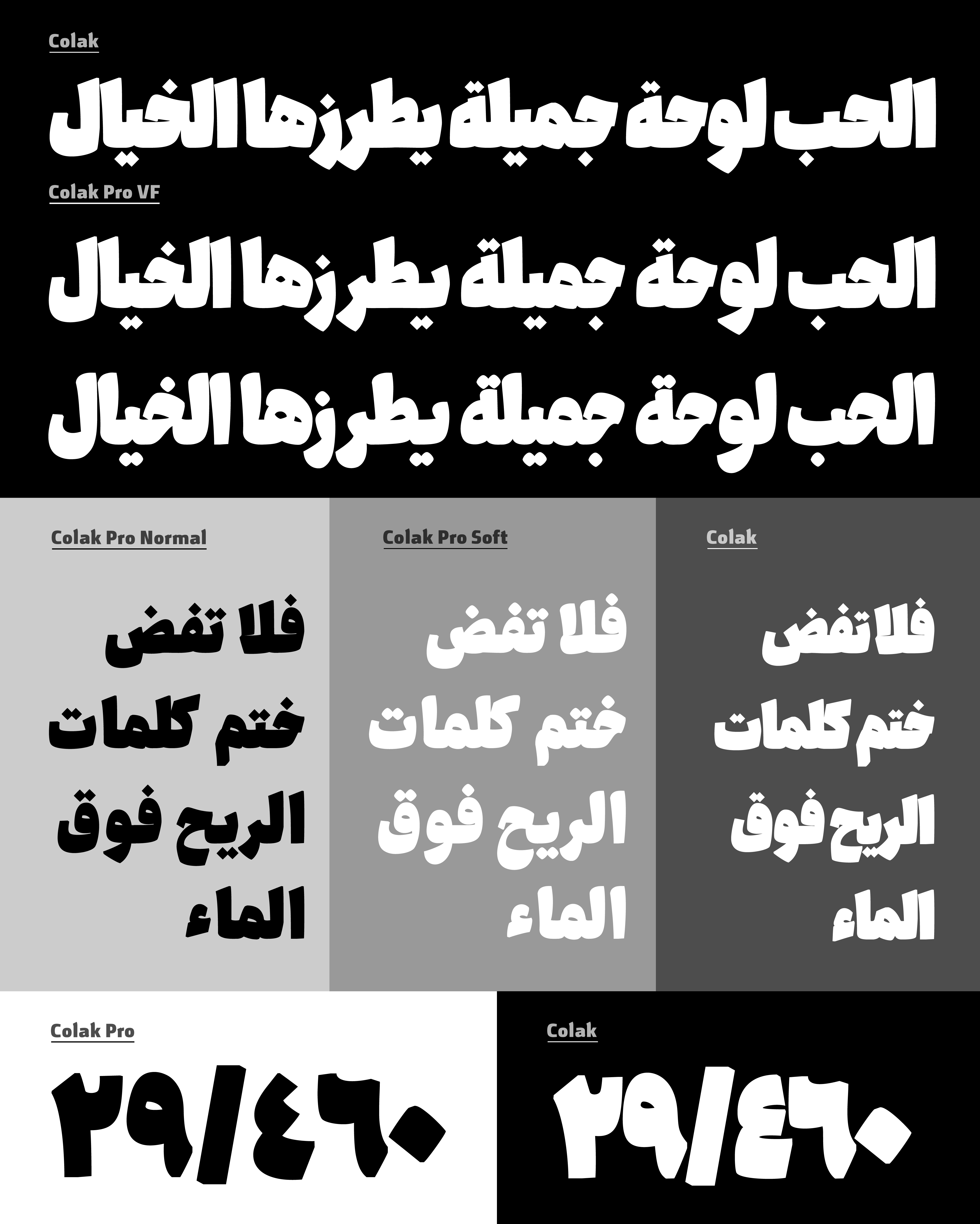
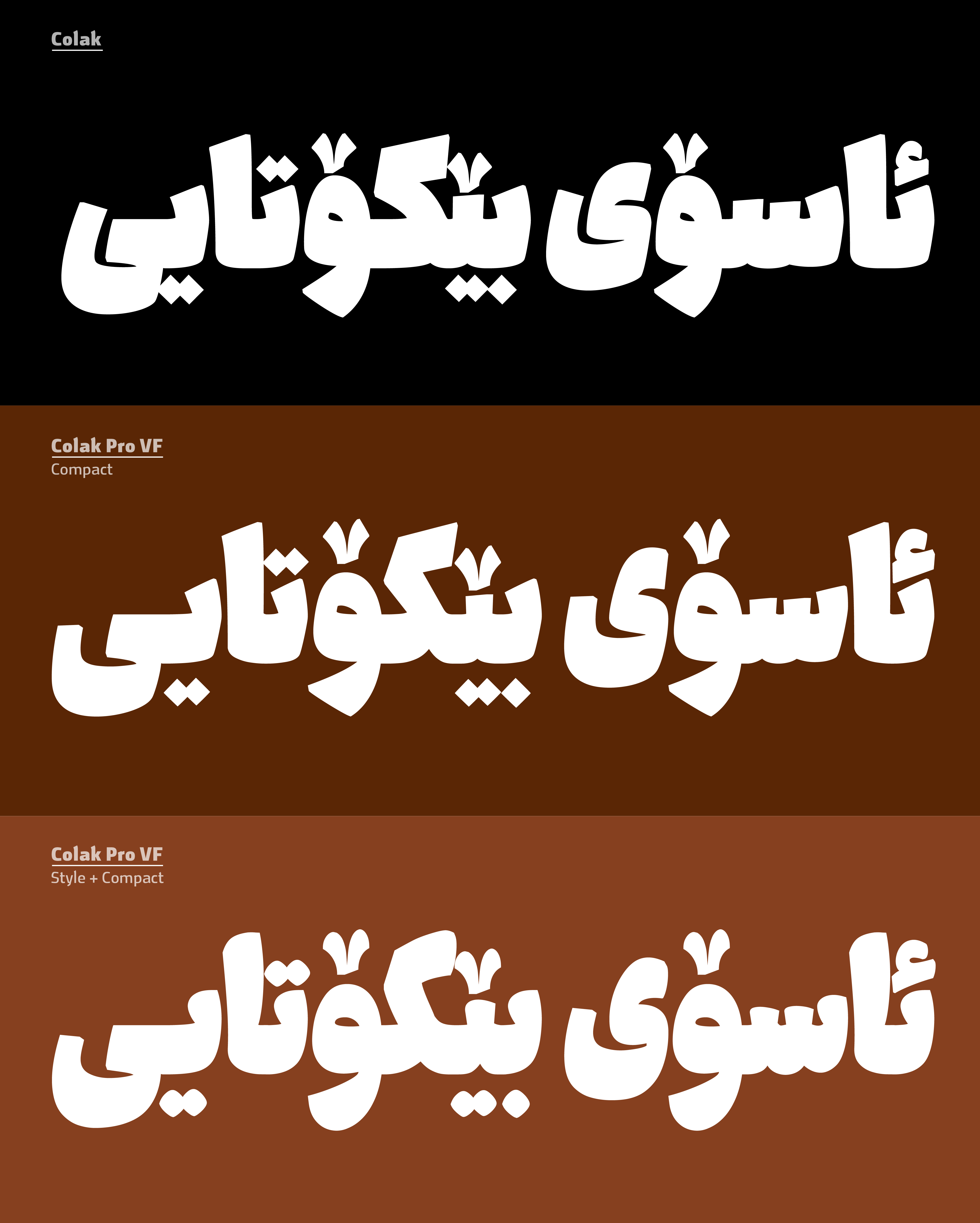
Colak and Colak Pro are display typefaces designed for headlines, branding, packaging, and short texts with strong visual impact.
Colak
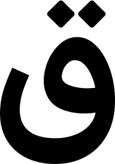
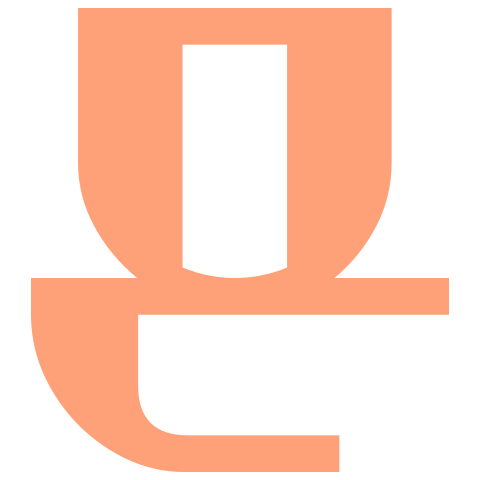
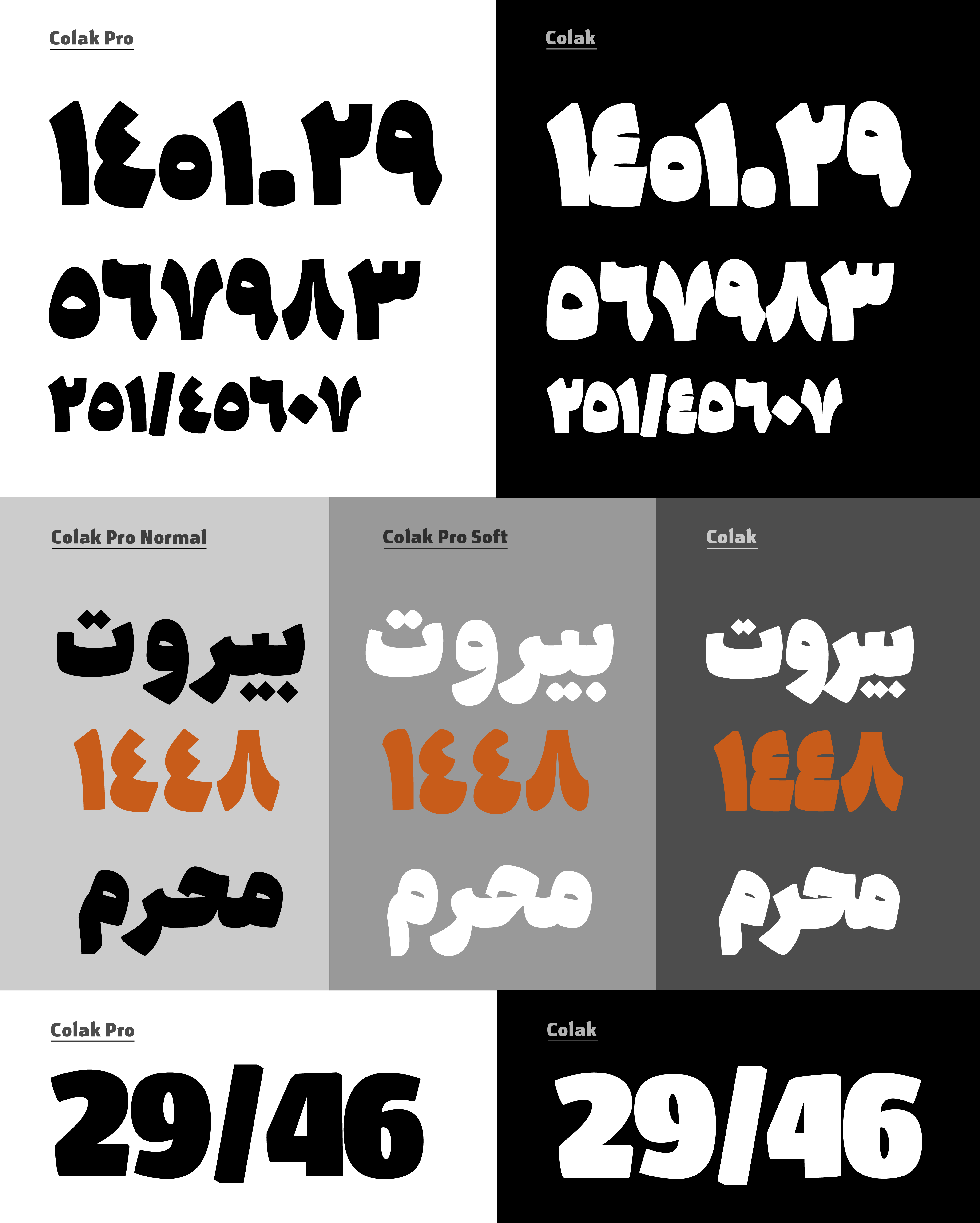
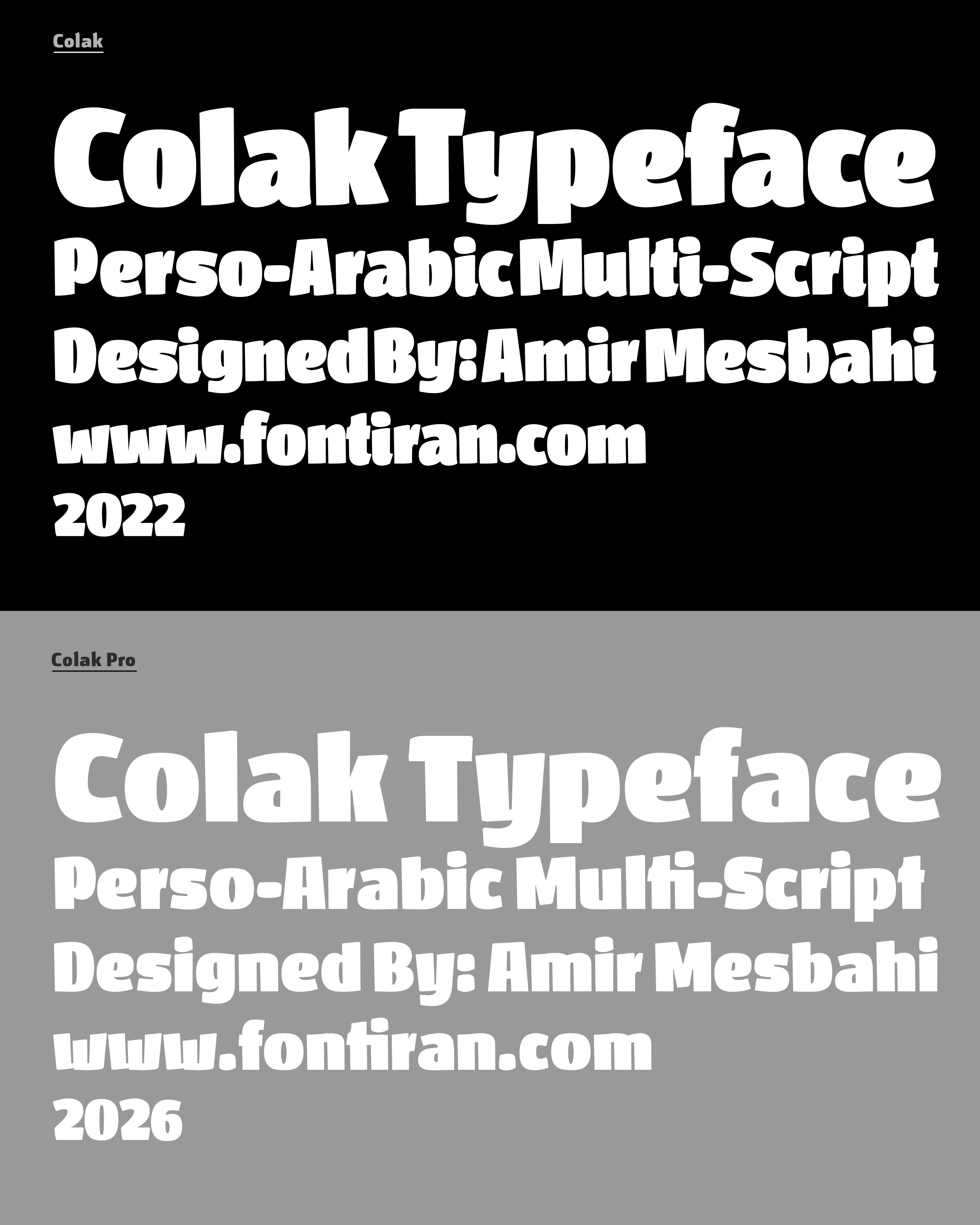
Released in 2022, Colak is built on the contrast between bold positive space and minimal negative space, creating a distinctive and powerful visual character.
Colak Pro
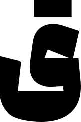
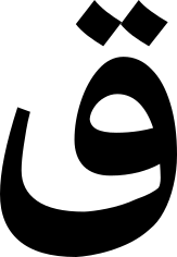
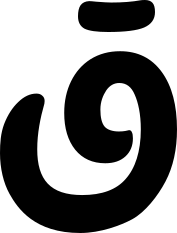
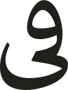
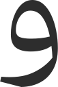
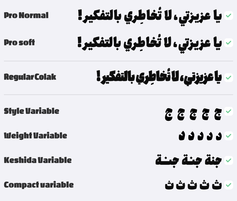
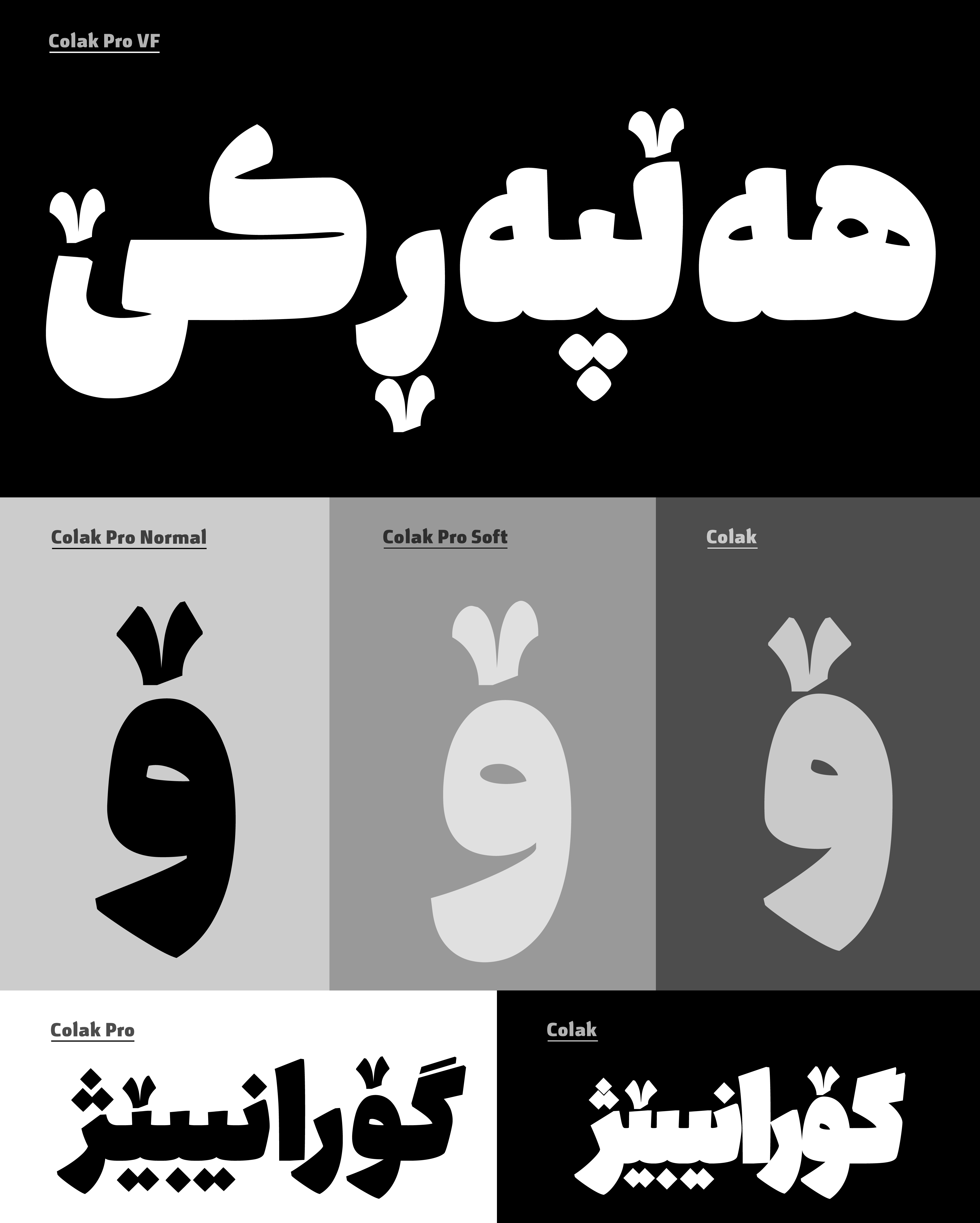
Colak Pro is an advanced evolution of the original Colak. As a variable font, it features four adjustable axes: Style, Weight, Keshida, and Compact, offering greater flexibility for a wide range of typographic expressions.
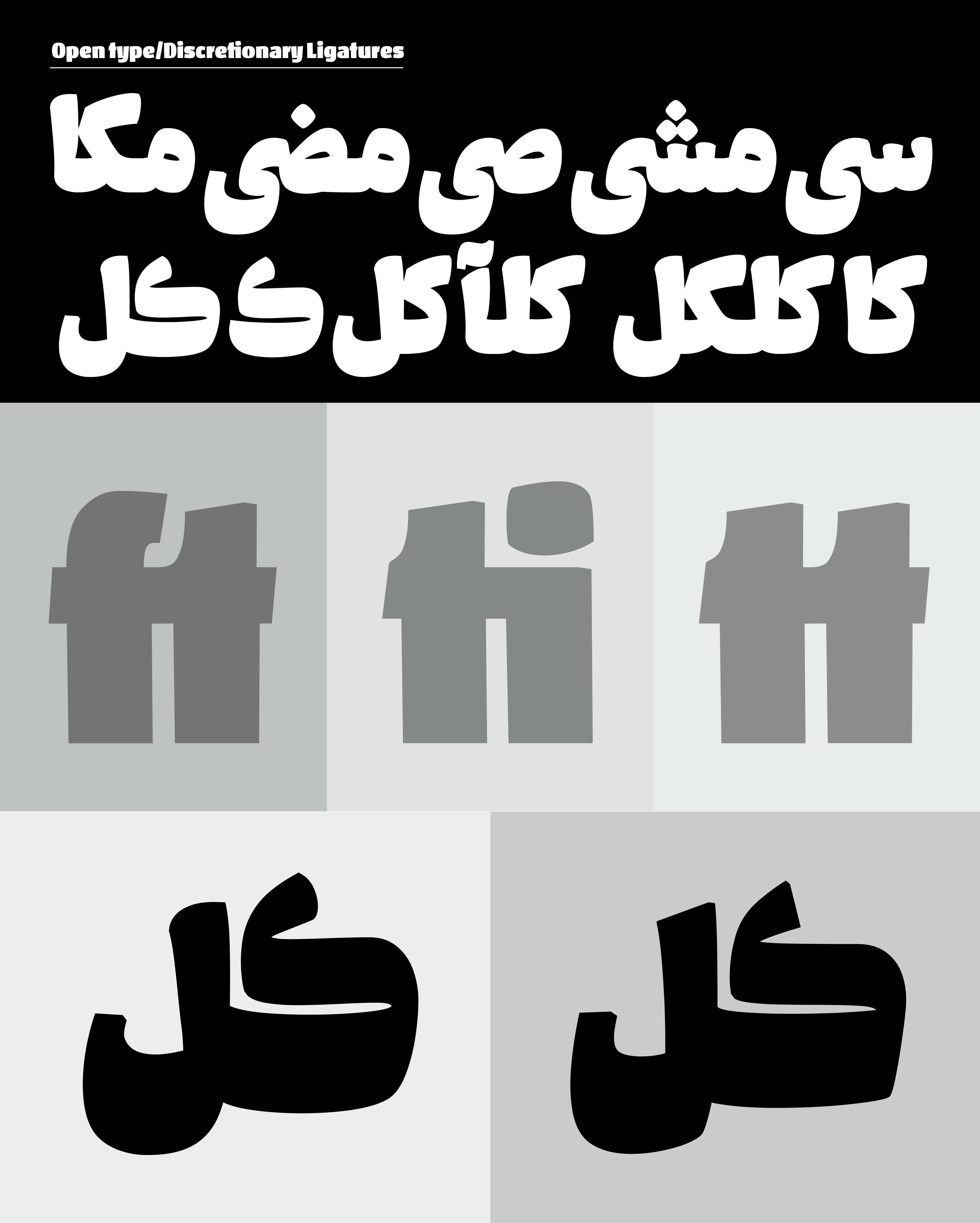
In addition, Colak Pro supports OpenType features, including ligatures and advanced typographic substitutions.
Why Colak Pro?
Rather than replacing Colak, Colak Pro expands the family with a more versatile system, providing greater creative freedom for modern multilingual typography.
The family supports Arabic, Persian, Kurdish, and Latin characters.
 Font Licensing
For an additional user to use the font.To share the font with your designer or project partner. (details)
For one website or app and to share the font with 2 additional project partners. (details)
For small businesses to share the font with 5 additional employees and use it on one website.(details)
For unlimited use by companies in all their activities. A website builder, website templates and services that allow users to type with the font. (details)
Colak Pro
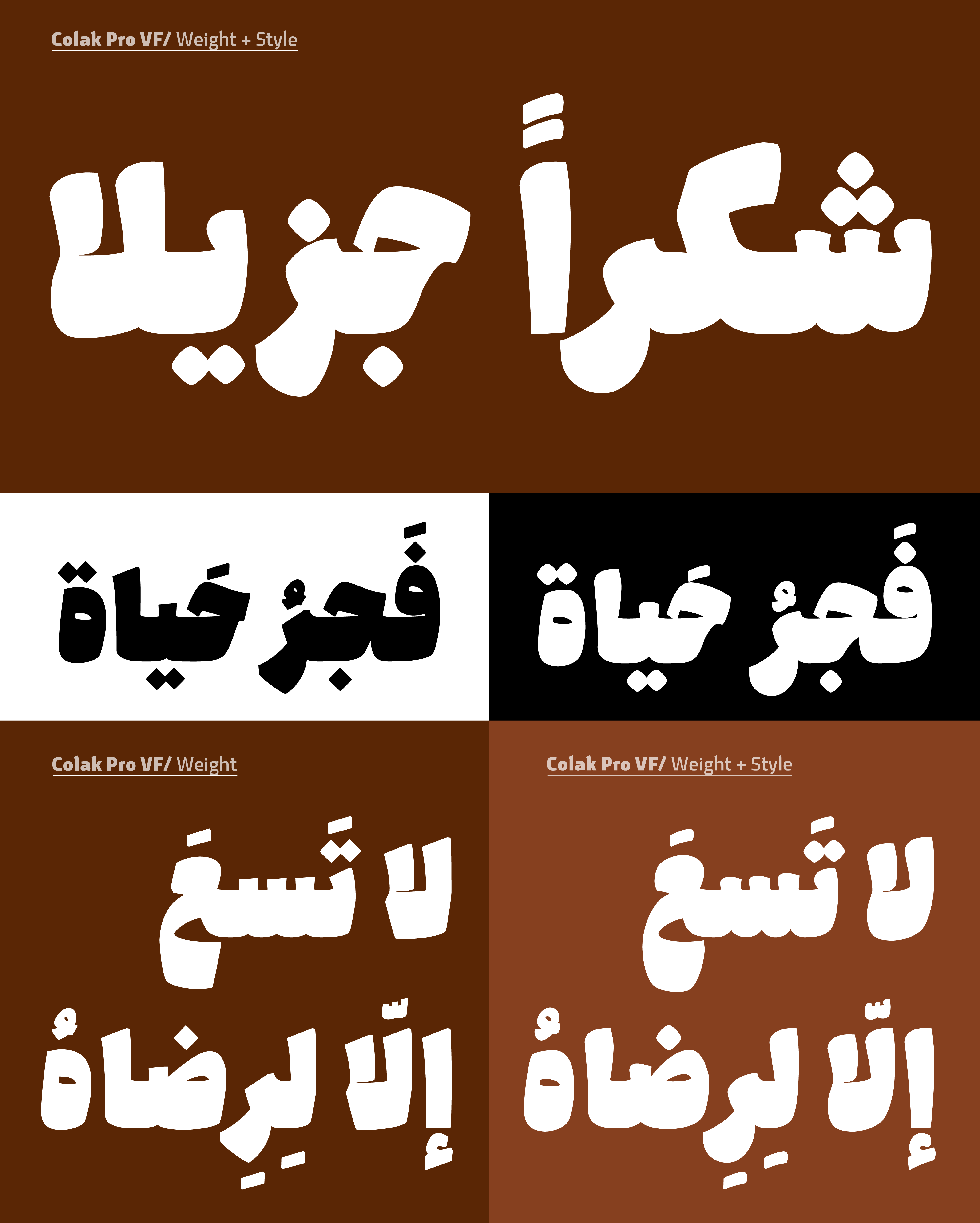
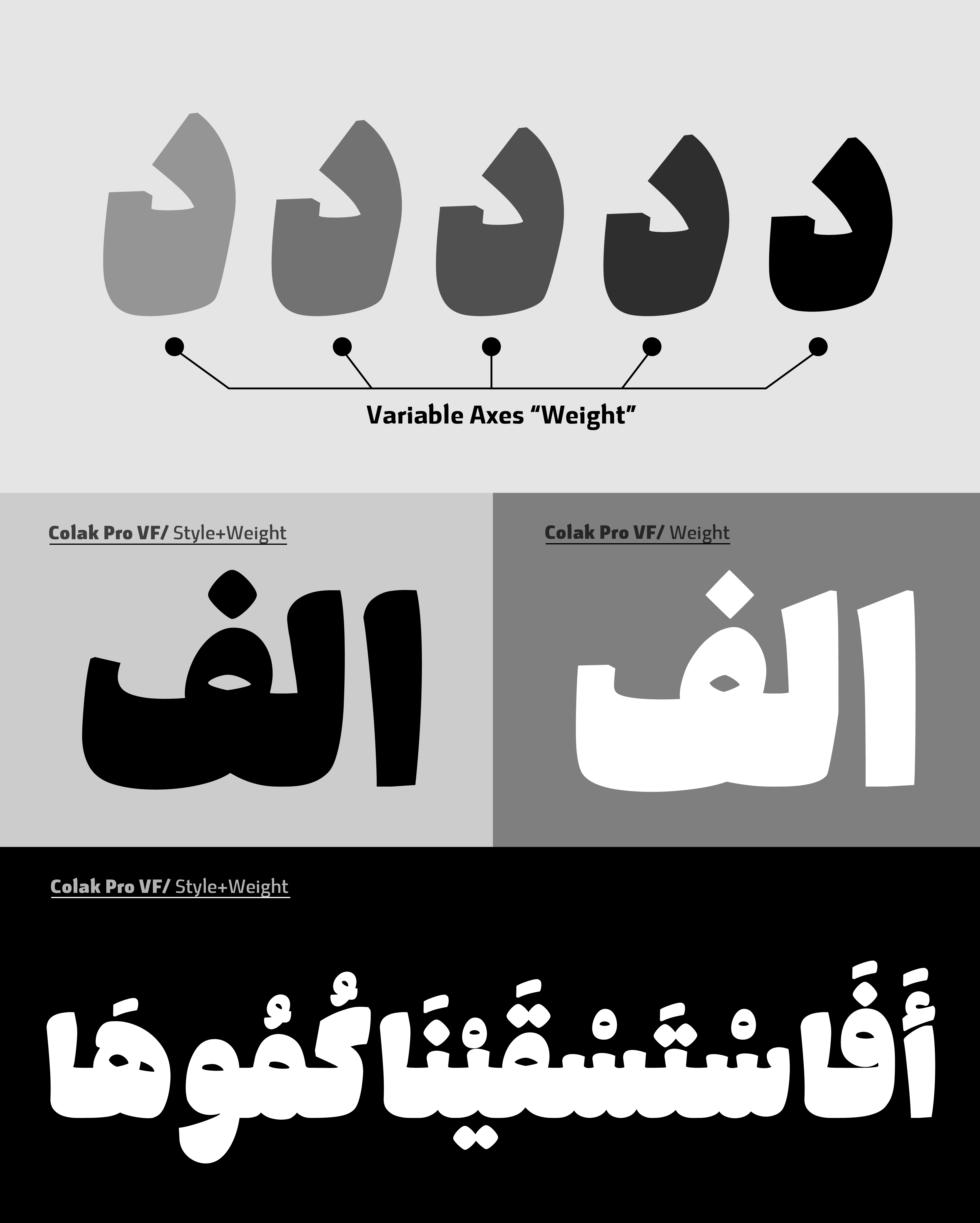
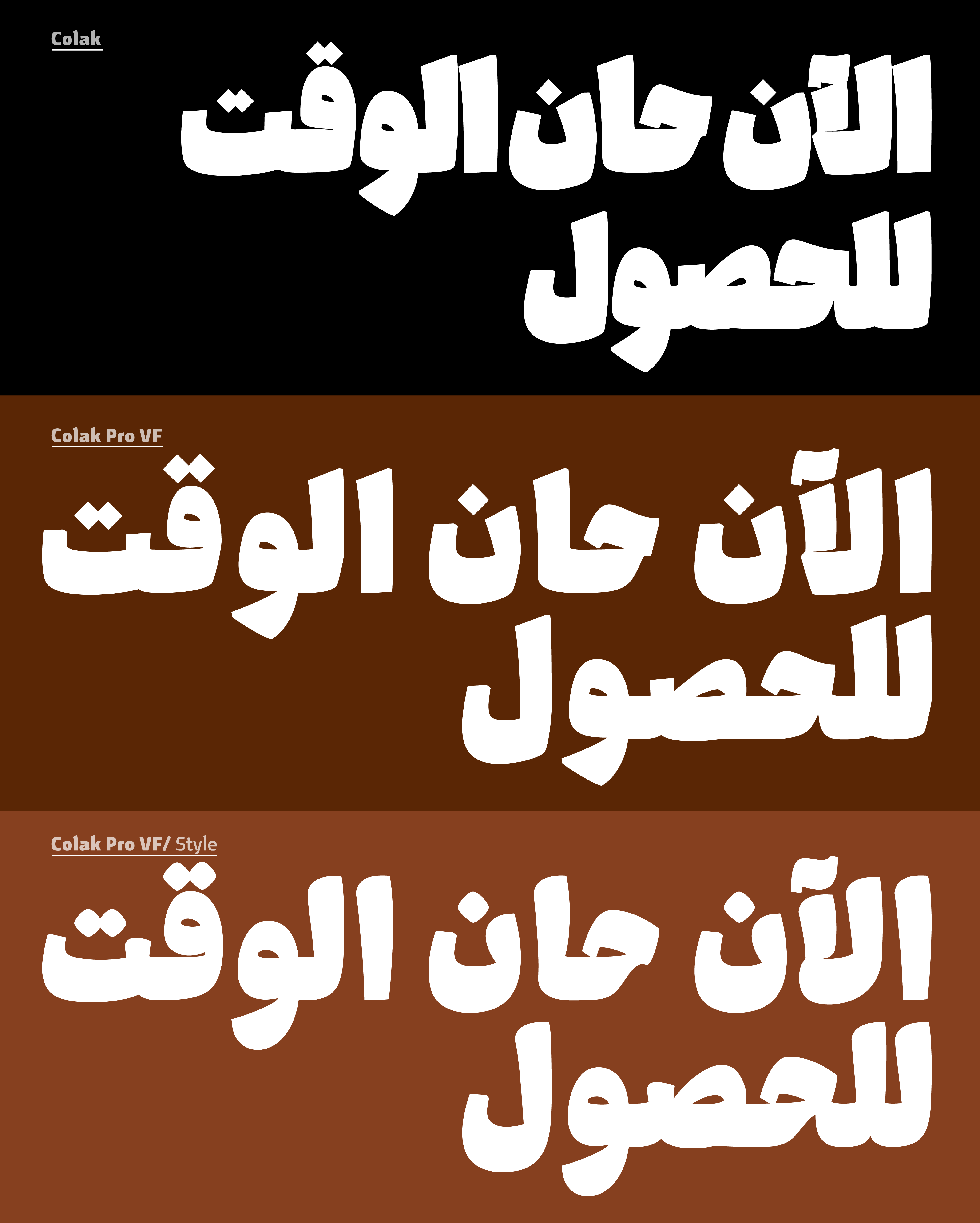
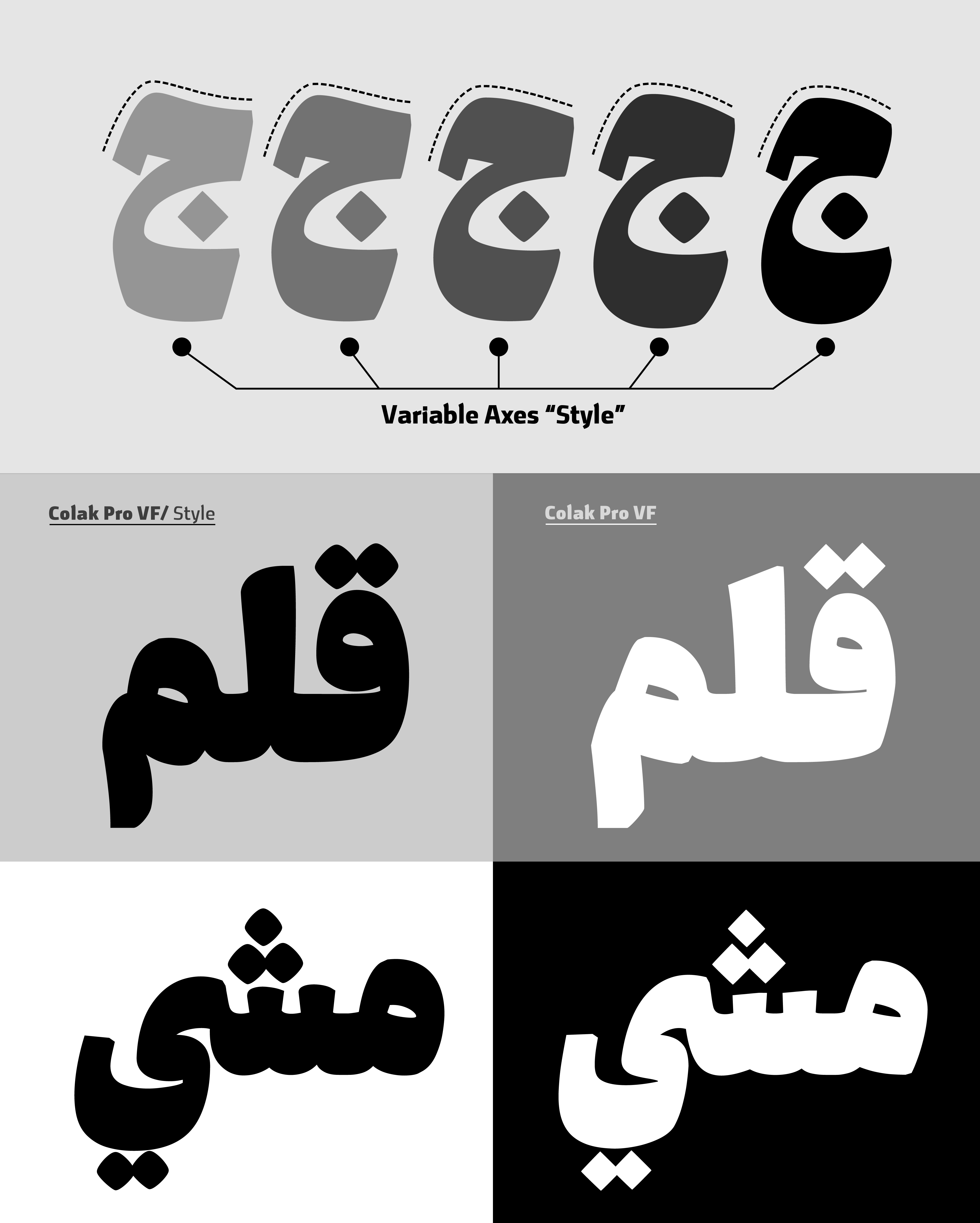

Style Axis
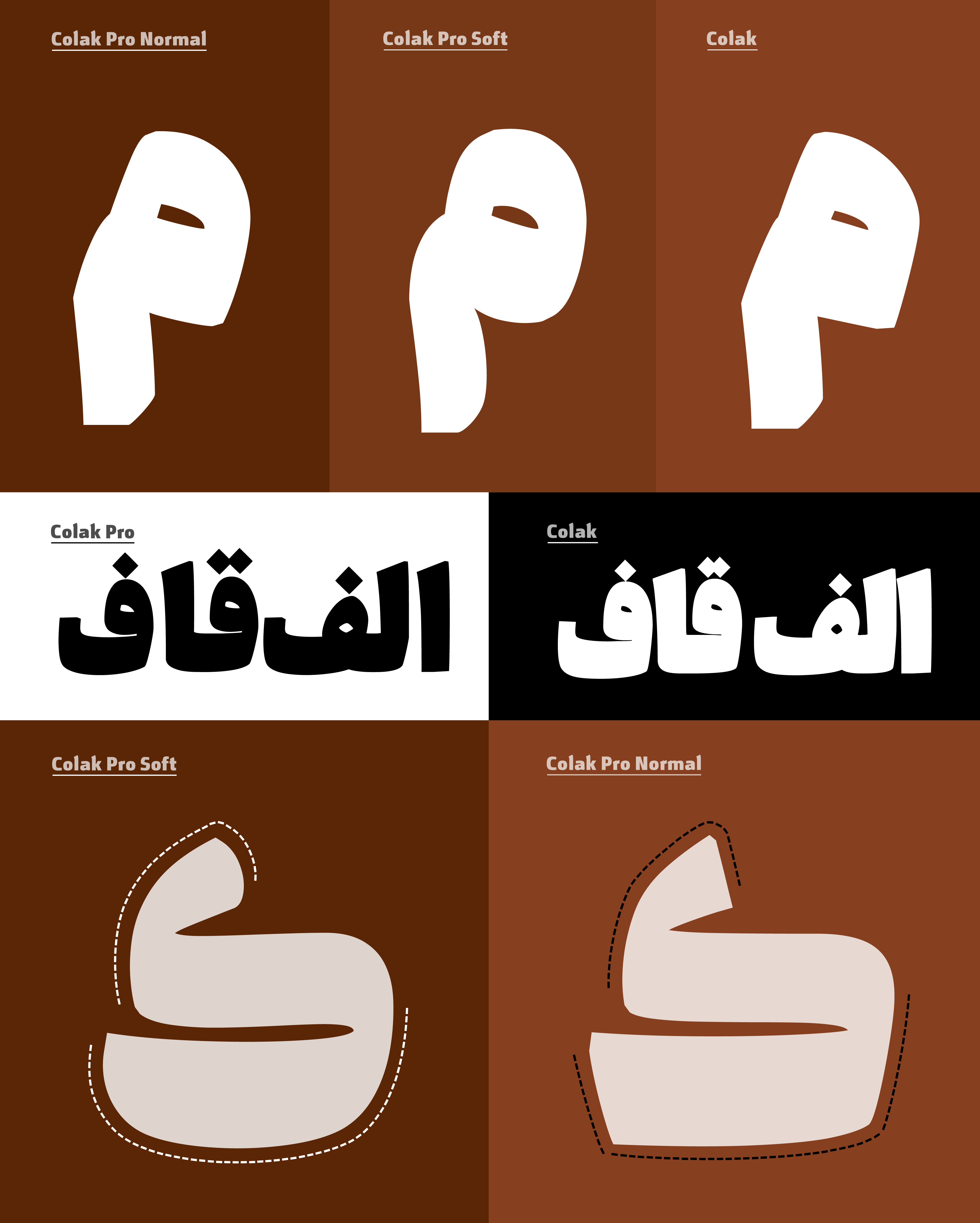
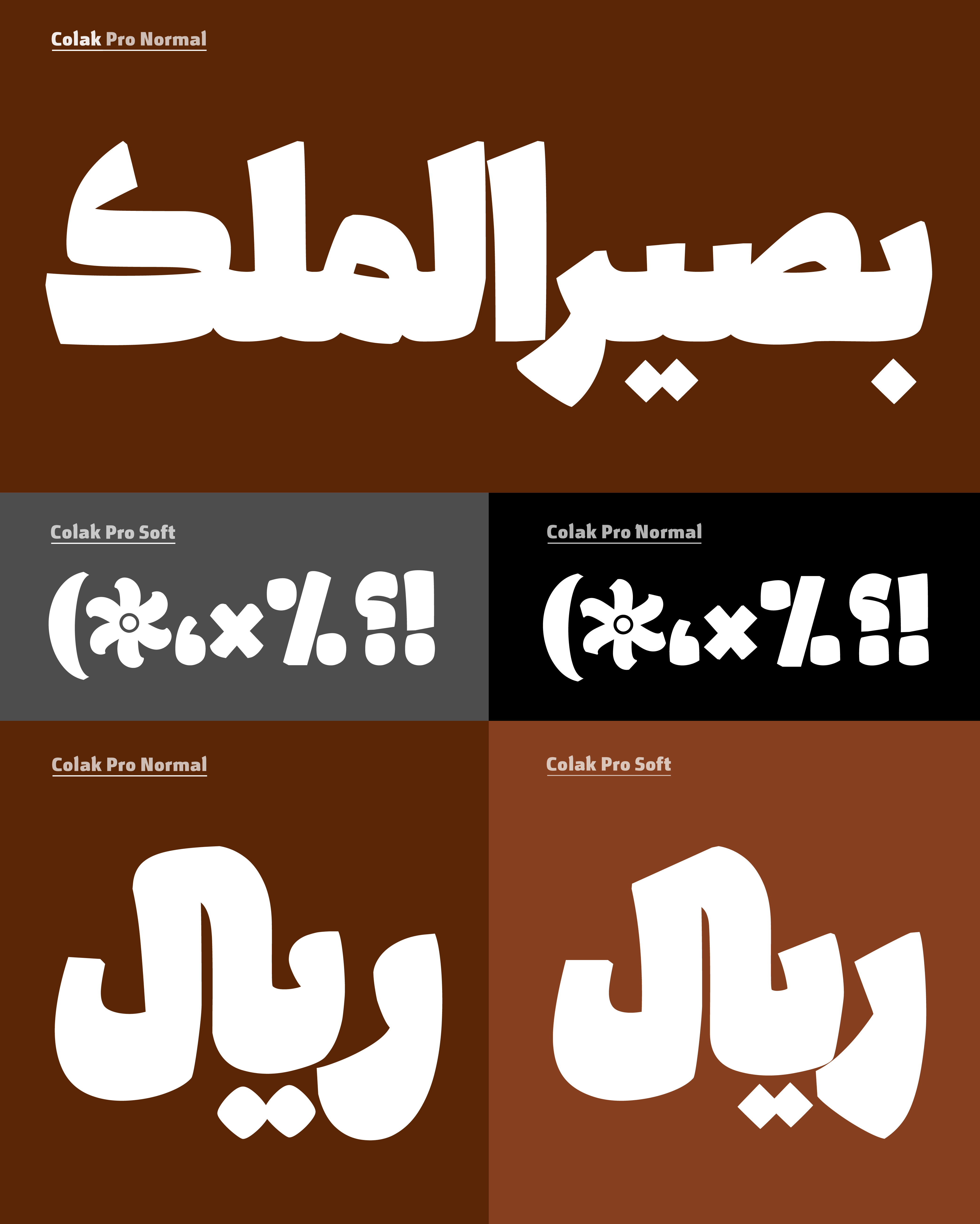
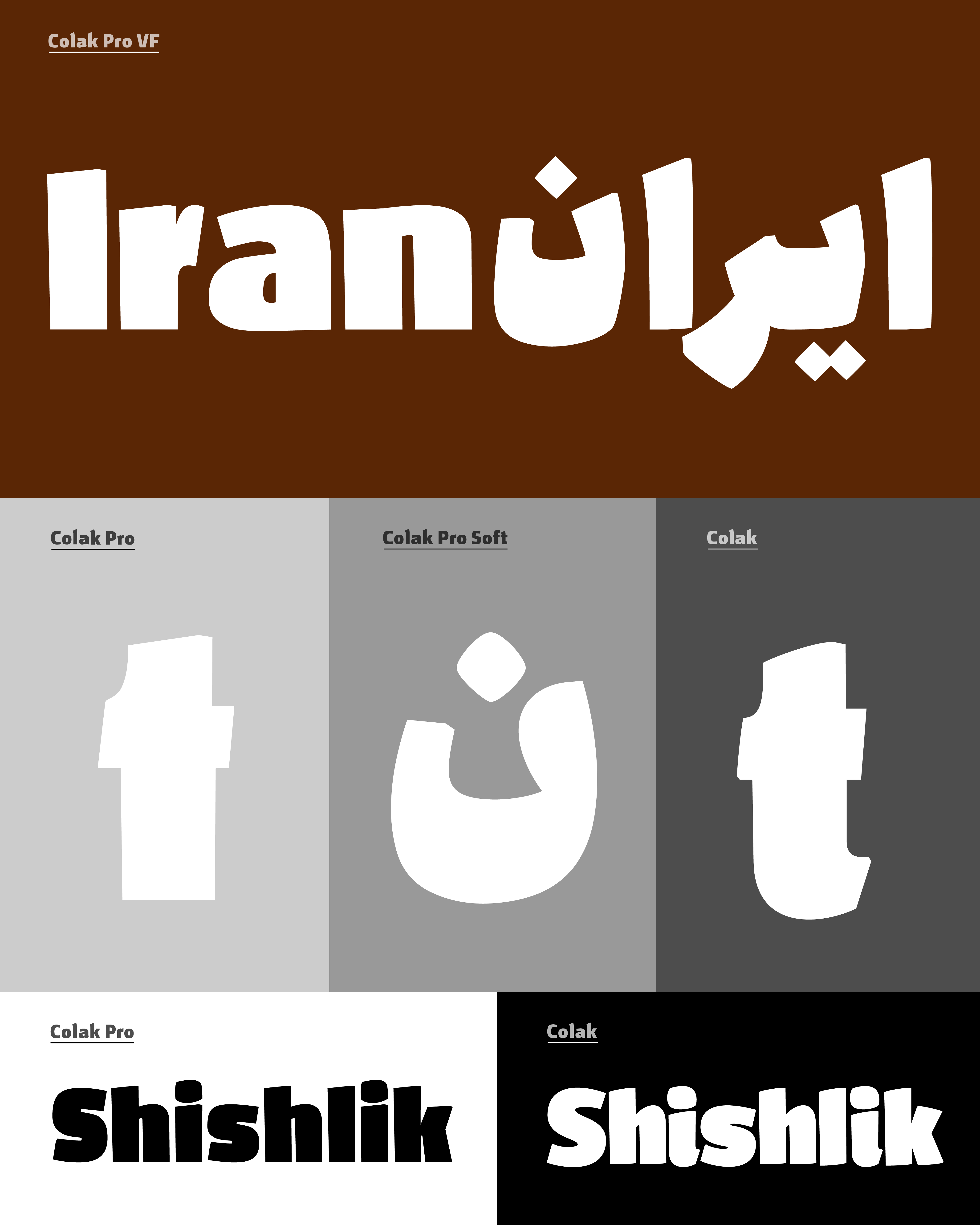
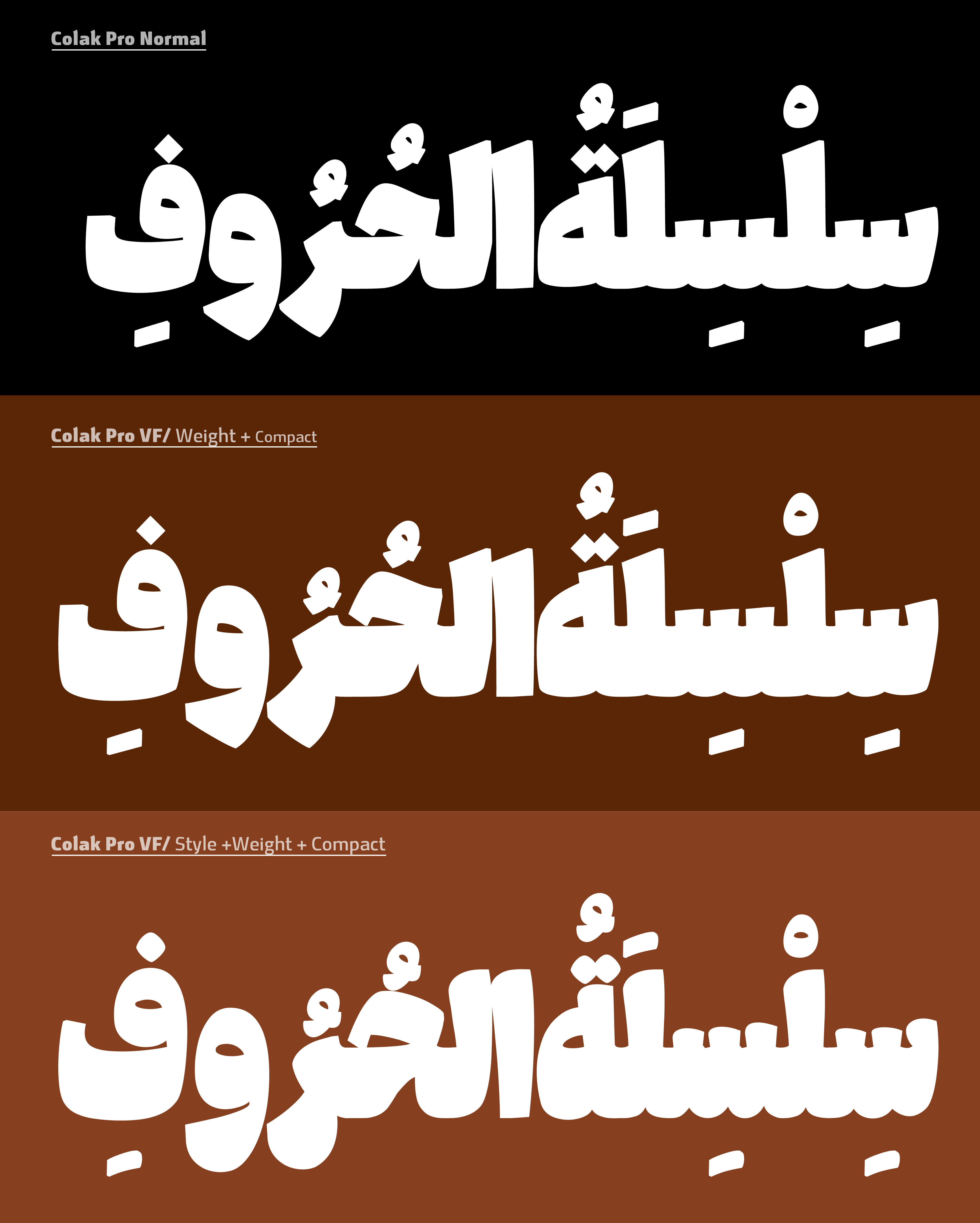
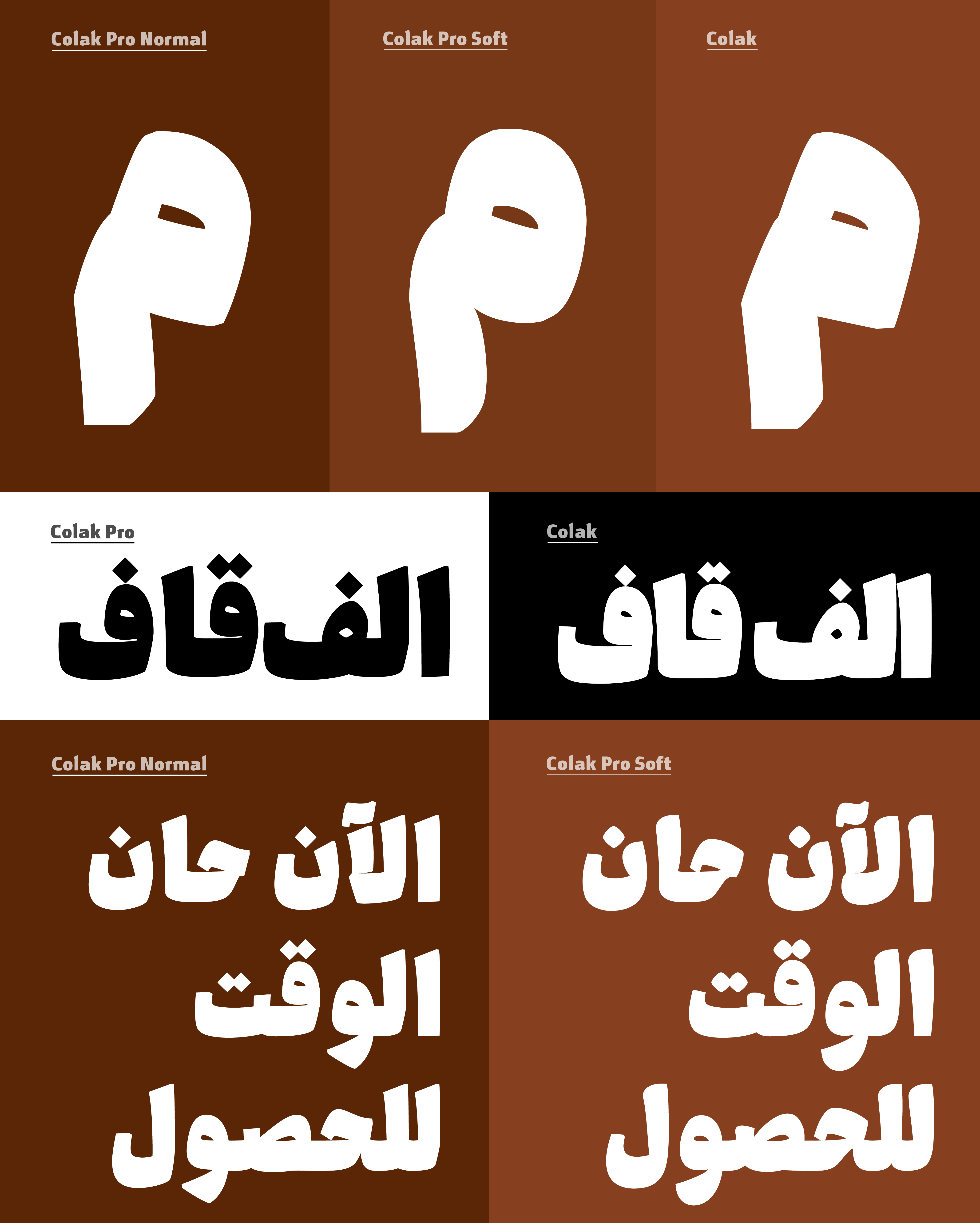
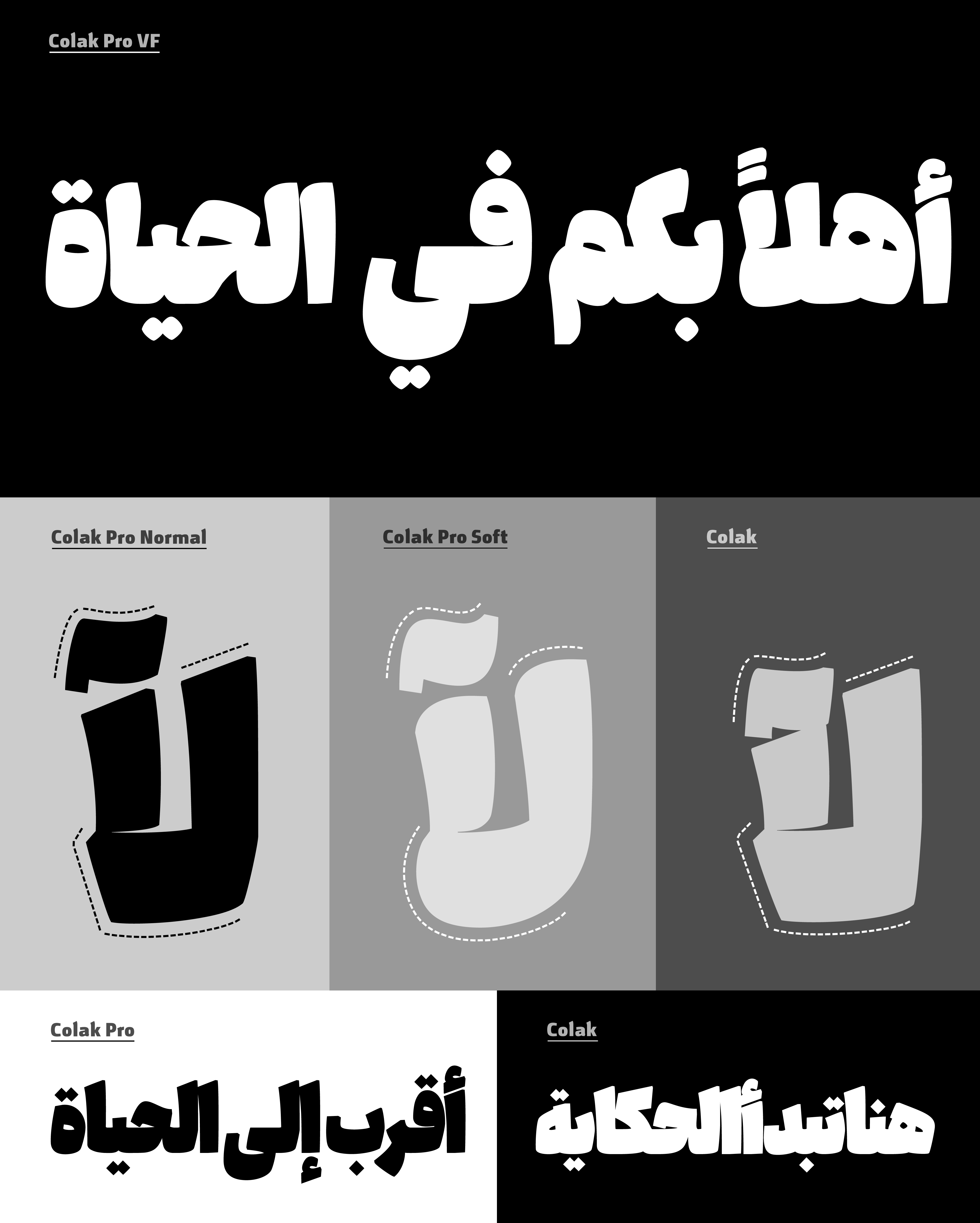
The Style axis allows a smooth transition between two distinct design styles within a single typeface—from a sharp, rigid appearance to a more fluid and friendly expression. It enables a wider range of visual tones, from formal and structured to warm and approachable.
Weight Axis
The Weight axis provides continuous control from heavy to ultra-heavy (Fat) styles, enhancing visual impact and allowing precise adjustment of typographic emphasis.
Keshida Axis
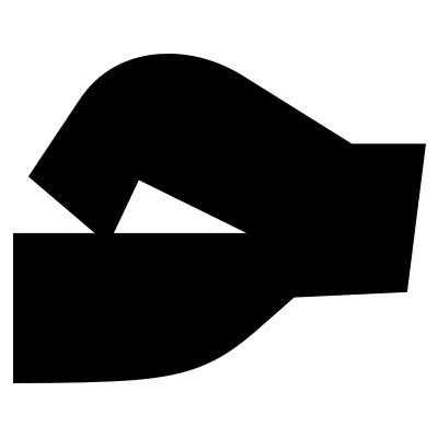
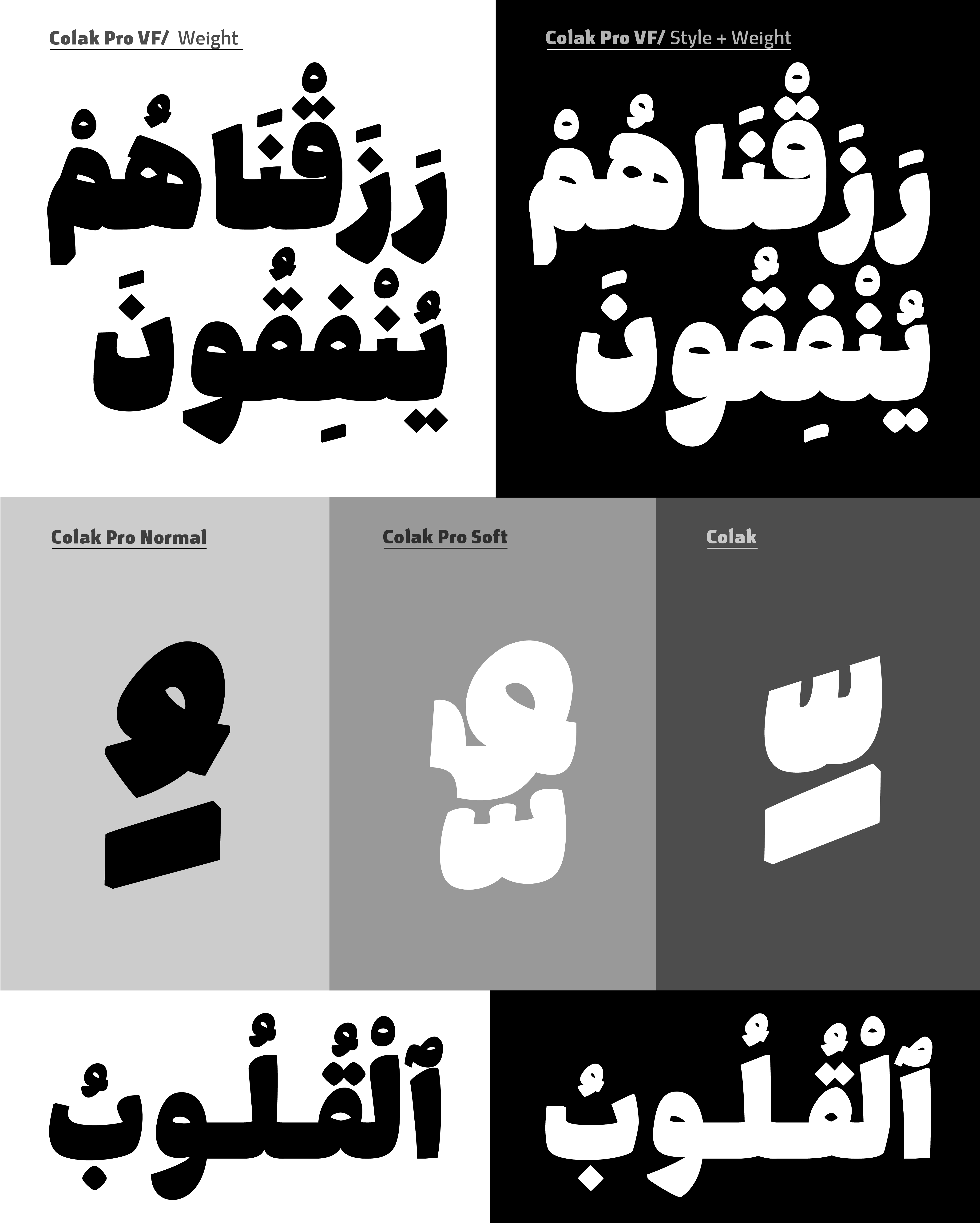
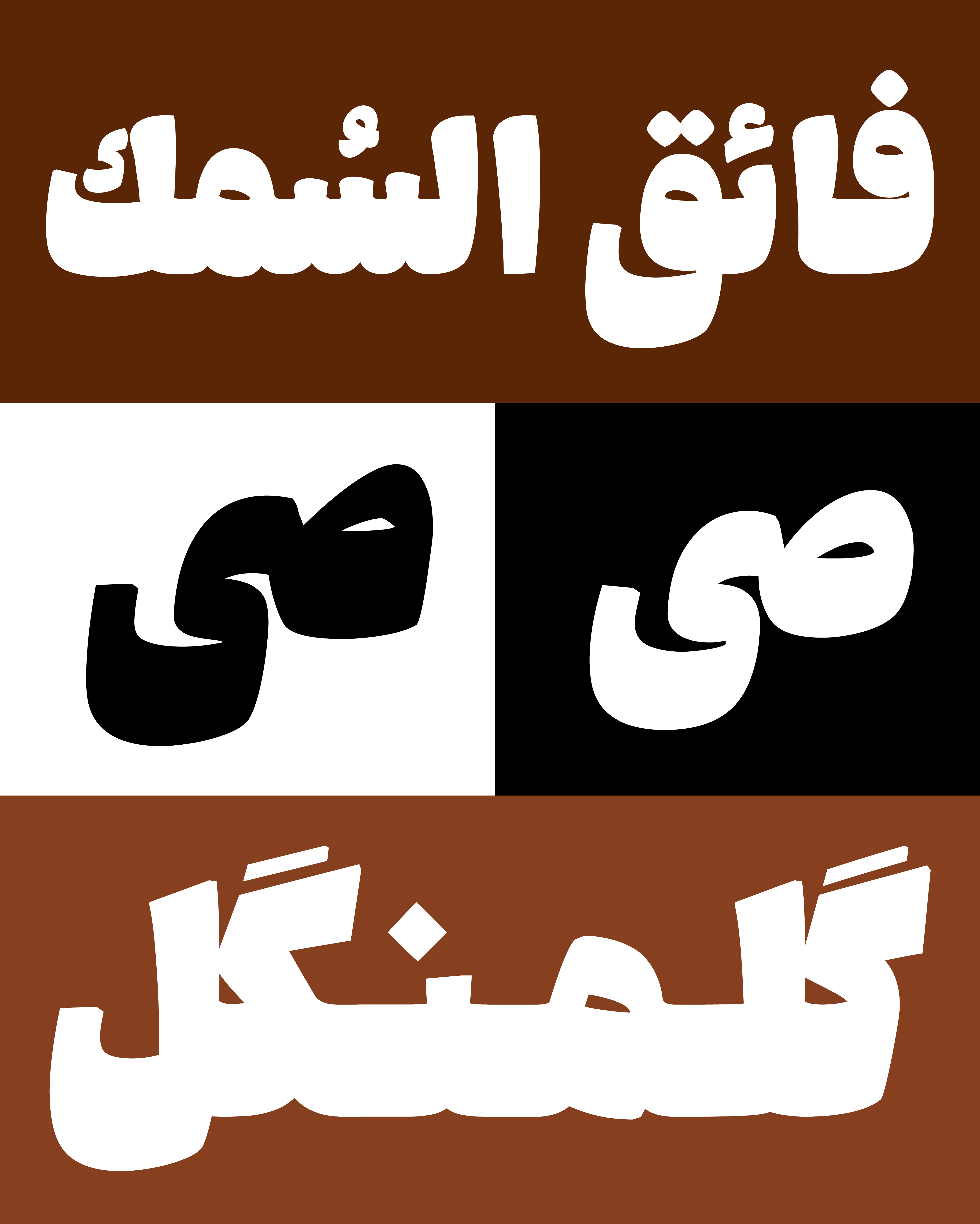
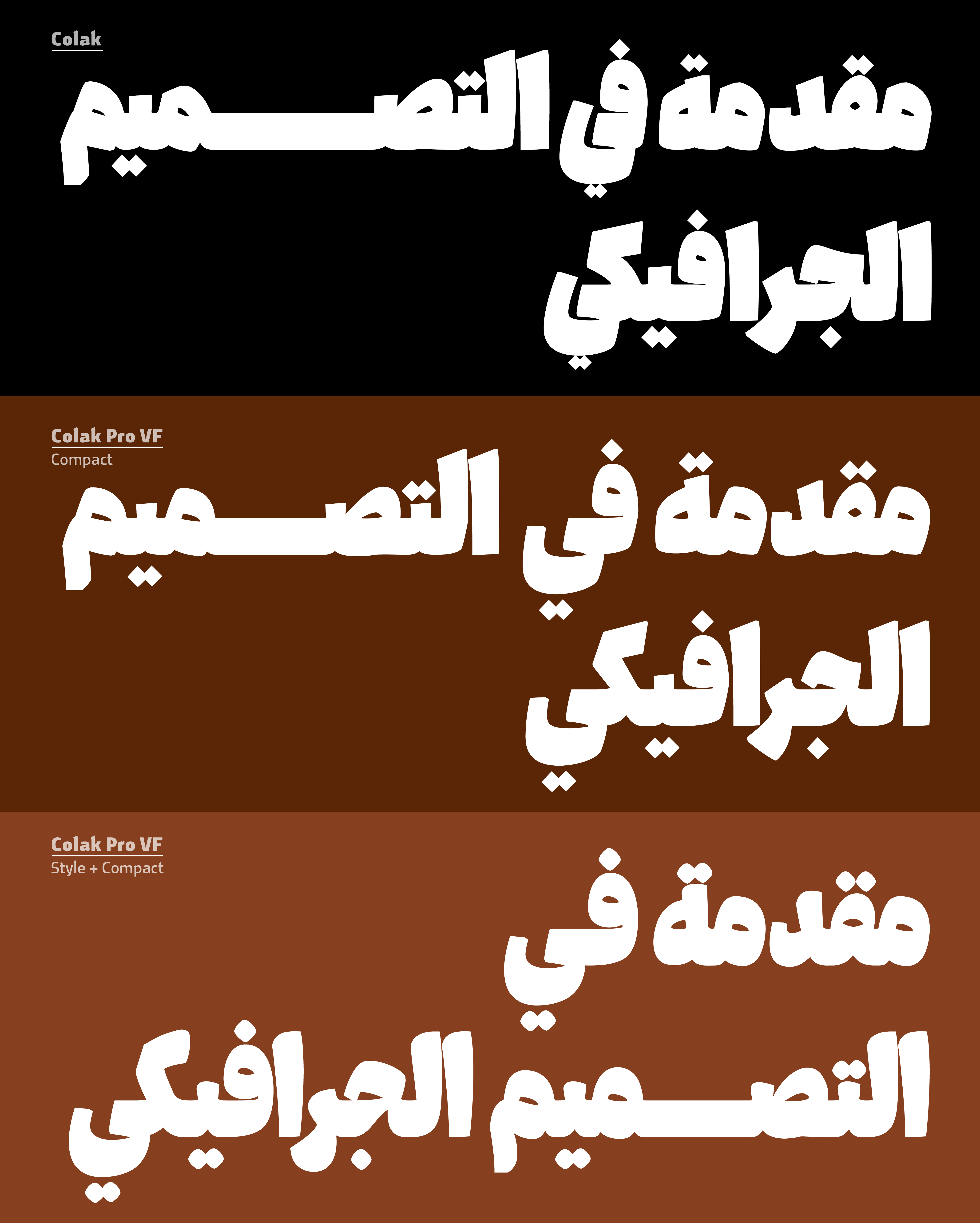
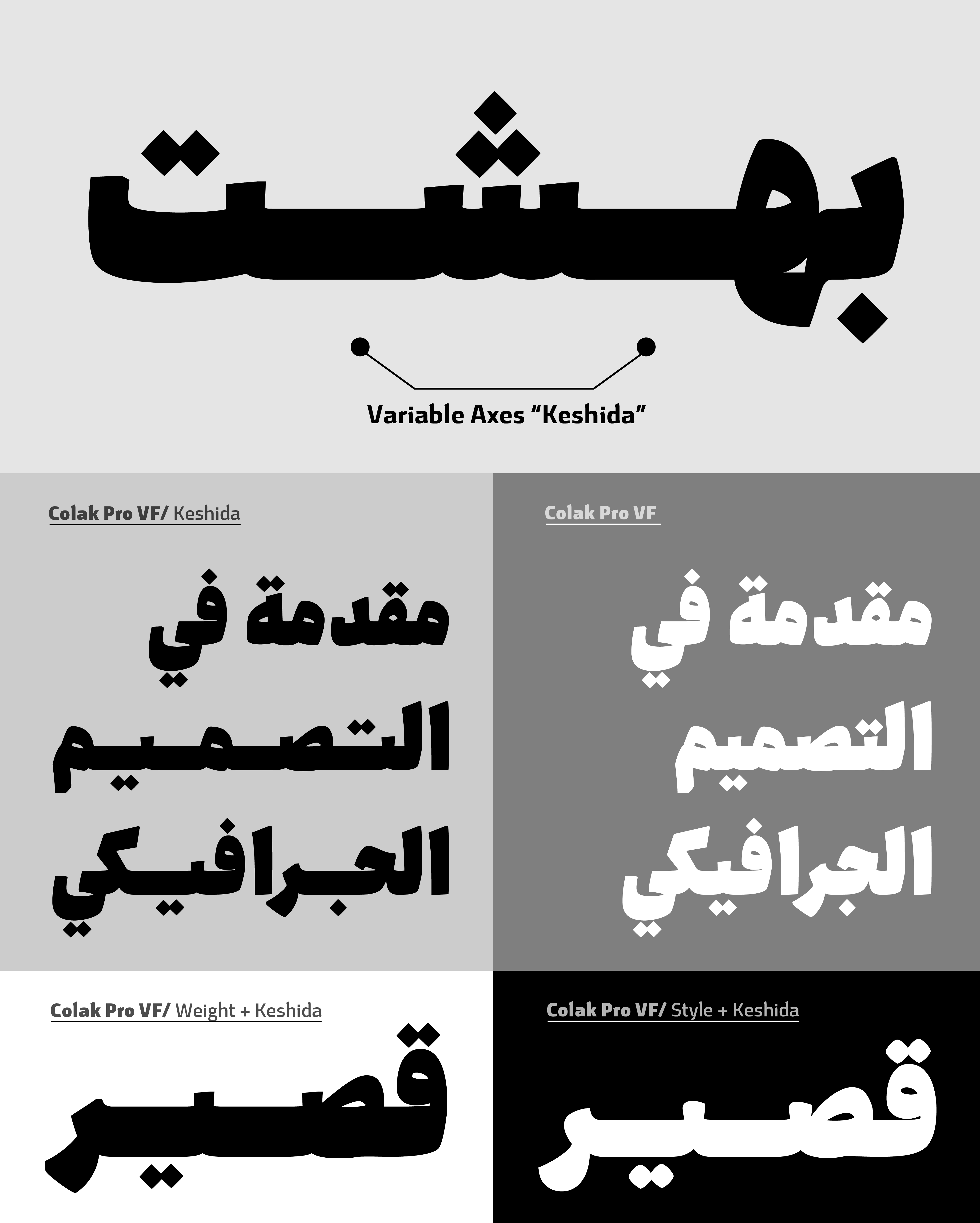
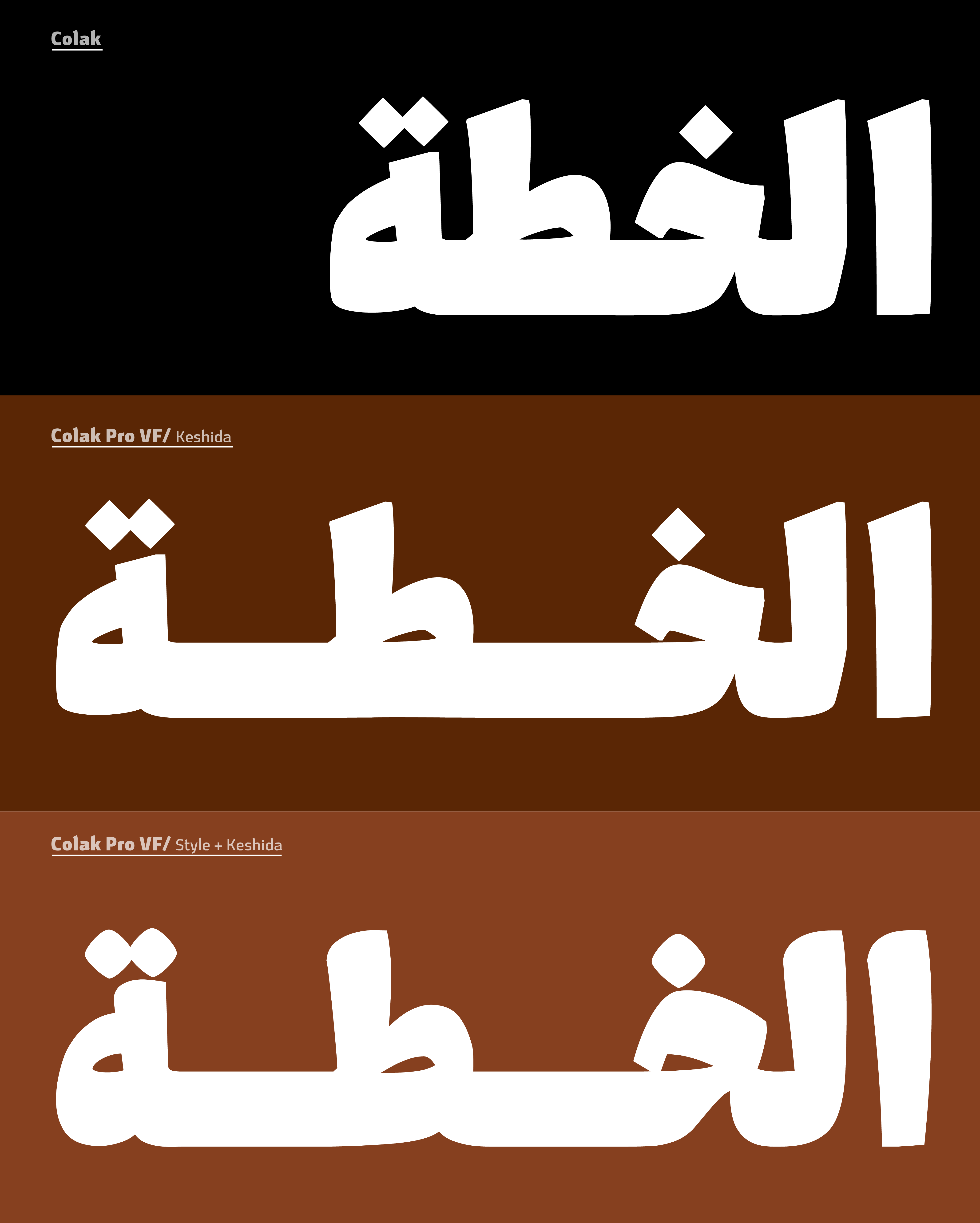
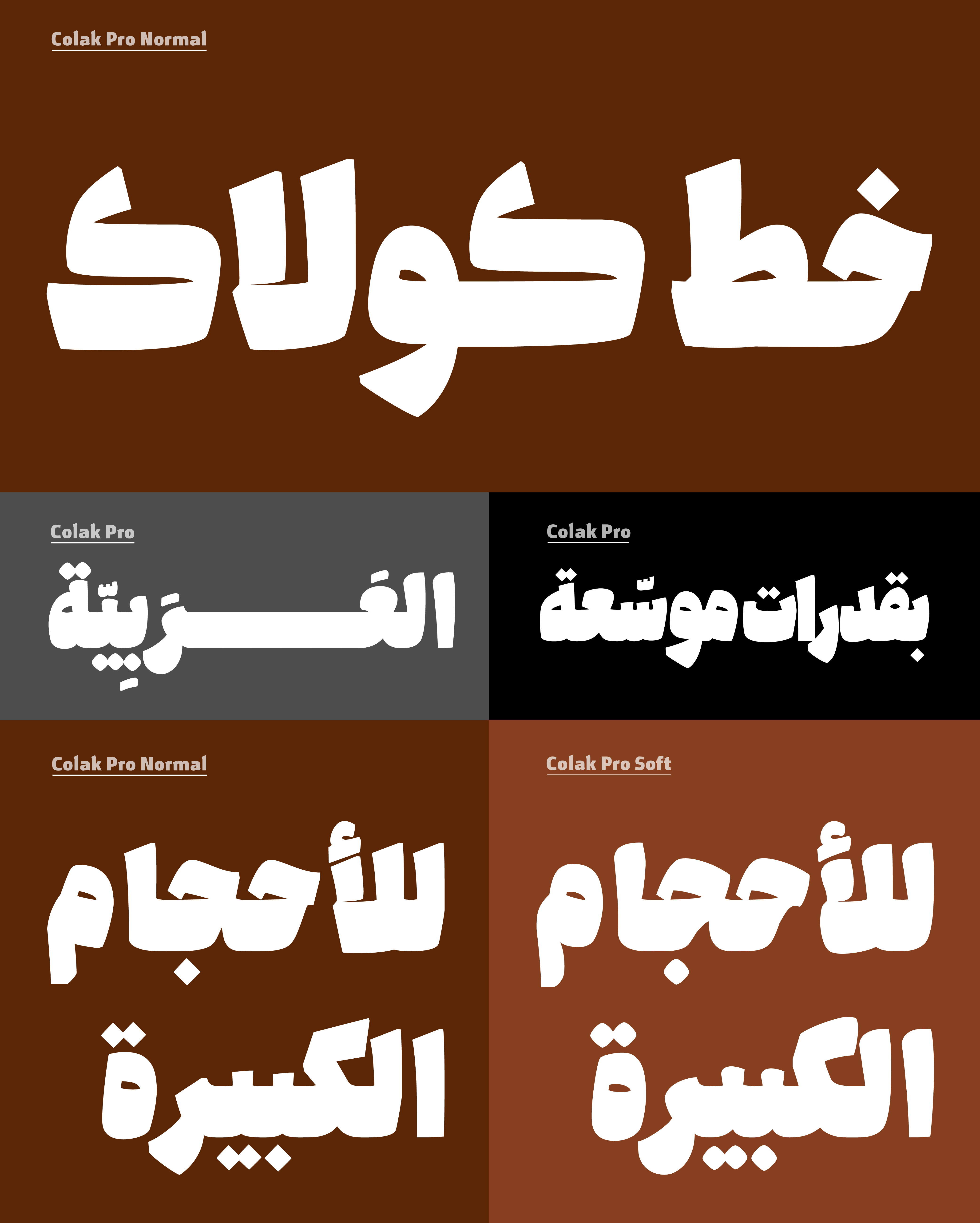
The Keshida axis controls the horizontal extension of connecting letters, creating emphasis and distinctive visual rhythms in headlines and display typography. It is applied to characters with dual-sided connections and extends from the left side of the glyph.
Compact Axis
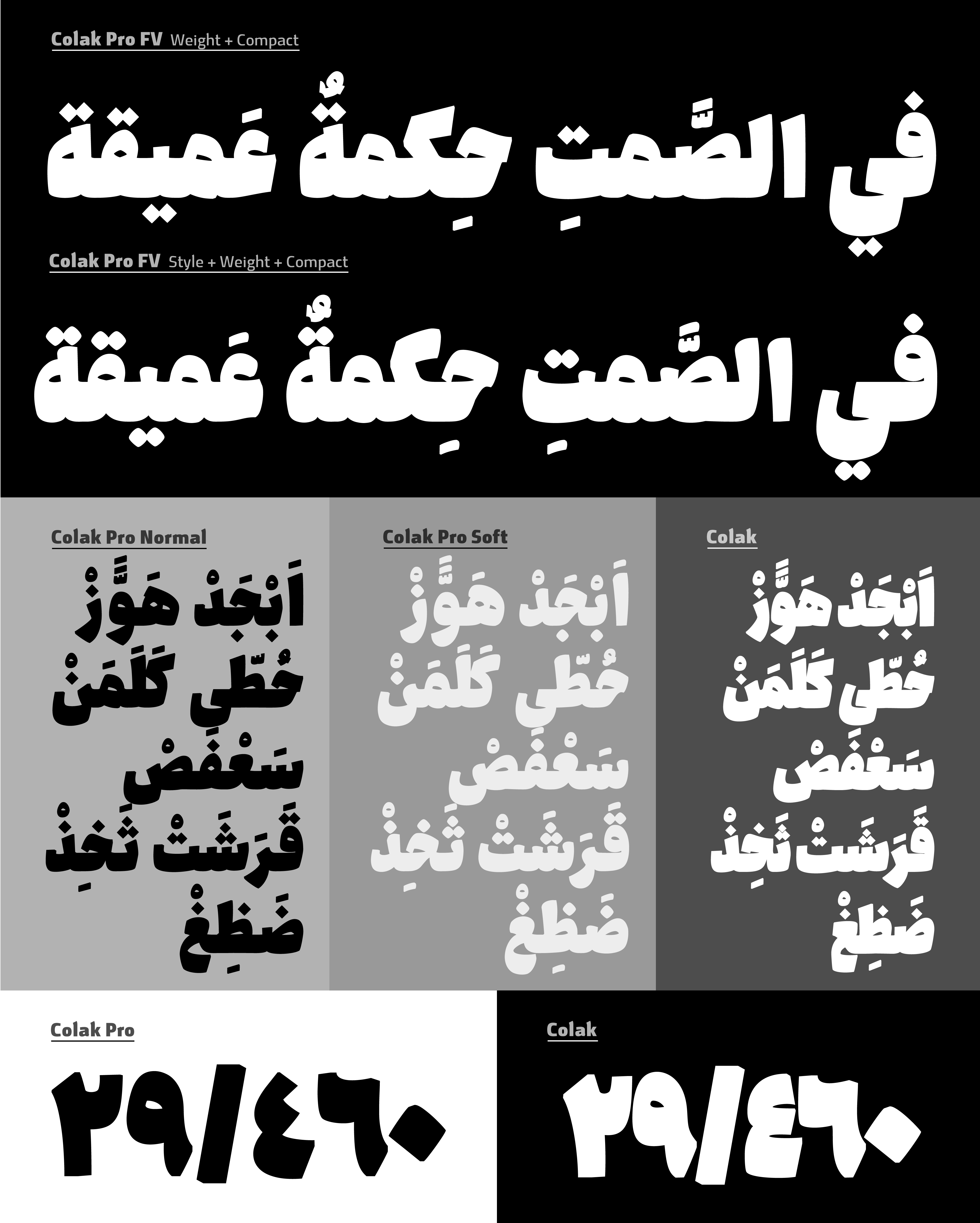
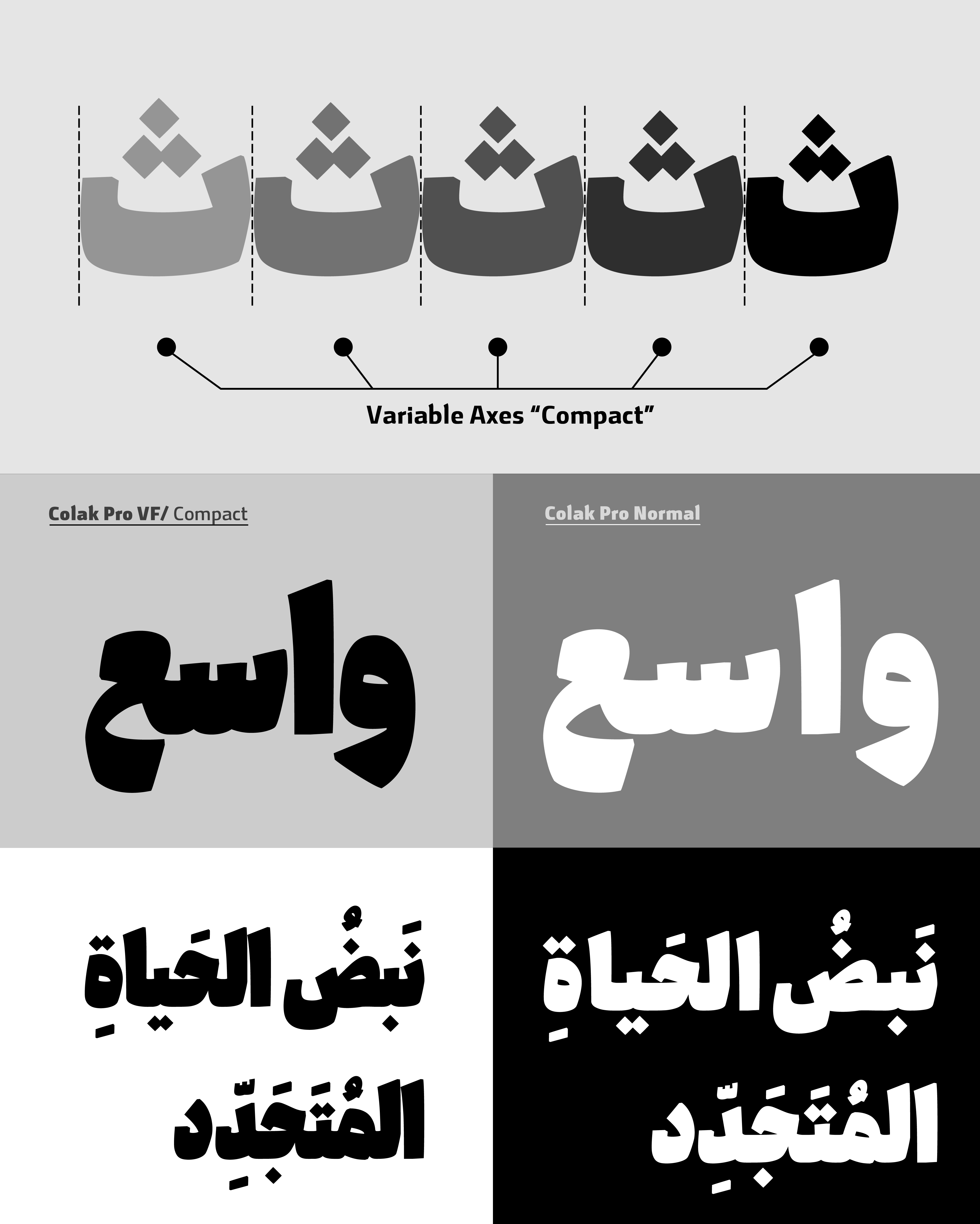
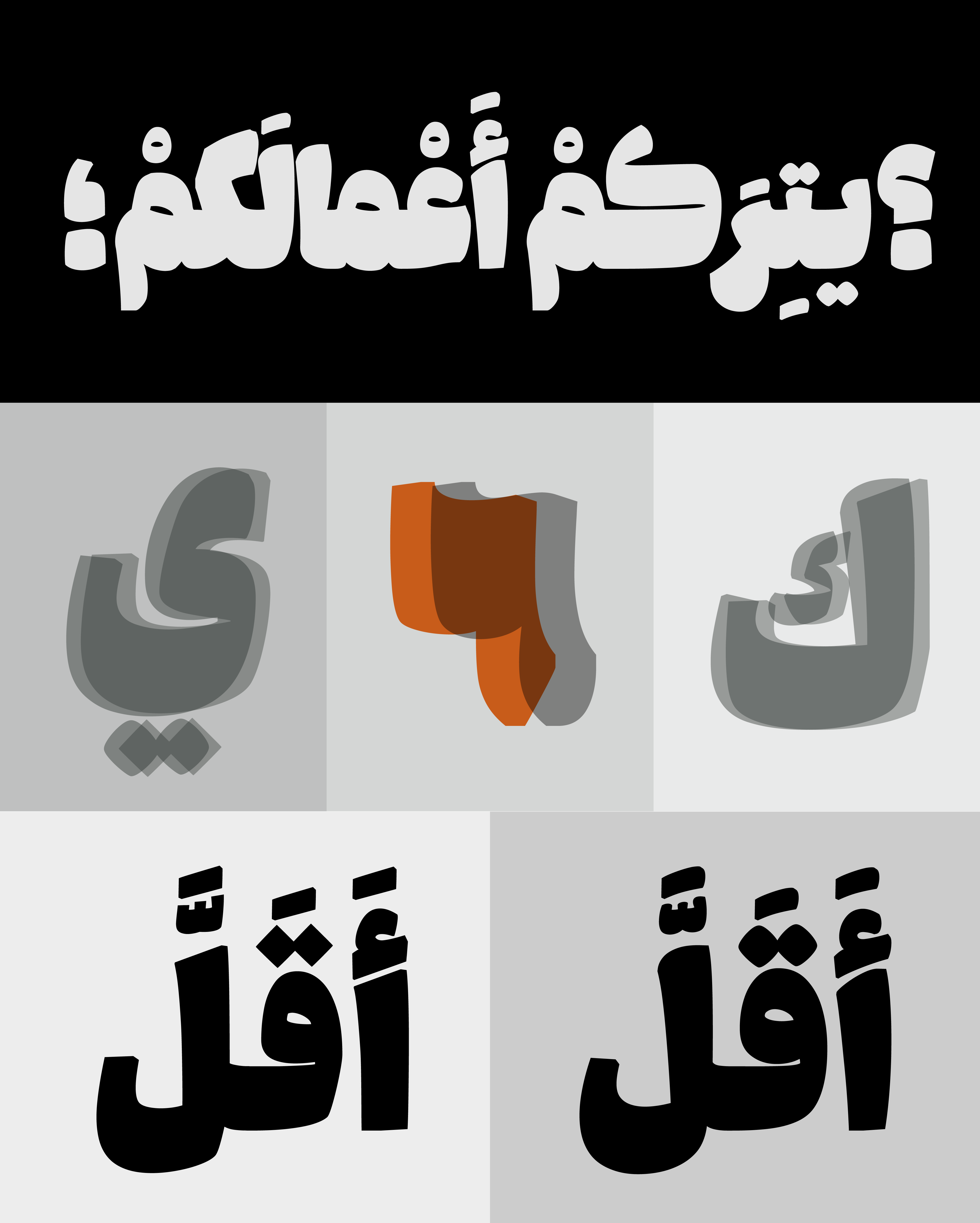
The Compact axis reduces negative space within and between characters, allowing more content to fit into less space while maintaining readability. Unlike a traditional condensed style, it primarily optimizes internal and inter-letter spacing, with only subtle width adjustments on selected glyphs
Language Support
Supports Arabic, Persian, Kurdish, and Latin, with a dedicated Latin character set designed to match the visual character of the Arabic script for bilingual and multilingual typography.
Colak Pro Features
Compared to the original Colak, Colak Pro works as a comprehensive toolkit for headline and display typography.
- Two distinct styles: Formal and Fantasy
- Four variable axes: Style, Weight, Keshida, and Compact
- An ultra-heavy Fat weight, fully adjustable through the variable system
- Support for OpenType features, including ligatures and alternate glyphs
By combining these features and variable parameters, Colak Pro offers exceptional flexibility, allowing designers to create a wide range of typographic expressions and fine-tune the typeface to the specific needs of each project.
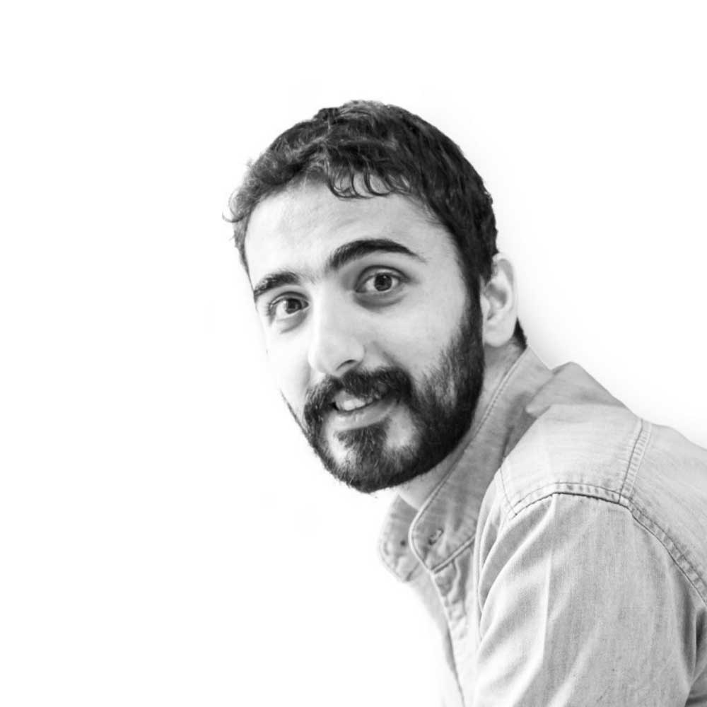


My journey in type design and typography goes beyond a mere fascination with the artistic form. It is driven by a profound exploration of how these shapes interact with essential human activities such as reading and information processing. I believe that the right typography can enhance the communication experience, making it more accessible, engaging, and meaningful. Throughout my career, I have honed my skills in crafting beautiful and functional typefaces that capture the essence of the Arabic script. I am proficient in utilizing cutting-edge design software and techniques to create visually striking and technically precise type designs. Collaboration is at the heart of my creative process. I enjoy working closely with clients, fellow designers, and experts in the field to understand their unique requirements and deliver tailored solutions that exceed expectations. Whether it’s designing custom typefaces for branding projects or creating legible and harmonious fonts for publications, I am committed to delivering exceptional results that align with the vision and purpose of each project. As a lifelong learner, I stay updated with the latest trends, research, and advancements in the field of typography. I actively participate in workshops, conferences, and online communities to expand my knowledge and skills, ensuring that my work reflects the highest standards of quality and innovation. Academic Education: -Master of visual art in graphic design, reading type & typography. PXL-Mad university of college arts & media, Hasselt, Belgium, 2021-2023. -Master of science in visual communication. Azad university science, research and technology branch, Tehran, Iran, 2019. -Bachelor of visual communication. Enghelab technical college, Tehran, Iran, 2014. -Associate degree in graphic design. Enghelab technical college, Tehran, Iran, 2010. -Diploma in graphic design. Hamedan technical highschool of fine arts, Iran, 2006.





















Comments
Recommended Posts
Meeting with Karim Shahin, Designer of the Narengi Typeface
Nostalgic Arabic Fonts: Reviving the Beauty of the Past
Top Arabic Fonts for Ramadan and Eid Design
Arabic Fonts for Books & Magazines: From Print to Digital
Techno Typeface; A Look at the Design Process and Logic
What features does an ideal subtitle font have?
Selected Fonts of 2025 in the TDC Competition
13th GRANSHAN Type Design Competition