


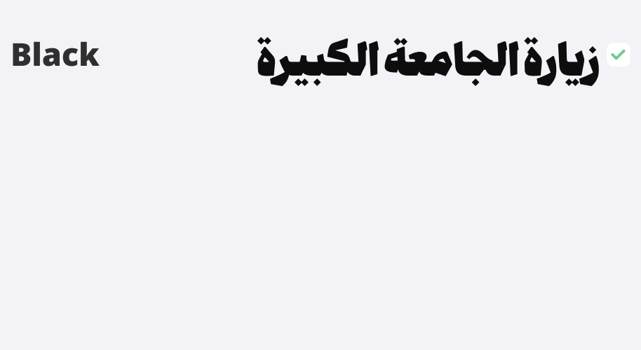
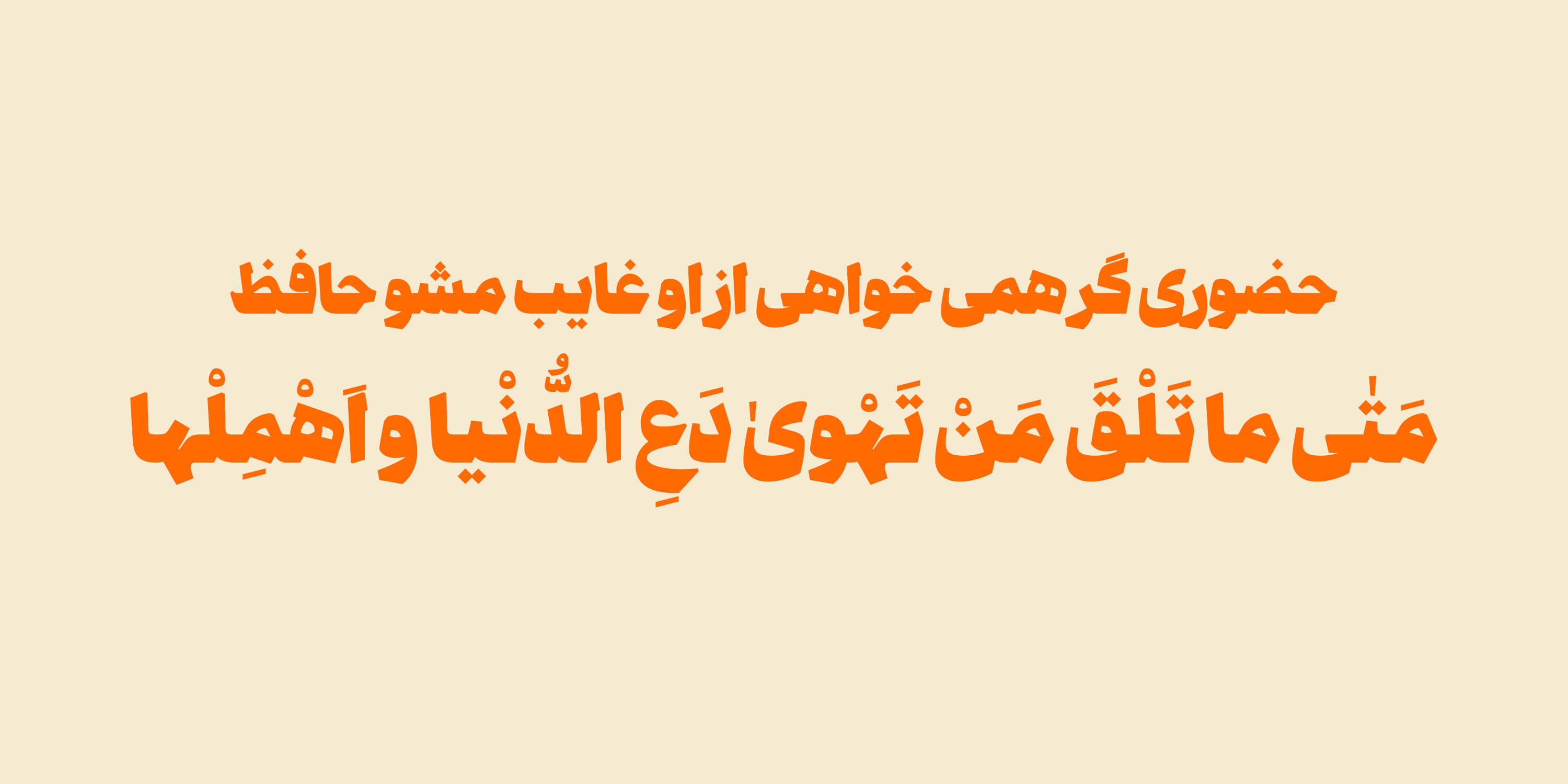
didar
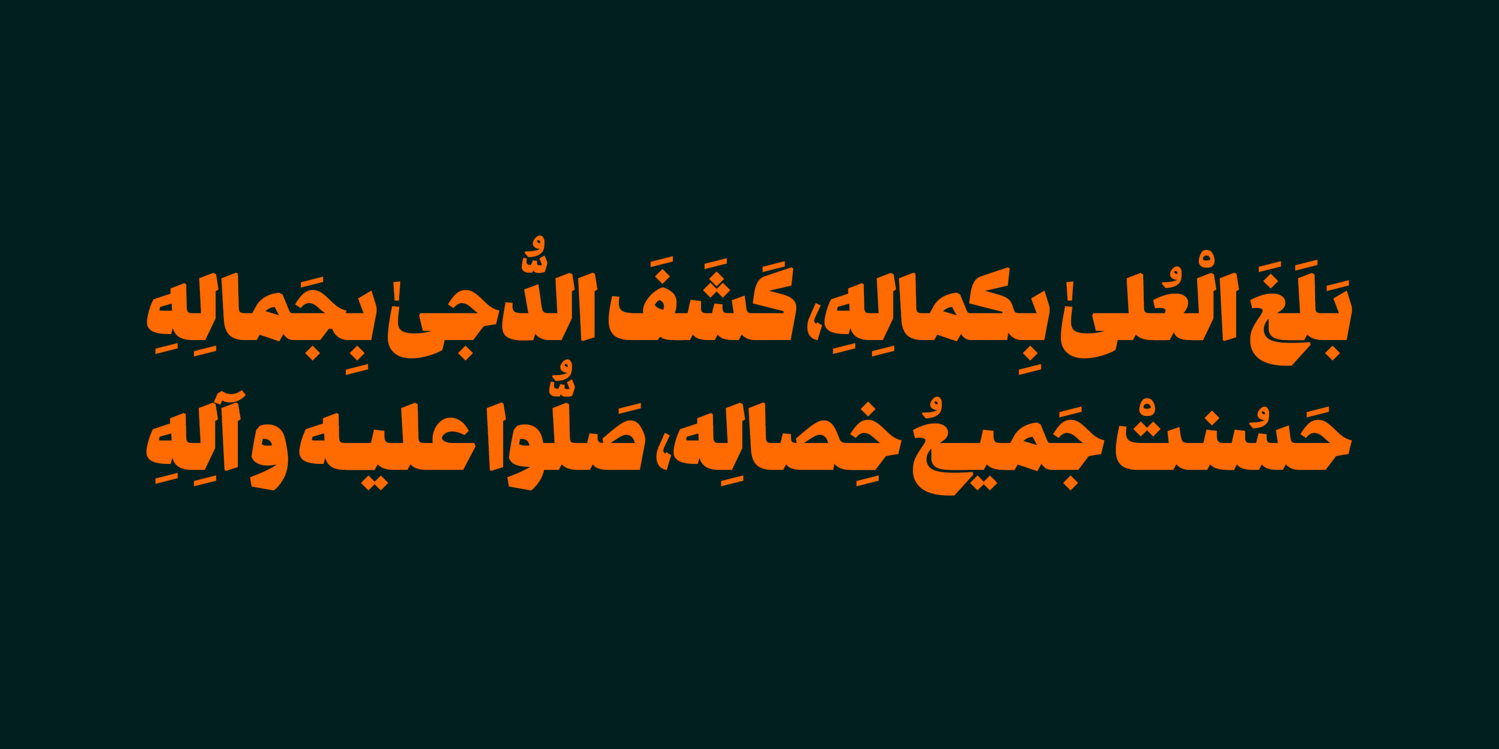
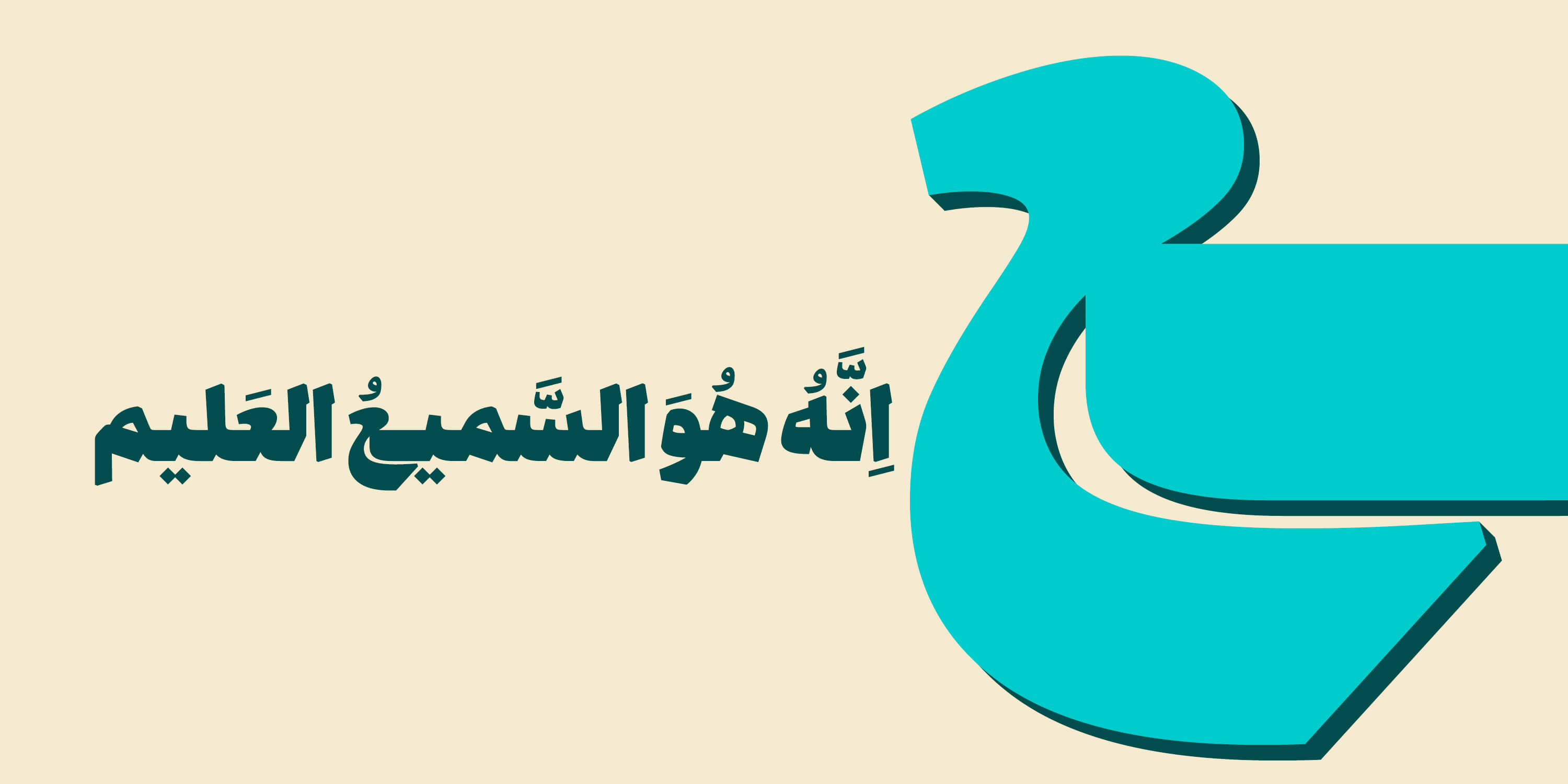
The Didar font is inspired by the beauty of the Naskh script and its solid and sturdy structure. With its thick base and bold presence on the page, this font is an ideal choice for serious and formal headlines.
Not only does Didar inspire authority and solidity at first glance, but it also adds a sense of trust and credibility to your content by observing precise proportions and heavy weight.
The considered geometric forms and balanced rhythm in the letters have made this font present a magnificent and serious presentation of the text while being simple.
If you are looking for a font that screams strength and seriousness in headlines without any hesitation, Didar is a worthy choice.
For an additional user to use the font.To share the font with your designer or project partner. (details)
For one website or app and to share the font with 2 additional project partners. (details)
For small businesses to share the font with 5 additional employees and use it on one website.(details)
For unlimited use by companies in all their activities. A website builder, website templates and services that allow users to type with the font. (details)
didar


-
Mail fonts: in TTF and OTF formats, in one weight
-
Web fonts: fonts specifically for website use, in WOFF and WOFF2 formats
-
Guide: usage guide for alternate characters

Recipient of the Excellence in Typography award from Type Directors Club. Designer and developer of the Wall Script plugin for Glyphs software.


Comments
Recommended Posts
Nostalgic Arabic Fonts: Reviving the Beauty of the Past
Top Arabic Fonts for Ramadan and Eid Design
Arabic Fonts for Books & Magazines: From Print to Digital
Techno Typeface; A Look at the Design Process and Logic
What features does an ideal subtitle font have?
Selected Fonts of 2025 in the TDC Competition
13th GRANSHAN Type Design Competition
Golpayegani Typeface creation