فونت سنجاق | Sanjaq
Sanjaq

Sanjaq

font_weights
2 Weight
version
Version 1
update_date
Last update July 23, 2023
 

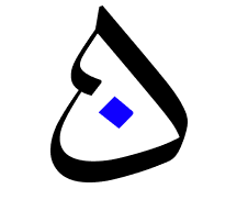
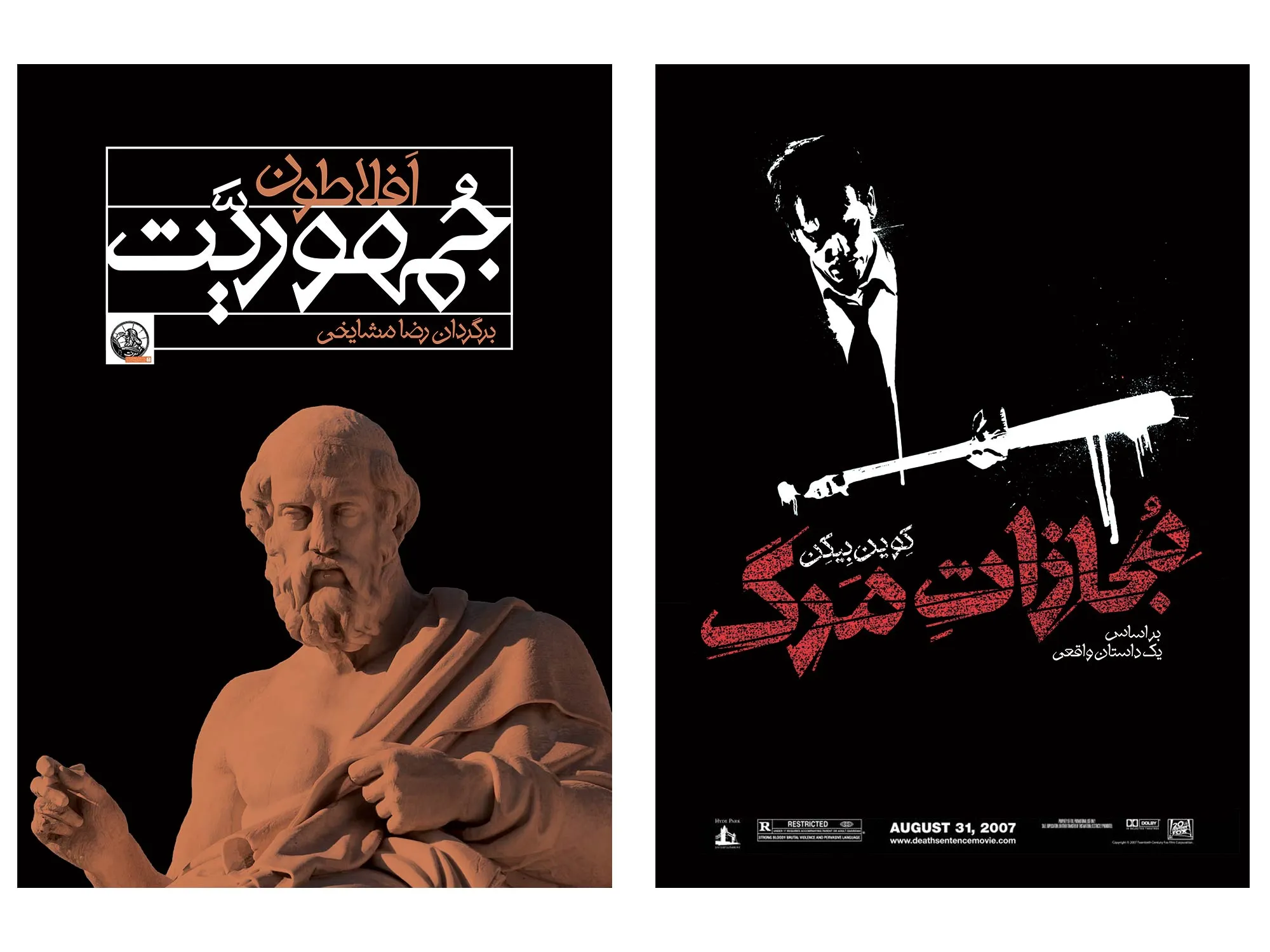
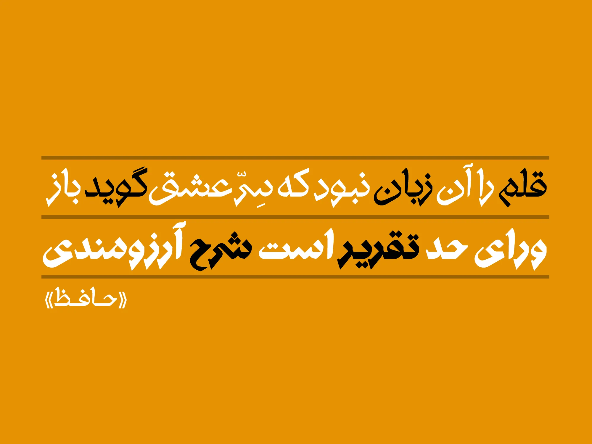
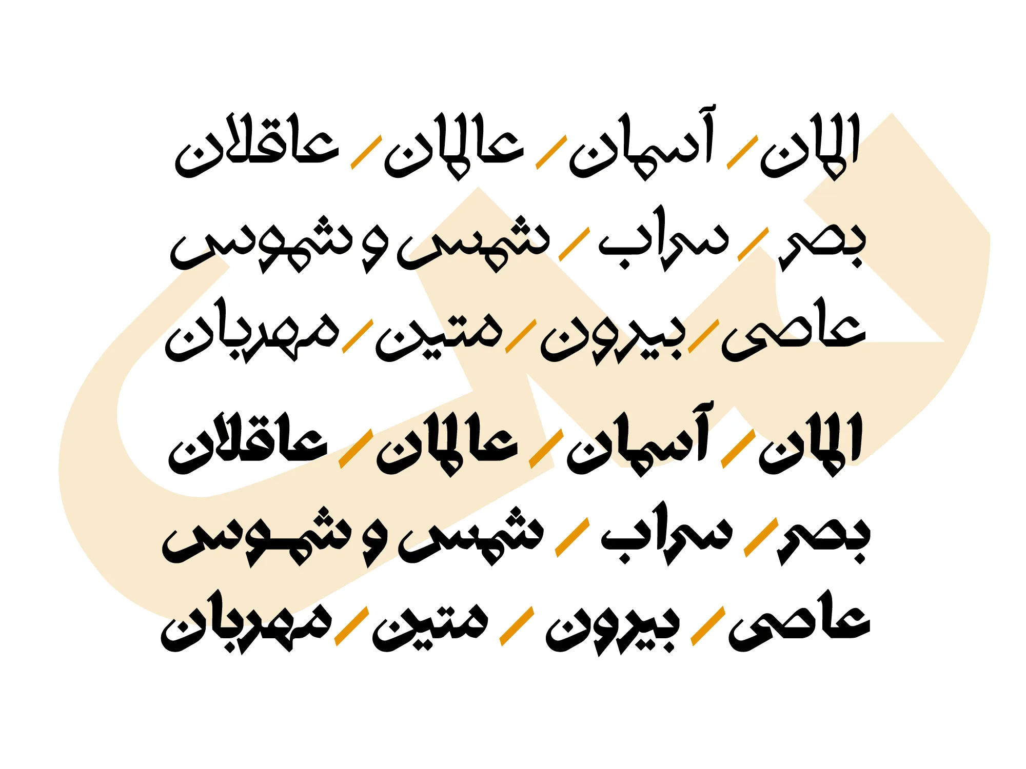
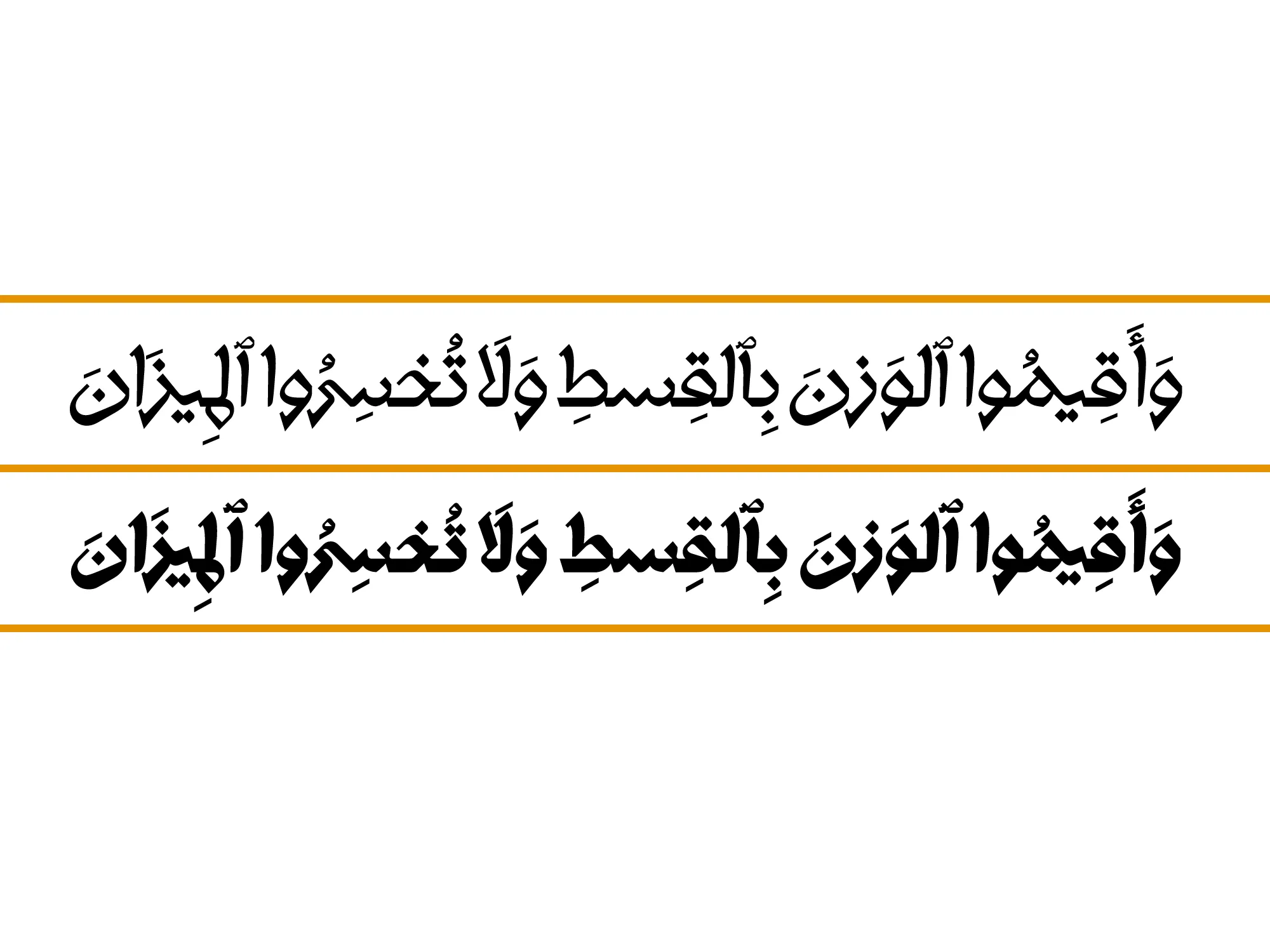
The Sanjagh Typeface may appear geometric at first glance, but it adheres to the Naskh script style.

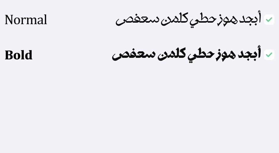
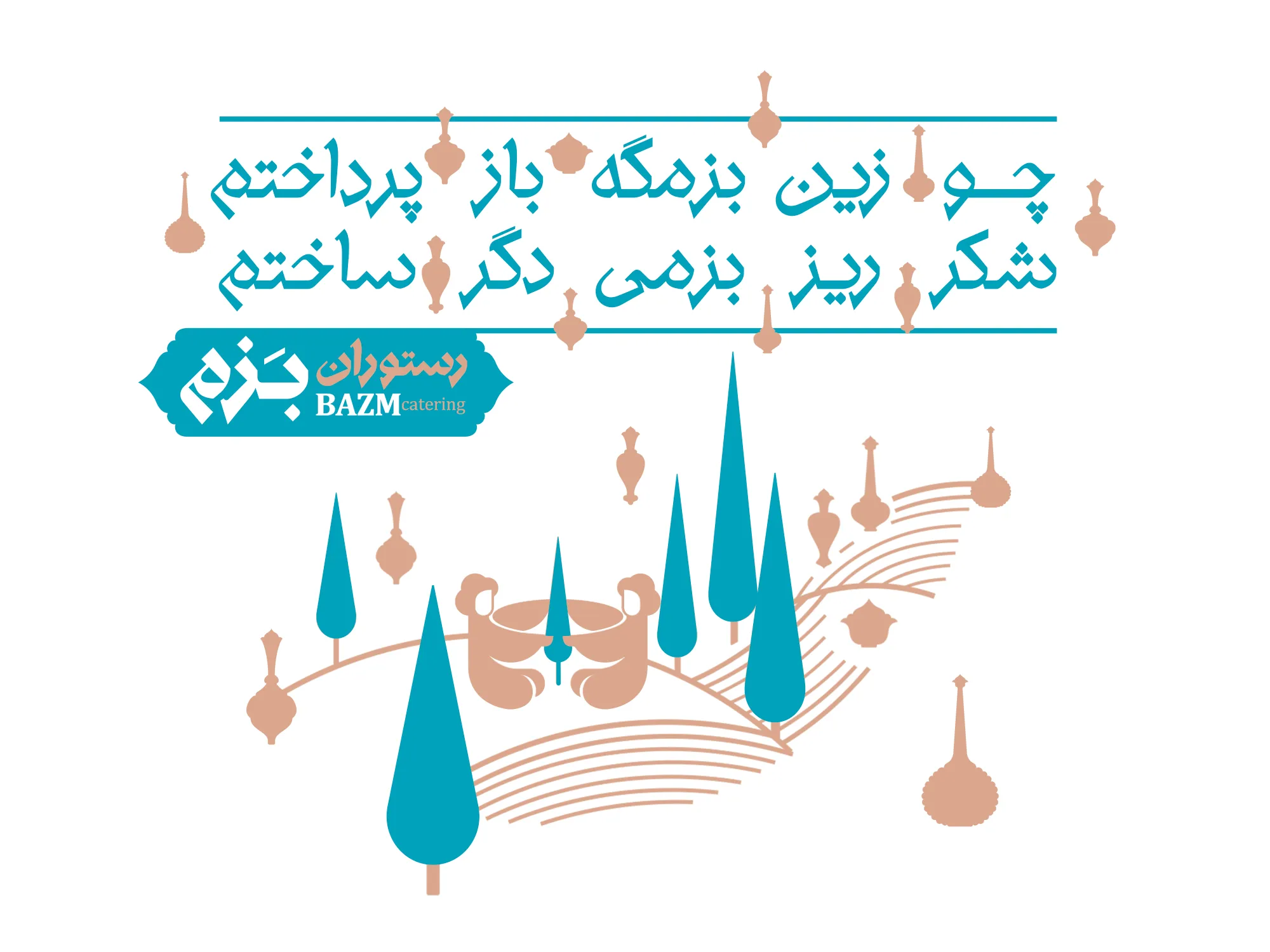
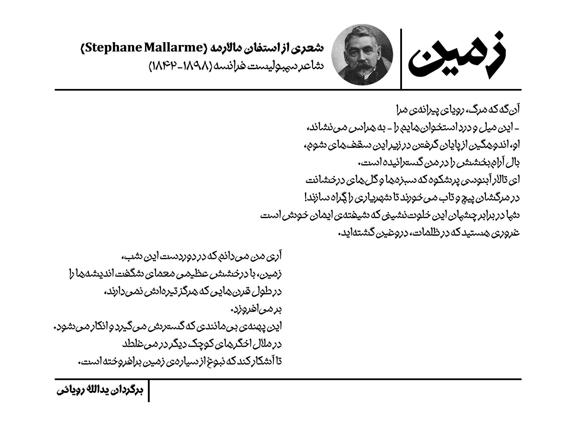
This display typeface is designed in two weights, light and bold, and is suitable for short texts and headings.

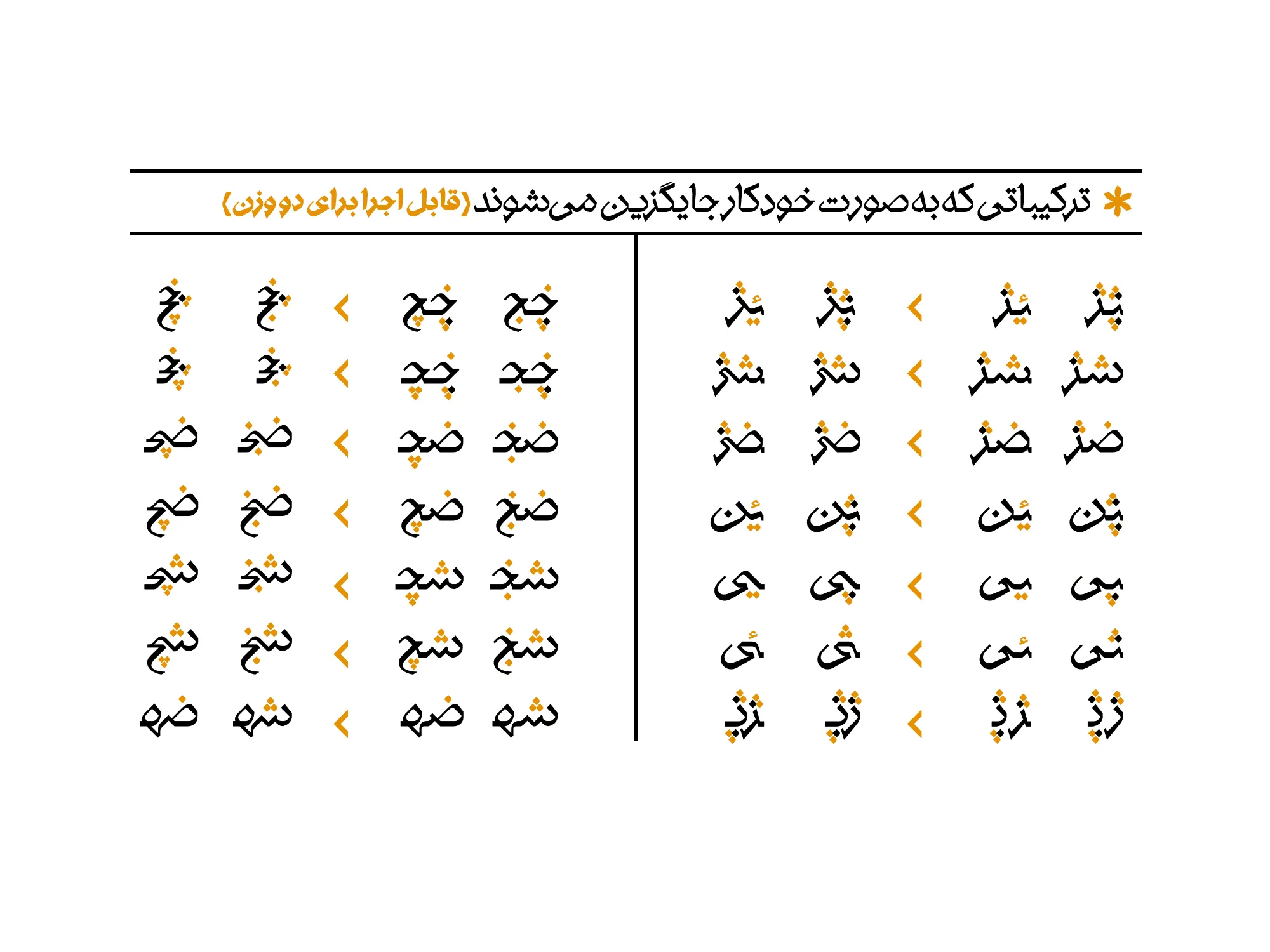
The overall idea for the Sanjagh typeface is inspired by the shape of a pin. The pin consists of curves, sharp angles, and breaks with relatively high contrast thickness. The broken and slanted lines, mostly connected to the curves at 45-degree angles, create a bold yet dynamic form for this typeface. Each part of the letter anatomy is designed based on a consistent form pattern: simply put, all positive curves (ص، ن، ل، ی...) and all negative curves (ع ،ح ...), all vertical lines (ا،ط،ل ...), and all eye shapes (ه، م) are similar within their respective categories. This characteristic, along with the uniform angles, curves, and letter terminals, results in a more geometric order in the Sanjagh typeface.

Preview

If you have multiple social media pages, one license covers font use across all of them. (details)

For all your social media pages, one website or app. (details)

For all your social media pages, one website or app and 5 users. (details)

For all your social media pages, one website or app and unlimited users. (details)

total:

Sanjaq


In the SANJAQ font package, you will receive the following items:

Original Fonts: Available in ttf in 2 weights(Regular, Bold).

Web Fonts: Special fonts for use on websites in woff and woff2 formats.


Release Date:
July 23, 2023
Weight | style :
2 Weight
Designed By
Rasool Kamali
Type Designer

Born in 1982, Rasoul Kamali is a graphic designer, instructor, and art researcher. He holds a Master's degree in Visual Communication and a PhD in Philosophy of Art. He is also a faculty member at the University of Art in Isfahan.

comment

Comments

Frequently Asked Questions