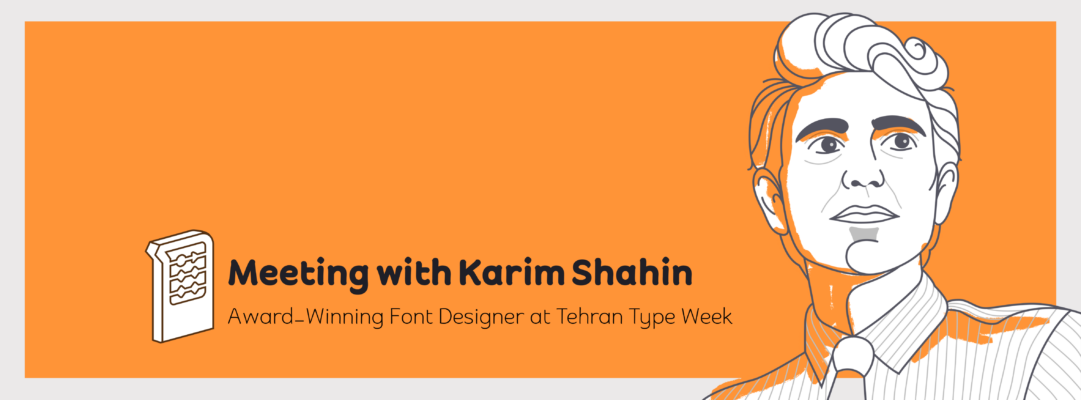
Meeting with Karim Shahin, Designer of the Narengi Typeface


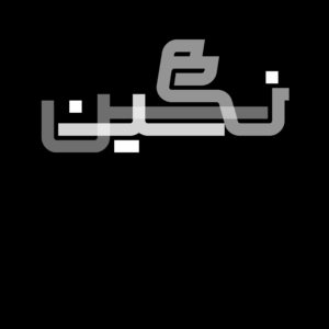
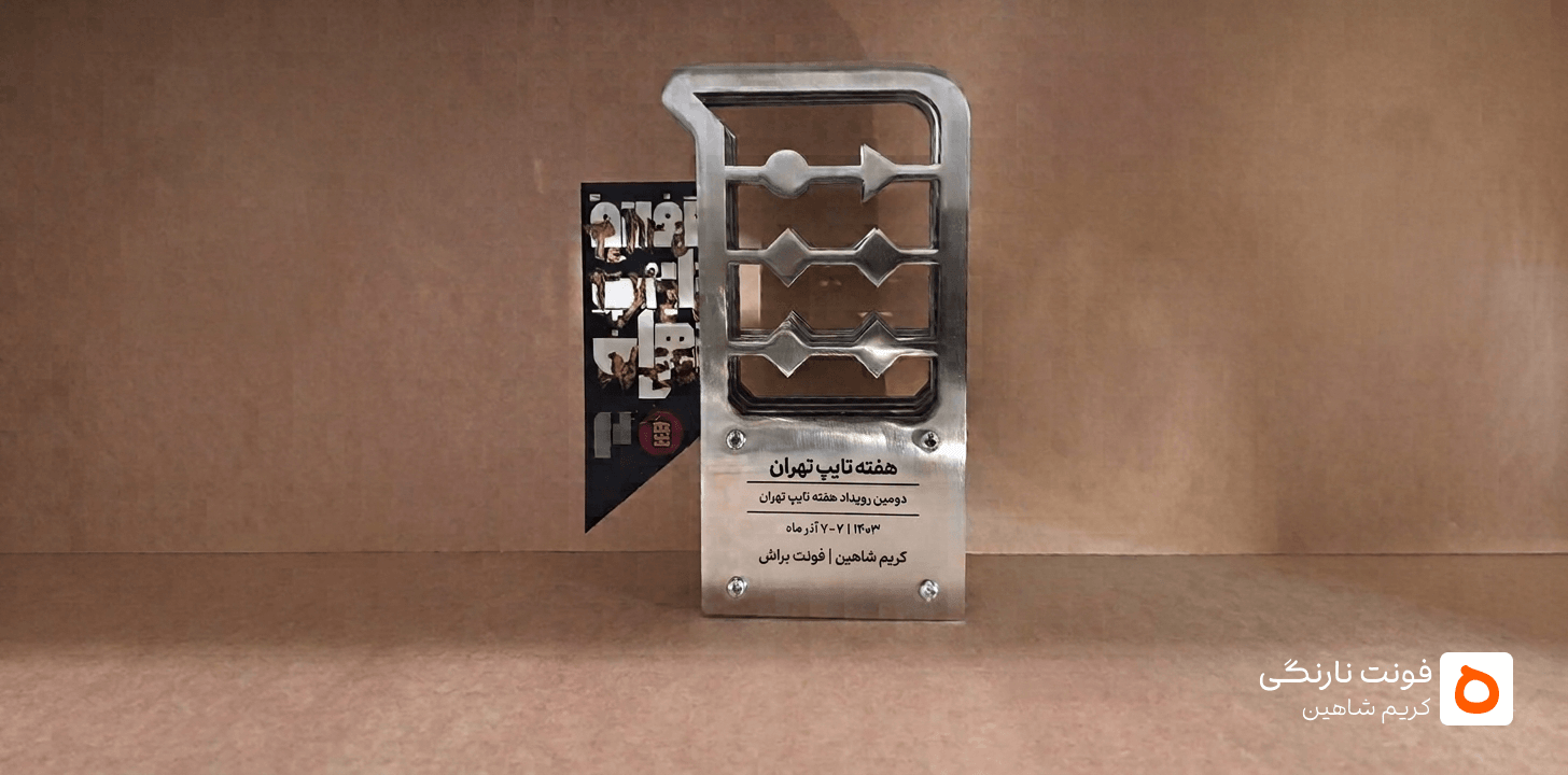
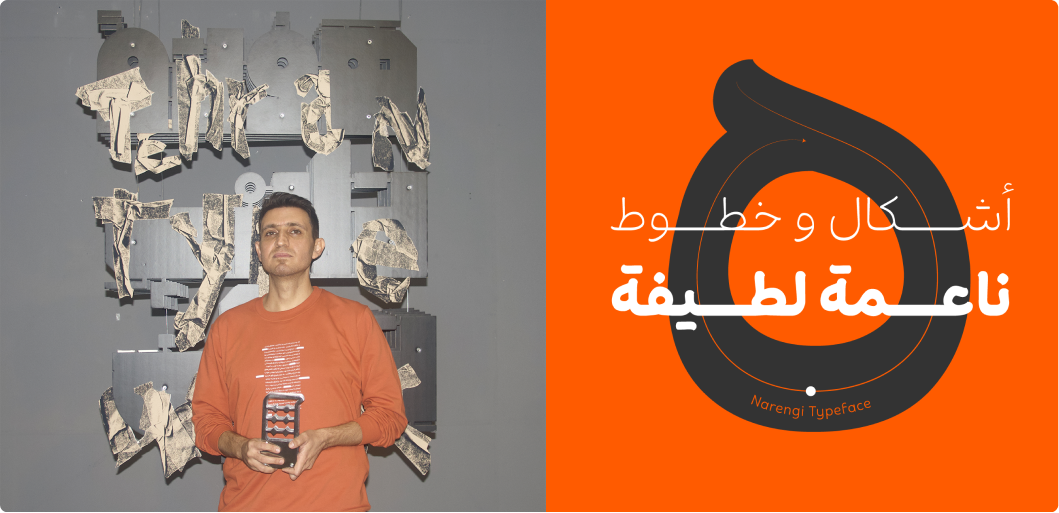
The Narengi Typeface, originally named “Brush,” was featured during the second week of Type Tehran and was selected as the event’s featured typeface.
Coinciding with the release of Narengi after a two-year hiatus, we spoke with its designer, Karim Shahin. In this interview, he talks about his first encounter with letterforms in the fourth grade of elementary school, the development of the Brush typeface, the reasons behind changing its name to Narengi, and his plans for releasing a new typeface.
What inspired you to enter the world of type design?
When I was a child, I had to stay in my room and study for a certain number of hours each day. I didn’t enjoy studying, so I would write the words from my textbooks in different styles just to make the study time pass. This gradually became a habit that has continued to this day. It was a kind of pastime, but in reality, I was practicing and sketching letterforms.
When my brother noticed my interest, he enrolled me in a calligraphy class. I was in the fourth grade of elementary school at the time. By the seventh grade, I had received an advanced calligraphy certificate, but I didn’t continue on to the highest level. There was no art school in our city, Ilam, so I chose mathematics in high school and later studied chemistry for my bachelor’s degree. But I knew that, sooner or later, I would study graphic design.
You designed typefaces with a degree in chemistry!?
No. In 2017, I took the national entrance exam for art and was accepted into the Graphic Design program at the University of Tehran. It was in Professor Jabbari’s type design class that I designed my first typeface. Later, for my thesis, I chose Persian typeface design as my subject. The result was two typefaces, Gozan and Brush, both of which were selected as featured typefaces at Type Tehran Week.
Where did the initial idea for designing Brush come from?
The initial sketches for the letters of Brush were drawn with a Japanese brush. I tried to preserve the softness and fluidity of handwritten writing in the letterforms of the typeface. That’s why I chose the name Brush for it.
Why did it take two years to release the typeface, and why did you change the name from Brush?
As my first typeface, I cared a lot about its quality and technical integrity. At the same time, I wanted to handle the entire type development process myself, from start to finish.
I didn’t want to release the typeface under the name Brush because, throughout the development process, it had evolved far beyond the original idea. It was no longer simply a typeface with forms inspired by a brush. I also generally preferred Persian names, so I decided to change the name.
Where did the name “Narengi” come from?
First, I think of this typeface as soft, with fluid and playful forms, and to me, its color feels orange. Secondly, I was looking for a name that had a distinct identity and a tangible, physical presence—something that would stay in the audience’s mind.
Can you tell us a few things about the characteristics of Narengi?
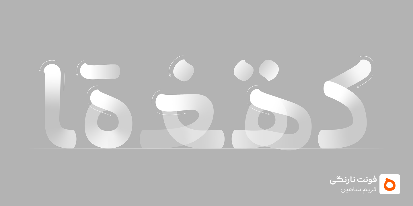
Narengi aims to have a flexible personality that adapts to its context. In the lighter weights, it is quiet and orderly, so it doesn’t interfere with smooth reading. In the heavier weights, however, it tries to express its personality in a bold and distinctive voice.
Narengi also features horizontal extensions in some of its letterforms. The idea behind this is to reflect the phonetic structure of the Persian language in the structure of the typeface. Most existing Persian typefaces tend to be geometric. Narengi attempts to fill part of the gap by introducing more curved forms.
Which typefaces by other type designers do you particularly like?
I like many typefaces, so it’s difficult to choose. I really like Potk, Hasti, and Abar. Among custom typefaces, I think Ali Baba is a masterpiece, and I enjoy looking at it every time.
One final question: Besides Narengi, you have another featured typeface. When will it be released?
I hope I can release Gozan within the next three months, because I’m eager to move on to new typefaces and explore new experiences.