






















Narengi


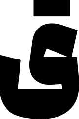
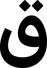
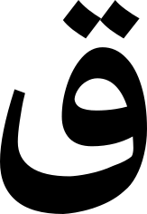
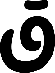
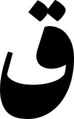
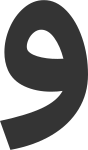
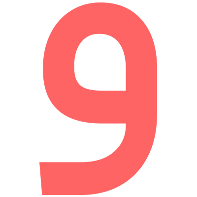
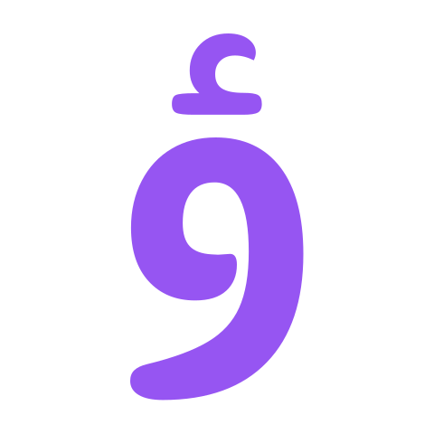
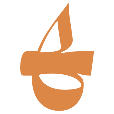
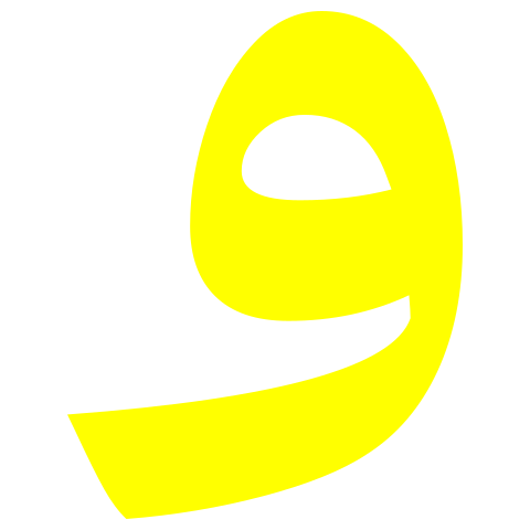
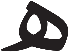
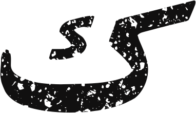
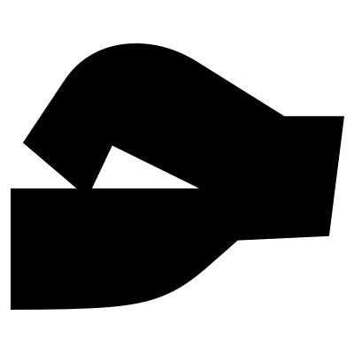
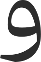
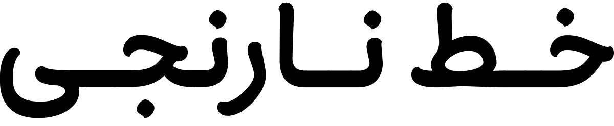
The Narengi typeface is inspired by the natural and dynamic form of the brush, recreating the softness of handwritten strokes within a cohesive structure. The fluid curves of its letterforms impart a sense of intimacy and poetry to words, as if the text is not merely read, but heard in a gentle tone.
Breaking away from the monotony of purely geometric fonts, Narengi is an ideal choice for design spaces seeking a visual tone defined by dynamism, warmth, and a vibrant presence.
 Font Licensing
For an additional user to use the font.To share the font with your designer or project partner. (details)
For one website or app and to share the font with 2 additional project partners. (details)
For small businesses to share the font with 5 additional employees and use it on one website.(details)
For unlimited use by companies in all their activities. A website builder, website templates and services that allow users to type with the font. (details)
Narengi
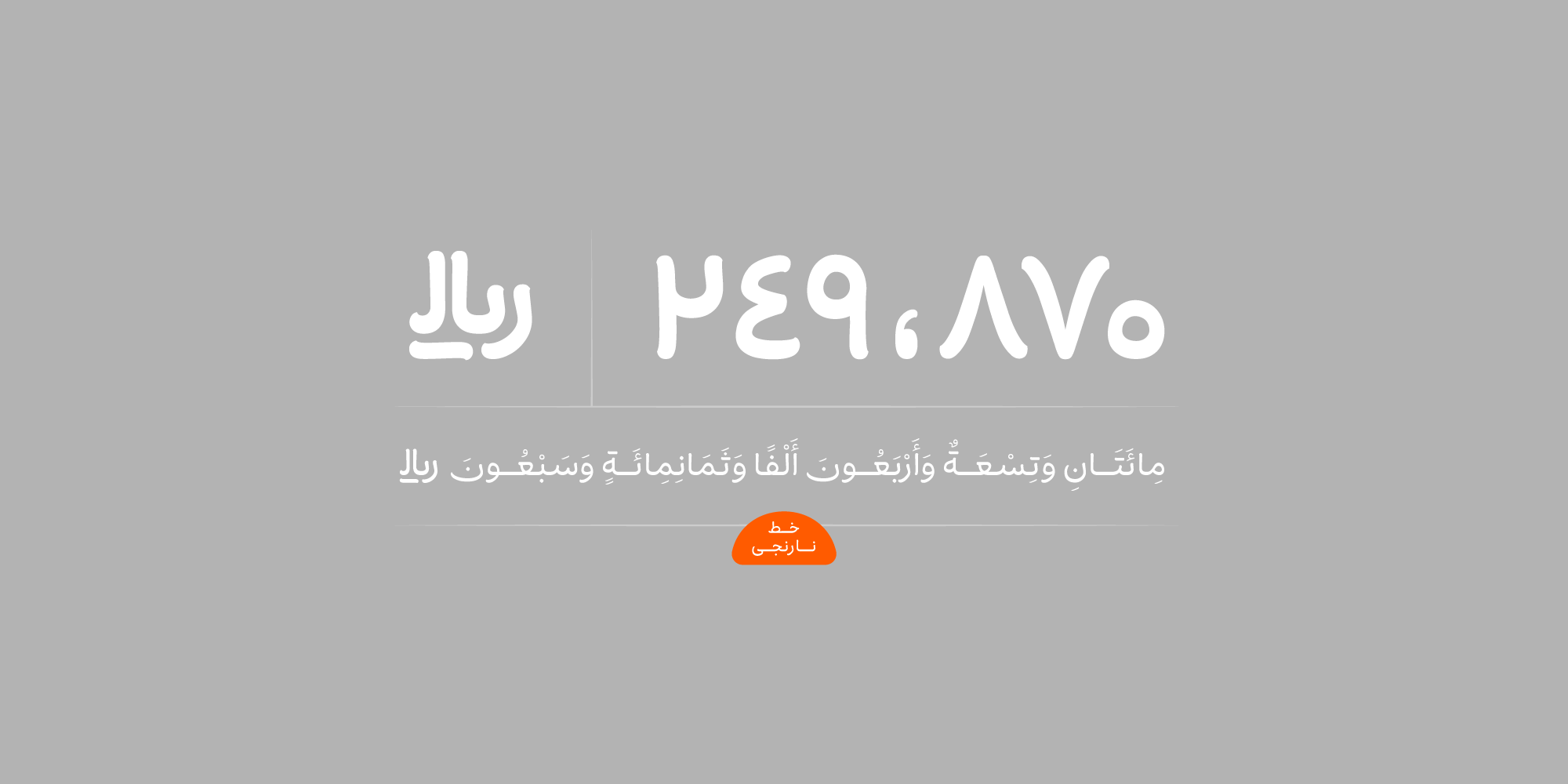
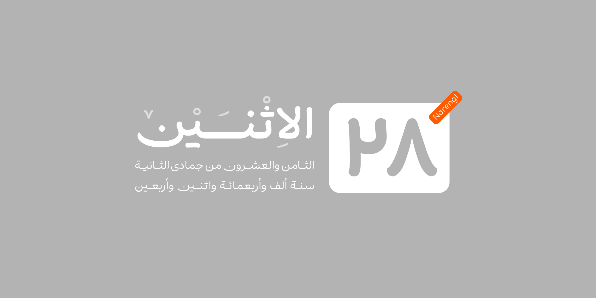
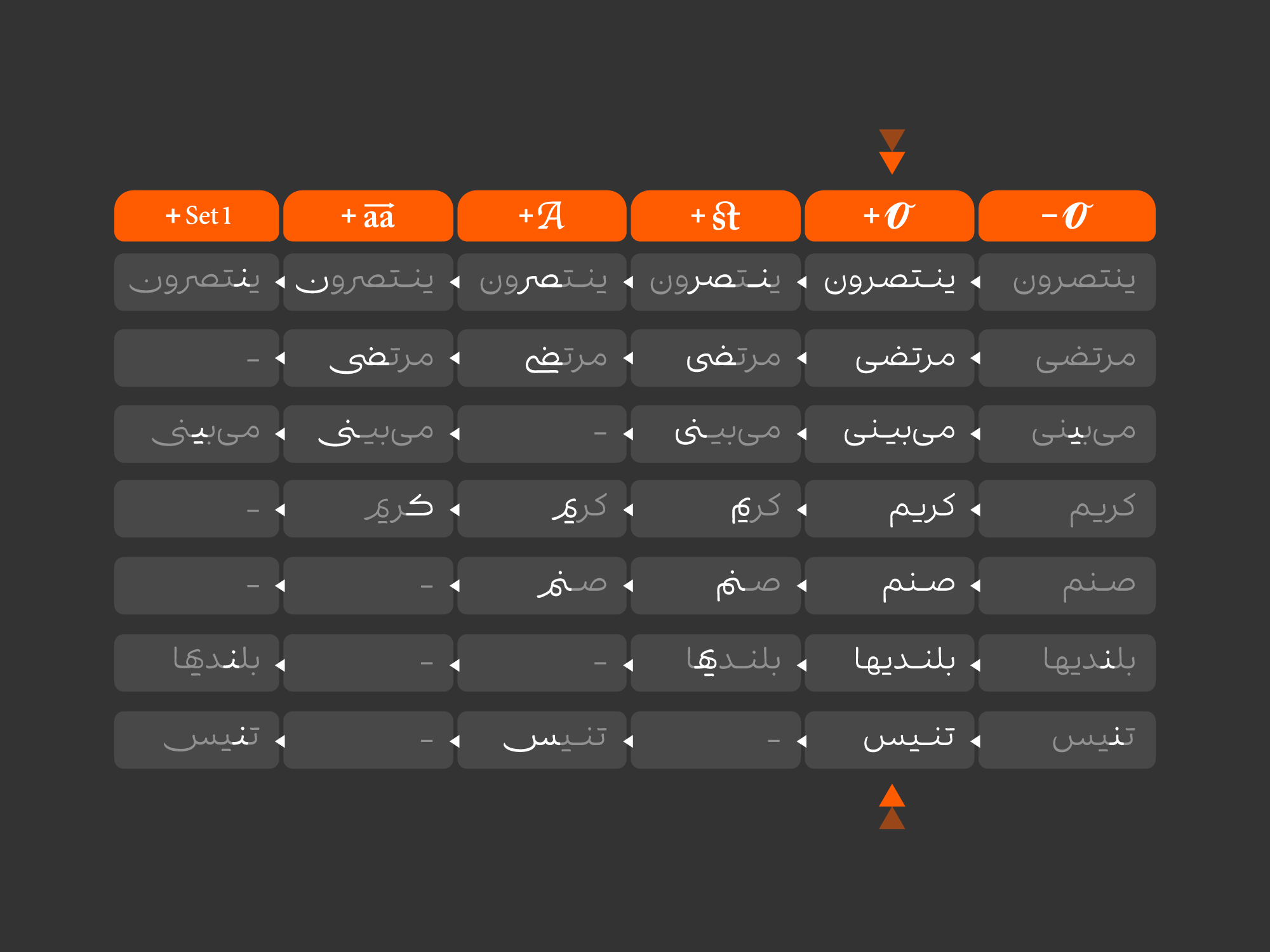
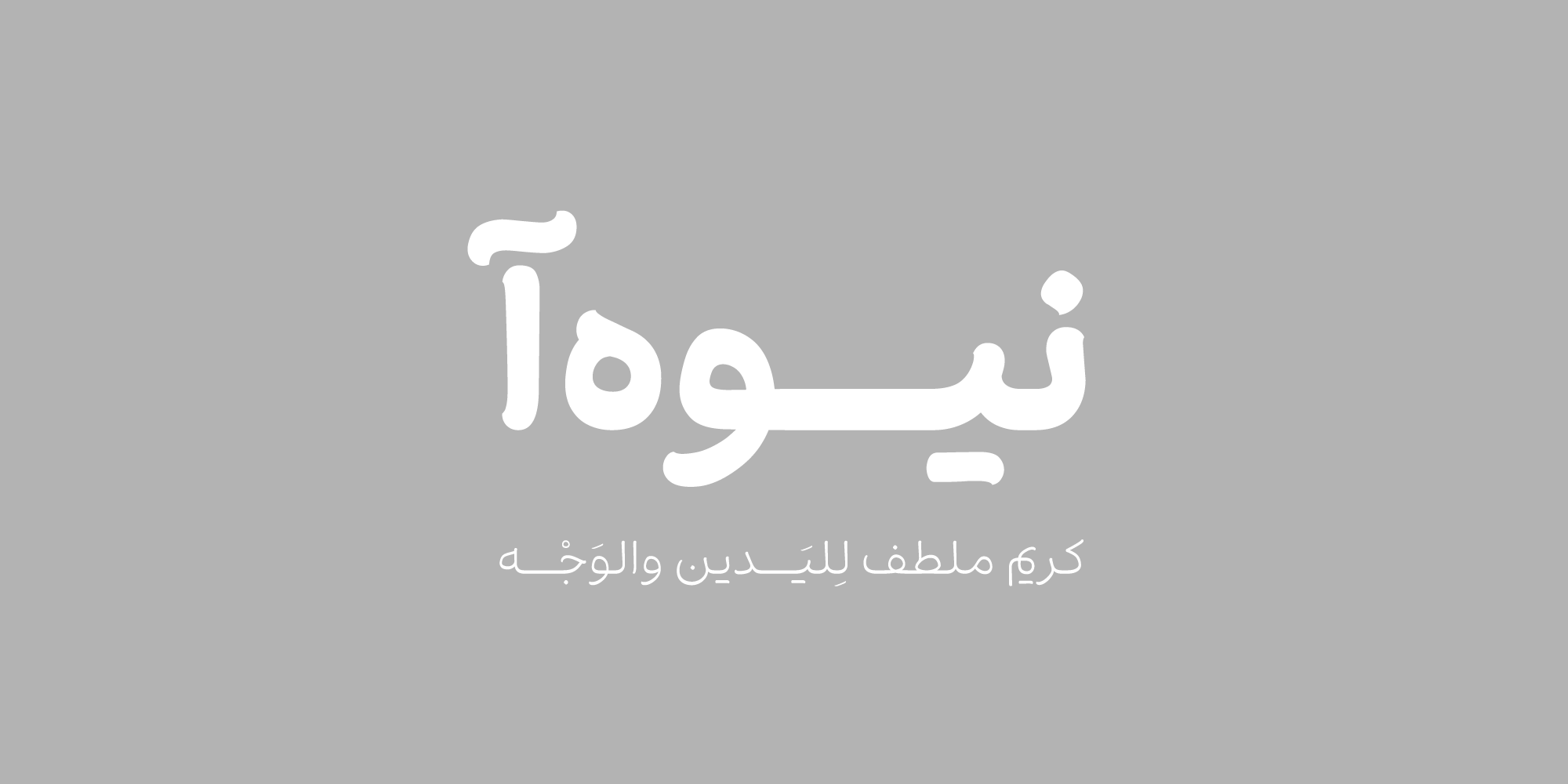
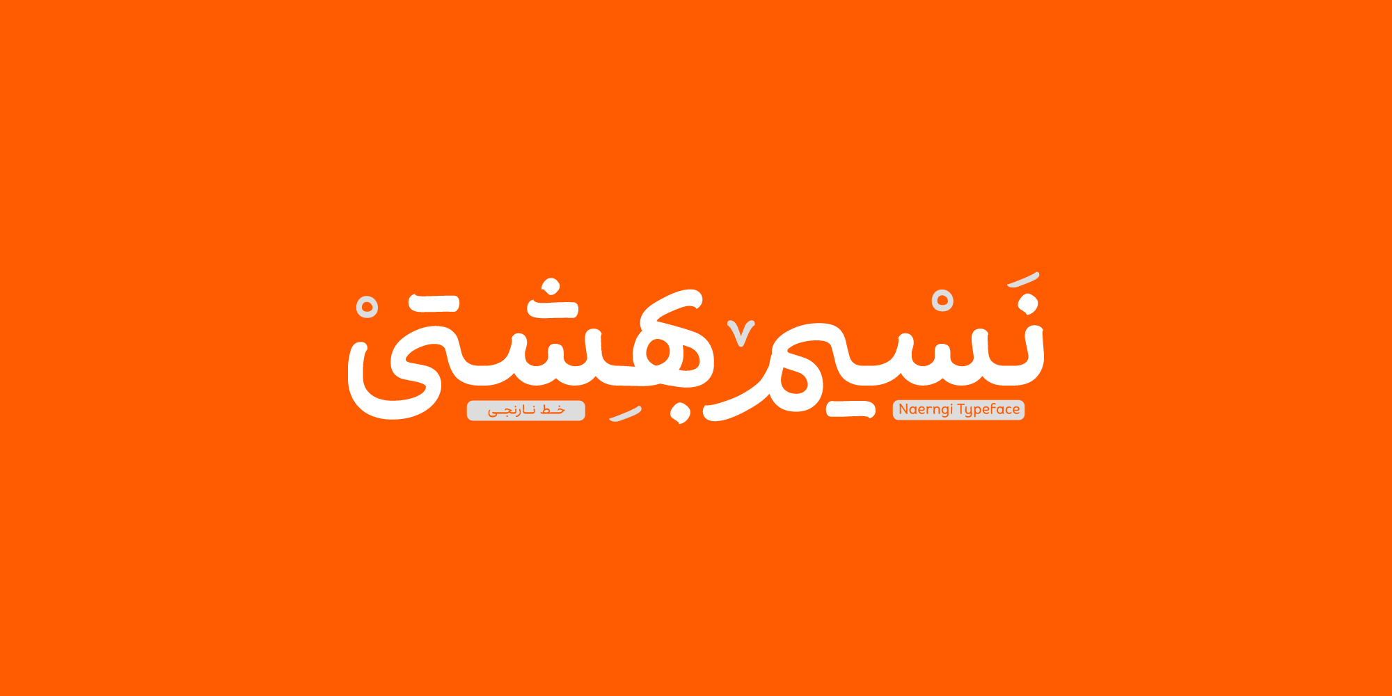
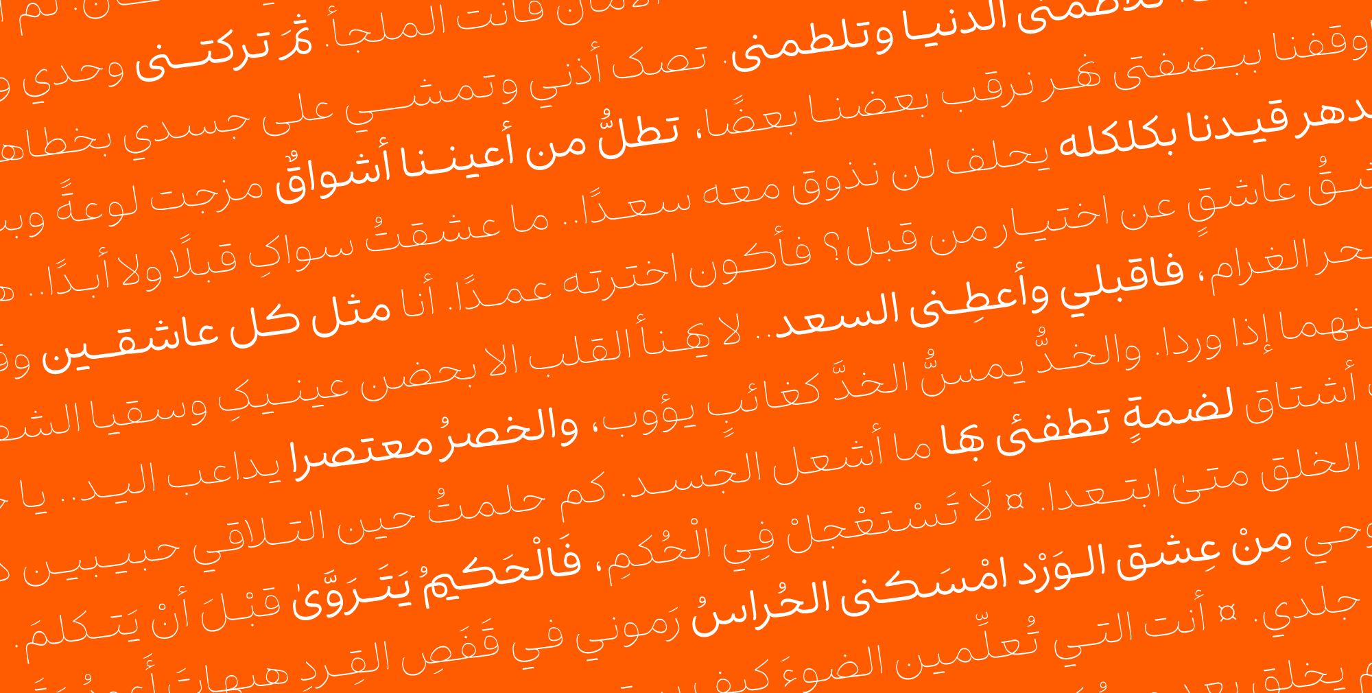
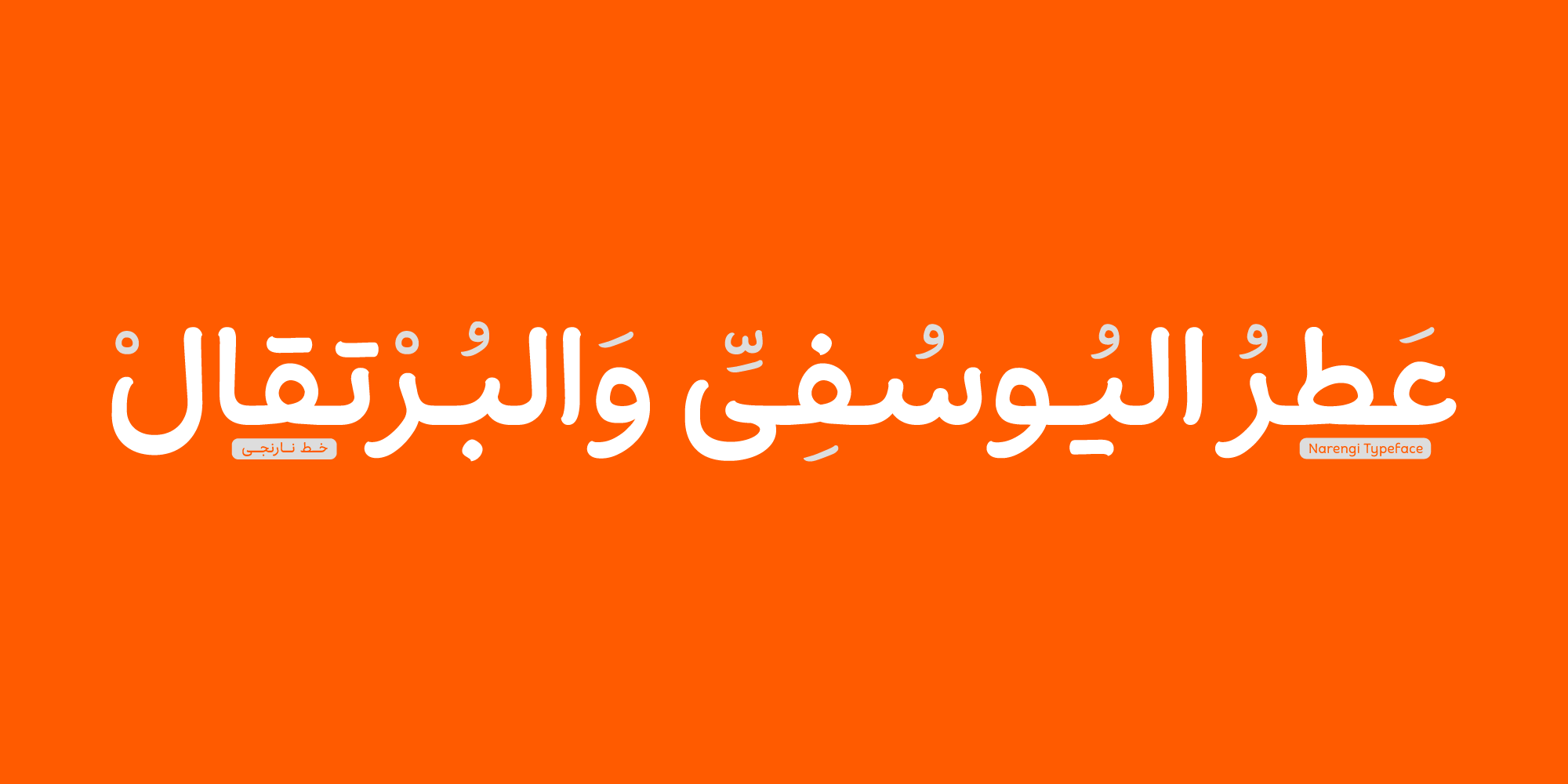
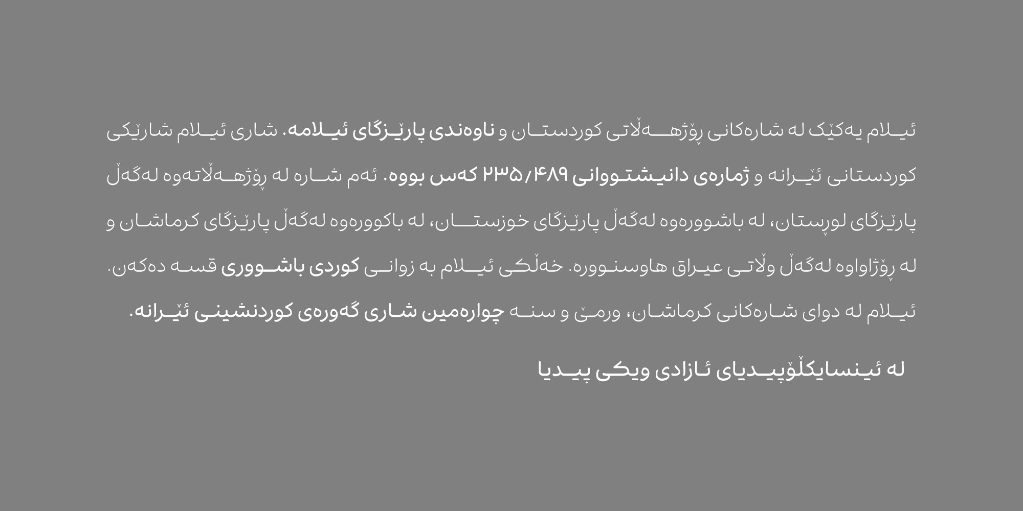
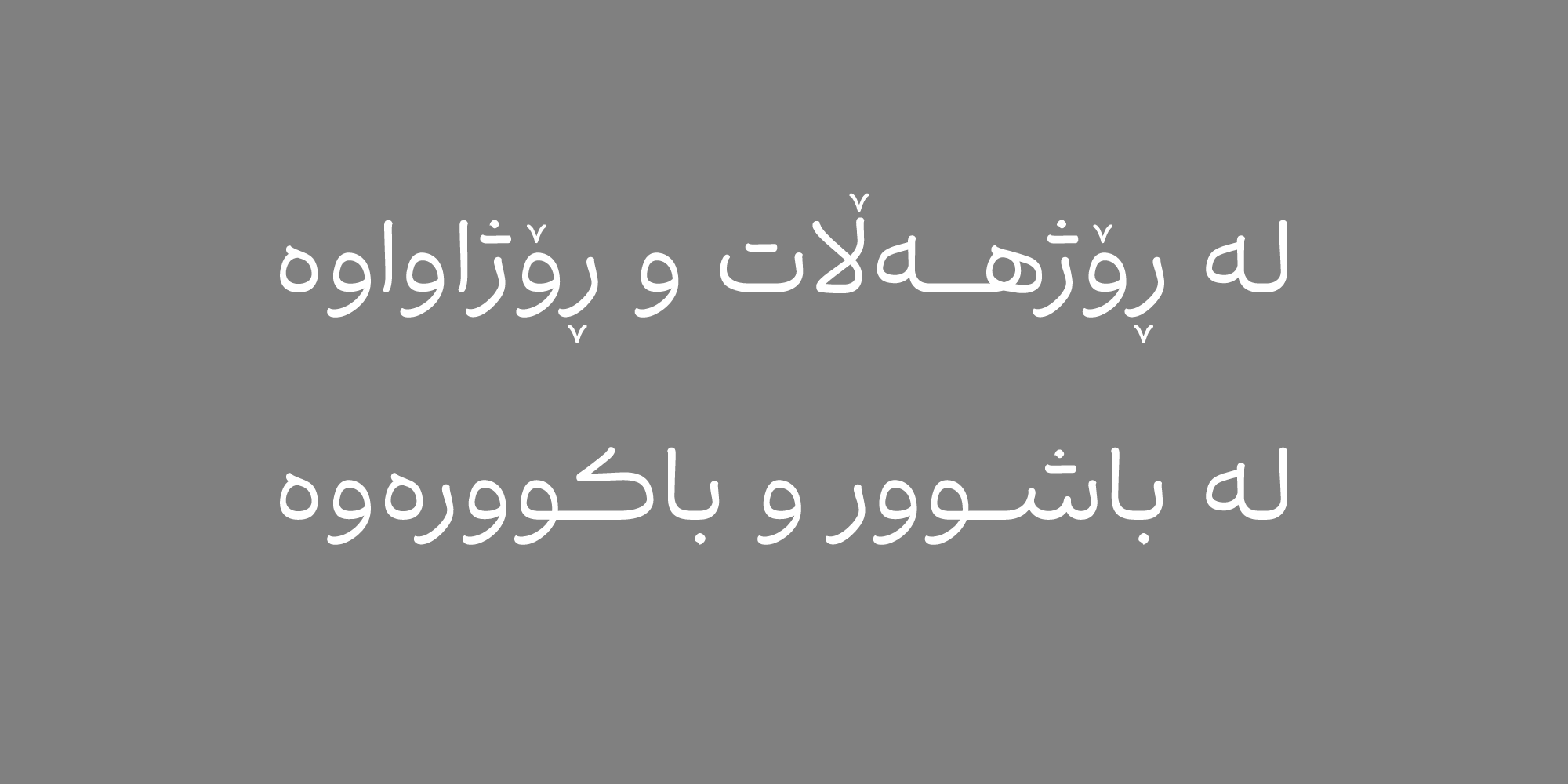
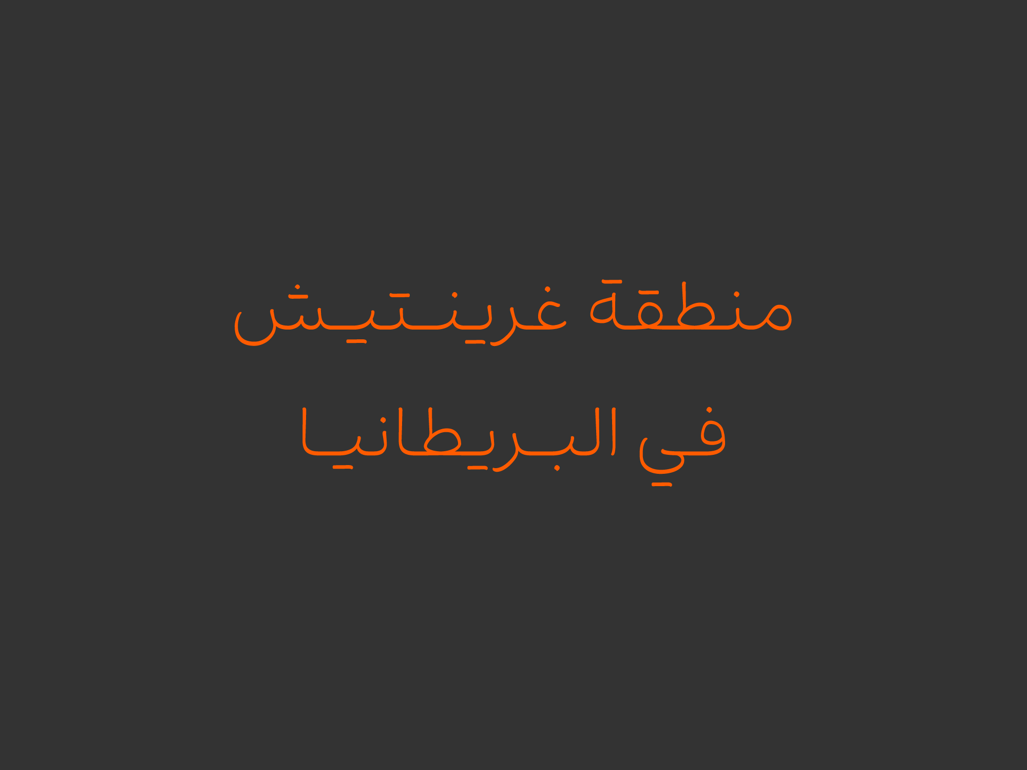
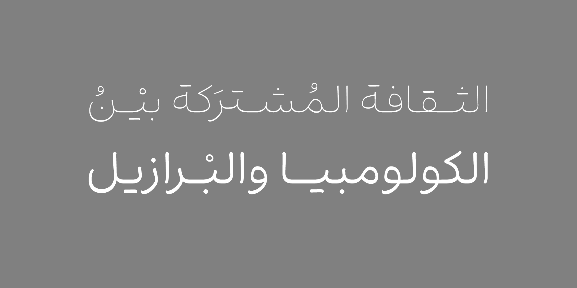
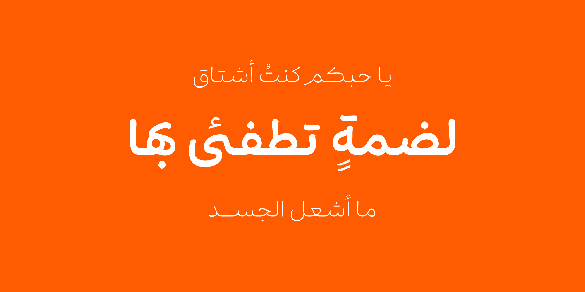
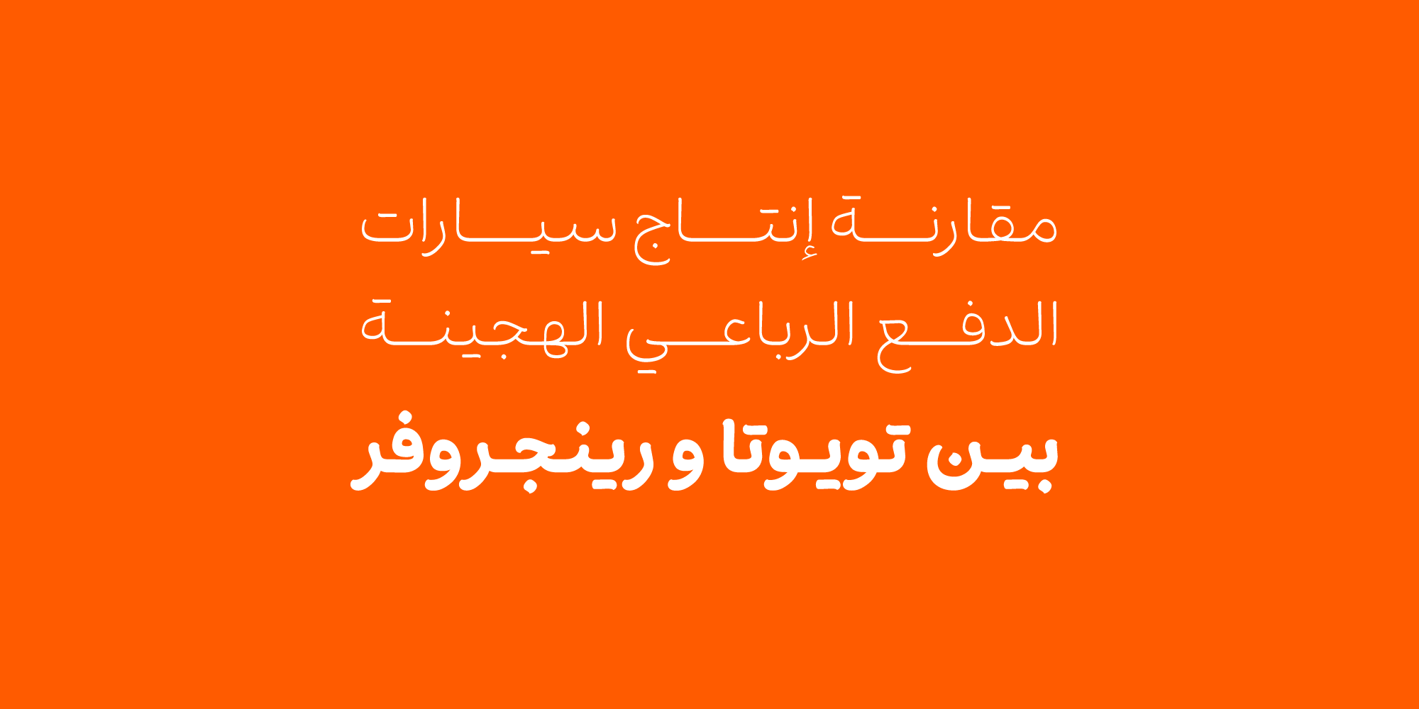
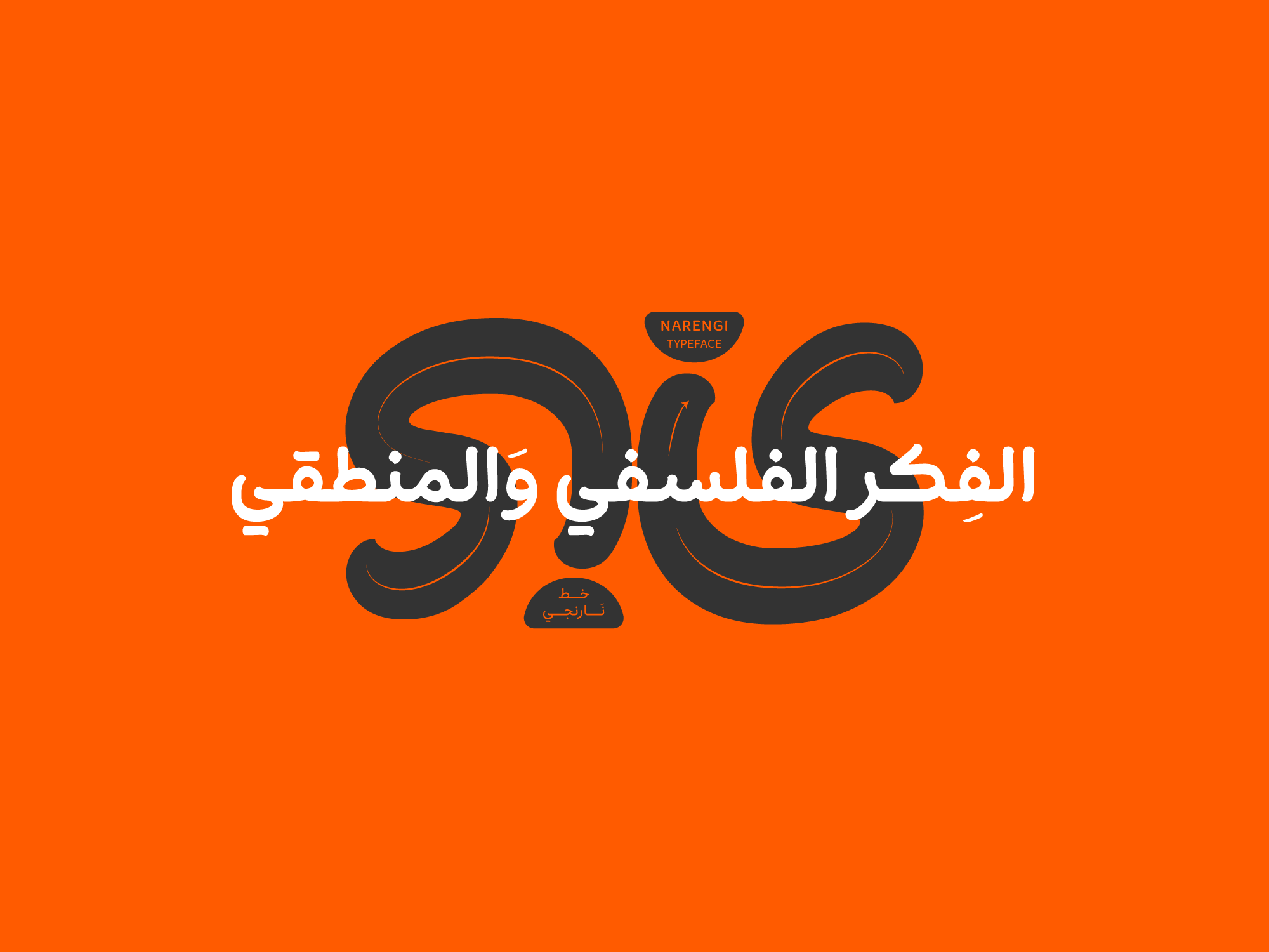
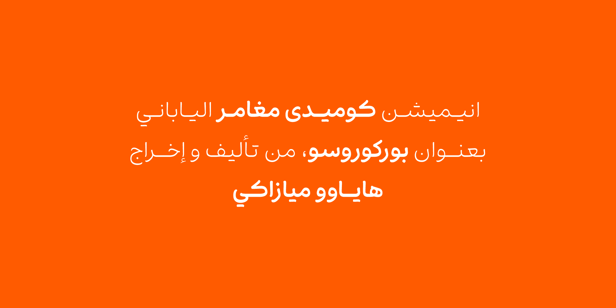
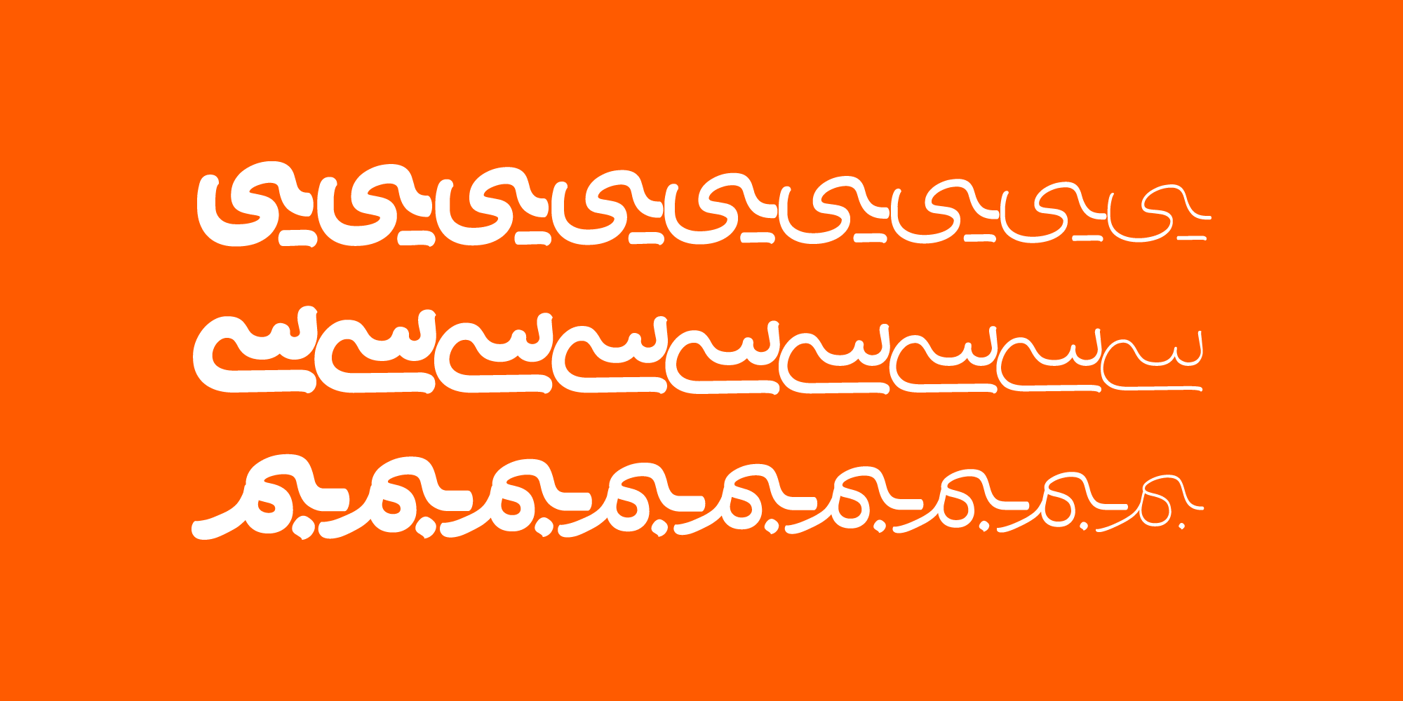
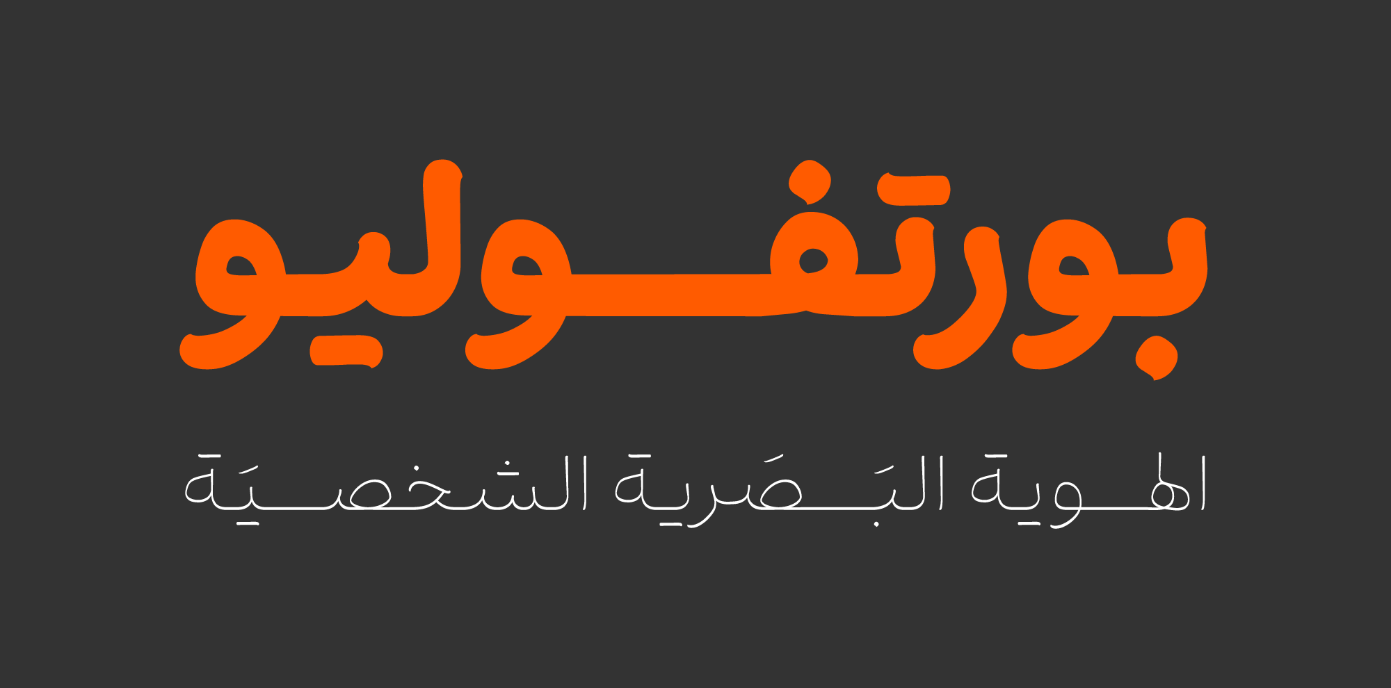
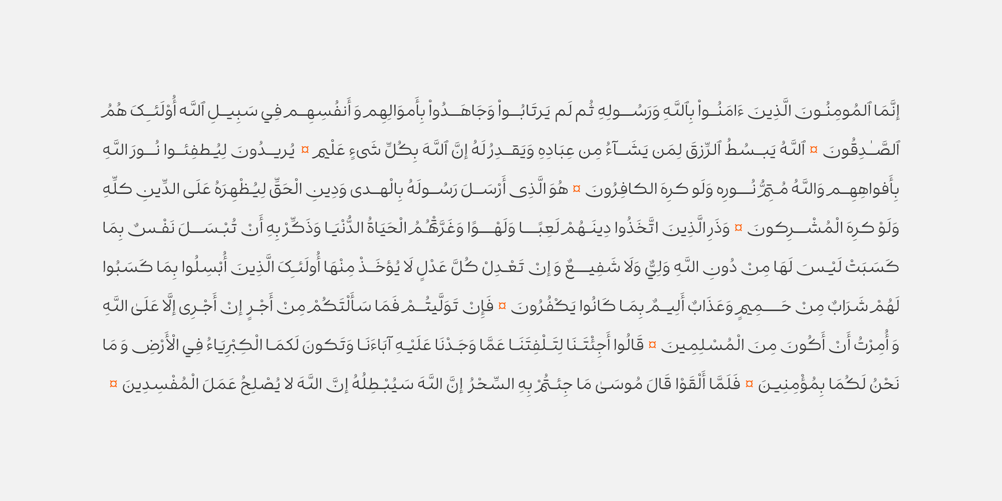
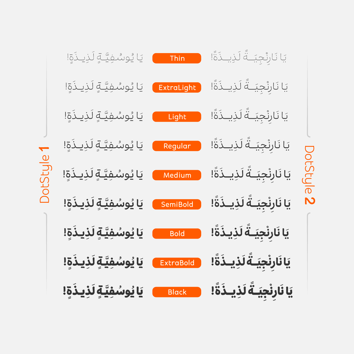
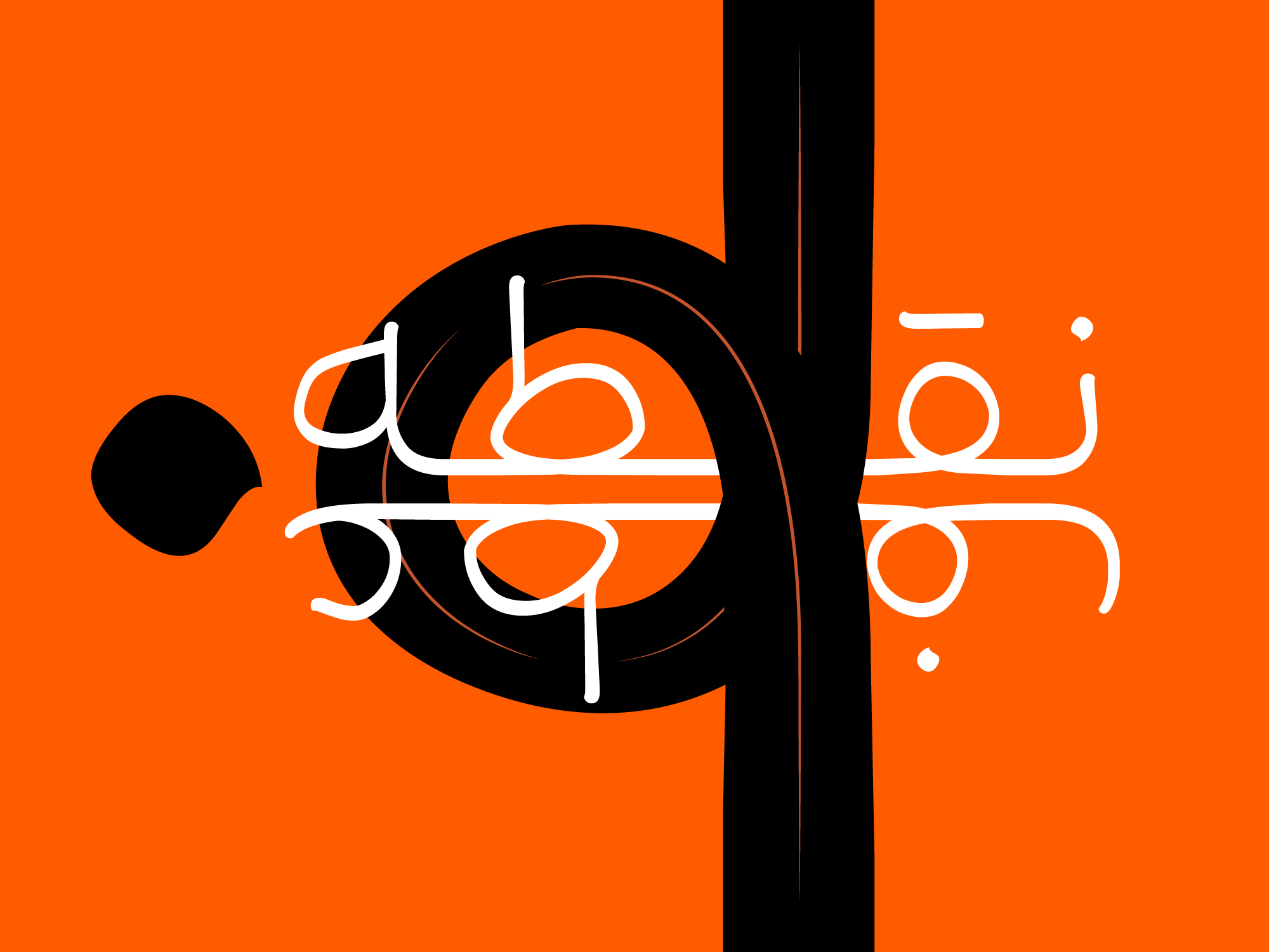
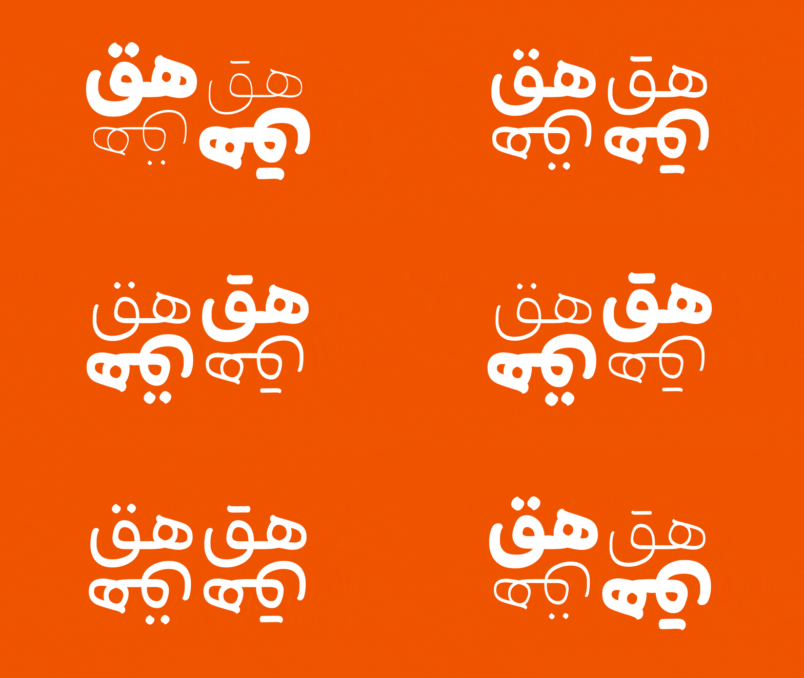
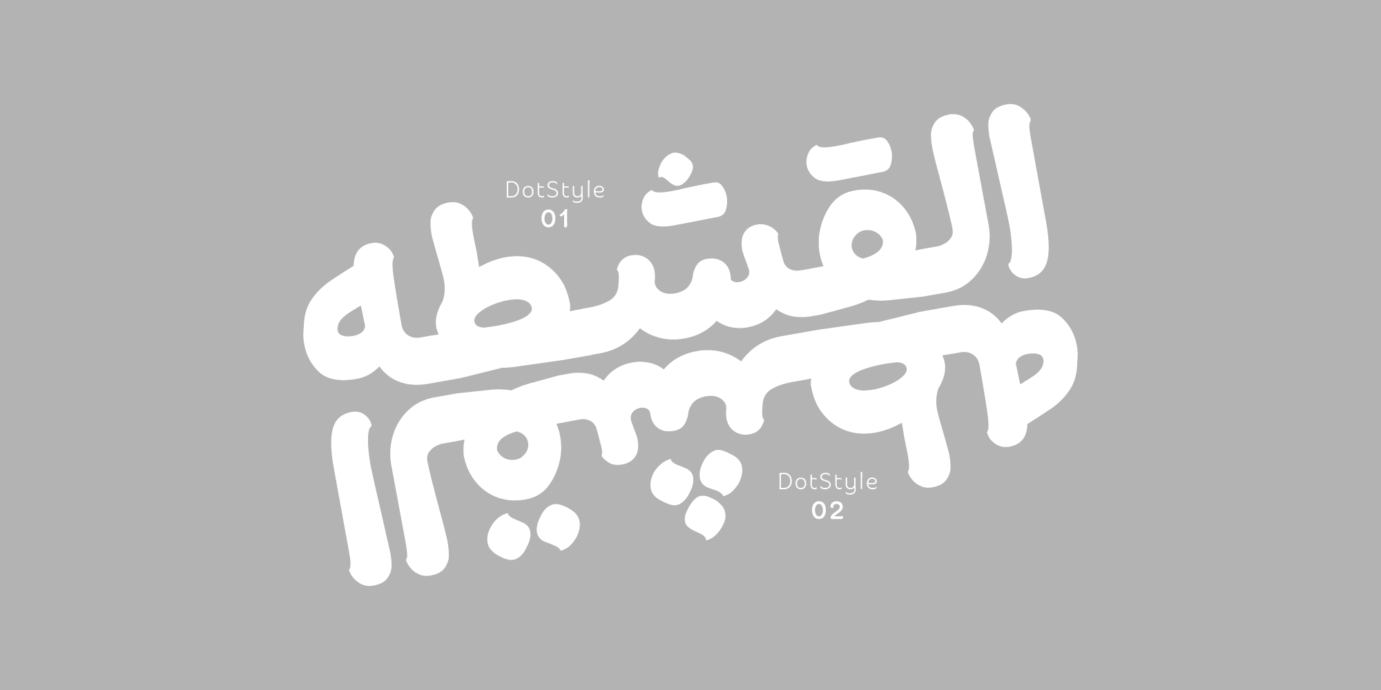
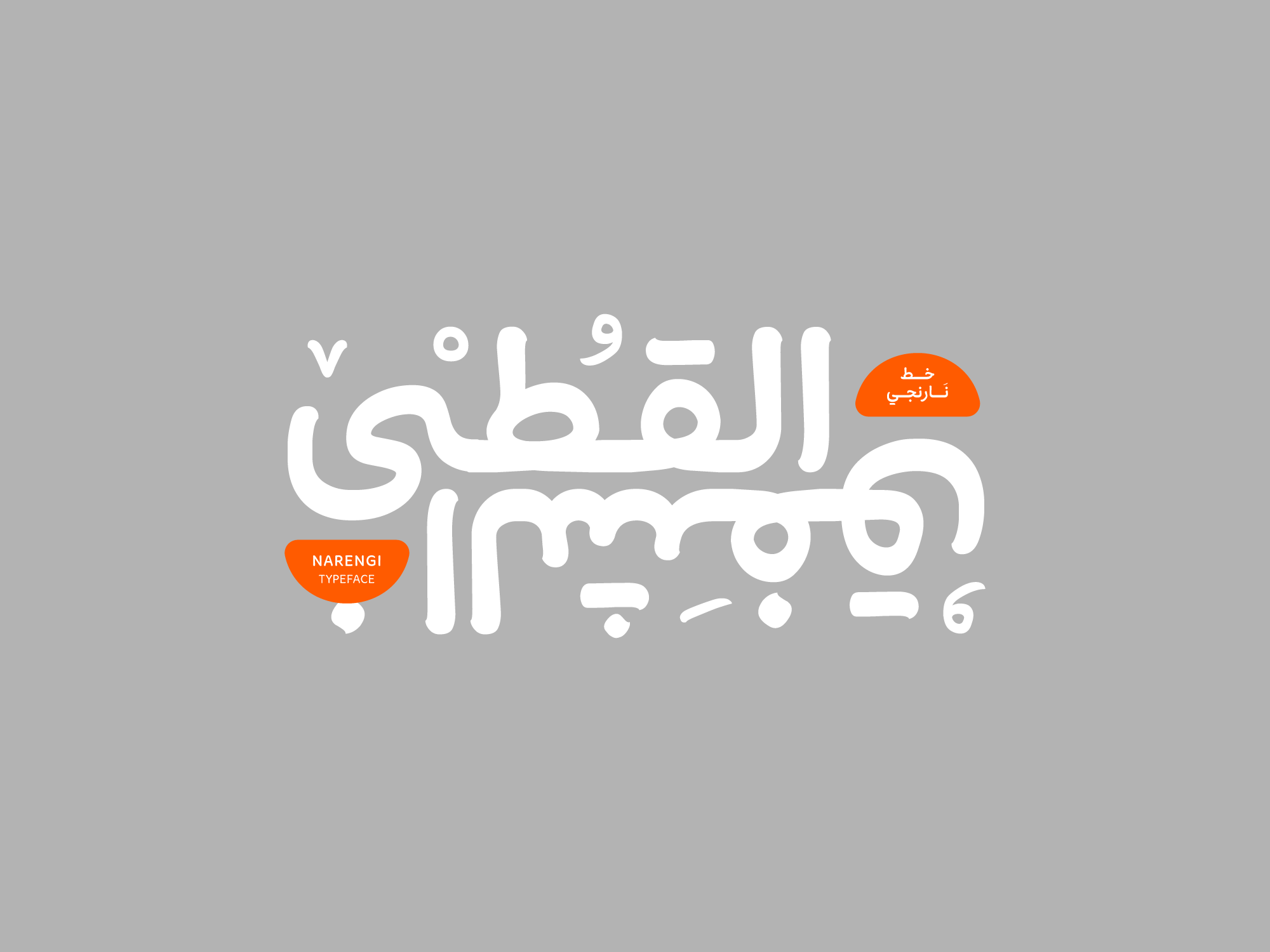
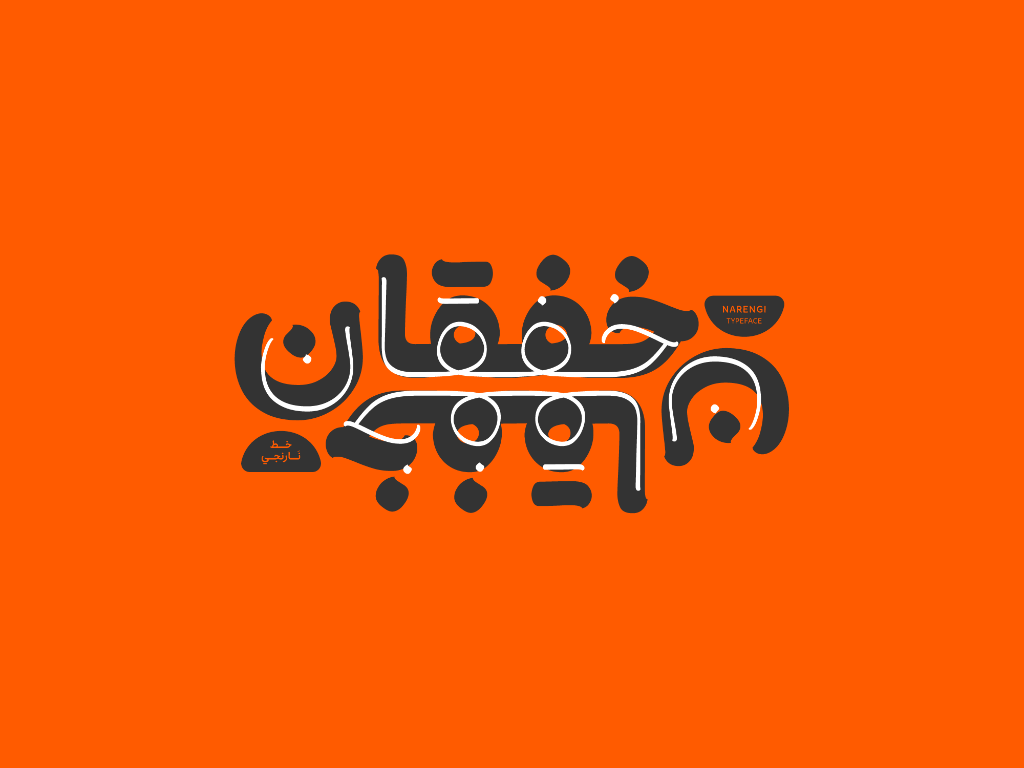
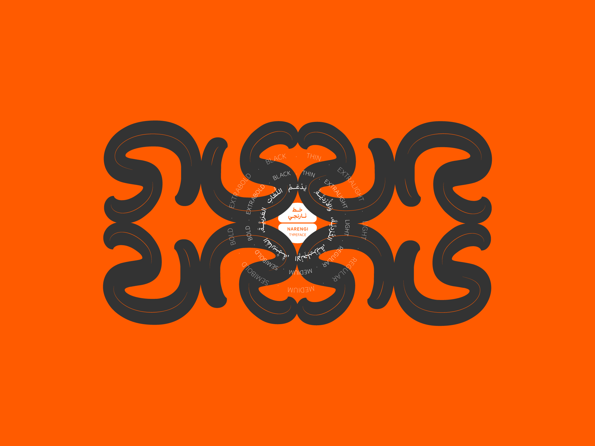
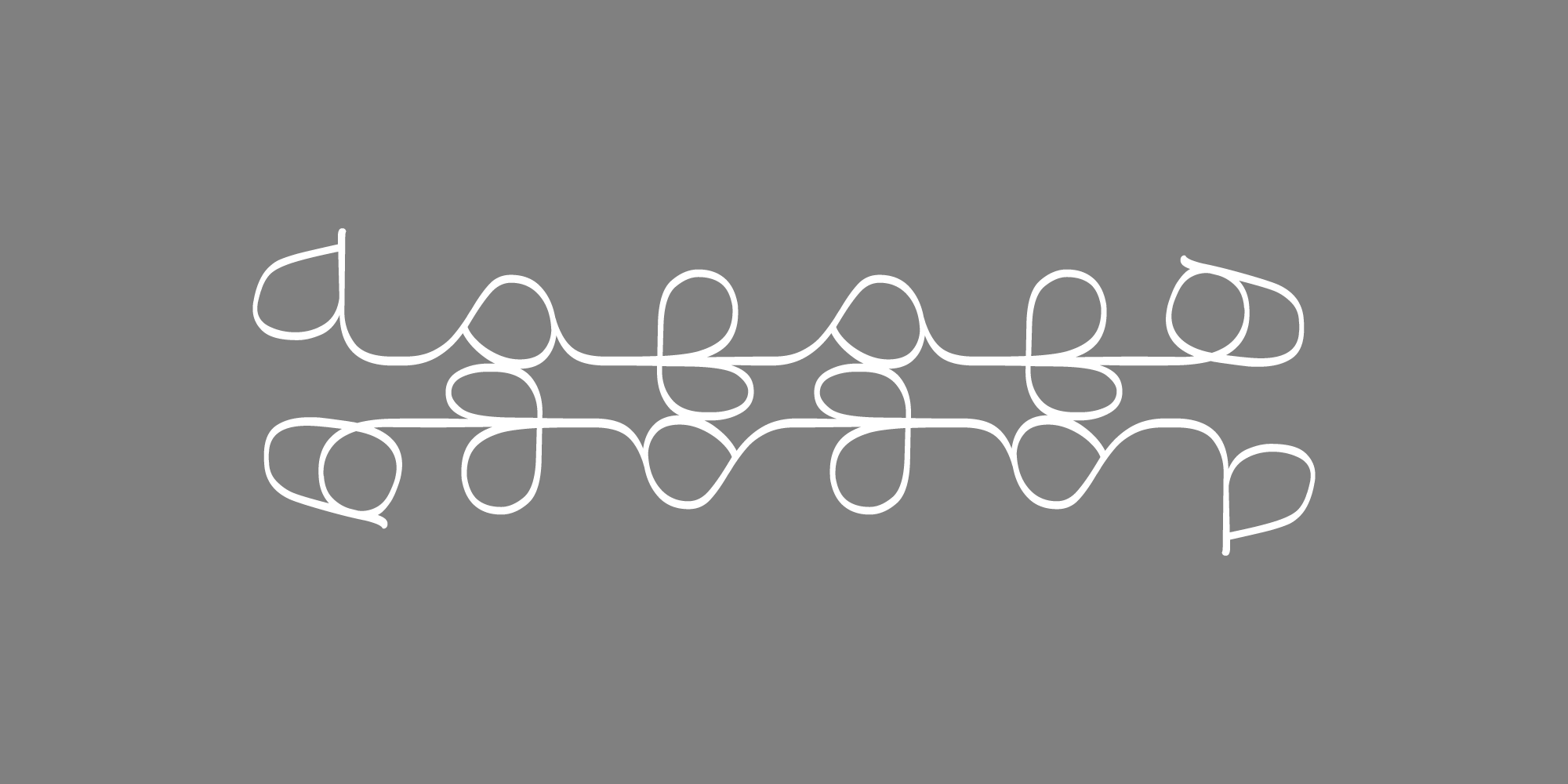
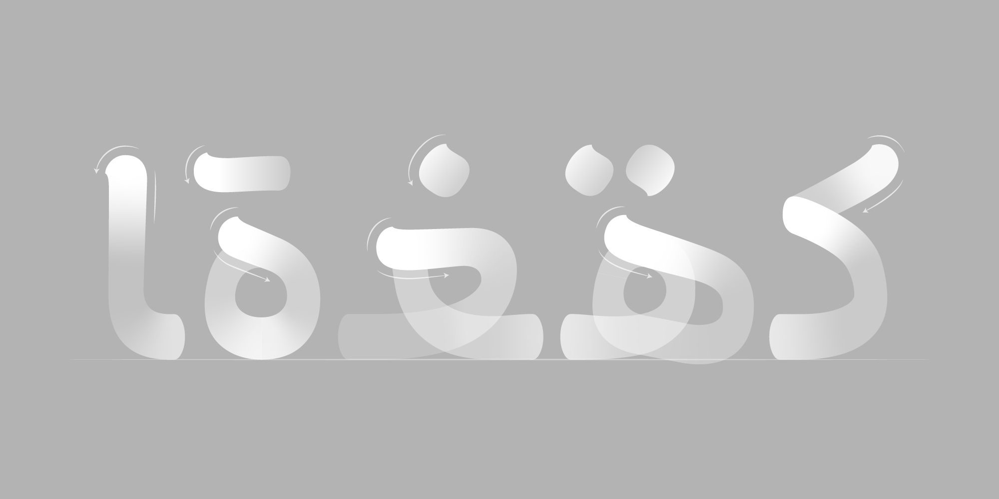
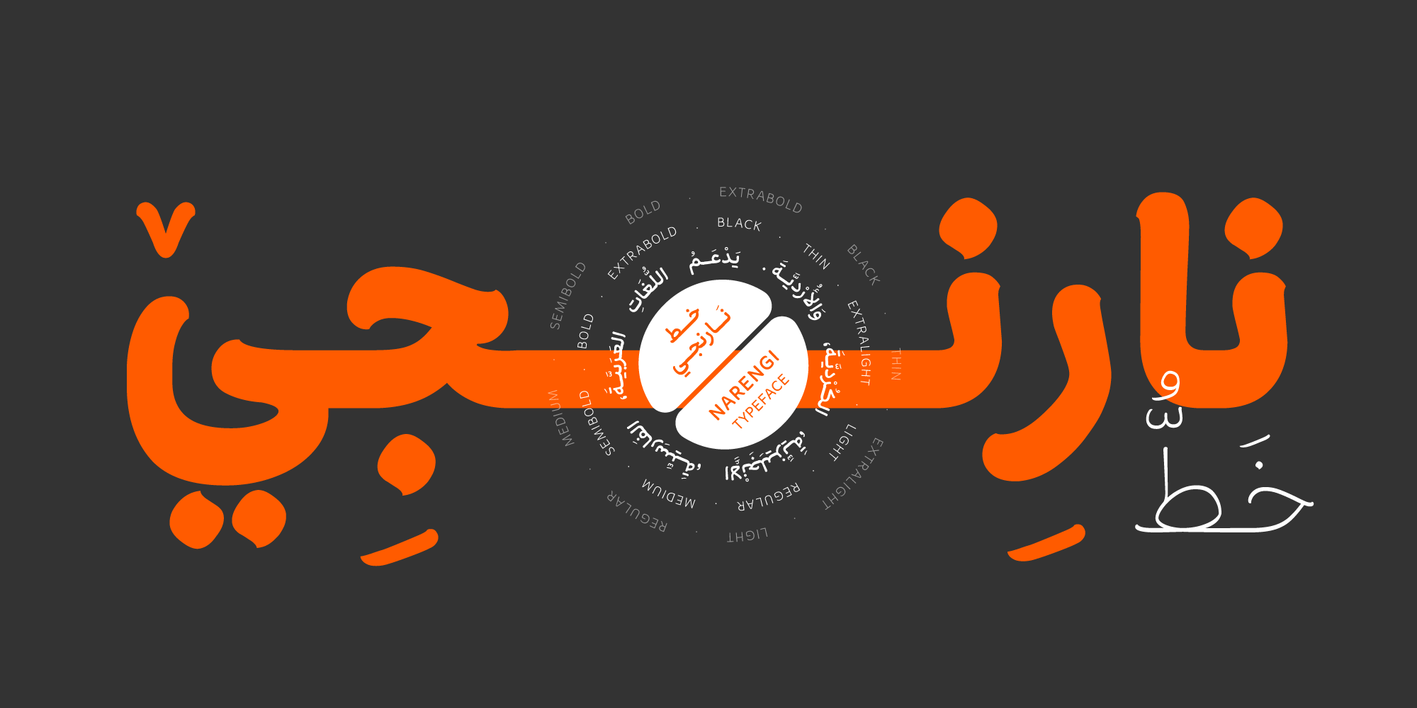
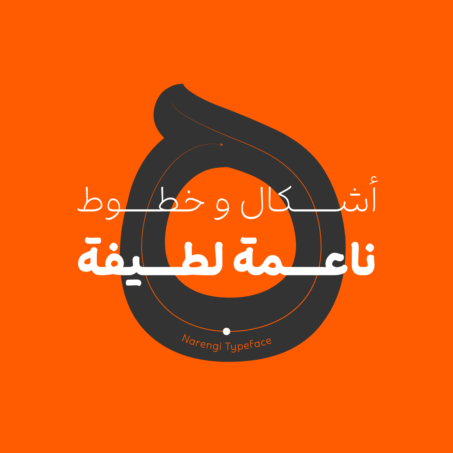
Narengi was showcased during the second week of Type Tehran, under the theme "Brush Font," where it was selected as the event's Best Typeface.
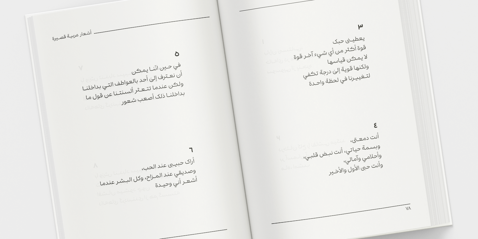
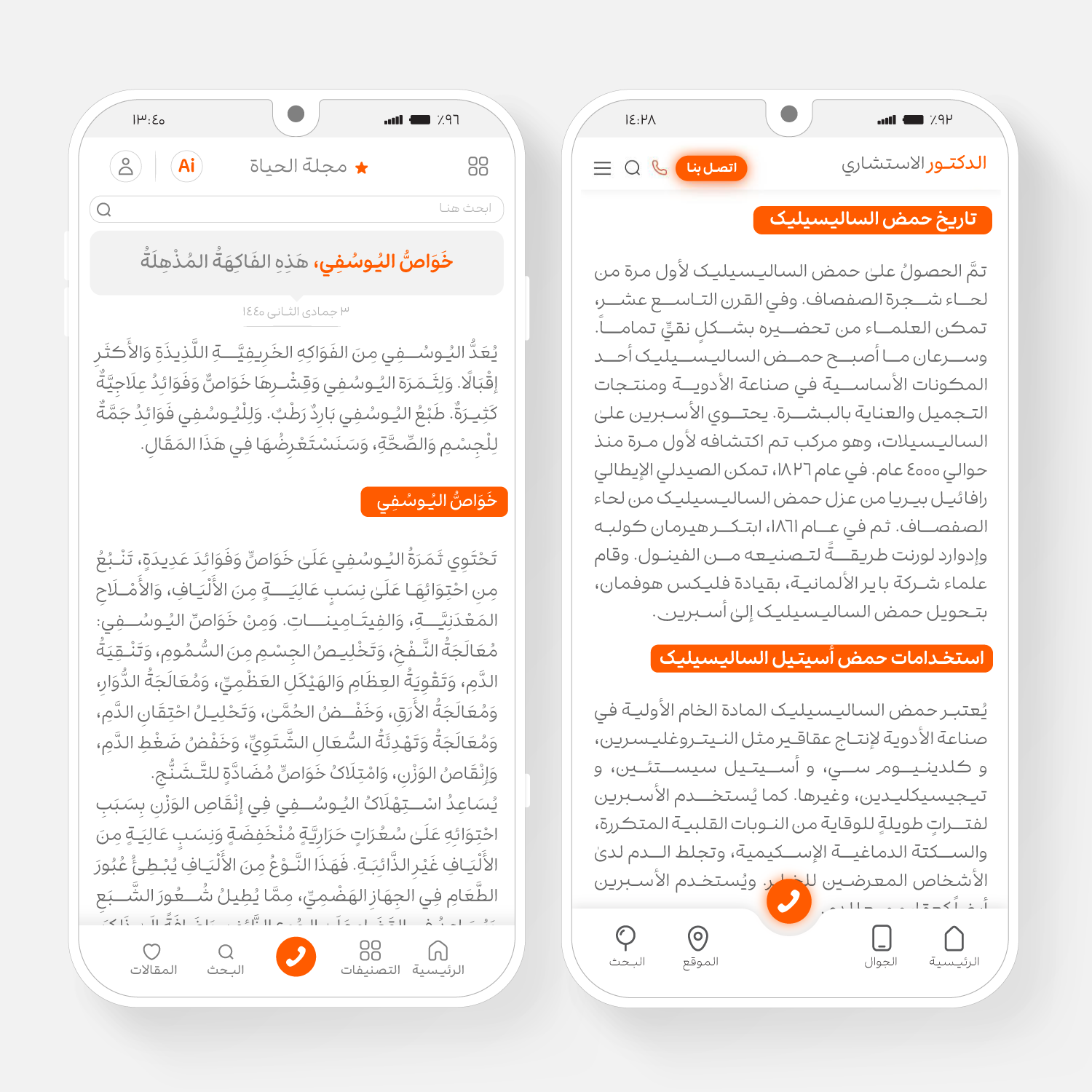
Inspired by the fluid movement of a brush, Narengi recreates the softness of handwritten strokes within a cohesive typographic structure. Its flowing letterforms lend words a sense of warmth and lyricism, making the text feel not only readable but almost audible in a gentle voice. Breaking away from the rigidity of geometric typefaces, Narengi is an ideal choice for designs that seek a warm, expressive, and emotionally engaging visual tone.
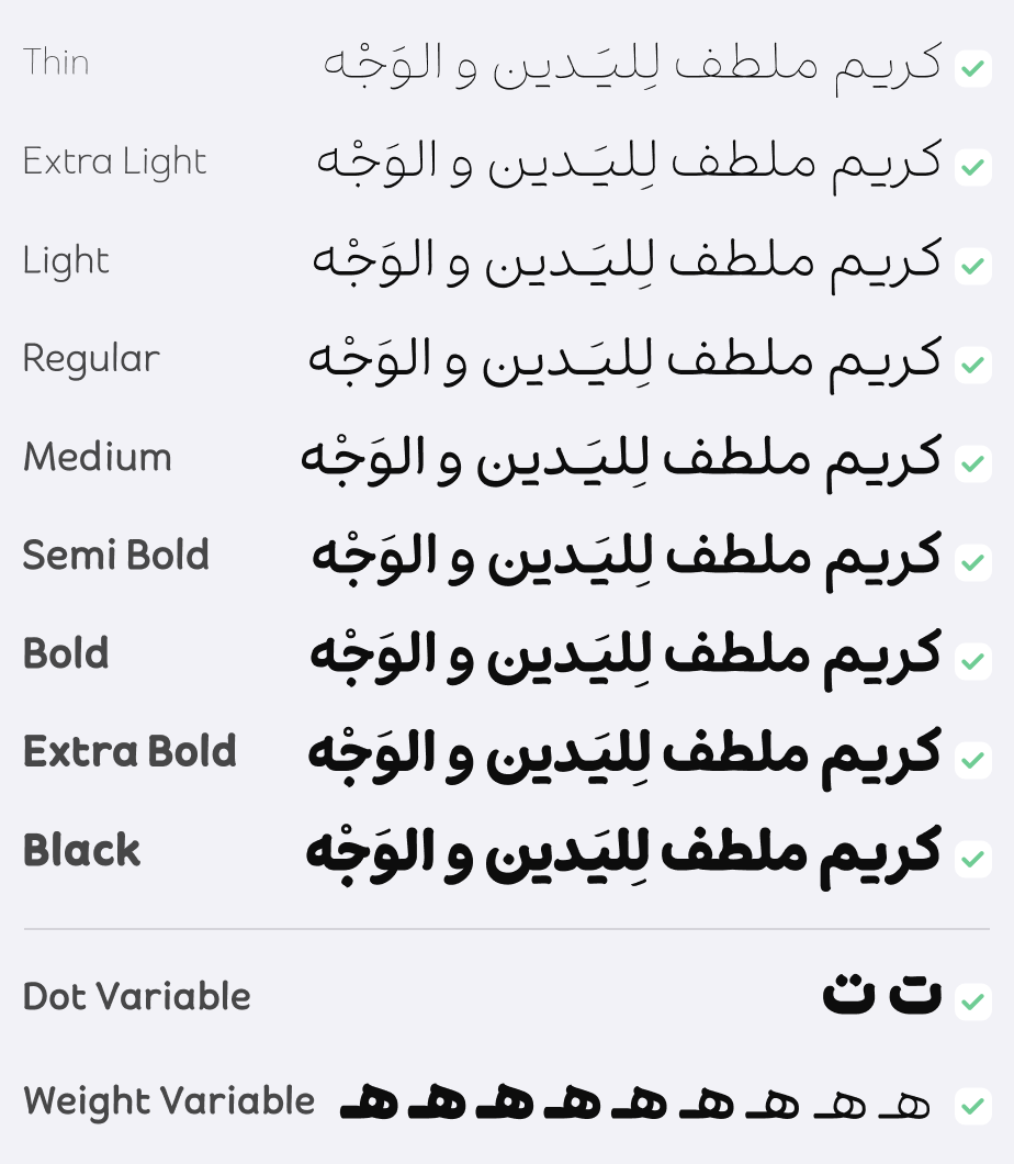
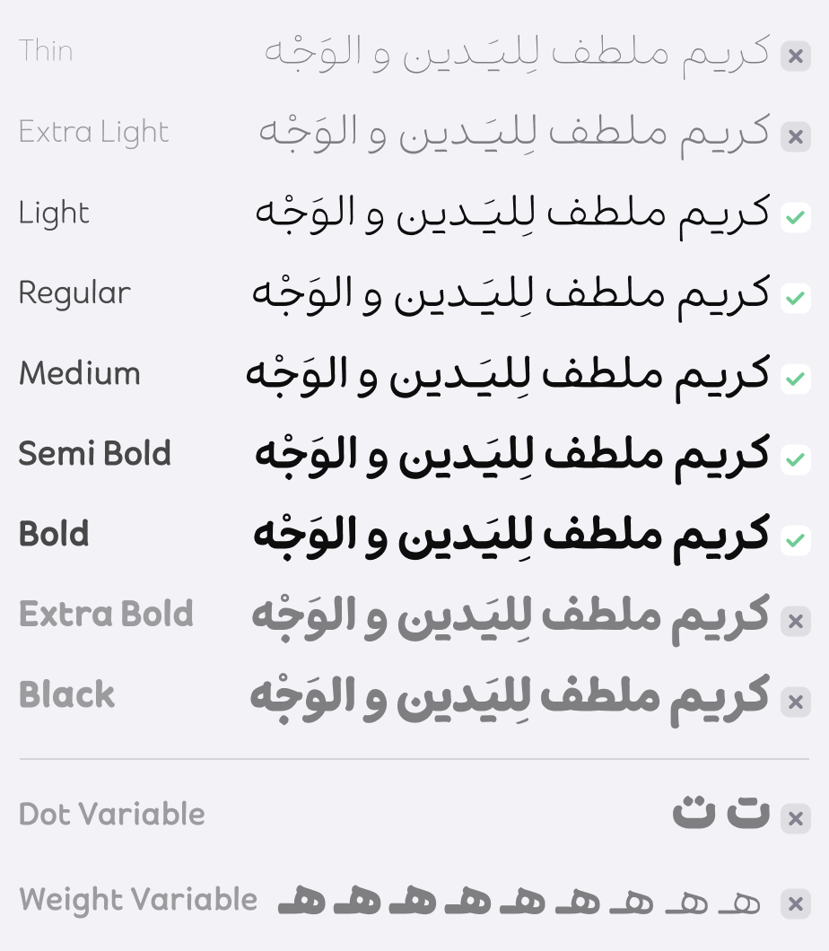
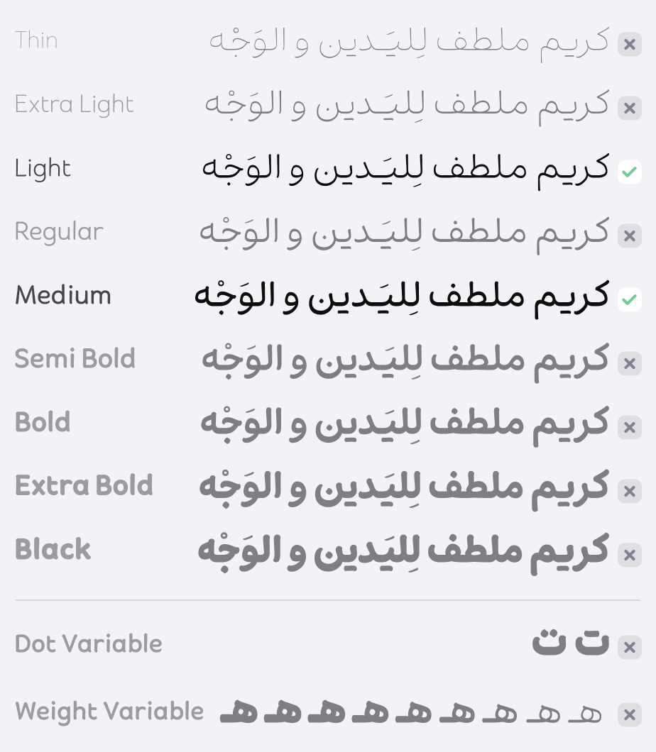
Narengi is available in nine distinct weights and features two alternative dot styles—Connected (DS1) and Separated (DS2). It supports Persian, Arabic, Kurdish, Urdu, and Latin, making it a versatile typeface for multilingual typography.
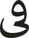
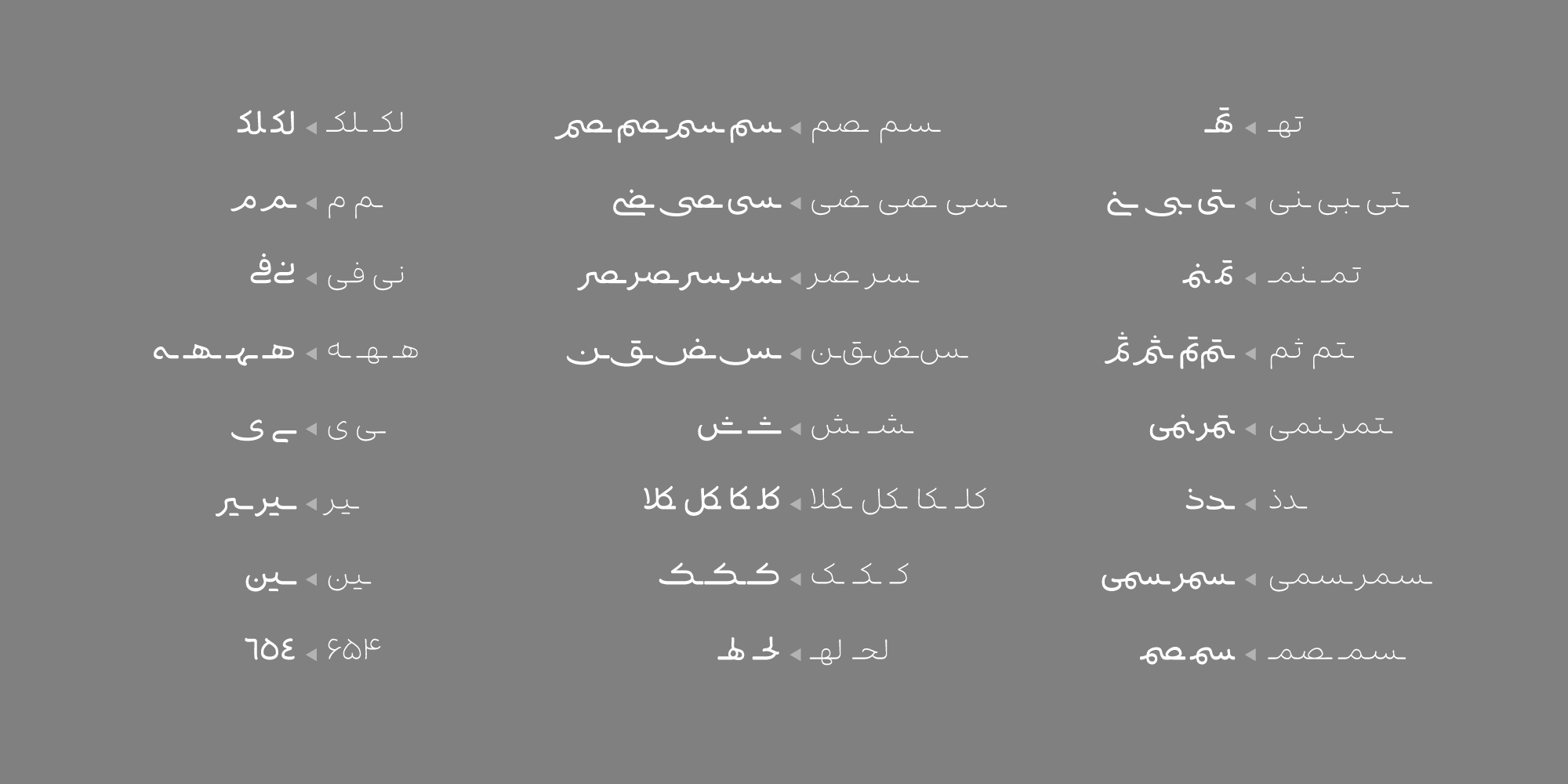
Narengi features distinctive elongated strokes in selected letterforms and is characterized by a broader horizontal extension along the baseline than most Arabic typefaces.
This generous horizontal rhythm gives the typeface a graceful, flowing appearance while enhancing its expressive and calligraphic character.
The behavior of Narengi varies according to its weight and intended use. In the lighter weights, which are optimized for continuous text, the extended horizontal strokes create a sense of calm and visual balance, counteracting the abundance of curves in the letterforms and helping maintain a clear, orderly text texture.
In the heavier weights, designed primarily for display and headlines, these horizontal extensions have been intentionally shortened, allowing larger words to fit more efficiently within limited space without sacrificing the typeface's distinctive character.
In the Narengi(Pro) Font Package:
Main Fonts: 9 weights available in TTF formats.
Web Fonts: WOFF and WOFF2 formats along with CSS and HTML codes.
Variable Fonts: 2 axis (weight and dot styles).



Karim Shahin, a graduate of Graphic Design from the University of Tehran, began his professional career during his studies as a graphic and type designer. He has collaborated with numerous companies and organizations, both on-site and as a freelancer. His background and interest in calligraphy paved the way for his entry into the field of type design. His first font design project was carried out as part of his academic thesis, resulting in two fonts that were selected as winners at the "Tehran Typography Week" event. Previously, he had also received recognition in logotype design competitions.









Comments
Recommended Posts
Meeting with Karim Shahin, Designer of the Narengi Typeface
Nostalgic Arabic Fonts: Reviving the Beauty of the Past
Top Arabic Fonts for Ramadan and Eid Design
Arabic Fonts for Books & Magazines: From Print to Digital
Techno Typeface; A Look at the Design Process and Logic
What features does an ideal subtitle font have?
Selected Fonts of 2025 in the TDC Competition
13th GRANSHAN Type Design Competition