


























Nabat


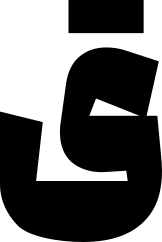
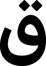
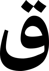
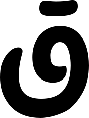
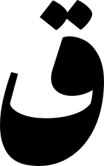
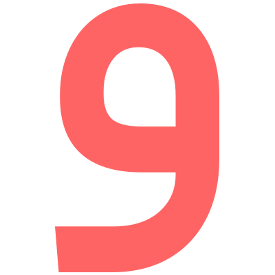
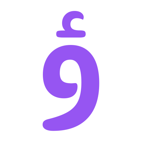
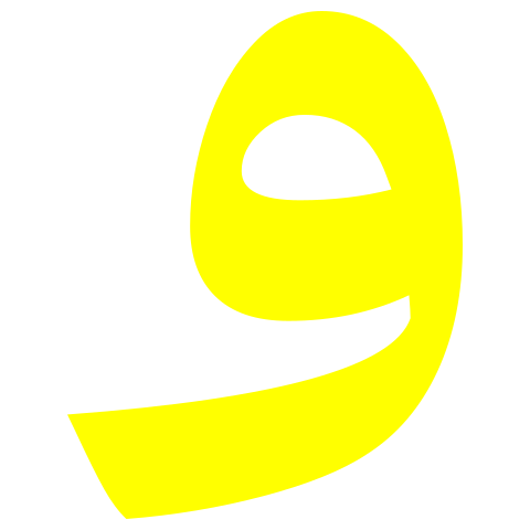
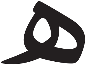
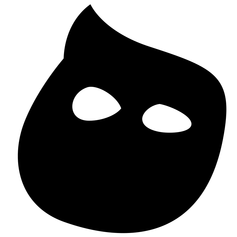
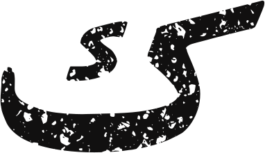
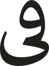
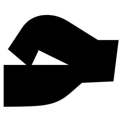
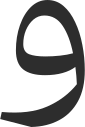
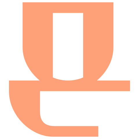
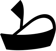
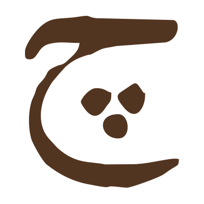
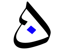
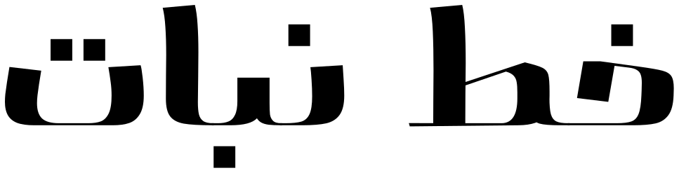
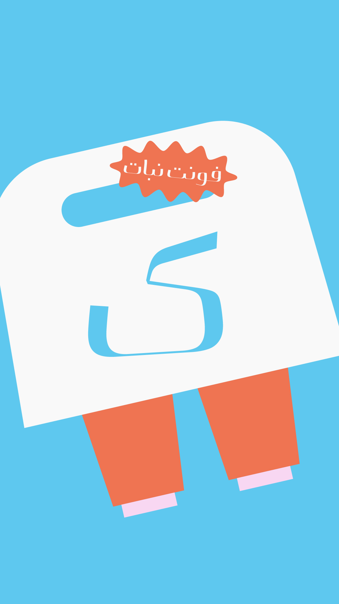
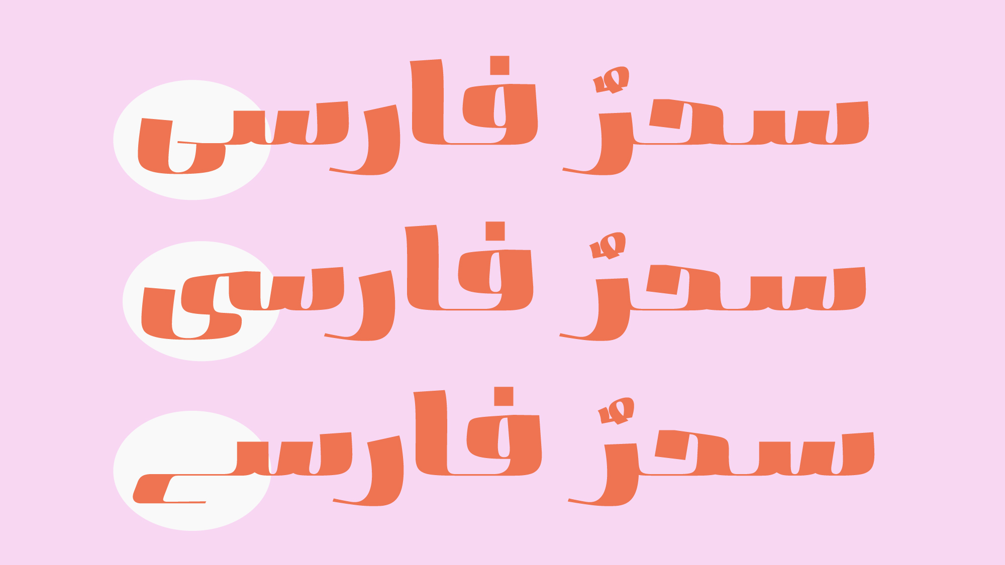
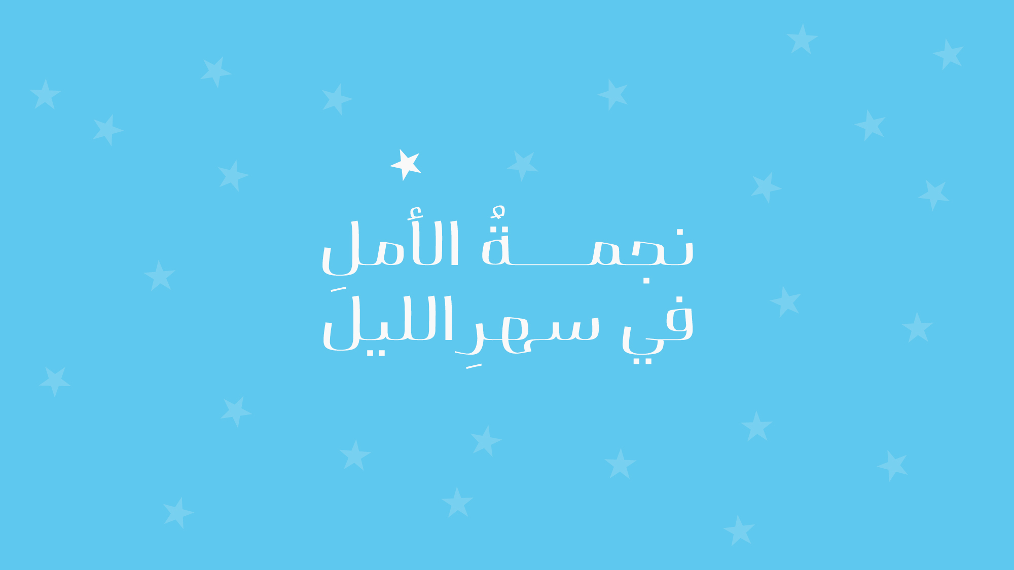
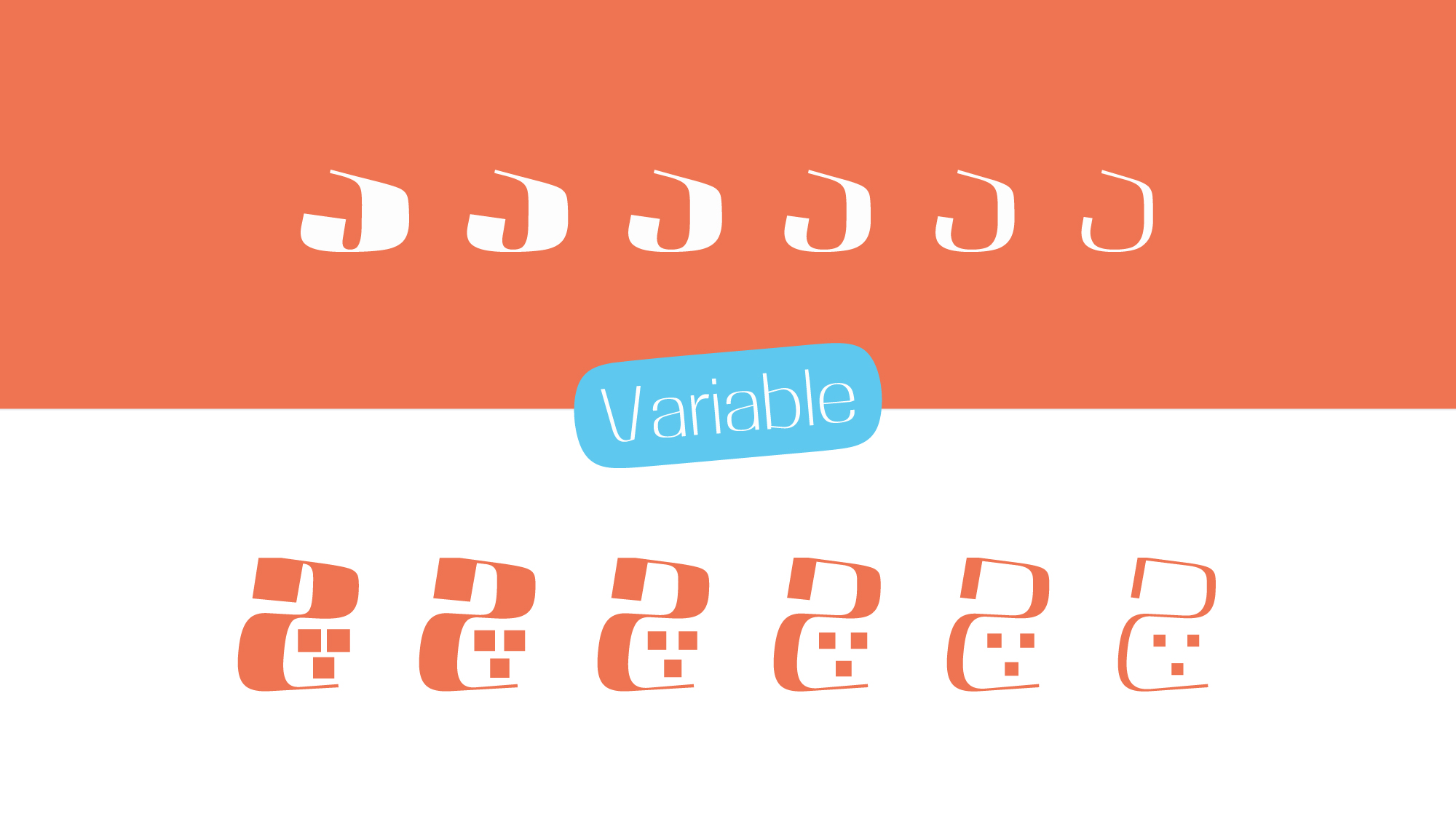
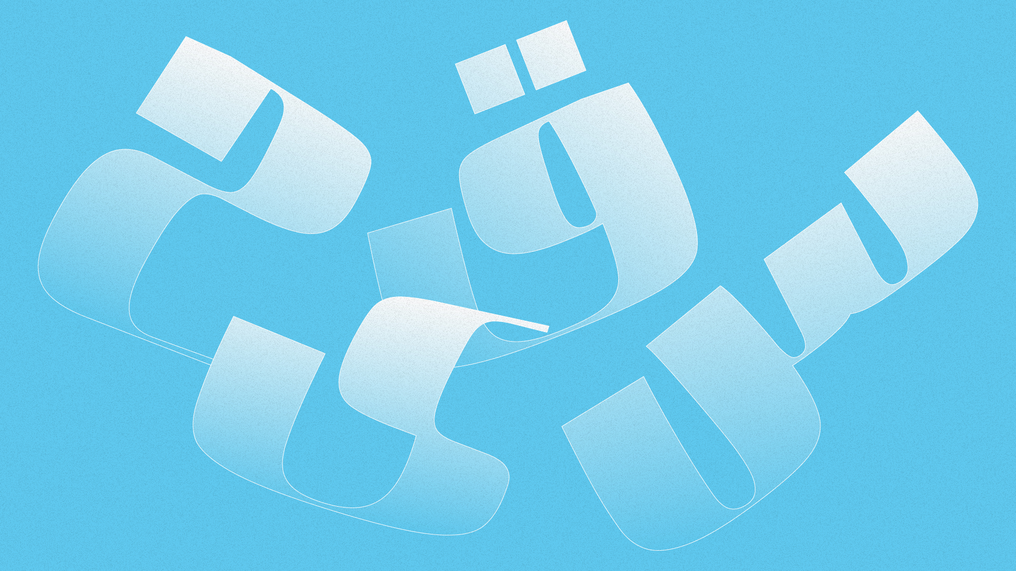
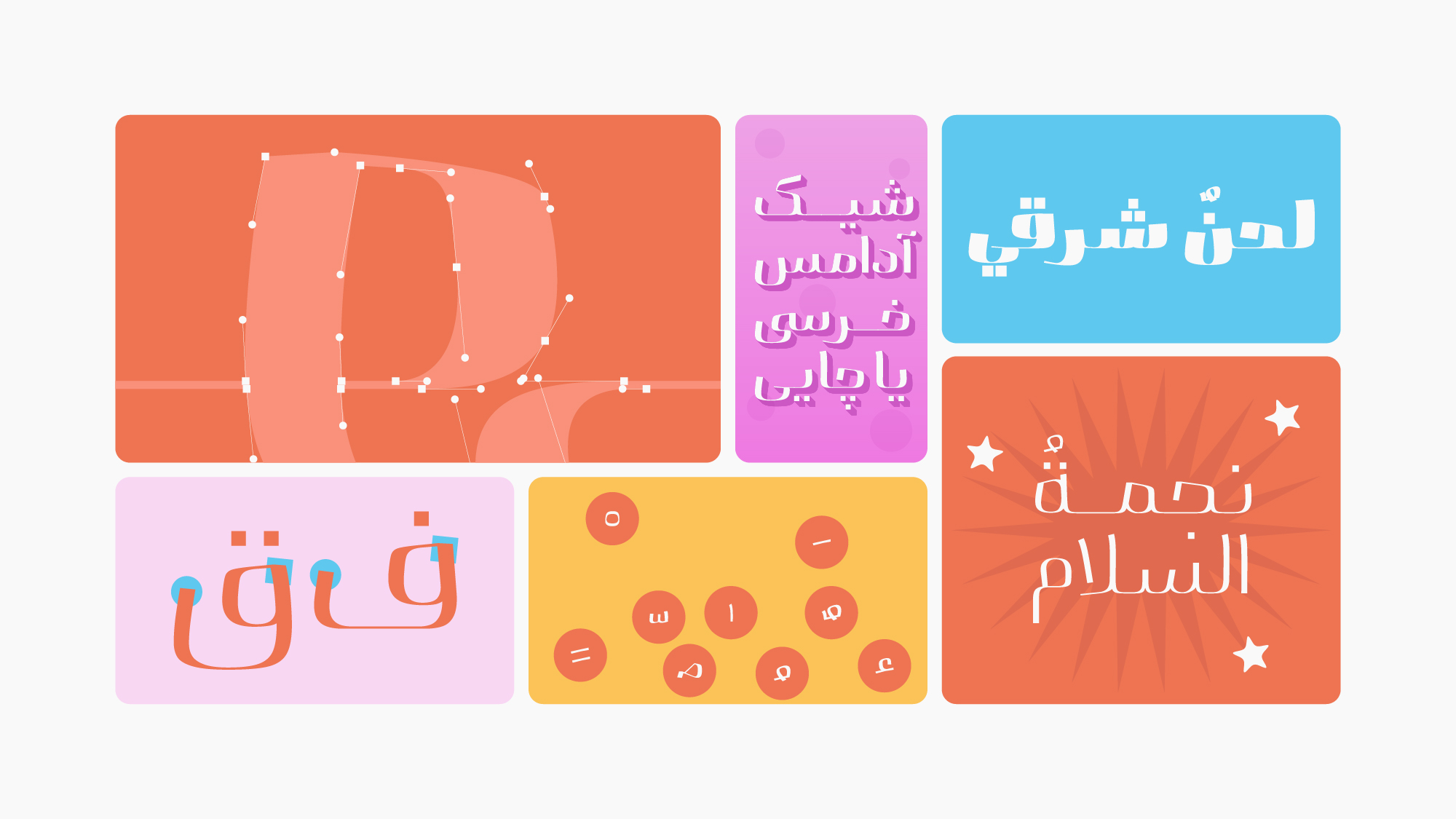
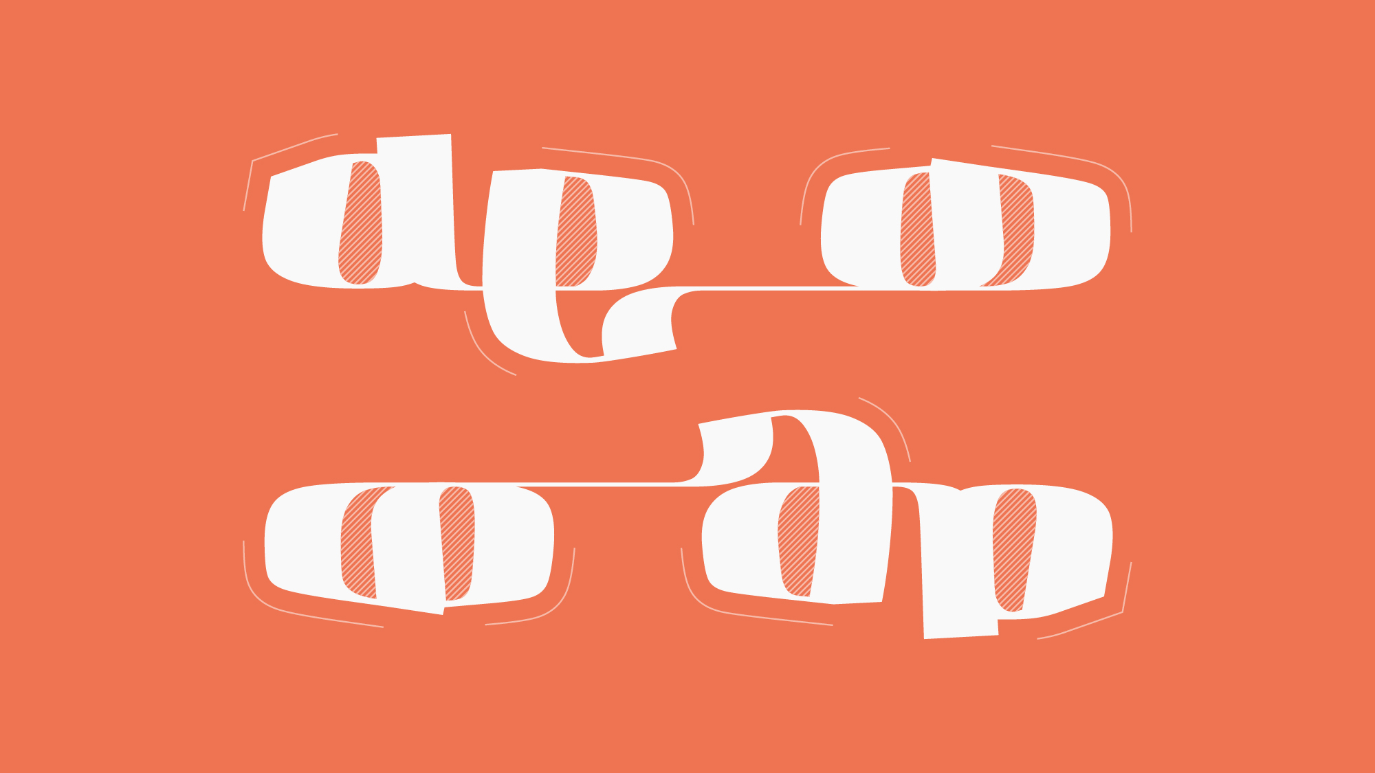
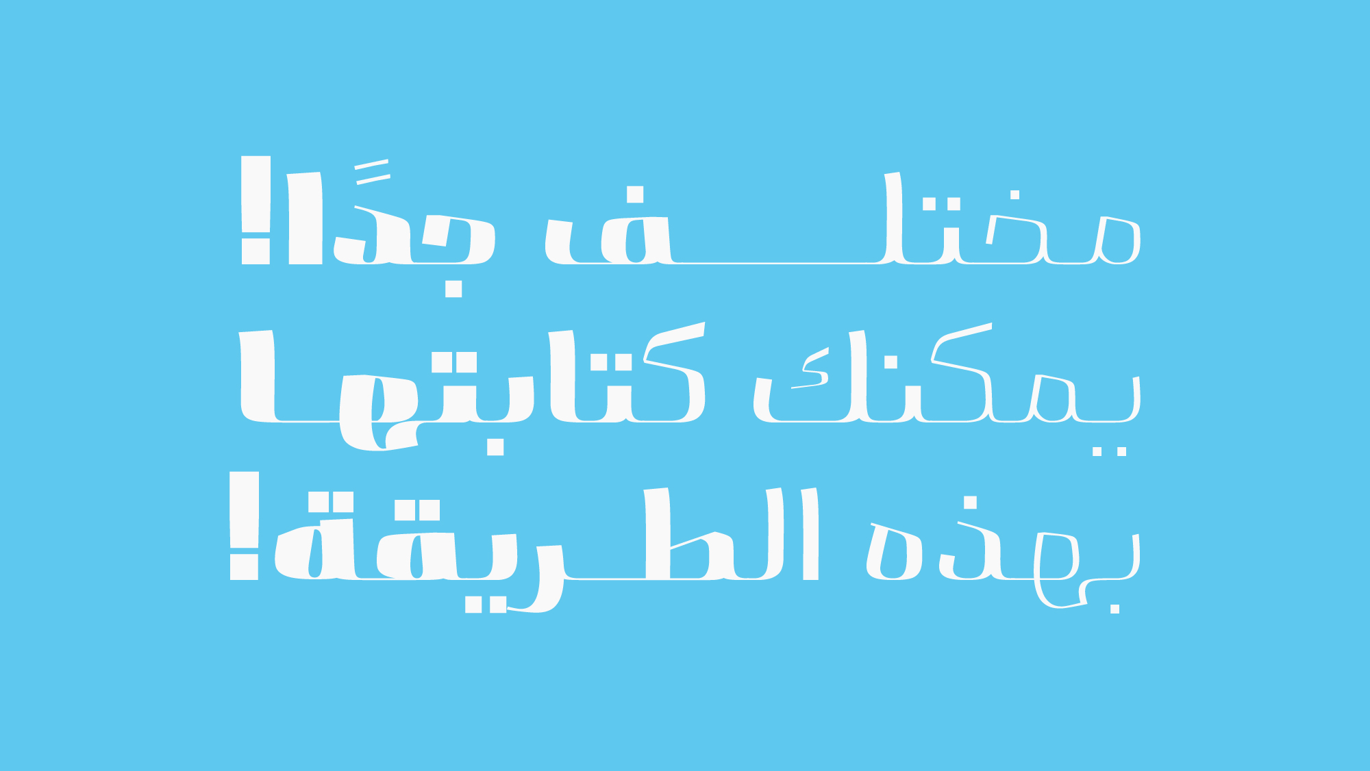
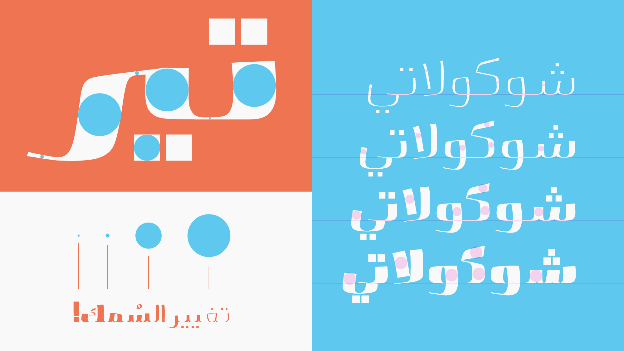
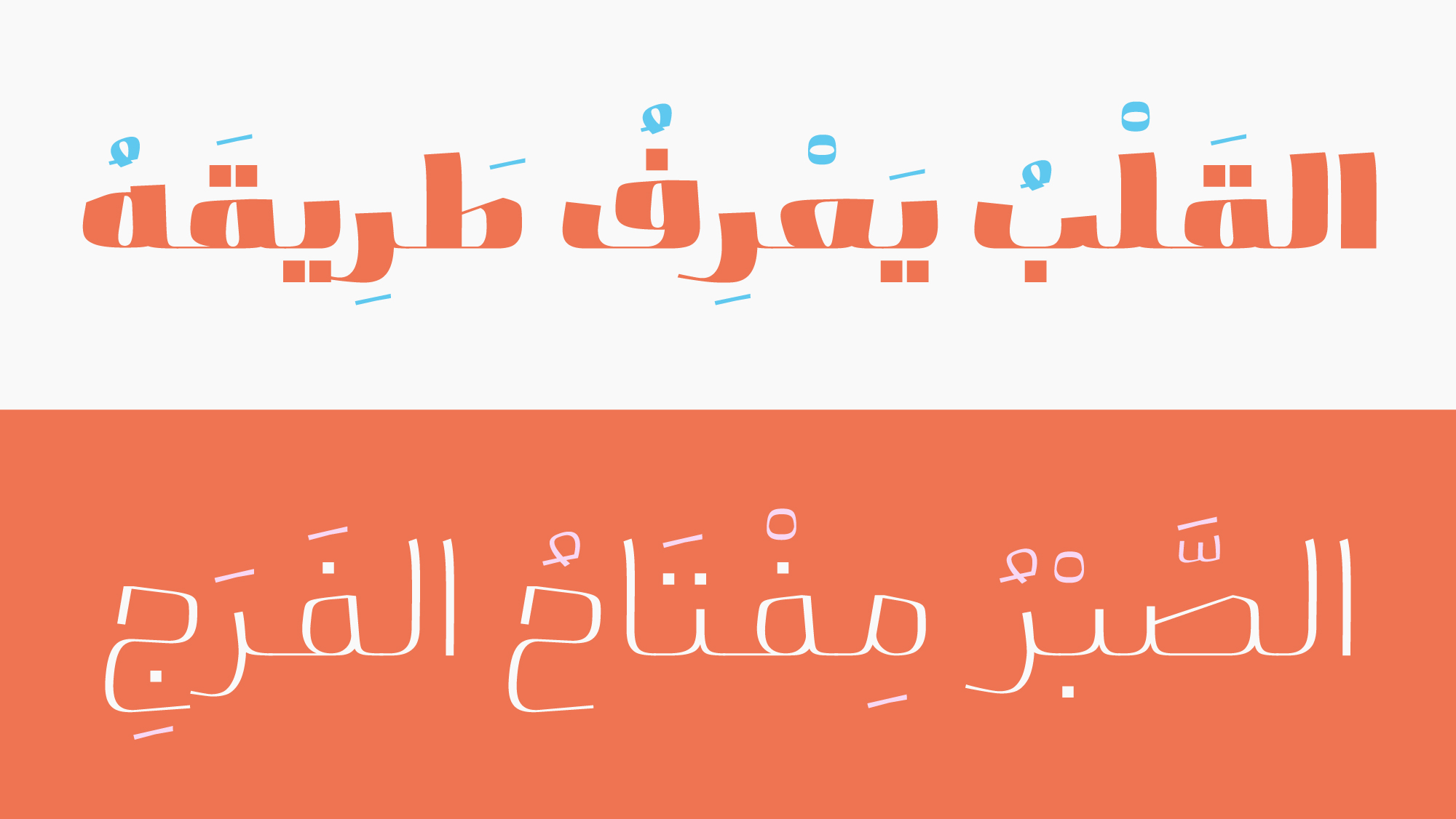
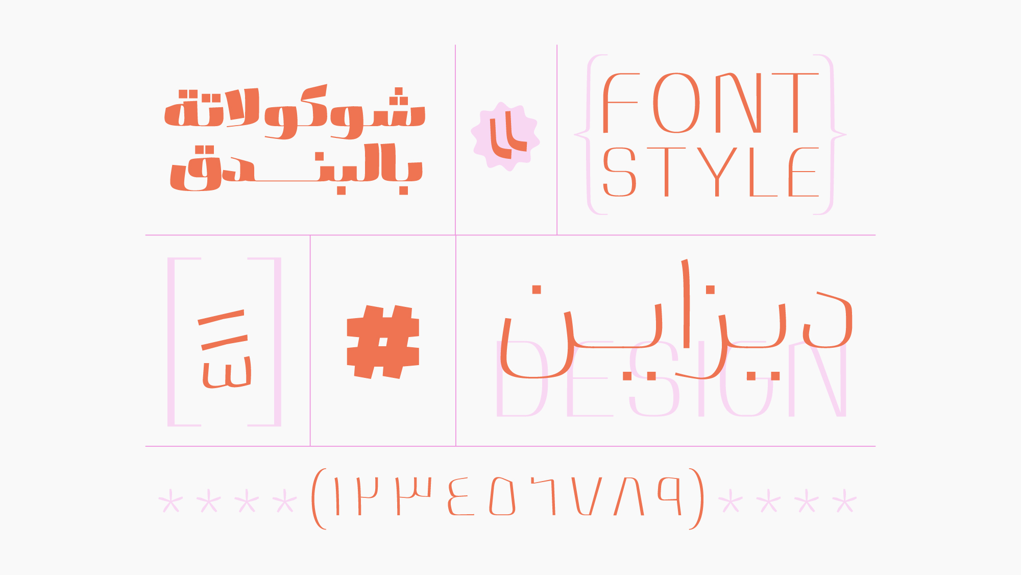
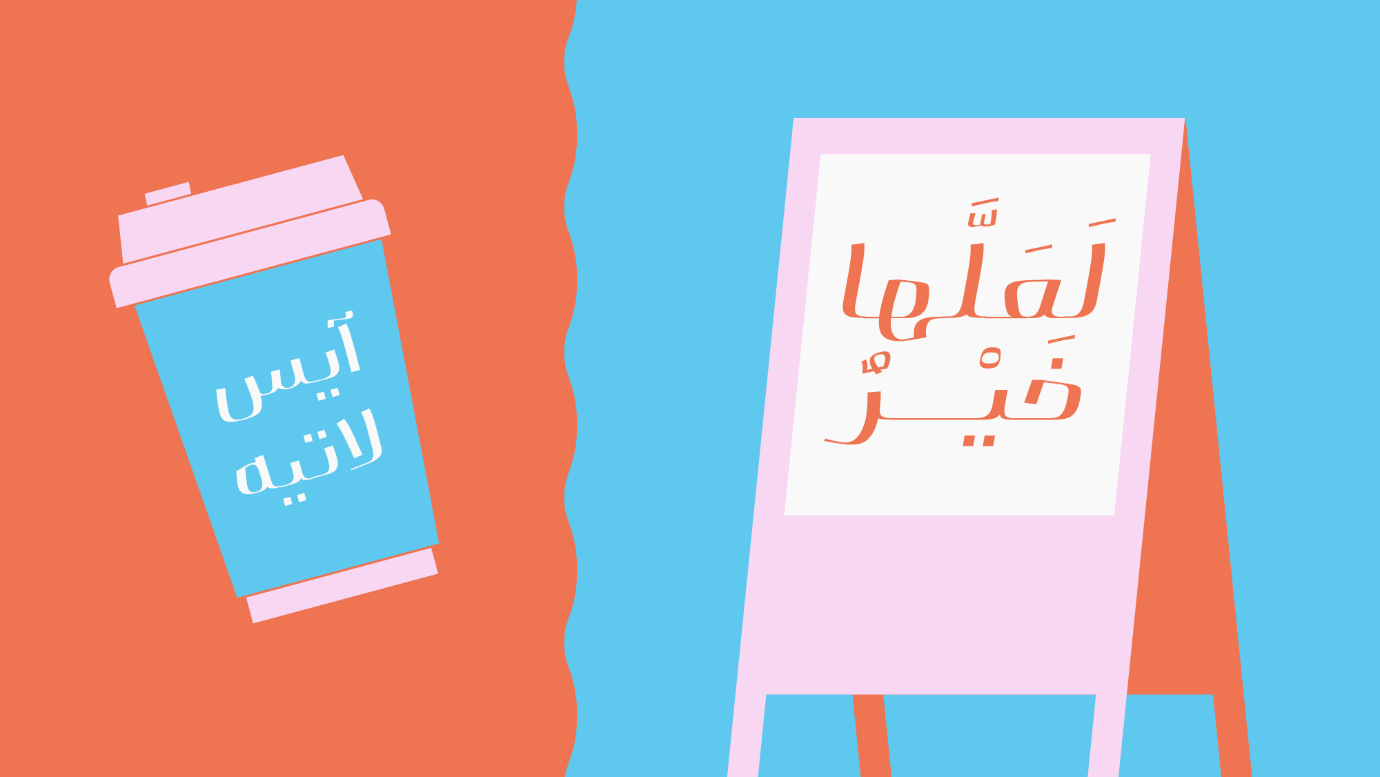
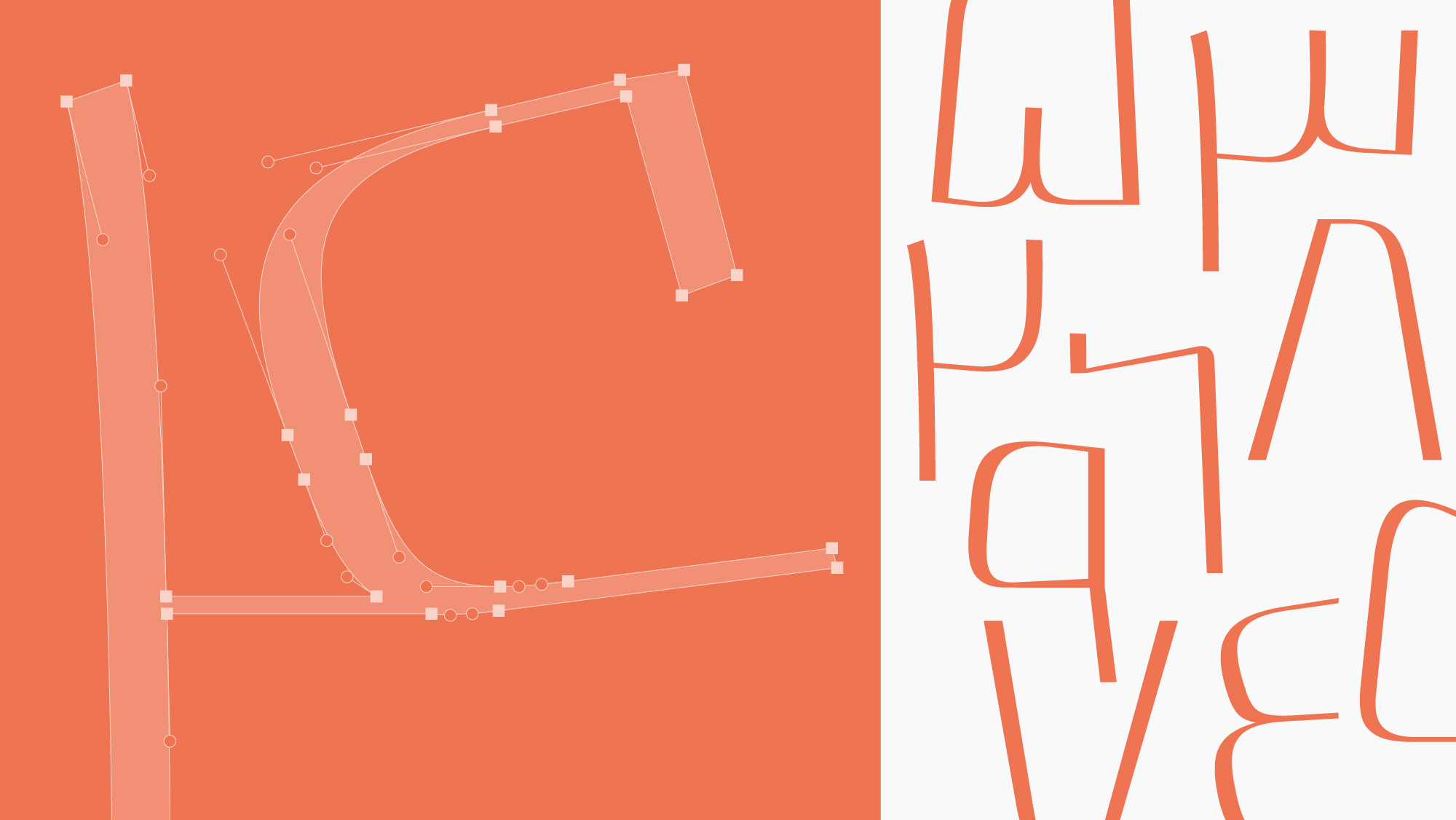
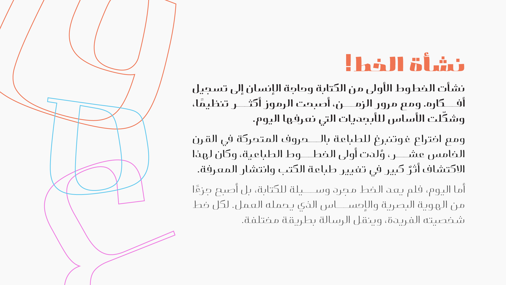
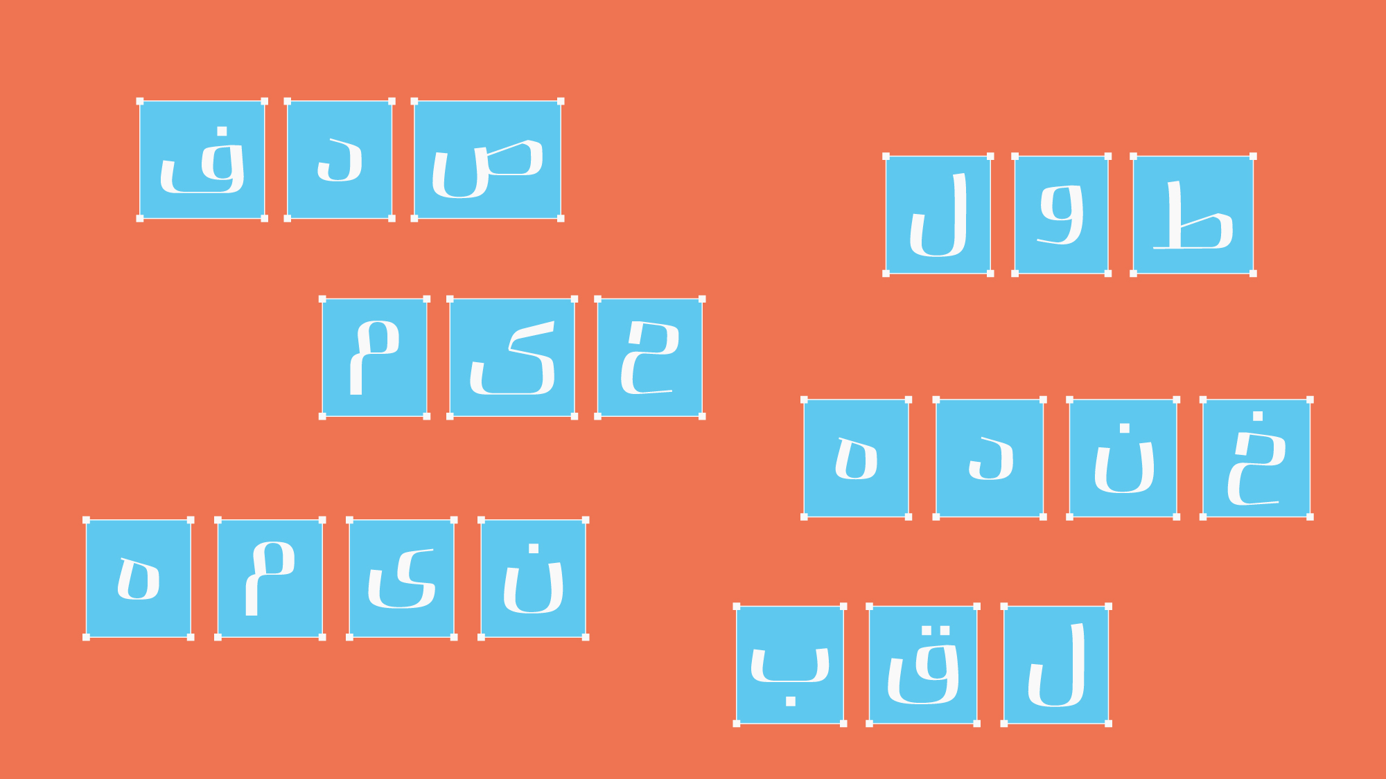
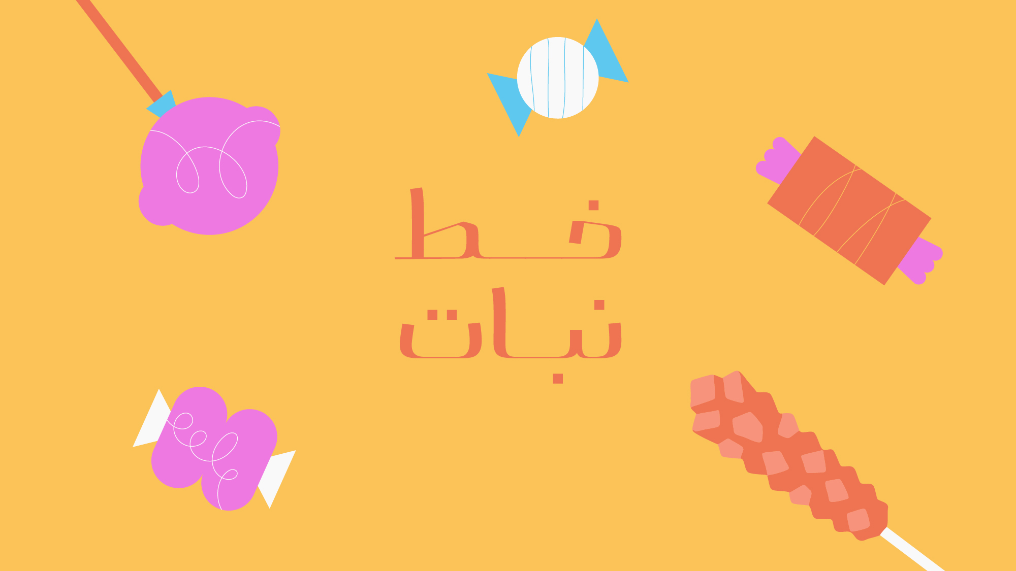
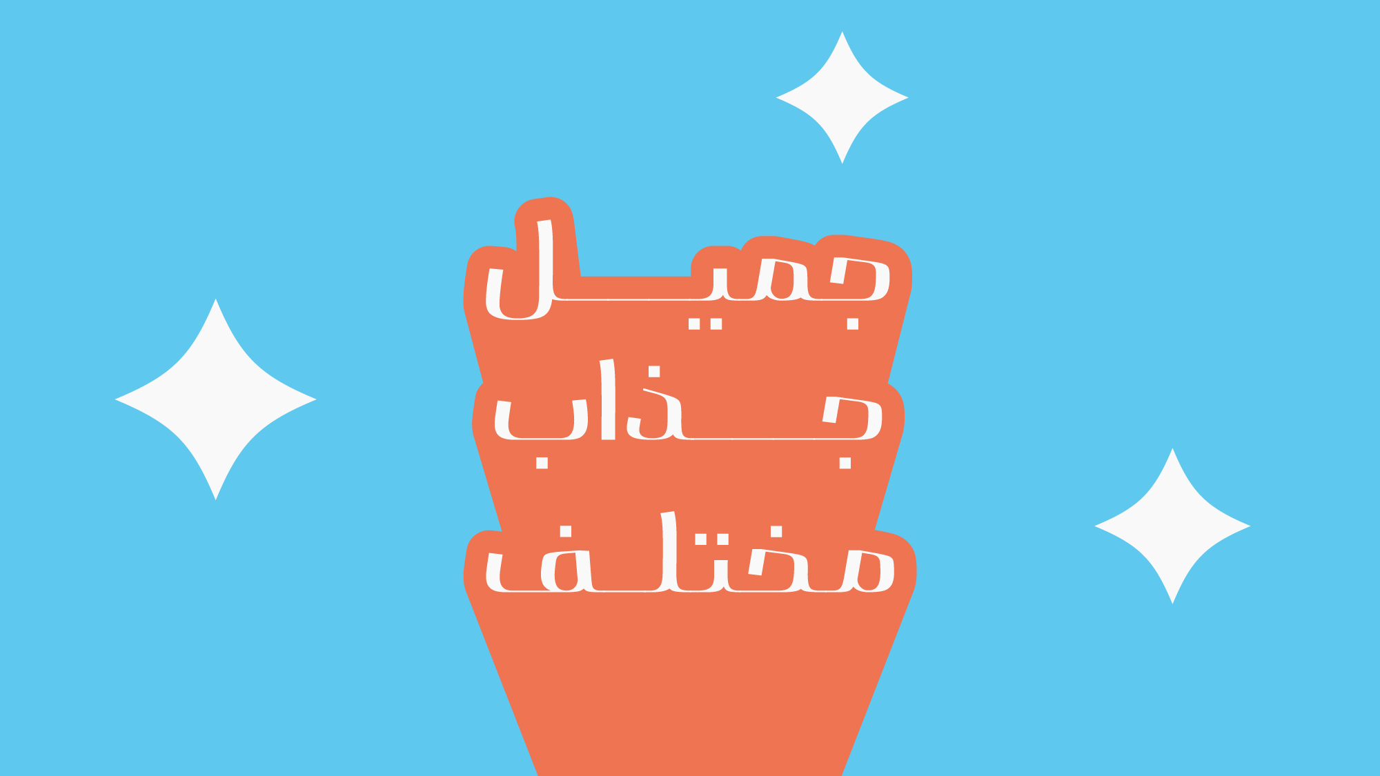
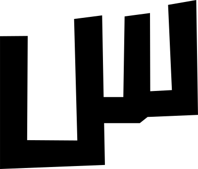
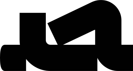
Nabat is a display typeface with a warm, dynamic, and playful personality, designed with a fresh perspective on the structure of Persian typefaces. The core concept of the family is based on creating weight through the expansion of letterforms horizontally. Unlike the conventional approach of increasing stroke thickness in Persian typefaces, this method is closer to the design logic of many Latin typefaces, giving Nabat a distinctive visual identity. Its soft forms, bold proportions, and wide-open eyes make words in Nabat more than mere carriers of meaning; they become expressive and impactful visual elements in design.
Key Features of Nabat:
-
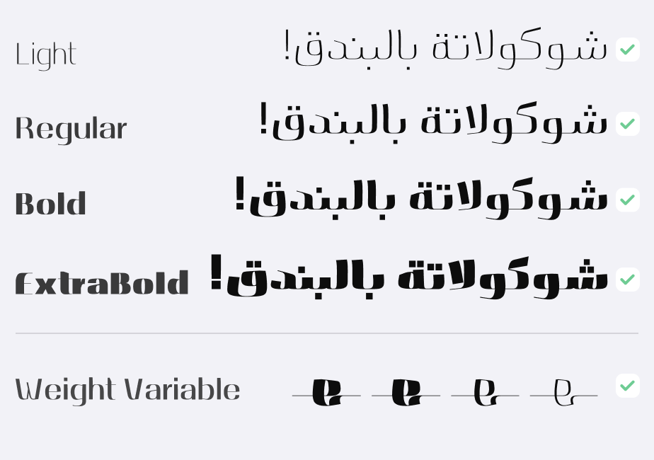
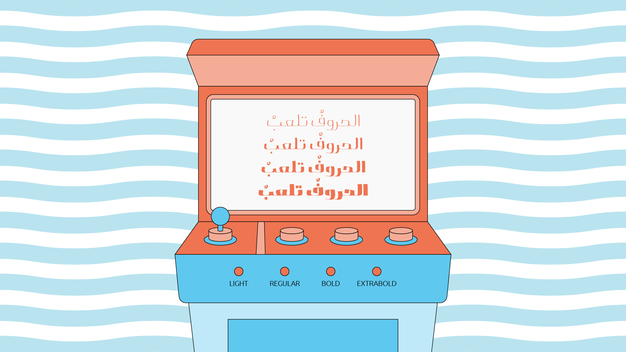
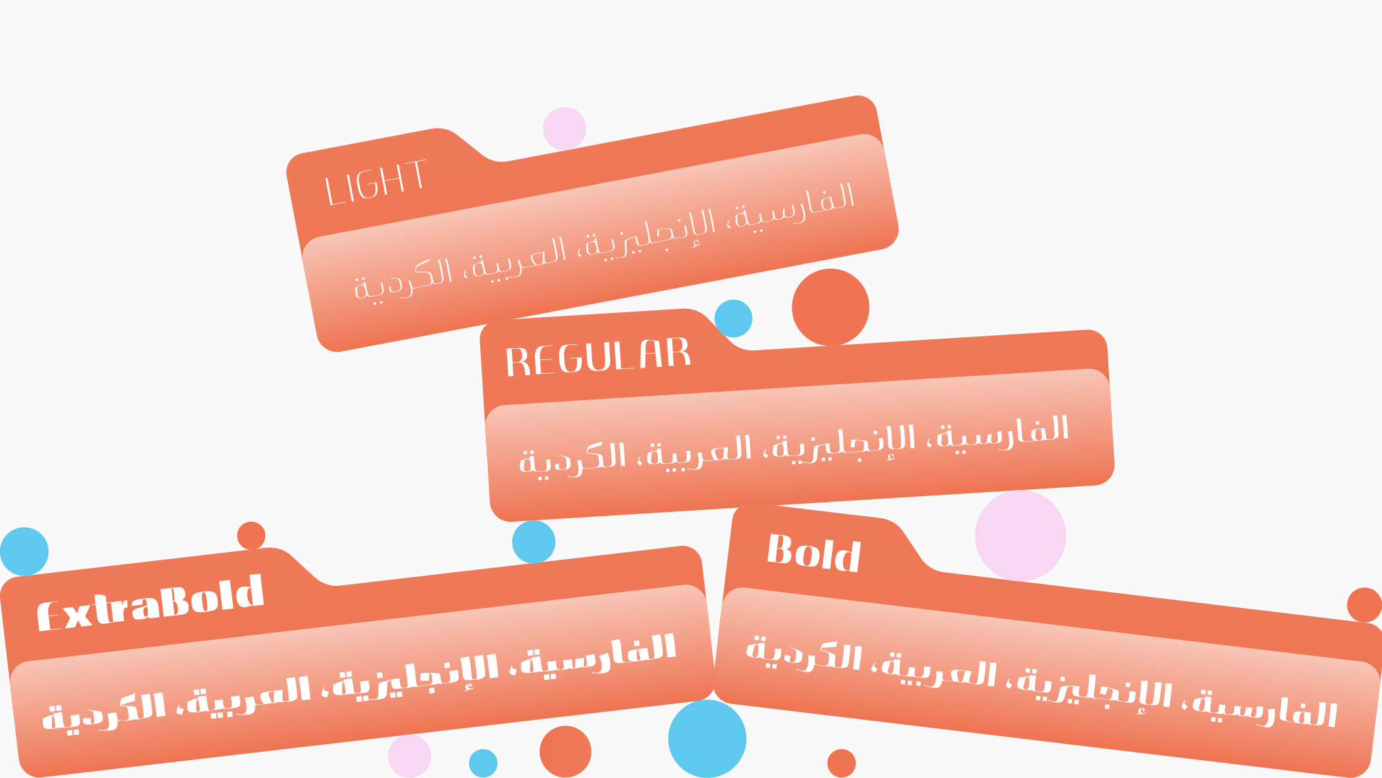
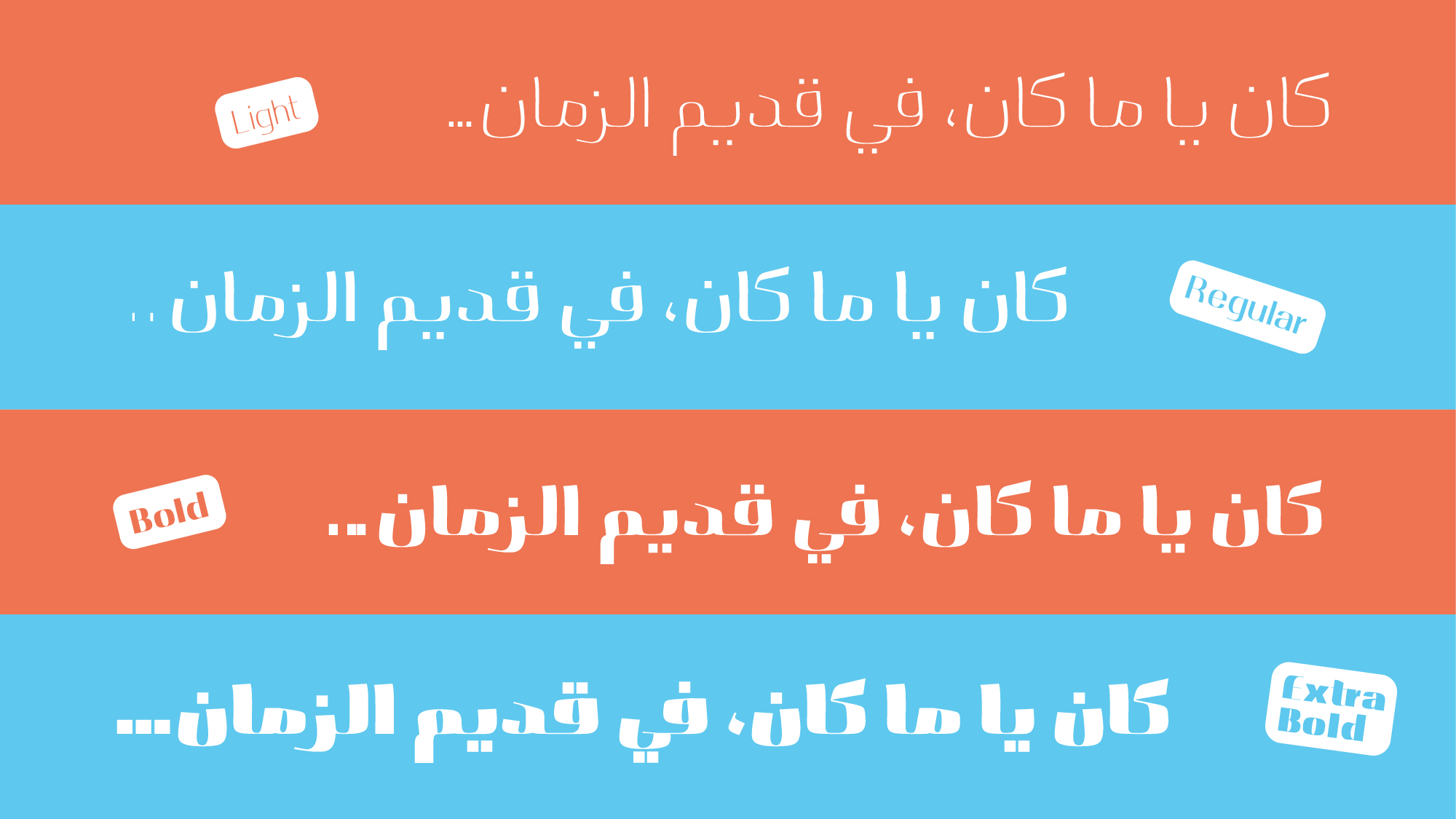
A family of 4 weights: Light, Regular, Bold, and Extra Bold
-
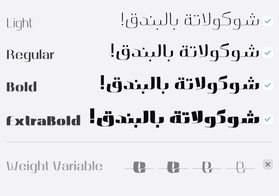
Variable Font version with a Weight axis
-
A weight system based on horizontal expansion of letterforms
-
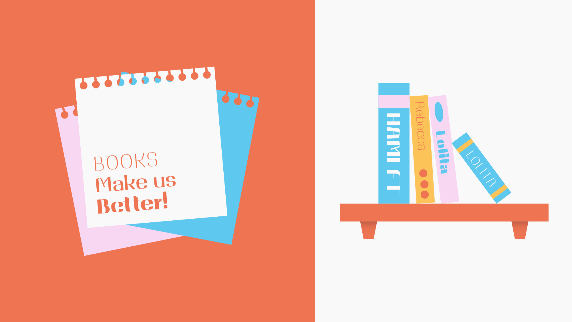
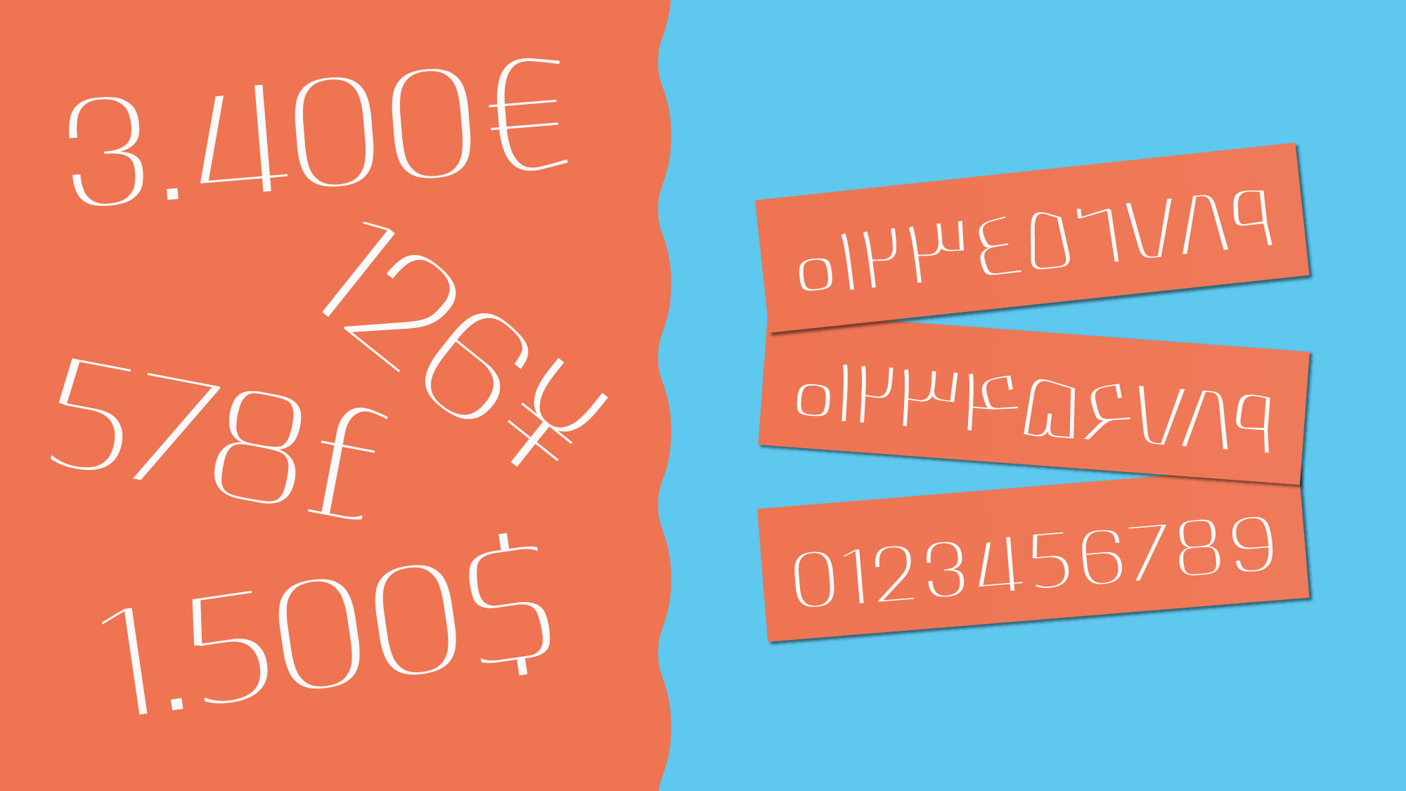
Harmonized Persian and Latin scripts with a shared visual identity
-
Support for Persian, Arabic, and Kurdish
-
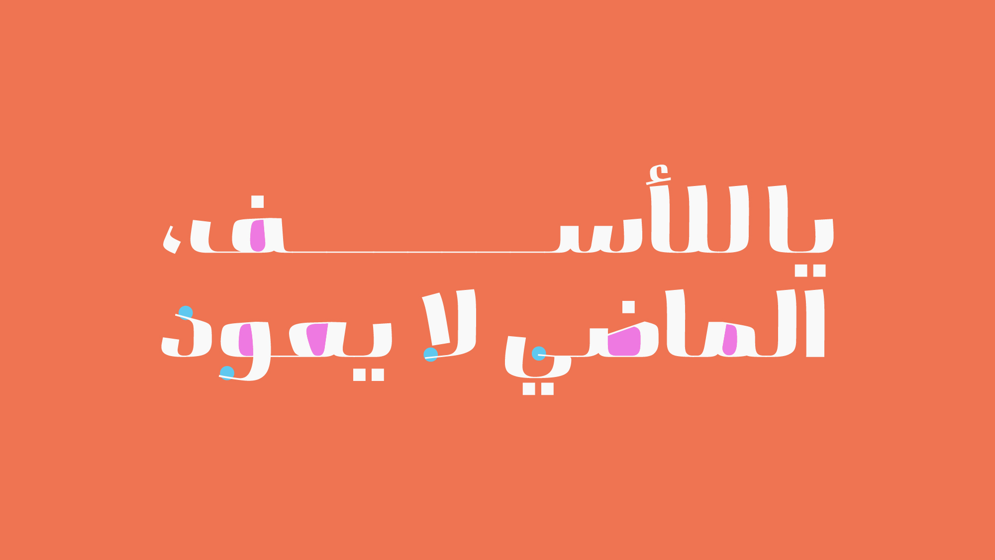
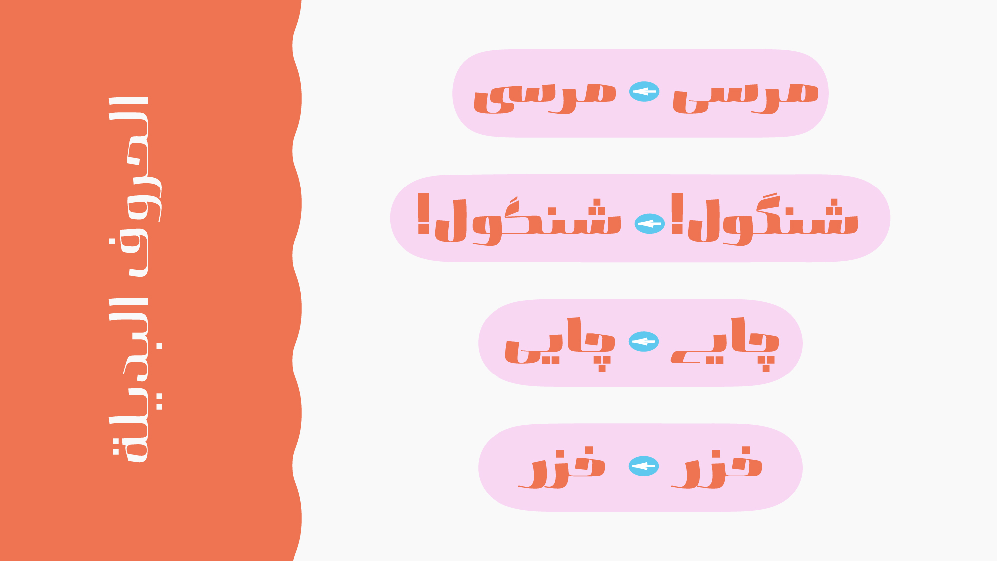
Alternate characters, ligatures, and OpenType features
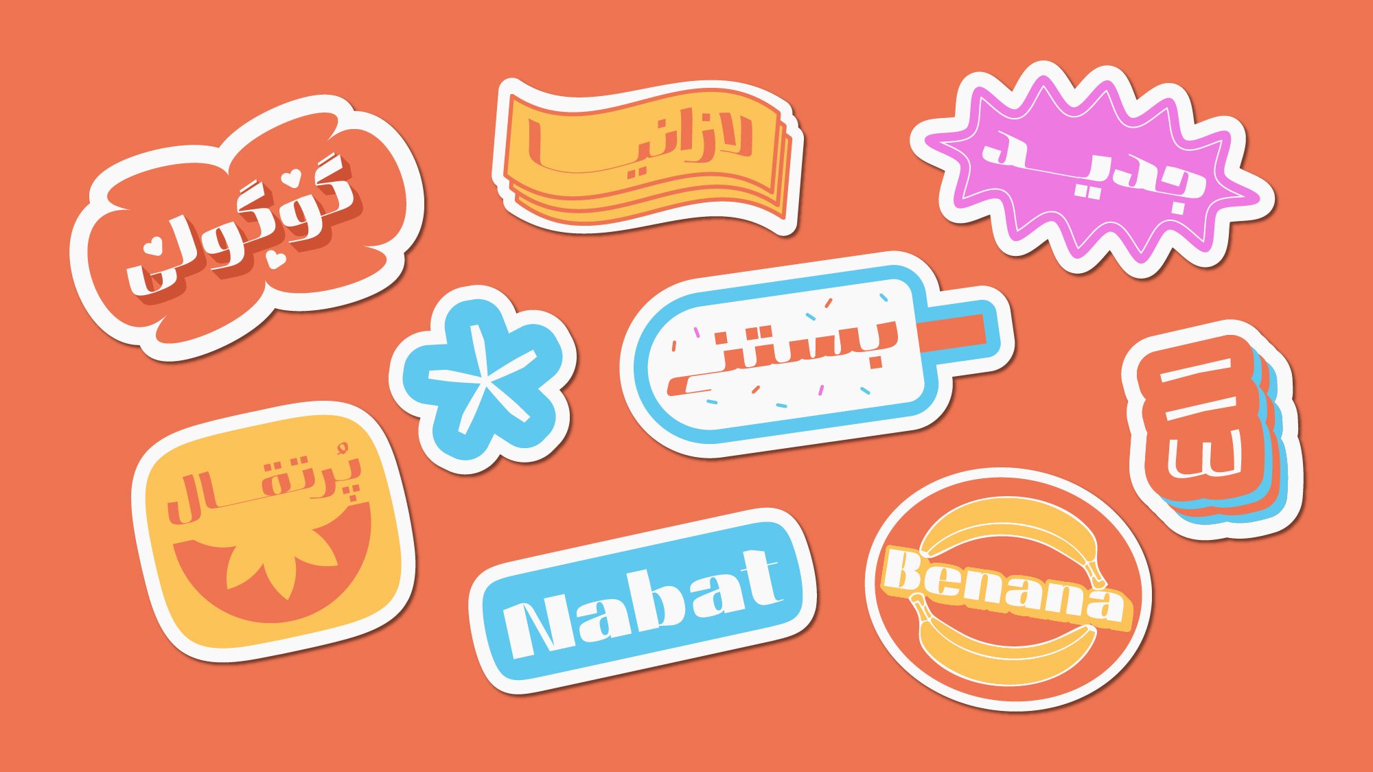
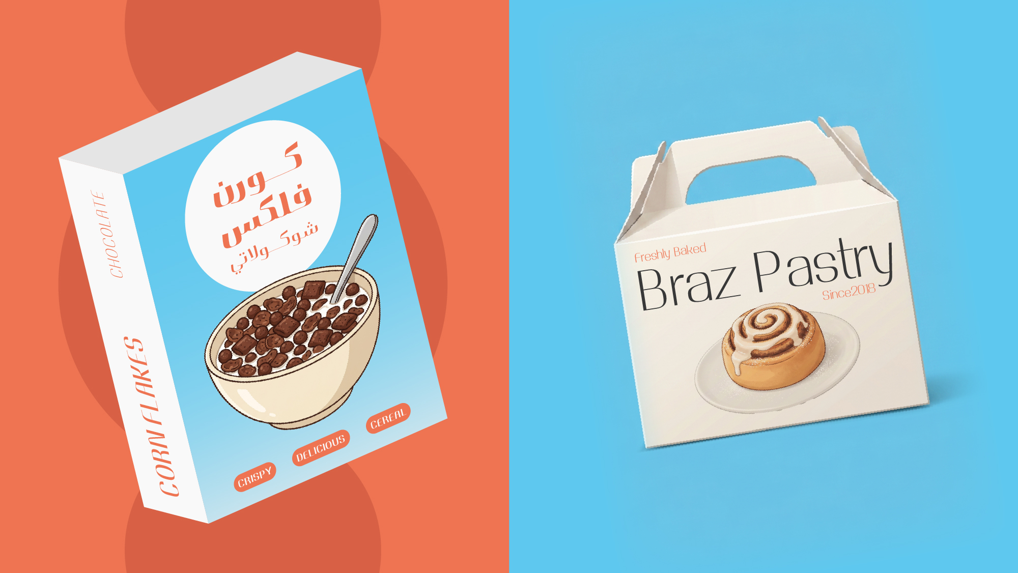
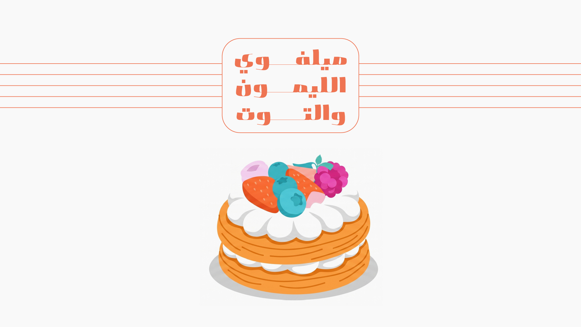
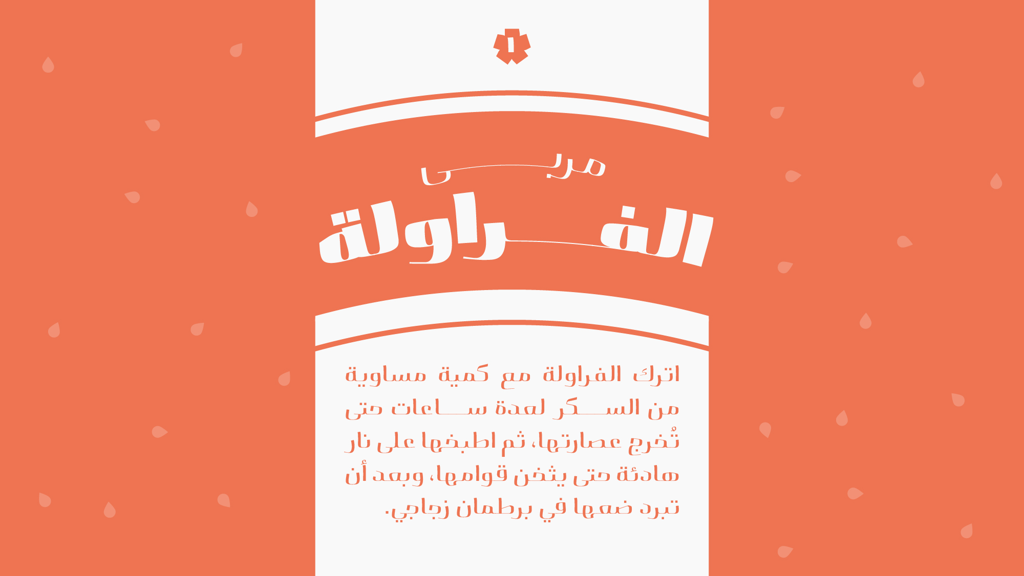
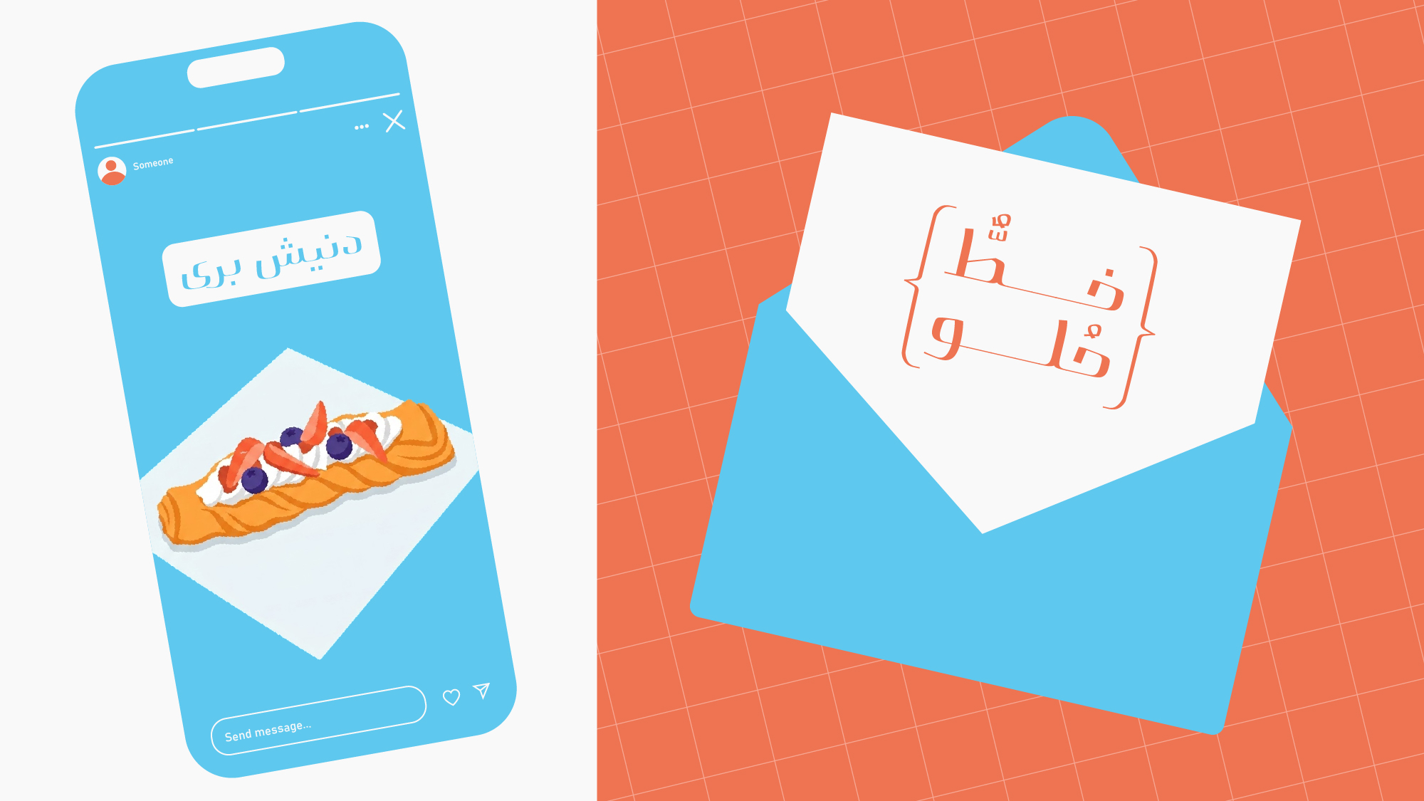
Nabat is designed for projects seeking a friendly, energetic, and distinctive voice—from visual identity and packaging to advertising, cultural projects, and any design that calls for a bold and unconventional presence.
 Font Licensing
For an additional user to use the font.To share the font with your designer or project partner. (details)
For one website or app and to share the font with 2 additional project partners. (details)
For small businesses to share the font with 5 additional employees and use it on one website.(details)
For unlimited use by companies in all their activities. A website builder, website templates and services that allow users to type with the font. (details)
Nabat

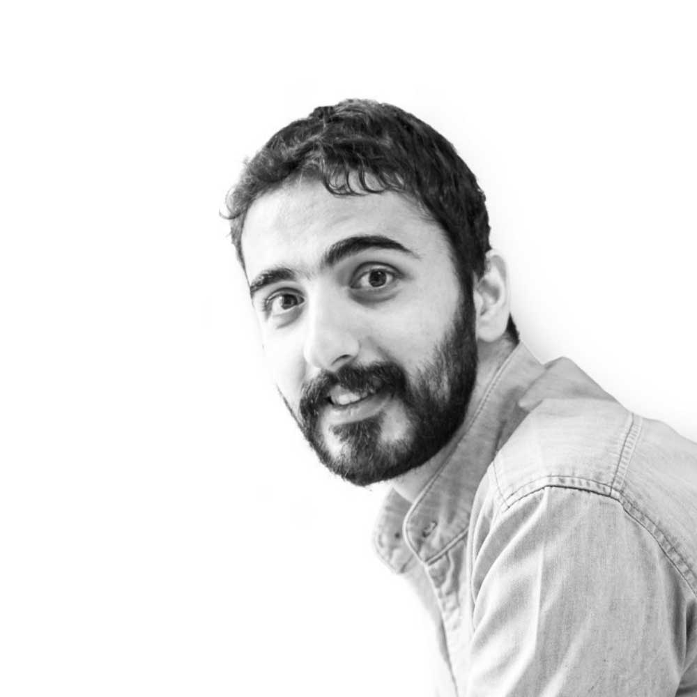


My journey in type design and typography goes beyond a mere fascination with the artistic form. It is driven by a profound exploration of how these shapes interact with essential human activities such as reading and information processing. I believe that the right typography can enhance the communication experience, making it more accessible, engaging, and meaningful. Throughout my career, I have honed my skills in crafting beautiful and functional typefaces that capture the essence of the Arabic script. I am proficient in utilizing cutting-edge design software and techniques to create visually striking and technically precise type designs. Collaboration is at the heart of my creative process. I enjoy working closely with clients, fellow designers, and experts in the field to understand their unique requirements and deliver tailored solutions that exceed expectations. Whether it’s designing custom typefaces for branding projects or creating legible and harmonious fonts for publications, I am committed to delivering exceptional results that align with the vision and purpose of each project. As a lifelong learner, I stay updated with the latest trends, research, and advancements in the field of typography. I actively participate in workshops, conferences, and online communities to expand my knowledge and skills, ensuring that my work reflects the highest standards of quality and innovation. Academic Education: -Master of visual art in graphic design, reading type & typography. PXL-Mad university of college arts & media, Hasselt, Belgium, 2021-2023. -Master of science in visual communication. Azad university science, research and technology branch, Tehran, Iran, 2019. -Bachelor of visual communication. Enghelab technical college, Tehran, Iran, 2014. -Associate degree in graphic design. Enghelab technical college, Tehran, Iran, 2010. -Diploma in graphic design. Hamedan technical highschool of fine arts, Iran, 2006.


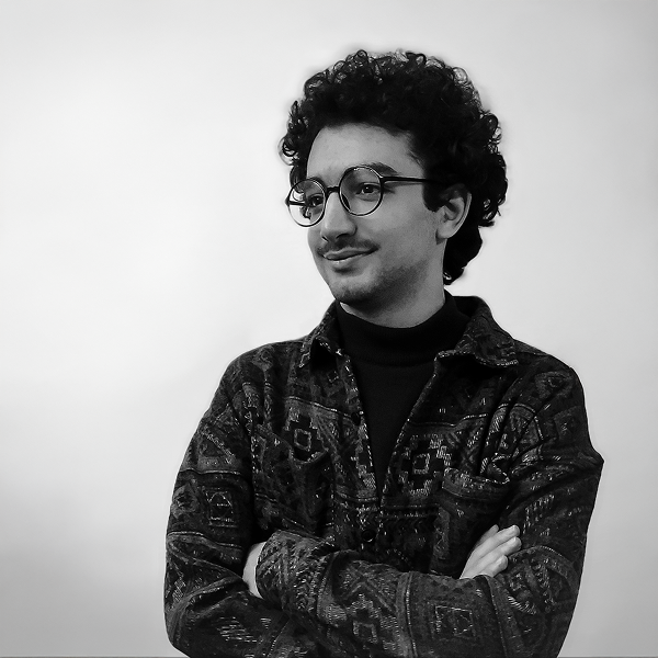


Graphic designer specializing in visual identity and branding, passionate about playing with letters and discovering new forms.
















Comments
Recommended Posts
Meeting with Karim Shahin, Designer of the Narengi Typeface
Nostalgic Arabic Fonts: Reviving the Beauty of the Past
Top Arabic Fonts for Ramadan and Eid Design
Arabic Fonts for Books & Magazines: From Print to Digital
Techno Typeface; A Look at the Design Process and Logic
What features does an ideal subtitle font have?
Selected Fonts of 2025 in the TDC Competition
13th GRANSHAN Type Design Competition