


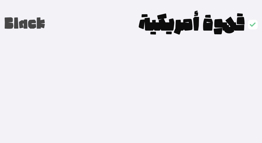
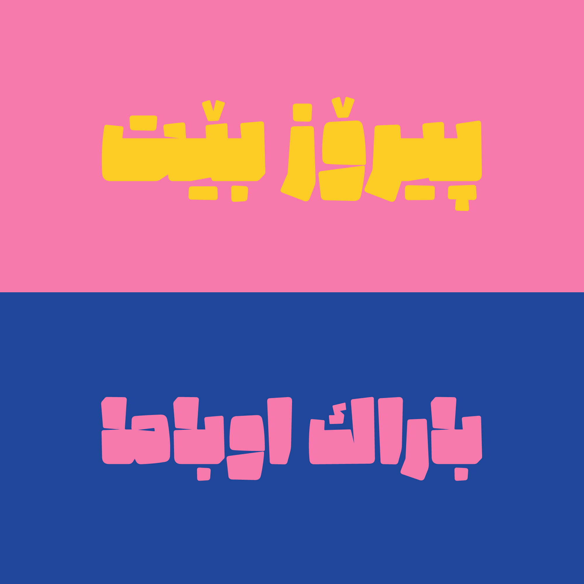
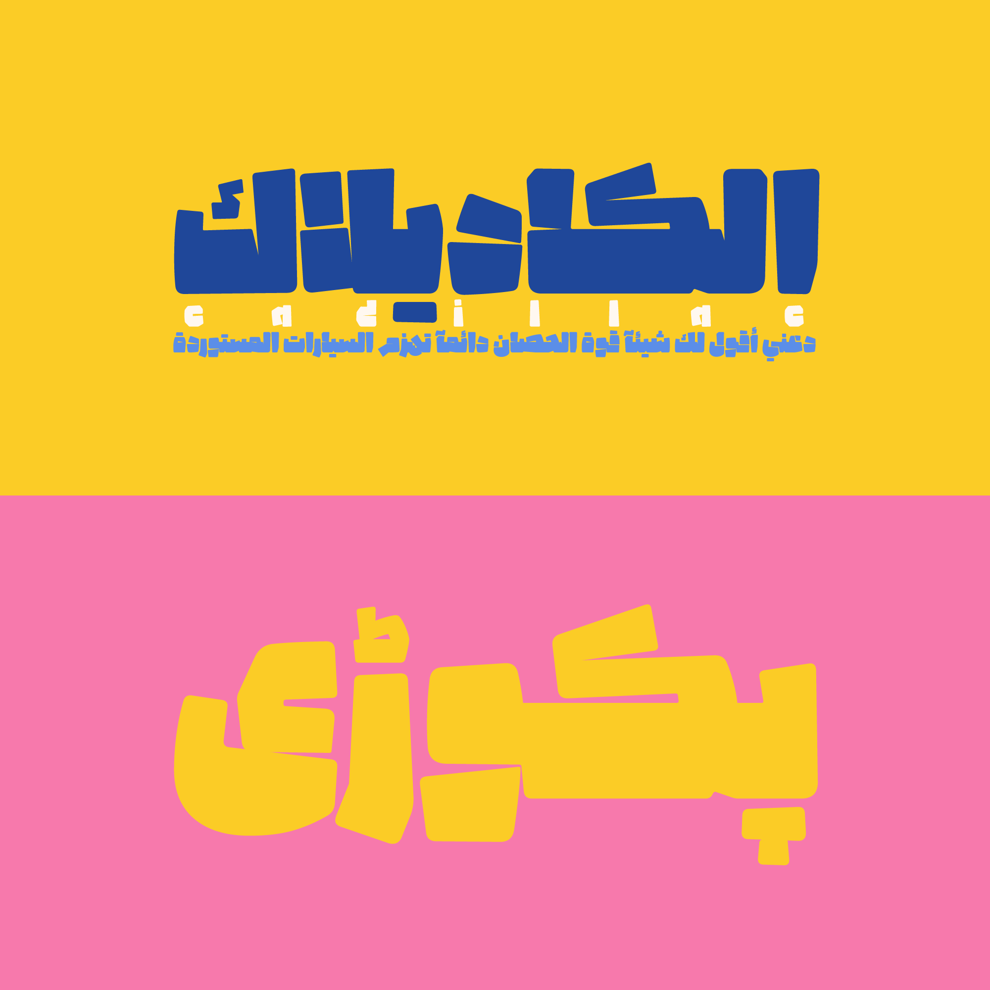
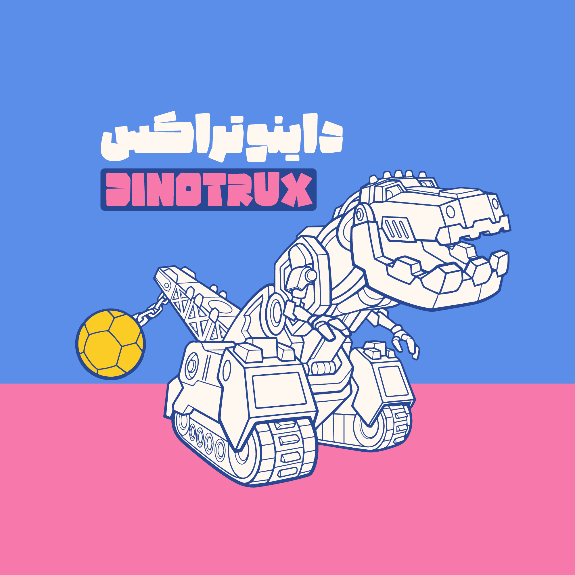
Potk
Beating anything with a Potk (it means sledgehammer) leads to changing forms, and doing so, with a meaningful purpose could turn things into unique forms.
It doesn’t matter what is being beaten by the Potk, the volume of the beats and the way it hammers is what matters. Hot metals, mine stones, cement blocks, and even letter’s forms can be changed.
For an additional user to use the font.To share the font with your designer or project partner. (details)
For one website or app and to share the font with 2 additional project partners. (details)
For small businesses to share the font with 5 additional employees and use it on one website.(details)
For unlimited use by companies in all their activities. A website builder, website templates and services that allow users to type with the font. (details)

Potk
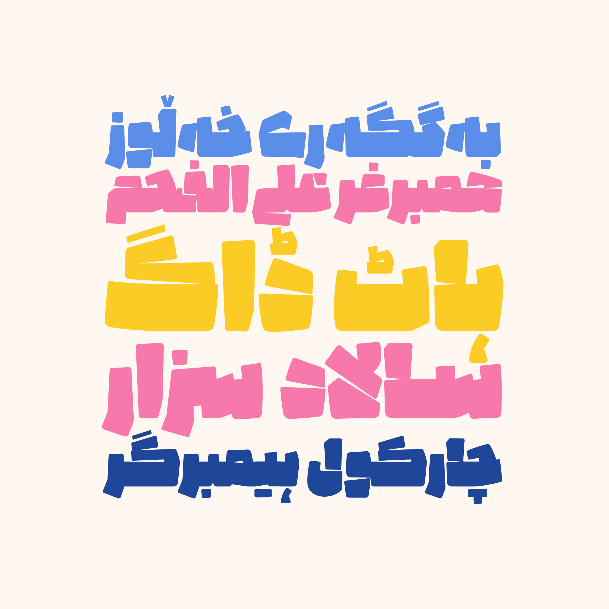
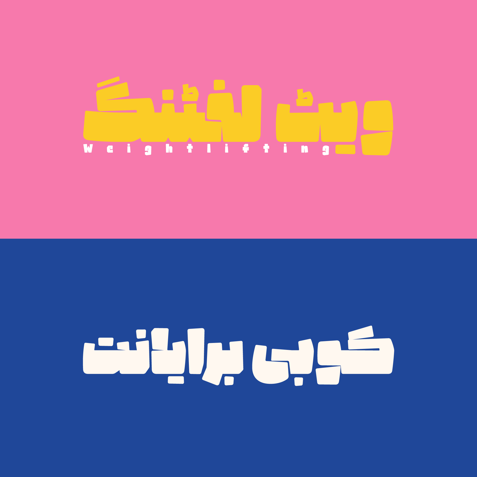
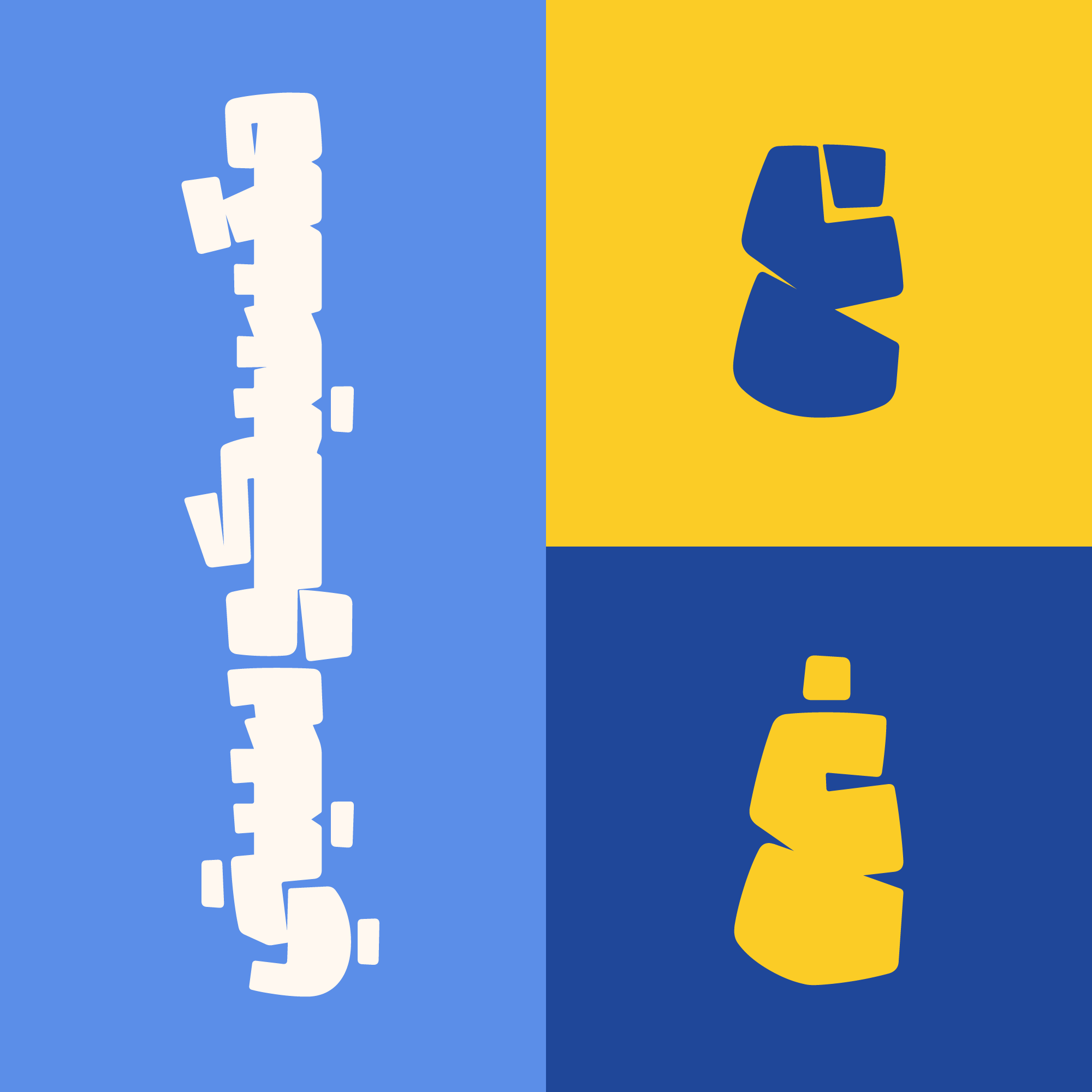

Let’s imagine what letters would look like if a Potk strikes their bodies.
What if it applies a large force on the letters?
What would their physical appearance look like?
Some changes, like missing the white spaces and the counters, uneven thicknesses, accidental breaks of the strokes, changing of the sizes, diminishing rounded parts and the strokes, are what come out of this.
Potk typeface is designed and optimized based on these changes and hammerings.
In the Potk font package:
Main Fonts: 1 weight Available in ttf format.
Web Fonts: woff and woff2 formats, accompanied by CSS code.
I have a degree in Graphic Design and have been a member of the Iranian Graphic Designers Society (since 1987). I am involved in typeface design, font development, and logotype design. I have publicly released the Potk and Borna fonts, and I designed the Ayandeh, Ali Baba, Bonyad Koodak, Fanoos, and Inverse fonts in collaboration with Reza Bakhtiari Fard. The design and creation of the Kamand font in collaboration with Omid Emamian, as well as the development of the Valman font, are among my latest activities. I have held various workshops and courses in the field of typography, and I received the third Grand Prize at the 2021-2022 Granshan competition in Armenia for the Ali Baba font and a special award for the Potk font.


Comments
Recommended Posts
Nostalgic Arabic Fonts: Reviving the Beauty of the Past
Top Arabic Fonts for Ramadan and Eid Design
Arabic Fonts for Books & Magazines: From Print to Digital
Techno Typeface; A Look at the Design Process and Logic
What features does an ideal subtitle font have?
Selected Fonts of 2025 in the TDC Competition
13th GRANSHAN Type Design Competition
Golpayegani Typeface creation