


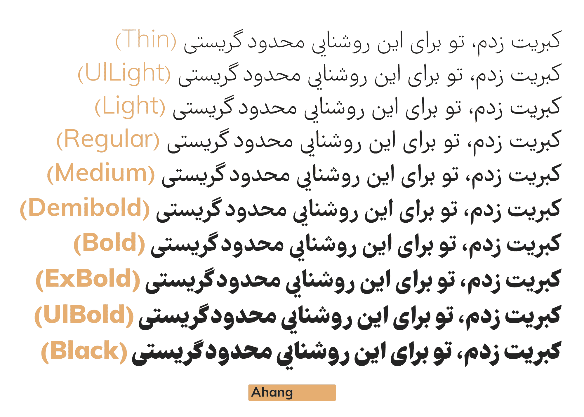
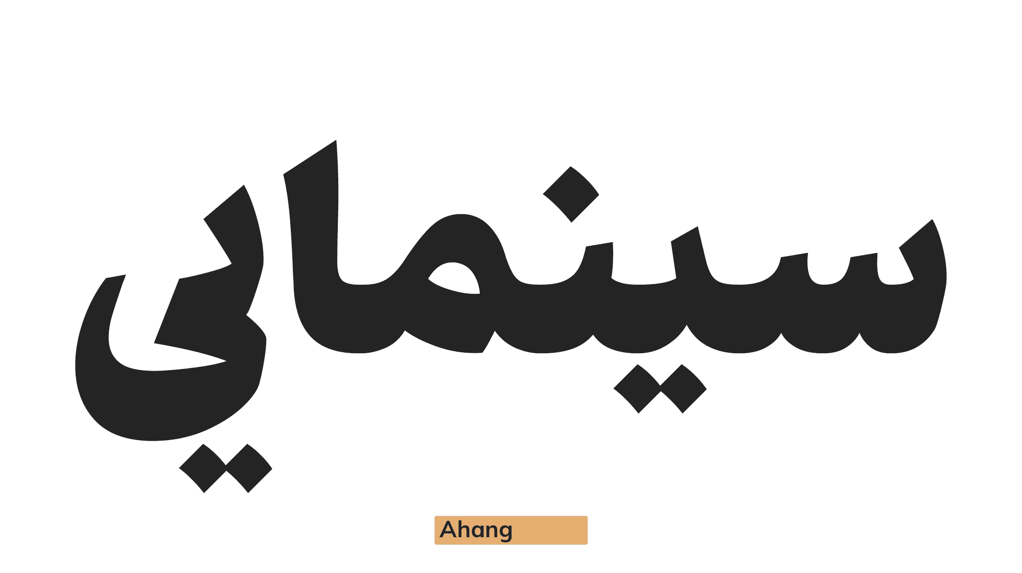
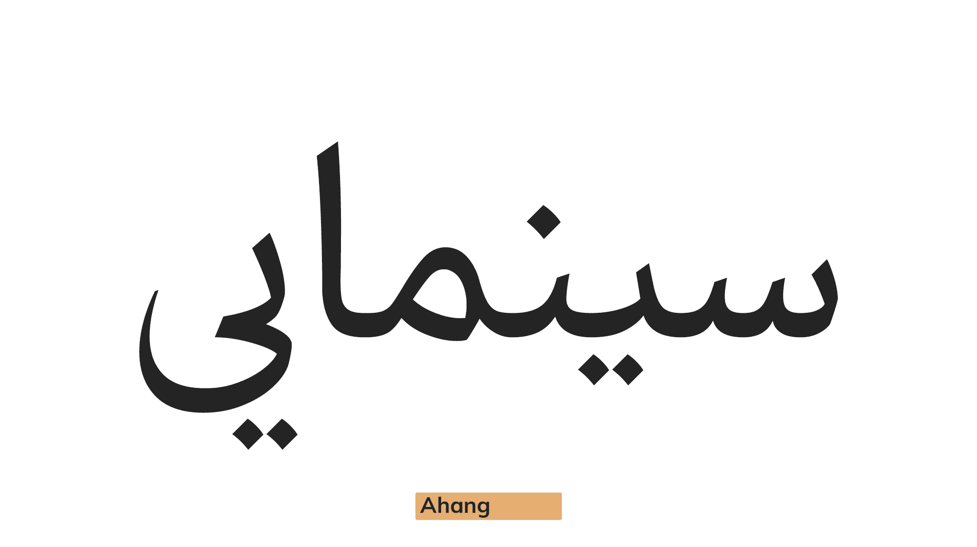
Ahang
The Ahang typeface is a remake of the Farhang typeface, drawing inspiration from the publication's typeface and transforming its influence to Naskh and Thuluth calligraphy.
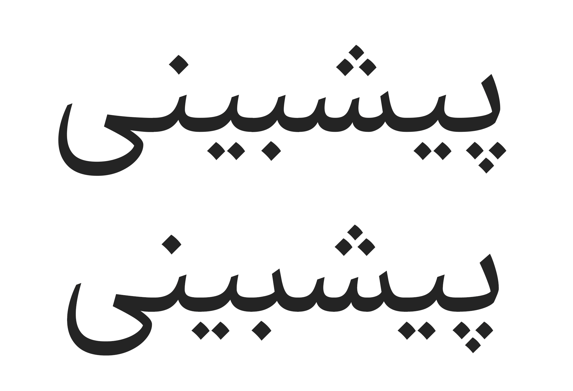
The Ahang sharp typeface is the main base of the Farhang typeface, and Ahang was created by flattening and reducing the contrast of the Ahang sharp typeface.
The term "Ahang" in Farsi refers to the tune or musical rhythm of a song, as well as the overall mood or atmosphere of something.
For an additional user to use the font.To share the font with your designer or project partner. (details)
For one website or app and to share the font with 2 additional project partners. (details)
For small businesses to share the font with 5 additional employees and use it on one website.(details)
For unlimited use by companies in all their activities. A website builder, website templates and services that allow users to type with the font. (details)

Ahang
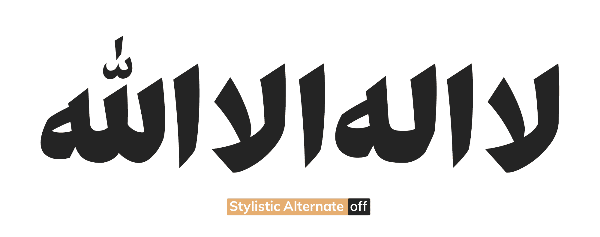
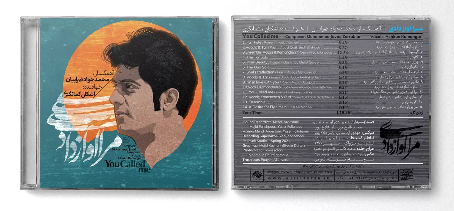
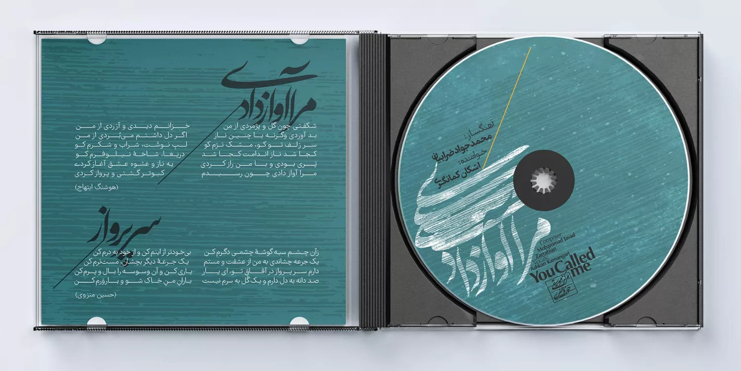
The Ahang(Melody) of Typography
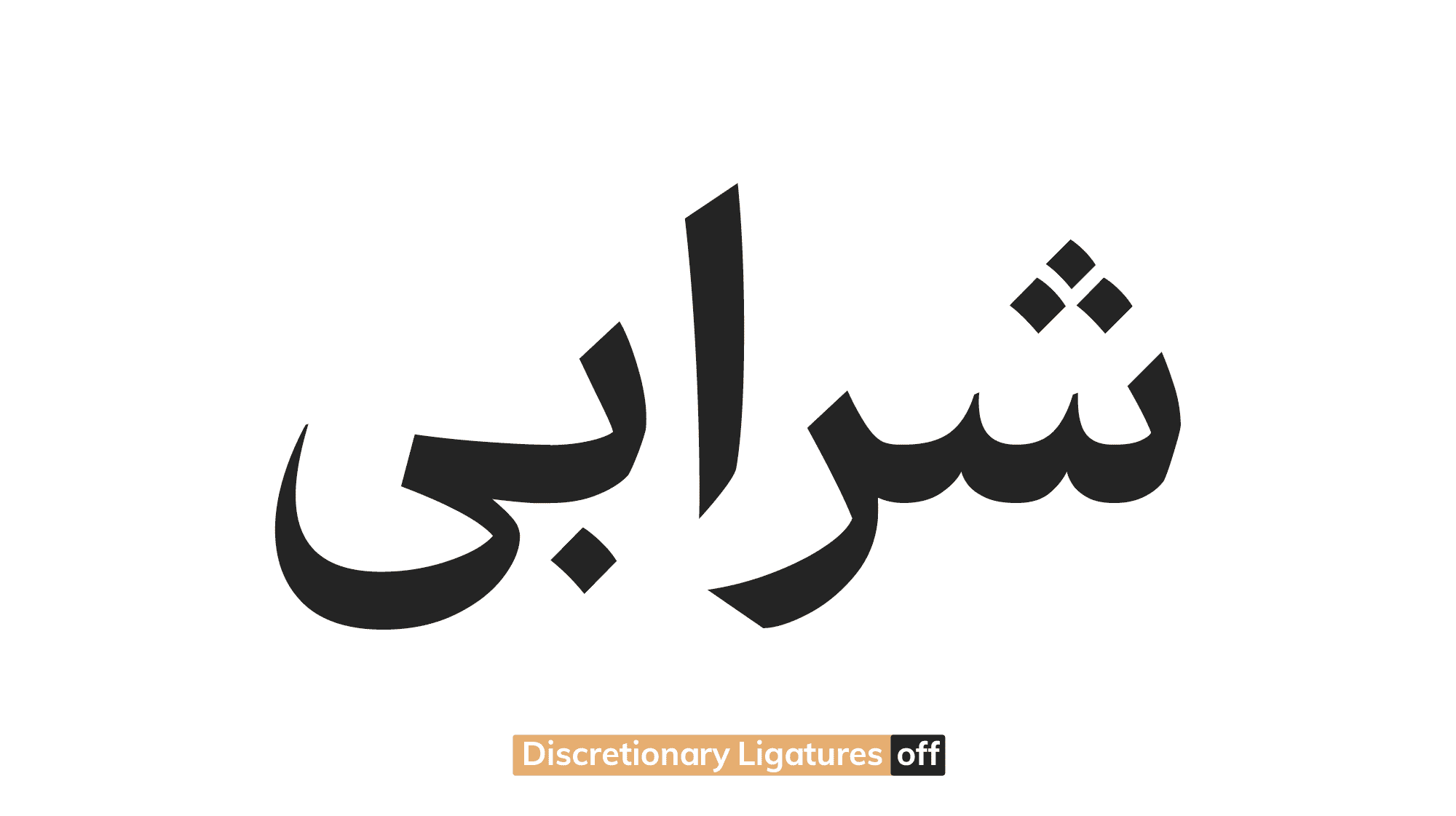
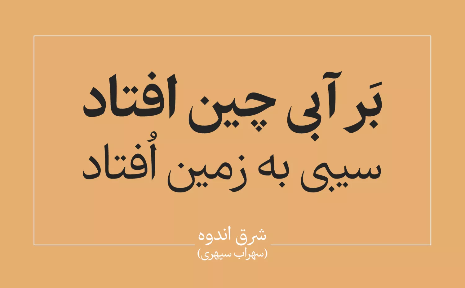
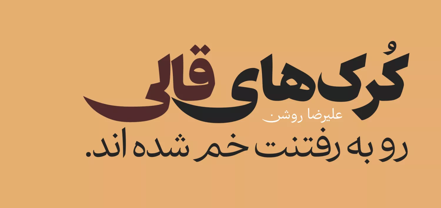
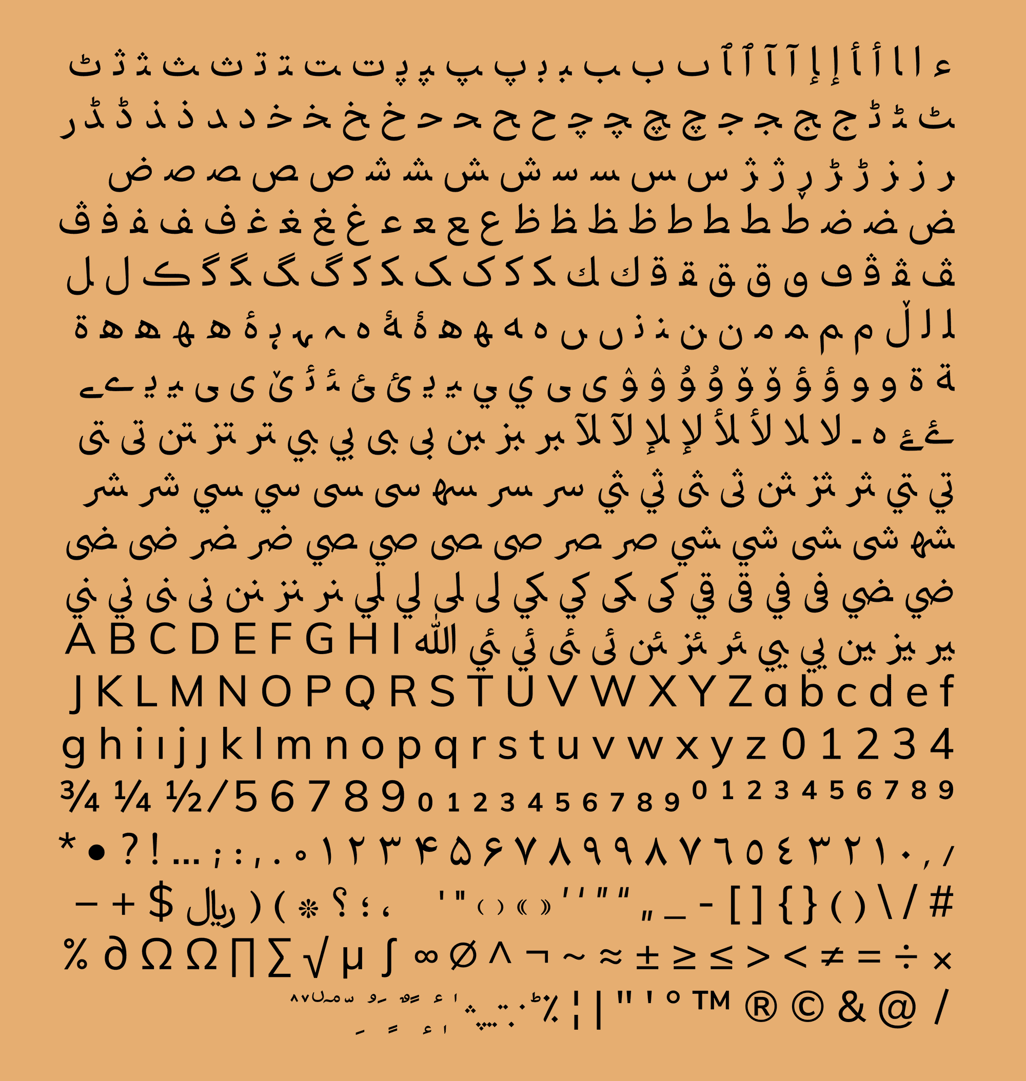
Certain letters, like ر and ک, have always been troublemakers in the design of text fonts. One sticks its leg out too far, while the other intrudes on its neighbor's space.
That's why, over time, the size of ر and ک has been reduced in the design of Persian typeface.
In the Ahang typeface, however, ر and ک are bold and rebellious! By doing so, this typeface maintains its sense of calligraphy.

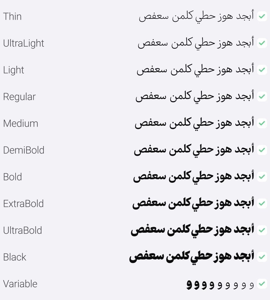
In the Ahang (Pro) Font Package:
Main Fonts: 10 weights available in TTF format.
Sharp Style: 10 weights available in TTF format.
Web Fonts: WOFF and WOFF2 formats, along with CSS and HTML code.
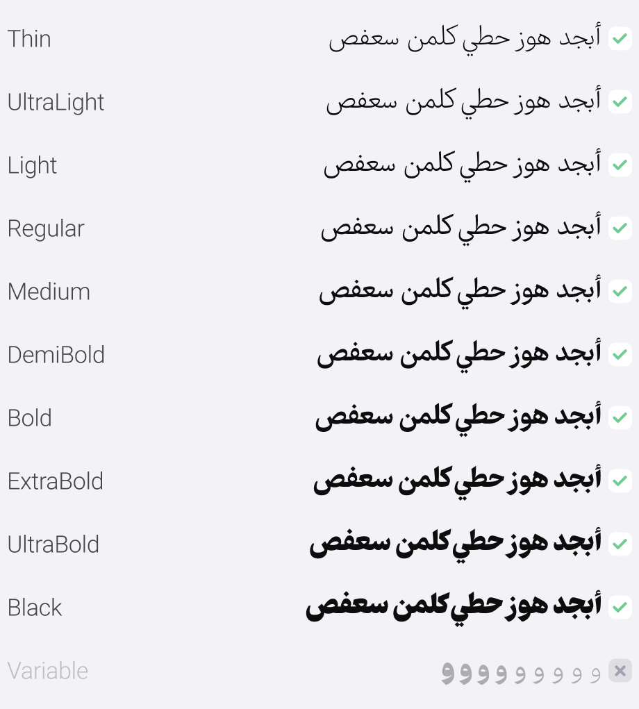
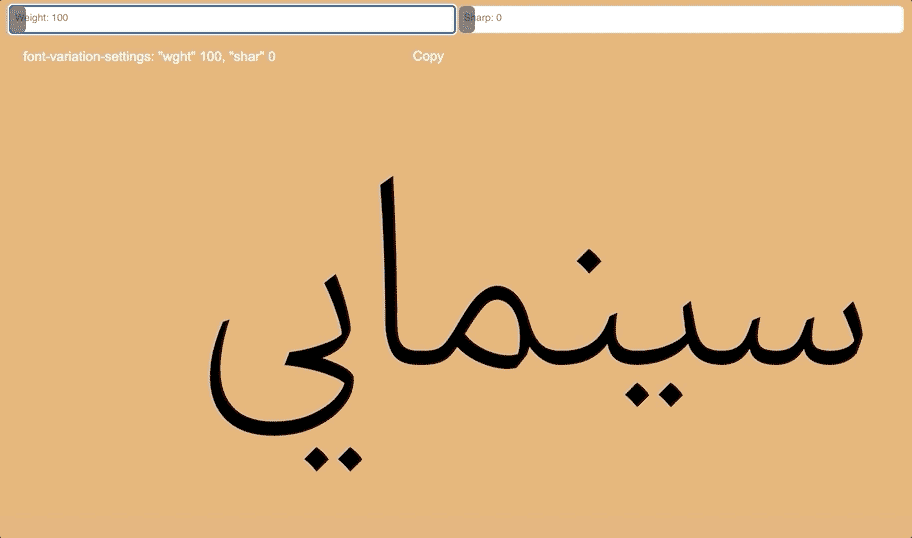
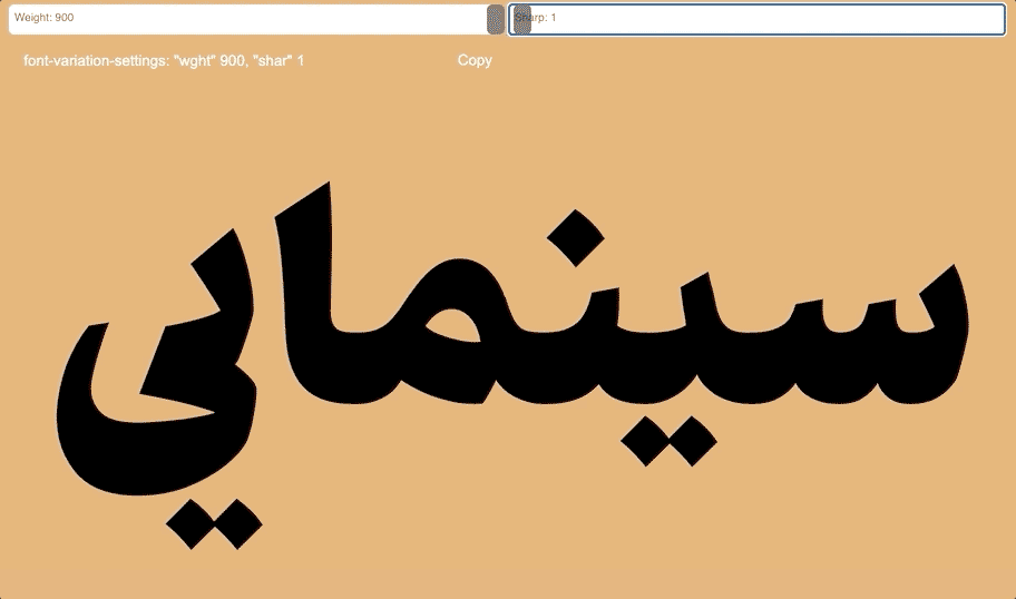
Variable Font: 2 axes (Weight and Contrast)

Moslem Ebrahimi, an experienced graphic design professional specializing in Persian typography since 2009. Early in his career, he was dedicated to teaching typography design at the university level. Subsequently, he shifted his focus to establishing the FontIran website, where his efforts were redirected to the publication and marketing of Perso-Arabic typefaces. Between 2014 and 2017, Ebrahimi's typefaces underwent a significant transformation, playing a pivotal role in shaping the typographic landscape for Persian web and software design. The launch of FontIran Foundry marked a successful advocacy for voluntary copyright adherence in the realm of Perso-Arabic typefaces, addressing challenges related to sales and income for type designers. . Ebrahimi's impactful contributions have left a lasting impression on the field, influencing the culture of Perso arabic typography and providing solutions to challenges faced by fellow type designers.


Comments
Recommended Posts
Nostalgic Arabic Fonts: Reviving the Beauty of the Past
Top Arabic Fonts for Ramadan and Eid Design
Arabic Fonts for Books & Magazines: From Print to Digital
Techno Typeface; A Look at the Design Process and Logic
What features does an ideal subtitle font have?
Selected Fonts of 2025 in the TDC Competition
13th GRANSHAN Type Design Competition
Golpayegani Typeface creation