





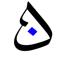


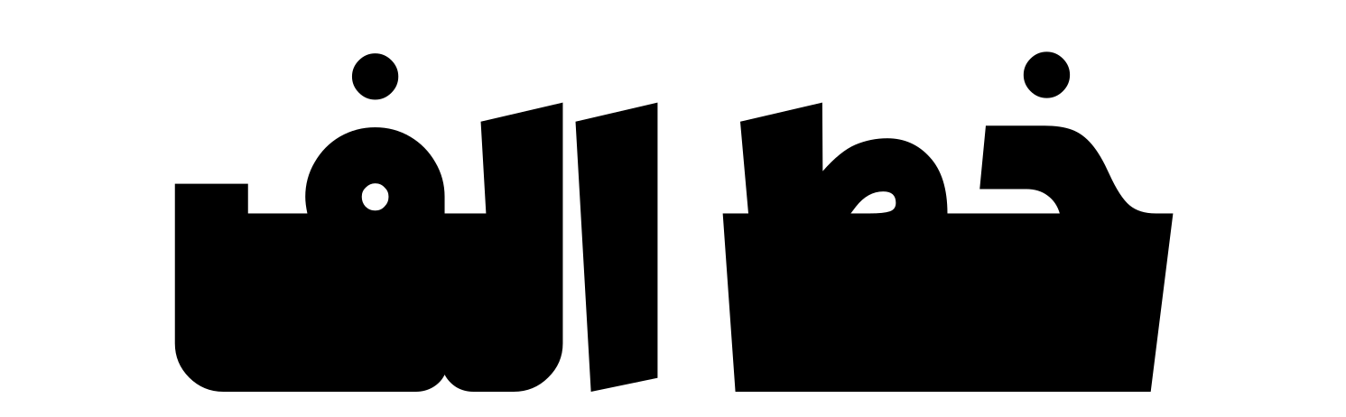
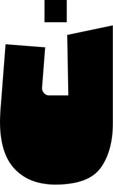
Alef


Alef Typeface: Designing Space Through the Power of Letters
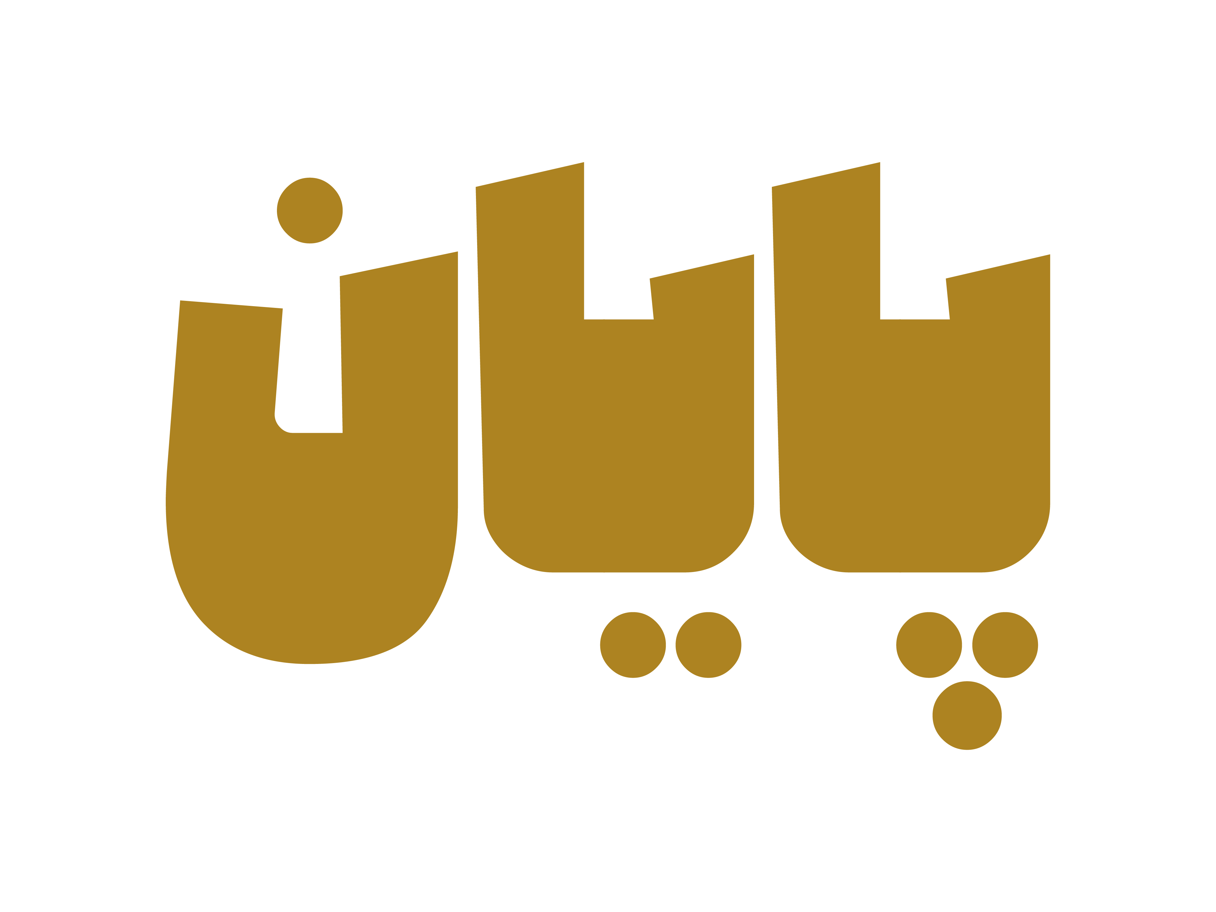
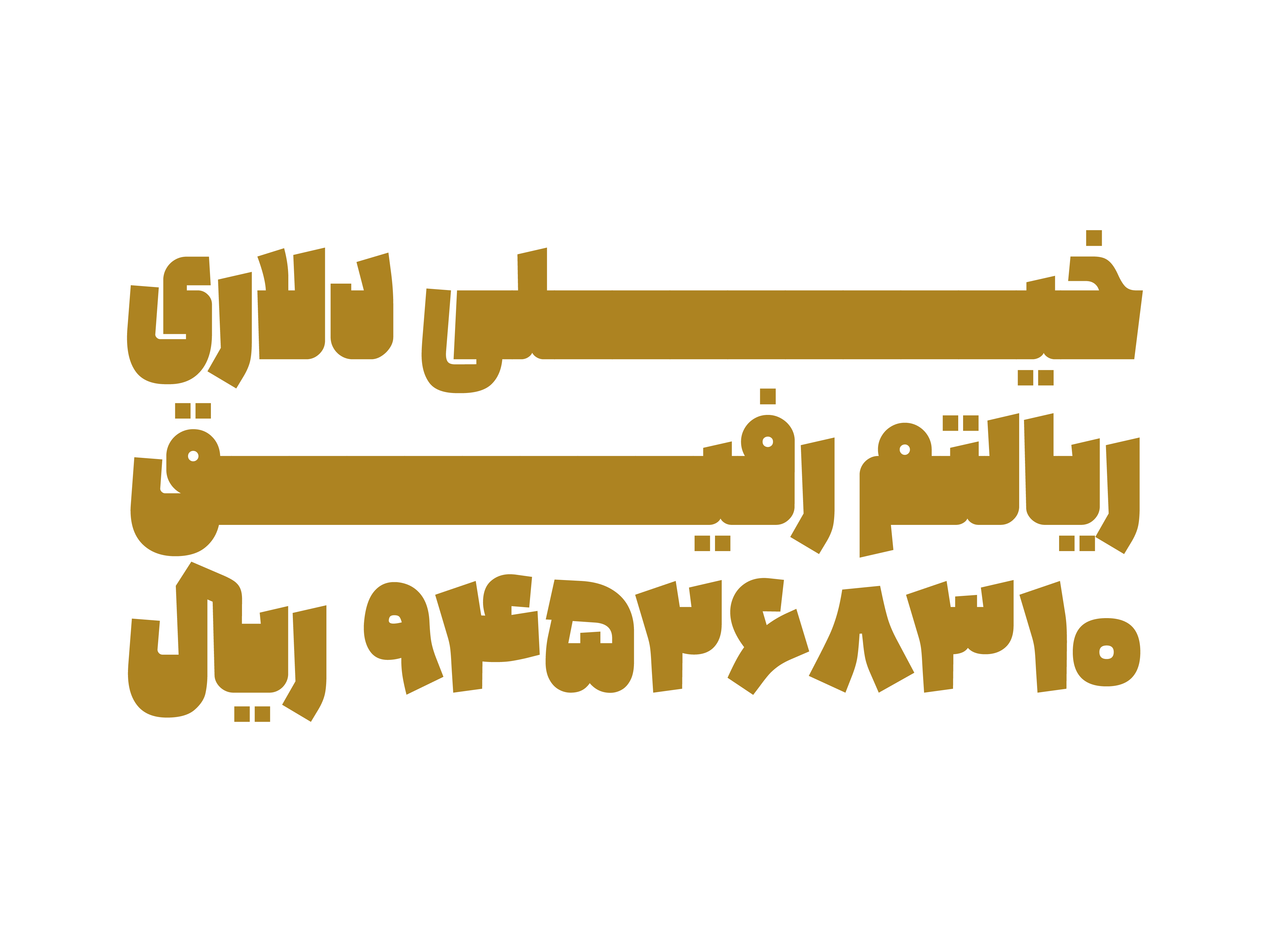
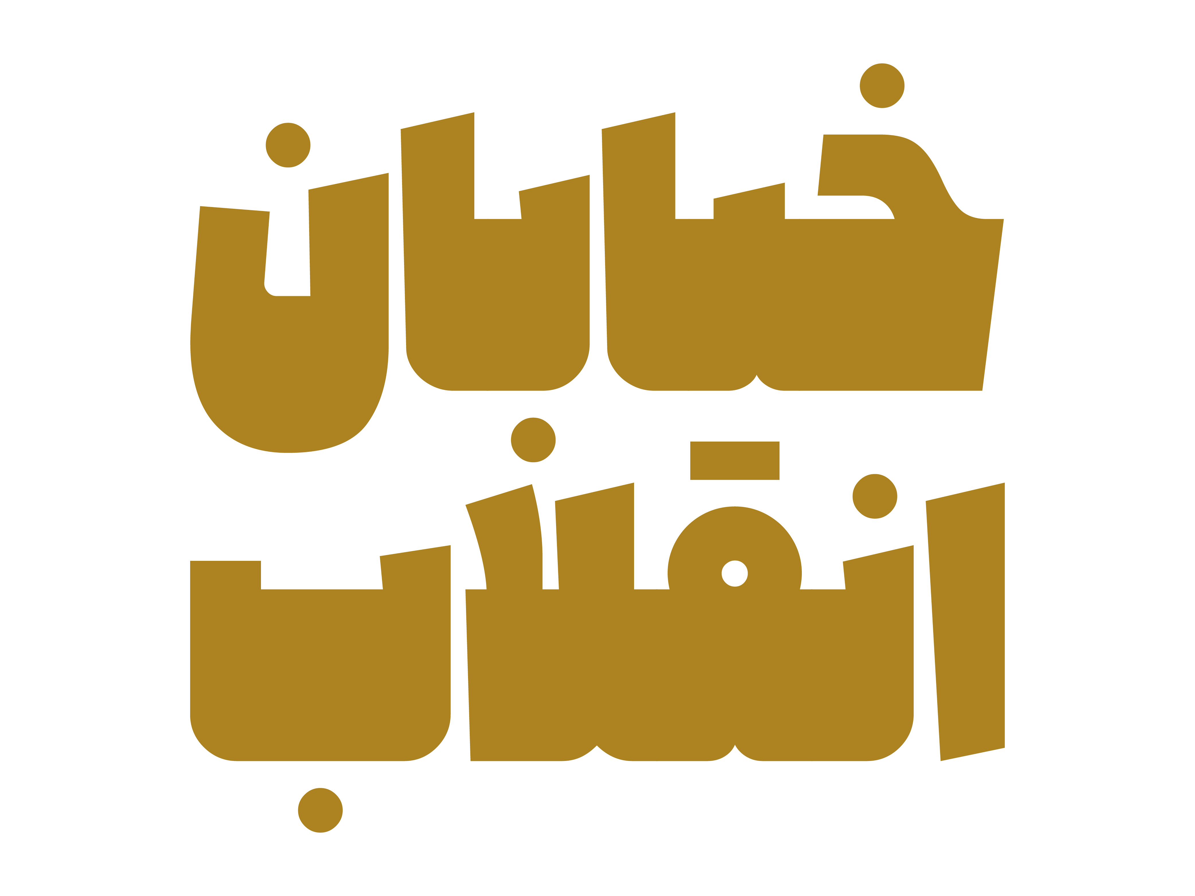
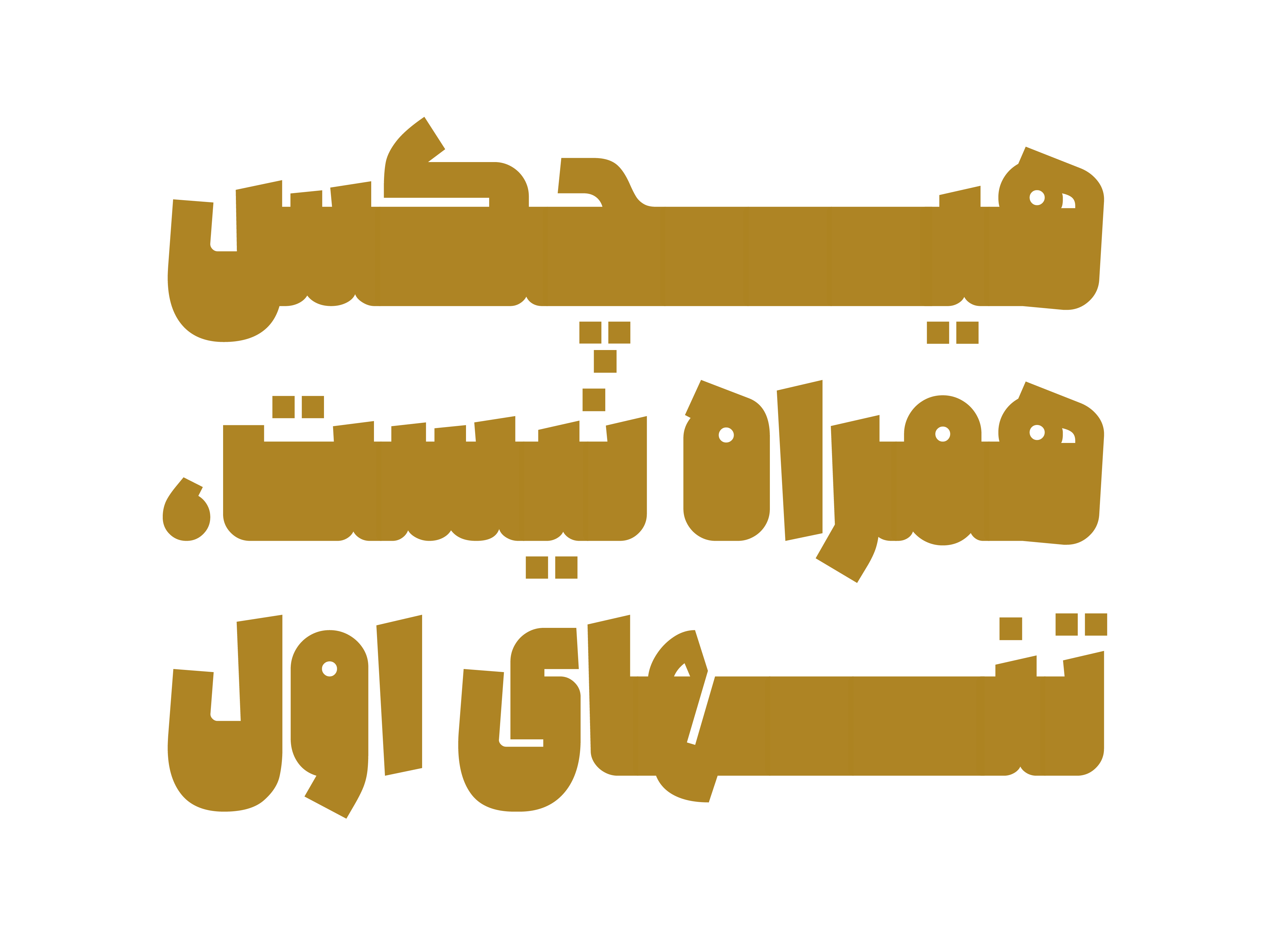
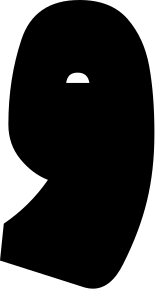
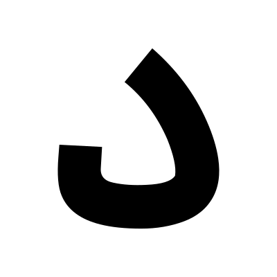
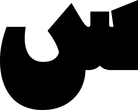
In ultra-heavy typefaces, the primary concern is not simply thickness, but rather how space is occupied and organized. The Alef typeface is built around this very approach, where letters move beyond their conventional role as linear elements and become spatial units capable of defining the composition of a page on their own.
In such typefaces, text no longer plays a secondary role; instead, the written form itself becomes the dominant visual element. In Alef, spacing, stroke weight, and the relationship between positive and negative space are carefully structured so that the eye perceives text not merely as a sequence of letters, but as a cohesive mass and an integrated visual structure. This is why the application of Alef is not limited to headlines and visual emphasis; it can also play a defining role in projects where the scale and presence of typography are integral to the visual identity.
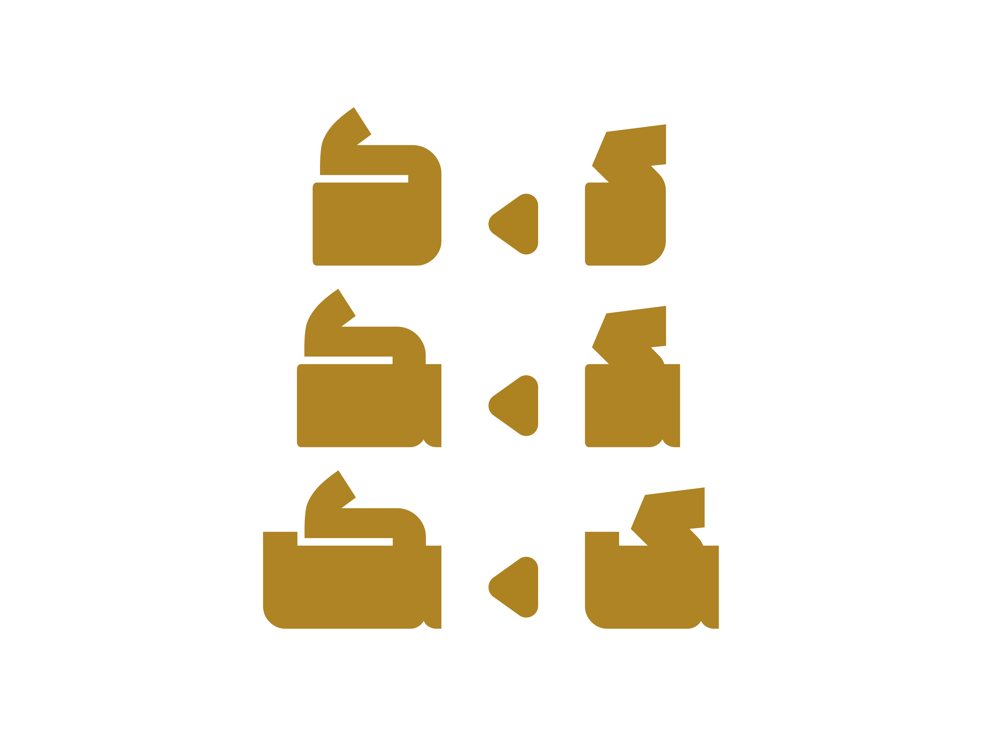
Successful heavy-weight typefaces are not simply those with thicker strokes, but those capable of maintaining balance, rhythm, and a degree of legibility at large scales. In the design of Alef, factors such as contrast control, the management of internal and external letter spaces, and consistency in formal behavior distinguish the typeface from a merely bold font.
In the design philosophy behind Alef, weight is not a decorative feature; it is a tool for shaping space. Letters must be able to occupy surfaces, create frames, and transform written language into a visual structure without compromising the coherence of the design system. This is where letter weight evolves from a technical specification into an integral part of the typeface's visual language.
 Font Licensing
For an additional user to use the font.To share the font with your designer or project partner. (details)
For one website or app and to share the font with 2 additional project partners. (details)
For small businesses to share the font with 5 additional employees and use it on one website.(details)
For unlimited use by companies in all their activities. A website builder, website templates and services that allow users to type with the font. (details)
Alef
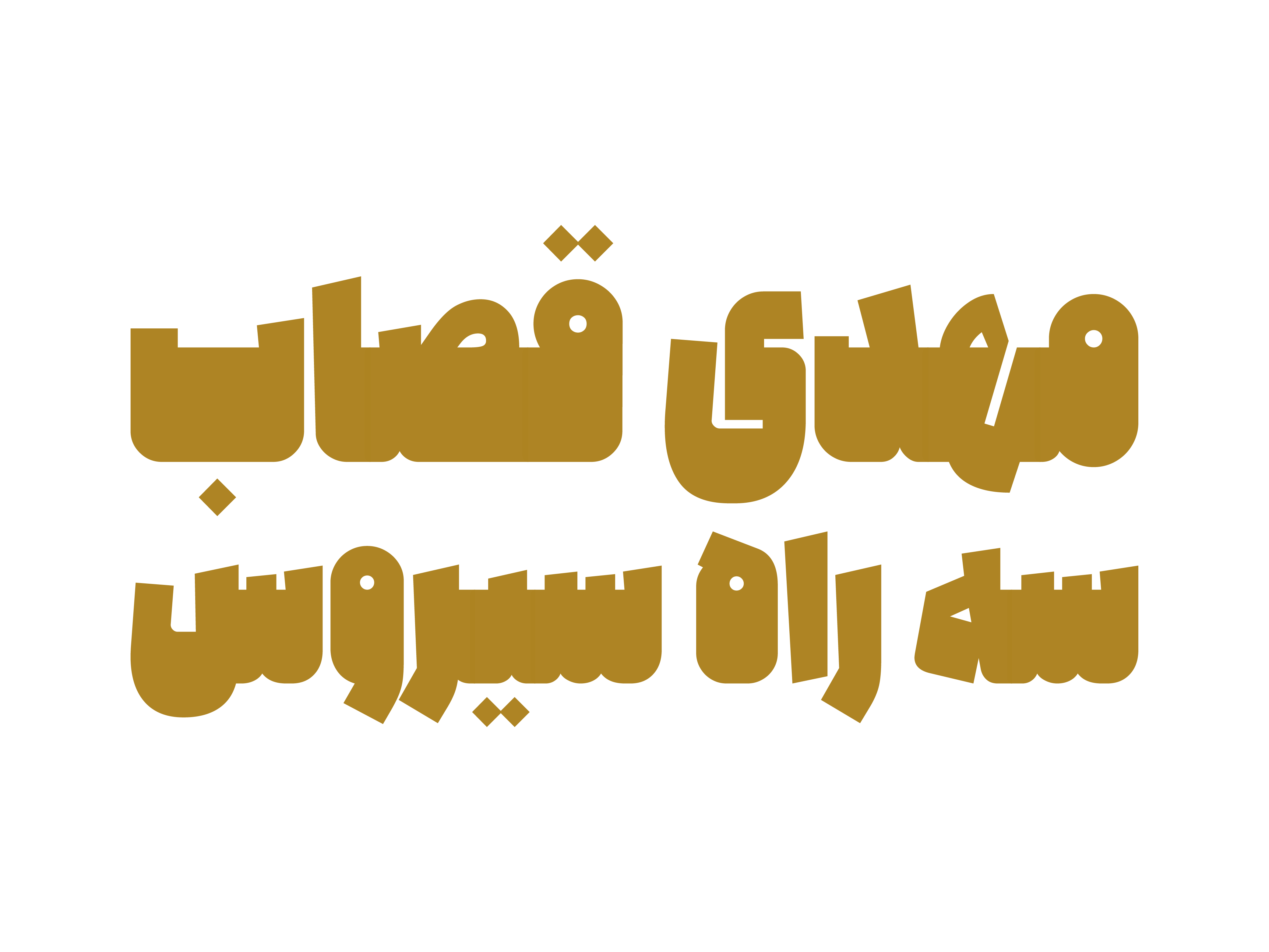
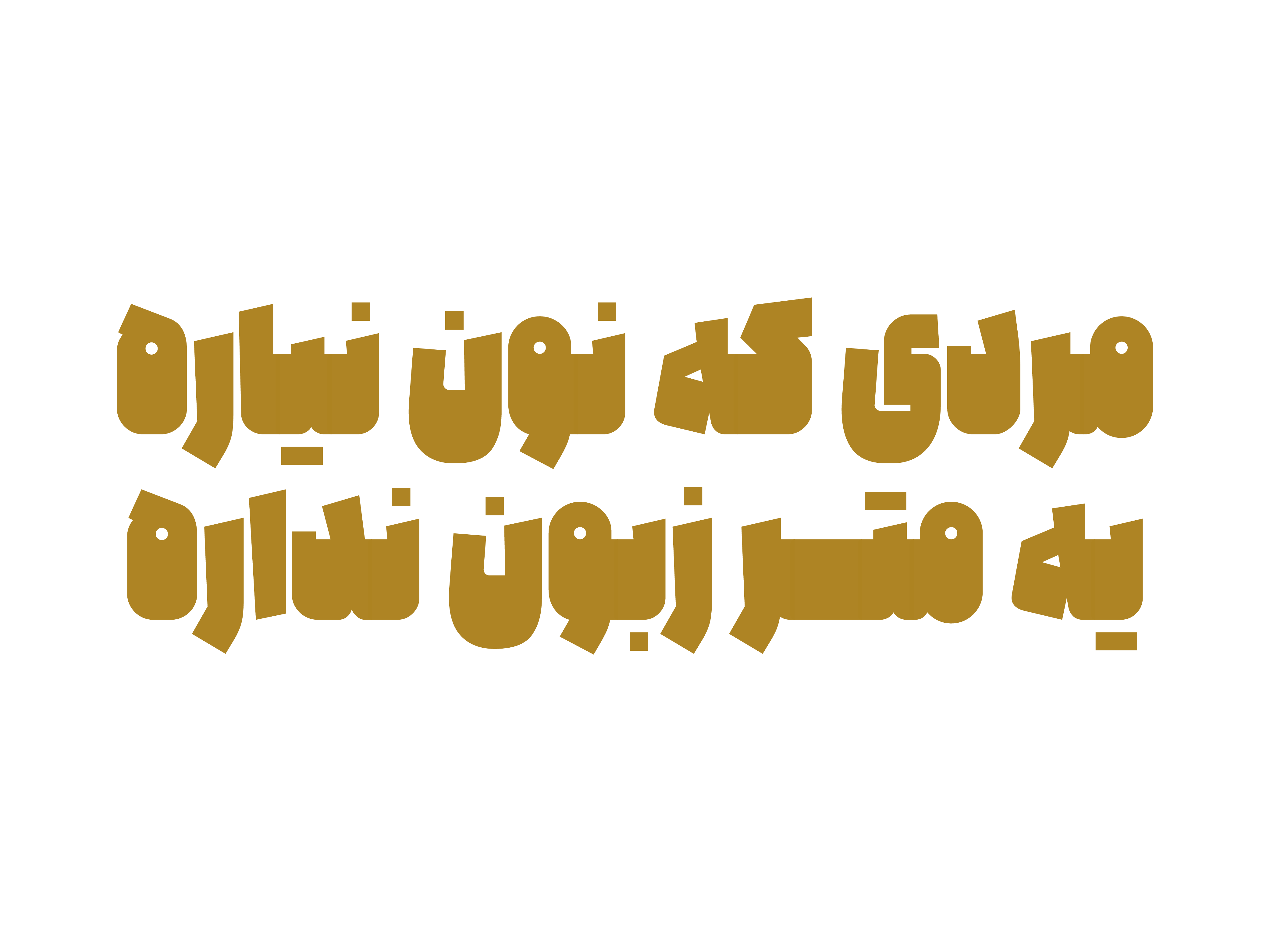
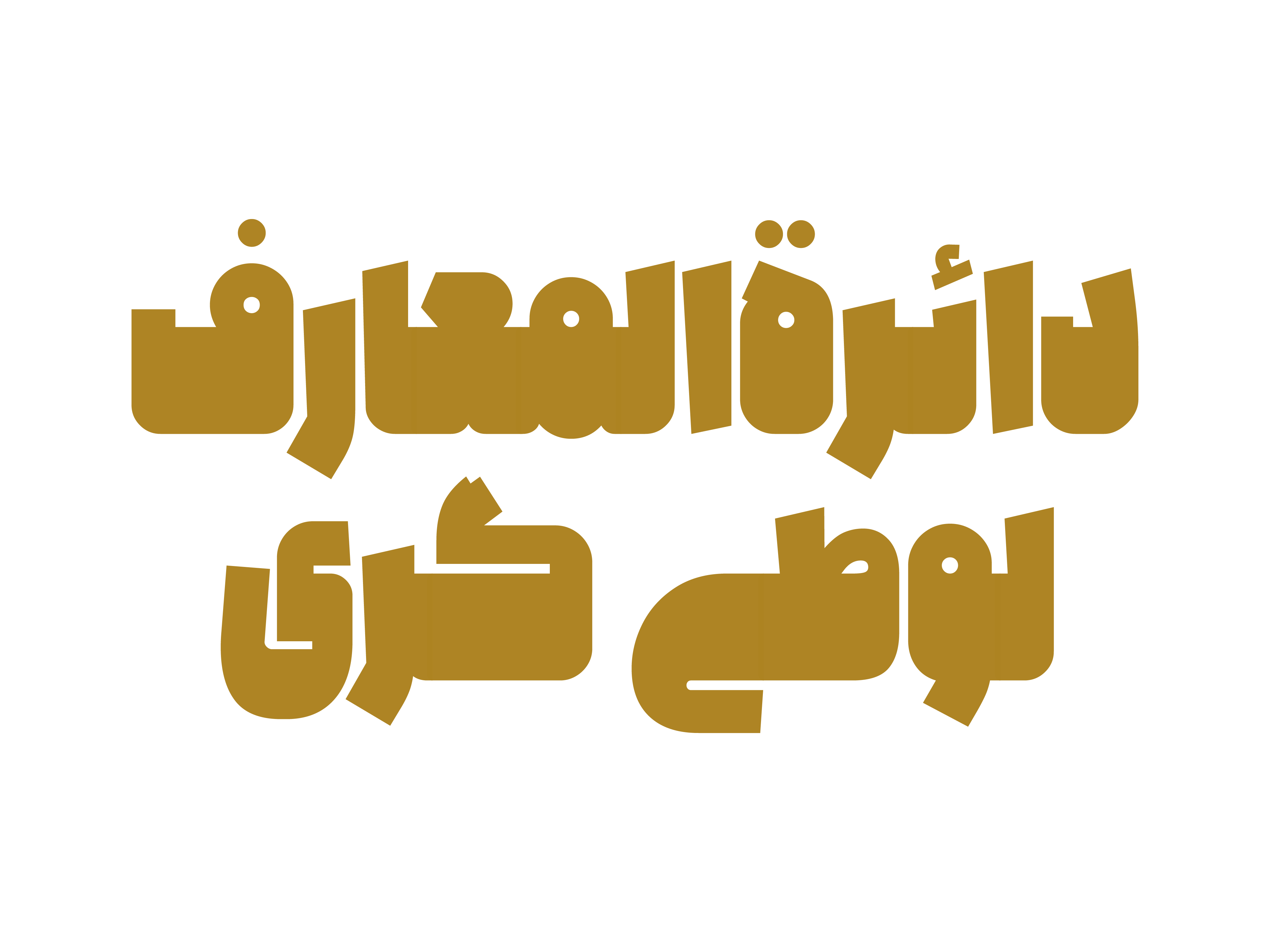
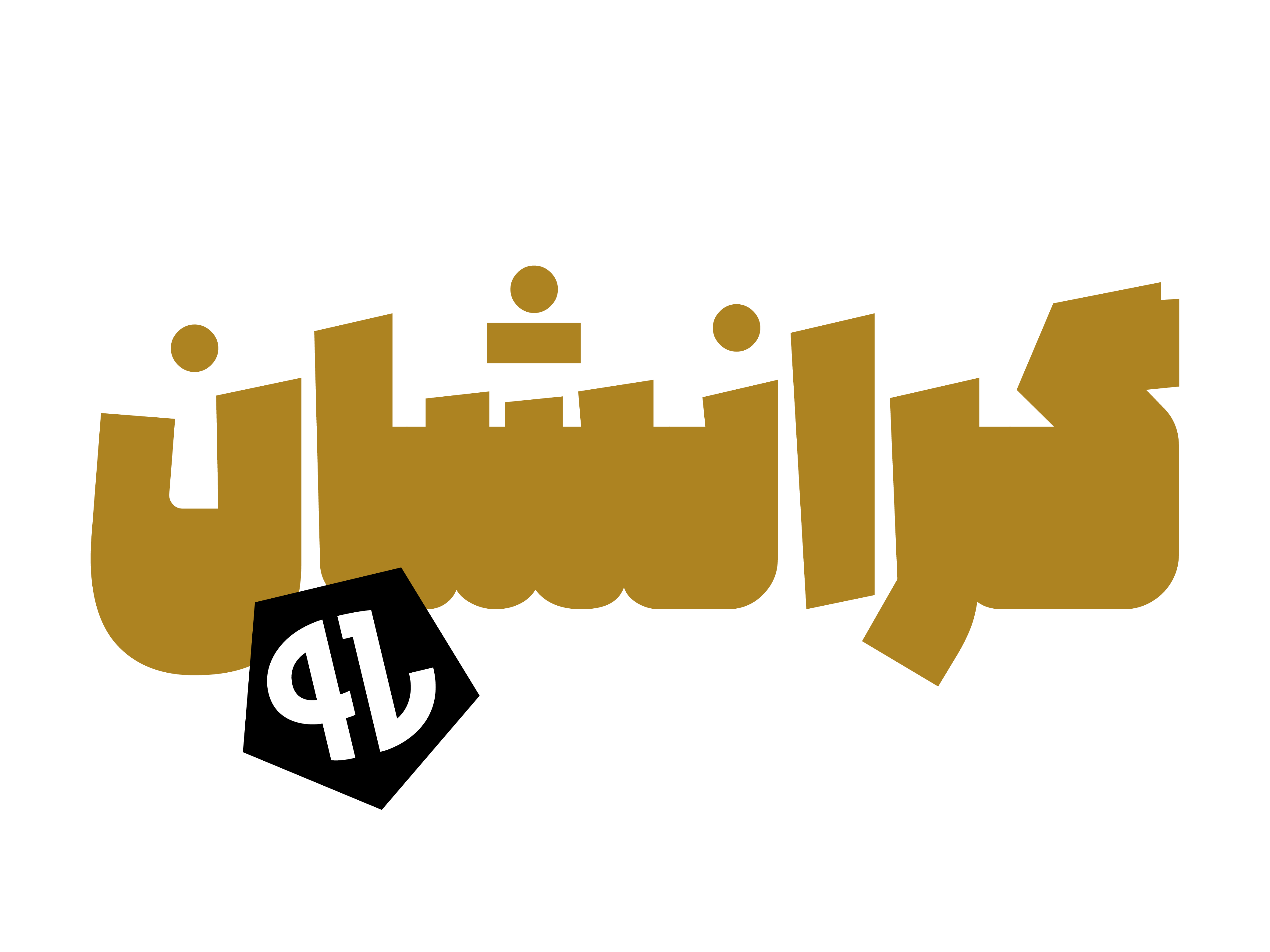
Alef Typeface: International Recognition – Third Place at Granshan 2016
The Alef typeface is the culmination of Mehdi Ravandi’s approach to heavy-weight typeface design. Mehdi Ravandi, the designer of Alef, received third place in the 2016 Granshan International Type Design Competition for this typeface.
Granshan is a renowned international event dedicated to non-Latin typeface design, providing a platform for showcasing, evaluating, and competing with the work of type designers from around the world.

In the Alef font package :
- Main Font: 1 weight in
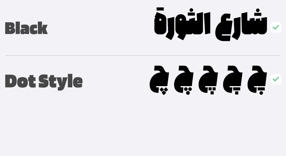
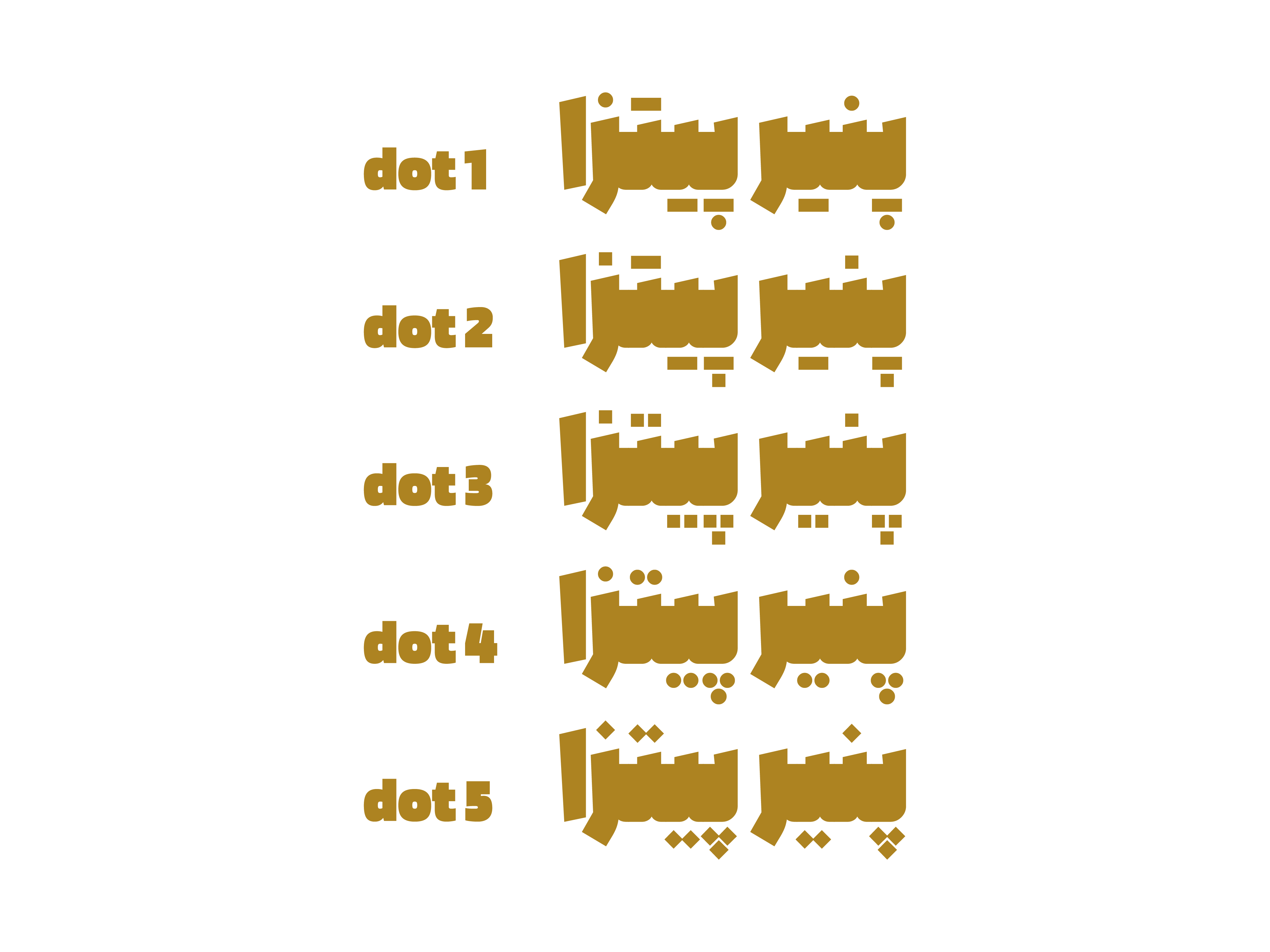
TTFformat (5 Dot Styles) - Web Fonts:
WOFF1andWOFF2



Mahdi Ravandi is a type designer, art director, and graphic designer with a Master’s degree in Visual Communication. He began his professional career in type design in 2010, focusing primarily on the design and redesign of Persian typefaces, as well as cultural and commercial graphic design projects. He won third place in the international Granshan 2016 Typeface Design Competition and has extensive professional and managerial experience working with studios, companies, and cultural institutions in Shiraz, Mashhad, and Tehran.

















Comments
Recommended Posts
Meeting with Karim Shahin, Designer of the Narengi Typeface
Nostalgic Arabic Fonts: Reviving the Beauty of the Past
Top Arabic Fonts for Ramadan and Eid Design
Arabic Fonts for Books & Magazines: From Print to Digital
Techno Typeface; A Look at the Design Process and Logic
What features does an ideal subtitle font have?
Selected Fonts of 2025 in the TDC Competition
13th GRANSHAN Type Design Competition