







Kaaf


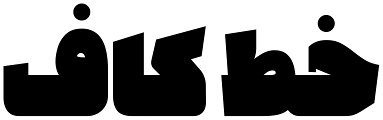
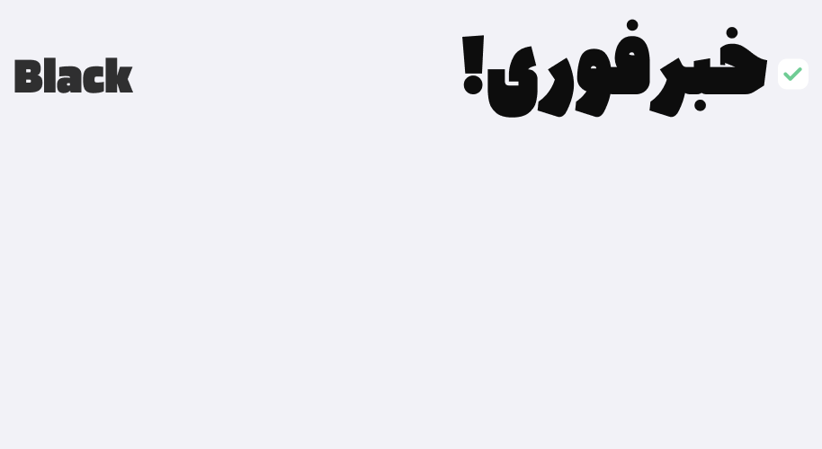
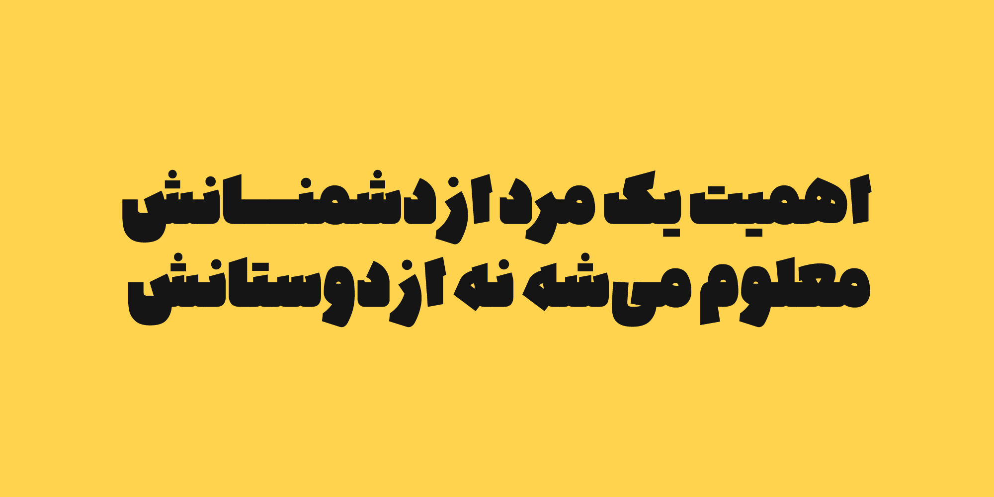
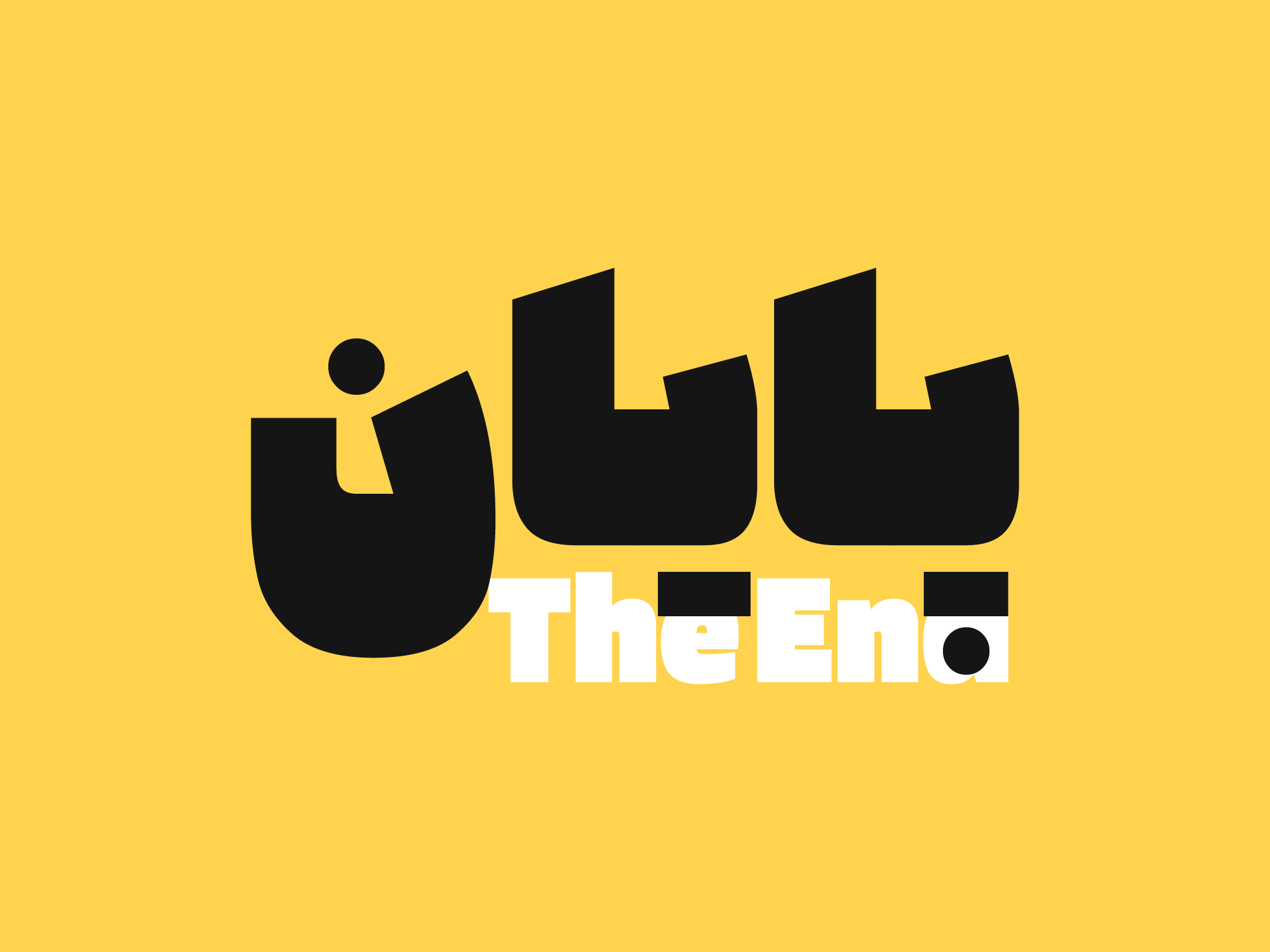
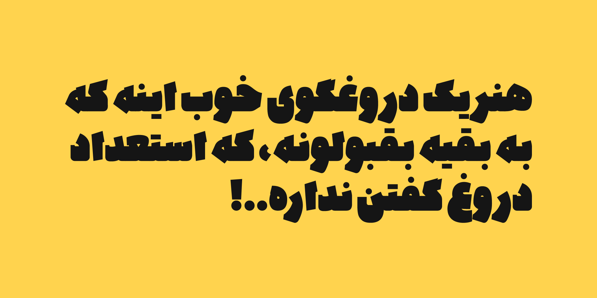
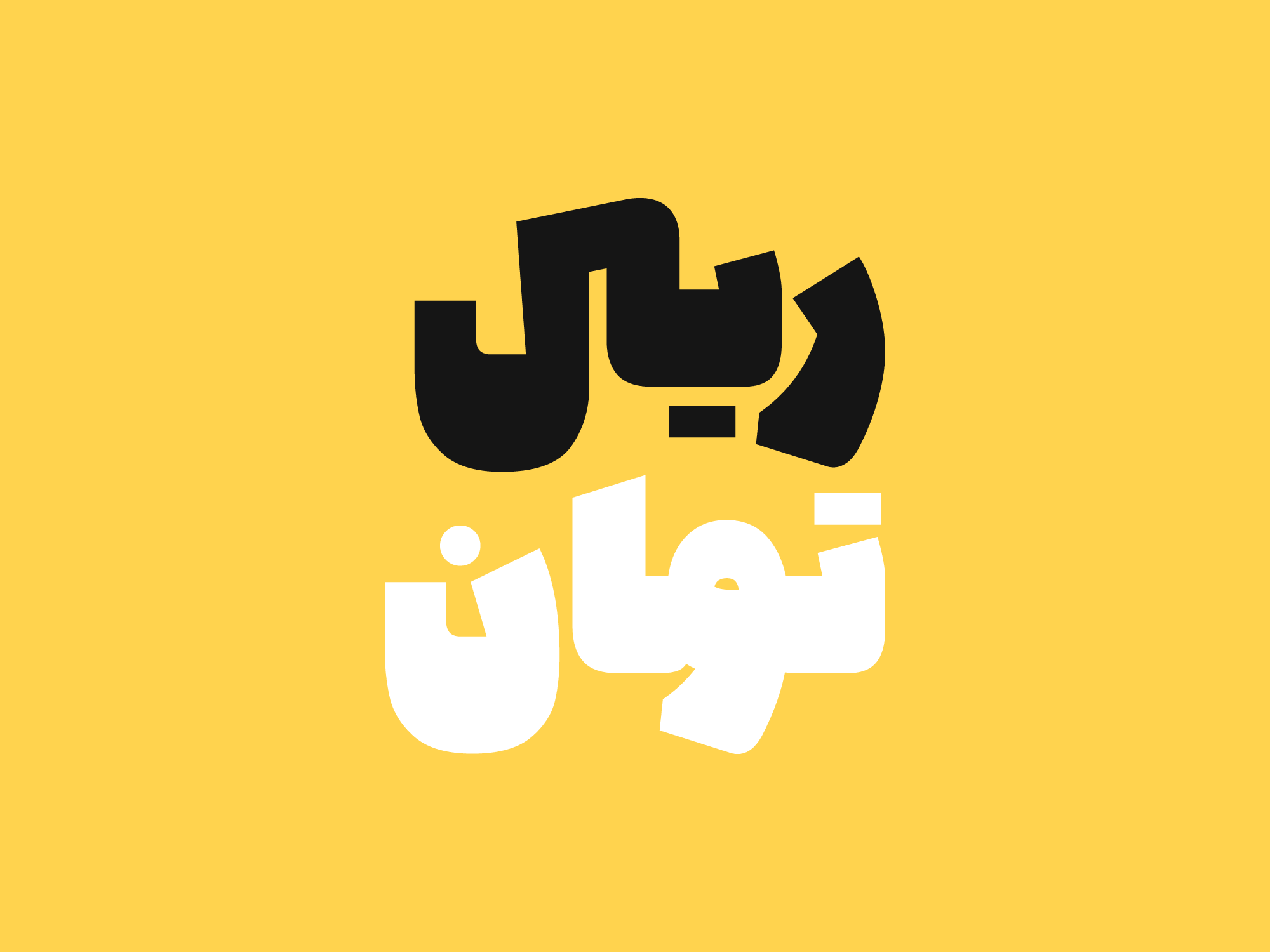
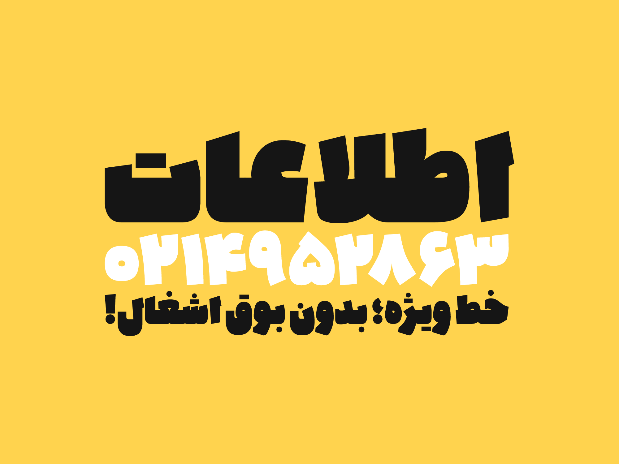
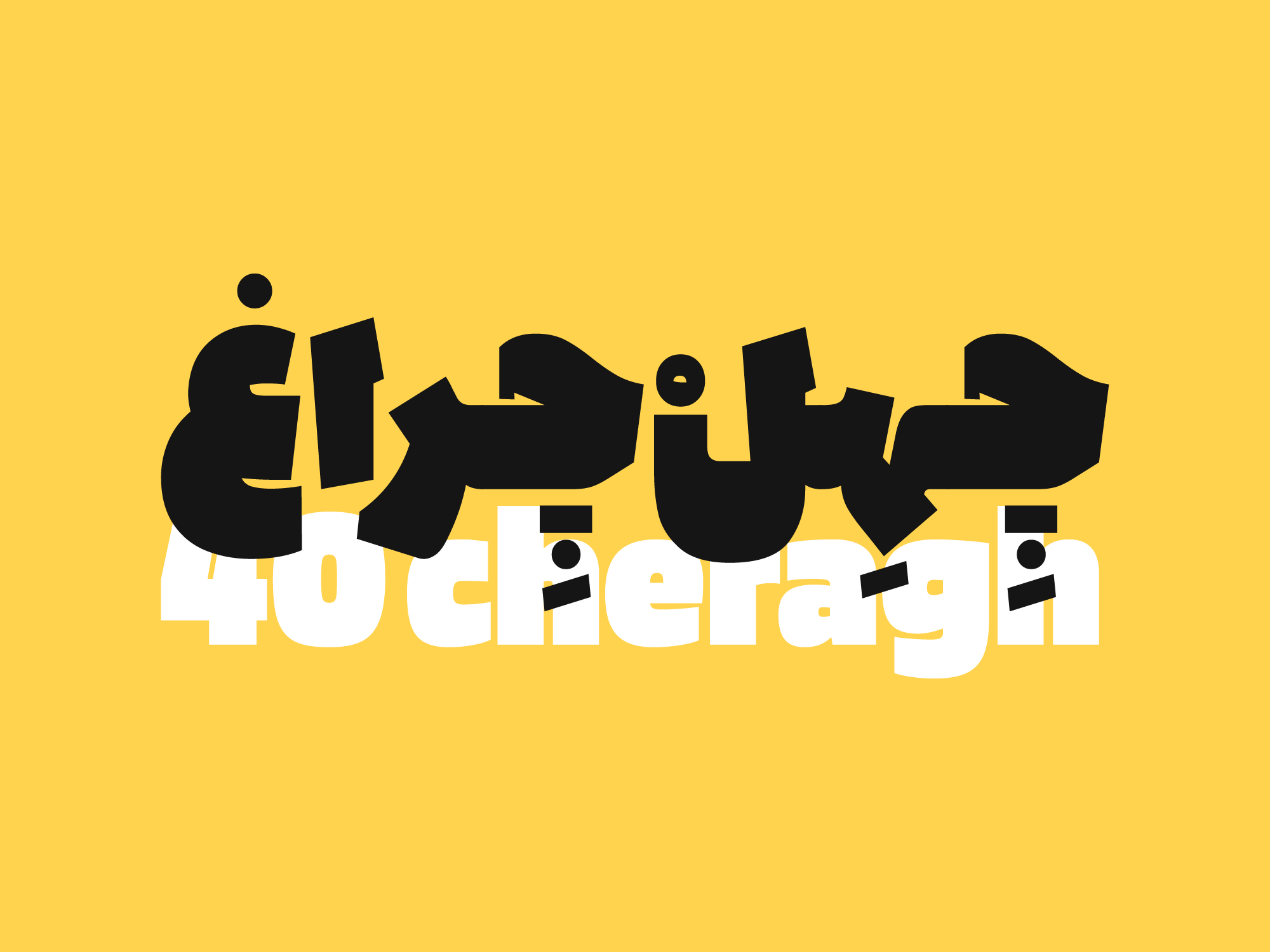
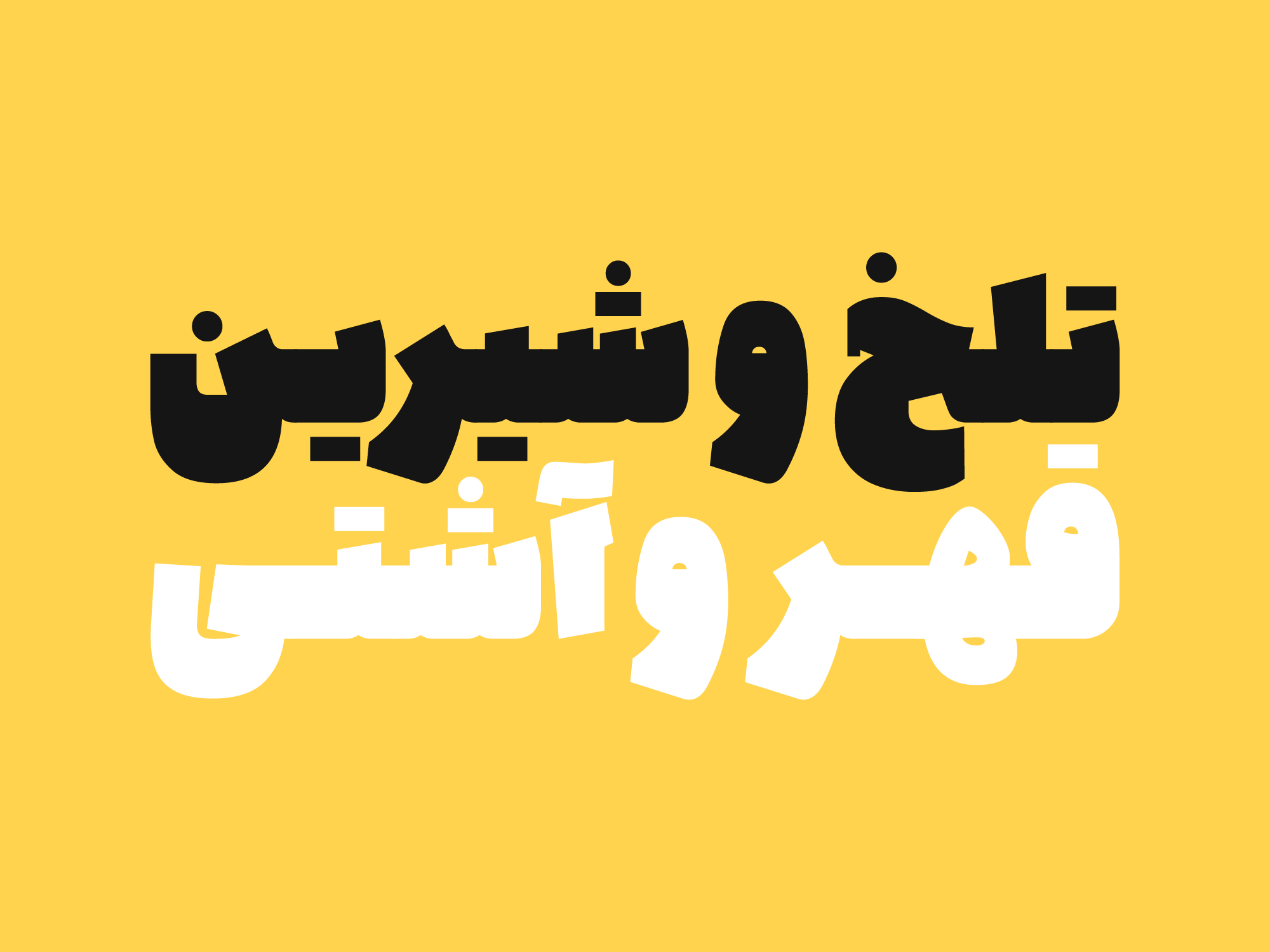
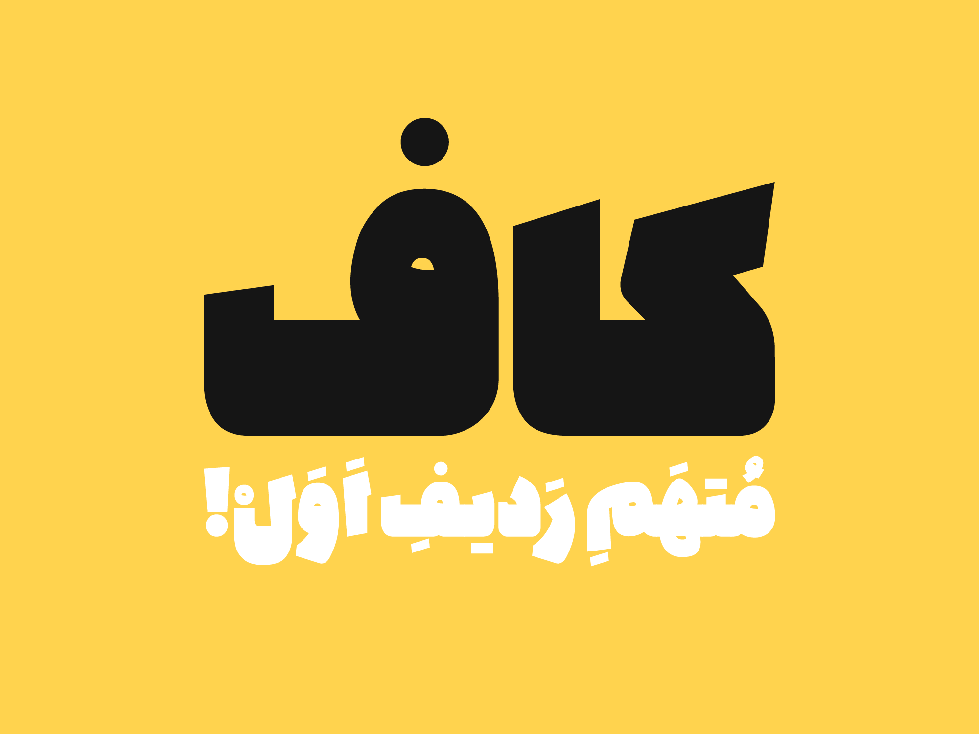
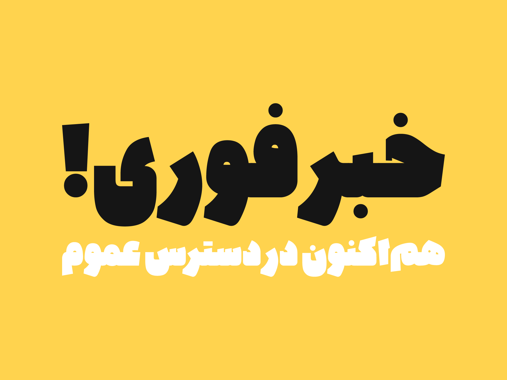
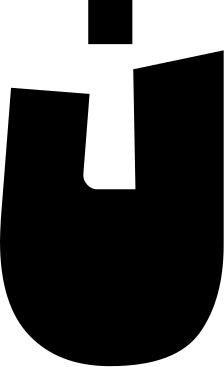
Kaaf is a bold, muscular display typeface rooted in the formal logic of Naskh calligraphy, reinterpreting its structure through a contemporary lens.
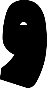
In Kaaf, the black forms of the letters are built within a compact structure, where the calligraphic qualities of Naskh merge with strong angles and dense forms. This combination creates a powerful and dynamic structure, giving the letters a bold and distinctive presence.
The compactness of the letters turns words into powerful visual units. As the typeface increases in size, the details of its forms, the interaction of strokes, and the rhythm of the spaces between letters become more pronounced. Kaaf is therefore more than a collection of heavy letterforms; it is a system for creating texture and imagery through words.
Kaaf is designed for display applications—from headlines and posters to visual identities, covers, and packaging—where typography goes beyond conveying text and becomes an integral part of the image and identity of the design.
In such typefaces, text no longer plays a secondary role; the writing itself becomes the dominant visual element. Spacing, stroke thickness, and the ratio of filled to empty space are calibrated so that the eye perceives the text not as a string of individual letters, but as a cohesive mass. For this reason, the use of these fonts is not limited to headlines or visual emphasis—they are employed in projects where the scale of the text is an integral part of the visual identity.
Successful heavyweight typefaces are not merely thicker fonts; they are designs that maintain balance, rhythm, and relative readability even at large sizes. Careful control of contrast, management of internal and external spacing, and consistent behavior of glyphs distinguish these typefaces from fonts that are simply bold.
In this approach, stroke thickness is not a decorative feature; it is a tool for designing space. Letters must be able to fill surfaces, construct frames, and transform text into a visual structure, without compromising the integrity of the overall design system.
 Font Licensing
For an additional user to use the font.To share the font with your designer or project partner. (details)
For one website or app and to share the font with 2 additional project partners. (details)
For small businesses to share the font with 5 additional employees and use it on one website.(details)
For unlimited use by companies in all their activities. A website builder, website templates and services that allow users to type with the font. (details)
Kaaf
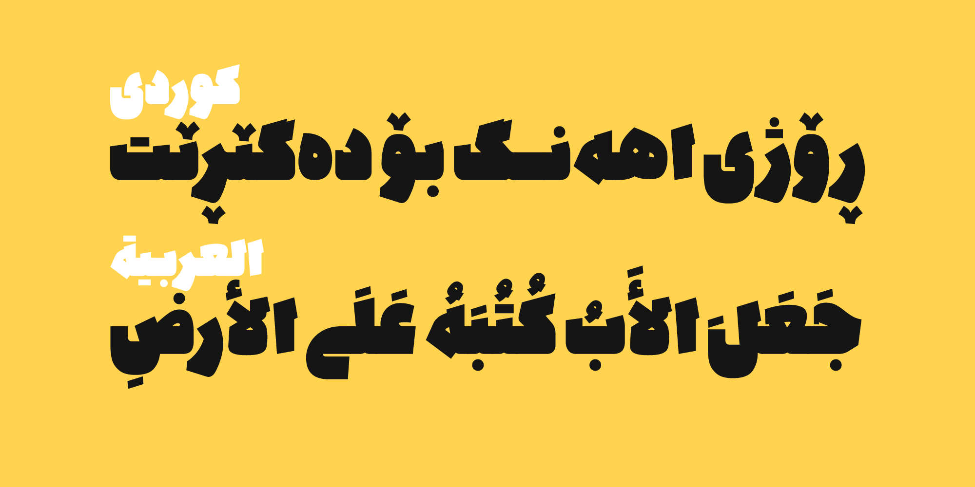
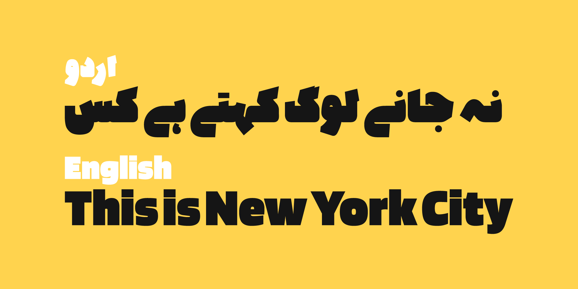
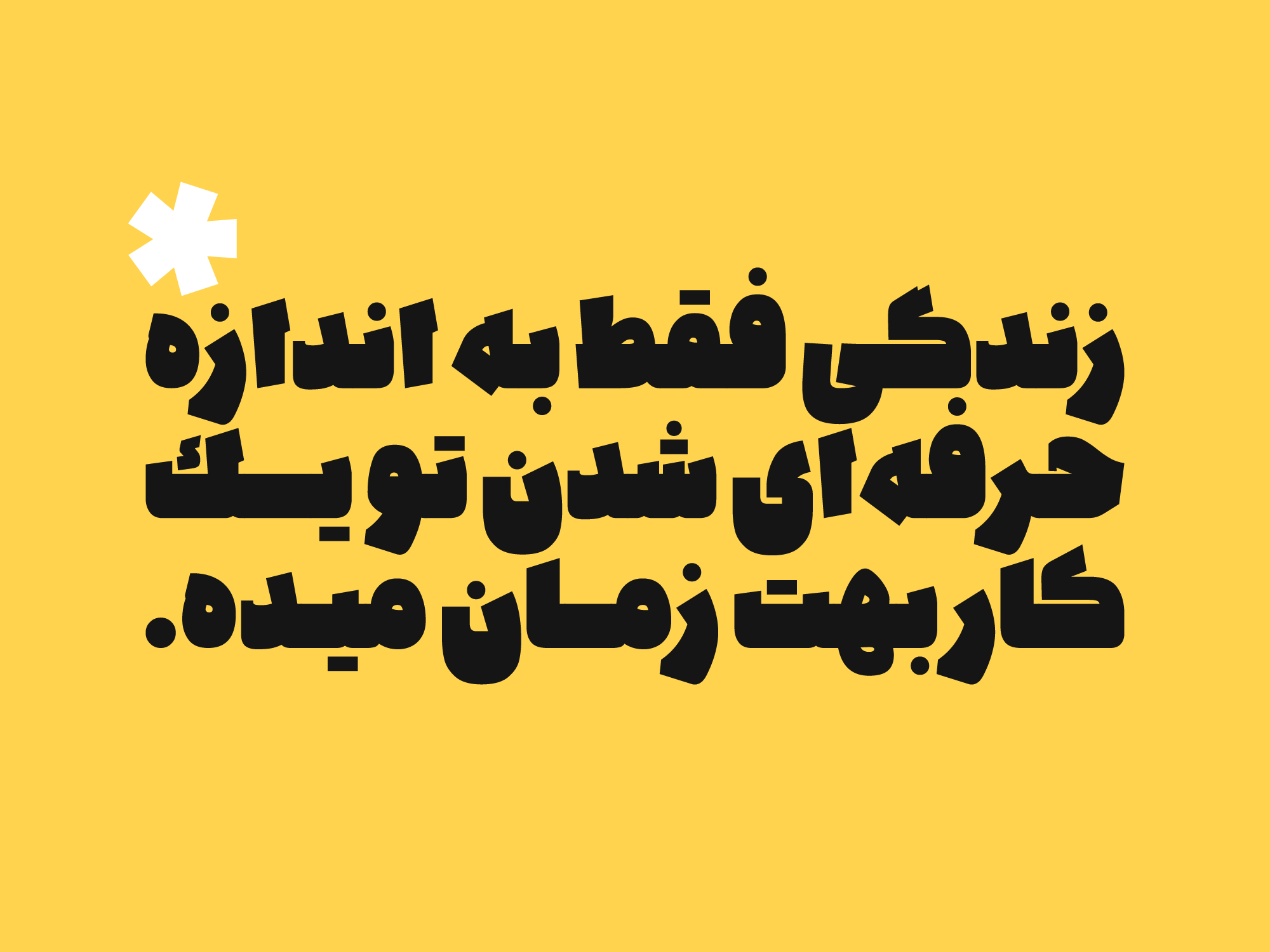
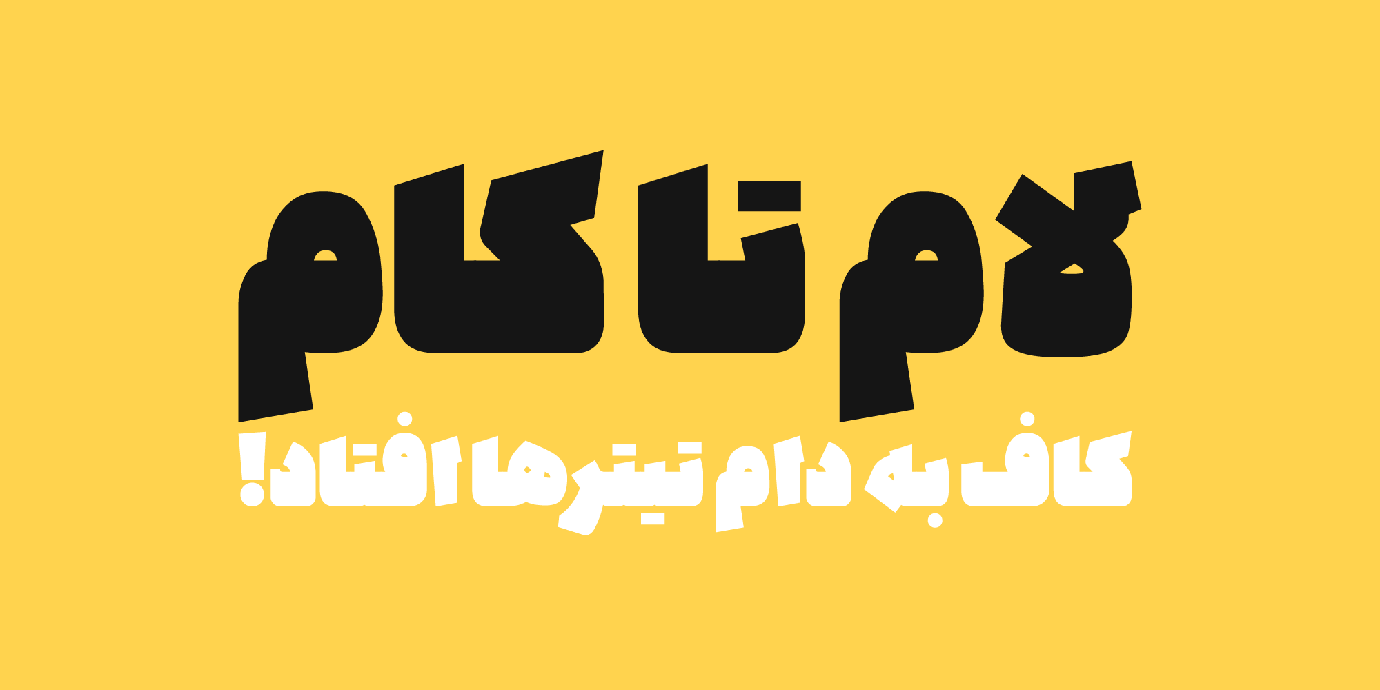

In the Kaaf font package :
- Main Font: 1 weight in
TTFformat. - Web Fonts:
WOFF1andWOFF2



Mahdi Ravandi is a type designer, art director, and graphic designer with a Master’s degree in Visual Communication. He began his professional career in type design in 2010, focusing primarily on the design and redesign of Persian typefaces, as well as cultural and commercial graphic design projects. He won third place in the international Granshan 2016 Typeface Design Competition and has extensive professional and managerial experience working with studios, companies, and cultural institutions in Shiraz, Mashhad, and Tehran.
















Comments
Recommended Posts
Meeting with Karim Shahin, Designer of the Narengi Typeface
Nostalgic Arabic Fonts: Reviving the Beauty of the Past
Top Arabic Fonts for Ramadan and Eid Design
Arabic Fonts for Books & Magazines: From Print to Digital
Techno Typeface; A Look at the Design Process and Logic
What features does an ideal subtitle font have?
Selected Fonts of 2025 in the TDC Competition
13th GRANSHAN Type Design Competition