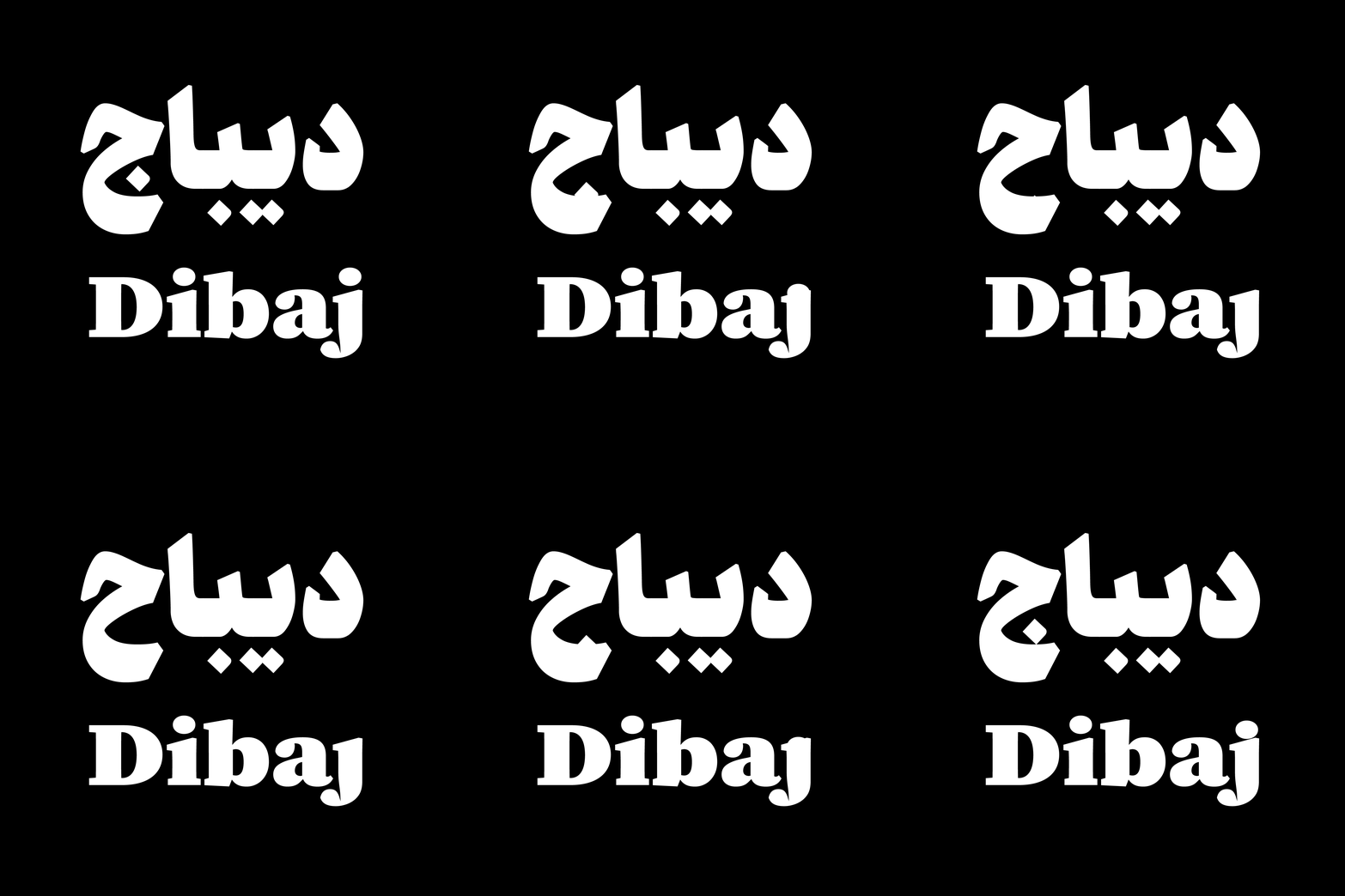
Dibaj
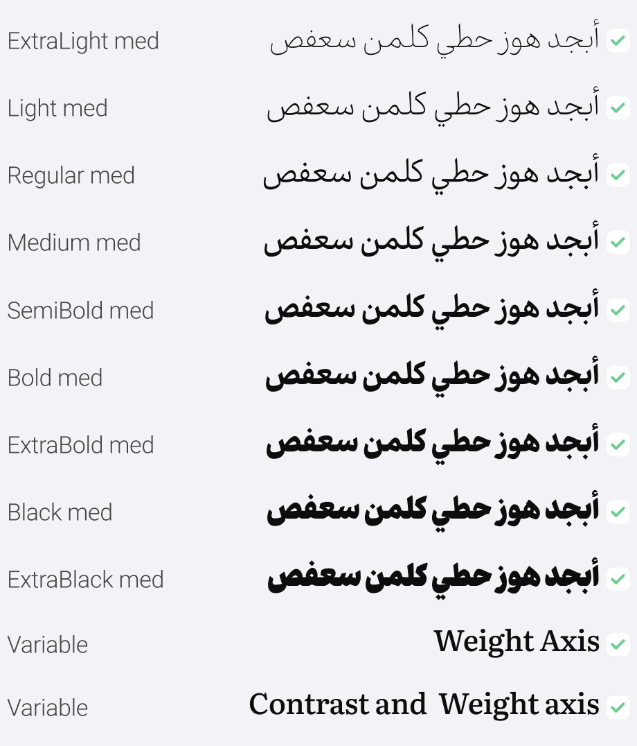
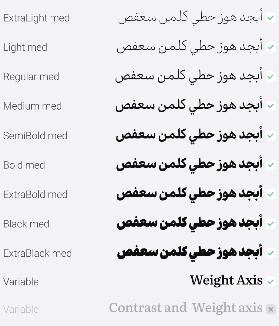
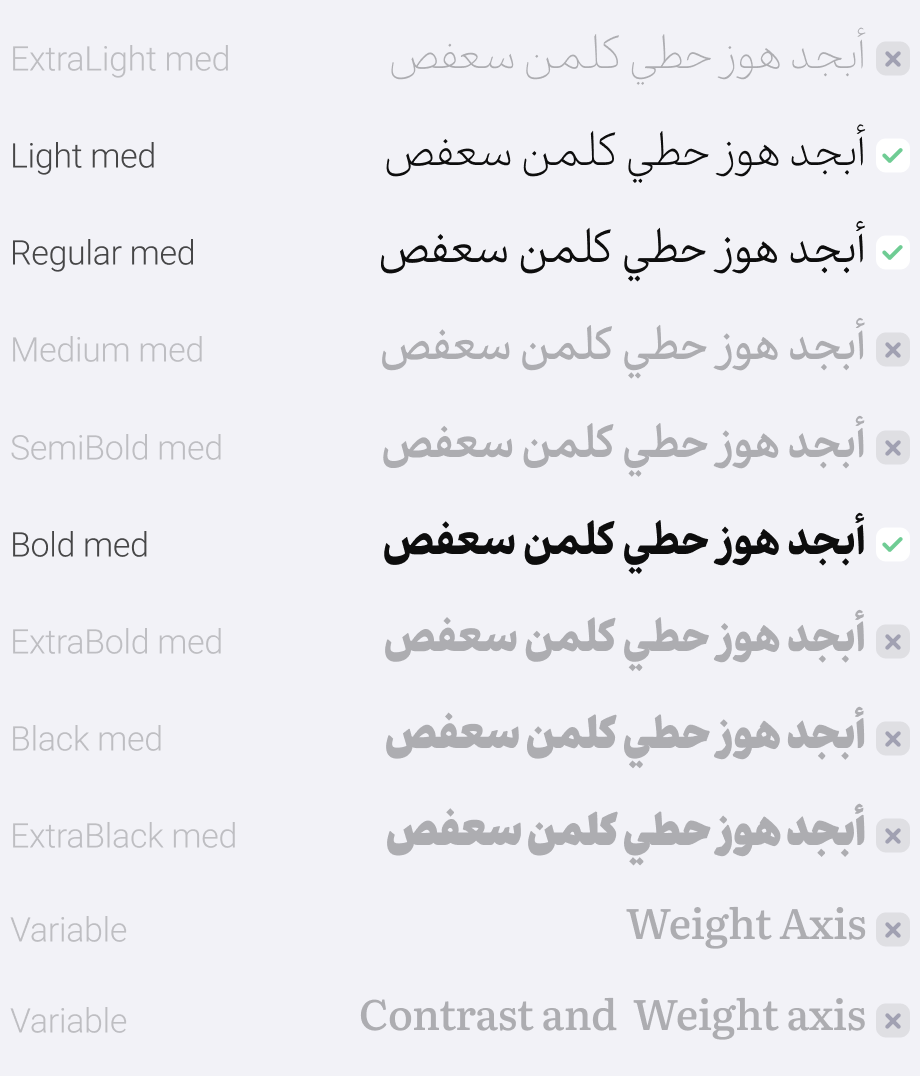
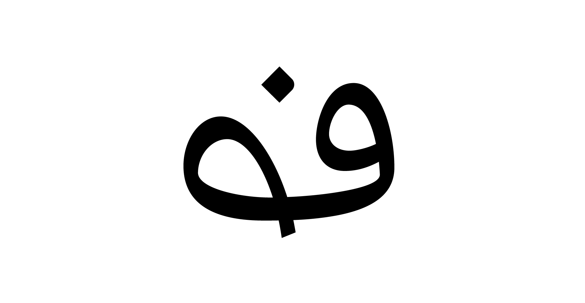
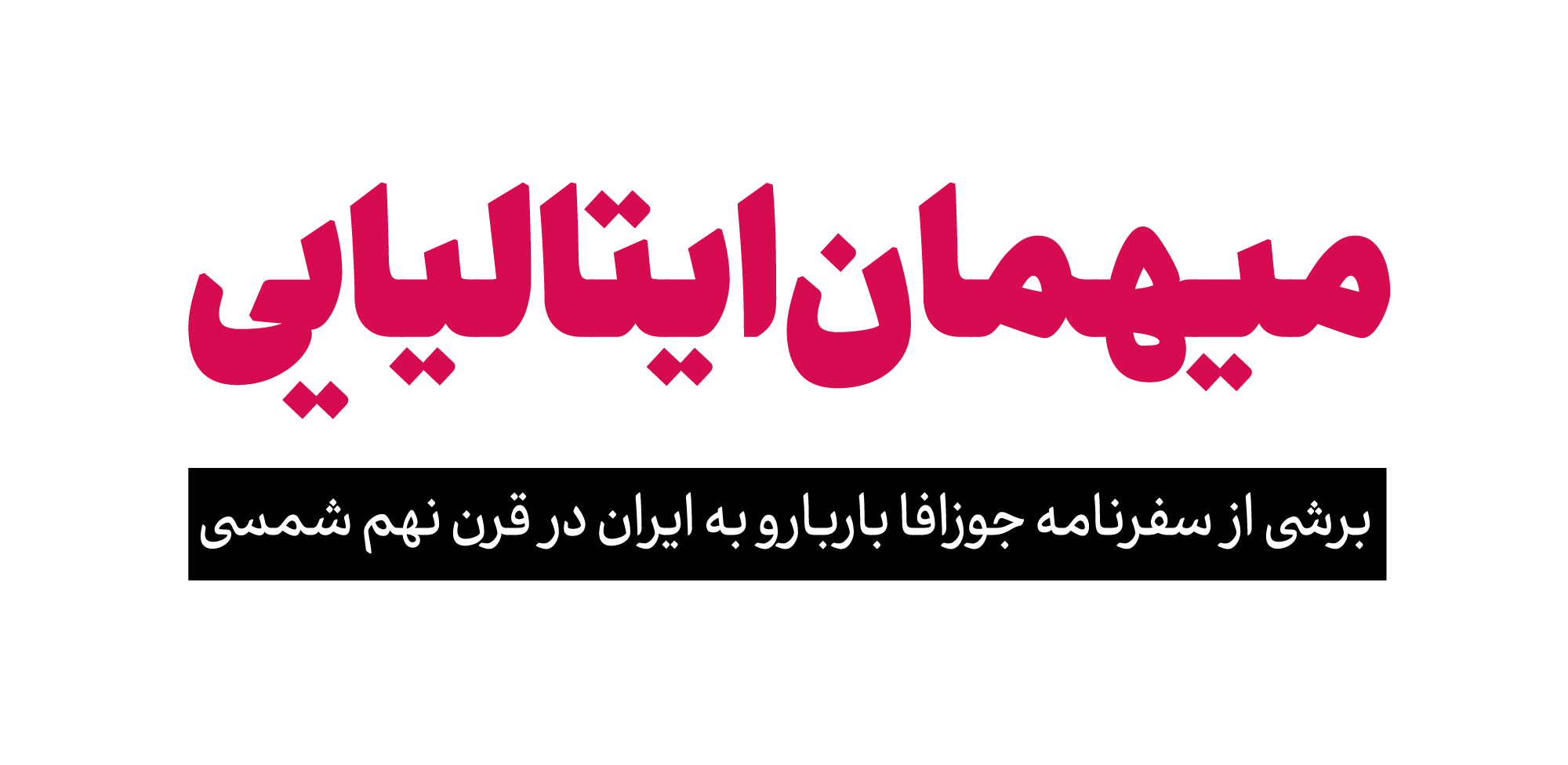
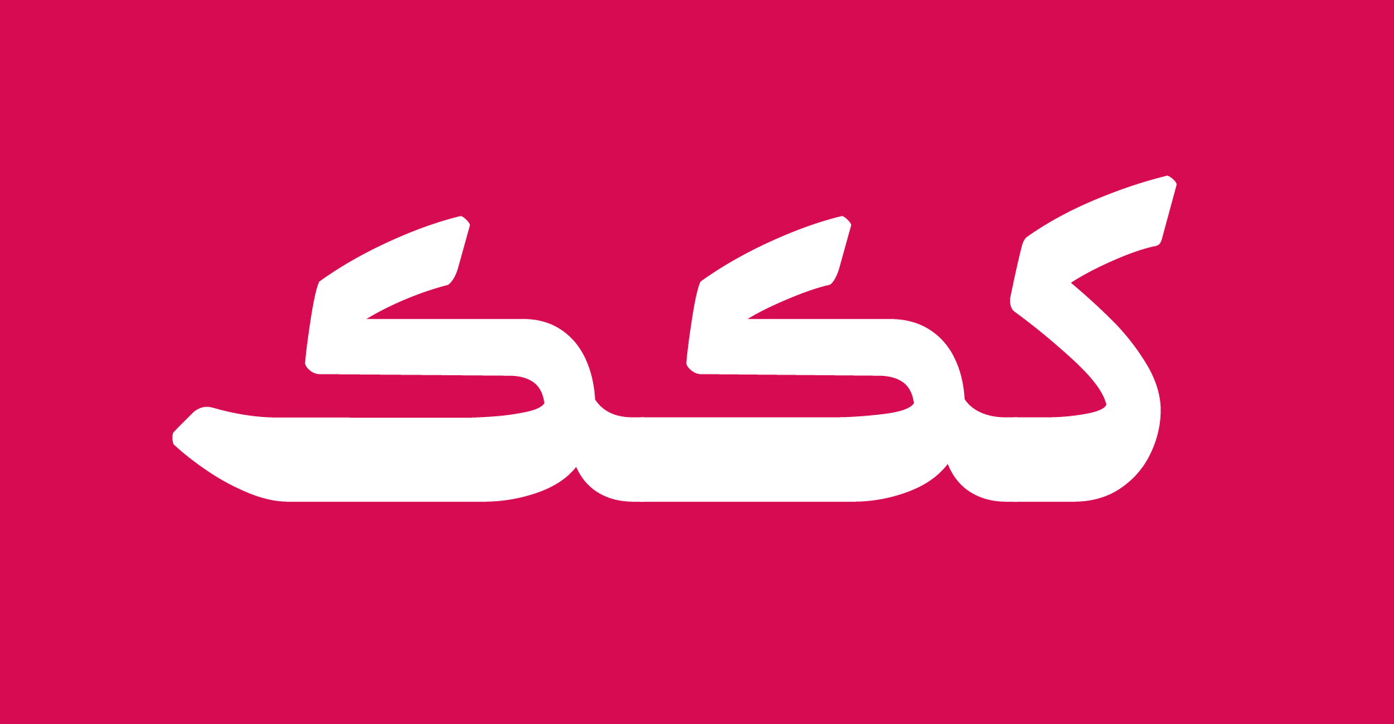
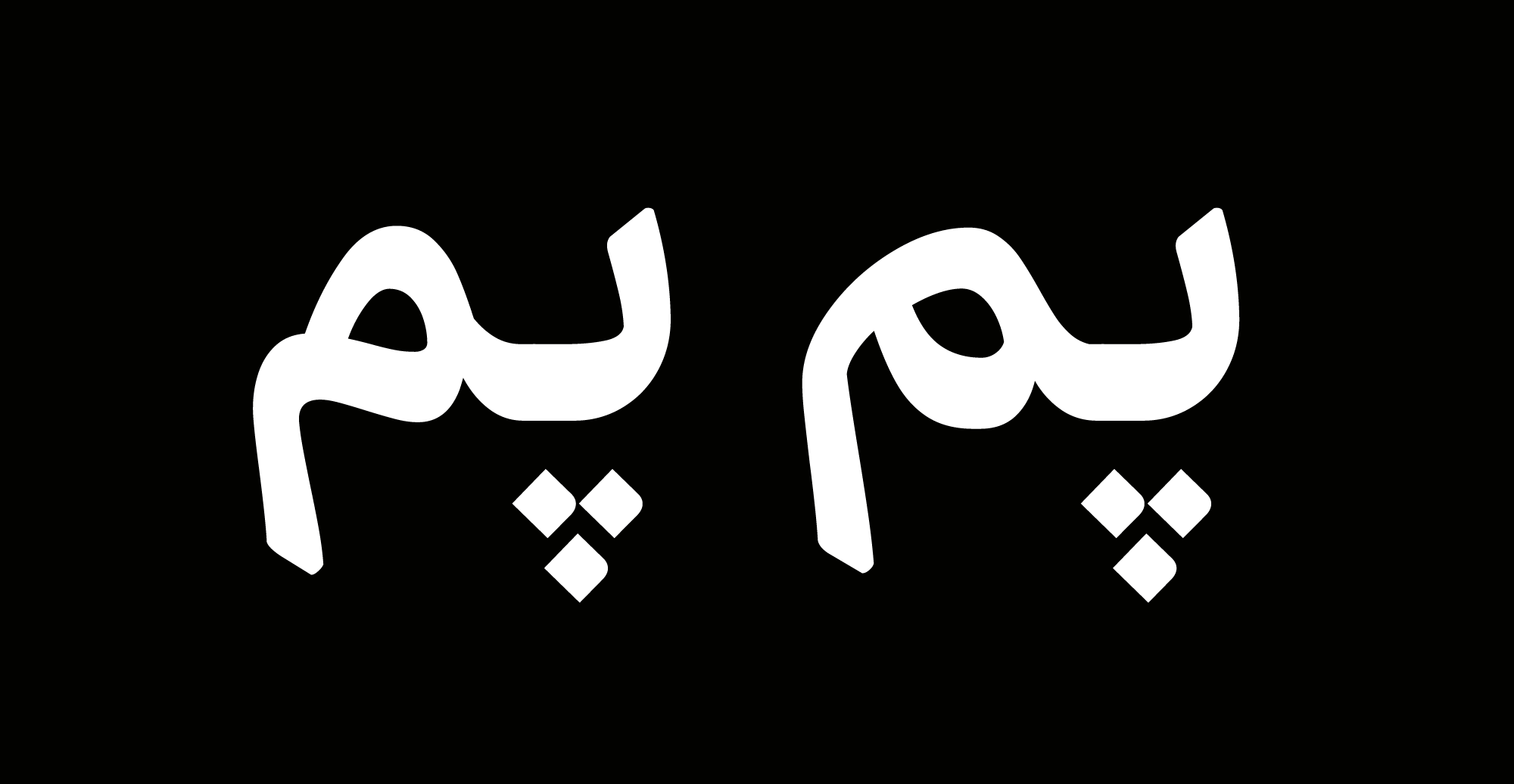
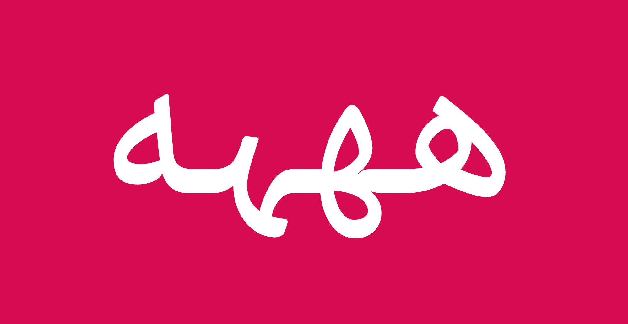
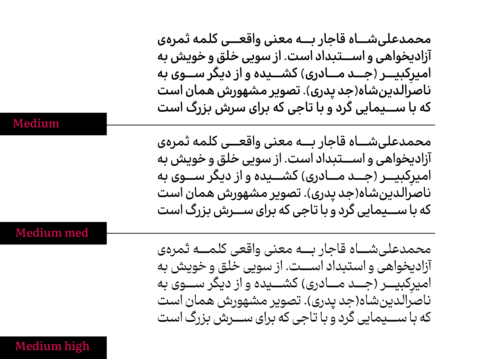
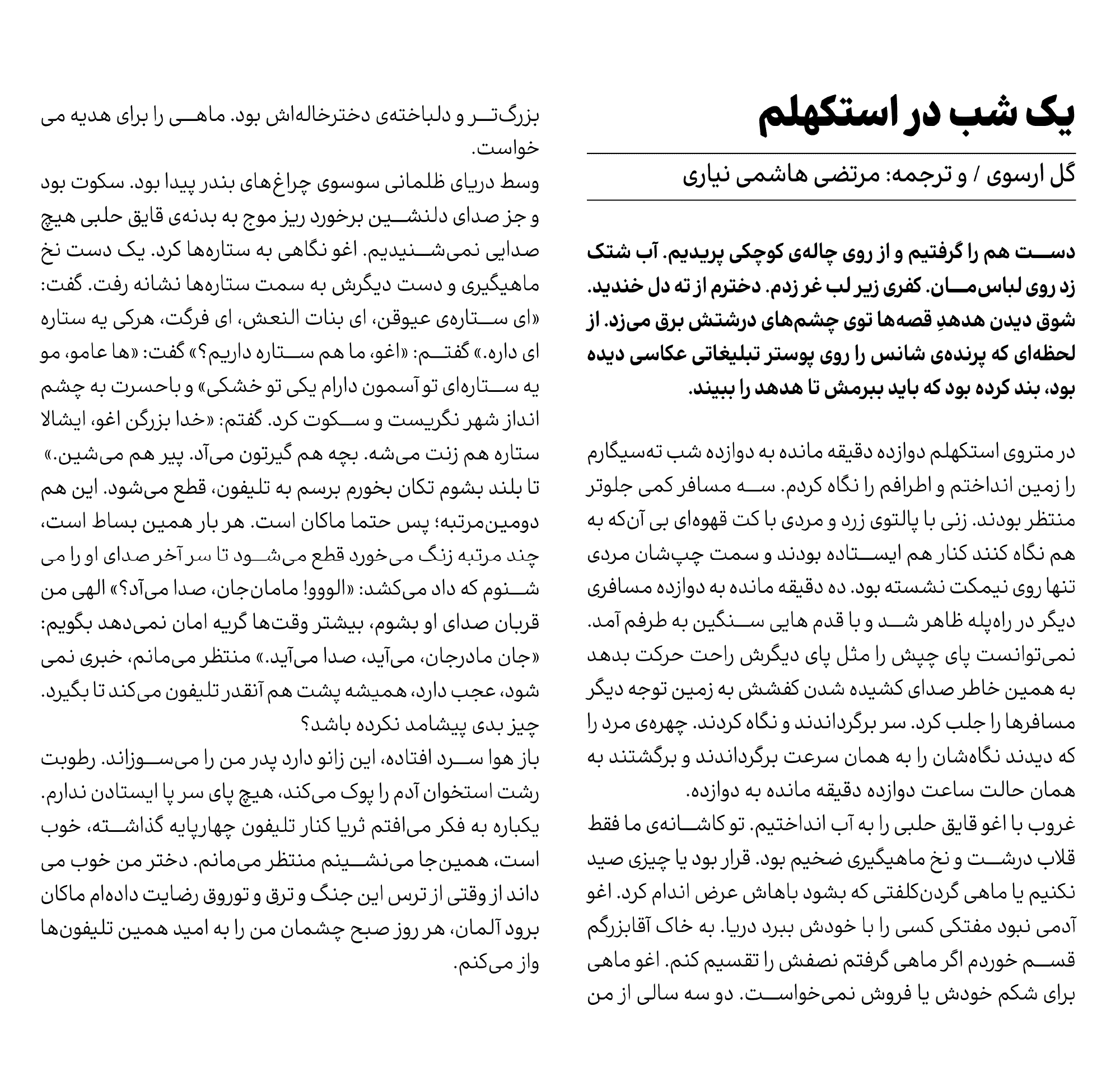
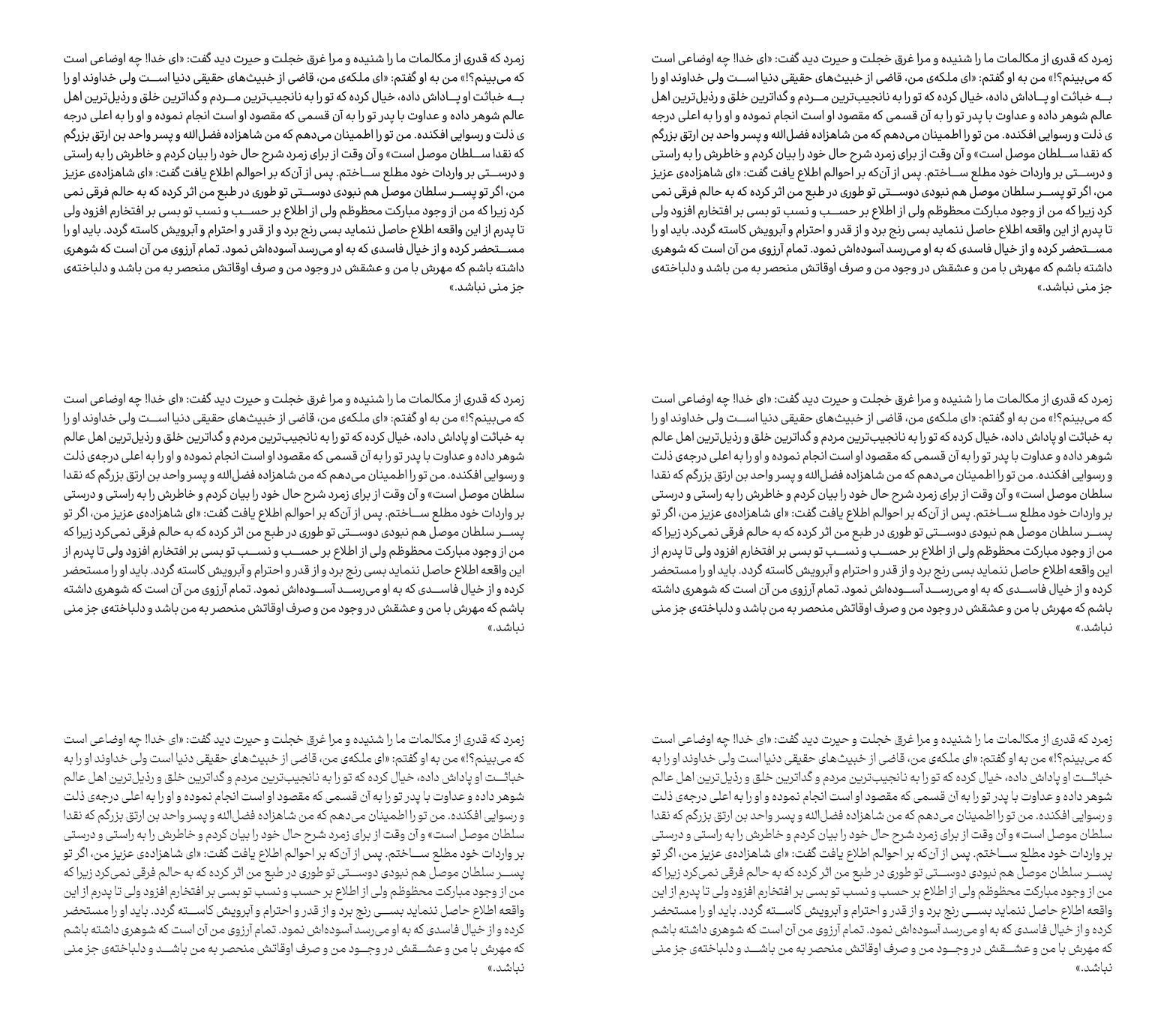
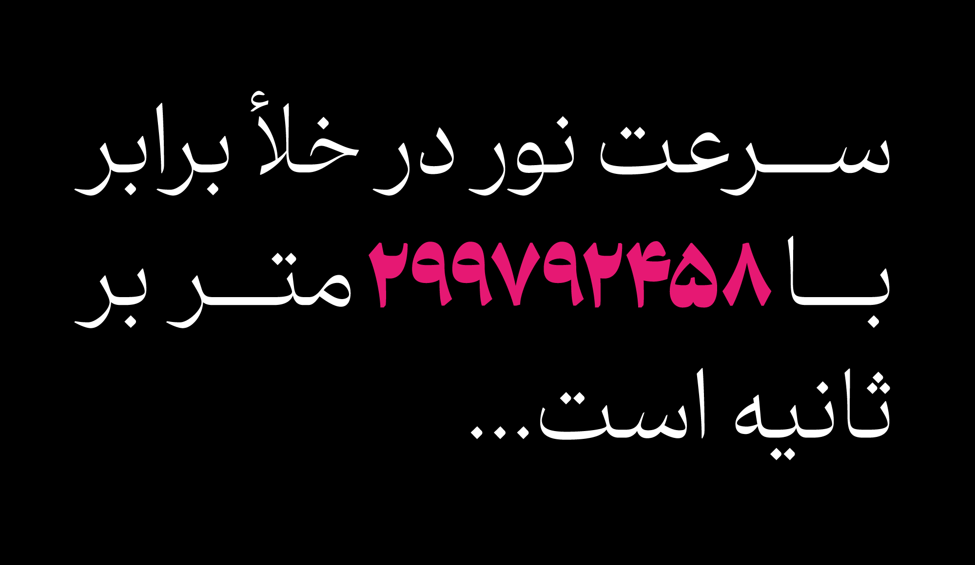
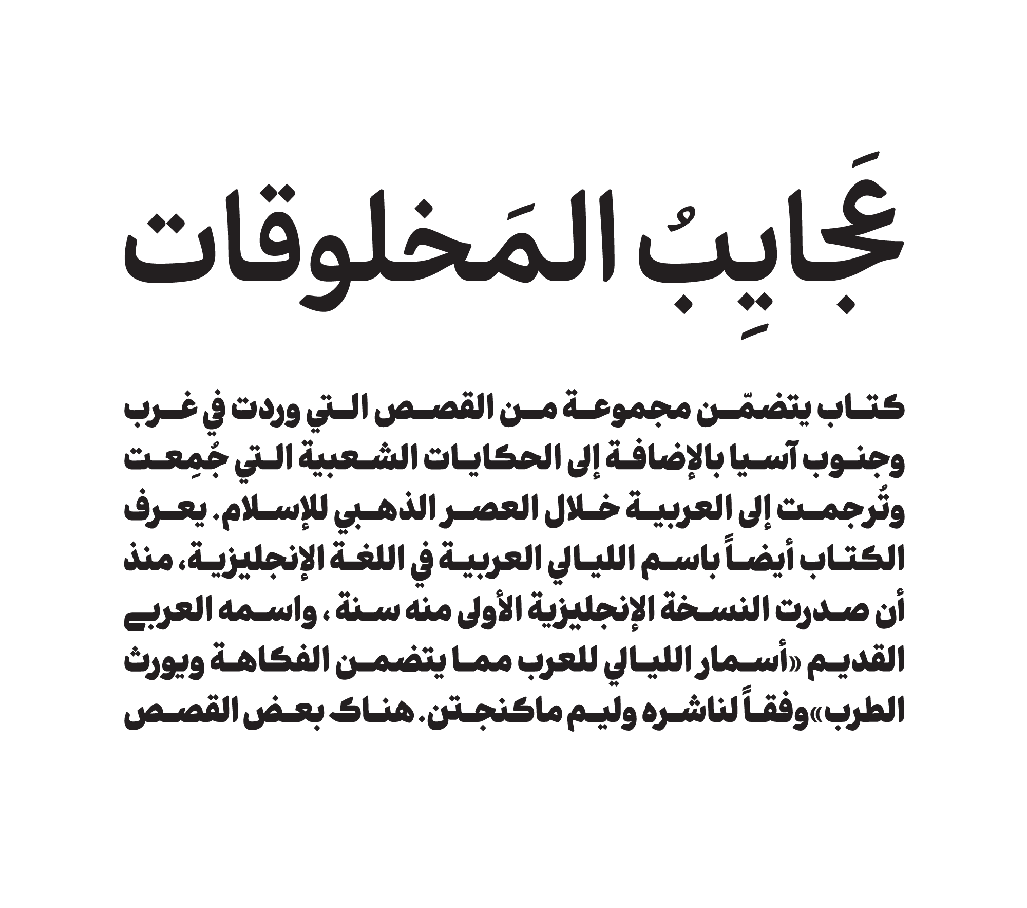
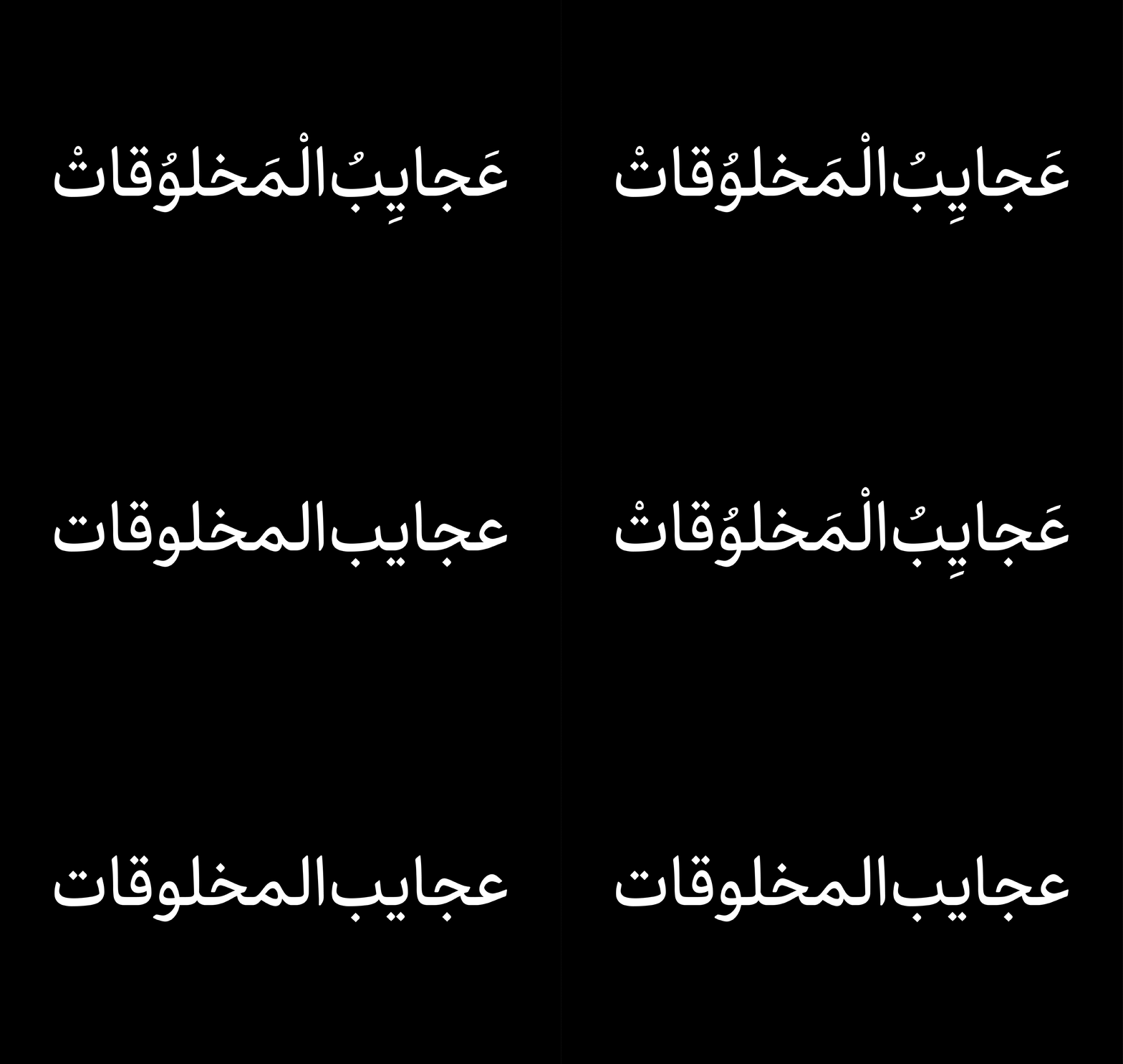
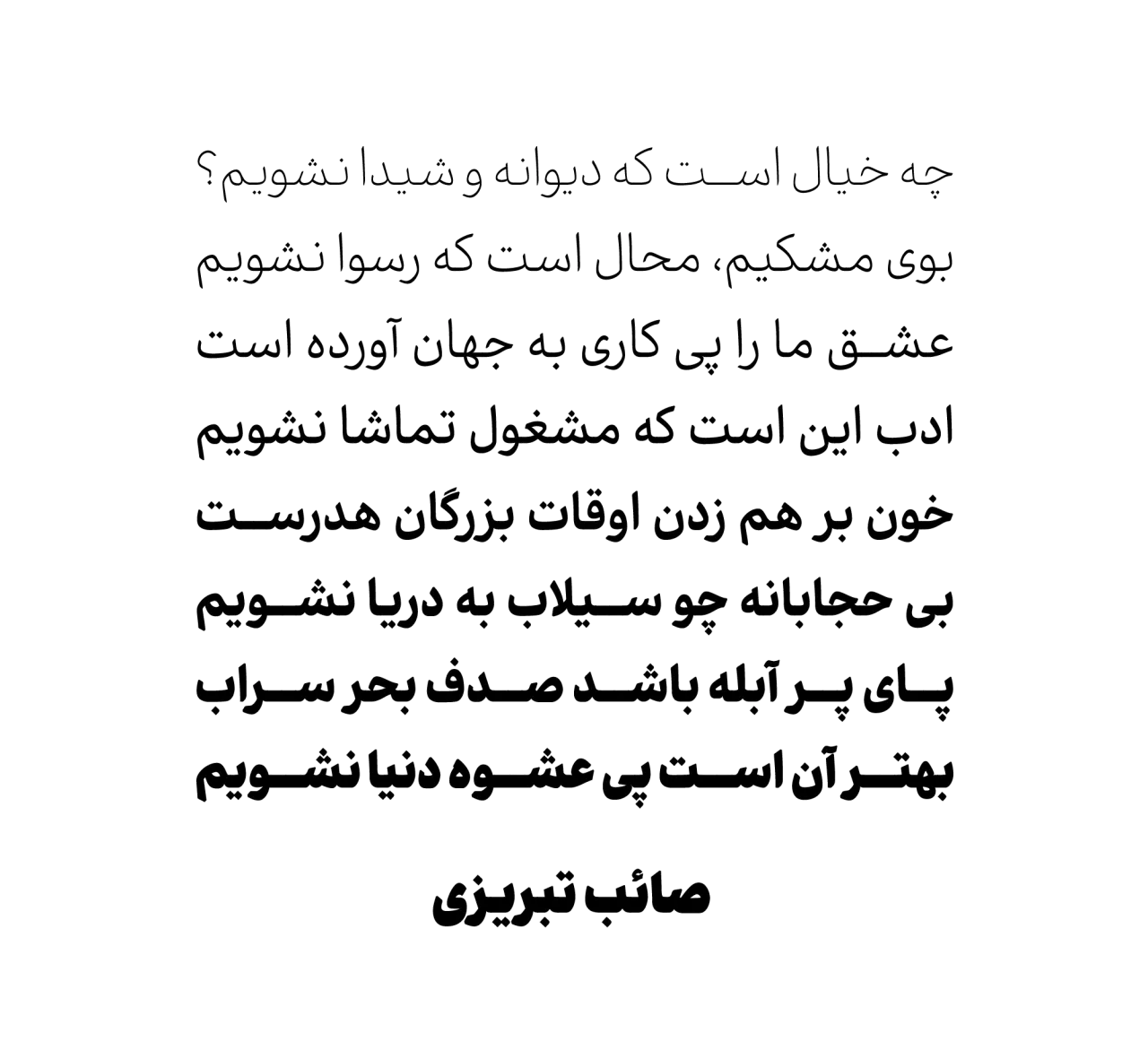
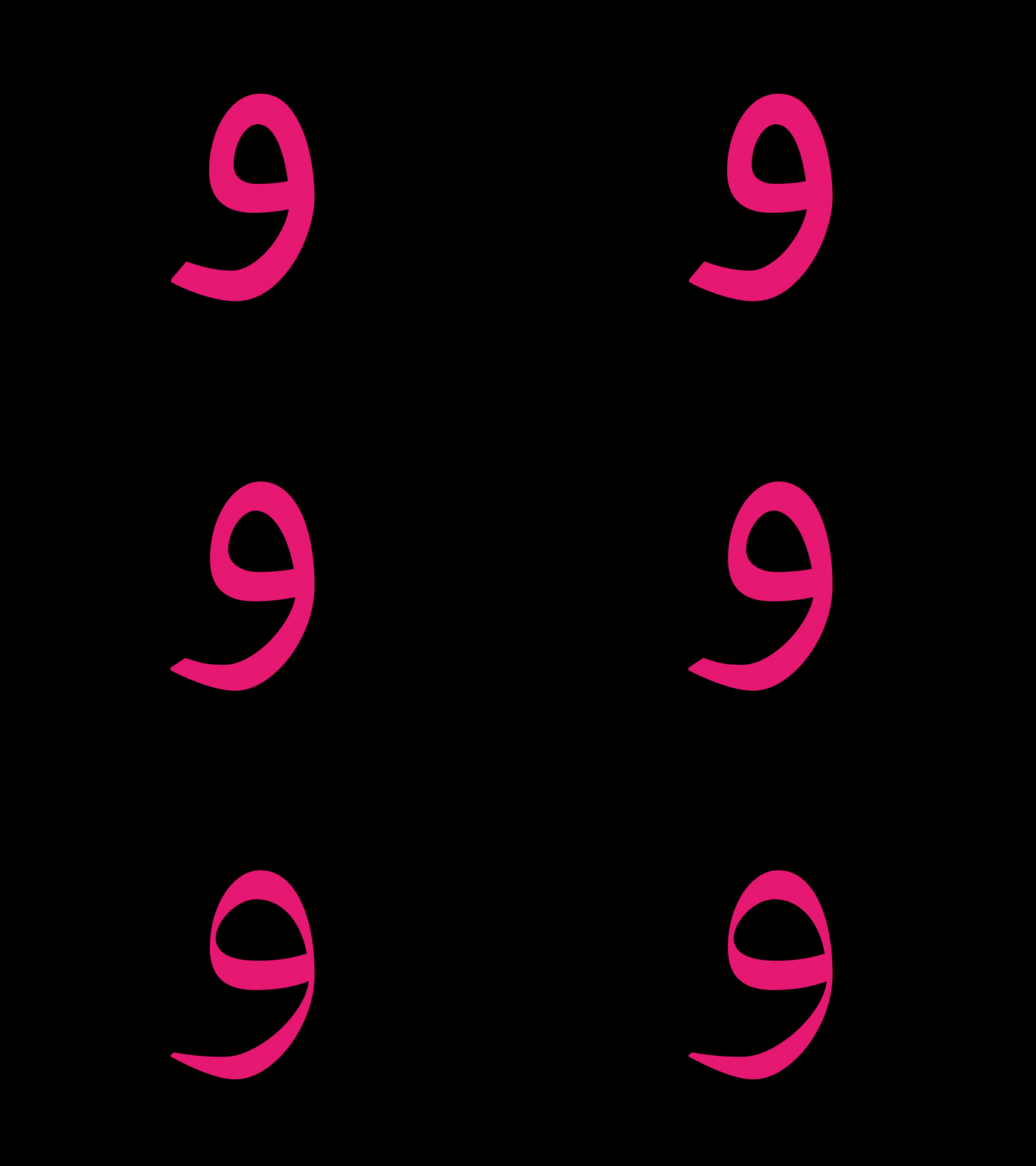
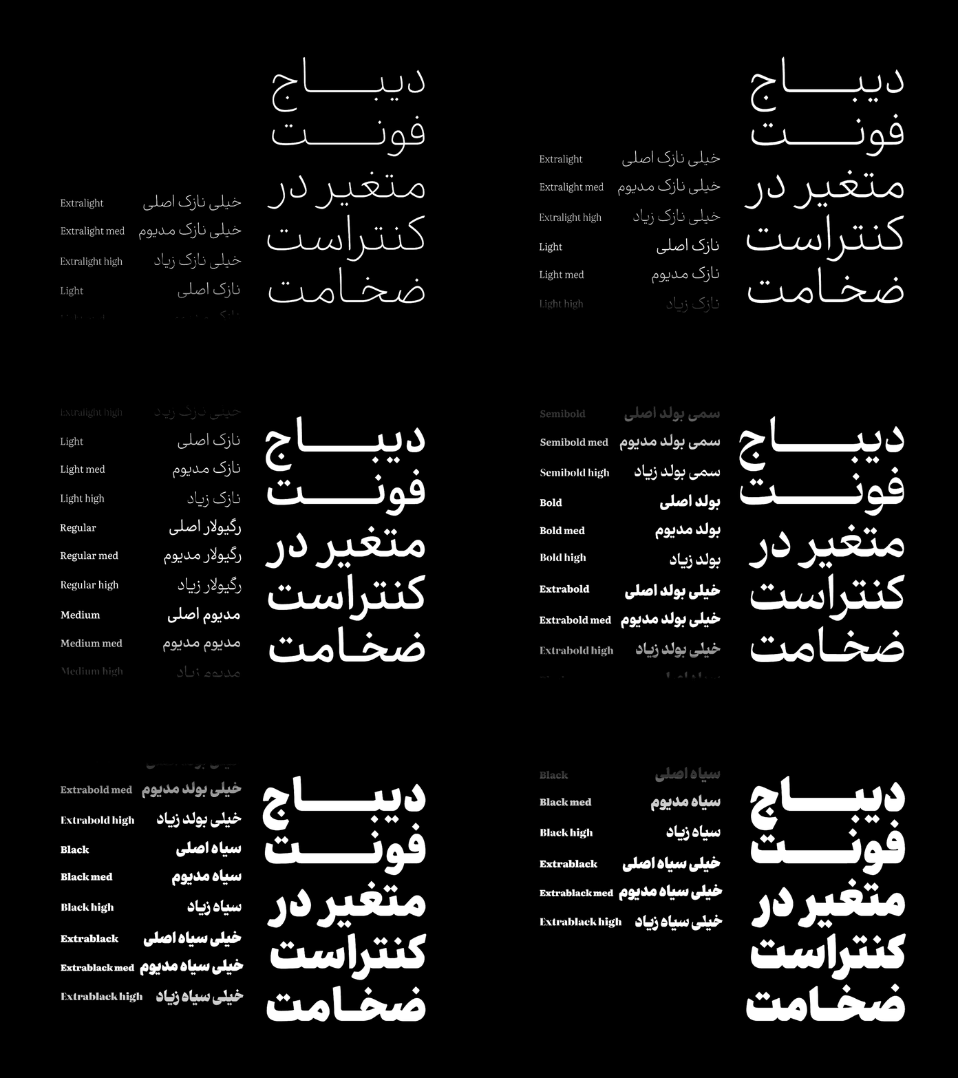
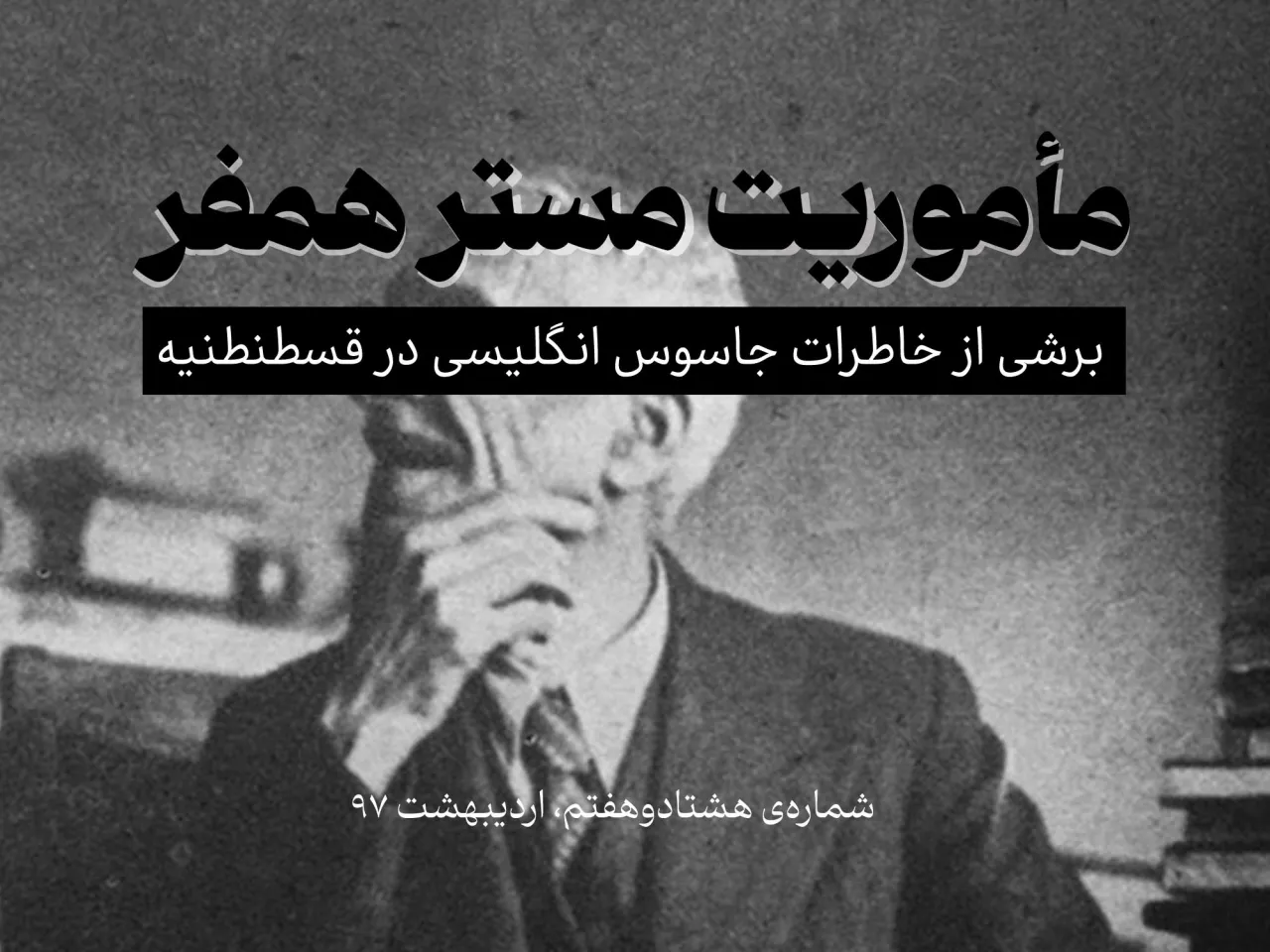
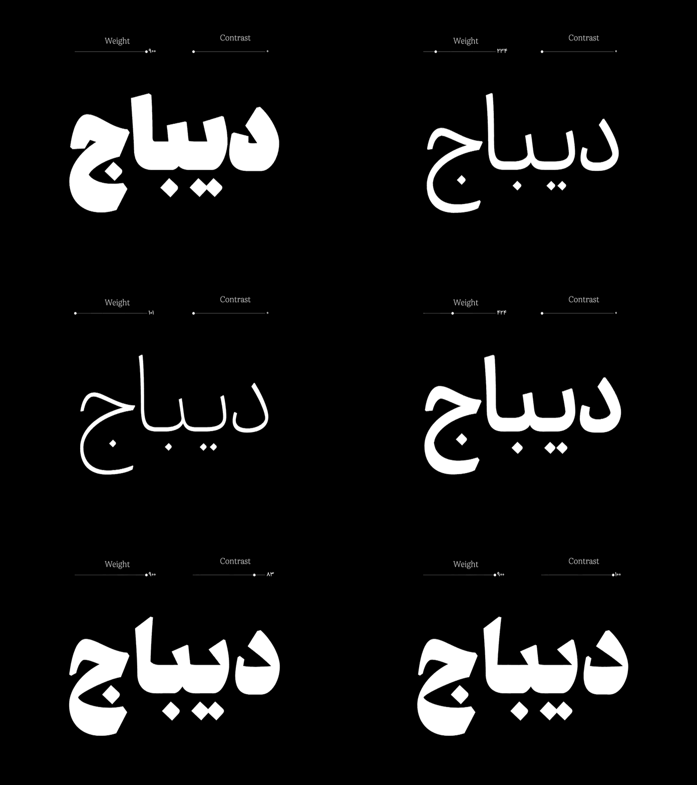
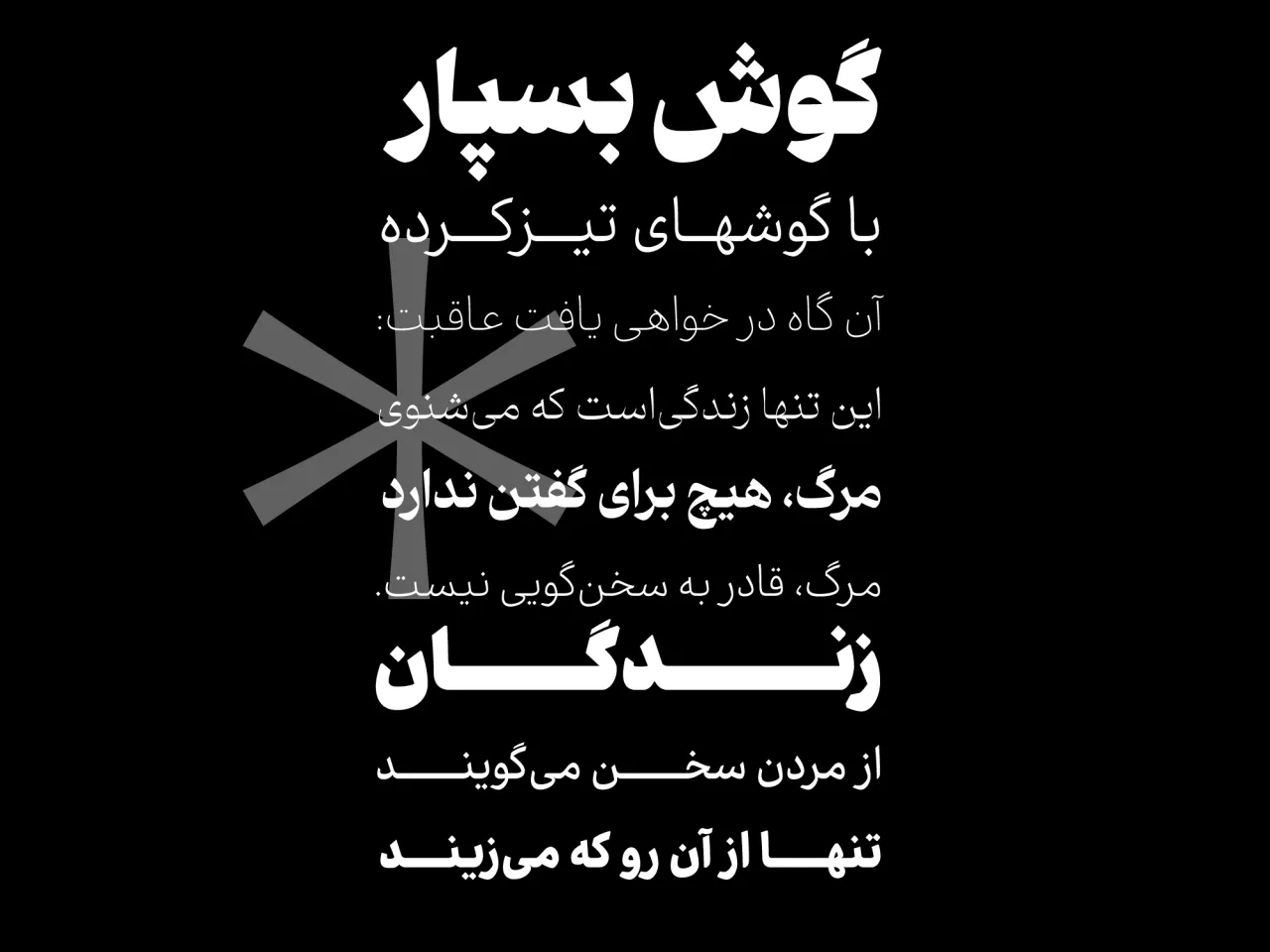
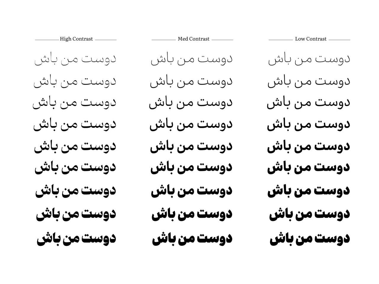
The pro-Dibaj font package includes 9 weights (Extra Light, Light, Regular, Medium, Semi-Bold, Bold, Extra Bold, Black, Extra Black) and three thickness styles (Low contrast, Medium contrast, High contrast), as well as a variable font version.
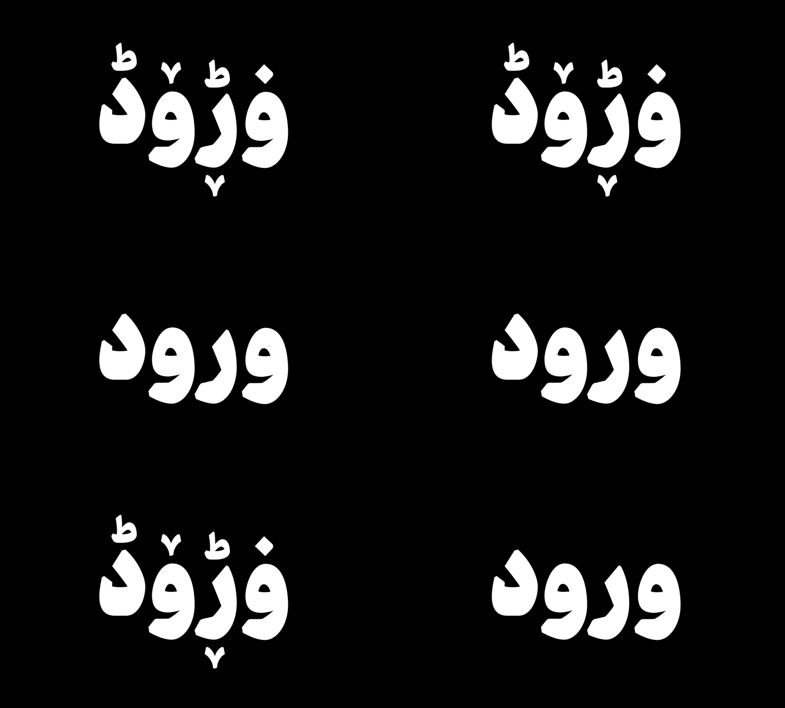
In the variable font version of this package, users can not only change weights but also alter their writing style. The professional Dibaj package provides users with various characters and tones of letters, allowing them to utilize the font across a broader spectrum of topics.


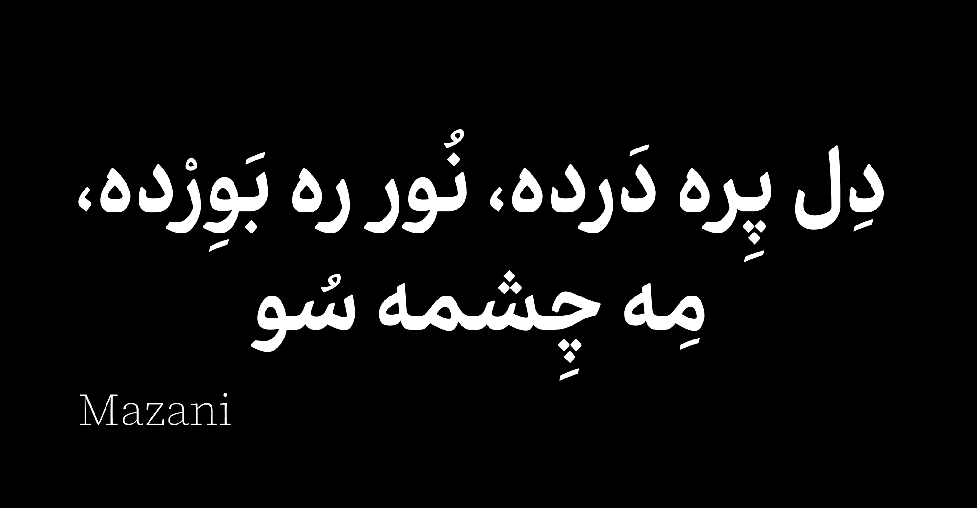
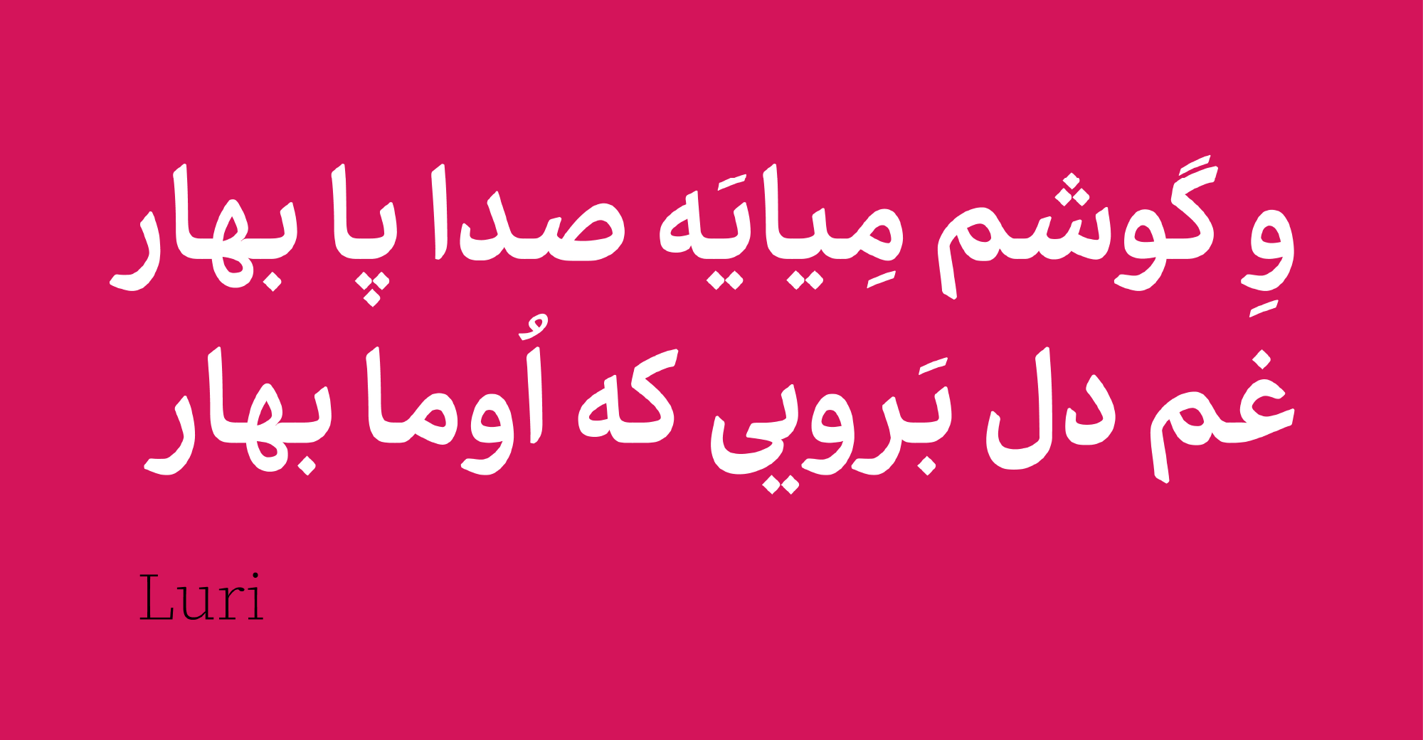
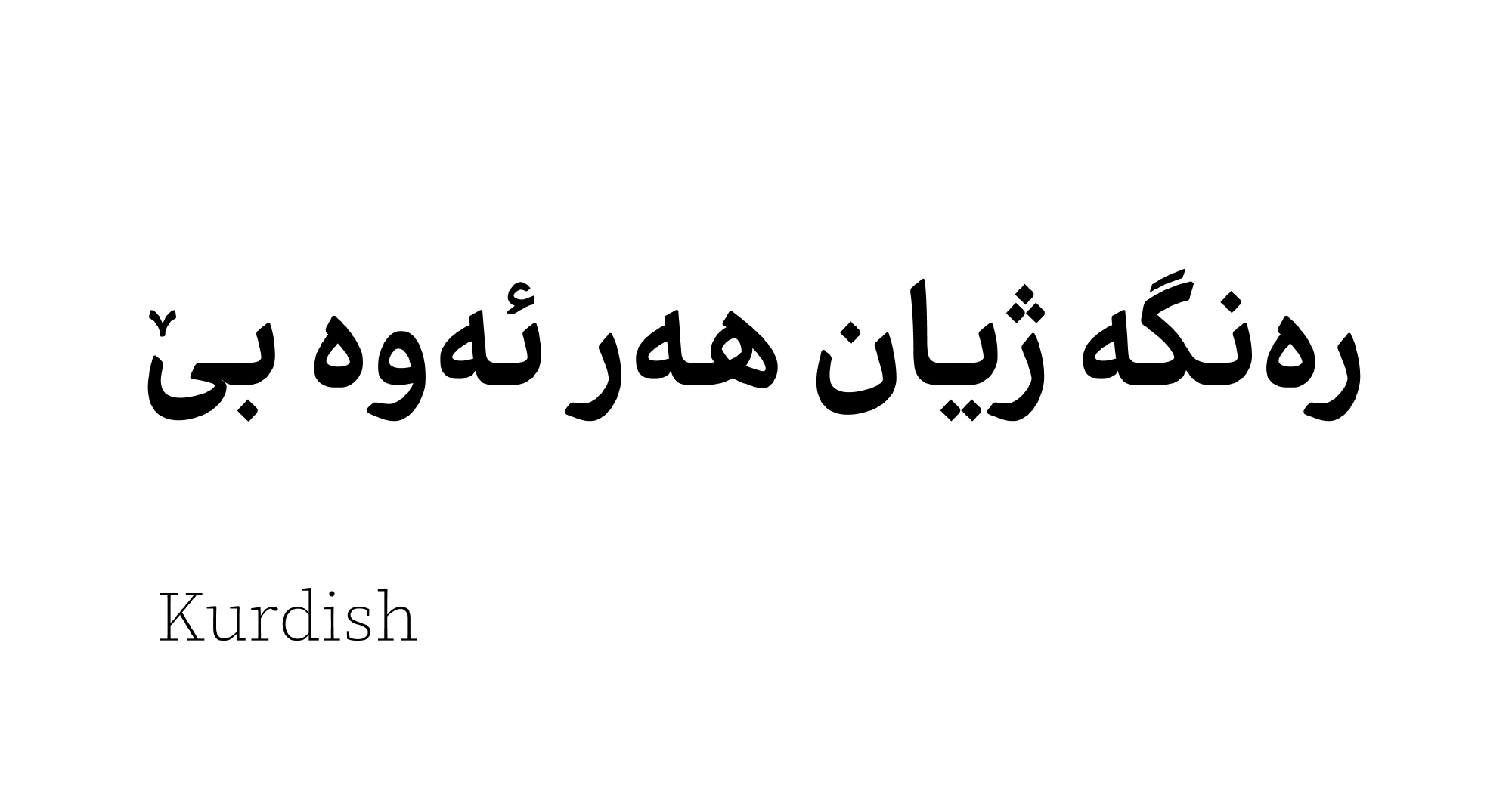
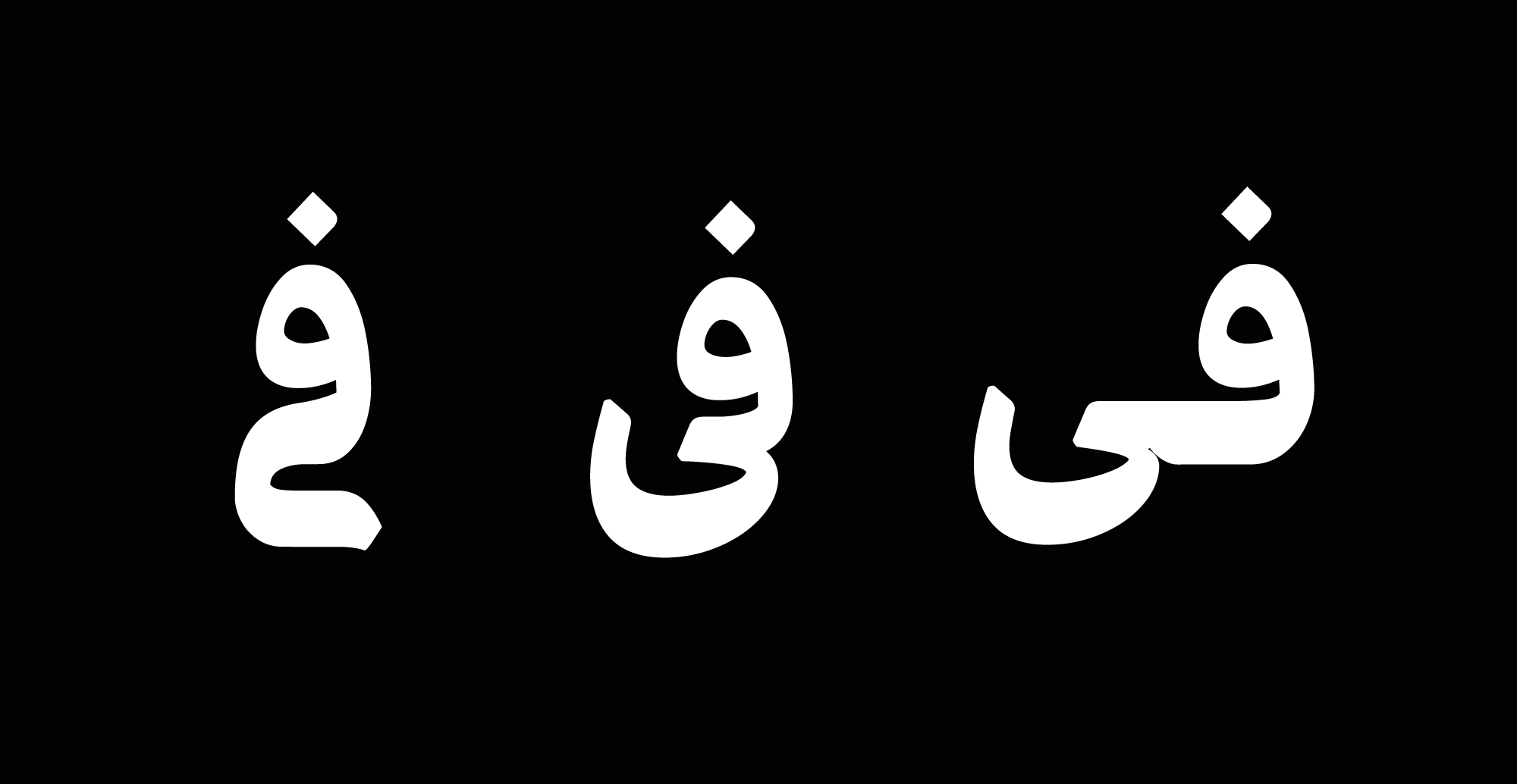
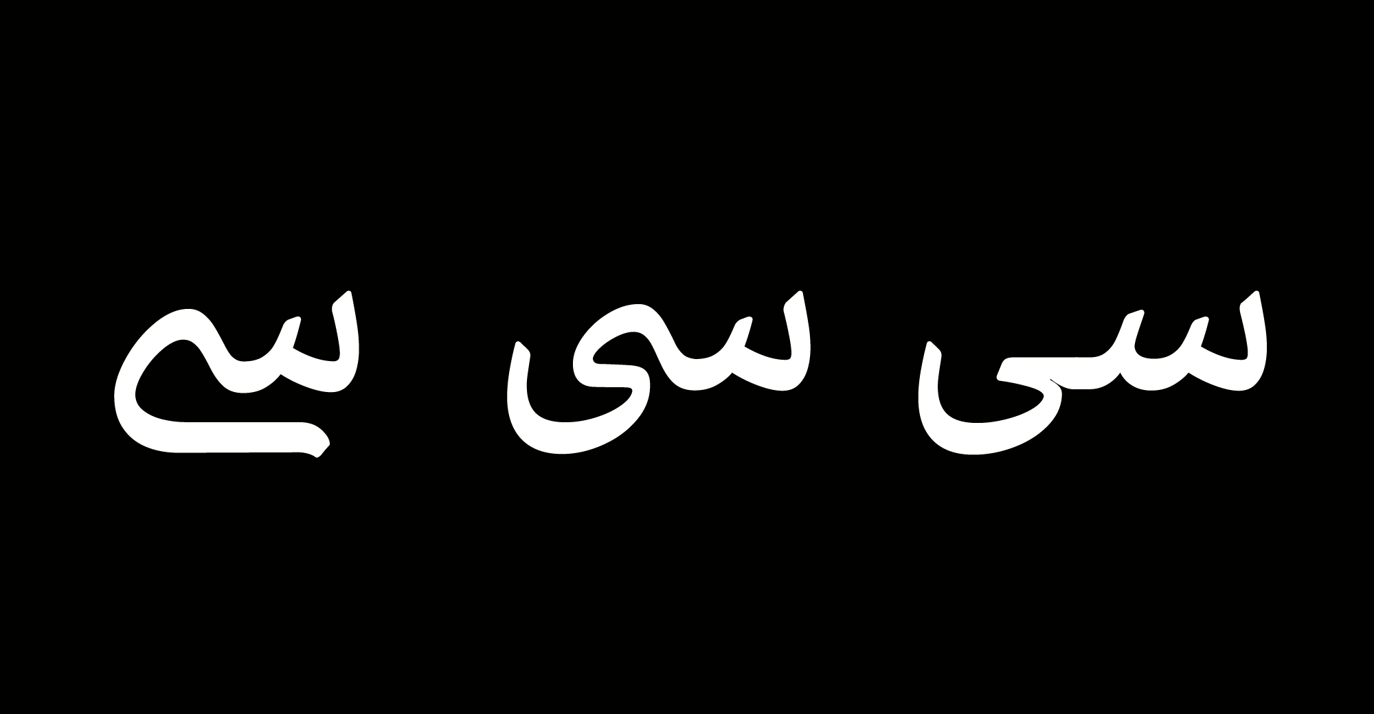
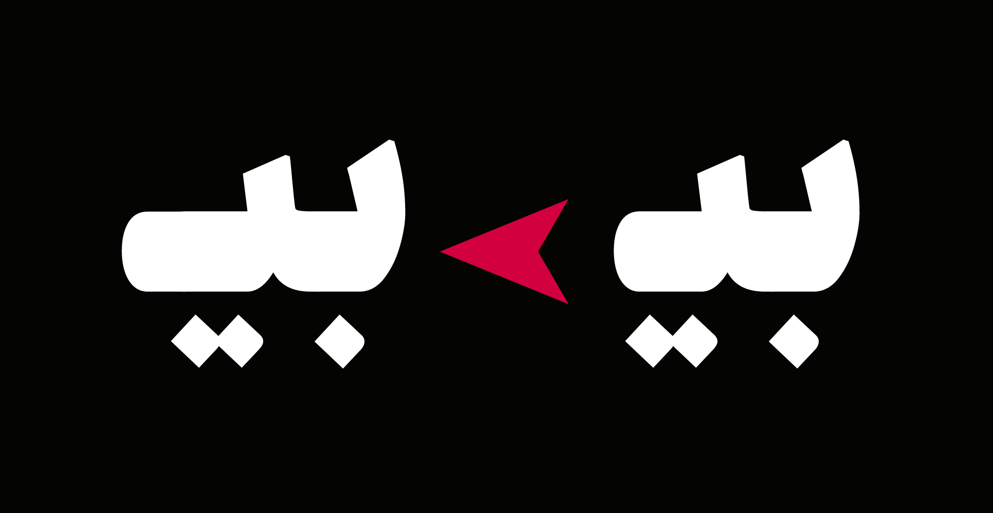
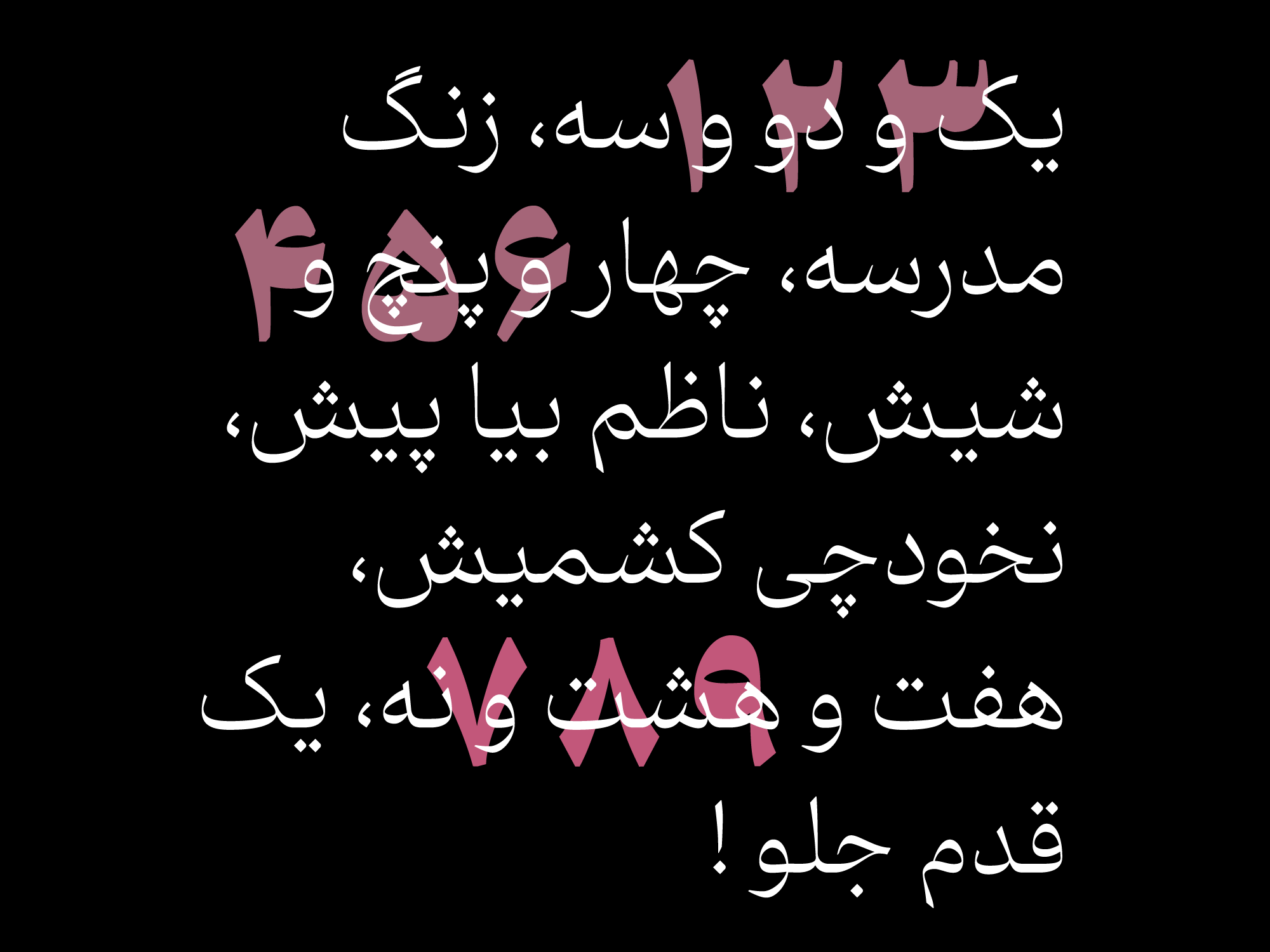
Dibaj typeface also supports Arabic, Kurdish, Luri, Mazandarani, Urdu, and Afghan glyphs.


In the Dibaj (Pro) font package :
Main Fonts: 9 weights in 3 styles available in TTF and OTF formats.
Web Fonts: WOFF and WOFF2 formats.
Variable Font: A variable font with 2 axes(weight and contrast).
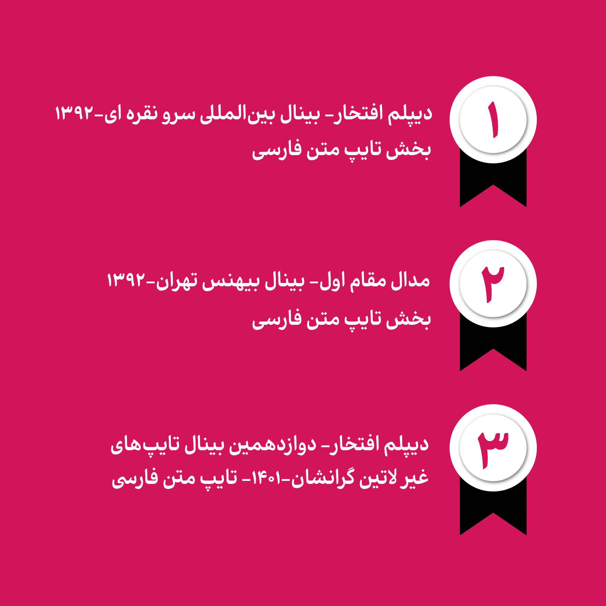
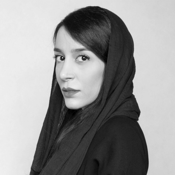
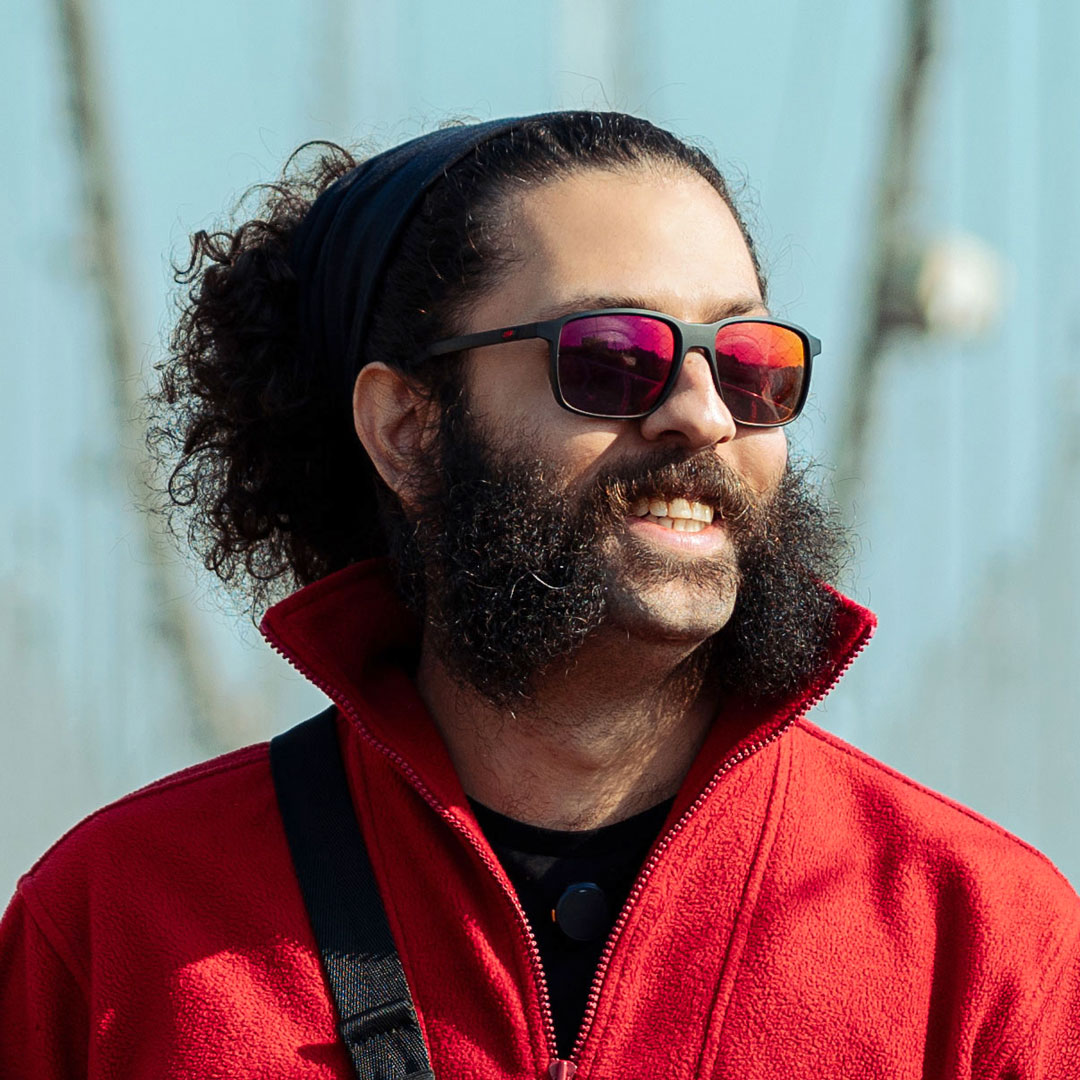
Master of visual communication, member of the Iranian Graphic Designers Association, teacher and researcher of Persian type design Received an honorary diploma of Sarve Noghreh in 1992 Received the first title of Persian type design, Behance Received the honorable title at the 12th Granshan International Biennale Speaker of ATYPI, Typewknd, Design principle & practices conferences, UX Shiraz, Side section of Sarve Noghreh, Author of scientific and research articles: -Comparative study of Tahoma font and structural principles of Persian font, Journal of Honar-haye-ziba-Visual Arts. - Investigating the factors affecting the readability and optimization of types in the field of printing and publishing based on the habit and taste of the audience, Honar-haye-ziba -Visual Arts Journal.
Typographer, Logotype & Typeface Design Instructor • Design Irancell, Tehran Book Garden, Leila, Ravi, Abar & Paykan • Design MyBaby, Alibaba, Ayandeh Bank, Fanoos (Hamkaran System), Inverse School, Bonyade Koodak & InshapeBody typefaces in collaboration with Mahdi Ershadi • Design MIKA, Vazeh quranic typefaces, Dabestan & Ray typefaces in collaboration with Omid Emamian • Design Doran typeface in collaboration with Fereshteh Iranshahi • Design Yekan Bakh typeface (Redesigning Yekan Typeface) in collaboration with Mahan Jafarzadeh • Design Novin Web typeface (Redesigning Novin Typeface designed by Hirbod Lotfian) • Design Nian typeface in collaboration with Afsaneh Salek Notable Achievements • 3rd Place and Honorable Diploma - GRANSHAN Type Design Competition. • Grand Prize - Silk Road Biennial for Typeface Design. • TDC Typographic Excellence (2018) - Vazeh UI Quranic Typeface. • TDC Typographic Excellence (2018) - Ray Typeface. • TDC Typographic Excellence (2019) - Vazeh Classic Quranic Typeface. • Jury President of Tehran Type Week 3rd & Jury Member of Tehran Type Week 2nd





















Comments
Recommended Posts
Nostalgic Arabic Fonts: Reviving the Beauty of the Past
Top Arabic Fonts for Ramadan and Eid Design
Arabic Fonts for Books & Magazines: From Print to Digital
Techno Typeface; A Look at the Design Process and Logic
What features does an ideal subtitle font have?
Selected Fonts of 2025 in the TDC Competition
13th GRANSHAN Type Design Competition
Golpayegani Typeface creation