


Kahroba
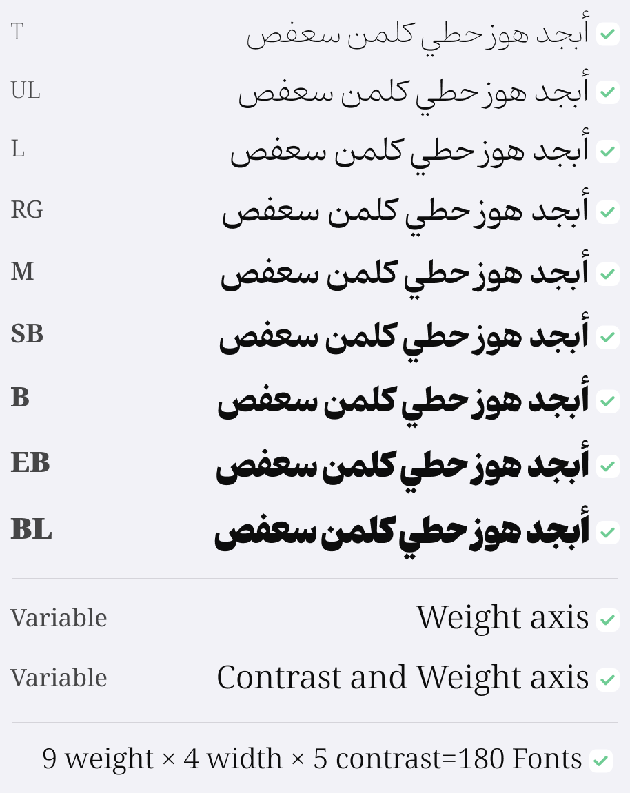
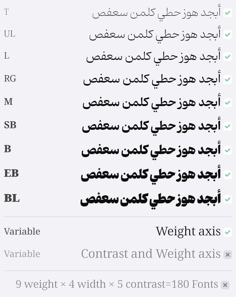
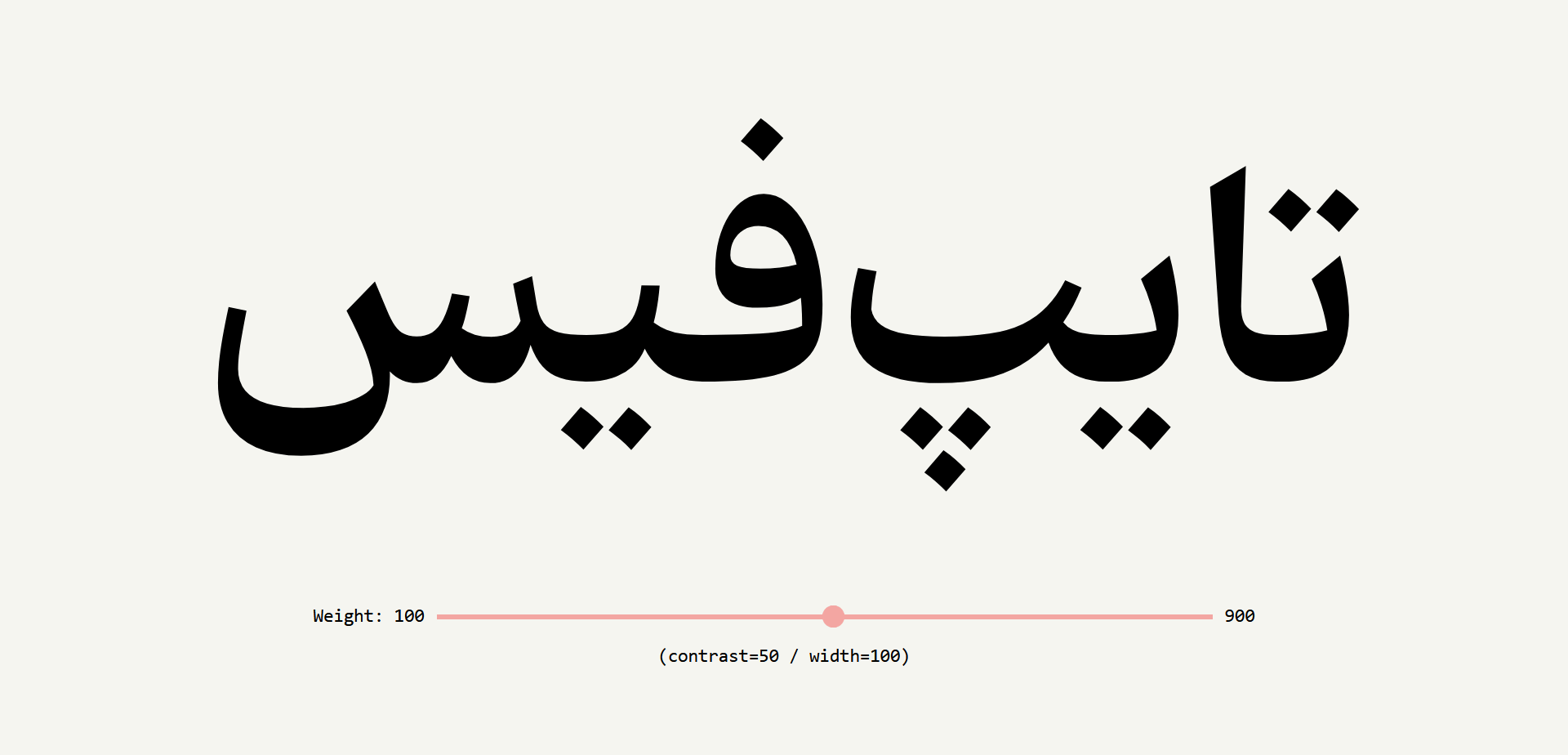
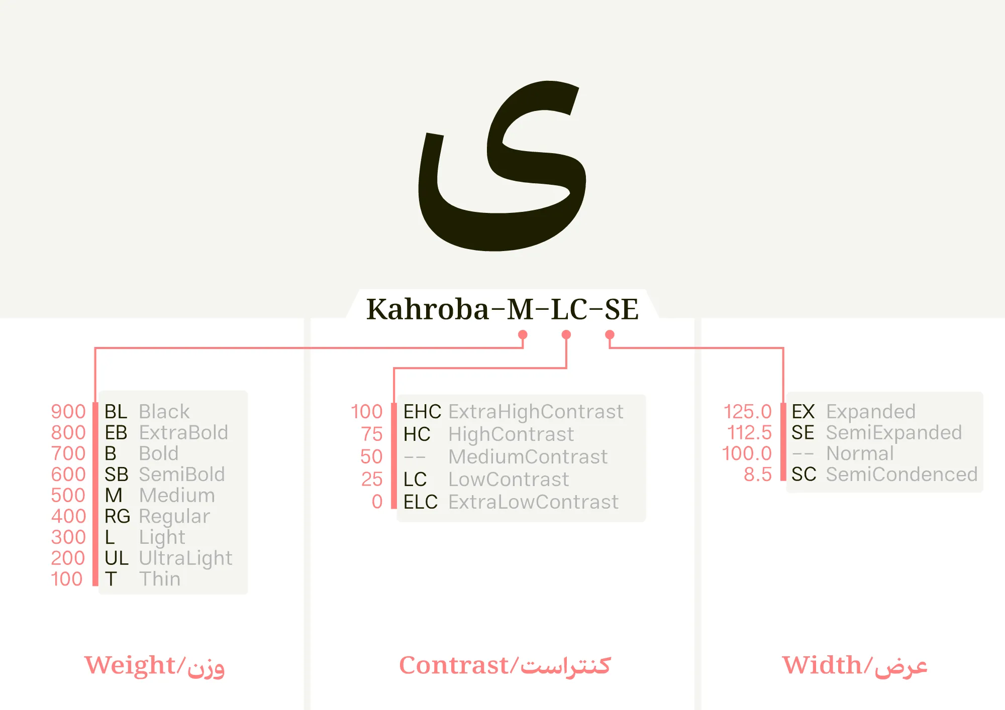
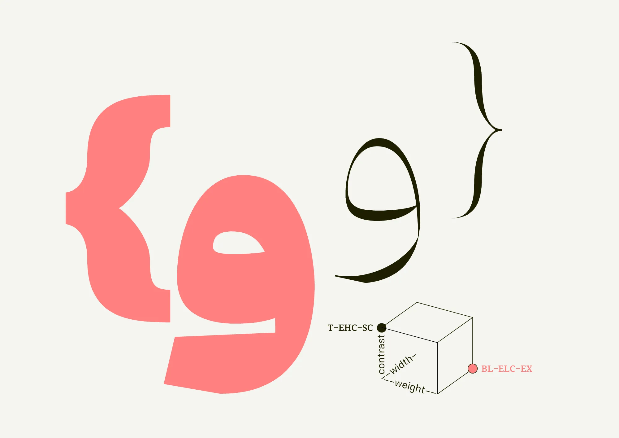
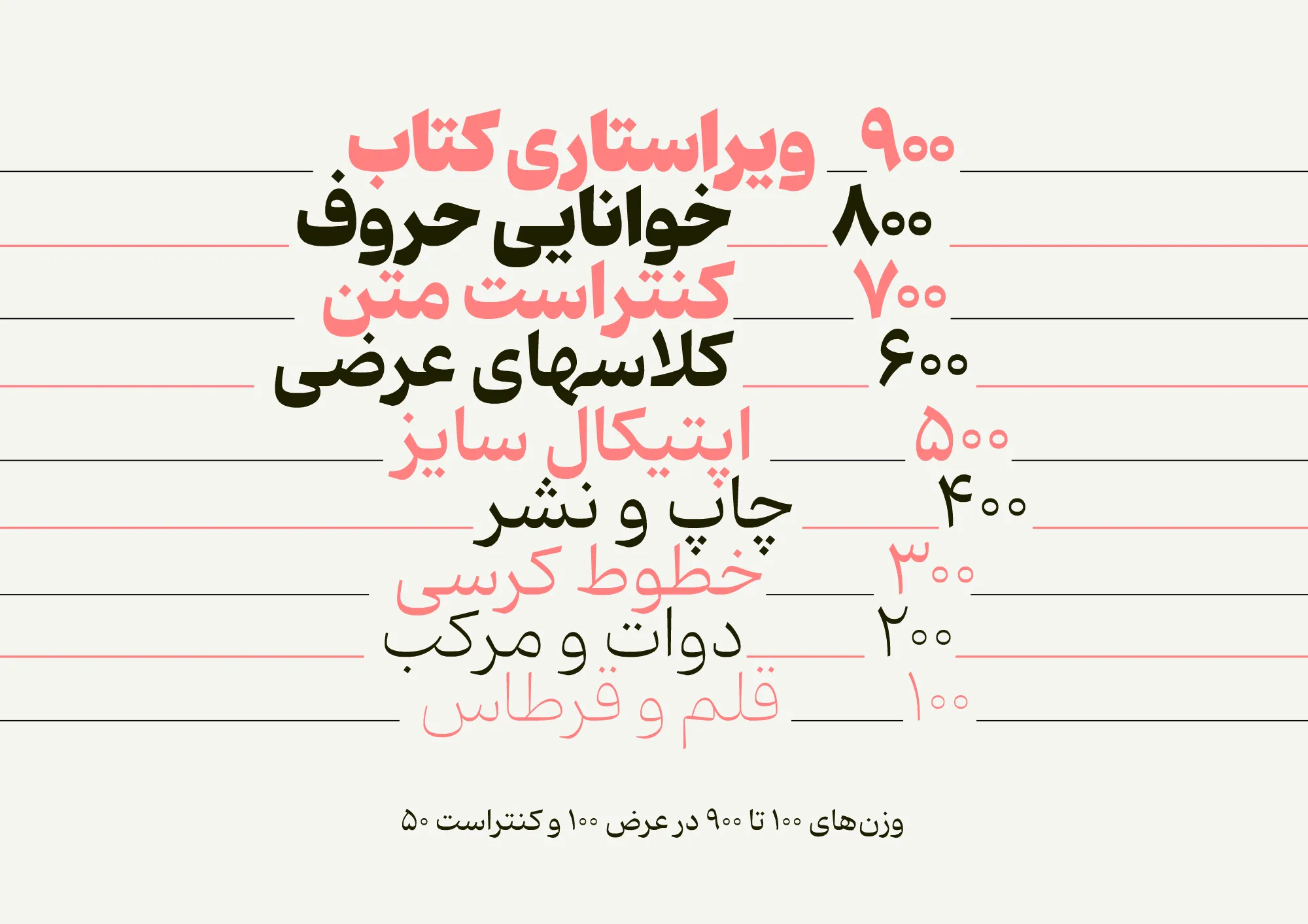
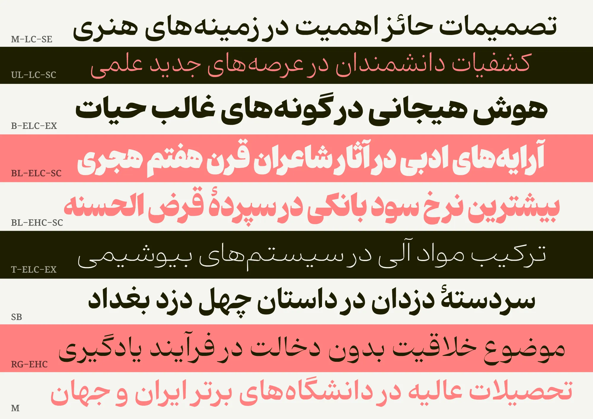
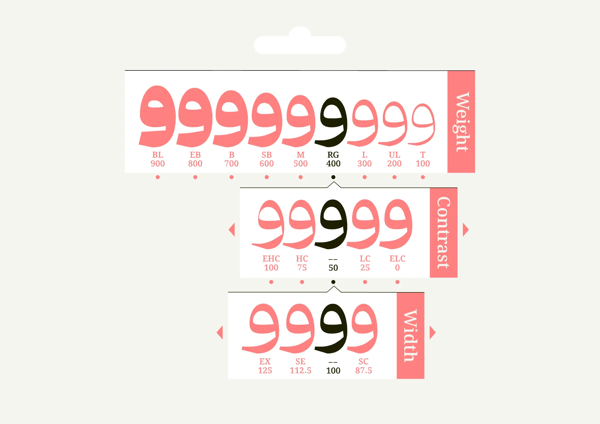
Kahroba typeface is a condensed pseudo-Naskh typeface available in 9 weights, 5 contrast levels, and 4 width classes, totaling 180 fonts for printed publications and web use. While efforts have been made to maintain a distinctive, robust, and structured letter personality, the final result carries a familiar tone.
For an additional user to use the font.To share the font with your designer or project partner. (details)
For one website or app and to share the font with 2 additional project partners. (details)
For small businesses to share the font with 5 additional employees and use it on one website.(details)
For unlimited use by companies in all their activities. A website builder, website templates and services that allow users to type with the font. (details)

Kahroba
Design:
Kahroba is a semi-Naskh typeface with a notable range of weights, widths, and contrasts. The proportion and design of Kahroba's letters are not entirely dictated by the pen; in some cases, the outer curves (usually created by the movement of the pen) are separated from their inner angles. This letter design approach, which resembles the style of the initial letter "ع" in Thuluth calligraphy, simplifies the curves. The design process was entirely computer-based, with numerous iterative revisions to achieve the final result.

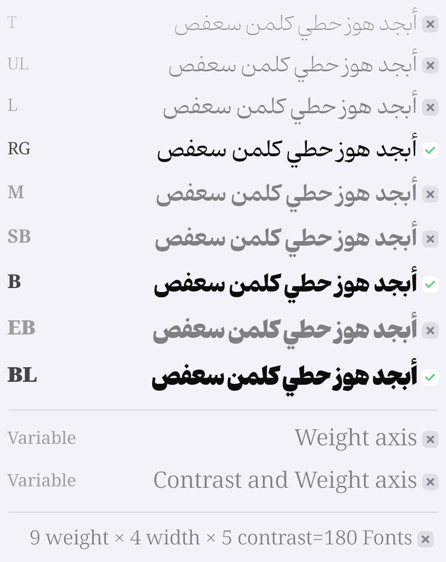
Contrast:
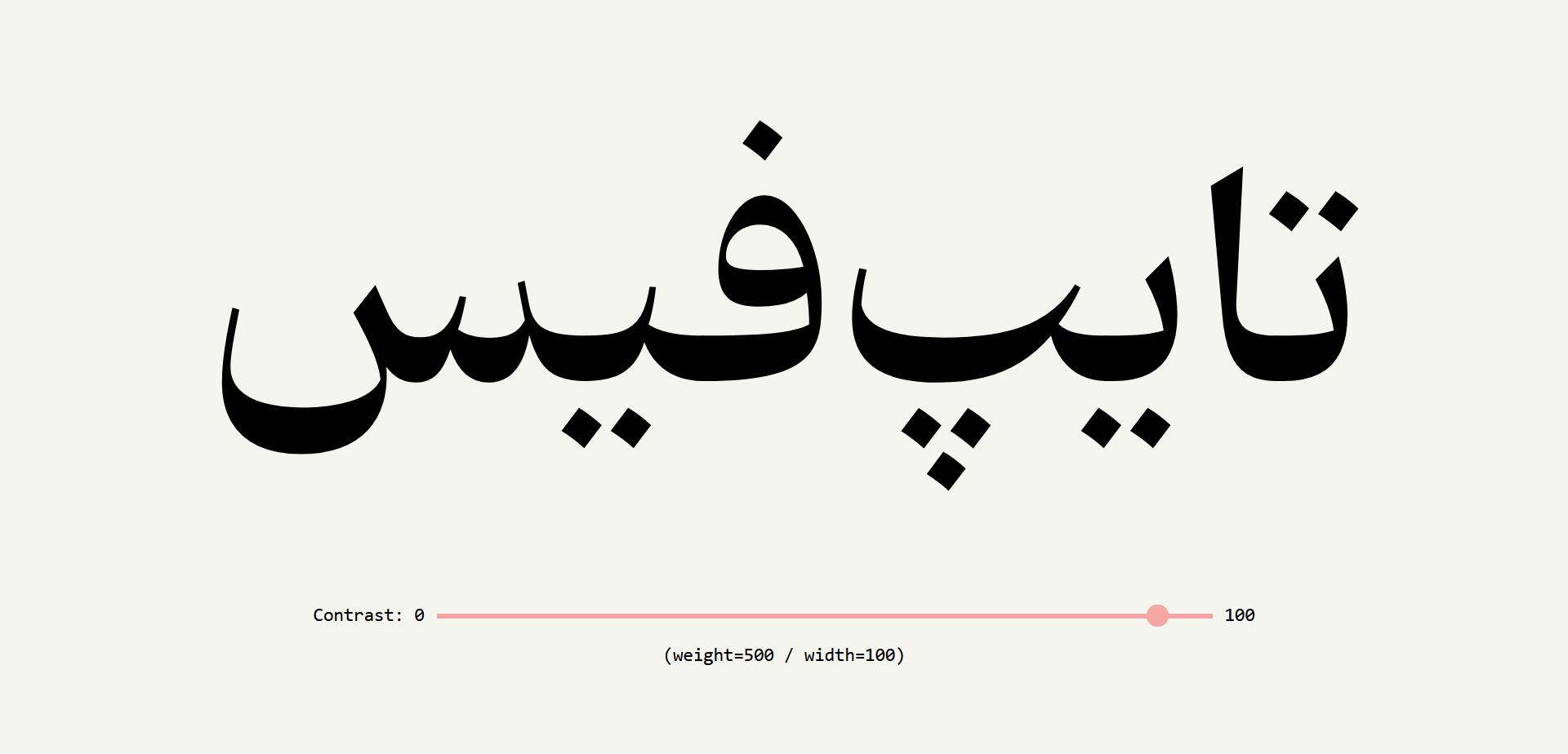
The contrast levels designed for the Kahroba typeface do not affect the width of different characters. These levels, in different styles within the range of Arabic characters (and their corresponding axis in the variable version), can be considered as a sort of grade. This capability can be utilized to adjust readability on digital display pages and print quality on various printing materials in the printing industry, and even to adjust optical size (the proportion of letter shapes for different text sizes). This feature has imposed a cost on the design and had consequences for the typeface because the Arabic script includes connected letters, and achieving a consistent width across all contrast levels in one weight required slightly different and challenging adjustments in the overall letter design, imposing some unavoidable distortions in the harmony between elements, which efforts have been made to control.
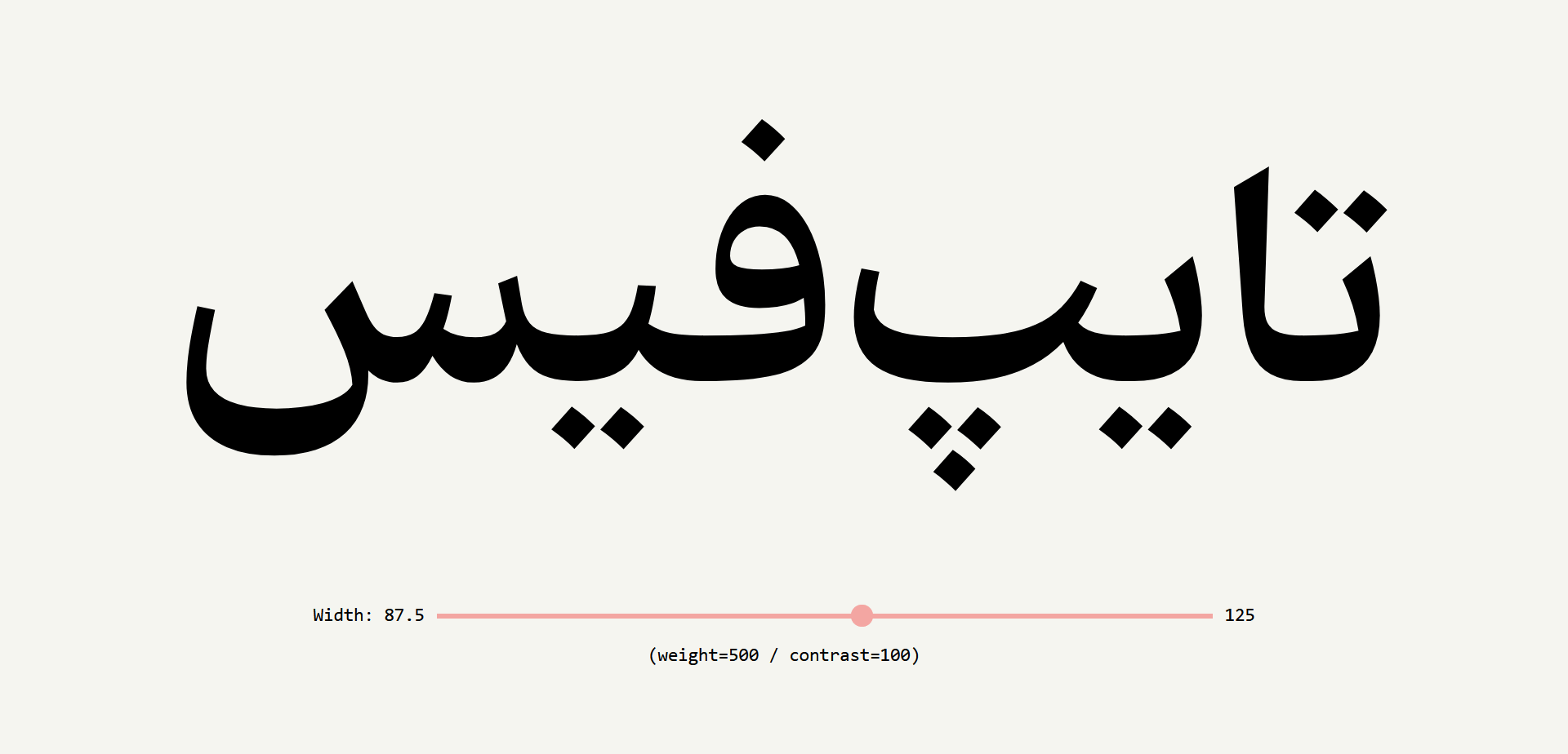
Width Classes:
Contrary to common beliefs, it seems that we need width classes in Arabic typefaces because although the task of adjusting the width of the text in Arabic script is delegated to the strokes, the strokes only affect connected letters and (even according to expectations) influence based on the rules defined in calligraphy. Therefore, they alone cannot improve experiences related to controlling text width. This is where controlling the width of letters through adjustments and controls in letter design can provide a more comprehensive solution to this need. (However, there may be rare typefaces that integrate width and strokes.)
Kahroba includes four width classes: semi-condensed (87.5%), regular (100%), semi-expanded (112.5%), and expanded (125%) (in the variable typeface version, continuous access to all these ranges is possible). The main considerations that separate width classes from normal and software-based width scaling are weight adjustments in the longitudinal scale and specific adjustments in letter design.
Why Weight, Contrast, and Width?
It seems that almost any requirement related to the performance of a typeface in different conditions can be addressed by adjusting these parameters.
Regarding contrast adjustment, suppose the materials used in the paper, our primary choice for printing, cause ink spreading and illegibility of the text. In this case, one solution is to increase the typeface contrast. A similar event can occur on a display screen. Also, contrast in this typeface can be considered as a grade and even optical size. That is, in fine text to improve readability for lighter weights, contrast is reduced, and for heavier weights, it is increased. Contrast can also be used to adjust readability at a specific size or desired color and background.
As for width adjustment, the circle of applications is broader and the examples are simpler and more tangible. By using these width classes, especially with better support for variable typefaces, along with typeface size adjustment, more precise scaling control can be achieved, from short texts (such as headlines) to long texts (such as the number of pages in a book).
Do we need all 180typefaces? What's the main goal?
The main reason why all 180typefaces have been extracted in this typeface and not made available as a variable typeface is not primarily to showcase technical achievements (although there have been some innovations at this level); the main reason for this action is the weak support of various software, especially Adobe and Microsoft suites, for variable typefaces.
One of the main goals of this typeface is to create a relatively wide field for accessing suitable choices compatible with various applications. The boundaries of this field, up to the point where manual letter design becomes a limiting factor for progress, have been designed and adjusted manually at 12 points. This approach itself has led to the adjustment of visual characteristics of letters and symbols at accessible points in this field.
Here are a few points about this typeface:
1- Contrast in this typeface is not solely based on pen movements for all characters; this deliberate decision is made to control the darkness of the text effectively.
2- For the Latin part of the typeface, the open-source typeface Voto Serif has been used, which is not perfectly suitable for small texts. However, adjustments have been made to it to improve the outcome. Voto Serif is the only open-source typeface available that covers all three axes of weight, width, and contrast.
In the Kahroba (Pro) font package :

type designer and founder of the Fontamin website.


Comments
Recommended Posts
Nostalgic Arabic Fonts: Reviving the Beauty of the Past
Top Arabic Fonts for Ramadan and Eid Design
Arabic Fonts for Books & Magazines: From Print to Digital
Techno Typeface; A Look at the Design Process and Logic
What features does an ideal subtitle font have?
Selected Fonts of 2025 in the TDC Competition
13th GRANSHAN Type Design Competition
Golpayegani Typeface creation