







Bonyan


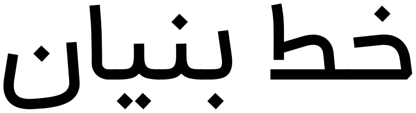
Bonyan font has been developed for an effective presence in UI design and modern technological environments. Utilizing a monoline structure, it conveys a sense of geometric order and modern precision, enhancing legibility through controlled simplicity.
In designing Bonyan, careful effort was made to preserve the calligraphic essence and authenticity of the Persian script, despite its minimalist approach and uniform stroke weight. Furthermore, to meet the diverse demands of digital mediums, broad language and character support was integrated into its development, making it a versatile and efficient tool for designers.
 Font Licensing
For an additional user to use the font.To share the font with your designer or project partner. (details)
For one website or app and to share the font with 2 additional project partners. (details)
For small businesses to share the font with 5 additional employees and use it on one website.(details)
For unlimited use by companies in all their activities. A website builder, website templates and services that allow users to type with the font. (details)
Bonyan
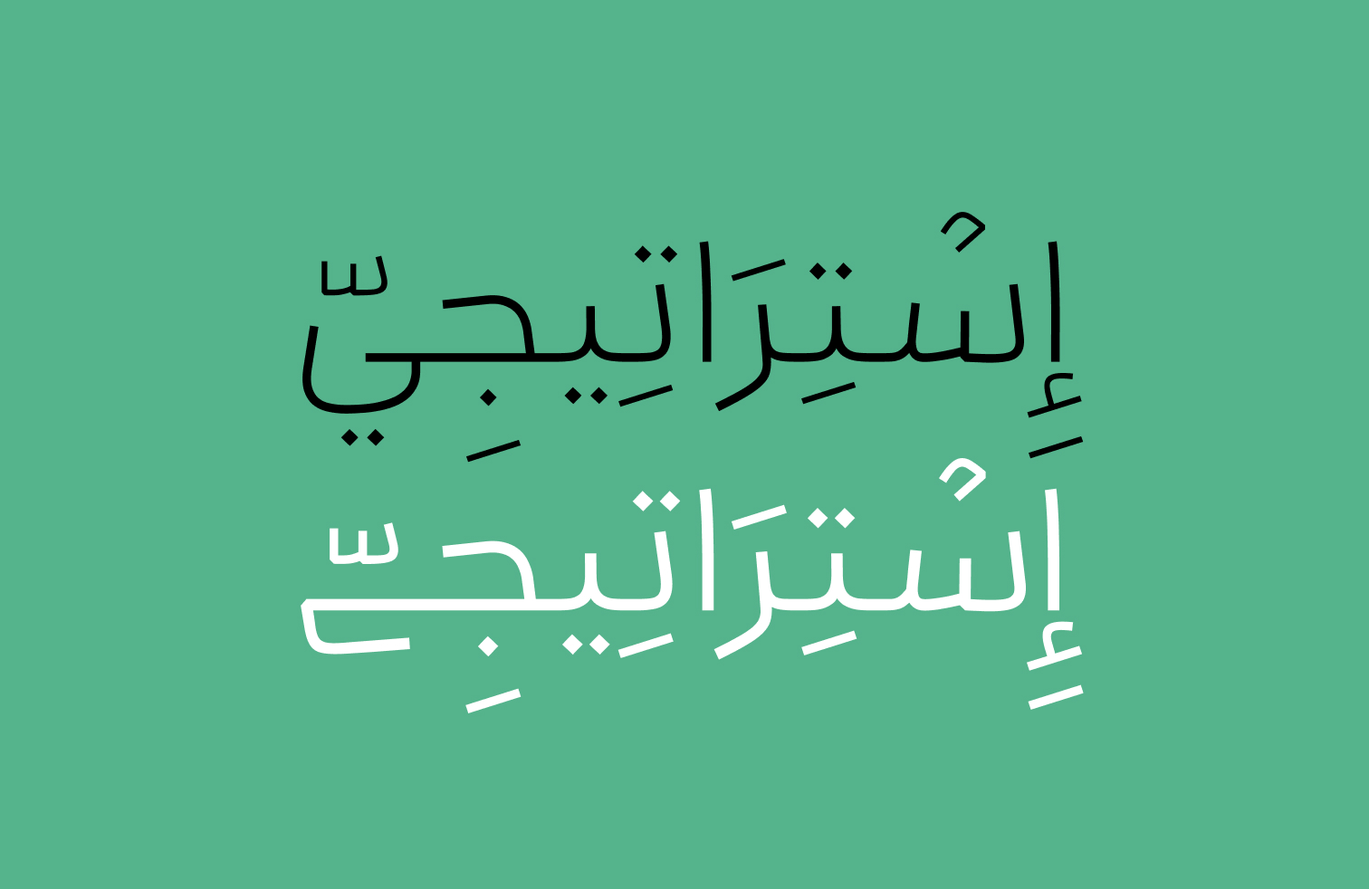
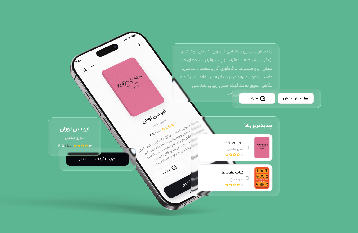
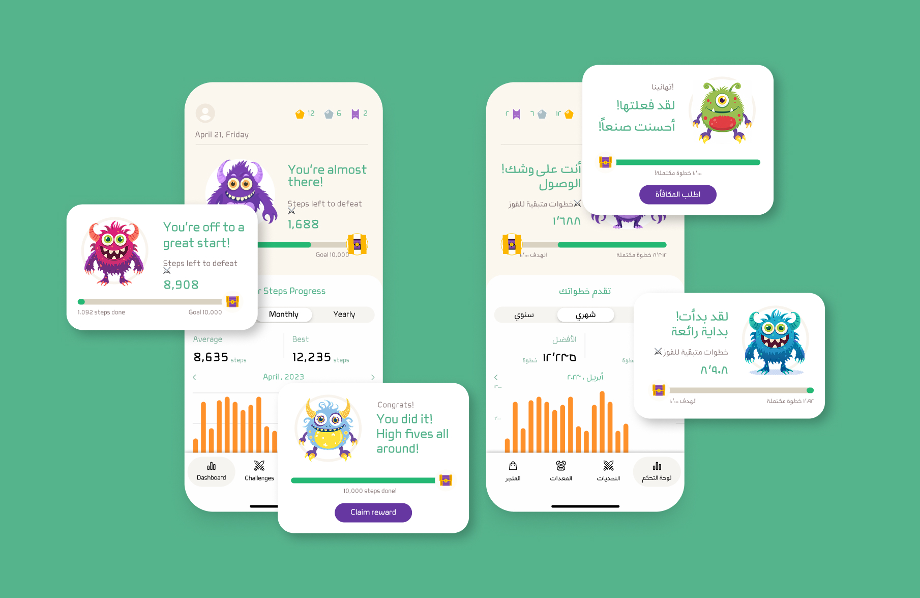
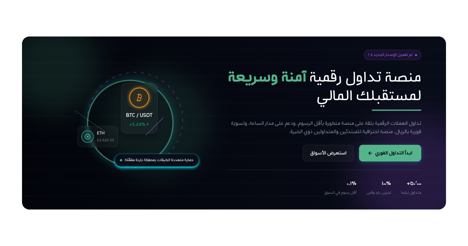

Bonyan font was developed to play an effective role in UI design workflows. Built around a monoline structure, the typeface conveys geometric order and modern precision while pursuing improved readability through controlled simplicity. Despite its minimal approach and consistent stroke weight, Bonyan seeks to preserve the authenticity and calligraphic character of Persian script.
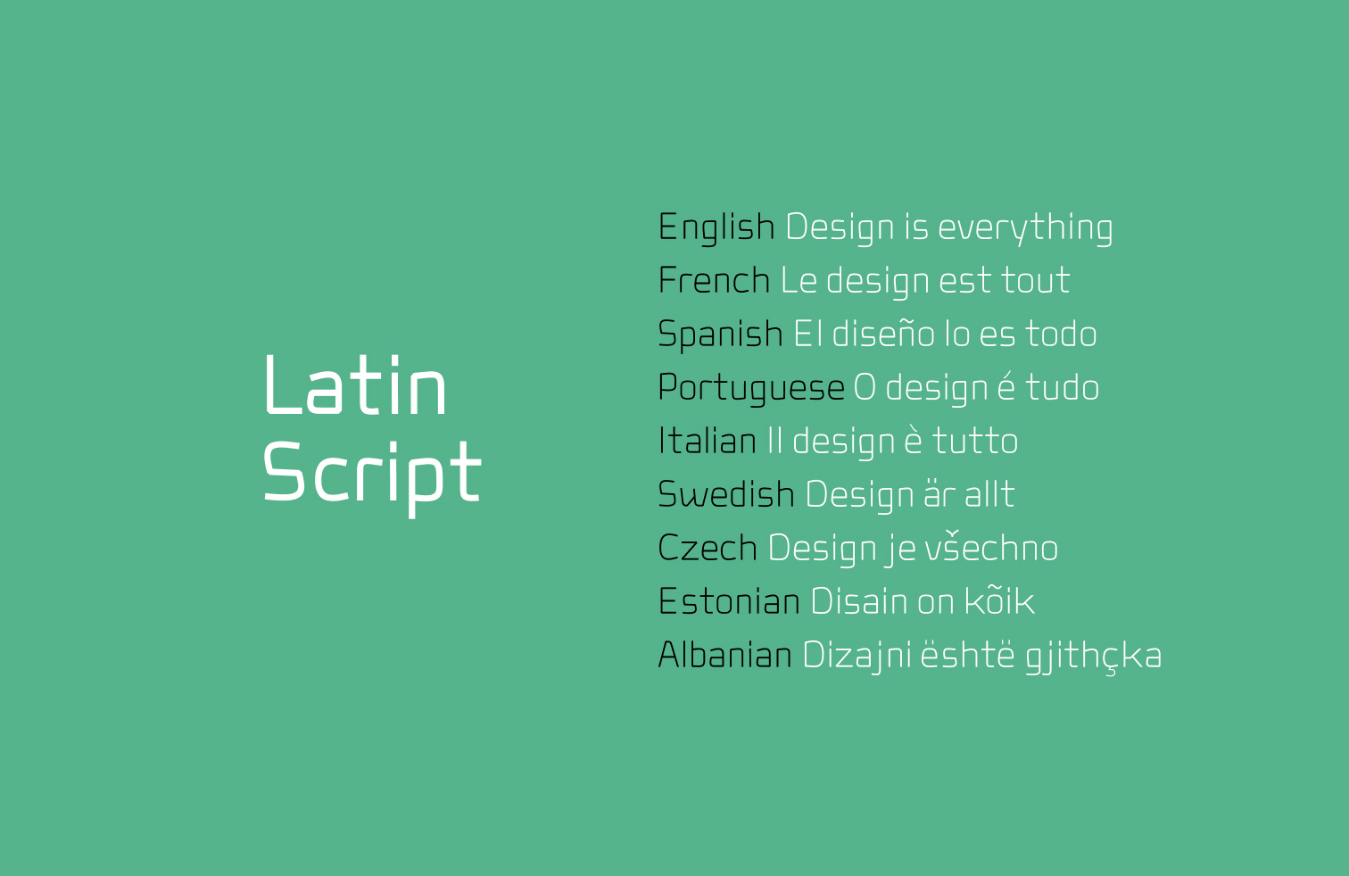
The Latin characters have also been custom-designed to align with the typeface’s underlying formal logic. This creates a cohesive visual identity across mixed-language and multilingual texts, helping preserve the visual identity of your product or brand. This harmony is particularly evident in characters such as x, y, w, and k, as well as other Latin letters, whose structures and proportions are directly informed by the Persian and Arabic letterforms.

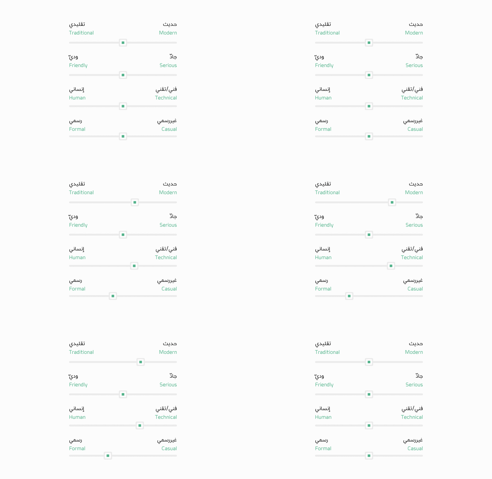
When using Bonyan in your projects, the resulting typographic texture brings together a sense of modernity, technical precision, and formality. At the same time, the letterforms and overall structure of the typeface convey a friendly and approachable tone. These qualities make Bonyan suitable for a wide range of digital products and experiences.
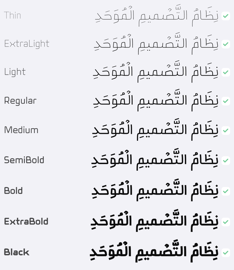
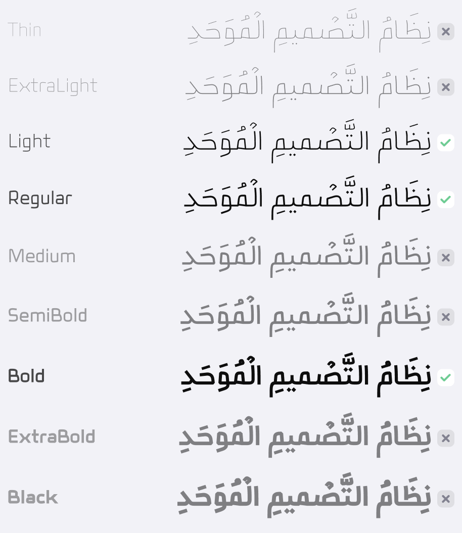
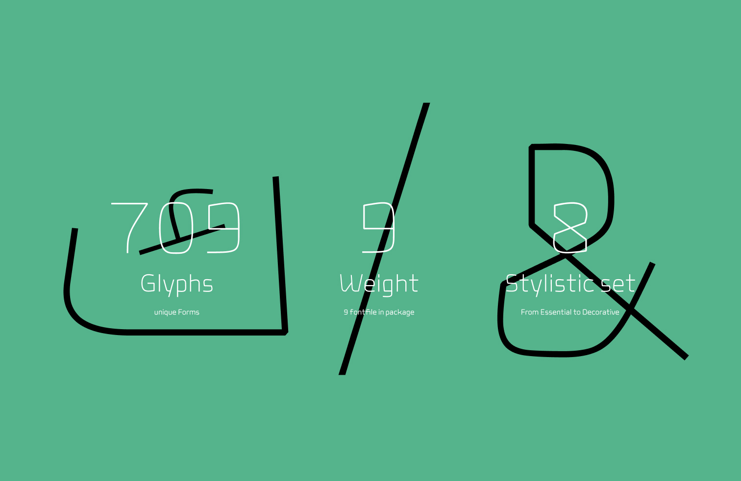
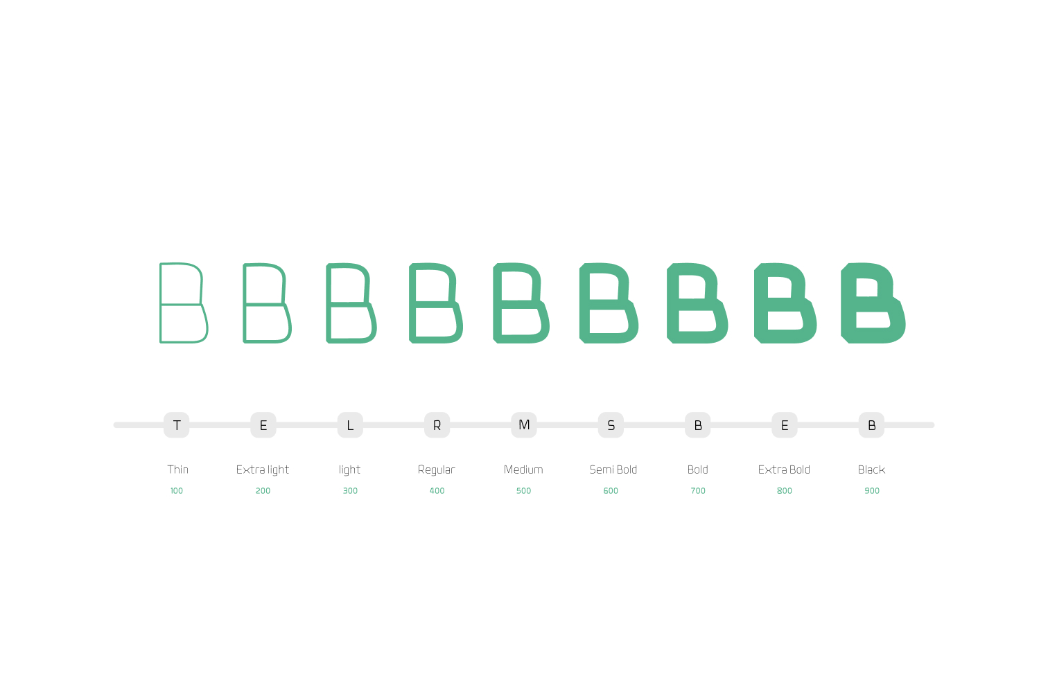
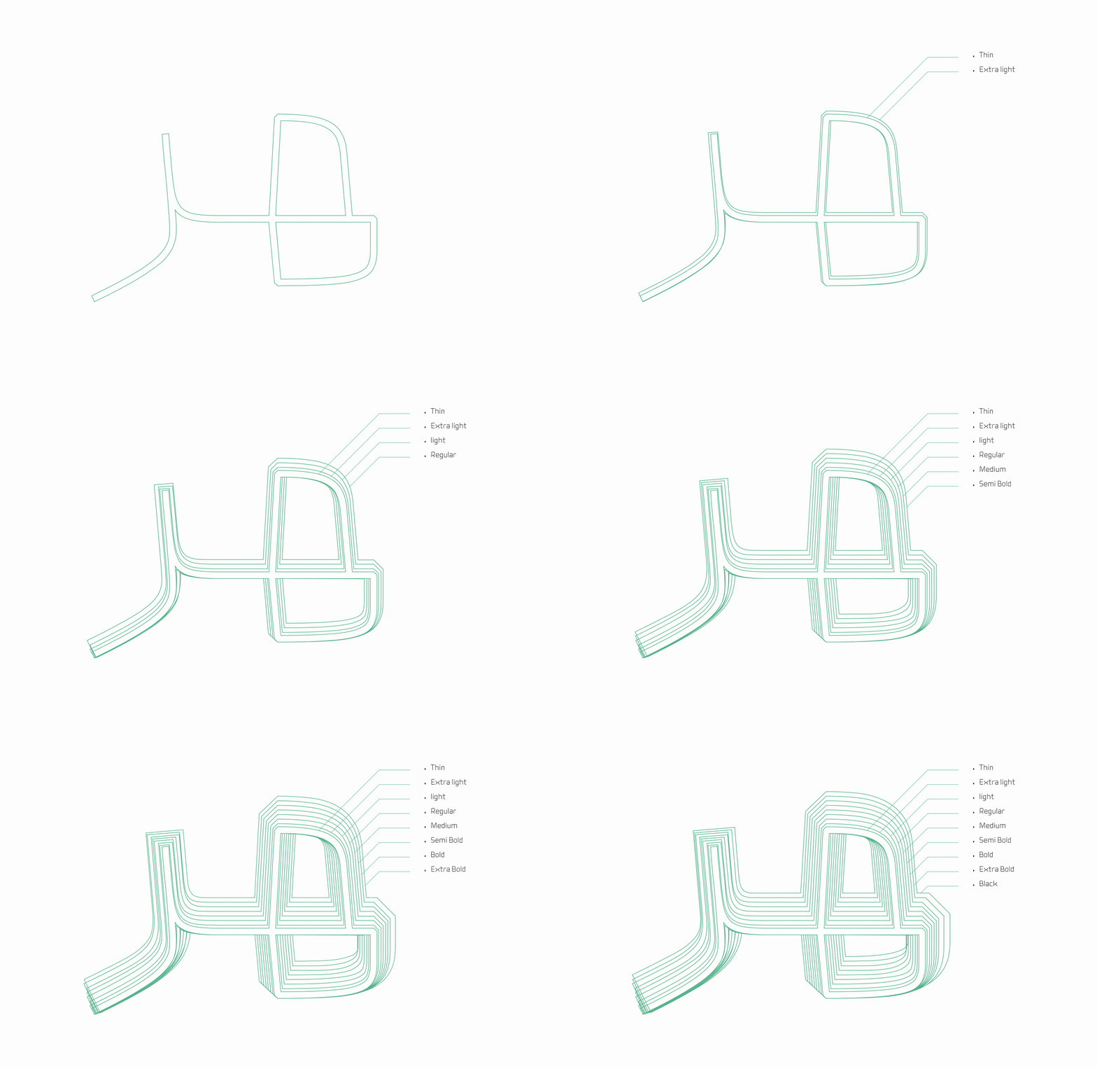
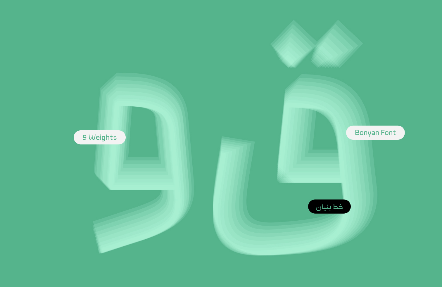
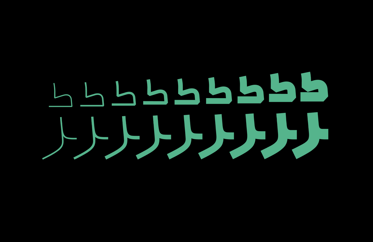
The Bonyan type family is designed in nine weights, ranging from Thin to Black: Thin, ExtraLight, Light, Regular, Medium, SemiBold, Bold, ExtraBold, and Black. This range allows designers and developers to select and combine different weights, providing greater flexibility in UI design and other digital applications.
Bonyan’s weights have been designed to be more refined than those of many commonly used typefaces. This characteristic is particularly beneficial in screen environments, helping maintain readability and create a lighter typographic texture. It also allows a wider range of weights to be used without making the text feel excessively heavy.
Automatic Character Substitution
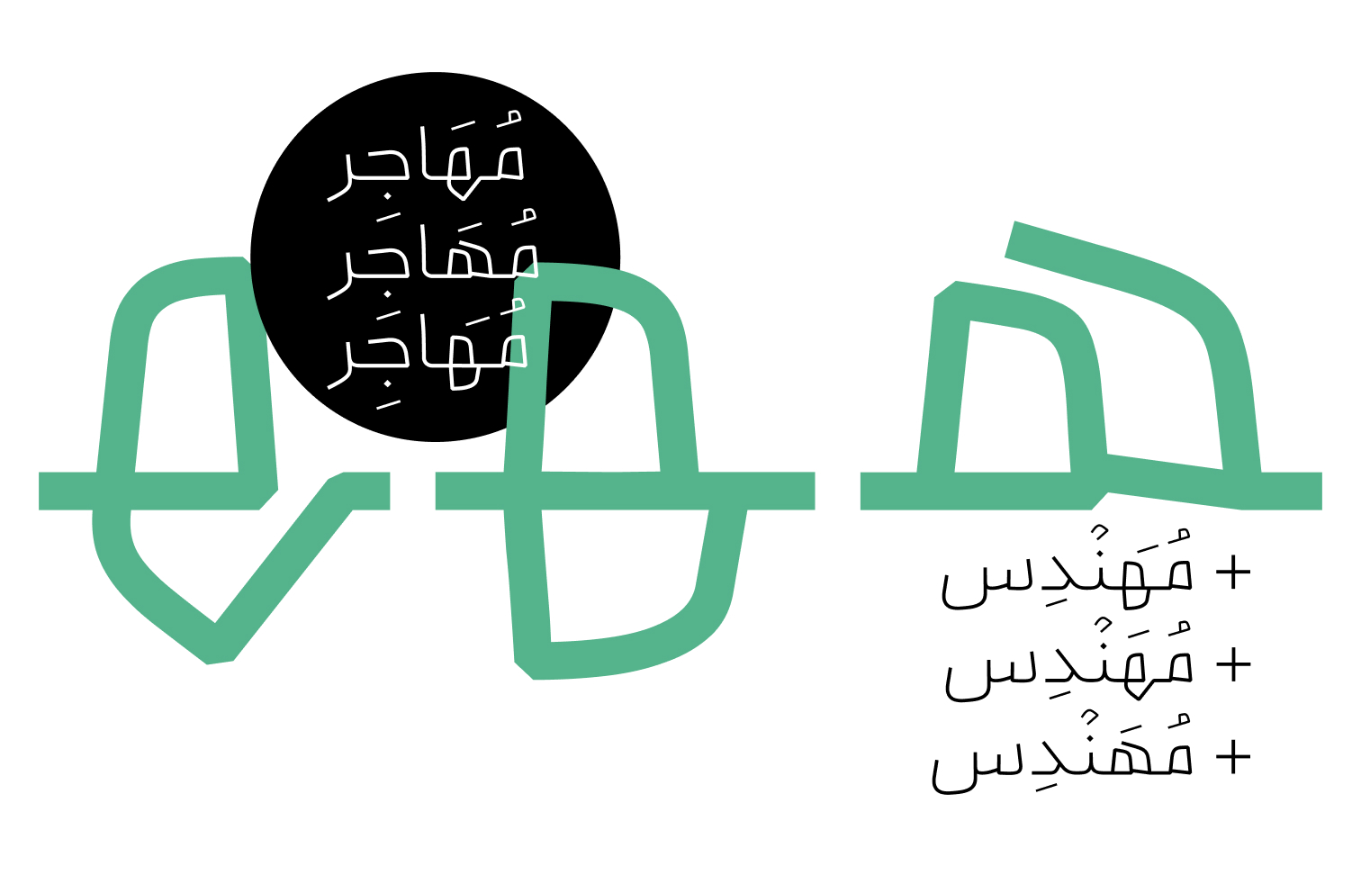
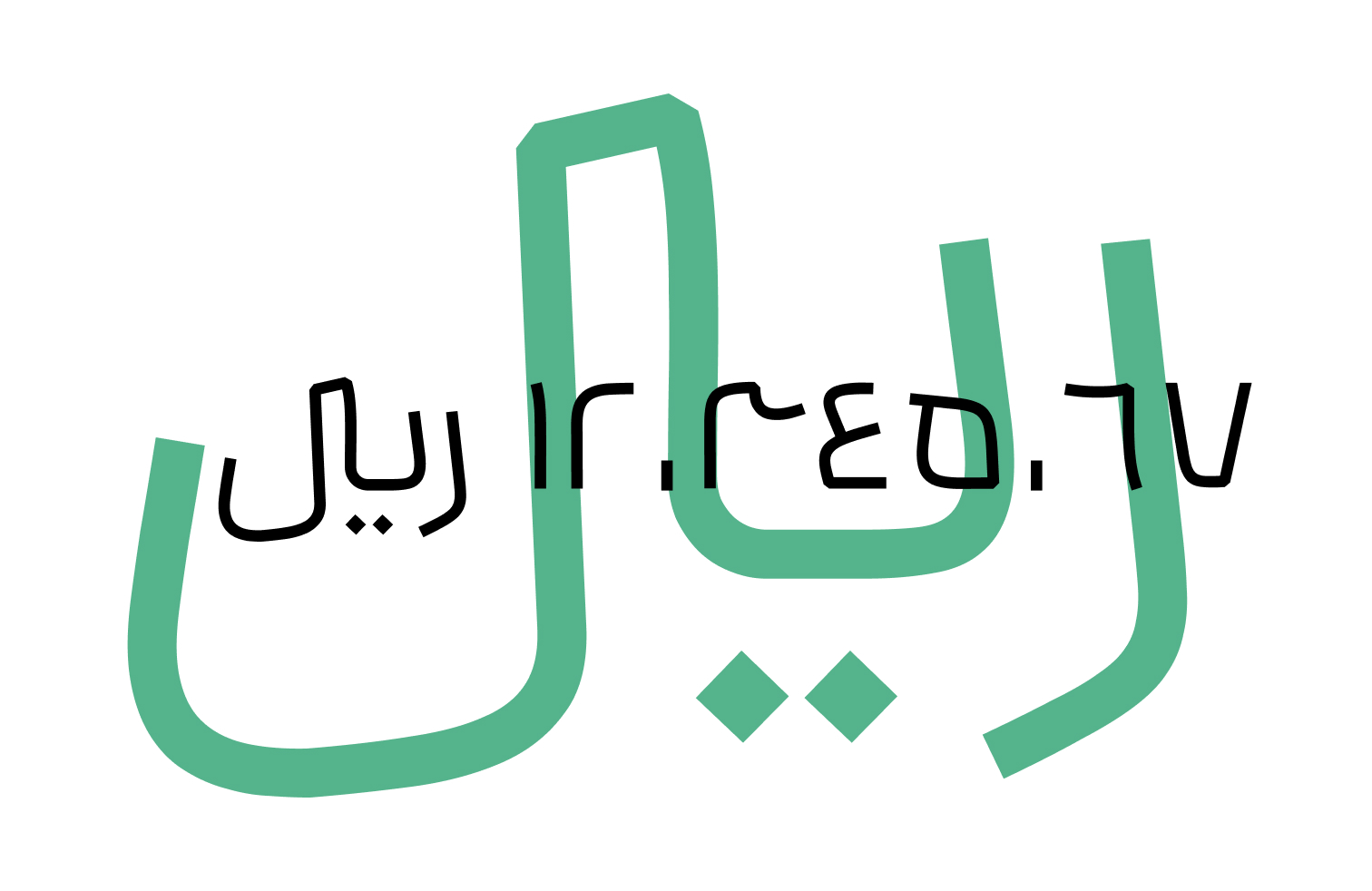
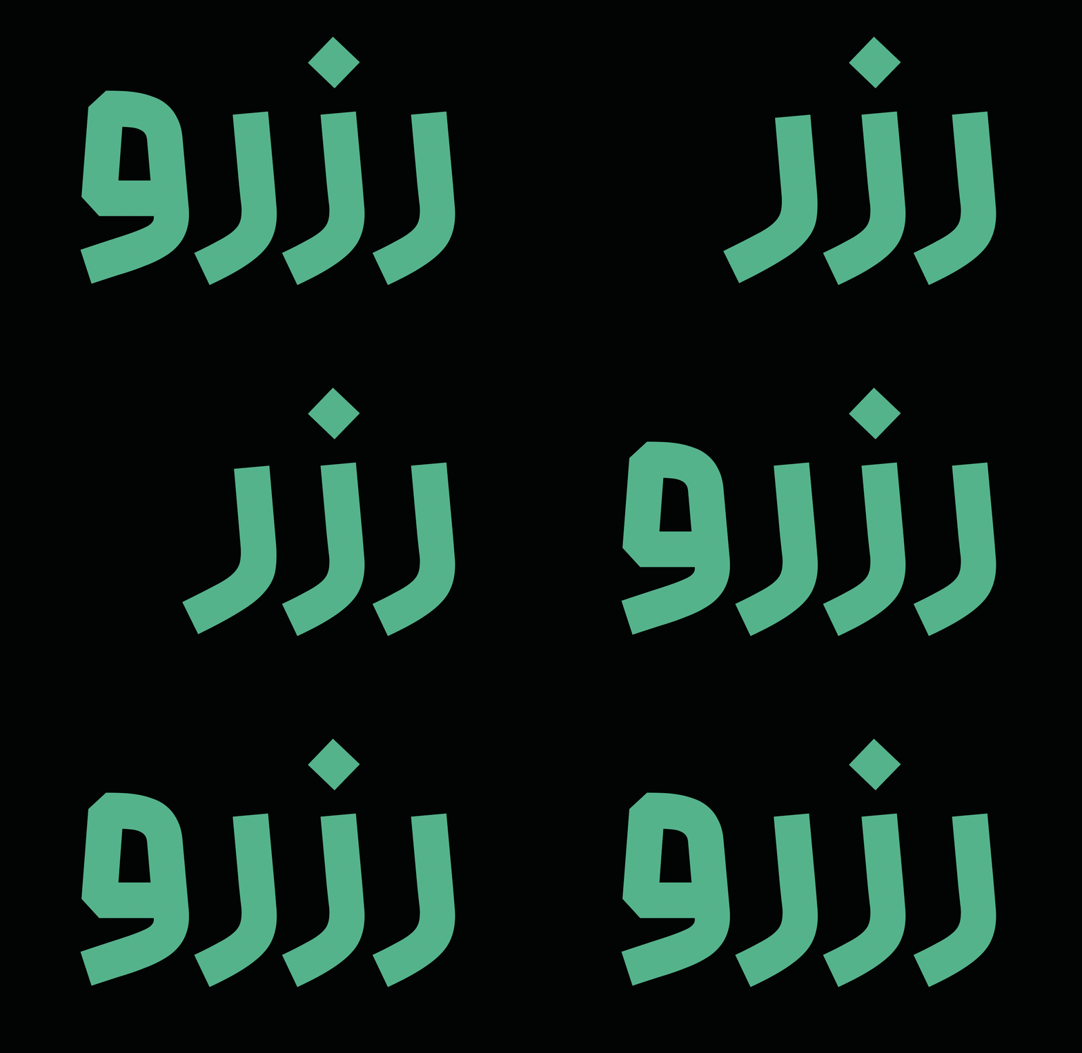
To prevent character collisions and improve readability, dedicated OpenType features have been developed for combinations that may cause overlapping or reduced legibility. These features address combinations such as «ری», «رر», and «رع», as well as the positioning and spacing of dots, helping create a more consistent and legible typographic texture across different letter combinations.
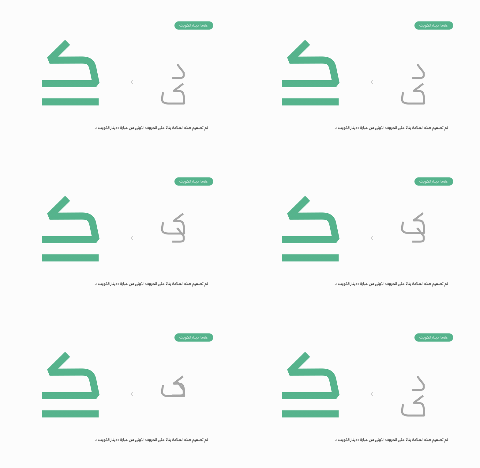
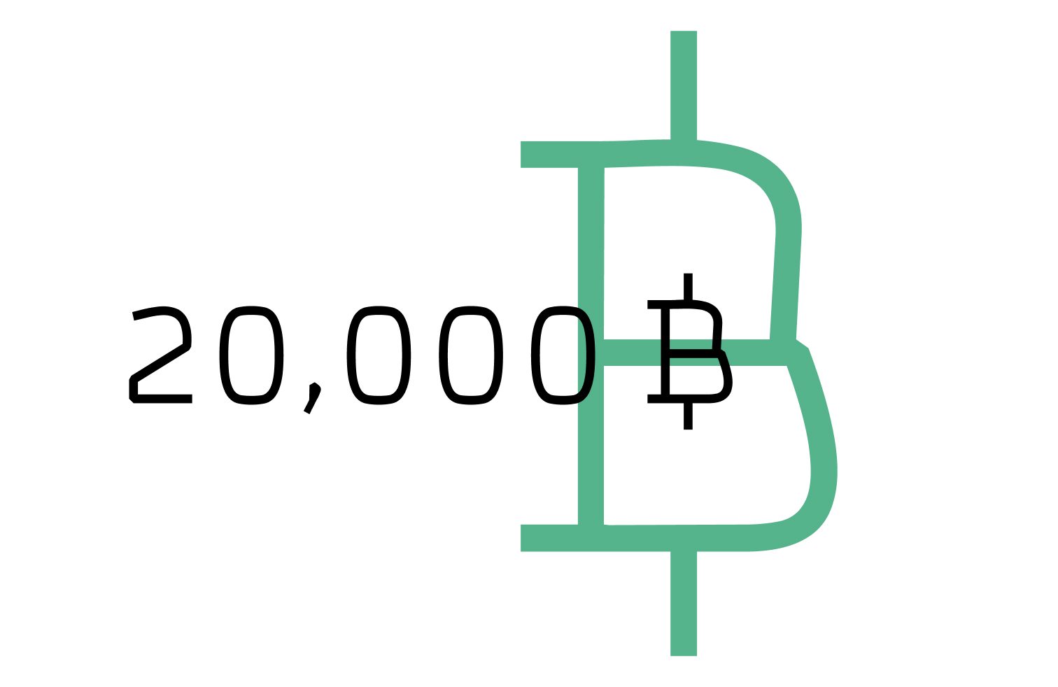
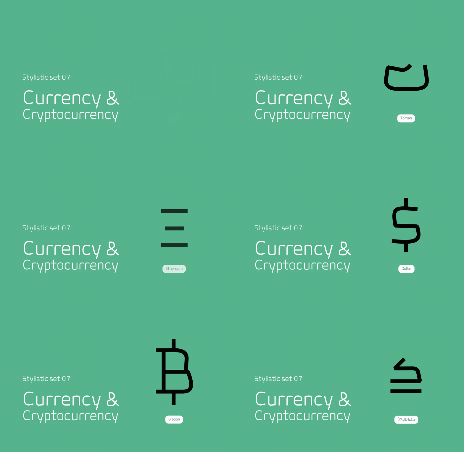
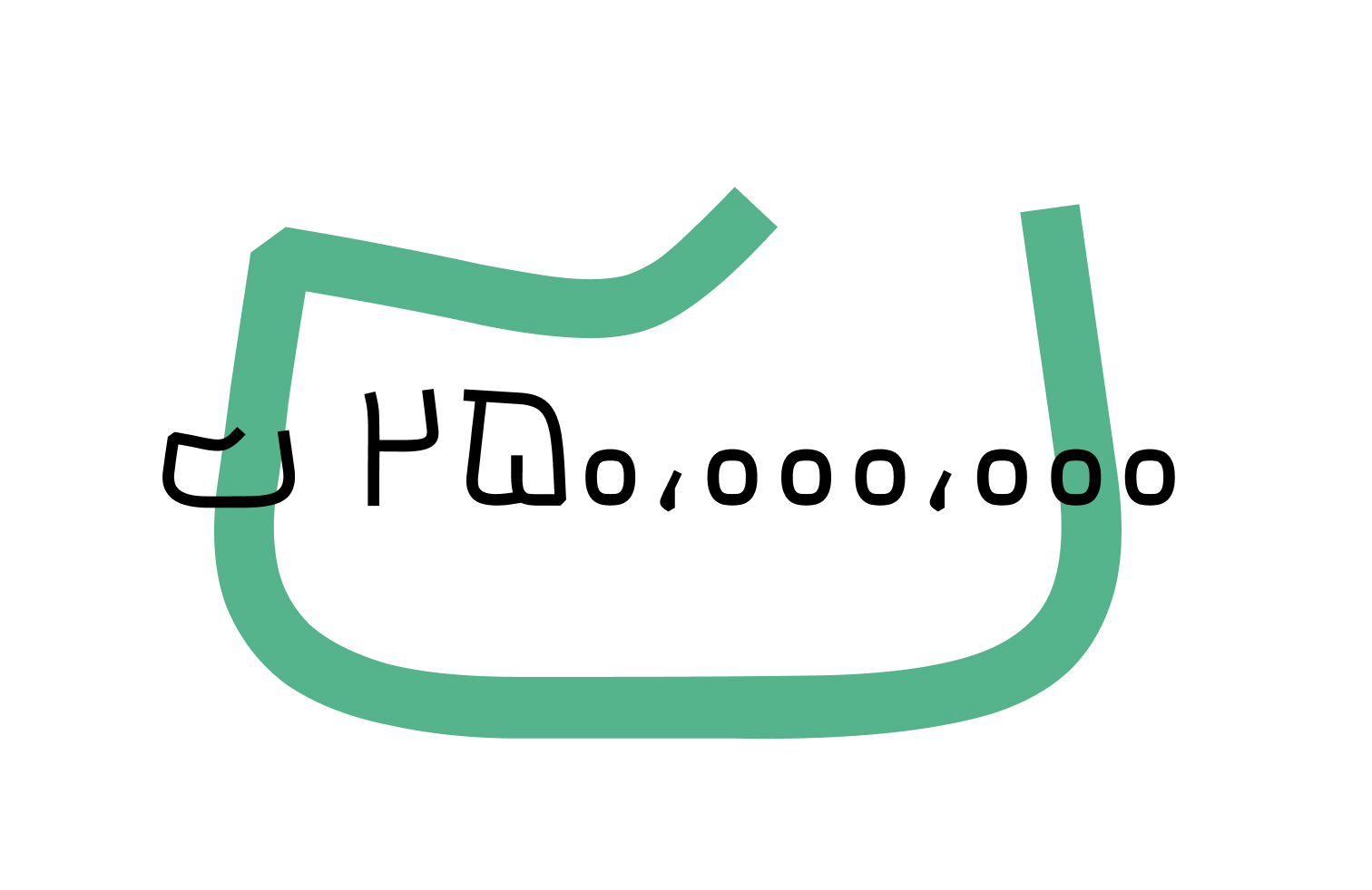
Given the typeface’s anticipated use across diverse languages and digital products, an extensive collection of currency and cryptocurrency symbols has been designed. This collection includes symbols for the US dollar, toman, rial, euro, pound sterling, cent, dinar, yen, Kuwaiti dinar, Ethereum, and Bitcoin.
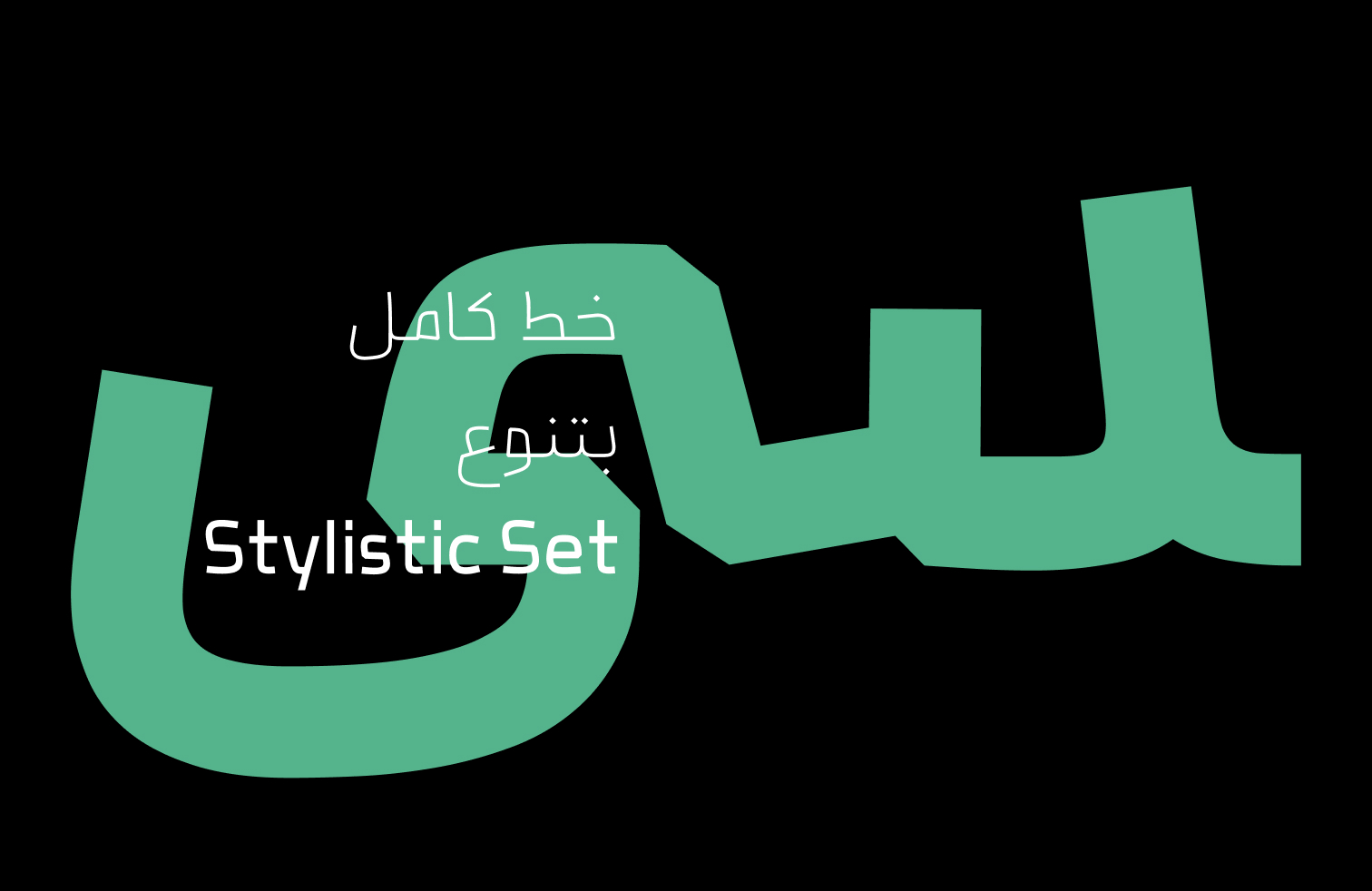
These symbols are accessible through Stylistic Set 07. Once enabled, typing designated characters substitutes their standard forms with the corresponding currency or cryptocurrency symbols. This feature simplifies access to these symbols without requiring dedicated character codes or manual substitution.
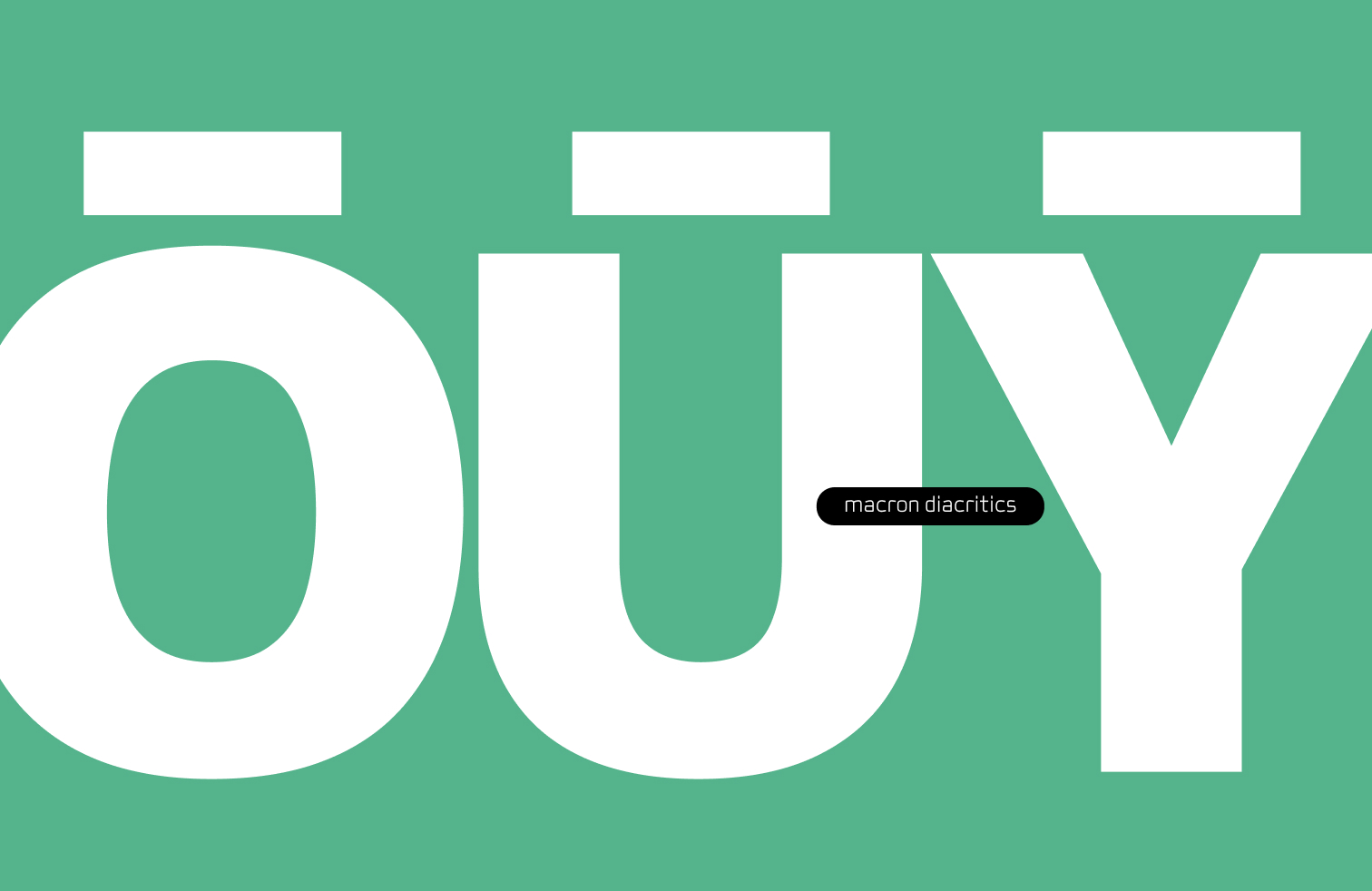
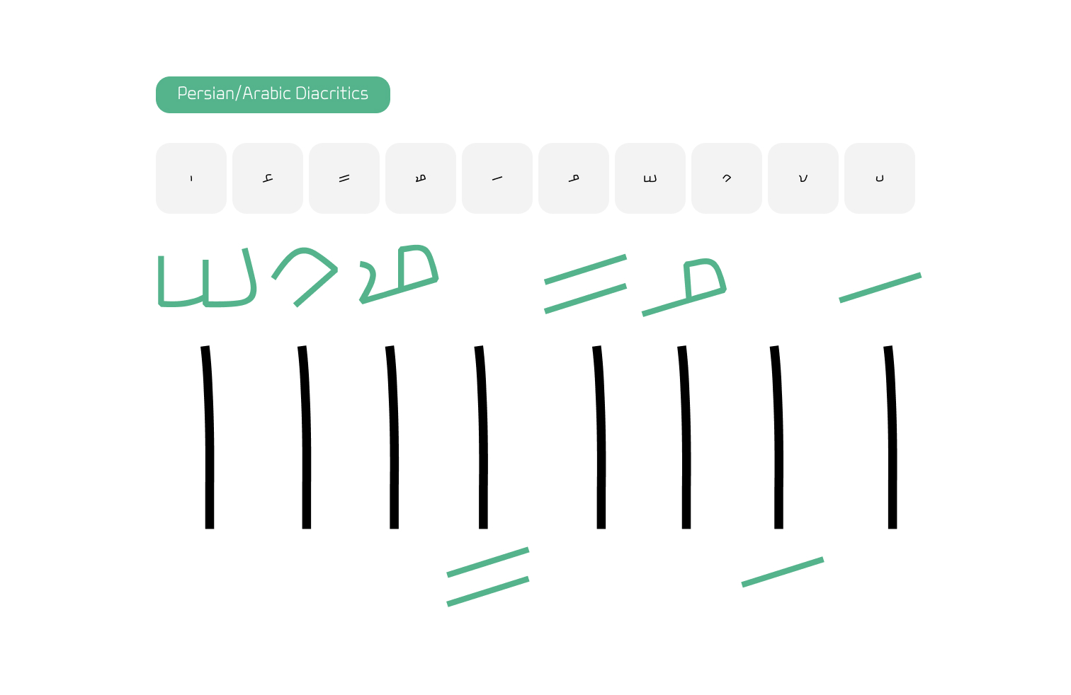
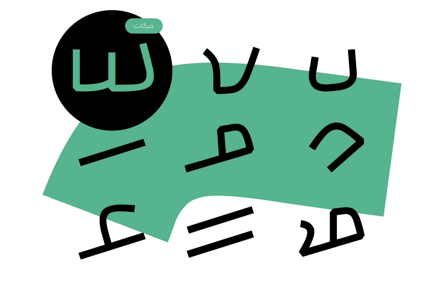
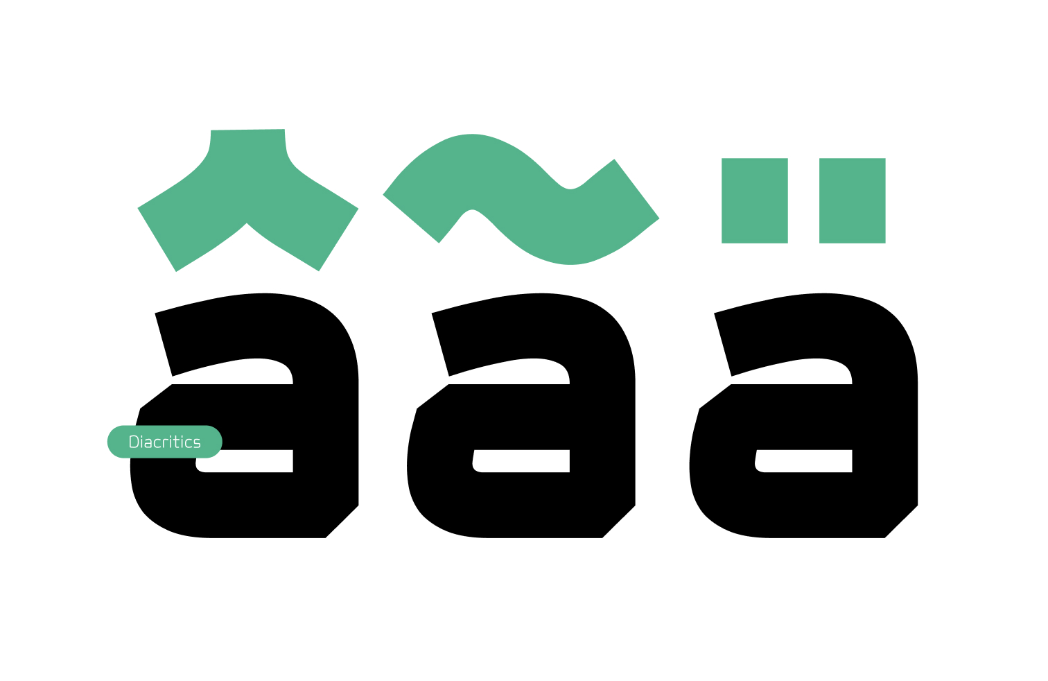
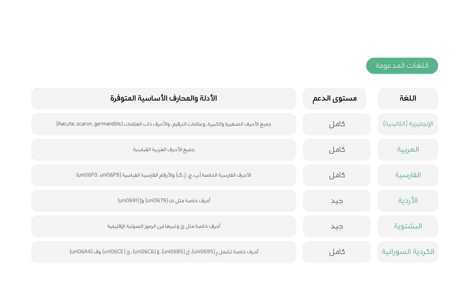
To support the use of Bonyan across different languages and writing systems, an extensive set of diacritical marks has also been designed to meet the requirements of each language. The collection includes marks used in Persian, Arabic, Urdu, French, and other supported languages. These marks are harmonized with the typeface’s letterforms and formal logic to ensure accurate, consistent, and legible text rendering across different combinations.
Considering the typeface’s intended use in web and digital environments, tabular figures have also been incorporated.
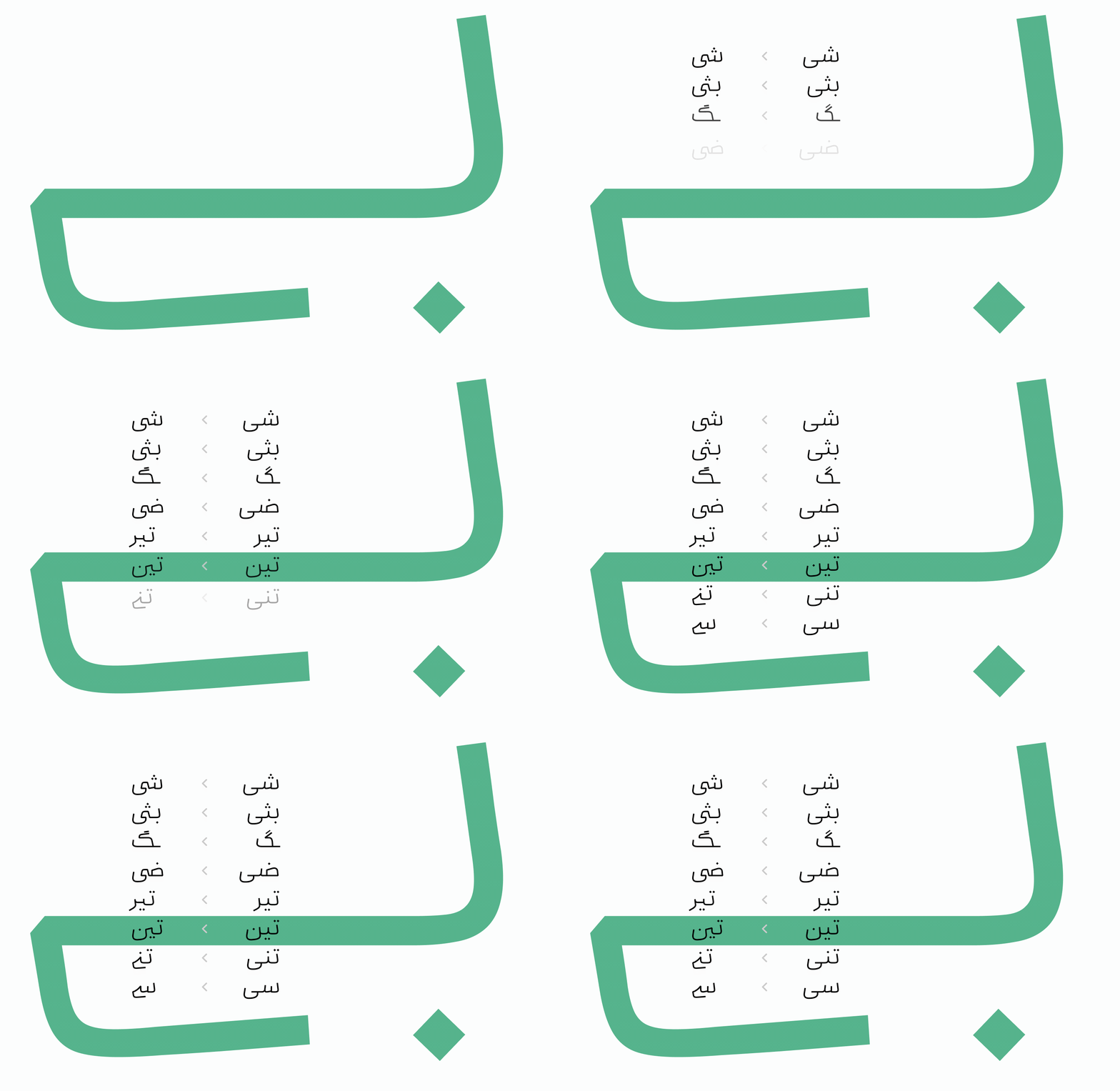
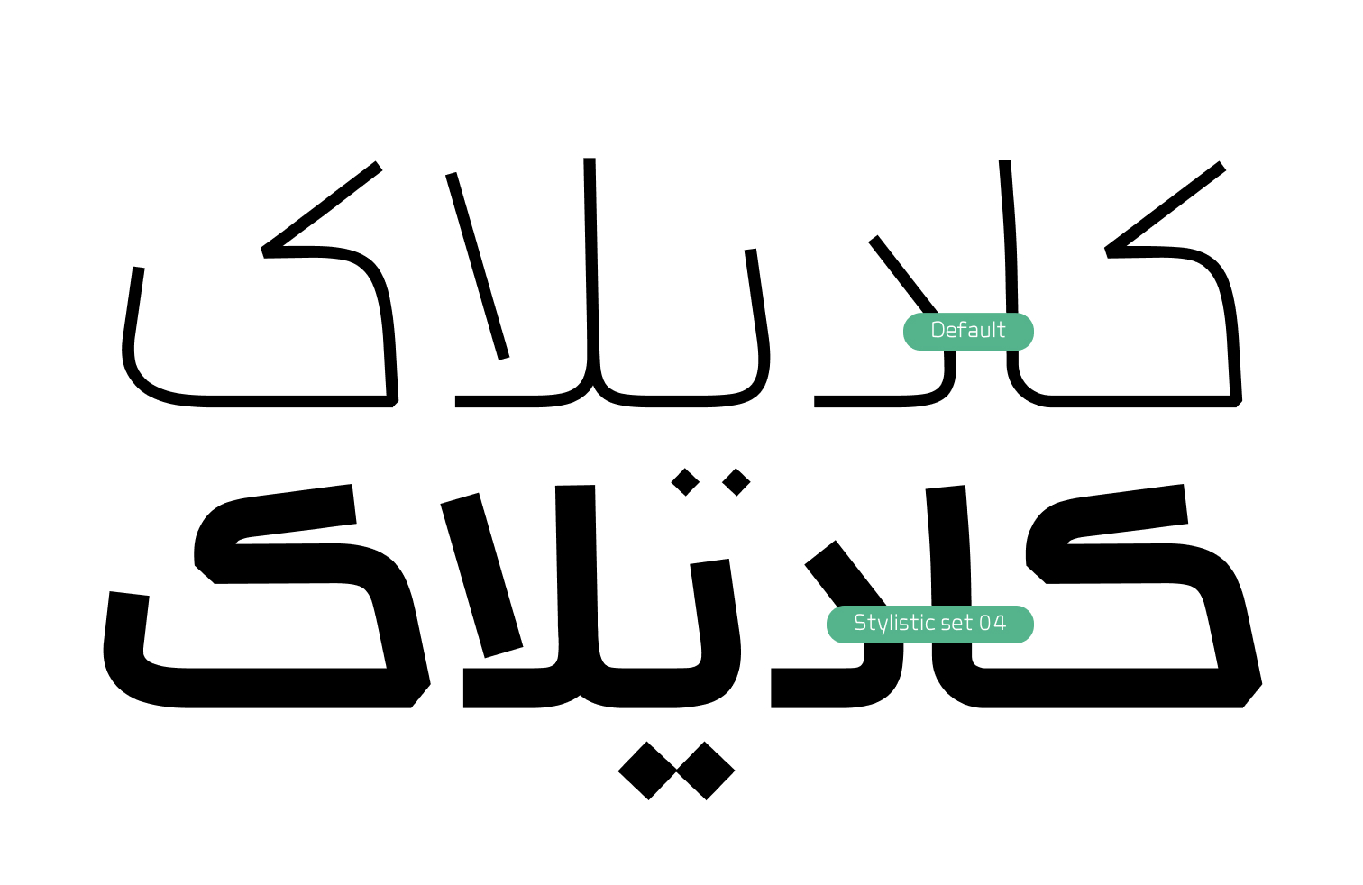
For greater visual variety and added character in headings and text, Bonyan’s Stylistic Sets can be used to modify selected letterforms and connections. These include alternative forms of «ک», terminal «ی» connections, «ـبر» combinations, and other variations. This allows the visual texture and character of the text to be adapted to different design contexts without changing the typeface’s overall structure.
X
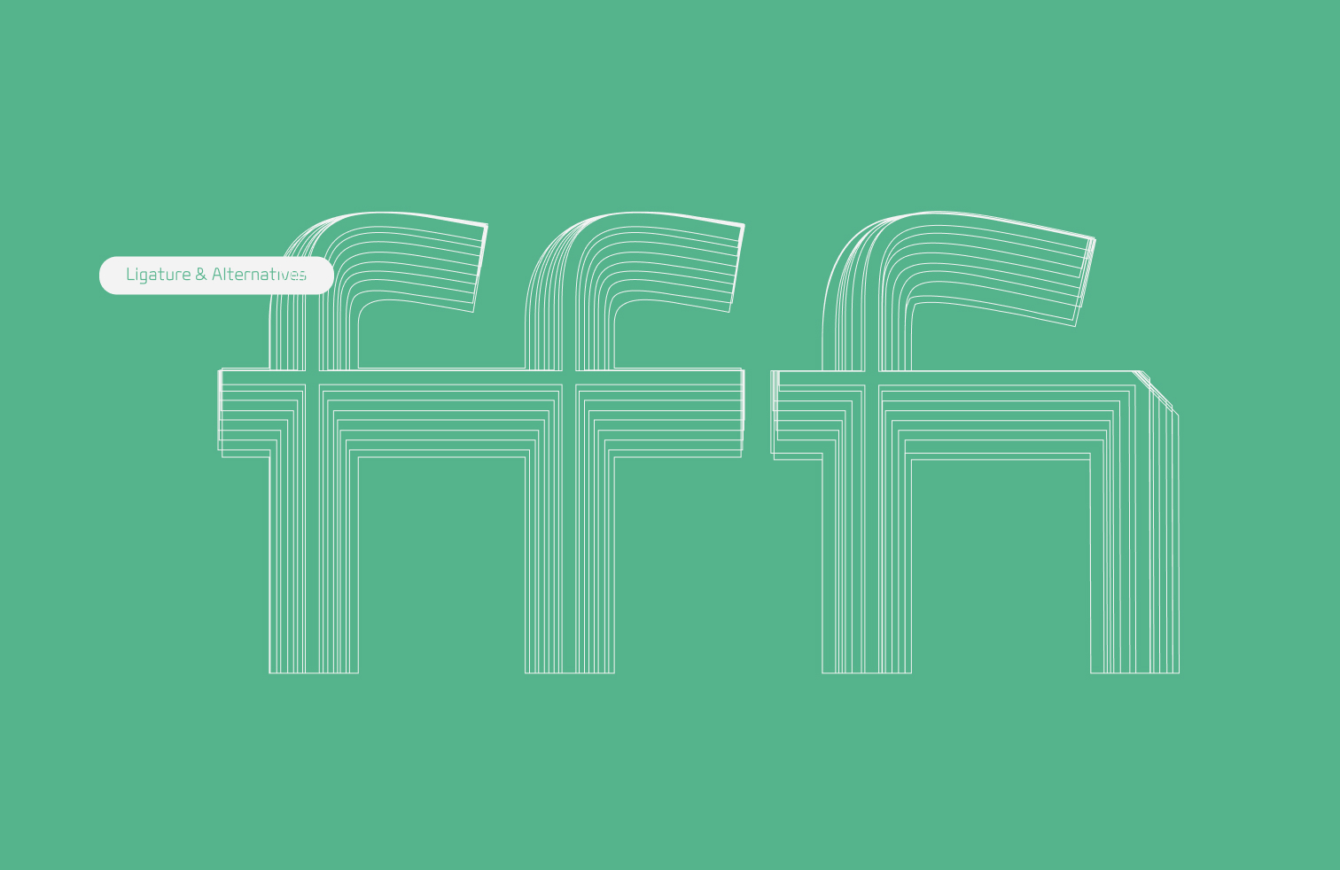
A set of Latin ligatures has also been designed for the typeface. In specific letter combinations, such as fi and ff, these ligatures create more cohesive and harmonious connections between letters, resulting in a more unified and uninterrupted typographic texture.
The availability of three alternative forms of «ه» in medial and final positions introduces greater visual variety and rhythm throughout a text. These forms can be selected according to the design context to create more diverse typographic textures and give the text a distinct visual character.
Bonyan in use: Examples
Main Fonts: 9 weights Available in TTF format.
Web Fonts: WOFF2 formats.



Mehdi Amirian is a designer, born in 1999 in Isfahan. He studied at the Isfahan School of Fine Arts and the University of Art. His primary focus is type design and typeface design. He has provided a wide range of design services to various companies, Design studios and clients from product and interface design to process design, campaign design, branding, and visual identity.
















Comments
Recommended Posts
Meeting with Karim Shahin, Designer of the Narengi Typeface
Nostalgic Arabic Fonts: Reviving the Beauty of the Past
Top Arabic Fonts for Ramadan and Eid Design
Arabic Fonts for Books & Magazines: From Print to Digital
Techno Typeface; A Look at the Design Process and Logic
What features does an ideal subtitle font have?
Selected Fonts of 2025 in the TDC Competition
13th GRANSHAN Type Design Competition