


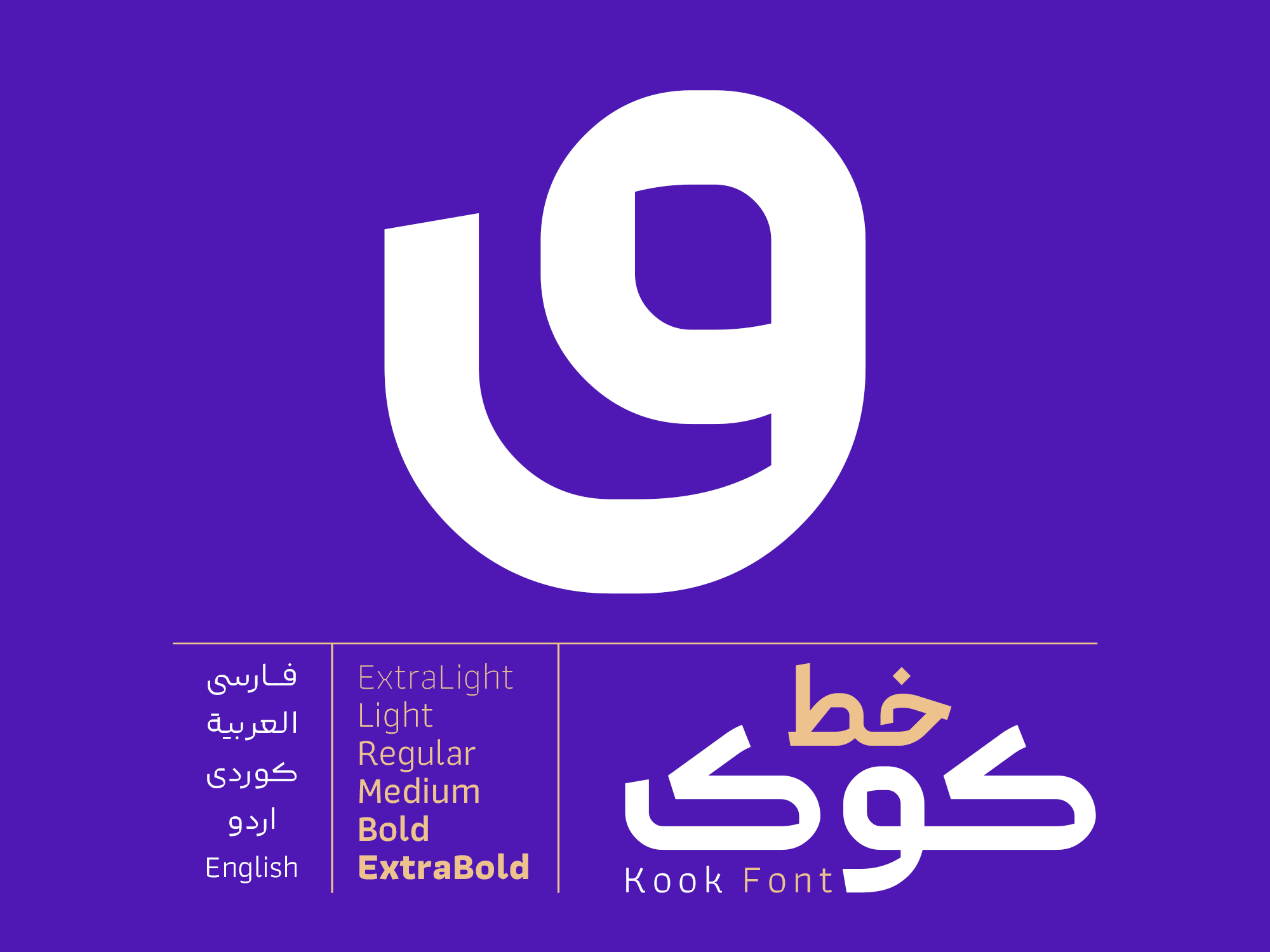
Kook
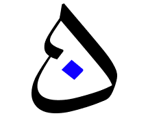
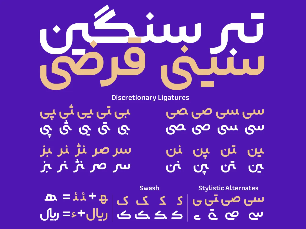
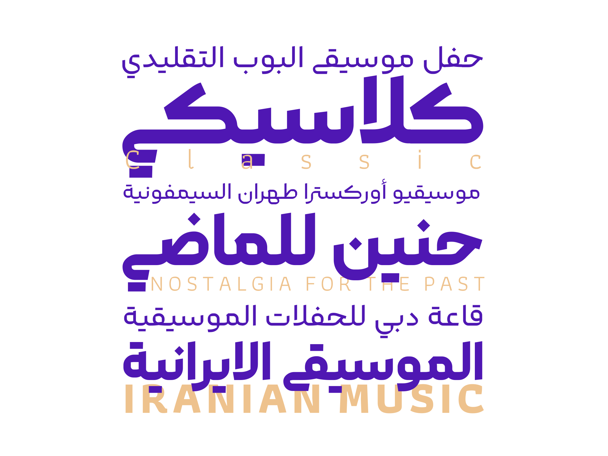
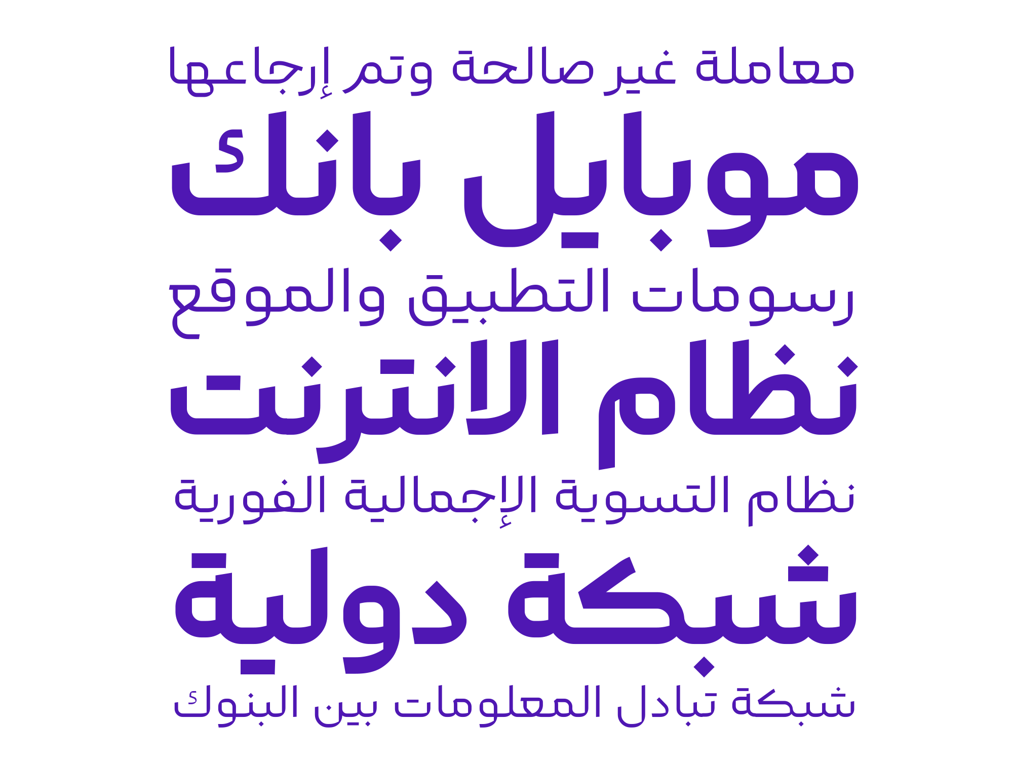
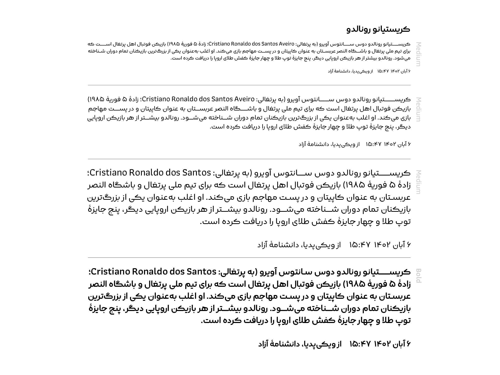
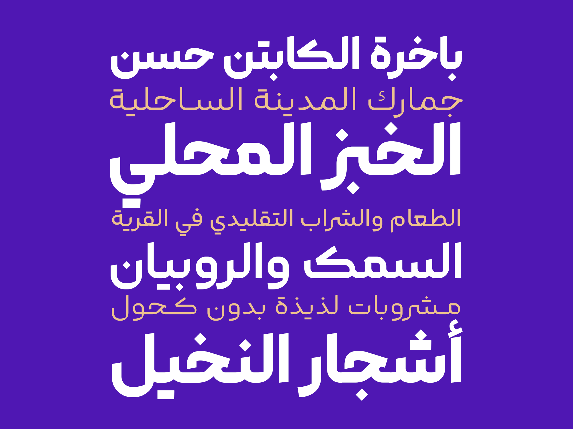
The Kook typeface is characterized as a geometric text typeface. While sharing a general structure with other geometric Perso/Arabic typefaces, the execution details are contemporary. The pen strokes have a slight angle. Some joints have breaks and sharp angles. Some letters have bends that are outside of the norm. All of these delicate details help to create a better texture in fine text and increase readability.
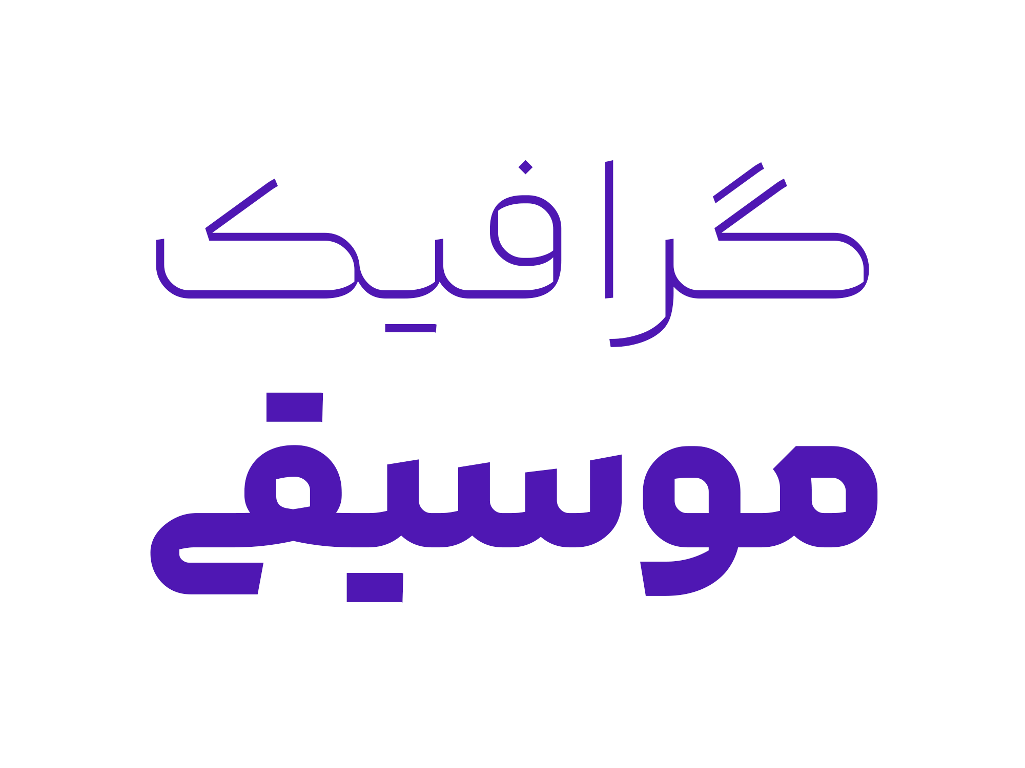
The Kook typeface is particularly well-suited for contemporary subjects such as advertising, user interface design, and social media content. While it is suitable for text, it may not be ideal for reading long passages.
For an additional user to use the font.To share the font with your designer or project partner. (details)
For one website or app and to share the font with 2 additional project partners. (details)
For small businesses to share the font with 5 additional employees and use it on one website.(details)
For unlimited use by companies in all their activities. A website builder, website templates and services that allow users to type with the font. (details)
Kook
The Creation of Kook typeface
The idea behind designing the Kook typeface originated during the creation of an advertising poster. The aim was to develop a font that seamlessly blended geometric lines with calligraphy while maintaining harmony with Latin fonts

The Design and Tuning Process of Kook typeface:
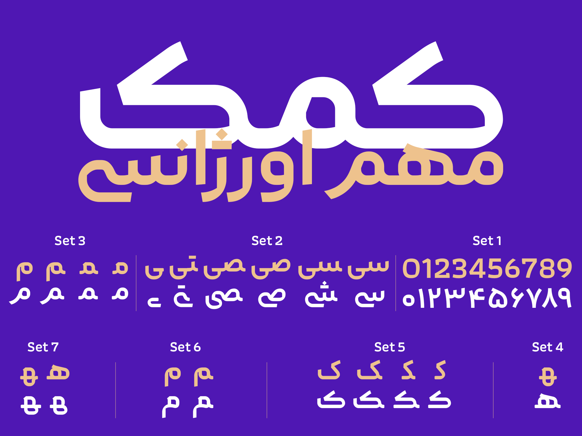
Kook typefaceinitially started as a simple geometric typeface. However, in later stages, the designer added a twist to the pen strokes and refined the typefacemultiple times to reach their current form. The goal was to create a font with well-balanced components and a pleasing appearance.
A Variety of Weights and Languages in the Kook typeface:
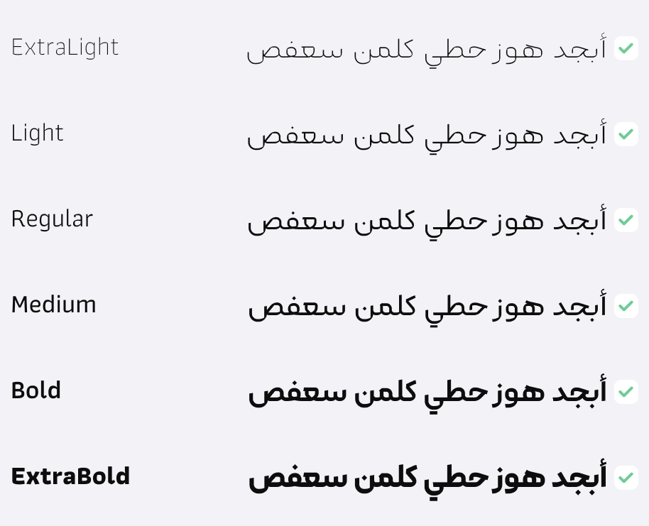
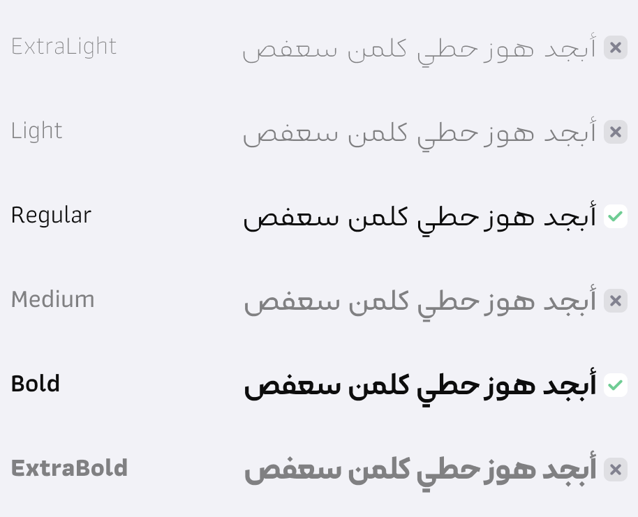
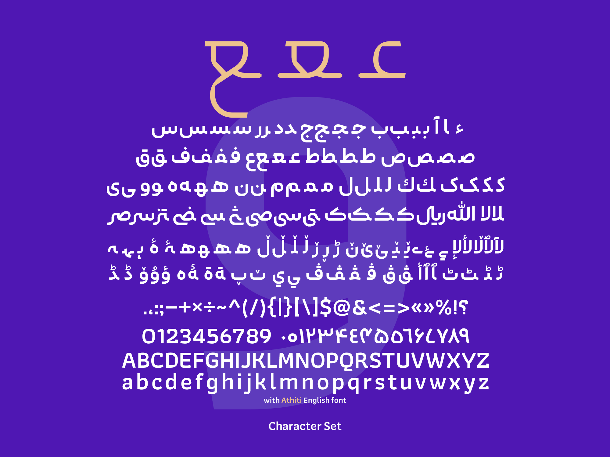
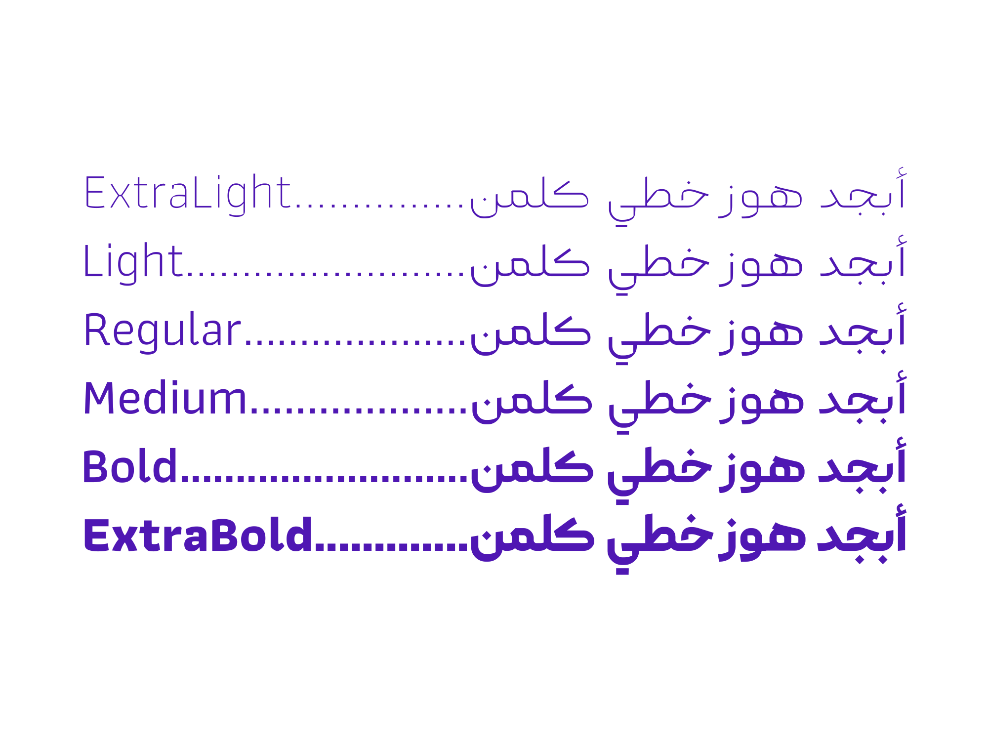
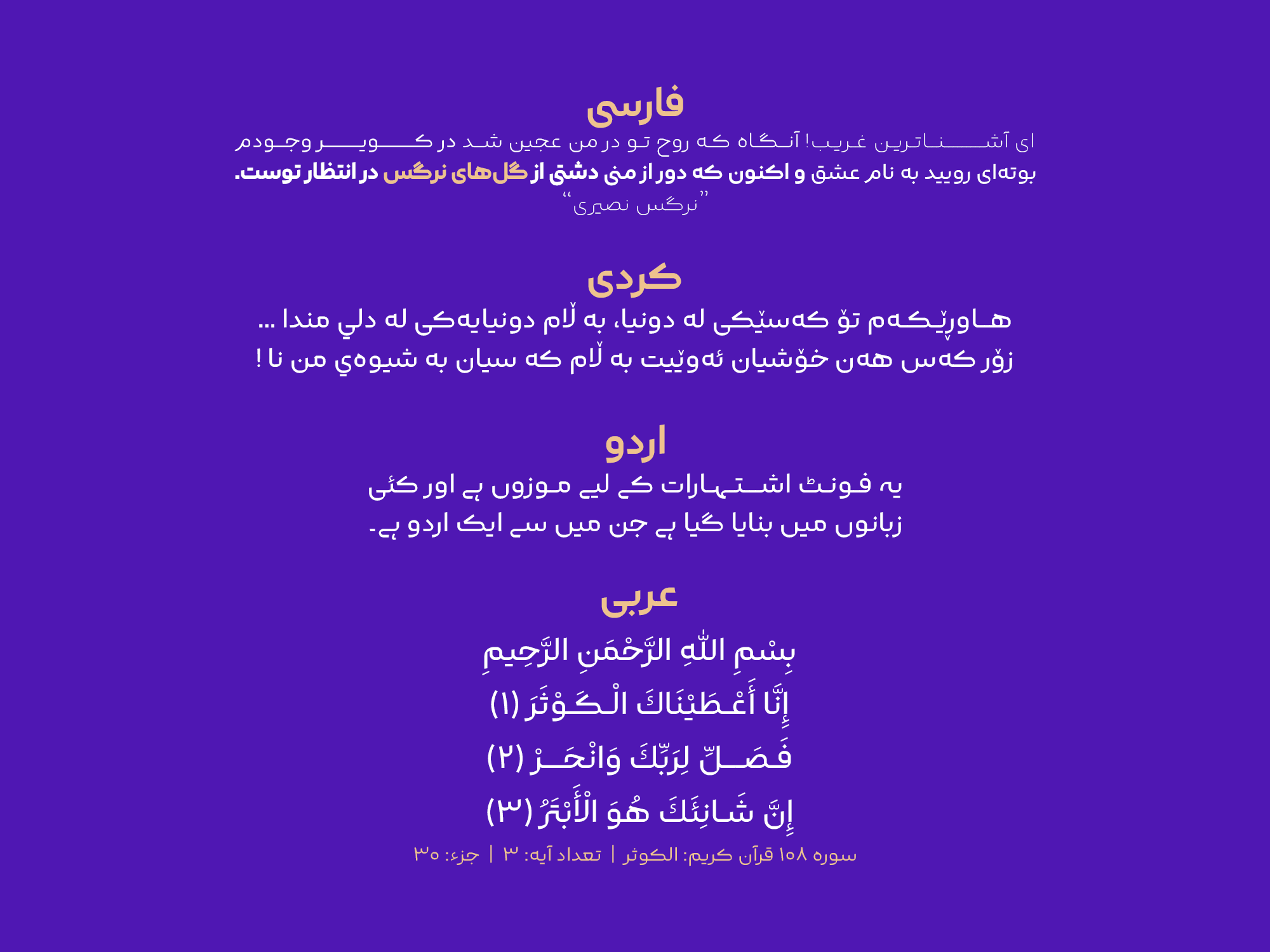
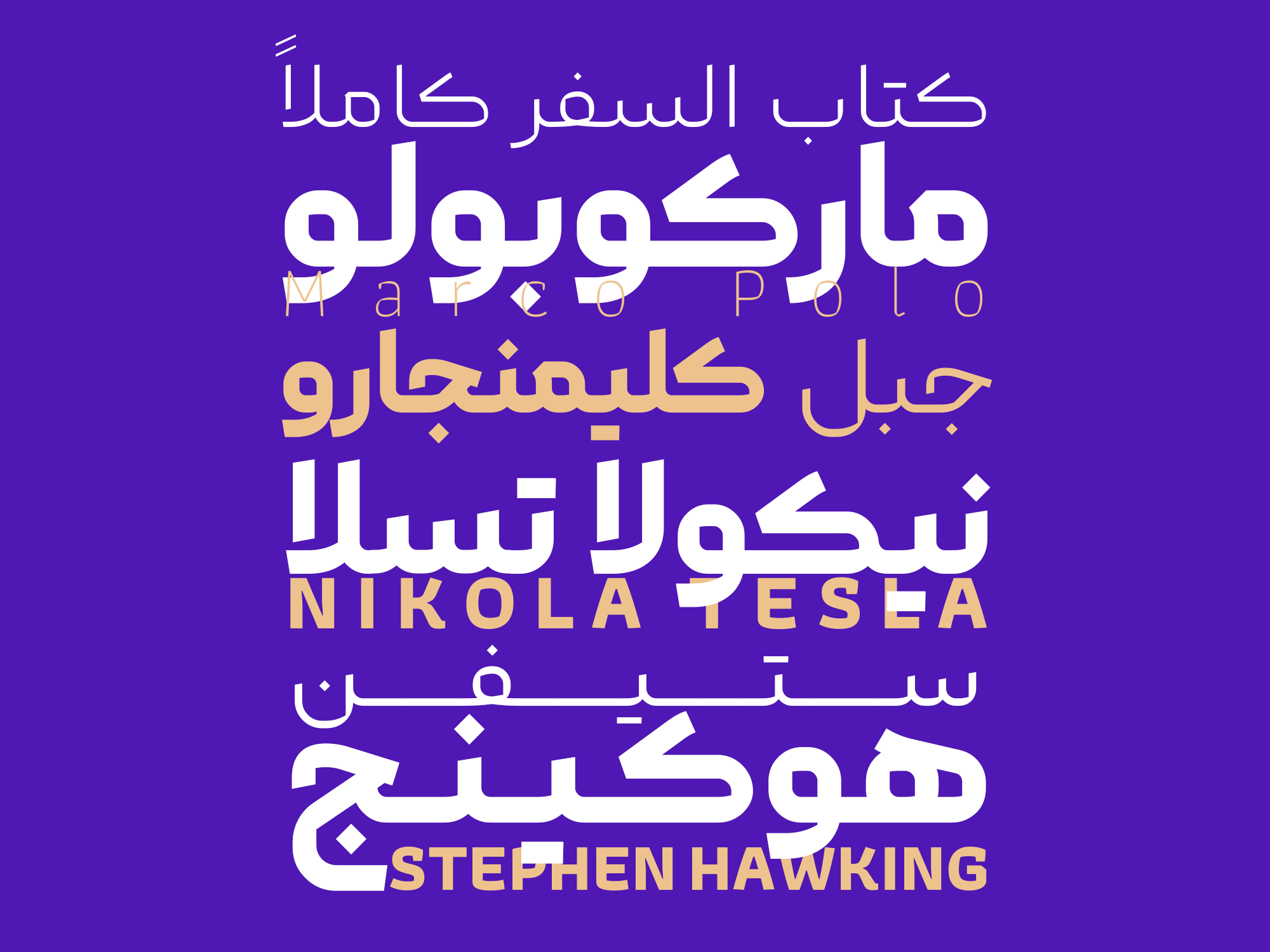
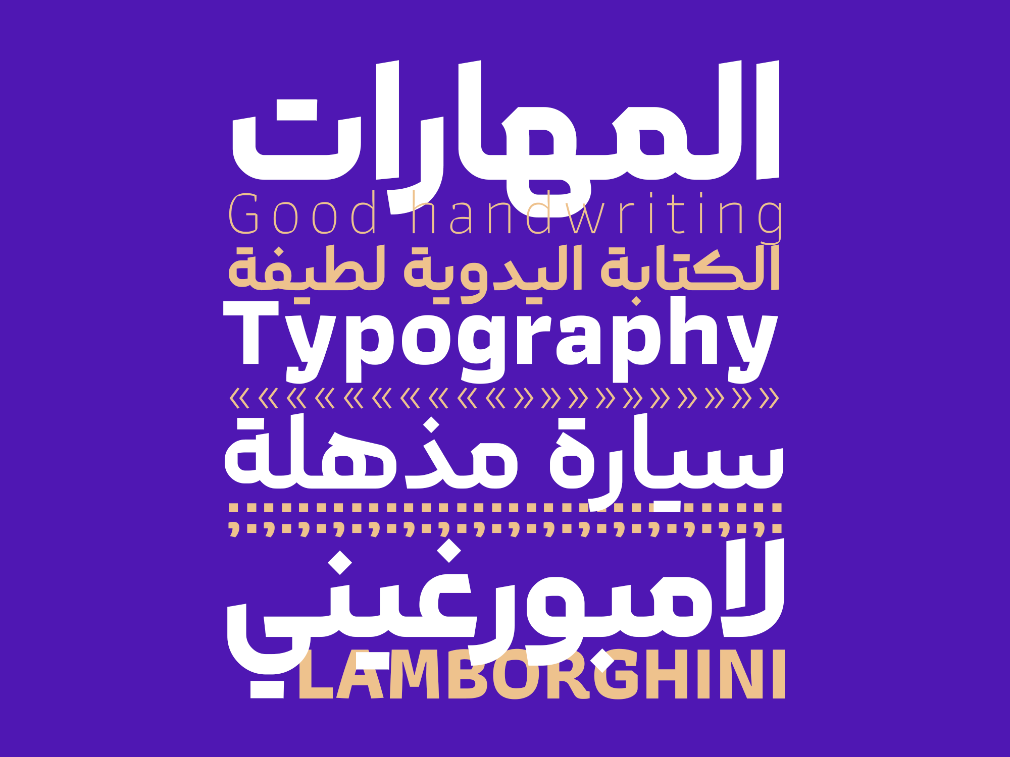
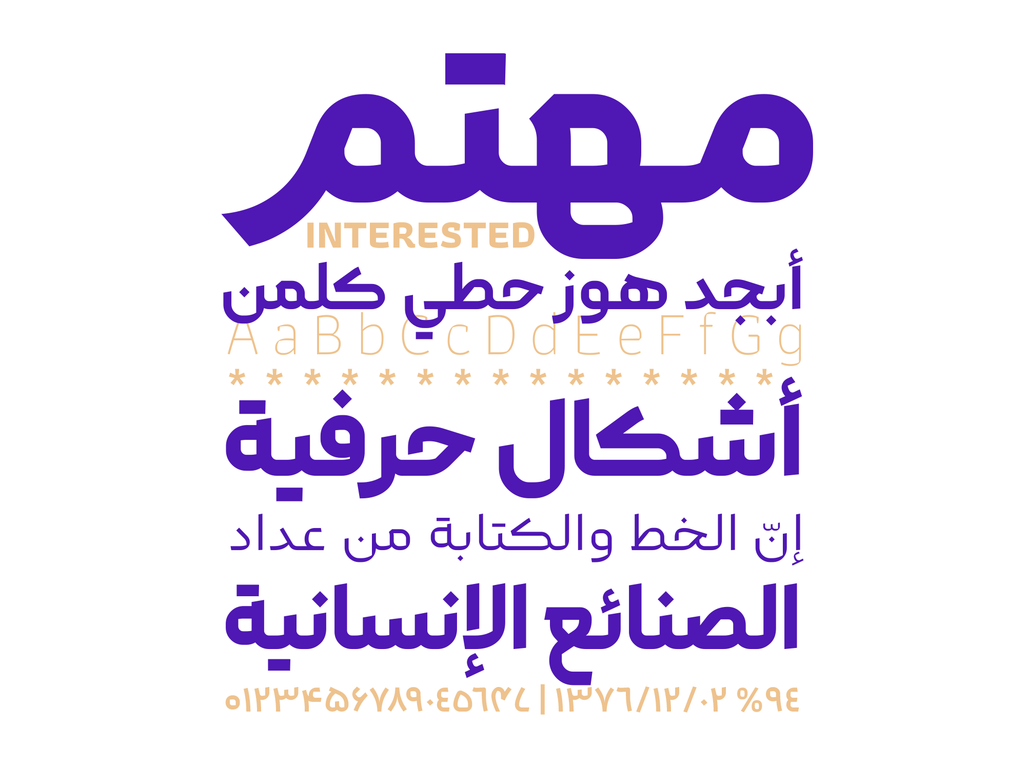
Kook is a 6-weight font family (ExtraLight, Light, Regular, Medium, Bold, ExtraBold) that supports Persian, Arabic, Kurdish, Urdu, and English. The English version of the font is based on the open-source font Athiti.
In the Kook (Pro) font package:
Main Fonts: 6 weights Available in TTF format.
Web Fonts: WOFF and WOFF2 formats.

Saeed Haghighat has been working as a typographer and a cover art designer since 2015. His skills lie in executing projects related to type design, typography, and cover design.


Comments
Recommended Posts
Nostalgic Arabic Fonts: Reviving the Beauty of the Past
Top Arabic Fonts for Ramadan and Eid Design
Arabic Fonts for Books & Magazines: From Print to Digital
Techno Typeface; A Look at the Design Process and Logic
What features does an ideal subtitle font have?
Selected Fonts of 2025 in the TDC Competition
13th GRANSHAN Type Design Competition
Golpayegani Typeface creation