Arabic Fonts for Books & Magazines: From Print to Digital
Choosing a font for books and magazines is not a simple graphic decision; it is a choice that can make reading smooth or difficult.
Although cover design, paper quality, and book size are all important, in the end, it is the font that accompanies the reader’s eyes throughout the reading journey.
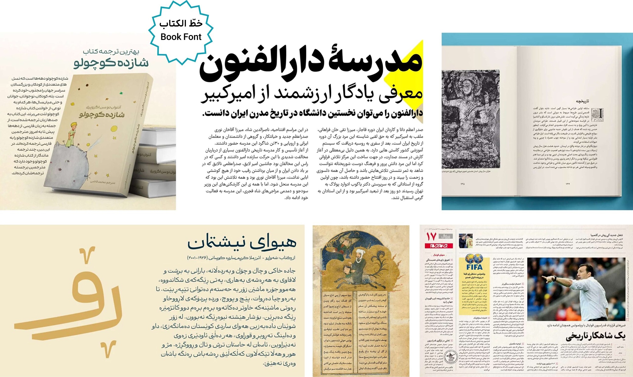
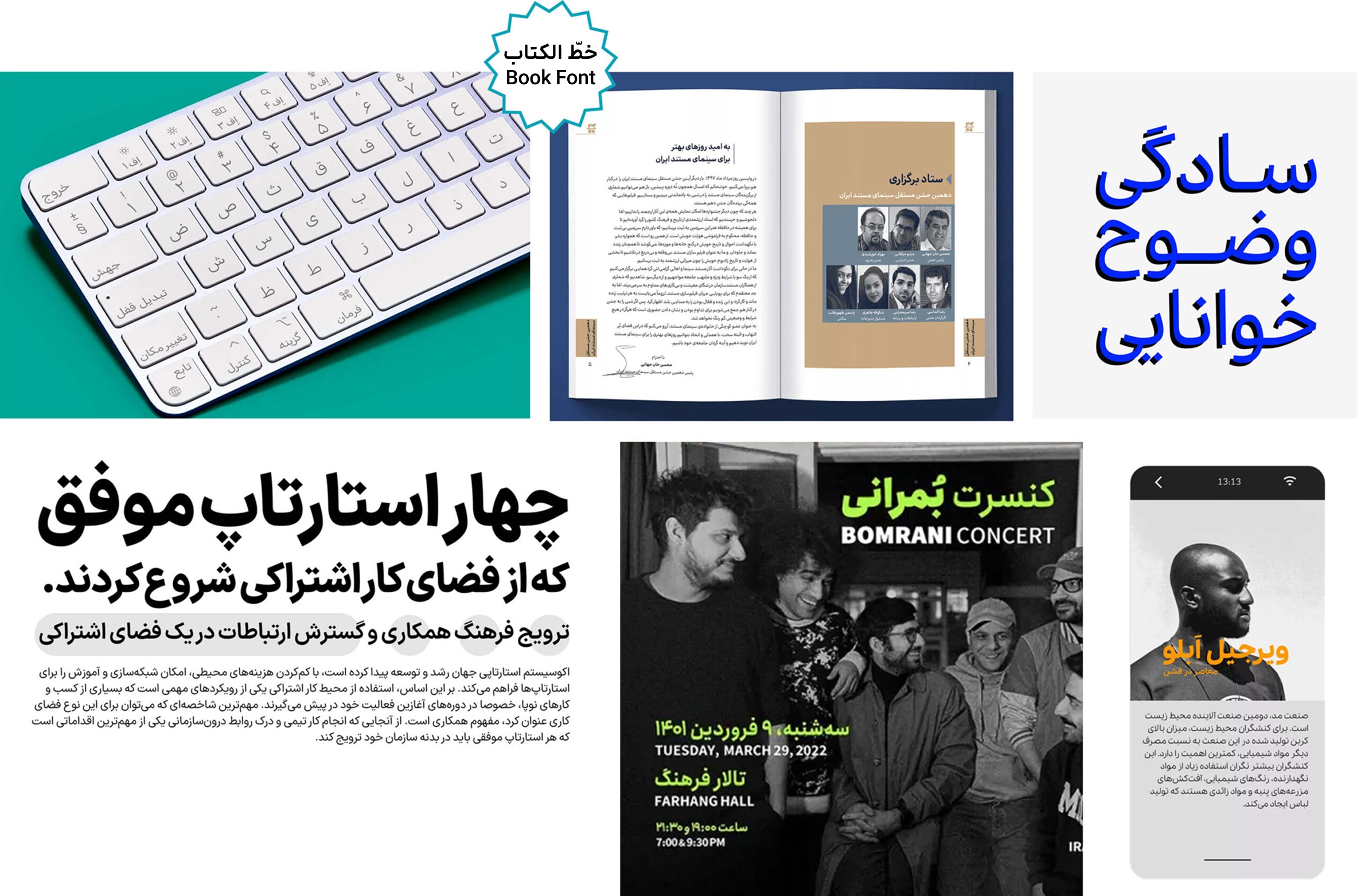
The choice of an Arabic font for a book or magazine can vary depending on the type of content. Books in the humanities (literature, art, history, politics) tend to use Naskh-style fonts, as this script is closer to traditional calligraphy and handwriting, helping convey a stronger sense of authenticity, seriousness, and credibility in the text.
Recommended Naskh-Style Fonts for Books and Magazines :


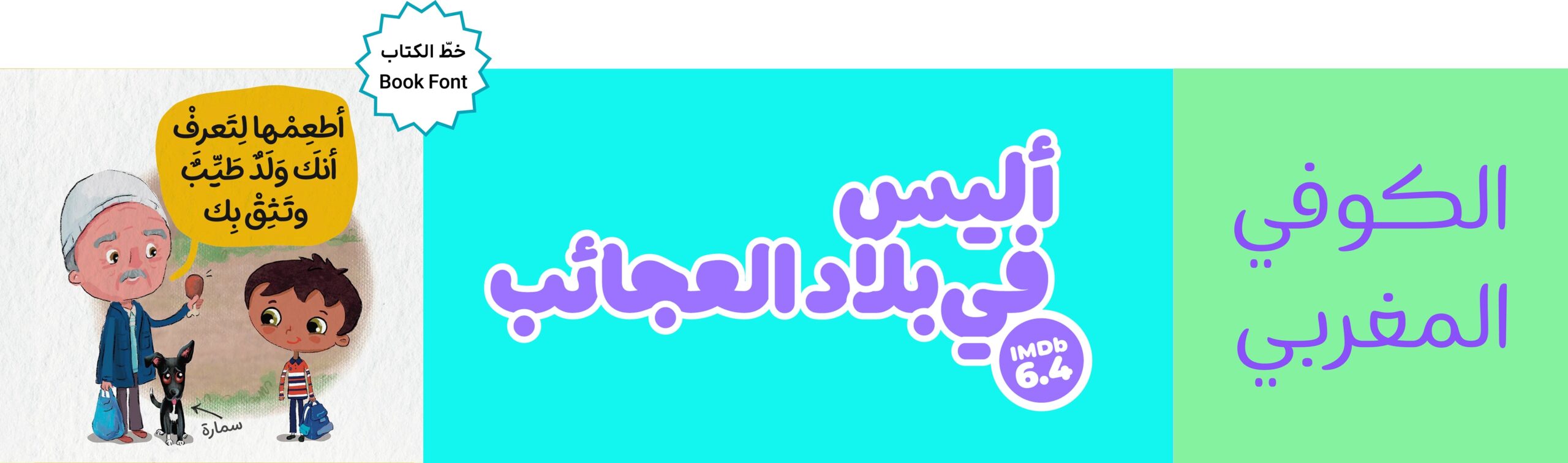
Regardless of the content, the age of the audience also plays an important role in choosing a font. For children’s and young adult books, handwritten, friendly, and energetic fonts are usually the best choice.
In conclusion, when it comes to fonts for books and magazines, the overall texture of the text is more important than the shape of individual letters.
A good font harmonizes so well with the content that it doesn’t impose itself, making the reading experience smooth and enjoyable.