








Shams


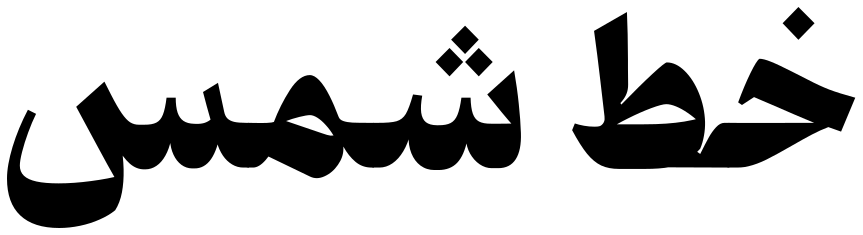
An examination of text typefaces reveals a gap between cold formality and unstable informality: there is little space for typefaces with greater balance in form and white space. Shams was designed to fill this gap, with a medium x-height, moderate density, relatively open counters, and a balanced relationship between black and white space. Its letterforms are inspired by personal Naskh handwriting and the scripts of calligraphers, creating a human and trustworthy character alongside readability. The result is a calm, balanced typeface that allows text to be both read and felt.
 Font Licensing
For an additional user to use the font.To share the font with your designer or project partner. (details)
For one website or app and to share the font with 2 additional project partners. (details)
For small businesses to share the font with 5 additional employees and use it on one website.(details)
For unlimited use by companies in all their activities. A website builder, website templates and services that allow users to type with the font. (details)
Shams
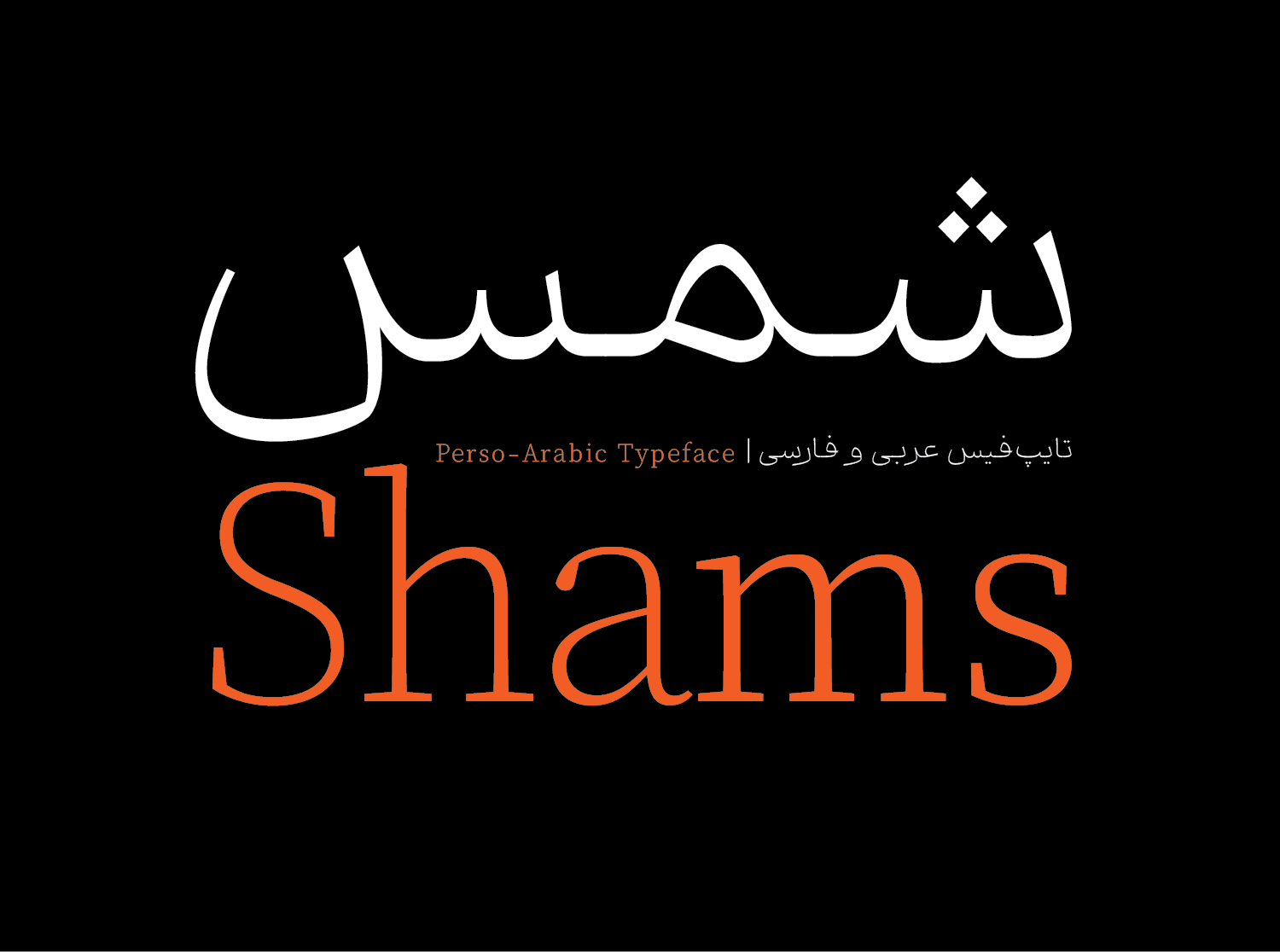
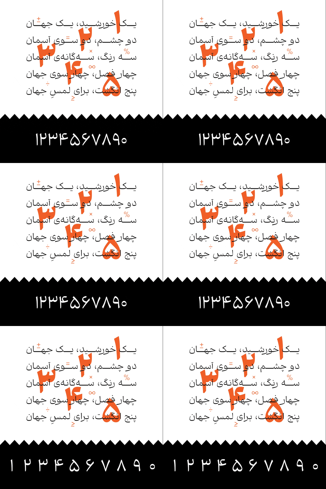
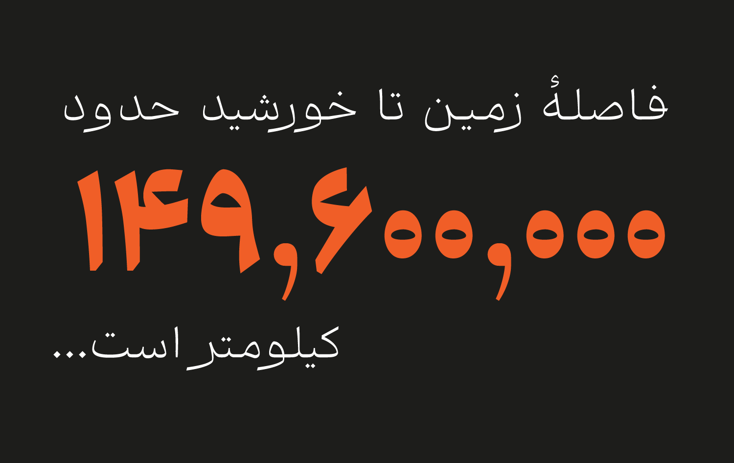
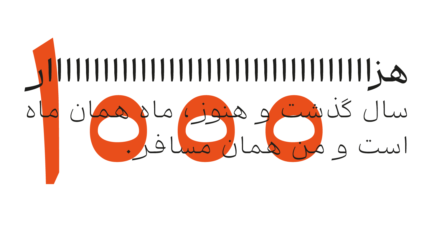
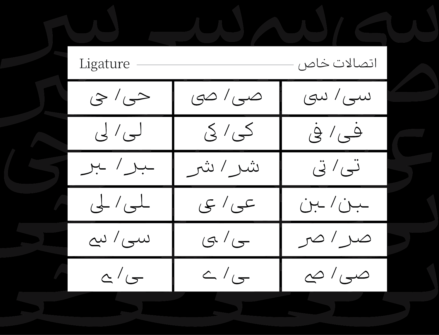
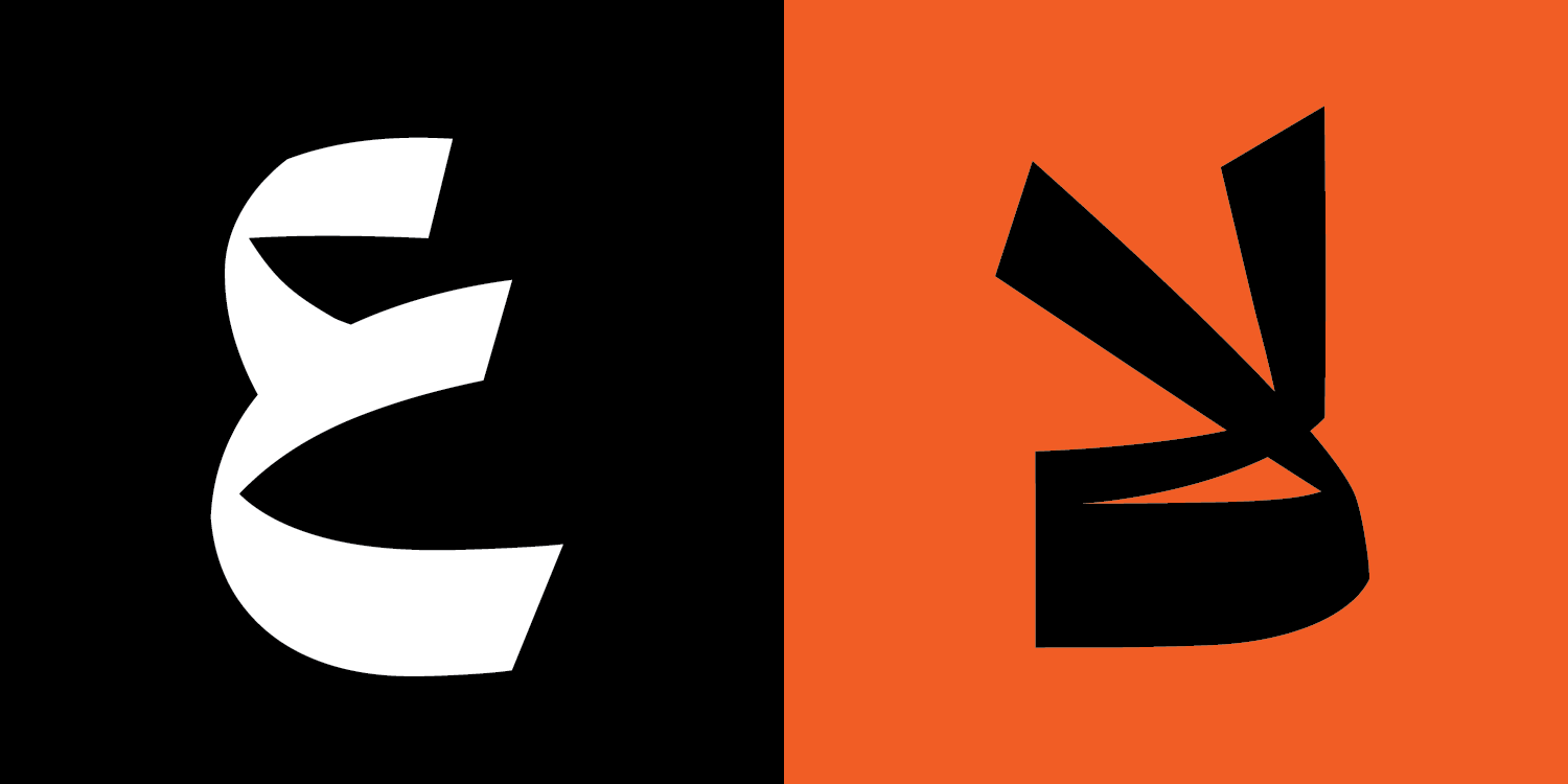
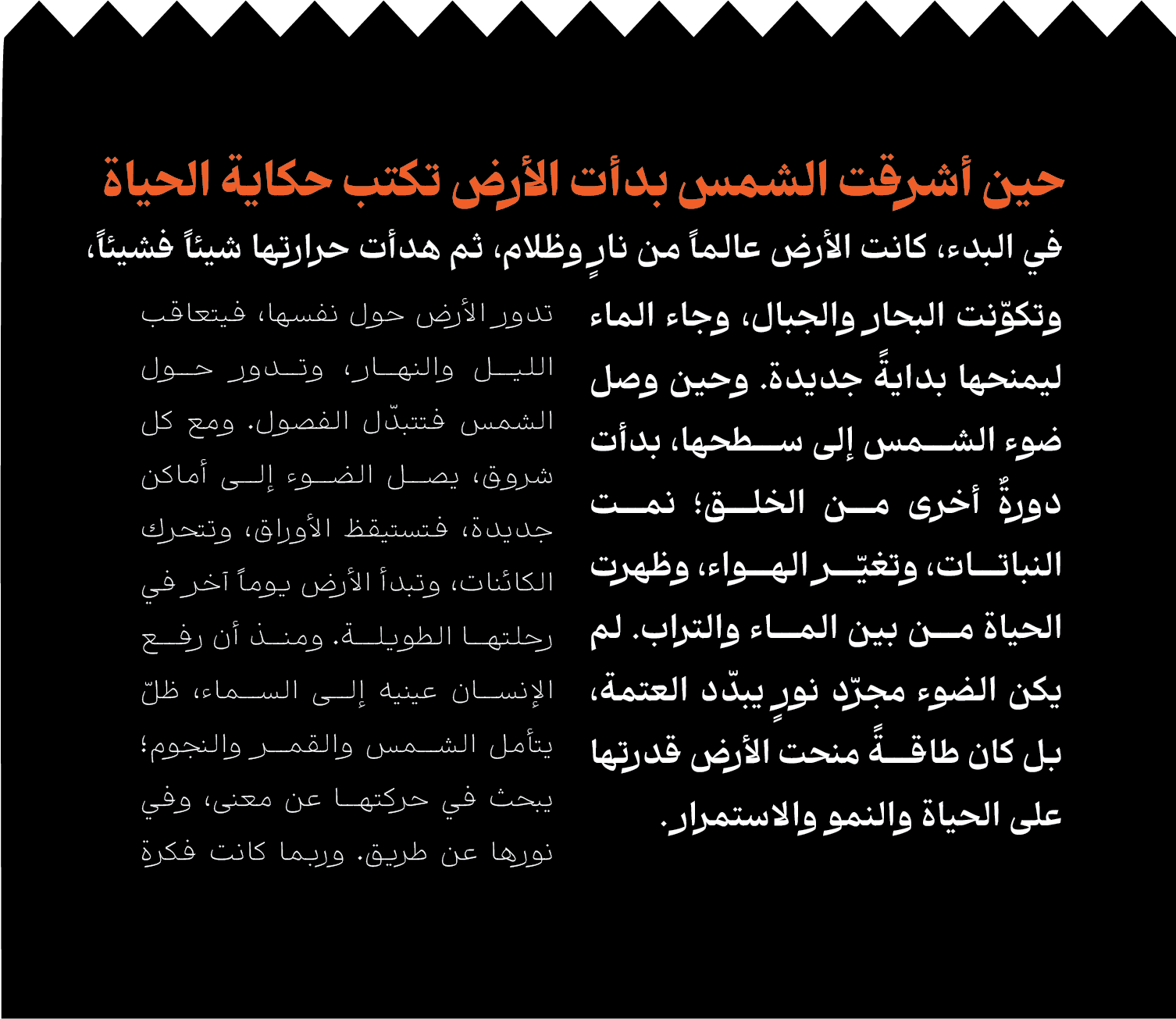
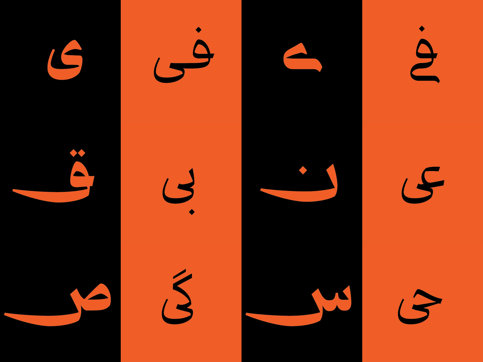
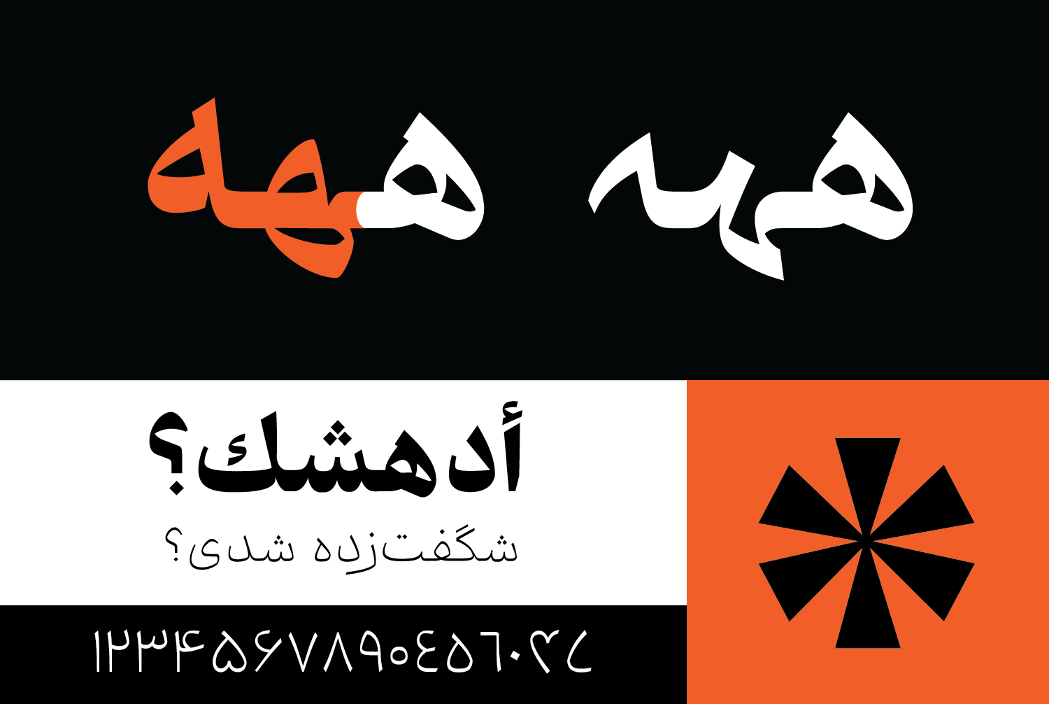
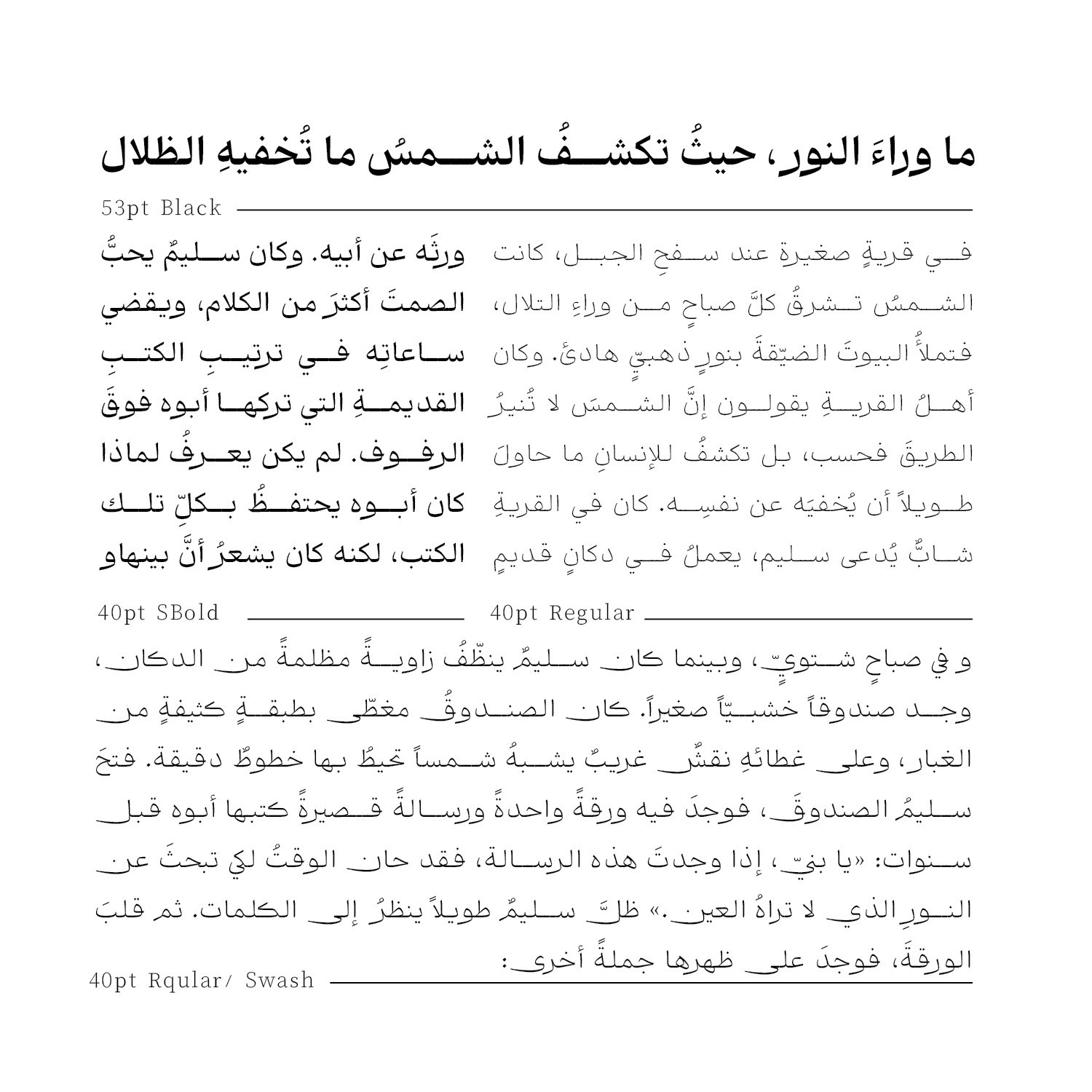
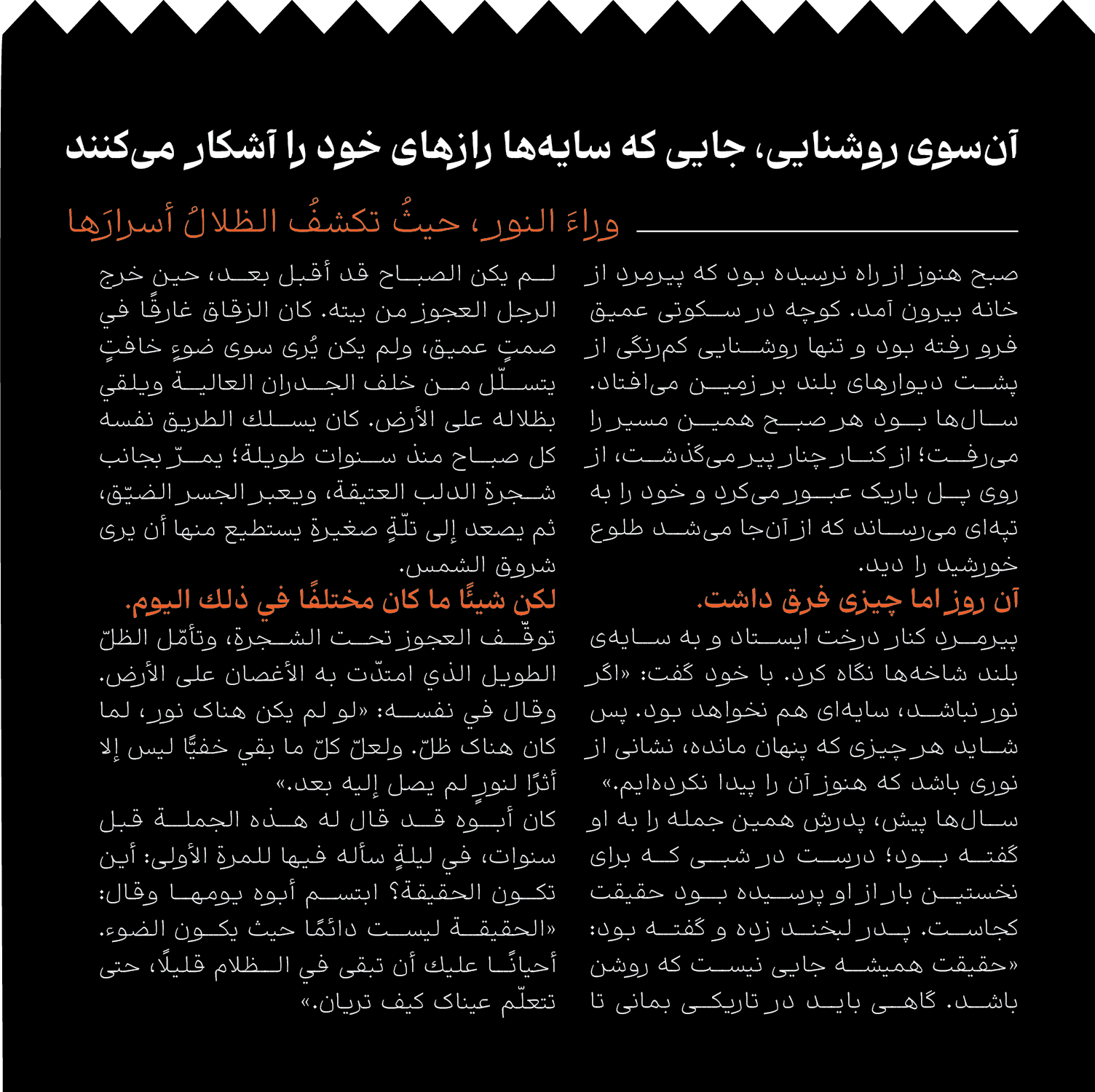
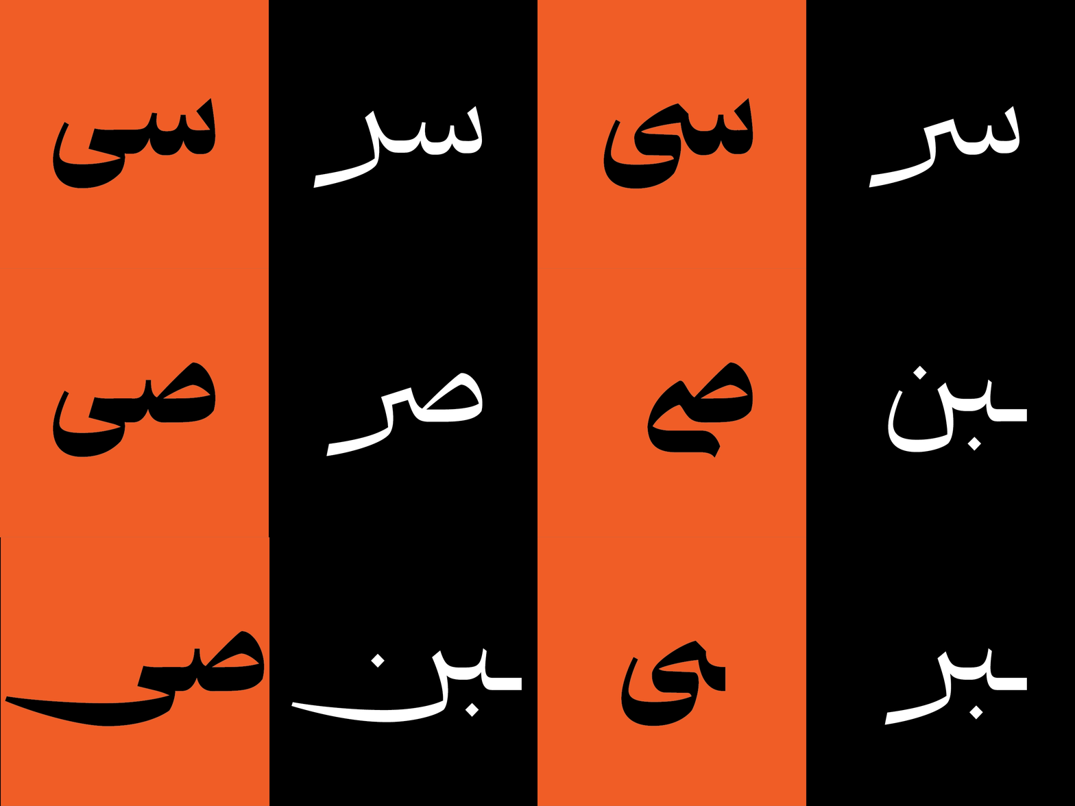
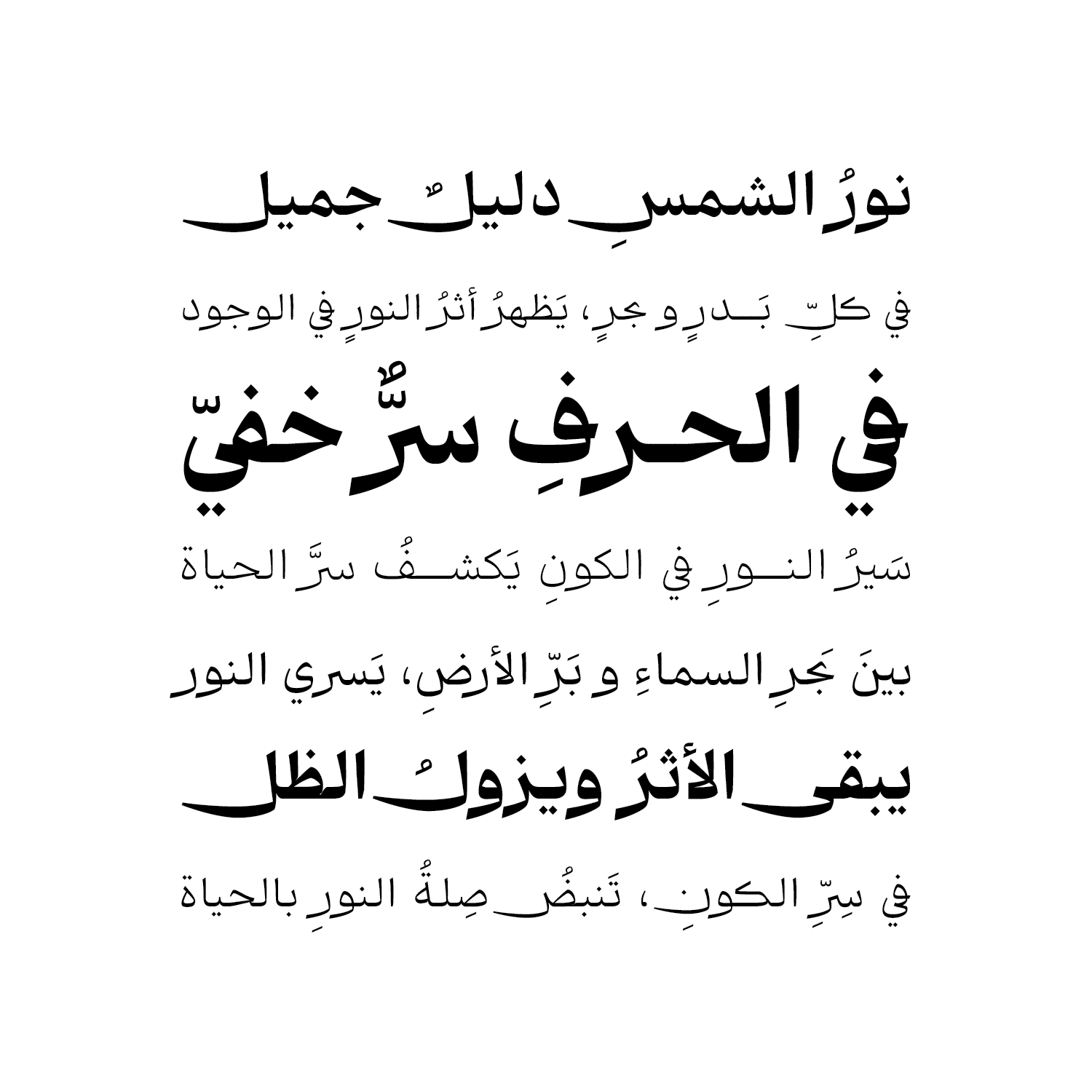
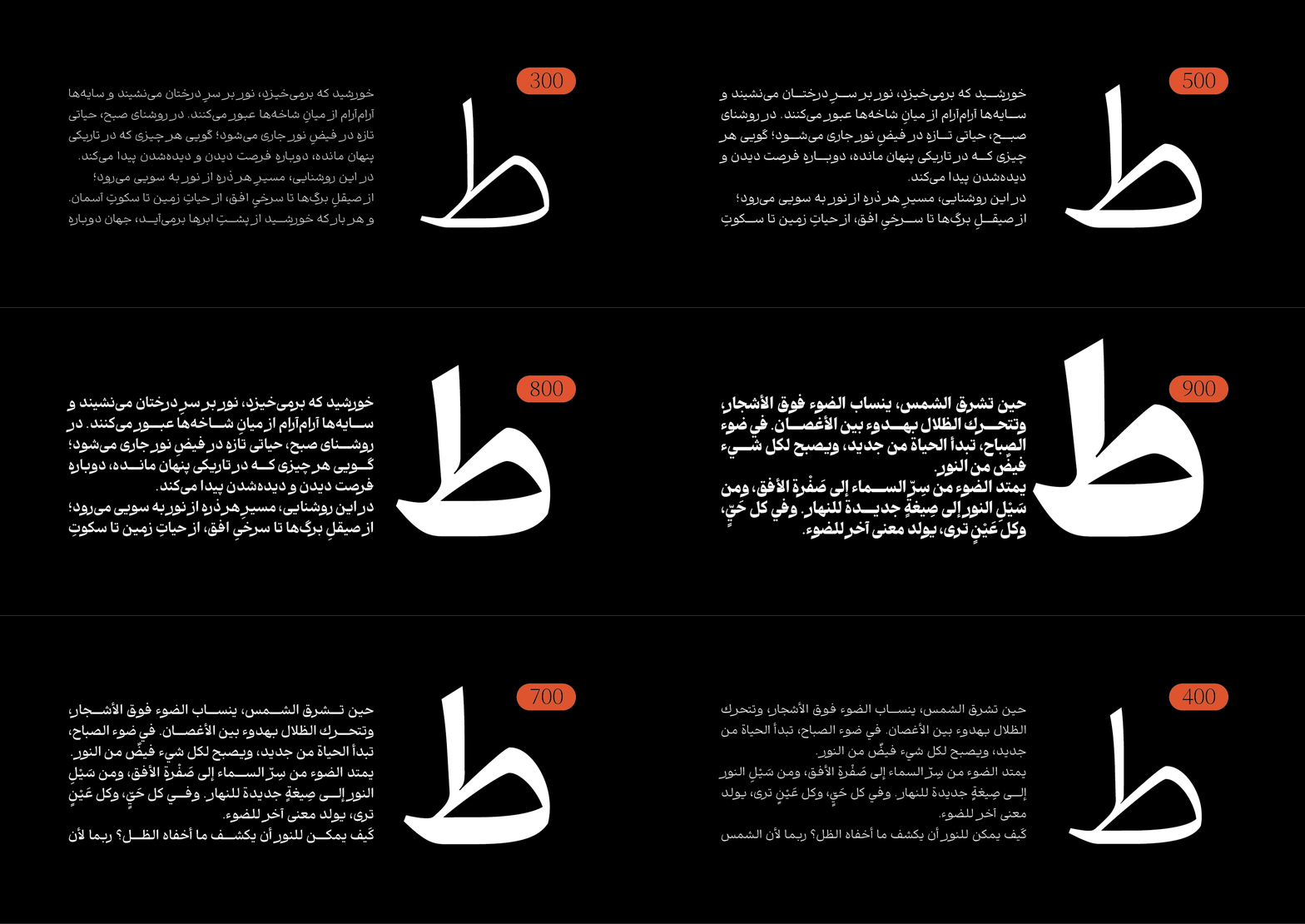
Research into Persian text typefaces reveals a recurring pattern: fonts tend to lean either toward formality, with tall x-heights, dense letterforms, and tightly enclosed counters, or toward informality, an approach that often proves unsustainable for long-form reading. What was missing was a typeface with a medium x-height, moderate density, relatively open counters, and, most importantly, a balance between black and white space. This balance is no coincidence.
Research in visual perception suggests that a balanced proportion of black forms and white space within letterforms, combined with neutral terminals, creates a sense of trust in the reader. Relatively open counters evoke positive emotions such as calmness and optimism. A medium x-height, balanced between the upper and lower extents of the letterforms, creates a sense of visual stability and confidence, keeping readers engaged without exhausting them. Shams was designed to fill precisely this gap.
The letterforms draw inspiration from personal Naskh handwriting traditions: the kind of handwriting a calligrapher would create for themselves. This gives Shams a human quality rarely found in Persian text typefaces. The result is a typeface that is quiet yet expressive, designed for texts that are meant not only to be read, but also to be felt.

Weight Variations in Shams
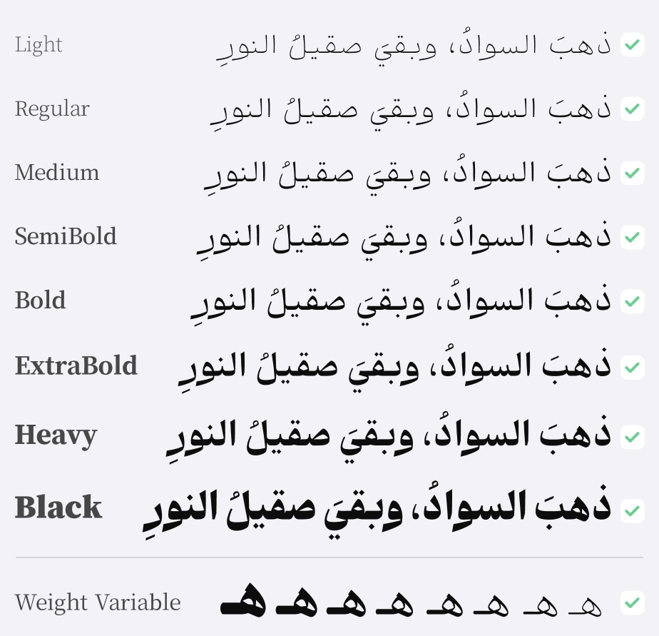
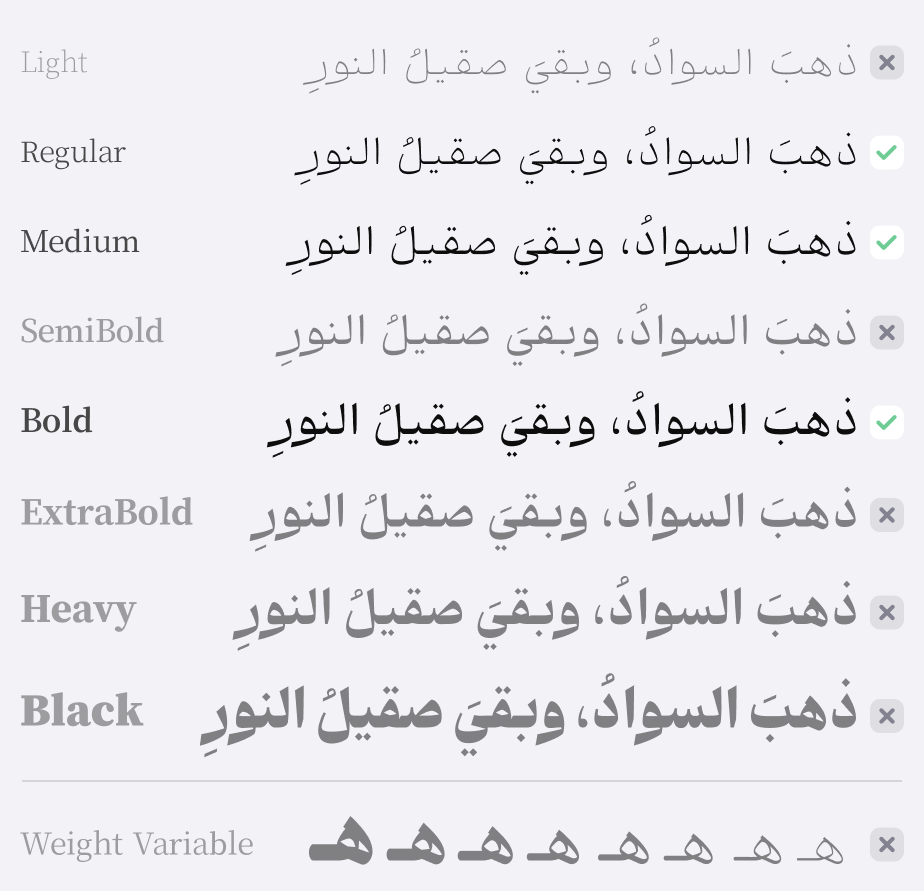
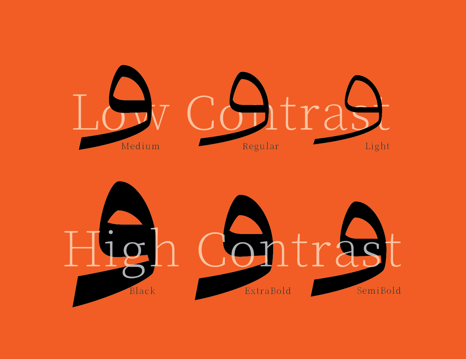
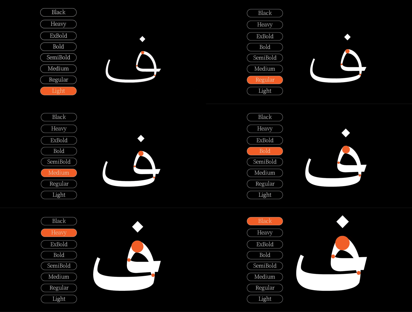
Shams comes in eight weights: Light, Regular, Medium, SemiBold, Bold, ExtraBold, Heavy, and Black. As the letterforms become heavier, the degree of stroke contrast also increases.
In the Shams package :
Main Fonts: 8 weights Available in TTF and OTF format.
Web Fonts: WOFF and WOFF2 formats.
Variable Fonts: Weight axis.
Help File: A PDF manual with instructions on how to use TrueType features such as ligatures, alternate characters, and more
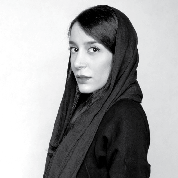


Master’s Degree in Visual Communication, Educator and Researcher in Persian Typeface Design Founder, Tehran Type Week Recipient of the Silver Cypress Honorary Diploma (1392) First Place in Persian Typeface Design, Behance Biennial Honorable Mention, 12th International Granshan Biennial Speaker at: ATYPI, Typewknd, Design Principles & Practices, UX Shiraz, Silver Cypress (Side Program), Ketab-Ara Collection Author of interdisciplinary academic and research papers at the intersection of design, cognitive science, and psychology, focusing on legibility and readability in print and digital media, typographic tone, and methods of typeface classification.




Omid Emamian, born in 1989, is an Iranian graphic designer and type designer. He began his professional career in typeface design in 2012. Omid has designed and developed numerous fonts independently or in collaboration with various designers such as Reza Bakhtiari Fard, Mahdi Ershadi, and Kamyab Jafari. His works include fonts such as: Jam-e-Jam, Aramesh, Vazeh, Dabestan, Rey, Irancell, Aria, Mika, and Kamand. Omid has won numerous awards, including three Typography Excellence Awards from the TDC (2018, 2019, and 2021), second place and an honorary diploma from Granshan (2014 and 2017), and an honorary diploma from the Silver Cypress Festival in 2017. In addition to his professional work, he teaches type design at Sooreh University, Alzahra University, and Islamic Revolution University. He has also held numerous workshops and lectures in this field and has participated in domestic and international type design exhibitions.
















Comments
Recommended Posts
Meeting with Karim Shahin, Designer of the Narengi Typeface
Nostalgic Arabic Fonts: Reviving the Beauty of the Past
Top Arabic Fonts for Ramadan and Eid Design
Arabic Fonts for Books & Magazines: From Print to Digital
Techno Typeface; A Look at the Design Process and Logic
What features does an ideal subtitle font have?
Selected Fonts of 2025 in the TDC Competition
13th GRANSHAN Type Design Competition